
Historical painting movement
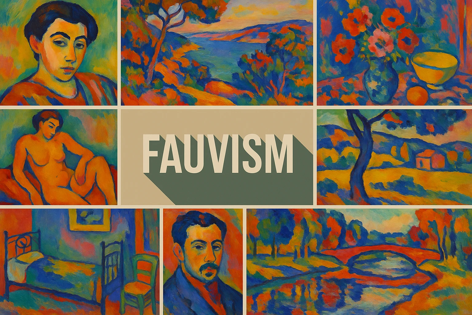
Fauvism was a short-lived early twentieth-century painting movement associated especially with Henri Matisse, André Derain and Maurice de Vlaminck. Its painters used assertive, often non-naturalistic colour and visible brushwork to organize recognizable subjects. The crucial change was not simply brighter paint: colour could construct the picture rather than describe an object’s expected hue.
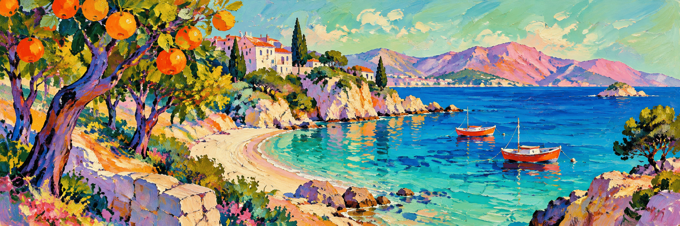
A visual introduction
Select an image for a closer look. Use the thumbnails, arrow keys or a swipe to compare examples. Zoom in to inspect details, or share the image that inspires you.
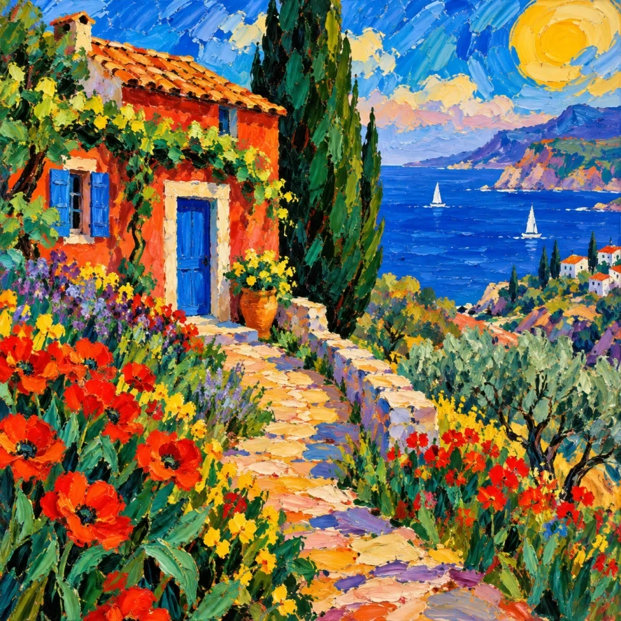
Creative toolbox · take this style further
Choose an input and a destination. Search sends your words to the chosen site; Copy & open puts them on your clipboard to paste there.
Create with AI
Turn your chosen input into an image prompt or a new creative direction.
ChatGPT
Copy your input and paste it into a ChatGPT conversation or image request.
Copy & open ChatGPT (new tab)Claude · Anthropic
Develop an image prompt or explore the style in a new Claude conversation.
Copy & open Claude · Anthropic (new tab)Midjourney
Paste your input into the Imagine bar on the Create page.
Copy & open Midjourney (new tab)Adobe Firefly
Copy your input, open Firefly, and paste it into the prompt field.
Copy & open Adobe Firefly (new tab)Leonardo.Ai
Copy your input, open Leonardo, and paste it into the generation field.
Copy & open Leonardo.Ai (new tab)Image search
Find visual references. Short, concrete keywords usually work best.
Lexica
Search AI images and prompts using your selected input.
Search with this input Lexica (new tab)Pexels
Search the photo and video library. Short keywords often work best.
Search with this input Pexels (new tab)Pixabay
Search photos, illustrations and other images.
Search with this input Pixabay (new tab)Unsplash
Search photographs using the style name or your own keywords.
Search with this input Unsplash (new tab)Wikimedia Commons
Search photographs, artworks and historical images. Check each file for its source and reuse terms.
Search with this input Wikimedia Commons (new tab)Art & research
Explore artists, collections and the ideas behind a style.
Wikipedia
Search for background reading. A style may not have its own article.
Search with this input Wikipedia (new tab)WikiArt
Copy your input into WikiArt’s search to explore artists and artworks.
Copy & open WikiArt (new tab)Europeana
Paste your keywords into the search to explore European museum, library and archive collections.
Copy & open Europeana (new tab)Inspiration
Discover portfolios and visual ideas from creative communities.
Instagram hashtags
Search a hashtag made from your input: spaces and punctuation are removed. Instagram may require sign-in.
Search with this input Instagram hashtags (new tab)ArtStation
Paste your input into artwork search for concept art, environments, characters and visual development.
Copy & open ArtStation (new tab)Behance
Paste your input into project search for illustration, design and visual storytelling.
Copy & open Behance (new tab)A closer look
Strong warm-cool contrasts, simplified forms, visible strokes and compressed space. A violet road, green face or orange hillside can remain readable because colour areas, contours and intervals create a deliberate structure. Landscapes, portraits, interiors and still lifes offer different ways to test that structure.
More specific than any brightly coloured image
Fauvism is associated with an early twentieth-century group of painters and an intensified use of color. Individual works vary, and the term is more specific than any brightly colored image. Color can separate forms, organize space or heighten an experience without closely matching observed local hues. The resulting picture still depends on composition and relationships among areas; saturation alone does not explain its effect.
The term names a historical grouping as well as a set of pictorial possibilities. A contemporary image can be Fauvist-inspired without belonging to the original movement. Likewise, the later work of an artist who participated in Fauvism should not automatically be placed under the same label. Look at the particular work, its date and its decisions.
Collioure and the 1905 Salon
The Met’s exhibition research identifies the summer of 1905 in Collioure as a decisive period of collaboration between Matisse and Derain. They experimented with colour, form and perspective in response to the Mediterranean setting. When their paintings appeared at the Salon d’Automne later that year, the radical palette became a focus of controversy.
The name comes from the French word fauves, meaning wild beasts, associated with the critic Louis Vauxcelles’s response to the exhibition. It was not a neatly planned collective manifesto. The Centre Pompidou describes a wider network that included Henri Manguin, Charles Camoin, Albert Marquet, Raoul Dufy and others, and notes that several participants followed different directions from around 1907.
Colour as structure, not decoration
Local colour is the colour we conventionally associate with an object: a green leaf or a brown trunk. Fauvist painting can detach that association while keeping the subject legible. A blue trunk might separate from an orange hillside; a red foreground can push against a cooler distance. The relationship between areas becomes more important than matching each object individually.
This freedom still requires choices. If every patch has the same intensity, size and visual weight, the picture may become noisy. Give a broad area a supporting role, let a small accent interrupt it and use quieter intervals where the composition needs breathing room. The point is to organize sensation, not to demonstrate that every tube of paint has been opened.
Brushwork and the visible surface
Fauvist marks can be broad, broken, quick or more continuous; a uniform recipe misses their variety. MoMA’s record of Matisse’s Landscape at Collioure, painted in summer 1905, describes sketchy strokes and areas of unprimed canvas left visible. The museum treats it as a finished painting, making the exposed support part of the work rather than evidence of incompletion.
When looking closely, ask what a stroke does. Does it establish the direction of a tree, separate water from land, or set one colour vibrating beside another? Avoid assuming that energetic paint must have been careless. A visibly abbreviated form can be the result of a precise decision about what the painting needs to retain.
Space can be shallow and still convincing
A Fauvist picture may compress distance, tilt a surface or simplify modeling without dissolving into abstraction. Overlap, relative scale, a directional contour and warm-cool relationships can preserve orientation. A table need not resemble a geometrically measured box to hold the composition together, but its relationship to the objects must remain purposeful.
SFMOMA’s account of Matisse’s Sketch for Le Bonheur de vivre, dated 1905–6, places expressive colour alongside flattened space, line and brushwork. It also distinguishes the broken colour of the sketch from the broader colour fields of the final painting. That comparison is useful: the movement contains different balances between individual marks and larger shapes.
Look at specific works
Derain’s Portrait of Henri Matisse (1905), documented by the Philadelphia Museum of Art, shows his colleague seated outdoors beside a table. The museum emphasizes its rhythmic primary-colour relationships. It provides a concrete way to study how an ordinary arrangement can be reorganized through colour without abandoning the person or setting.
Derain’s The Palace of Westminster (1906–1907), in The Met, extends the discussion to an urban river scene. The museum connects its broken strokes and strong colours with Neo-Impressionist painters and Matisse, while noting Derain’s interest in Monet’s London views. Compare how colour links the water, architecture and sky instead of treating every passage as an isolated effect.
Related movements are comparisons, not synonyms
Fauvism grew in conversation with earlier experiments in colour, including Post-Impressionist and Neo-Impressionist work. The Centre Pompidou traces these connections through artists such as Van Gogh, Gauguin and Signac. Influence does not make the movements interchangeable: the organization of marks, the role of observation and the purpose of colour vary between works.
Expressionism offers a useful comparison where colour and distortion carry feeling, but it covers other artists, places and histories. Cubism asks different questions about pictorial construction, even though some painters moved between these developments. Surrealism is not an alternative name for Fauvism. Historical labels are useful when they sharpen attention; they become misleading when they merely collect everything unconventional.
An original colour workshop
For an original study, reduce a scene to a few large shapes and assign colors by their relationships. A cool path can lead through a warm landscape even if the colors are invented. Preserve value differences where the subject needs to remain legible. Let brushwork reinforce shape rather than covering the image with identical marks. Compare a version using many intense colors with one that includes quieter intervals. The latter may give a single vivid accent more force and prevent the scene from becoming visually uniform.
Try the same simple arrangement twice: once with colour close to observation, then with an invented palette. Preserve the major shapes while changing the warm-cool pattern. Compare which version holds together at a small scale and where the eye travels. This exercise reveals what colour contributes to structure instead of relying on saturation as a general mood switch.
Reading the new gallery
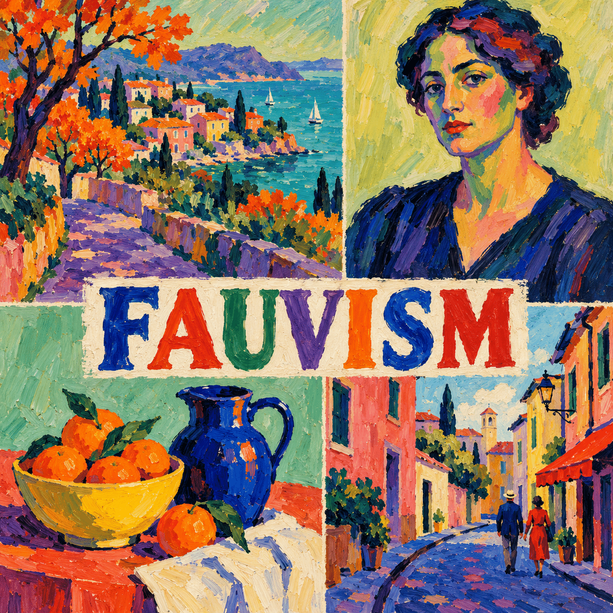
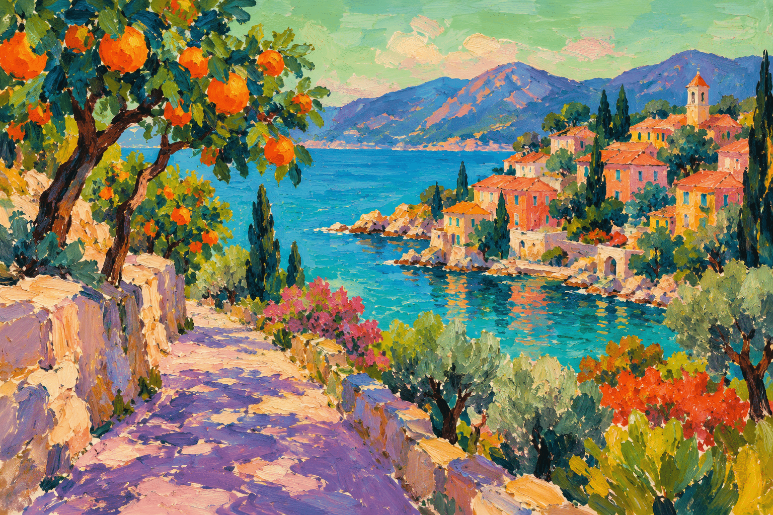
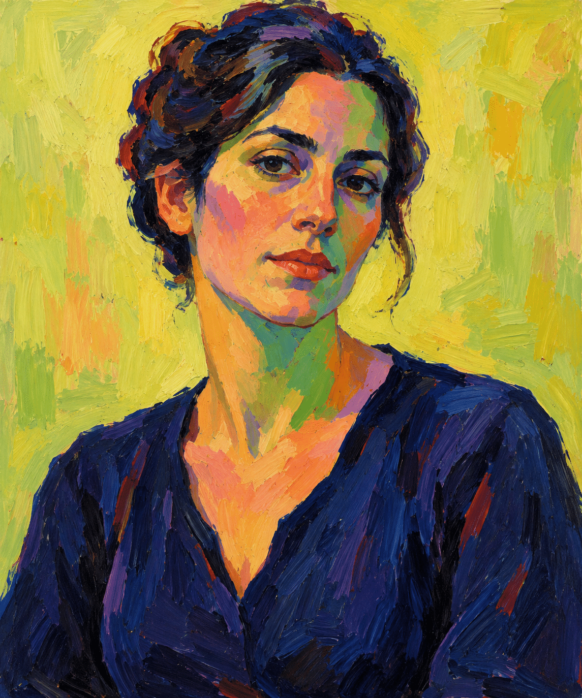
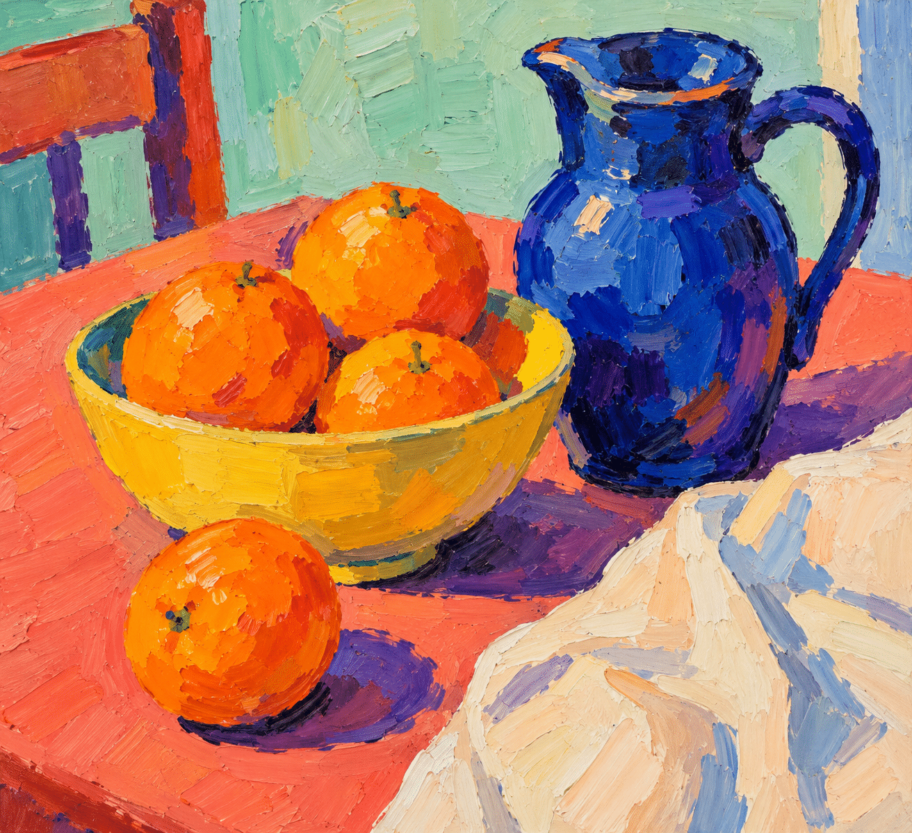
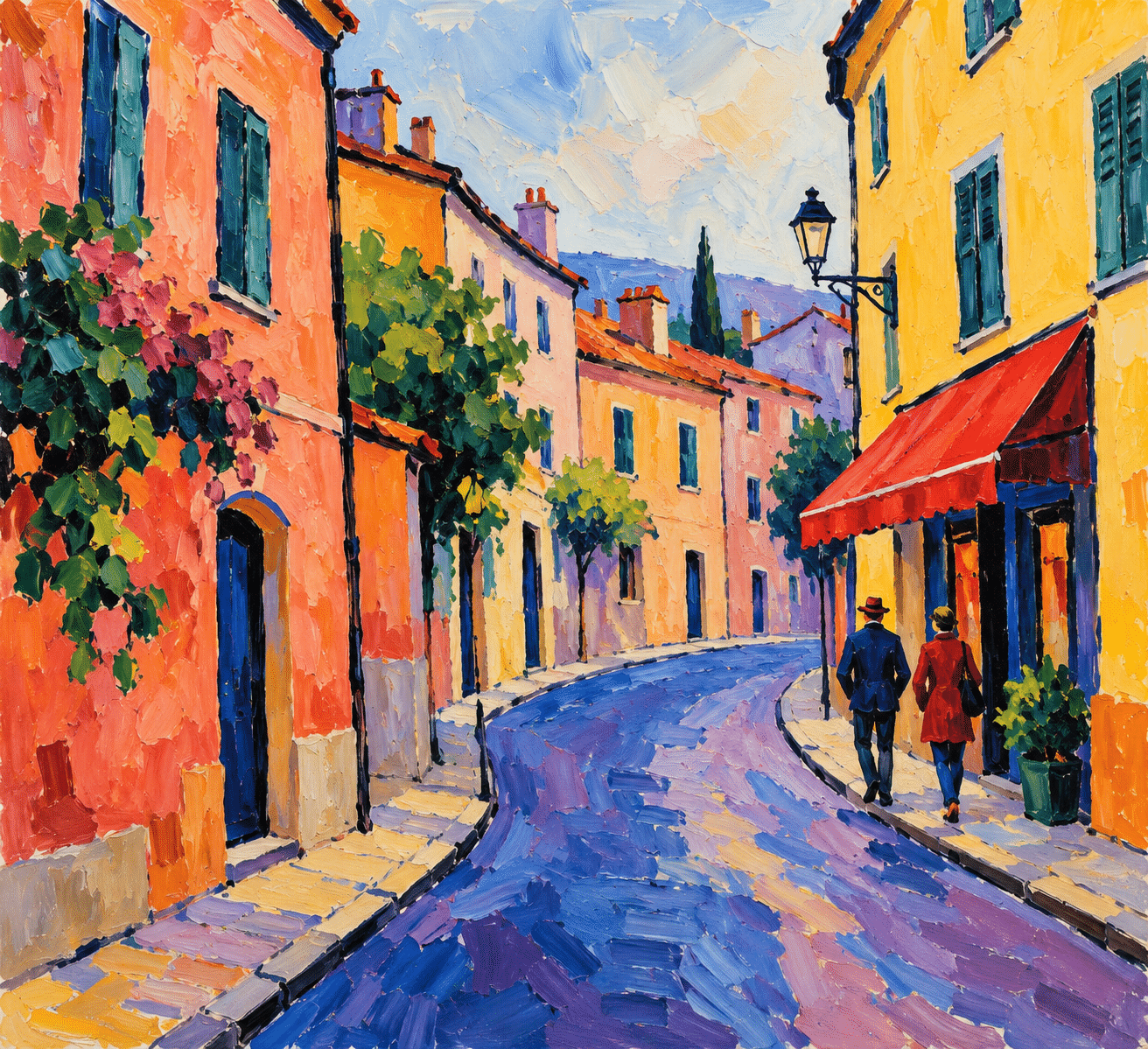
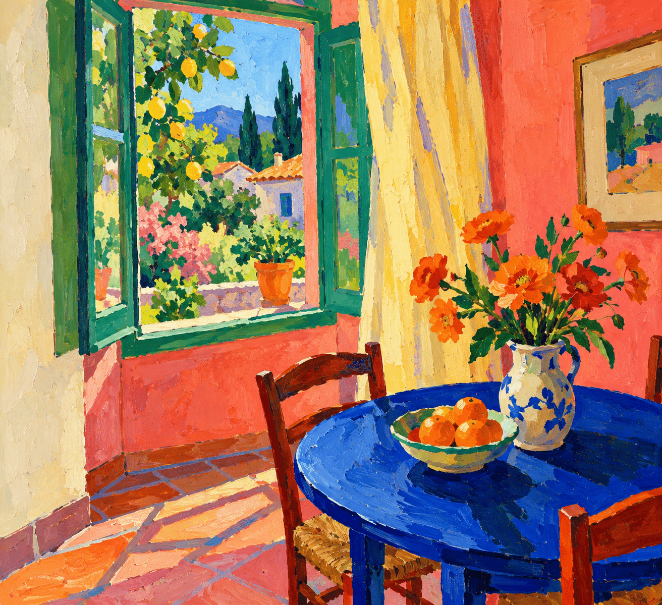
The new AI-generated illustrations explore a coastal setting, a portrait, a still life, a street and an interior. They are contemporary teaching interpretations, not reproductions of works by the historical artists. Their differing subjects make it possible to compare how a colour relationship behaves around a face, across a table or through a landscape.
Use the prompts as starting constraints, then inspect the actual result. Are the strongest colours doing different jobs? Does the stroke direction reinforce form? Is there enough quiet space for an accent to register? A digital filter can make a photograph brighter while leaving its entire pictorial logic unchanged; a more thoughtful interpretation reorganizes that logic.
Positive editorial assessment — AI-authored
Fauvism makes colour an active agent in the picture. Its strongest works allow a surprising hue to feel necessary because the surrounding shapes and intervals support it. The approach can turn a familiar subject into a direct encounter with the painter’s choices, without requiring the subject to disappear.
Critical editorial assessment — AI-authored
Superficial imitation often reduces Fauvism to saturated colour and rough brush texture. The result can become evenly loud, with no focal hierarchy or meaningful spatial relationships. Improve it by assigning distinct roles to colour areas, varying the marks and allowing selected passages to remain comparatively restrained.
Neutral editorial assessment — AI-authored
Fauvism is both a historically specific movement and a useful reference for contemporary colour experiments. Its principles can inform painting and digital illustration, but a generated example cannot replace looking at documented works and their material surfaces. The historical label should remain distinct from present-day exercises.
Pocket-sized facts
Fauvism is a historical movement, not a synonym for every brightly coloured picture.
Non-naturalistic colour can organize space and form rather than imitate local hues.
The new gallery contains contemporary AI interpretations, not historical paintings.
A small poetic detour
Original words from the AOI studio.
Poetry
The road is violet, the hillside burns,
a green cheek holds the afternoon;
the eye remembers as it turns
a scarlet answer to the blue.
No colour stands here quite alone:
the quiet patch, the urgent line,
make light a language of their own,
and give the ordinary time.
The prompt workshop
Original creative exercises. These prompts create new illustrations, not documentary evidence.
Colour builds a landscape
Create an original Fauvist-inspired landscape with a violet path, orange trees and a cool green sky, broad deliberate shapes and clear value separation. Keep the composition readable despite invented local colors.
An interior with deliberate contrasts
Create an original Fauvist-inspired painting of an open-window room, cobalt table, coral walls, pale yellow curtain and green garden. Broad visible strokes, compressed space and a few dark contours, one quiet cream area balancing intense colour. No reproduction of an existing artwork, signature or text.
A portrait through colour relationships
Create an original Fauvist-inspired waist-up portrait of a fictional adult woman in a simple dark blouse. Use violet and green facial planes balanced by warm orange accents, clear readable features, broad deliberate paint marks and a restrained pale background. Expressive non-naturalistic colour without caricature; no signature or text.
Your next inspiration
Discover another art style
Follow a visual thread to the next subject.
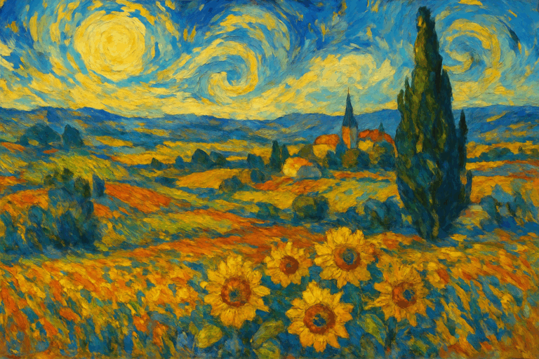

Divisionism: Building Light with Separate Color Marks
Compare separated touches and optical colour relationships with Fauvist handling.
People & works to explore
References discussed in this article. Consult the sources below for context.
Artists and practitioners
Henri Matisse
André Derain
Maurice de Vlaminck
Henri Manguin
Charles Camoin
Albert Marquet
Raoul Dufy
Paintings and other works
Henri Matisse — Landscape at Collioure (1905), MoMA
André Derain — Portrait of Henri Matisse (1905), Philadelphia Museum of Art
André Derain — The Palace of Westminster (1906–1907), The Met
Henri Matisse — Sketch for Le Bonheur de vivre (1905–6), SFMOMA
A smile from the studio
Jokes
The sky asked why it had been painted green. The painter suggested it discuss the matter with the orange trees.
Sources and further exploration
The Met: Vertigo of Color — research on Matisse and Derain at Collioure in 1905
Centre Pompidou: Le fauvisme — artists, precedents and changing directions
MoMA: Landscape at Collioure — visible canvas and brushwork in Matisse’s 1905 painting
The Met: The Palace of Westminster — Derain’s 1906–1907 London painting
SFMOMA: Sketch for Le Bonheur de vivre — the relationship of broken colour, line and flattened space