
Pixel-art approach · Dithering Pixel Art
Two colours can suggest a third without adding it to the palette. Dithering places contrasting pixels in patterns so that, at viewing distance, their mixture can bridge a tonal step. It is a technique within pixel art rather than a separate hardware generation.
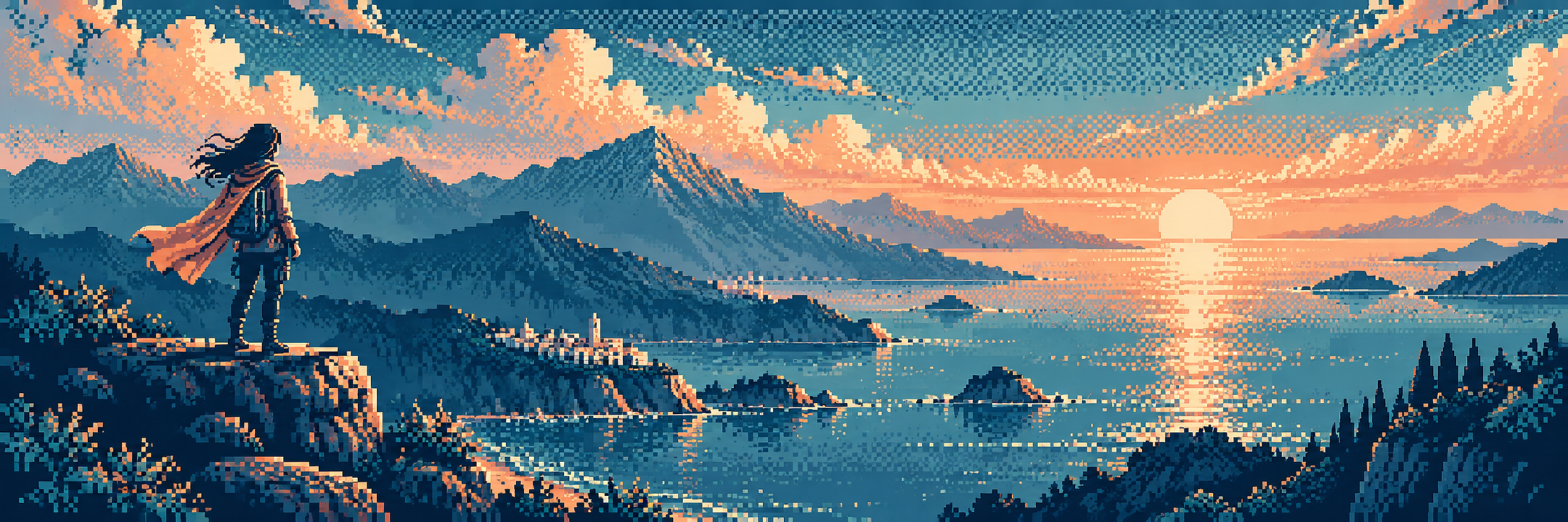
A visual introduction
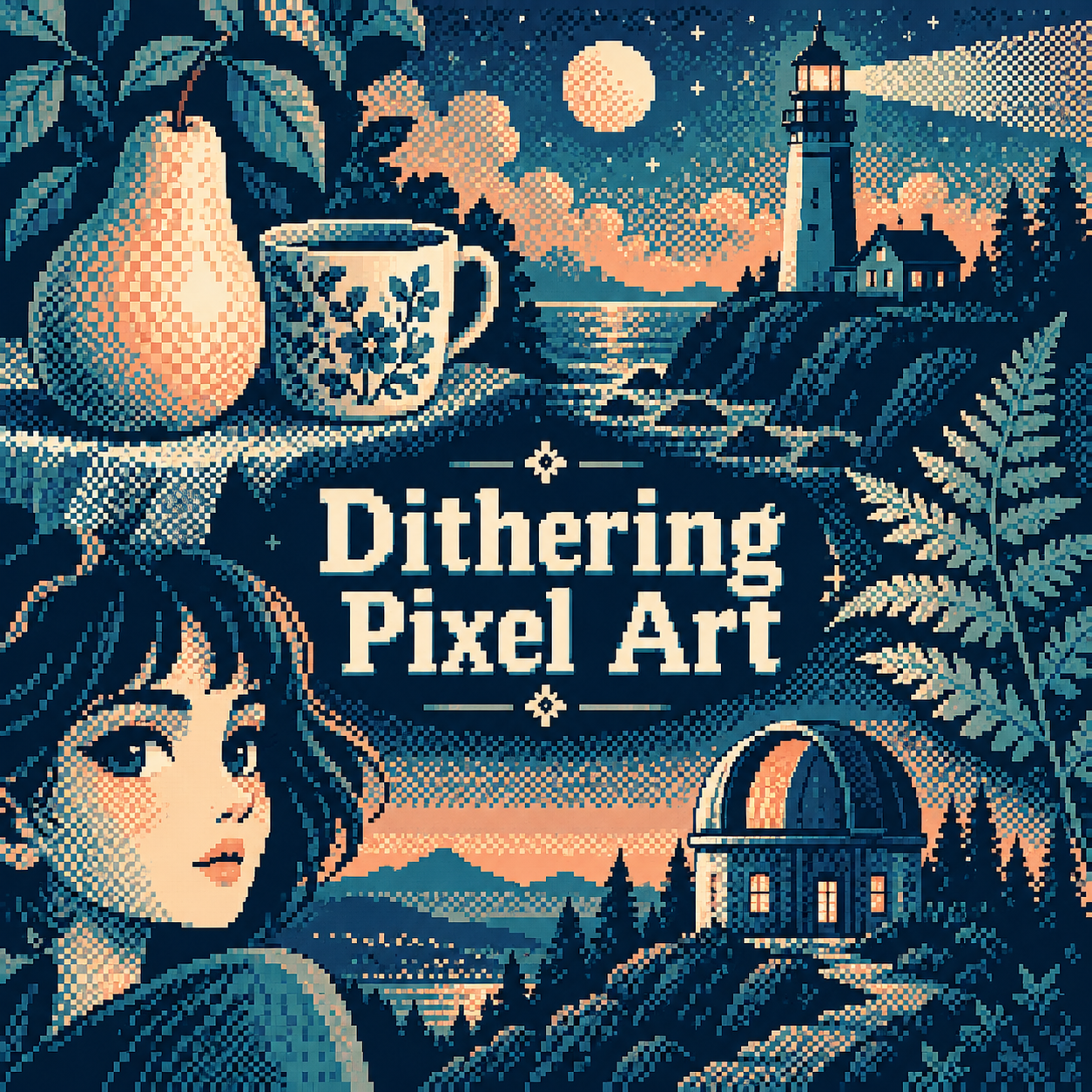
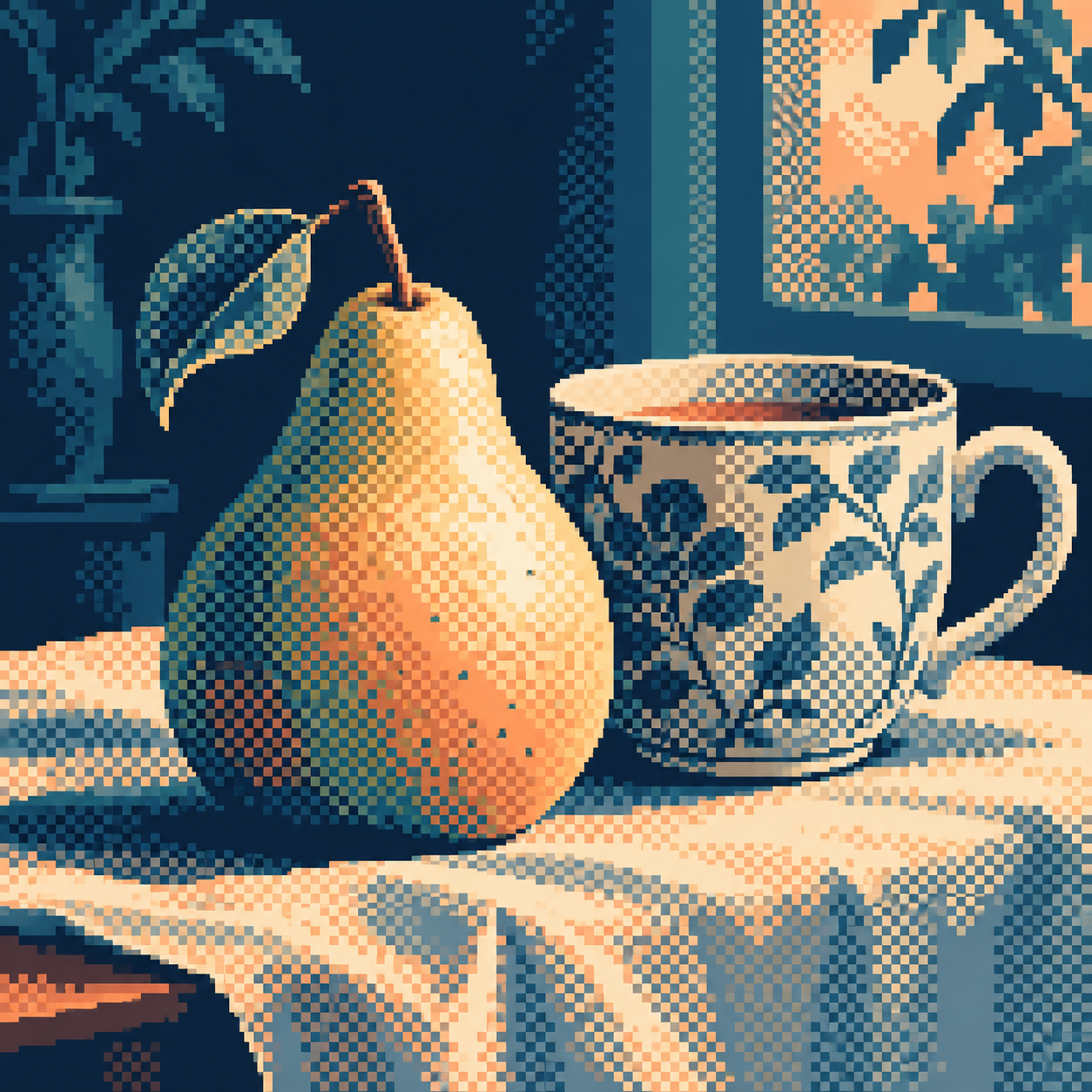
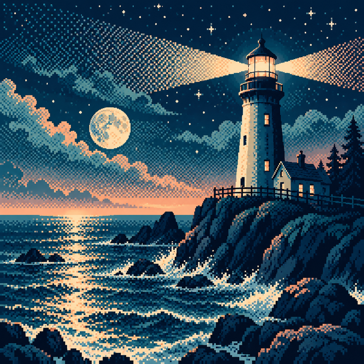
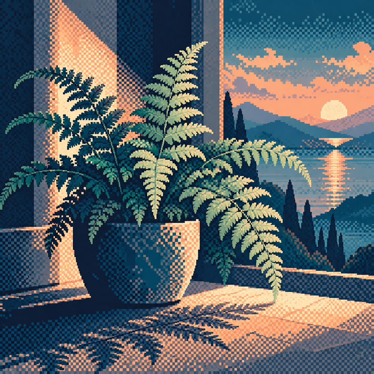
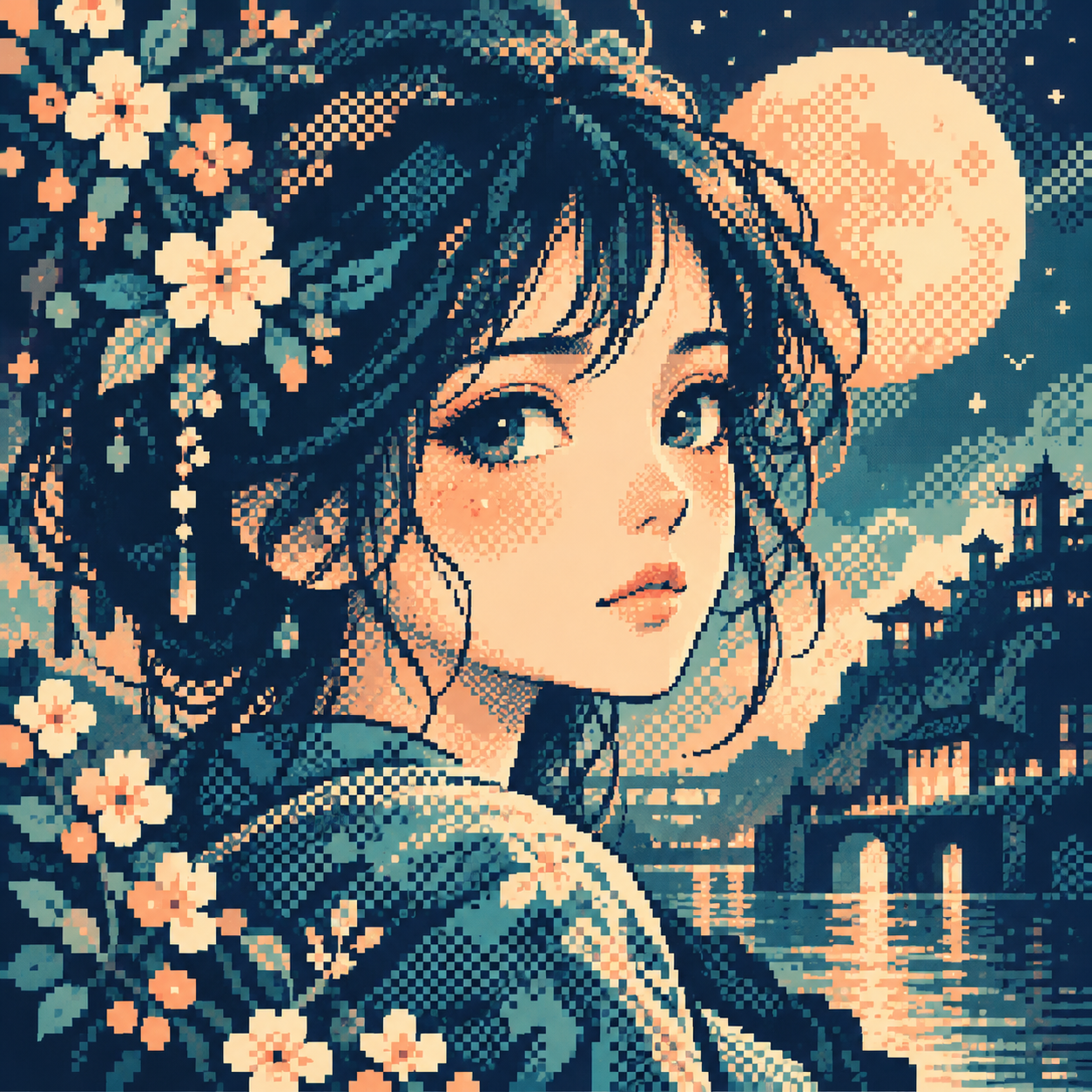
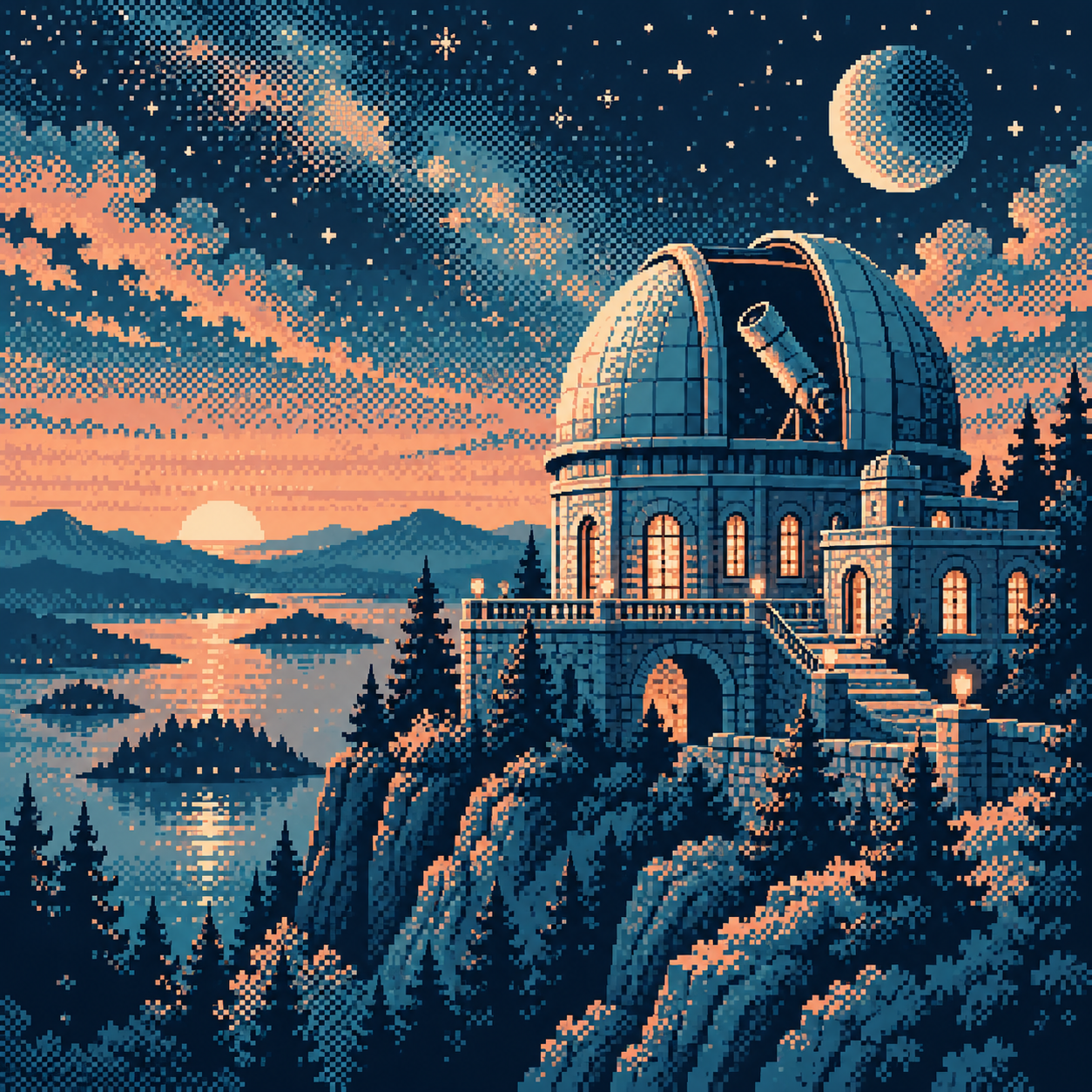
Seven original AI-generated interpretations: a dedicated banner, a centrally titled collage and five visual studies. These are contemporary illustrations, not historical game screenshots or certified hardware-ready assets.
Select an image for a closer look. Use the thumbnails, arrow keys or a swipe to compare examples. Zoom in to inspect details, or share the image that inspires you.
Creative toolbox · take this style further
Choose an input and a destination. Search sends your words to the chosen site; Copy & open puts them on your clipboard to paste there.
Create with AI
Turn your chosen input into an image prompt or a new creative direction.
ChatGPT
Copy your input and paste it into a ChatGPT conversation or image request.
Copy & open ChatGPT (new tab)Claude · Anthropic
Develop an image prompt or explore the style in a new Claude conversation.
Copy & open Claude · Anthropic (new tab)Midjourney
Paste your input into the Imagine bar on the Create page.
Copy & open Midjourney (new tab)Adobe Firefly
Copy your input, open Firefly, and paste it into the prompt field.
Copy & open Adobe Firefly (new tab)Leonardo.Ai
Copy your input, open Leonardo, and paste it into the generation field.
Copy & open Leonardo.Ai (new tab)Image search
Find visual references. Short, concrete keywords usually work best.
Lexica
Search AI images and prompts using your selected input.
Search with this input Lexica (new tab)Pexels
Search the photo and video library. Short keywords often work best.
Search with this input Pexels (new tab)Pixabay
Search photos, illustrations and other images.
Search with this input Pixabay (new tab)Unsplash
Search photographs using the style name or your own keywords.
Search with this input Unsplash (new tab)Wikimedia Commons
Search photographs, artworks and historical images. Check each file for its source and reuse terms.
Search with this input Wikimedia Commons (new tab)Art & research
Explore artists, collections and the ideas behind a style.
Wikipedia
Search for background reading. A style may not have its own article.
Search with this input Wikipedia (new tab)WikiArt
Copy your input into WikiArt’s search to explore artists and artworks.
Copy & open WikiArt (new tab)Europeana
Paste your keywords into the search to explore European museum, library and archive collections.
Copy & open Europeana (new tab)Inspiration
Discover portfolios and visual ideas from creative communities.
Instagram hashtags
Search a hashtag made from your input: spaces and punctuation are removed. Instagram may require sign-in.
Search with this input Instagram hashtags (new tab)ArtStation
Paste your input into artwork search for concept art, environments, characters and visual development.
Copy & open ArtStation (new tab)Behance
Paste your input into project search for illustration, design and visual storytelling.
Copy & open Behance (new tab)A closer look
Visible alternating pixels, ordered or irregular patterns, solid focal shapes and patterned transitions between discrete tones.
Make the pattern earn its place
An ordered checkerboard produces a regular texture; a less regular distribution can break that rhythm. Neither is automatically better. Choose according to the material and the image’s scale. The pear study uses pattern to turn a rounded surface, while the lighthouse keeps a solid structure against a textured sky. Dithering can work with more than two colours and is not synonymous with one-bit art.
Protect the readable shapes
Start with flat masses and a decisive silhouette. Introduce a narrow patterned transition where two tones meet, then judge it at the intended display size. Keep an eye, a window or the edge of a lighthouse clean when that detail carries recognition. Covering every surface with the same checkerboard makes cloth, stone and sky compete equally. Patterns following every contour can also create distracting bands instead of useful volume.
Hard pixels, softer tone
The individual marks remain sharply bounded even when the overall transition appears gentle. This is a different effect from blurring the image. Enlargement reveals the construction; reduction or resampling may make the pattern muddy or produce interference. Inspect both native size and the actual publication preview. Aseprite’s context-bar documentation provides a practical reference for its dithering controls; the artistic decision is where a pattern improves the picture.
Positive editorial assessment · AI-authored
Dithering makes the act of building tone visible. Solid lighthouse edges against a patterned sky show why contrast between quiet and busy surfaces can be more persuasive than adding more colours.
Negative editorial assessment · AI-authored
Blanket patterning quickly becomes visual static. Reserve it for transitions or chosen materials, and remove it from details that need immediate recognition. A smaller palette does not excuse a confused silhouette.
Neutral editorial assessment · AI-authored
This technique suits deliberately textured shading and limited-colour studies. Its success depends on viewing scale and pattern placement; it neither requires monochrome output nor identifies a particular computer or console.
A small poetic detour
Original words from the AOI studio.
Poetry
Between two colours
No third blue waits inside the evening tin.
We set the first beside the second square;
the dusk that neither colour keeps within
arrives when we step back and leave it there.
The lighthouse stands in one unbroken tone.
Around it, little differences become
a sky too wide for either blue alone,
and night is more than adding up their sum.
The prompt workshop
Original creative exercises. These prompts create new illustrations, not documentary evidence.
Turn a simple form
Create an original pixel-art pear beside a cup. Use two main colours with an ordered checkerboard transition to suggest volume. Keep the silhouettes solid, the background quiet and every pixel edge crisp. No text.
Judge the pattern at the intended viewing size.
Separate texture and focus
Create a coastal lighthouse at night in dithered pixel art. Use patterned sky transitions, a clean pale tower, one warm window and large dark rocks. Keep the tower more readable than the surrounding texture.
Use the pattern selectively, not as a uniform overlay.
Compare pattern rhythms
Create two studies of the same shaded sphere in a restricted pixel palette. Use a regular ordered pattern on one and an irregular distribution on the other. Match lighting and silhouette. No lettering.
Compare texture and tonal smoothness without changing the subject.
Your next inspiration
Discover another art style
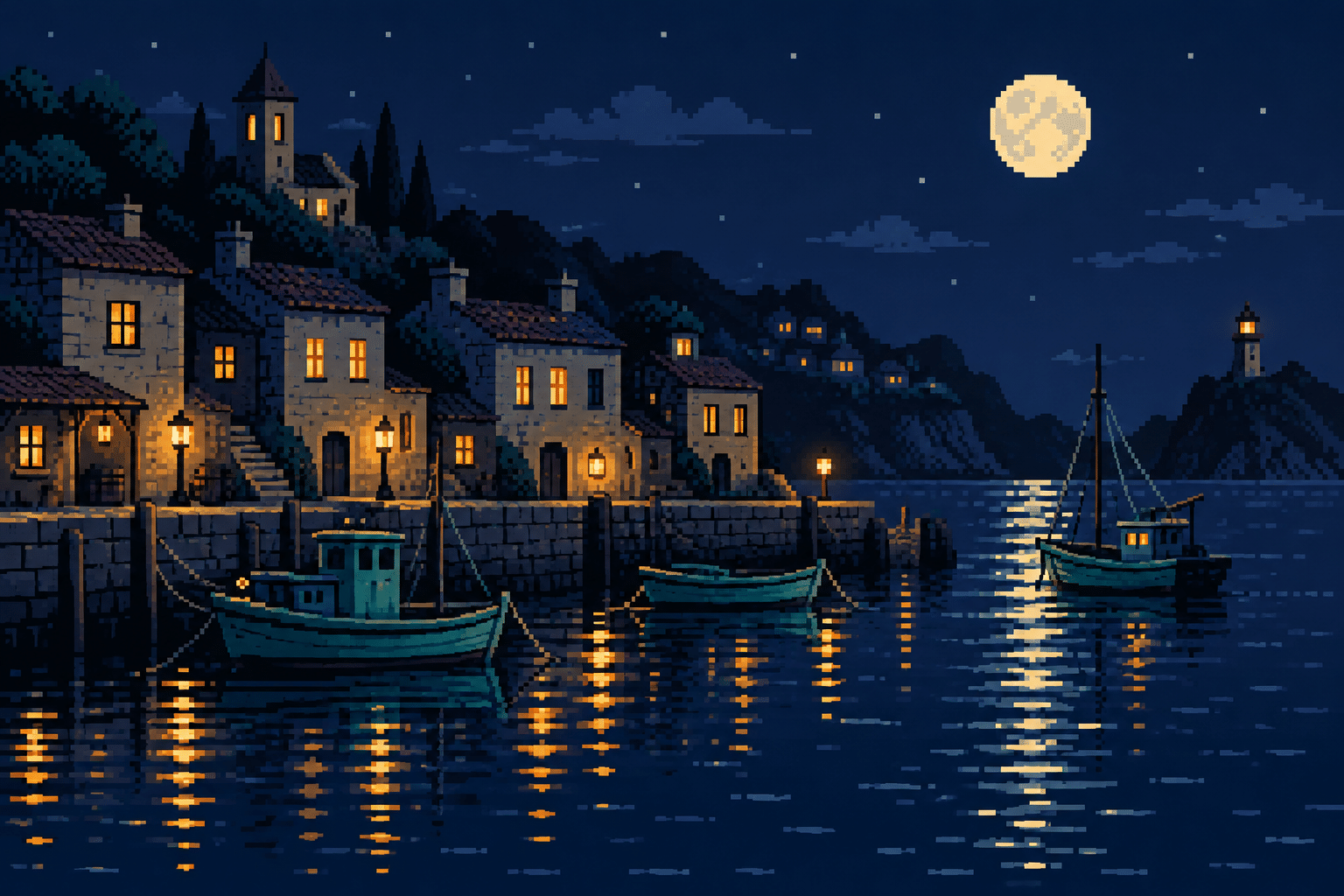
Follow a visual thread to the next subject.
A smile from the studio
Jokes
The palette manager refused to approve a third colour. The artist arranged the first two in a checkerboard. From across the room, the manager spotted a new shade. “Who authorised that?” “Collaboration,” said the artist. The manager scheduled a meeting to determine whether the shade required its own job description. By the time everyone returned, the artist had made a sunset.
Sources and further exploration
Aseprite — context-bar reference, including dithering controls