
Visual storytelling approaches in film and image-making
Cinematic styles are families of choices about staging, camera, light, color, rhythm and sound. A compelling film-like image makes those choices serve a situation; it does not depend on one palette or a pair of black bars.
A visual introduction
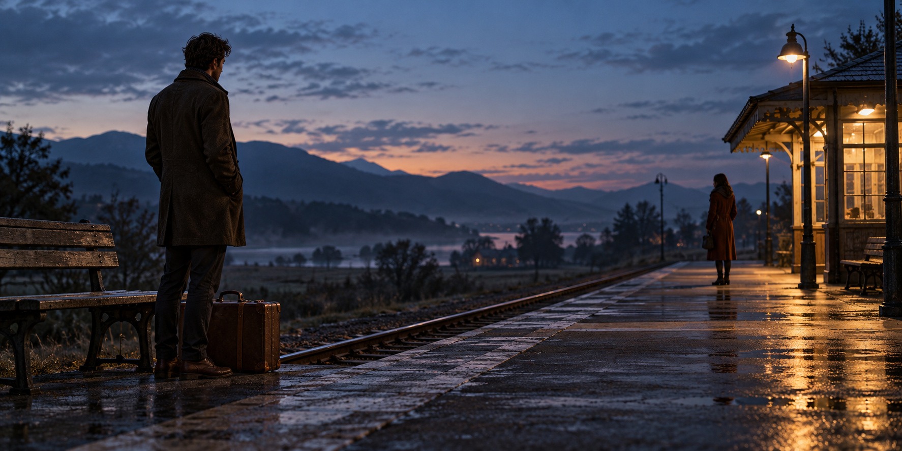
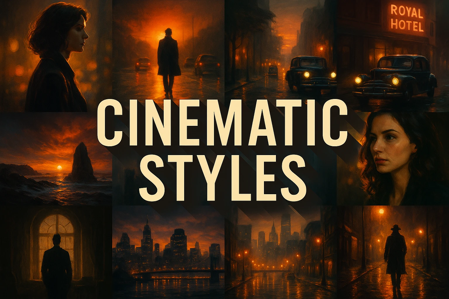
Compare the dedicated banner, central-title collage and three distinct examples. Captions identify new generated studies and retained earlier AOI illustrations.
Select an image for a closer look. Use the thumbnails, arrow keys or a swipe to compare examples. Zoom in to inspect details, or share the image that inspires you.
Creative toolbox · take this style further
Choose an input and a destination. Search sends your words to the chosen site; Copy & open puts them on your clipboard to paste there.
Create with AI
Turn your chosen input into an image prompt or a new creative direction.
ChatGPT
Copy your input and paste it into a ChatGPT conversation or image request.
Copy & open ChatGPT (new tab)Claude · Anthropic
Develop an image prompt or explore the style in a new Claude conversation.
Copy & open Claude · Anthropic (new tab)Midjourney
Paste your input into the Imagine bar on the Create page.
Copy & open Midjourney (new tab)Adobe Firefly
Copy your input, open Firefly, and paste it into the prompt field.
Copy & open Adobe Firefly (new tab)Leonardo.Ai
Copy your input, open Leonardo, and paste it into the generation field.
Copy & open Leonardo.Ai (new tab)Image search
Find visual references. Short, concrete keywords usually work best.
Lexica
Search AI images and prompts using your selected input.
Search with this input Lexica (new tab)Pexels
Search the photo and video library. Short keywords often work best.
Search with this input Pexels (new tab)Pixabay
Search photos, illustrations and other images.
Search with this input Pixabay (new tab)Unsplash
Search photographs using the style name or your own keywords.
Search with this input Unsplash (new tab)Wikimedia Commons
Search photographs, artworks and historical images. Check each file for its source and reuse terms.
Search with this input Wikimedia Commons (new tab)Art & research
Explore artists, collections and the ideas behind a style.
Wikipedia
Search for background reading. A style may not have its own article.
Search with this input Wikipedia (new tab)WikiArt
Copy your input into WikiArt’s search to explore artists and artworks.
Copy & open WikiArt (new tab)Europeana
Paste your keywords into the search to explore European museum, library and archive collections.
Copy & open Europeana (new tab)Inspiration
Discover portfolios and visual ideas from creative communities.
Instagram hashtags
Search a hashtag made from your input: spaces and punctuation are removed. Instagram may require sign-in.
Search with this input Instagram hashtags (new tab)ArtStation
Paste your input into artwork search for concept art, environments, characters and visual development.
Copy & open ArtStation (new tab)Behance
Paste your input into project search for illustration, design and visual storytelling.
Copy & open Behance (new tab)A closer look
Ask what the viewer notices first, what the characters know, and what the frame withholds. Compare naturalistic observation, graphic suspense and deliberately theatrical color.
What “cinematic” can and cannot mean
Cinematic style is an umbrella term, not one historical painting movement. Films can look restrained, theatrical, documentary-like, dreamlike, graphic or richly textured. Their style emerges through coordinated decisions across directing, cinematography, production design, costume, performance, editing and sound. A single image can borrow some of those visual decisions, but it cannot demonstrate the experience of a whole film.
A useful starting question is what changes in the scene. Someone waits, notices, hesitates, enters or refuses to leave. Even a still image becomes more purposeful when its framing and light relate to that situation. Conversely, dramatic color and expensive-looking detail can produce an empty picture when nothing organizes the viewer’s attention.
Staging: meaning inside the frame
Mise-en-scène concerns what is placed and performed before the camera: setting, props, costume, lighting and the arrangement of people. Yale’s guide separates these elements so they can be examined rather than bundled into “atmosphere.” Blocking is especially useful for image-making: the distance between two people, their orientation and an obstacle between them can communicate a relationship.
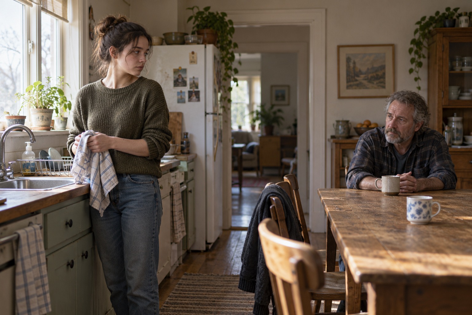
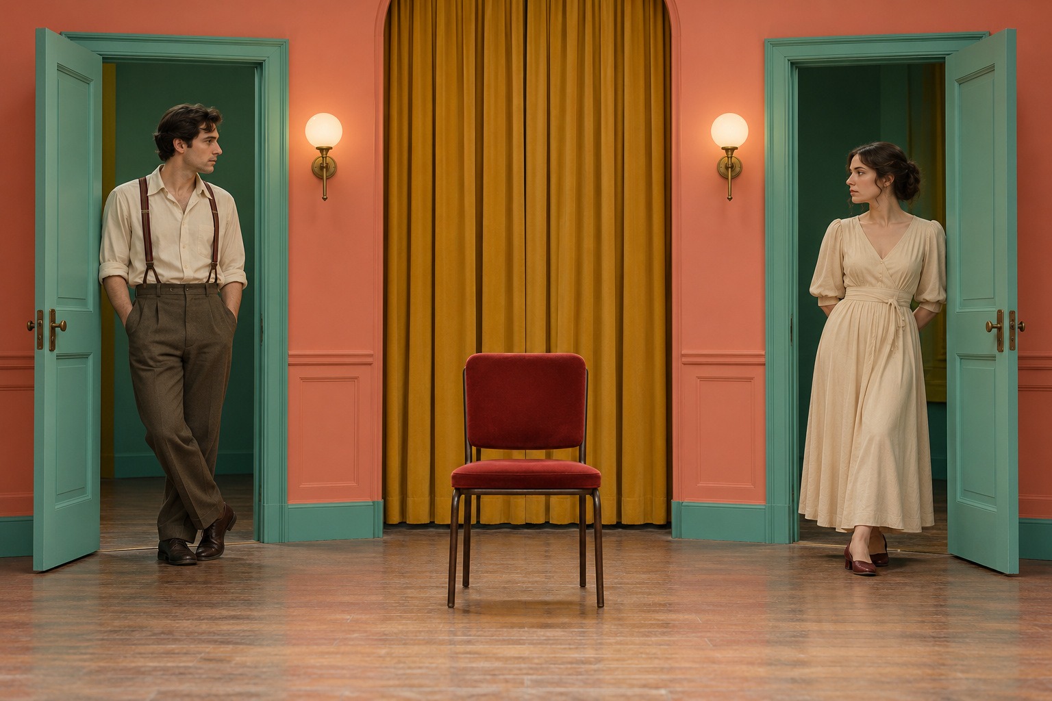
In the new kitchen study, the standing and seated adults occupy different areas of an ordinary room. The space between them matters as much as their expressions. In the theatrical color study, opposing doorways and an empty central chair create a more formal arrangement. These AOI interpretations show two staging problems; they are not frames from actual films.
Camera, framing and focus
Cinematography shapes the recorded view through framing, viewpoint, lens choices, focus, exposure and movement. A close view can emphasize a gesture, while a wider view can show a person’s relation to a room. Depth of field decides which distances remain legible. Yale’s cinematography chapter connects such choices with how an image is received; none is a universal shortcut to emotional depth.
For an original frame, decide whether the viewer should feel beside the characters, across the room, or separated by a doorway. Then make the composition consistent with that position. Avoid adding several contradictory camera instructions. A static illustration can imply a camera location, but a claim such as “a continuous tracking shot” requires moving footage to be evaluated.
Light and color as organized choices
A light source can be visibly motivated by a window, lamp or shelter, even when the actual production would use additional lighting. Contrast determines which shapes remain readable and which merge into shadow. A limited palette can connect a setting and costume, while a deliberate contrasting color can draw attention. Colors do not carry one fixed meaning across all films or cultures.
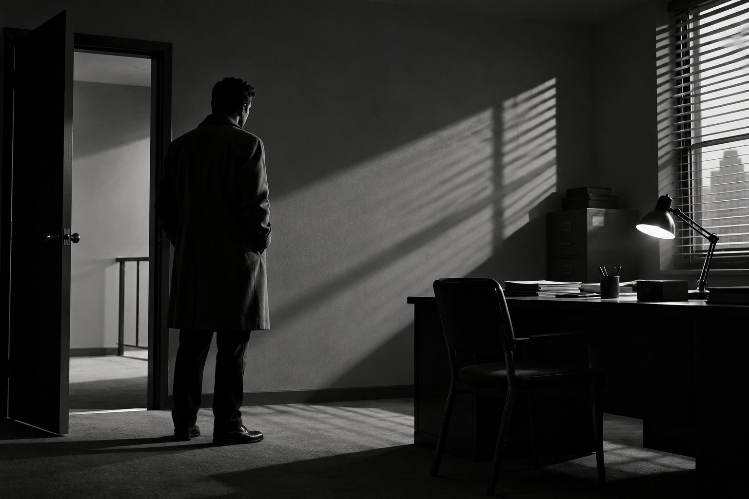
The railway banner uses a warm shelter against a cooler evening environment. The office study uses monochrome, diagonal shadows and a dark figure to create graphic tension. The rehearsal-room study uses coordinated coral, green and mustard with a red chair. Each arrangement supports a different viewing experience; none defines cinema as a whole.
Three approaches to compare
Naturalistic observation can make an ordinary room and small gesture sufficient. In our kitchen example, restrained color and soft light keep attention on the people and their shared space. For a related exercise, remove every decorative object that does not help establish the situation. The result should still have a readable relationship between the characters.
Graphic suspense can use partial visibility, strong directional shapes and areas of withheld information. The office image gives the doorway and slatted light specific roles. Theatrical color can instead reveal its design openly: balanced entrances, coordinated surfaces and an emphatic central object. These are workshop approaches, not rules equating an entire genre with one lighting setup.
Editing, duration and sound complete the experience
Editing creates relationships between shots. Continuity can make actions and space easy to follow; a conspicuous cut can instead interrupt or compare. Duration changes how long a viewer has to examine an action. Yale’s editing guide supplies terms for these relationships, which cannot be judged from a single generated still.
Sound adds another layer: a voice or noise may come from within the story world, from outside the frame, or from a non-diegetic score. A sound bridge can connect shots across a visual cut. Yale’s sound chapter explains these distinctions. For a storyboard, write a separate note about what is heard and when; do not pretend the still image itself demonstrates a soundtrack.
An original scene-building workshop
Write one sentence about a situation: two travelers have reached the same platform but have not approached each other. Choose three visible facts that support it, such as their separation, a shared pool of light and one piece of luggage. Build a simple frame around those facts. Review it at small size: can someone still identify the important figures and the distance between them?
Next design a second frame that changes only the viewpoint. Finally design a third that changes the blocking while keeping the setting recognizable. Compare how the implied relationship changes. If working toward video, add a shot order, duration and sound note. This creates an intentional sequence instead of a collection of unrelated attractive images.
Prompt vocabulary that gives direction
Specify the situation, the number of people, their positions, the viewpoint, the main light source and a restrained palette. Add one priority: an interrupted gesture, a readable silhouette, or the empty space between figures. Describe the result you want rather than stacking the names of directors, camera brands and film stocks without a reason.
For a still, phrases such as observational waist-height framing, soft window light, a deep doorway, or frontal theatrical symmetry are actionable. For video, movement and timing need their own instructions. Generated imagery can suggest a film-like texture, but it does not establish actual camera equipment, exposure settings or production history.
Common failures and how to revise them
Black letterbox bars do not create narrative. Teal-and-orange grading is optional, shallow focus is optional, and darkness is not the same as controlled lighting. Check whether faces, hands, furniture and sightlines remain coherent. A beautiful shadow that contradicts the visible window may weaken the scene unless the inconsistency is deliberate and understandable.
Ask what can be removed while preserving the situation. Then ask what one missing detail would clarify it. A second cup may be more useful than a spectacular skyline. The retained titled collage in this gallery illustrates one warm, shadowed family of imagery; the new examples broaden the range. All are labeled interpretations, with no invented film titles, actor identities or production credits.
About this guide and its illustrations
This is an AI-authored AOI guide under Penny Wraiter, AOI’s editorial persona. The linked sources support the historical and technical context; the practical exercises, poem and new illustrations are AOI interpretations. Generated pictures are labelled as such and do not establish historical authorship, material authenticity or physical performance.
Make a sequence, not just an attractive frame
A useful extension of a still-image exercise is a three-shot sequence: establish the space, show a consequential action, then show what has changed. Keep screen direction, the location of the light source and the position of important props consistent unless a change is deliberate. A polished close-up can still fail if the next shot places the same doorway on an impossible side of the room.
Sketch the sequence without surface detail first. Check where each person is looking and whether the viewer can infer what lies outside the frame. Then decide which transition should feel smooth and which should create a pause. These decisions make the images serve a shared event rather than behave like unrelated portfolio pieces.
Diagnose the image before adding effects
When a frame feels weak, identify the actual problem. If the subject disappears, adjust value separation or staging. If the room feels artificial, check scale, ground contact and light direction. If the scene says little, change the relationship between people or introduce a consequential action. Grain, a wide crop and coloured shadows cannot substitute for those decisions.
Use a controlled revision: keep the camera and setting fixed while changing one variable. Compare two versions at thumbnail size and at full size. The better frame should make its intended relationship clearer, not merely look more processed. For the wider roles of editing, sound, genre and serial storytelling, see the companion overview of cinematic styles in movies and TV series.
A small poetic detour
Original words from the AOI studio.
Poetry
A doorway waits before a person enters.
The lamp has made a country on the floor.
Two cups remember what the mouths are hiding;
a chair keeps room for someone at the door.
Then light shifts gently toward a listening face,
and distance learns the weight of being near.
The frame can hold a question without answer;
the next small gesture brings the story here.
The prompt workshop
Original creative exercises. These prompts create new illustrations, not documentary evidence.
Begin with a quiet situation
Create an original fictional film still of two adults at opposite ends of a modest kitchen, one standing and one seated. Use soft window light, restrained natural color and coherent everyday details. Make the distance and interrupted gesture legible; no recognizable actors or lettering.
Build suspense through space
Create an original monochrome office scene with one adult near a half-open door, angular slatted light, a readable silhouette and purposeful negative space. Preserve believable architecture and focal detail. No copied film frame, weapon, title or letterbox bars.
Restage the scene in theatrical color
Create a new frontal rehearsal-room scene with two adults in opposing sea-green doorways, coral walls, a mustard curtain and one empty red chair at center. Use balanced staging and clear color planes. Let the arrangement imply a relationship without copying a named filmmaker.
A smile from the studio
Jokes
The director asked for more tension. The prop department moved the two cups farther apart. For once, nobody requested a larger explosion.