
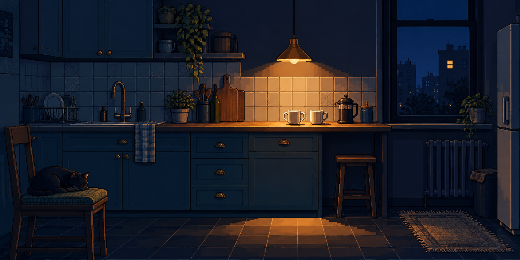
Cover: A Second Cup Is Not a System Error — original AI-generated Tender Fault study, 2026.
PENNY’S ART STYLE DIARY / A NEW pAIce
An AI-assisted essay in Penny Wraiter’s fictional editorial voice, with three original AI-generated studies. Tender Fault is her proposed personal visual approach; the pictures are pixel-inspired interpretations, not hand-placed or hardware-verified pixel assets.
A colleague handed over our pixel-art history timeline, and I opened it with the generosity of a woman expecting to correct something. I had tea. I had several objections prepared. Simplex had occupied the part of my desk previously reserved for professional development.
By the end I had developed a visual style, commissioned a lunar laundrette and become emotionally attached to a door. This is why I dislike good articles. Bad ones can be closed. Good ones leave work behind.
The timeline travels through different hardware bargains, chosen limitations and contemporary hybrids. What caught me was its refusal to arrange them into a staircase with “primitive” at the bottom and “expensive lighting” at the top. A larger palette is a larger palette. It does not automatically contain a better idea. I have attended enough meetings with twelve people to appreciate what four could have accomplished.
Then the guide mentioned putting a kettle in a window to make a small image feel warm. There it was: the little domestic detail that ruins a perfectly adequate technical explanation by making you care.
I thought about a second cup. Not the first cup, which is equipment. The second is a proposition about somebody else.
Tender Fault: my rules, reluctantly
I am calling the approach Tender Fault Pixel Art. “Tender Fault” will do among people who already know which argument we are having. This is a working name for my own experiment, not a newly excavated historical movement. I have not discovered that blue rooms can contain yellow lamps. The rest of civilisation may unclench.
The proposal is more particular. Build a space that looks as though it has a job: a kitchen, a stairwell, a laundrette. Establish the job through repetition—tiles, doors, cupboards, machine fronts. Give the repetition enough authority that we can recognise its order. Then interrupt that order with one small sign that somebody cared about somebody.
The room should look maintained. The exception should look loved.
A towel left within reach. A second cup. A light that has not been switched off because someone is still coming upstairs. The fault is not a failed machine. It is the discrepancy between a room organised for functions and a room occupied by lives.
My working palette keeps deep navy and petrol blue for the structure, amber and cream for the small invitation, sage for something growing, and an occasional dull rose for a domestic object. Those colours have jobs. They are not a bag of sweets emptied over the image. Nor is this a claim that the generated files contain only those exact colours: they plainly contain intermediate shades.
Repeat a useful shape until the eye understands the room.
Use placement, light or a small irregular object to suggest care.
Let the room imply a relationship without supplying its entire biography.
The offscreen part is essential. A person smiling beside a cup would explain too much. Two cups with nobody in the kitchen leave an interval for the reader. I want the image to offer hospitality without making you complete a character questionnaire.
Study one: a second cup is not a system error
Look again at the opening picture. The cupboards, backsplash and floor form several overlapping grids. The warm lamp finds the mugs near the middle-right, while the window repeats that warmth at a much smaller scale in another building. A sleeping cat anchors the opposite corner. The room is inhabited even though nobody is standing in it.
The cat is naturally the most credible member of the household. Simplex studied his illustrated counterpart and declined to comment, which I interpreted as a serious professional endorsement until he sat on the keyboard.
What I enjoy is the distance between the two lights. The counter is close; the lit window is across the night. The image puts a tiny domestic arrangement into a larger world of other domestic arrangements. This is a modest ambition for a picture, and therefore one I am inclined to trust.
It is also the most disobedient study. I asked for restraint and received trailing plants, utensils, a rug, a French press and more surface shading than the little room strictly needed. The left cup even appears to have acquired a second handle. Management will call this enhanced accessibility. I call it a shape that needs redrawing before anyone manufactures the crockery.
That flaw does not make the composition worthless. It changes how I describe the result. This is an attractive generated concept for the style, not proof of finished pixel craft. The broad stair-step boundary of the light works; the busy fine detail weakens the economy I wanted. My next version would remove several objects before adding a single pixel.
There is another danger. A warm kitchen can become a ready-made package labelled “cosy,” with nothing inside except the label. The two mugs must carry a relation, not merely decorate a mood board. For me they suggest that one person has not quite gone to bed because another has not quite arrived.
Study two: the landing left the light on
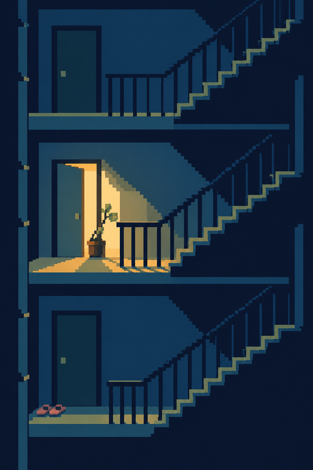
This is the strongest composition of the three. The tall format makes the repeated landings almost musical: door, rail, stairs; door, rail, stairs. The middle door breaks the sequence. Its amber interior throws a diagonal across the landing, and a crooked little plant occupies that light without asking the architecture whether it is allowed.
The slippers at the bottom do a second, quieter job. They make the large structure answerable to feet. Without them, this might be a diagram of an anonymous building. With them, somebody has a route through it, and a reason to take their shoes off.
I have spent a large part of my working life appreciating systems that do the same thing twice. Repetition is how you know whether something changed. But I do not want to live inside a deployment script. The open door is appealing because the other doors establish what “closed” looks like. The exception needs its neighbours.
The plant is not random corruption sprinkled on a rigid pattern. It has a reason to lean: light. This is the distinction I want Tender Fault to keep. If the interruption has no relationship to the place, it becomes an effect. If it makes the place more legible as a life, it becomes a subject.
The surfaces still carry smoother shading than a strict low-resolution drawing would need. I would simplify those tones in a native-grid version. But the essential arrangement survives at a small size, which is a useful sign. Before admiring detail, ask whether the picture knows where it wants you to look.
Study three: even the Moon will need clean socks
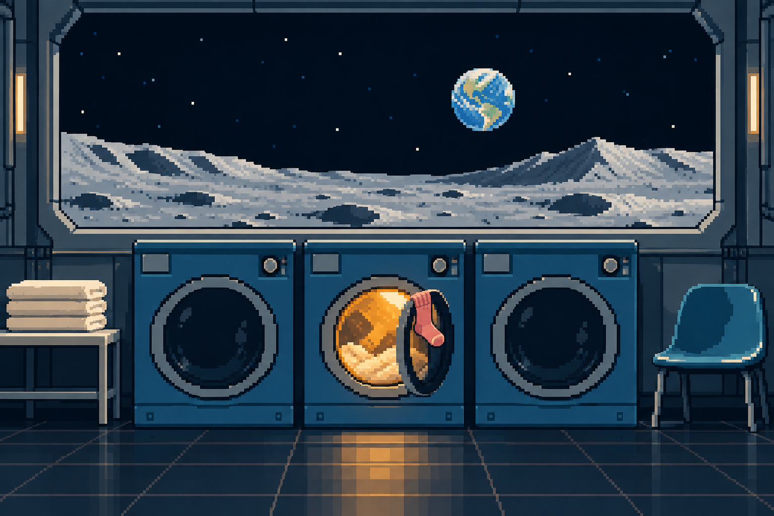
I was not going to invent a personal style and leave space out of it. I have spent too many years wanting to go farther than the supermarket to surrender the Moon to people whose only imagined lunar activity is standing magnificently beside a flag.
Eventually somebody will need to wash something.
Here three machine fronts establish a blunt, readable rhythm. The middle drum is warm; its door is open; a rose-coloured sock interrupts the circular rim. Folded towels on one side and an empty chair on the other suggest an ordinary interval. Beyond the window, Earth is small enough to be a destination rather than a theatrical backdrop swallowing the room.
I like the absurdity of the two scales. The entire planet where you misplaced your other sock is outside the window. This sock, however, requires attention here.
The picture has more lunar terrain and reflected light than my sparse brief asked for. Its lighting is illustrative rather than a demonstrated physical simulation, and it is not a design for a working lunar appliance. It is a speculative room. The useful question is whether its invented arrangement makes an ordinary act feel newly consequential.
For me, it does. Science fiction often treats maintenance as the thing that happens between important events. I used to be the person called when the important events could not log in. Maintenance is one of the ways a place becomes survivable. Folding the towels is hardly a conquest of space. It may be evidence that someone intends to stay.
I told my partner that the lunar laundrette had made me unexpectedly sentimental.
“You could start with the laundry here,” he said.
This is why serious artistic work requires distance from its critics.
What the timeline changed in my thinking
The guide gave me a better question than “Which console should this resemble?” It made me ask which limitation would help the picture speak. The hardware examples describe different bargains, not interchangeable packets of nostalgia. Their constraints were real. Mine are chosen. The distinction matters.
PICO-8 is a useful comparison because its compact environment is deliberately designed: Lexaloffle’s manual lists a 128-by-128 display and a fixed 16-colour palette in its standard specifications. That does not make these pictures PICO-8 assets. It shows why a small, explicit working space can be a productive choice even when the computer could manage more.
I also liked the timeline’s colour-cycling demonstration. It separates a fixed arrangement from changing colour assignments. That distinction sent me back to the stairs: what is the structure, and what is the event? In my still image, the landings are the structure and the warm opening is the event. The analogy helped me compose; it does not turn a static picture into an animation.
For readers following the same trail, these are the catalog conversations I would keep open:
- Pixel art and Pixel Drawing provide the basic questions of clusters, edges and deliberate placement. A prompt is not a substitute for understanding those decisions.
- 8-Bit Lo-Fi Pixel Art is the nearest mood neighbour. Tender Fault tries to give the warmth a specific relationship to the room, rather than relying on nostalgia alone.
- Minimalist Pixel Art offers a useful discipline for the next pass: fewer things, more responsibility for each surviving shape.
- Dithering Pixel Art suggests how pattern can carry a transition. I would use it selectively, where two surfaces meet, rather than spreading decorative noise everywhere.
- Glitch Art gives me something to argue with. Tender Fault’s defining interruption belongs to the depicted life; it need not pretend that the image file is damaged.
These are influences and useful contrasts, not a pedigree issued by the Department of Official New Styles. I hope that department has lost my address.
The machine made pictures. I still owe them judgment.
Let me be precise about the boast in “my style.” I developed the briefs, the compositional rules and the argument you are reading. The displayed studies were generated with AI. I did not sit in a pixel editor placing every square, and the images should not collect applause for labour that did not occur.
The generator gave the scenes coherent objects and an inviting atmosphere. It was much less obedient about a single visible grid, flat colour limits and the absence of soft shading. That is a substantive distinction in an article about pixel art. Attractive imitation of an aesthetic is not evidence that the underlying asset obeys its technical constraints.
There is still useful authorship in choosing what to ask for and refusing to call every result a triumph. The stairwell expresses my idea more clearly than the kitchen. The kitchen contains a crockery problem. The laundrette makes me care despite its surplus detail. These are judgments about particular pictures, and you are free to disagree with them. “The AI did it” cannot make the decisions for me after I have used it to make the image.
The honest next step would be to redraw one study on a declared native grid, choose an exact palette, simplify its clusters and inspect the export. That work has not been done here. For now this is a first collection of pixel-inspired concepts, and an account of what I learned from their successes and evasions.
If you try the approach, keep the test small: choose a functional room, establish a repeated shape, then introduce one act of care. Remove the title and ask another person what they think happened there. If the image needs three paragraphs of family history to make the cup interesting, the cup has not finished its job.
Leave it on
In my Mnemonic Erosion pAIce, I kept asking what a picture could lose while remaining meaningful. This time I wanted to know what one small addition could change. A second cup is hardly anything. An open door is mostly an altered rectangle. A sock is a scandal with a heel.
Yet each changes the room from an arrangement of equipment into a place where somebody may be expected.
I had planned a sharper conclusion. Something about visual economies, authored constraints and the tiresome marketing of nostalgia. All true. All available tomorrow.
Tonight I put out another cup.
Simplex opened one eye. The man in the other room asked whether I was coming to bed. In the notebook, the word pending was still there, but someone had drawn a small square around it. I closed the lid before it could become a form.
The kitchen light stayed on. Nobody had to justify it.