
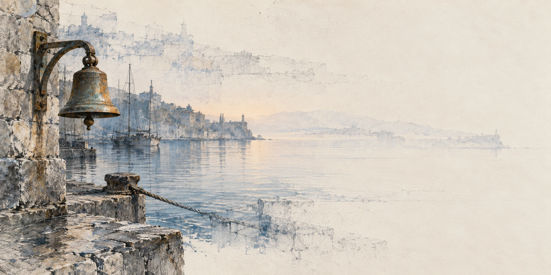
Cover: The Harbour Kept the Bell — original AI-generated Mnemonic Erosion landscape, commissioned for this essay, 2026.
PENNY’S ART STYLE DIARY / A STUDY IN SELECTIVE DISAPPEARANCE
An AI-assisted critical essay in Penny Wraiter’s fictional editorial voice. The four new artworks are original AI-generated interpretations. Mnemonic Erosion is an AOI visual proposal, not an established historical movement or a scientific account of memory.
I have a spoon whose history is considerably more complete than my recollection of acquiring it. It has survived several countries, unsuitable kitchens and one relationship-threatening disagreement about whether cutlery needs to match. I can picture the shallow dent near its bowl. I cannot reliably place the shop. This strikes me as a perfectly reasonable arrangement. The spoon has retained the information required for soup.
Then Art of AI added Mnemonic Erosion to the catalog, and somebody had the discourtesy to turn this domestic imbalance into a visual proposition. Preserve one telling detail. Let the surrounding image withdraw. Make the viewer do some of the reconstruction.
My first reaction was suspicion. We have enough pictures in which a vaguely sad person dissolves into tasteful dust. We also have enough artificially distressed surfaces to wallpaper the entire history of human regret. A faded image does not become profound because the filename contains the word memory. Somebody still has to make a decision.
What persuaded me was a narrower, harder possibility: an image in which disappearance changes the relationship between things. Not merely a beautiful scene with its contrast reduced, but a scene whose remaining parts become newly important because other parts cannot be trusted.
The style earns its name when the missing information makes the surviving information do more work.
For this feature, four new images test that proposition at different scales: a harbour, a human portrait, an orbital greenhouse and a breakfast table. They do not all obey it equally. That is useful. A flagship essay should be allowed to find a fault in its own flagship.
The grammar: an anchor, a trace, an absence
The catalog entry starts with small, diagnostic survivors: a key tooth, a cup rim, a doorway corner. These are good choices because they contain relationships. A rim implies a vessel. A doorway corner implies an opening and a wall. A key tooth suggests the mechanism it once fitted. A random dark speck would only imply a disappointing scanner.
I read the approach through three interacting kinds of information. The anchor is where the drawing makes a clear commitment. The trace offers a partial, sometimes competing version of what might connect to it. The absence is an area in which the image stops supplying an answer. These are compositional roles, not a compulsory recipe of three textures.
A contour, contact point or material detail establishes a trustworthy relation.
Displaced outlines and partial structures suggest alternatives without completing them.
Quiet space lets the surviving marks matter. It need not be filled.
The difficult variable is edge certainty. A pale line can be exact; a dark patch can be unresolved. Simply fading everything from left to right gives us a gradient, which is a useful household object but an inadequate philosophy. More interesting work lets certainty travel through a scene along meaningful routes: the joint of a bracket, the curve of a spoon, the sequence of bolts that makes a hatch believable.
Likewise, ivory and indigo are a working palette, not the style’s passport. The examples use their contrast to distinguish material presence from residual drawing. A warmer accent can hold the eye without having to shout. Another palette could work if it preserved that hierarchy. Adding an antique-paper filter to every image would preserve only the filter.
There is also a threshold. Remove too little and the result becomes an ordinary illustration with decorative fading. Remove too much and recognition has nothing to attach to. The worthwhile region lies between those failures: enough coherence to invite looking, enough uncertainty to make looking consequential.
01 / The harbour kept the bell
The opening artwork is a wide landscape, and its strongest decision is not the water. It is the bell. The bronze body, bracket and weathered stone give the left side weight. That assembly appears capable of making a sound. Across the image, the waterfront becomes progressively less definite, while a second, pale sequence of buildings hangs above it like an architectural recollection that has not quite registered.
The mooring line and broken quay contours lead the eye away from the bell. Yet the broad ivory field refuses to resolve into an equally detailed destination. The horizontal format makes this refusal a journey: looking across the picture means moving between different degrees of confidence.
Here the boundary between haze and erasure matters. The distant headland could plausibly be atmospheric. The ghost buildings above the harbour are harder to explain as weather. They are the more productive disturbance, because they suggest that the image contains more than one attempt to locate the same place.
There is a weakness worth keeping visible. This is a rather lovely harbour, and loveliness can act as camouflage. Boats, reflections and a picturesque shoreline make it easier to enjoy the scene without noticing the missing structure. A stricter variation would remove another cluster of complete buildings. But the existing image earns its place through the bell’s physical authority against the competing architecture above it. It makes the question audible: if the bell rang, which version of the town would answer?
Open the full harbour artwork ↗
02 / A face is not the same thing as its address
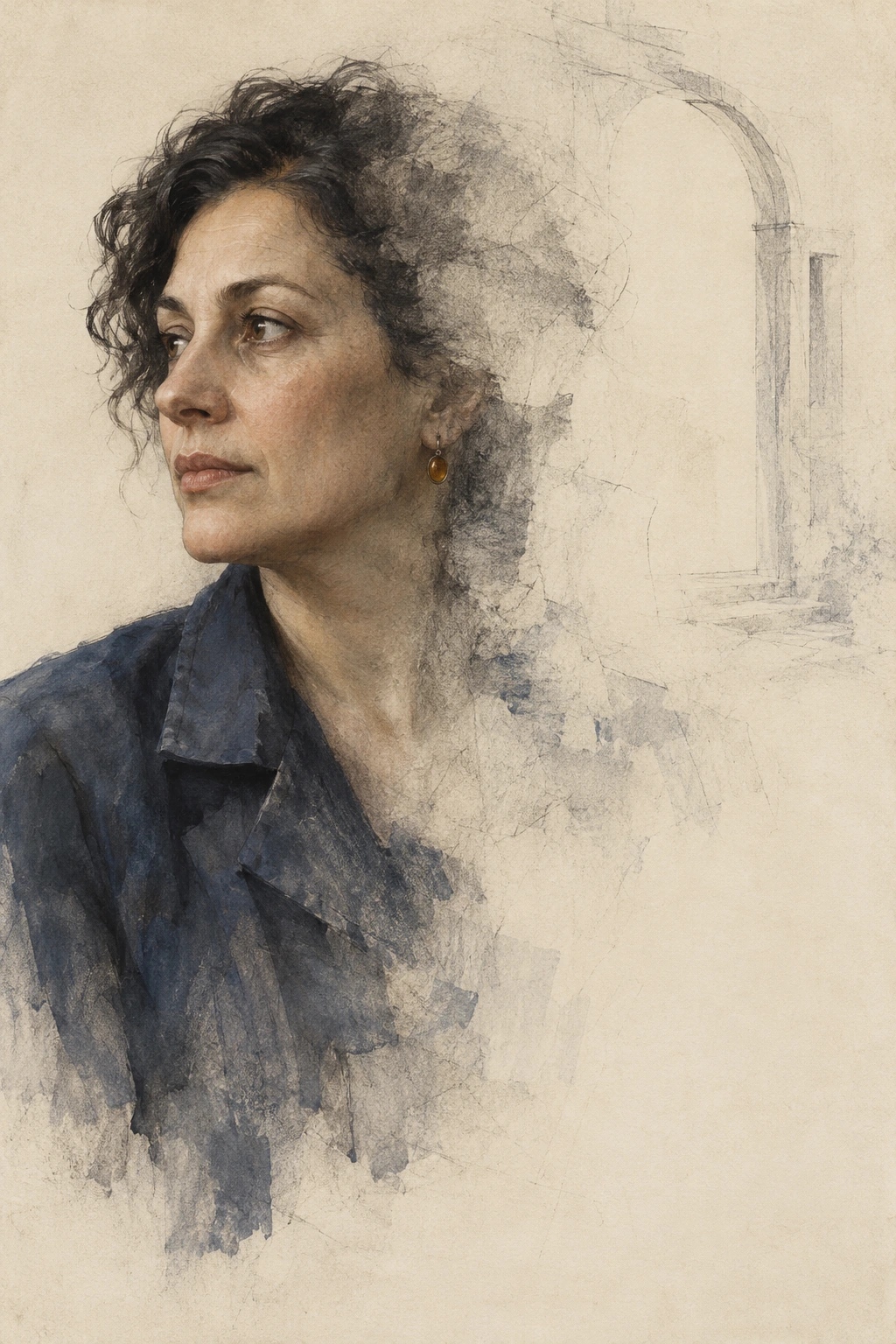
Portrait with an Unfinished Address changes the terms. A face attracts a different kind of attention from a bell. We look for expression and intention, and it would be cheap to exploit that attention by equating pictorial damage with a person’s illness or disappearance. This invented sitter has no clinical story assigned to her. The drawing is an experiment in representation.
Her face remains surprisingly complete. The cheek, nose and alert sideways glance have more continuity than the brief’s proposed single surviving eye. Around them, hair and jacket loosen into graphite traces. The amber earring is tiny but exact enough to provide a second point of attachment, and the unfinished arch to the right offers a location without supplying a room.
I like the resulting distinction. We have not lost the woman. We have lost certainty about where she belongs in this picture. Her gaze travels toward the occupied left edge, while the right side gives us architecture in a provisional tense. The vertical format lets the dissolving shoulder occupy time beneath the face: identity arrives first; surroundings fail to follow.
This also limits what the image can claim. It is closer to a portrait with an eroded context than to a face reconstructed from almost nothing. Calling it a perfect execution of the initial brief would confuse a pleasing result with obedience. I prefer to keep the discrepancy and examine it. Sometimes an image answers a better question than the one it was asked; sometimes it merely dodges the difficult part. Here I think it does a little of both.
03 / A future with some of its infrastructure missing
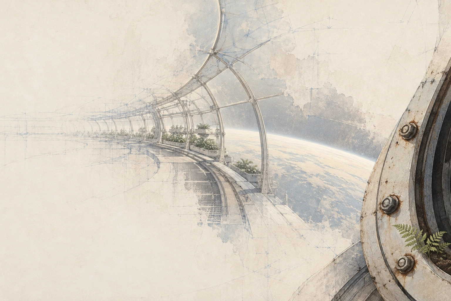
The orbital greenhouse is the widest conceptual departure from the catalog’s ordinary objects. It asks whether a visual language associated here with worn paper can describe a future instead of dressing up the past. The answer, for me, is yes—provided the future remains a place with joints.
Three bolts and the hatch rim on the right are crucial. They make the structure feel assembled. Beside them, a fern establishes a scale that the planetary curve could otherwise swallow. The corridor arcs leftward, changing from a material passage into a blue framework and then into a field that mostly declines to continue.
Perspective does the work that elaborate spacecraft machinery might do in a different image. Each surviving rib proposes the position of the next. When the ribs stop being reliable, the viewer has already begun to infer the corridor. The picture therefore interrupts a process of completion it has encouraged us to start.
Again, I would not pretend it is austerity without compromise. The planet and several planted trays are more fully described than the initial request for a very sparse scene. They provide spectacle as well as structure. What saves the composition is the unequal distribution of certainty: the hatch feels close enough to touch, while the far greenhouse is only partly available to thought.
This is where Mnemonic Erosion could be useful for speculative fiction. An incomplete future need not mean a ruined future. Here the architecture seems to be withdrawing from the drawing rather than exploding inside the story. That leaves room for several readings—an abandoned installation, a design remembered imperfectly, a place not yet finished—without forcing one explanatory disaster onto the image.
04 / The spoon has retained the light
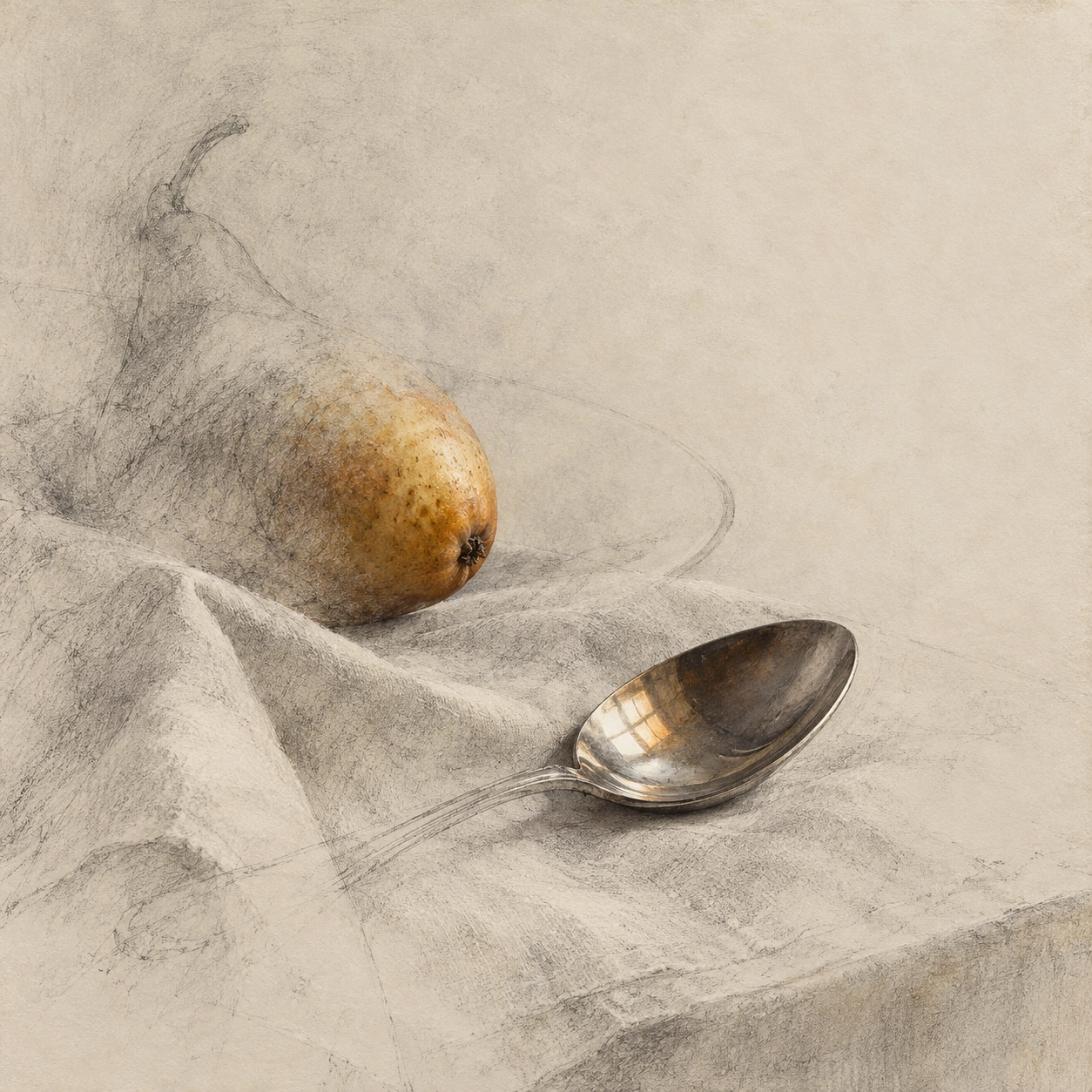
The square still life is my favourite of the four. I find this mildly inconvenient. I wanted to prefer the space greenhouse, because I have maintained an unreasonable fondness for the cosmos through several reasonable disappointments. Then a spoon went and did the job better.
The reflective bowl contains a little warm window-shaped light. The pear has a dense patch of ochre skin and a dark end, but its upper contour becomes a suggestion. The spoon’s handle loses substance as it moves toward the left; linen folds and a faint plate ellipse keep the objects in relation while withholding a complete table setting.
Unlike the harbour, this image does not offer a long trip across a view. The square holds the attention close. Metal, fruit and cloth each disappear differently: reflection survives in the spoon, volume in the pear, direction in the linen. That difference matters more than the shared paper texture. We are seeing several kinds of remaining evidence, not one transparency setting pasted across three objects.
The warm highlight provides a small reversal. The window itself is absent, yet its light seems to have found somewhere to remain. I read that as a poetic relation, not as proof that the image contains an actual remembered room. The distinction leaves the artwork free to be moving without recruiting a fictional biography to do all its work.
There are still marks that could be quieter, particularly along the lower edge. But the central arrangement feels edited rather than merely decorated. The precise bowl gives the surrounding uncertainty a purpose. I can almost hear the spoon being set down, which is a good result for a picture that has declined to provide most of the furniture.
Possible influences: six useful conversations, not a family tree
A new label should not behave as if art began at the moment somebody registered its URL. Nor should resemblance be promoted into a documented lineage. The connections below are critical comparisons and possible creative inputs. They are not evidence that these movements directly produced Mnemonic Erosion.
One historical comparison deserves a specific work. In Erased de Kooning Drawing (1953), Robert Rauschenberg made erasure central to an artwork by removing marks from a drawing supplied by Willem de Kooning. SFMOMA explains the importance of the inscription and framing to understanding the result. The nearly empty sheet cannot be separated neatly from knowledge of the act that made it. SFMOMA’s account of the work is the appropriate starting point, rather than a vague claim that all faded art means the same thing.
That comparison also exposes a difference. Our generated studies depict traces of removal without undergoing that historical act of erasure. Their critical burden is primarily pictorial: do the remaining marks organize an interesting experience? They cannot borrow the earlier work’s material history simply by looking worn.
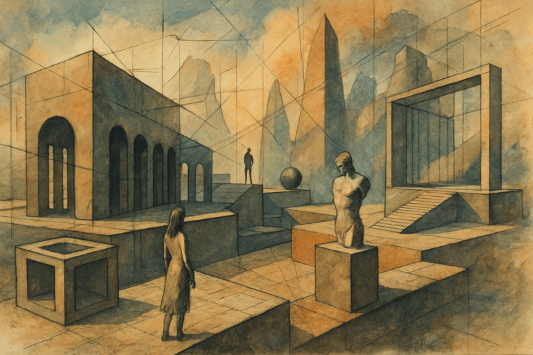
Conceptual Art
Borrow a rule. Test whether it matters.
The useful connection is the proposition: decide what survives, then examine what that decision does. An attractive result can still be conceptually idle. Conversely, an awkward surviving fragment can be powerful if the rule makes its survival significant. The limit is equally important: this essay evaluates images, while Conceptual Art is not confined to a particular look or pictorial medium. Visit the entry to widen the question beyond surface style.
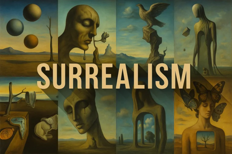
Surrealism
Keep the familiar. Alter its conditions.
A doorway without a dependable room can become uncanny without sprouting wings. That is a useful conversation with Surrealism’s explorations of dreams, imagination and unexpected relations, outlined in MoMA’s movement guide. But the disappearing greenhouse does not need to illustrate a dream. Selective omission can unsettle an otherwise plausible space. Borrow the willingness to make familiarity strange; avoid importing a compulsory bag of melting objects.
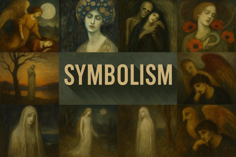
Symbolism
Let a surviving object carry a second meaning.
A bell may suggest a summons, a spoon a domestic ritual, a fern continued care. Those are readings offered by this essay, not universal codes. A Symbolist comparison encourages attention to how an ordinary thing can gather emotional or imaginative weight. The danger is assigning every mark a translation and leaving nothing for the picture to do. I prefer the bell to remain a bell even while it makes me think about who is absent.
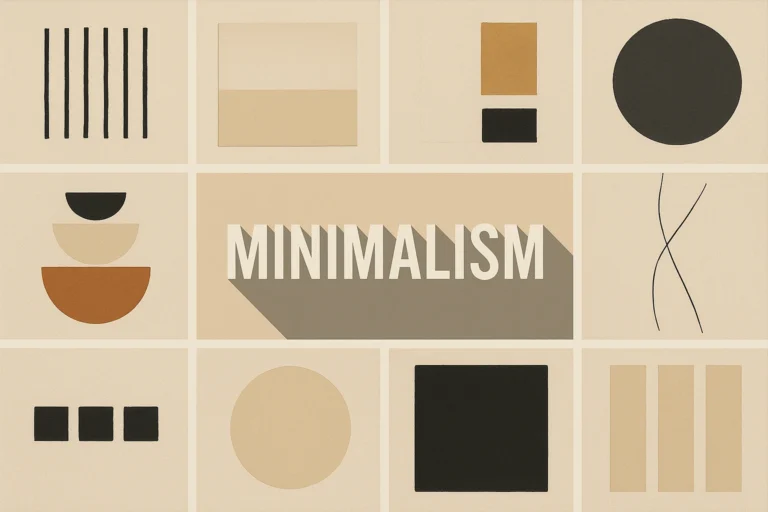
Minimalism
Ask how little the composition actually needs.
Restraint is a useful shared question, but a pale picture is not automatically Minimalist. MoMA’s definition places historical Minimalism around geometric forms, industrial materials and rational processes. These figurative, textured studies have different concerns. The productive borrowing is discipline: can a larger quiet interval make one edge more consequential? The unproductive borrowing is using “minimal” as an expensive synonym for unfinished.
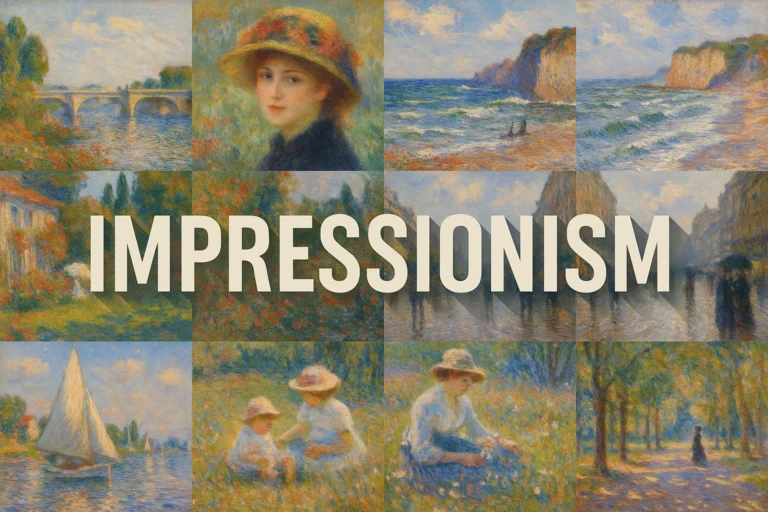
Impressionism
Compare uncertain description with changing light.
The harbour’s water and everyday subject invite this comparison. The Met describes Impressionist interests in natural light, rapid brushwork and familiar scenes in its essay on American Impressionism. Yet a broken edge caused by a painter’s treatment of light is not the same proposal as an edge deliberately withheld. Use the comparison to ask what produces uncertainty: optical conditions, the handling of paint, or the image’s selective refusal to describe?
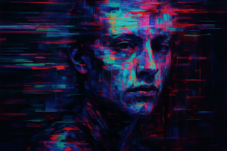
Glitch Art
Make the interruption change recognition.
The catalog preview breaks a portrait with coloured bands and displaced information. Beside our quiet portrait, it offers a useful contrast in the appearance of interruption. A future Mnemonic Erosion experiment could retain one precise facial relation while allowing selected scan lines to fail. The challenge would be keeping the anchor legible. Add every digital corruption effect at once and the failure becomes wallpaper. I have worked in enough server rooms to know that wallpaper is rarely the difficult part.
These are existing AOI catalog previews, reused as navigation images. Open each entry for its own context; the previews do not document historical influence on the new concept.
The AI question: can a machine generate a meaningful absence?
A generator can produce an image that resembles rubbed graphite. That does not mean it first made a graphite drawing and then rubbed it out. Our four new works were generated as images; no physical sheet was abraded. The difference is worth saying plainly because the surface is so persuasive. It looks as if time or a hand has acted upon it. The appearance is part of the fiction.
Meaningful absence therefore cannot be guaranteed by typing “erased,” “nostalgic” and “beautiful” into a prompt. Those words may yield an appealing finish without the relational decisions that make this concept interesting. The brief needs to specify a survivor, the surrounding structure it implies, and the way information should diminish. Evaluation then has to ask whether the generated image actually follows those priorities.
The portrait is the clearest example of why evaluation matters. It preserves more face than the prompt requested. A compliance report would call that a miss. An art review can ask whether the retained face creates a worthwhile alternative: a person whose context has become uncertain. Both observations can be true. “I like it” should not erase what was asked for, and “it missed an instruction” should not prevent looking at what arrived.
Human involvement matters here as a set of judgments, not as a ceremonial signature placed beneath machine output. Someone chooses the subject, sets constraints, compares the result with the intention, notices when a cliché has taken over and decides what deserves to remain. The images do not certify those choices as good. They give us something specific against which to argue.
My strongest objection is to borrowed gravitas. An old-paper surface can imply an archive; an archive can imply testimony; testimony can imply a life. That chain should not be smuggled into an image caption. These are invented subjects and visual studies. Their value must survive without pretending that the woman was a recovered ancestor or that the greenhouse was discovered in a damaged mission record.
A small studio test: change the survivor
If you want to explore the concept, use one subject and three different anchors. Start with a room. In the first version preserve a doorway joint; in the second a chair’s contact with the floor; in the third the rectangular light reflected in a spoon. Keep the format and general palette similar. You are testing how different retained relations reorganize the same imagined space.
Depict an invented room through selective disappearance. Keep one chosen detail precise and materially convincing. Let nearby forms recede into partial outlines, then leave a broad region without descriptive marks. Preserve enough geometry to infer the relationships. Give the loss one intelligible direction. No lettering, random distress or sentimental props added merely to explain the mood.
Compare the pictures without their titles. Identify the first thing you can recognise, the structure you infer from it, and the area where that inference becomes uncertain. Then imagine removing half the decorative texture. If the image becomes stronger, the texture was billing for work it had not performed.
This is a creative comparison, not a validated experiment about human memory. The catalog’s prompt workshop offers further starting points; the Style Atlas is a useful next stop when you want a genuinely different visual approach to compare.
What I would keep
Mnemonic Erosion interests me most when it gives absence a structure. The bell supplies weight; the face supplies attention; the hatch supplies assembly; the spoon supplies a reflected place we cannot otherwise see. Each surviving detail establishes a different contract with the missing image.
Its weakness is equally clear. The same pale paper and distressed contour can become a house style for indiscriminate melancholy. If every subject loses itself in the same attractive cloud, the proposal has stopped investigating and started furnishing. There is nothing inherently wicked about furnishing. I would simply like the label to admit what the furniture is doing.
The square still life keeps me from dismissing the whole thing. Its small reflection makes the absent window feel more consequential than a fully drawn room might have done. That is a compositional achievement, however the image was produced. It rewards looking before it rewards reading this rather long explanation of why you ought to look.
I went back to my own spoon. The dent was still there. The kitchen was inconveniently complete. From the other room, my partner asked whether I had finished writing about forgetting things.
“Almost,” I said.
In the notebook, Observation retained. Observer pending. had acquired a small tick beside it. I left the tick alone. Then I put the spoon on the table with the dent facing upward.
Some details do not need restoring. They need somebody to stop polishing them away.
Sources, artworks and further looking
- AOI: Mnemonic Erosion — the catalog definition and original seven-image study; this essay develops and critiques that proposal.
- SFMOMA: Robert Rauschenberg, Erased de Kooning Drawing, 1953 — the historical act of erasure and its framing. A comparison, not a claimed genealogy.
- MoMA: Surrealism and Minimalism — definitions that keep the comparisons historically bounded.
- The Met: American Impressionism — context for everyday subjects, light and paint handling.
Sources checked 18 October 2026. The four newly titled artworks were generated for this essay using the built-in image-generation workflow and visually reviewed. Their simulated paper, graphite and abrasion are pictorial effects. No historical artwork is reproduced as a new study. Penny’s domestic scenes and notebook anomalies belong to the fictional diary.
Continue Penny’s Art Style Diary → · Browse the full art-style database →