
Compositional format · three related panels or sections
A triptych brings three related panels into one work. It can extend a scene, compare variations or organize a sequence; its force comes from the relationship between the parts and the pauses separating them.
A visual introduction
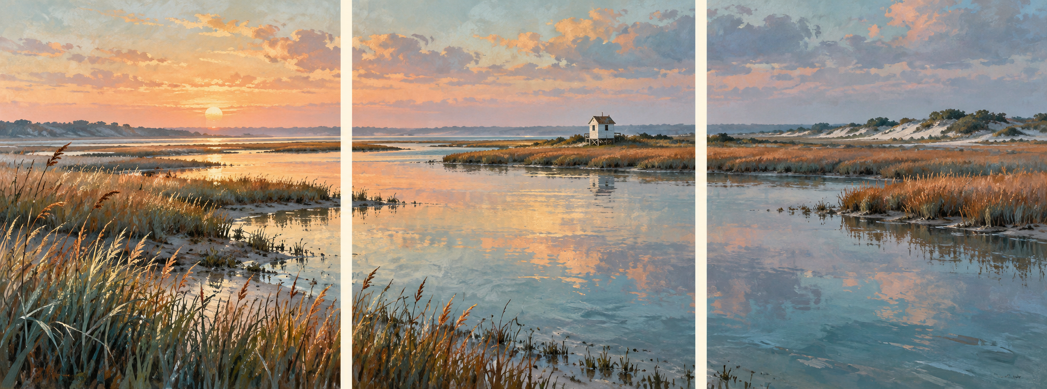
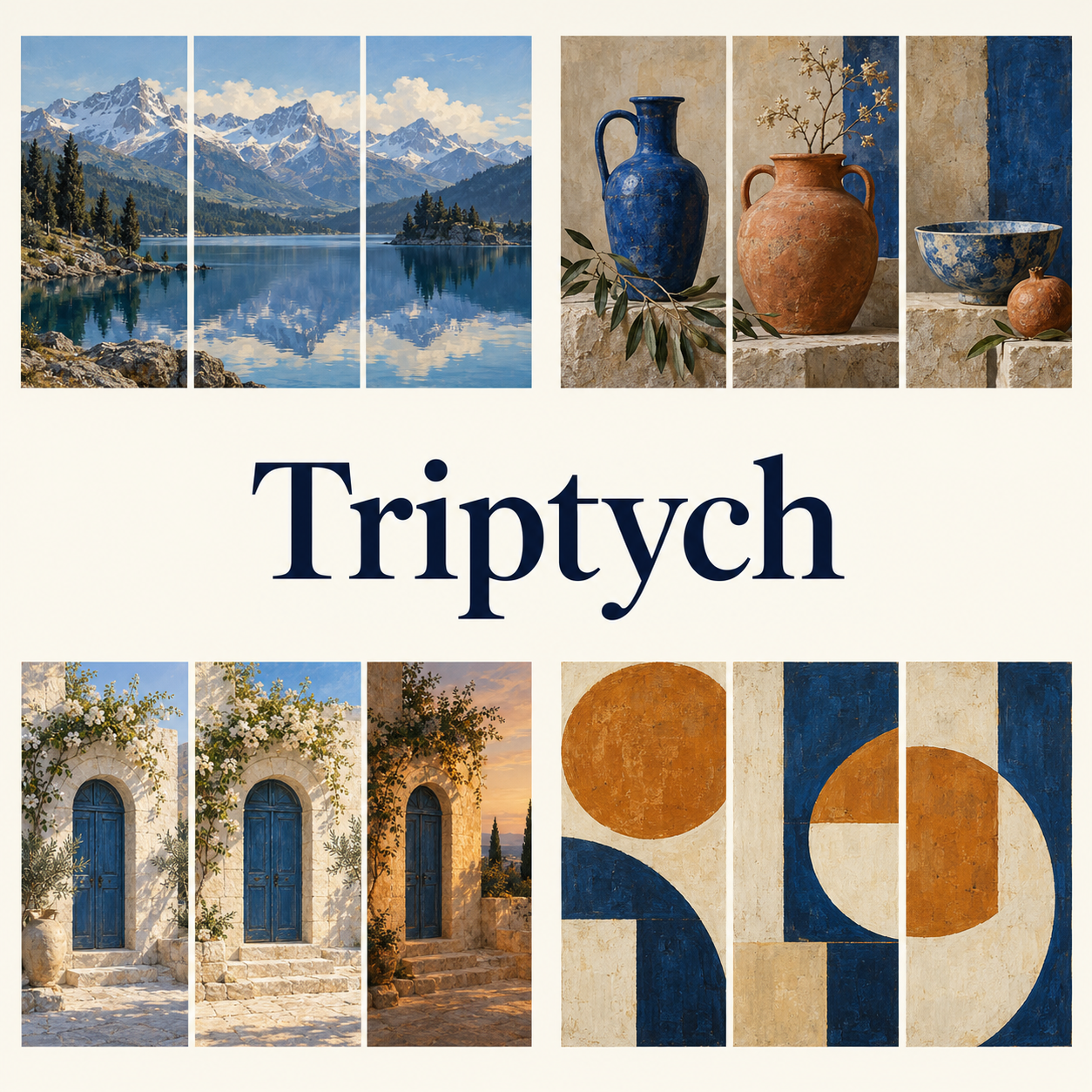
Seven original AI-generated AOI interpretations: a dedicated banner, centrally titled collage and five complete triptych studies. Each three-panel arrangement is one artwork; the scenes and sequences are fictional.
Select an image for a closer look. Use the thumbnails, arrow keys or a swipe to compare examples. Zoom in to inspect details, or share the image that inspires you.
Creative toolbox · take this style further
Choose an input and a destination. Search sends your words to the chosen site; Copy & open puts them on your clipboard to paste there.
Create with AI
Turn your chosen input into an image prompt or a new creative direction.
ChatGPT
Copy your input and paste it into a ChatGPT conversation or image request.
Copy & open ChatGPT (new tab)Claude · Anthropic
Develop an image prompt or explore the style in a new Claude conversation.
Copy & open Claude · Anthropic (new tab)Midjourney
Paste your input into the Imagine bar on the Create page.
Copy & open Midjourney (new tab)Adobe Firefly
Copy your input, open Firefly, and paste it into the prompt field.
Copy & open Adobe Firefly (new tab)Leonardo.Ai
Copy your input, open Leonardo, and paste it into the generation field.
Copy & open Leonardo.Ai (new tab)Image search
Find visual references. Short, concrete keywords usually work best.
Lexica
Search AI images and prompts using your selected input.
Search with this input Lexica (new tab)Pexels
Search the photo and video library. Short keywords often work best.
Search with this input Pexels (new tab)Pixabay
Search photos, illustrations and other images.
Search with this input Pixabay (new tab)Unsplash
Search photographs using the style name or your own keywords.
Search with this input Unsplash (new tab)Wikimedia Commons
Search photographs, artworks and historical images. Check each file for its source and reuse terms.
Search with this input Wikimedia Commons (new tab)Art & research
Explore artists, collections and the ideas behind a style.
Wikipedia
Search for background reading. A style may not have its own article.
Search with this input Wikipedia (new tab)WikiArt
Copy your input into WikiArt’s search to explore artists and artworks.
Copy & open WikiArt (new tab)Europeana
Paste your keywords into the search to explore European museum, library and archive collections.
Copy & open Europeana (new tab)Inspiration
Discover portfolios and visual ideas from creative communities.
Instagram hashtags
Search a hashtag made from your input: spaces and punctuation are removed. Instagram may require sign-in.
Search with this input Instagram hashtags (new tab)ArtStation
Paste your input into artwork search for concept art, environments, characters and visual development.
Copy & open ArtStation (new tab)Behance
Paste your input into project search for illustration, design and visual storytelling.
Copy & open Behance (new tab)A closer look
Three distinct sections form a deliberate whole through repeated color, aligned space, narrative change or a central subject with supporting wings. Panel widths, gaps and visual emphasis shape how the eye moves through the work.
Three parts, one considered relationship
A triptych is a work organized into three related sections or panels. Triptychon is a German-language form of the name and is treated here as a synonym. The word identifies a format, not a single art style: a triptych can be painted, photographed, printed, carved or assembled digitally. It can hold one continuous scene, three moments, or three images whose relationship is conceptual.
The useful question is not merely whether there are three rectangles. Ask what the viewer gains by seeing them together. A shoreline may continue across the breaks; a repeated object may change with the light; a large central subject may acquire meaning from quieter side images. Three pictures placed together can form a triptych when their grouping is deliberate, but the count alone says little about the quality of that relationship.
From folding wings to independent surfaces
MoMA's art terminology describes three sections or panels, commonly joined by hinges. The National Gallery's account of Hans Memling's Donne Triptych provides a concrete historical example: the central religious scene is accompanied by saints on the wings, while their exteriors carry figures painted to resemble stone sculpture. Opening and closing such a work changes what can be seen.
Hinges are not a requirement for every later triptych. MoMA records Claude Monet's Water Lilies (1914–26) as three oil-painted canvas panels. Its collection also includes Clarence H. White's Spring—A Triptych (1898), a platinum print, and Louise Bourgeois's Triptych for the Red Room (1994), a three-part print made with aquatint, drypoint and engraving. These are specific examples of a format moving across media, not stages in a single universal progression.
The Francis Bacon estate's catalogue identifies Three Studies for Self-Portrait (1979) as a triptych with three separate canvases. That example is useful when thinking about repeated attention to a subject rather than a panorama or an illustrated sequence of events. The works linked below are research references; the AOI images are newly generated interpretations, not reproductions of those works.
Choose what the panels do before choosing the borders
For spatial continuity, draw or compose the whole view first. Establish a horizon, a path or a band of light that can be followed across the gaps. Then place the divisions where the interruption adds rhythm. Cutting a bridge at two awkward joints may make the image harder to read; allowing the bridge to travel across one gap can make that same interruption purposeful.
For a sequence, keep enough stable information for change to matter. The same table, bowl and camera angle can connect the arrival of ingredients, the act of preparation and the finished meal. The viewer does not need every intermediate event. A triptych can leave a useful interval for imagination.
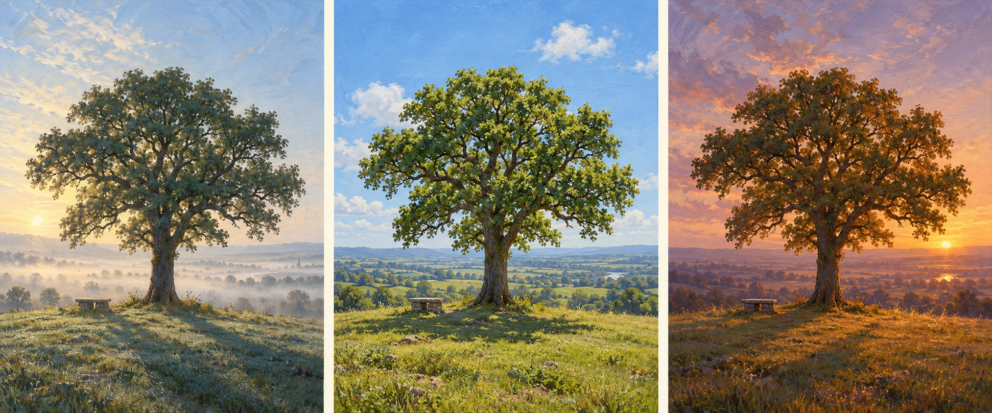
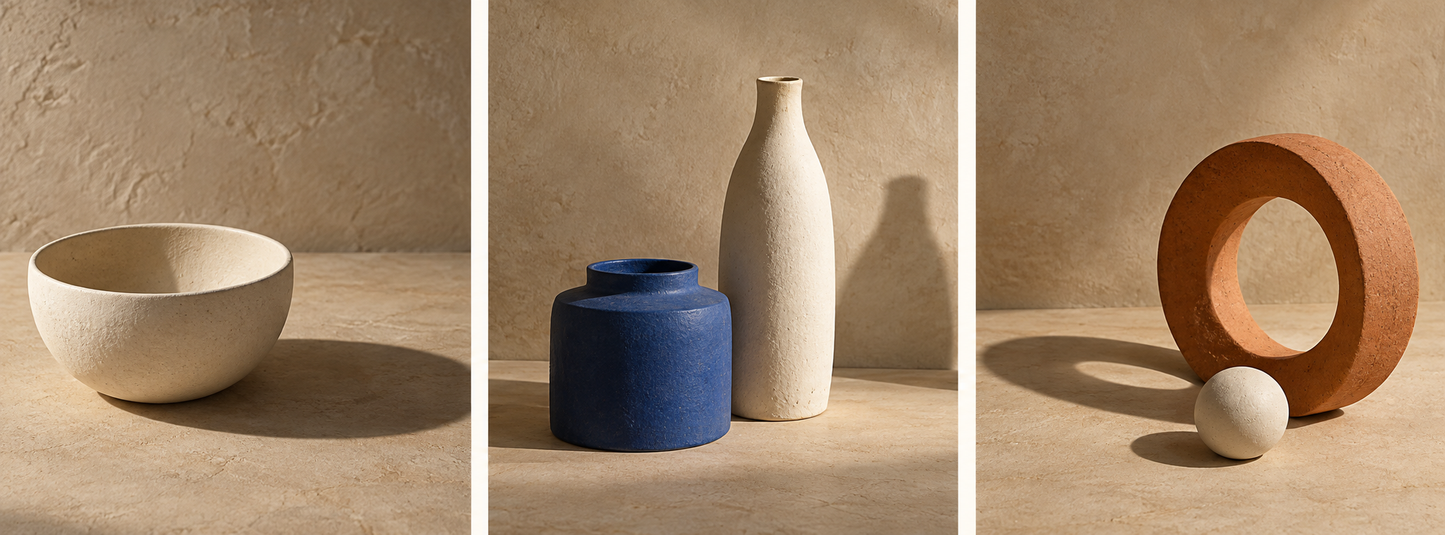
For comparison, hold one variable steady and alter another. Revisit the same tree under morning, noon and evening light, or show one ceramic object from three viewpoints. A conceptual trio can instead place unlike subjects in conversation through a repeated curve, a shared color or a visual rhyme. It need not pretend that they occupied one continuous space.
The center can lead without doing all the work
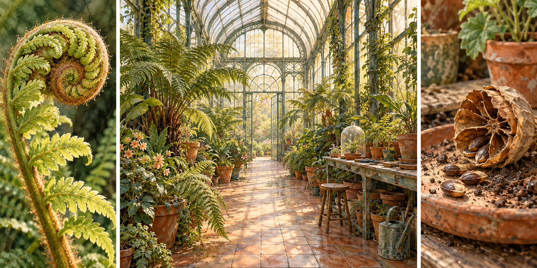
Three equal-width panels suggest a steady beat, especially when their top and bottom edges align. A broad center with narrower wings creates a different hierarchy: the center can carry the main event while the sides provide setting, detail or a contrasting scale. Neither arrangement is compulsory.
A central figure does not, by itself, turn a split image into a triptych. If one figure overlaps a two-sided world on a single uninterrupted field, the composition may still be a dual split with a connecting subject. For a clear triptych, the three sections need an intelligible identity as parts of the overall work, whether marked by physical supports, visible gaps or a deliberate visual division.
Try covering the center temporarily. If the side panels become meaningless scraps, they may need a stronger relationship to each other. Then cover each wing. The exercise tests whether the hierarchy is purposeful or whether the extra panels merely decorate an already complete central picture.
Treat the gap as part of the composition
A narrow interval can preserve the impression of a single field while making the eye cross a small interruption. A broad interval emphasizes the independence of each panel. Dark borders can act like firm punctuation; pale gaps may feel closer to breathing space. Their visual effect depends on the surrounding image and display surface.
For an artwork intended for separate prints, preview the intended spacing as well as the panel edges. Decide whether a continuous scene is being divided without missing image area, or whether the wall gaps stand for concealed strips of the scene. Those are different choices. A horizon can align in either approach, but a person's face or a carefully drawn circle may expose an accidental mismatch.
Hard-edged partitions make the format unmistakable. Softer internal transitions can still connect colors or atmosphere across the set. If every boundary dissolves completely, however, a viewer may read one continuous montage rather than three distinct sections. That may be attractive, but it changes the compositional question.
Color can connect, compare or complicate
A shared palette gives unlike panels a common atmosphere. Repeating a small amber accent in three otherwise different scenes can establish a visual route without flattening their differences. Alternatively, a grayscale–muted color–full color sequence can make saturation the main variable, provided the image explains why that change matters.
Color is not a built-in moral scale. Grayscale need not mean bad, old or lifeless, and bright color need not mean improvement. A quiet monochrome panel may be the most emotionally concentrated part of the work. Compare value structure before adding saturation; the set should remain readable when its colors are reduced.
Nuanced variation often outlasts a dramatic filter effect. A cool early panel, a neutral center and a slightly warmer final panel can suggest changing light without turning each section into a different advertising campaign. Keep the treatment consistent enough that the viewer notices the intended change rather than accidental shifts in exposure or contrast.
Five original studies in the AOI gallery
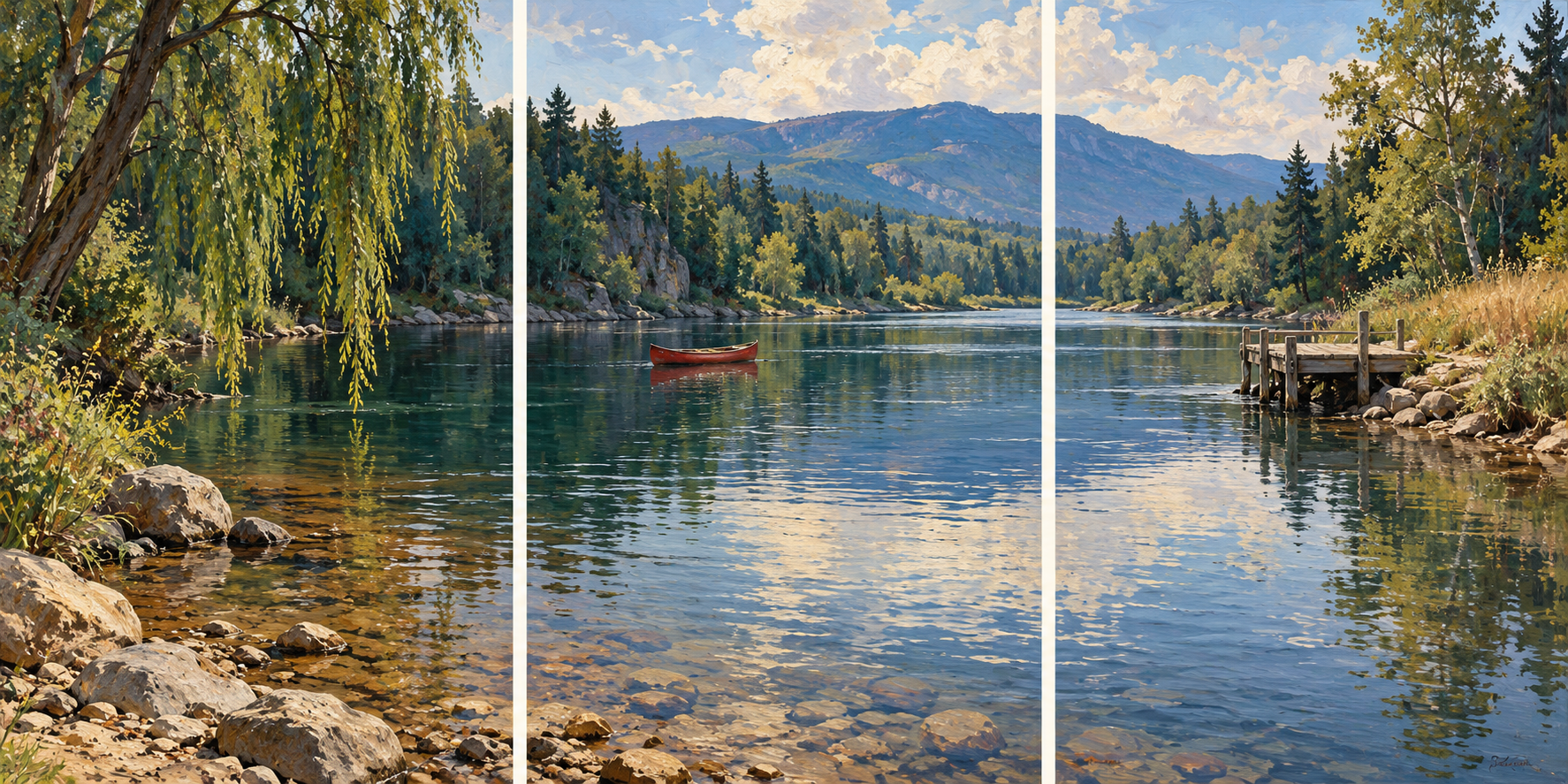
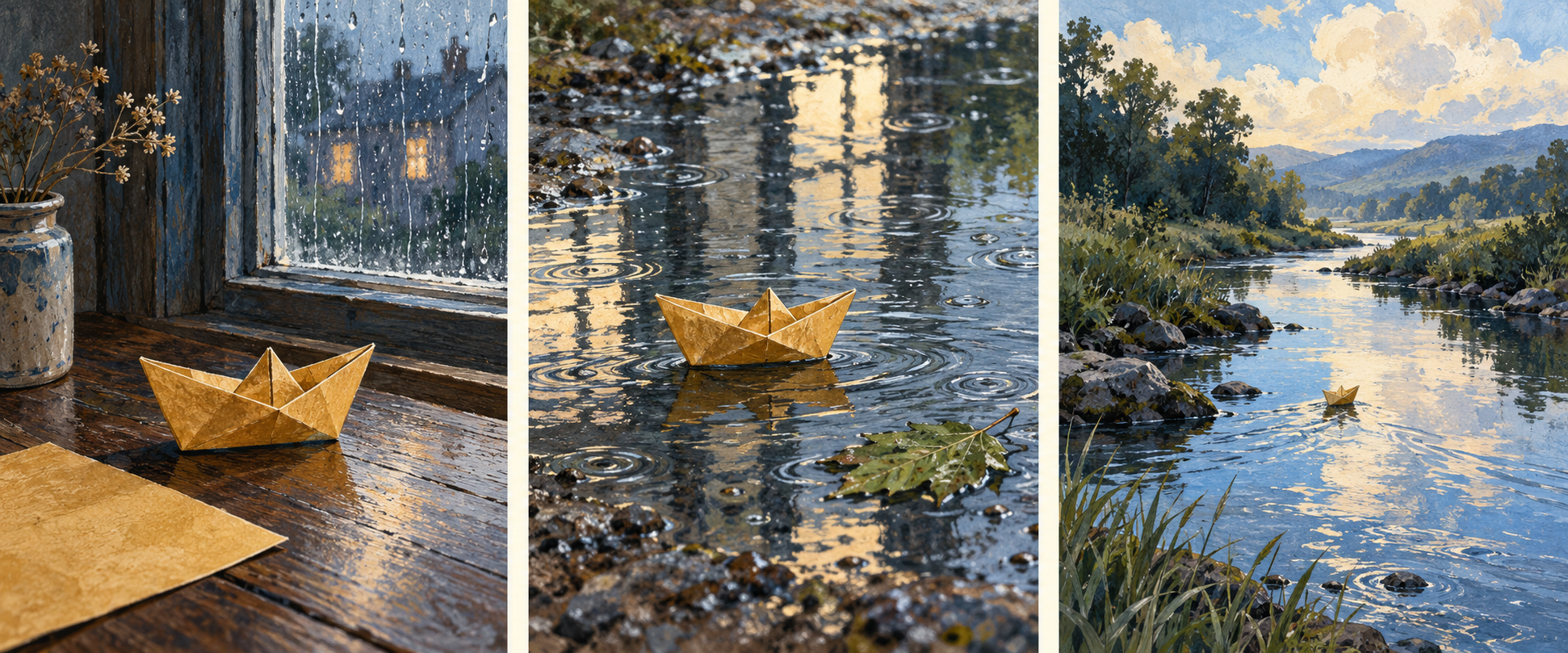
The linked landscape study treats a continuous river view as one field interrupted by two clear gaps. A narrative study follows a small paper boat from a worktable to rainwater and then toward open water. A repeated-subject study considers one tree at three times of day. A broad-center composition gives a greenhouse the main space while its narrower wings attend to leaf and seed detail. A photographic still life compares ceramic forms and their shadows.
Each complete three-panel arrangement is one artwork in this gallery. The five examples, dedicated banner and centrally titled collage are seven distinct generated assets. They are fictional illustrations of compositional possibilities, not records of a historical object or evidence of real events.
A practical way to build the first version
Start with three small empty rectangles and write one private sentence describing their relationship. Keep that sentence simple enough to test: one place across a pause, one object through changing light, or a central scene with two close observations. Make rough thumbnails before committing to detailed surfaces.
Then check the set at thumbnail size and at its intended display size. Look for a clear route through all three panels, an appropriate balance of emphasis, and deliberate placement of every division. Finally, inspect each panel alone. It does not have to function as an independent masterpiece, but it should contribute more than leftover background.
For AI imagery, request the number and relative widths of the panels explicitly, along with visible separation and the elements that must remain consistent. Inspect the actual output: generators can add extra frames, merge borders, change a repeated object's identity or place the most important detail exactly inside a gap. Correct those decisions before describing the work as a successful triptych.
Positive editorial review — AI-authored
AI-authored editorial assessment. A strong triptych makes looking itself part of the work. One panel establishes a shape, the second changes its meaning, and the third sends the eye back with a question. Shared color, scale or direction can hold the parts together without making them identical. The interval between panels then acts as a measured pause. The format is especially rewarding when removing any one section would weaken the relationship of the other two.
Negative editorial review — AI-authored
AI-authored editorial assessment. Three panels can lend an undeserved air of significance to an ordinary image. Arbitrary cuts may amputate the focal subject, while three equally busy compositions can compete until none is memorable. A predictable beginning–middle–end sequence can also explain too much. Improve the work by choosing the relation first, testing the gaps at the intended display size and allowing one panel to be quiet. More frames do not automatically supply more thought.
Neutral editorial review — AI-authored
AI-authored editorial assessment. A triptych is an arrangement of three related sections, compatible with painting, photography, print and digital composition. It can connect space, compare variations, organize a sequence or establish a central subject with supporting wings. It does not prescribe a single palette, technique, panel width or story. Its effectiveness depends on how the individual units and their combined presentation support the intended reading.
A small poetic detour
Original words from the AOI studio.
Poetry
Between the panels
The river leaves the first frame at the edge;
a little wall of silence takes its place.
Beyond the gap, a branch repeats its pledge
to hold the same wind in another space.
The middle keeps the boat, the weight of light,
the small event the other panels know.
One side remembers morning turning bright;
one lets the distance gather what must go.
Three windows do not guarantee a view.
The empty strip must earn its quiet part.
I cross it, carrying a shade of blue,
and find the pause has altered where I start.
The prompt workshop
Original creative exercises. These prompts create new illustrations, not documentary evidence.
Carry a landscape across two pauses
Create an original painted landscape triptych with exactly three equal-width panels separated by two narrow ivory gaps. Let one river, horizon and distant ridge continue coherently across the panels. Give the left a foreground reed, the center open water and the right a quiet landing stage. Keep the main boat clear of the divisions.
Plan the whole field first, then test whether each gap improves its rhythm. The three panels together are one artwork.
Keep the subject, change the light
Create a fictional photographic triptych of the same ceramic jug on the same table from a fixed viewpoint: soft cool morning, neutral midday, then restrained warm evening light. Use exactly three equal panels with clean separations, consistent jug shape and camera height, and meaningful changes in shadow direction.
This is a generated comparison, not a documented time sequence. Check that differences belong to light rather than accidental object changes.
Let a broad center answer two close views
Compose an original triptych with a broad central panel twice the width of each narrow side panel. The center shows an airy greenhouse; the left studies a leaf's veins and the right a seed pod. Repeat muted green, amber and ivory across all three panels, with visible pale gaps and a purposeful shift from detail to space to detail.
The wings need a role of their own. A figure simply overlapping a two-sided image would be a different format.
A smile from the studio
Jokes
The artist delivered a triptych and asked the curator to leave a thoughtful pause between each panel. The installer measured both gaps with a laser. The curator requested a slightly more contemplative left-hand pause. The collector asked whether the right-hand pause was included in the price. By lunchtime, the middle panel had been moved three times and nobody had looked at the painting. “At last,” said the artist, “a work about the relationship between three parts.” “Four,” said the installer, handing over the invoice.
Sources and further exploration
MoMA — Triptych art term and collection examples; a starting point for the three-part format
National Gallery — Hans Memling's Donne Triptych; central scene, wings and painted exterior faces
MoMA — Claude Monet, Water Lilies (1914–26); a three-panel canvas composition
MoMA — Clarence H. White, Spring—A Triptych (1898); the format in a platinum print