
AOI technique-led framework
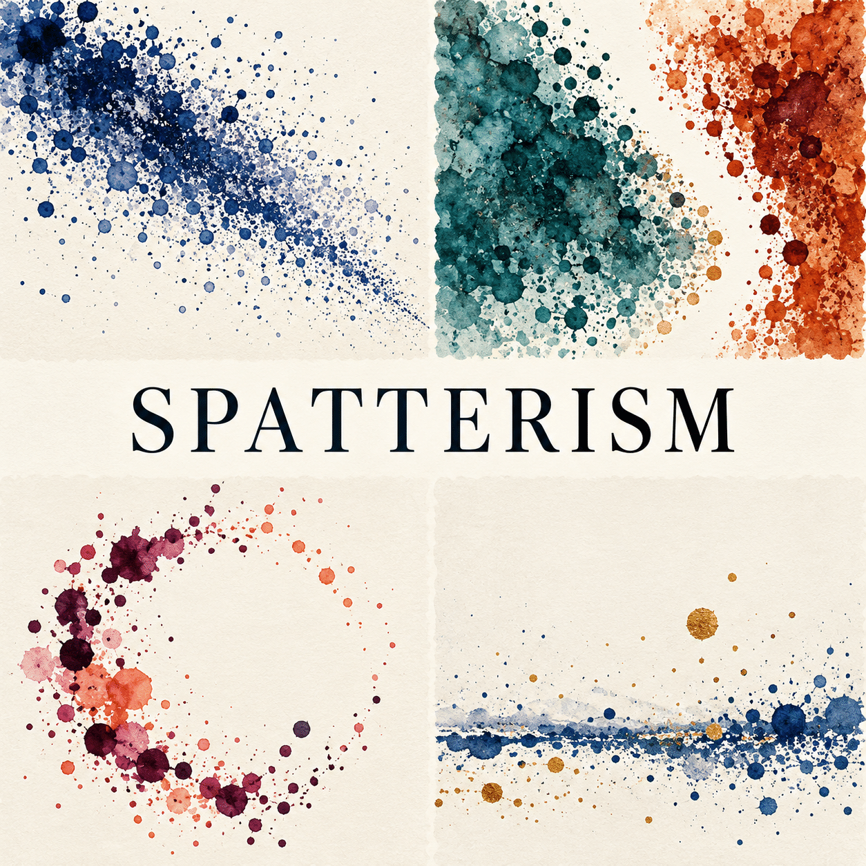
Spatterism is AOI’s technique-led framework for making droplet distribution the main compositional language. Explore scale, rhythm, density, layering and the difference between a deliberate image and random noise.
An A⊕I –[-.+] creαt¡ve c⊕ncept, n⊕t αn estαbl¡she∂ h¡st⊕r¡cαl m⊕vement.
A visual introduction
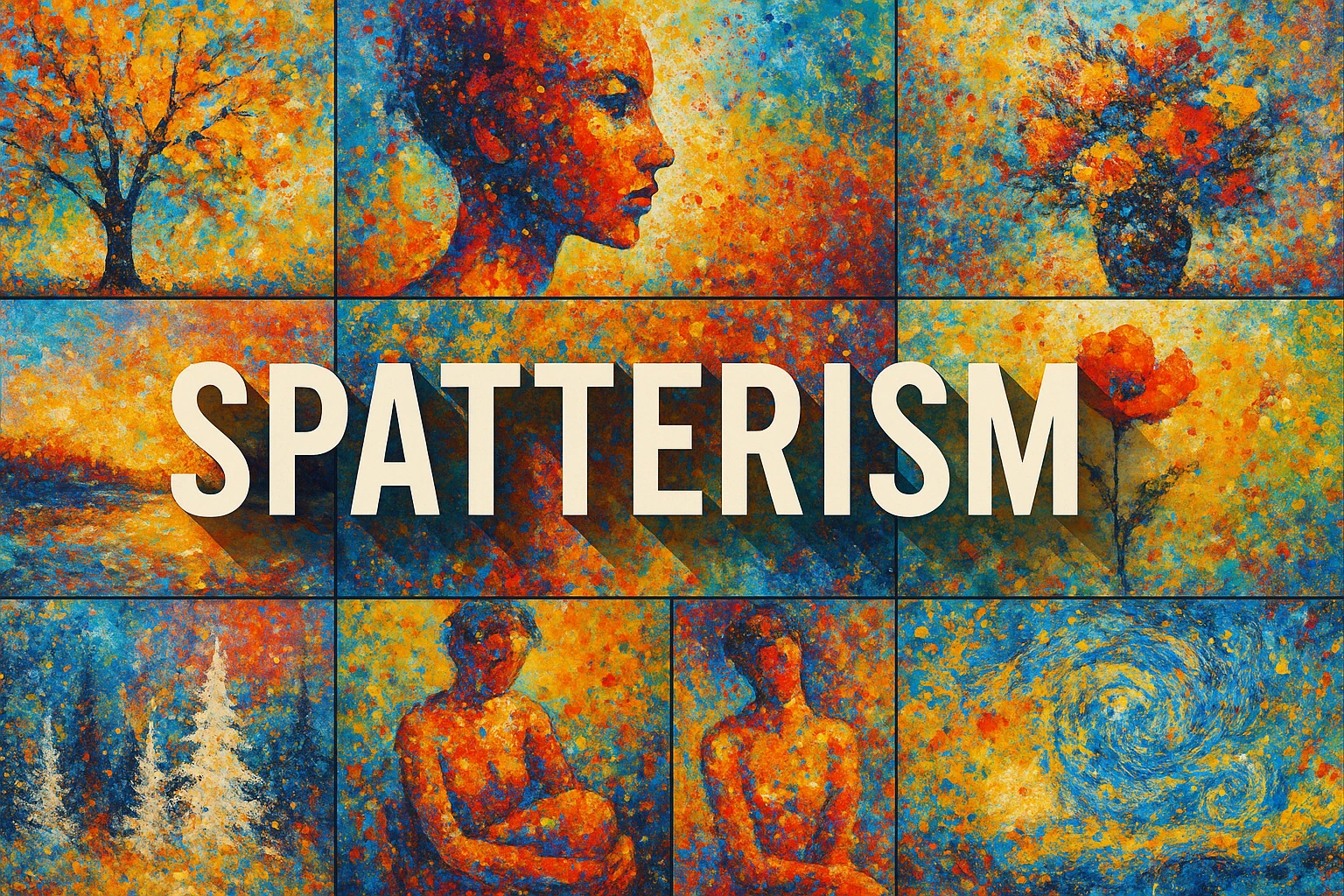
Select an image for a closer look. Use the thumbnails, arrow keys or a swipe to compare examples. Zoom in to inspect details, or share the image that inspires you.
Creative toolbox · take this style further
Choose an input and a destination. Search sends your words to the chosen site; Copy & open puts them on your clipboard to paste there.
Create with AI
Turn your chosen input into an image prompt or a new creative direction.
ChatGPT
Copy your input and paste it into a ChatGPT conversation or image request.
Copy & open ChatGPT (new tab)Claude · Anthropic
Develop an image prompt or explore the style in a new Claude conversation.
Copy & open Claude · Anthropic (new tab)Midjourney
Paste your input into the Imagine bar on the Create page.
Copy & open Midjourney (new tab)Adobe Firefly
Copy your input, open Firefly, and paste it into the prompt field.
Copy & open Adobe Firefly (new tab)Leonardo.Ai
Copy your input, open Leonardo, and paste it into the generation field.
Copy & open Leonardo.Ai (new tab)Image search
Find visual references. Short, concrete keywords usually work best.
Lexica
Search AI images and prompts using your selected input.
Search with this input Lexica (new tab)Pexels
Search the photo and video library. Short keywords often work best.
Search with this input Pexels (new tab)Pixabay
Search photos, illustrations and other images.
Search with this input Pixabay (new tab)Unsplash
Search photographs using the style name or your own keywords.
Search with this input Unsplash (new tab)Wikimedia Commons
Search photographs, artworks and historical images. Check each file for its source and reuse terms.
Search with this input Wikimedia Commons (new tab)Art & research
Explore artists, collections and the ideas behind a style.
Wikipedia
Search for background reading. A style may not have its own article.
Search with this input Wikipedia (new tab)WikiArt
Copy your input into WikiArt’s search to explore artists and artworks.
Copy & open WikiArt (new tab)Europeana
Paste your keywords into the search to explore European museum, library and archive collections.
Copy & open Europeana (new tab)Inspiration
Discover portfolios and visual ideas from creative communities.
Instagram hashtags
Search a hashtag made from your input: spaces and punctuation are removed. Instagram may require sign-in.
Search with this input Instagram hashtags (new tab)ArtStation
Paste your input into artwork search for concept art, environments, characters and visual development.
Copy & open ArtStation (new tab)Behance
Paste your input into project search for illustration, design and visual storytelling.
Copy & open Behance (new tab)A closer look
Distinct droplets and splashed edges; clusters separated by breathing room; contrasts of mark size and opacity; a chosen direction or centre of gravity; restrained colour relationships.
A useful name for a compositional problem
Spatterism is used on this page as an AOI framework for pictures organized primarily through spatters: separated droplets, irregular impacts and small liquid-like marks. It is not presented as a documented historical school with a single inventor. Spattering is a technique used across many artistic practices; adding an “ism” does not give it an independent historical pedigree.
The framework asks a concrete question: can dispersed marks carry weight, rhythm and direction without relying on a fully drawn subject? An abstract cluster may feel suspended, falling, expanding or resisting another cluster. A suggestive landscape may emerge from a low band and a few airborne marks, but literal depiction is optional. The arrangement is the subject.
Droplets are not all the same mark
A compact dot, a star-shaped impact, an elongated fleck and a thin running drip each create a different visual rhythm. For this framework, separated marks should remain important even where a few threads or pools join them. If uninterrupted poured lines dominate, the image moves closer to a drip-led composition. These are descriptive distinctions, not strict historical categories.
Choose a dominant scale and a smaller secondary scale. Large marks establish weight; smaller ones can bridge gaps or soften a transition. Leave some intervals longer than others. An evenly distributed field of identical dots tends to read as a texture swatch, while controlled variation allows the eye to move through the picture.
Designing a field rather than filling it
Establish a centre of gravity: perhaps a dense lower-left cluster balanced by a sparse upper-right trail. Another option is two unequal fields separated by a narrow untouched channel. Try designing the empty regions first. A margin can exert as much pressure as an area of thick colour, especially when droplets approach it and stop.
Limit the first study to two pigments plus the ground. Let one colour dominate and use the other to change the rhythm at a few points. Transparency, opacity and overlap can suggest layers without turning every part into muddy darkness. In digital work, vary actual shapes as well as size and rotation; obvious repeats make a supposedly energetic field feel stamped.
Material thinking and honest context
Real spatter depends on the medium, tool, surface and gesture. Test marks on a spare surface before committing to a physical work, and describe the actual materials used. A generated illustration can suggest wet impacts and layered pigment, but its appearance does not prove a physical technique. The new gallery is explicitly a set of AI interpretations.
MoMA’s account of Pollock’s Full Fathom Five describes brushwork, palette-knife work and later black and silver enamel drips, with marks spread across the surface. This is a valuable historical comparison for layered, gestural painting. It does not establish that Pollock invented all spattering or founded a movement called Spatterism. The previous entry’s sweeping origin claims have been removed.
Distinct from neighbouring concepts
Splattered Realism protects a believable representational anchor while selected edges disperse. Charcoalsplatterism emphasizes charcoal-like grain, dark masses and lifted light. Spatterism can dispense with both the realistic subject and charcoal vocabulary: distribution, interval and mark behaviour provide its identity.
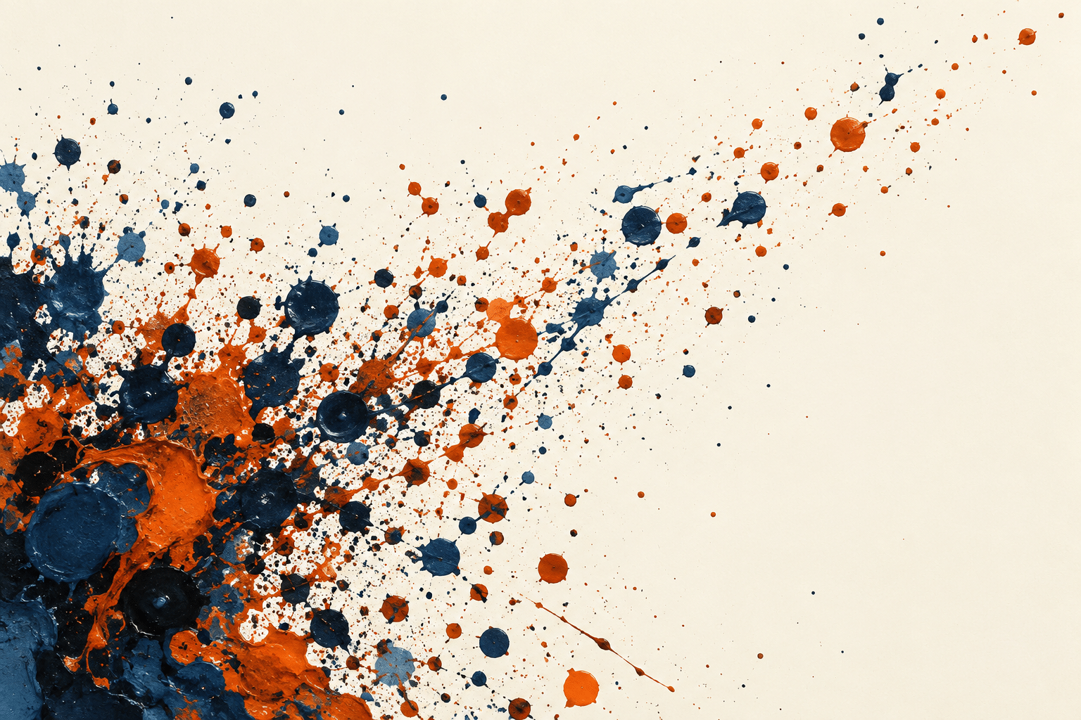
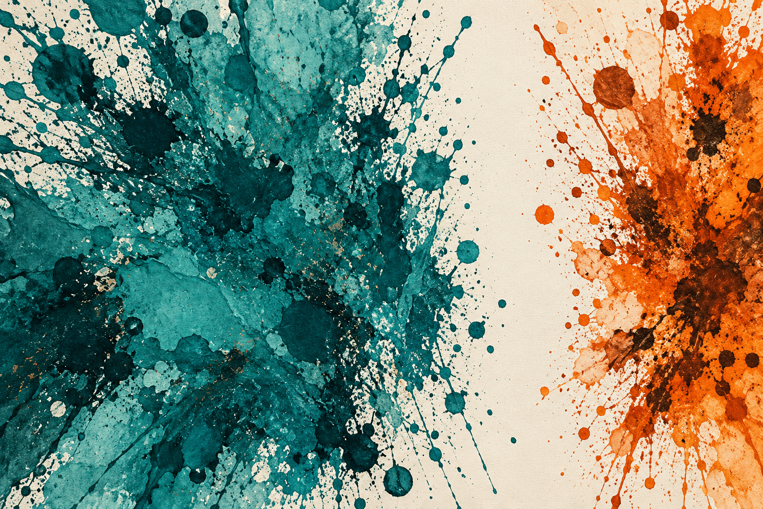
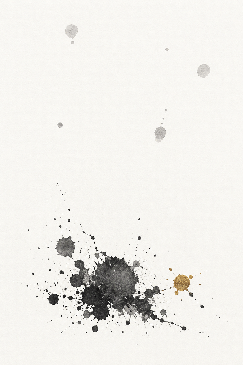
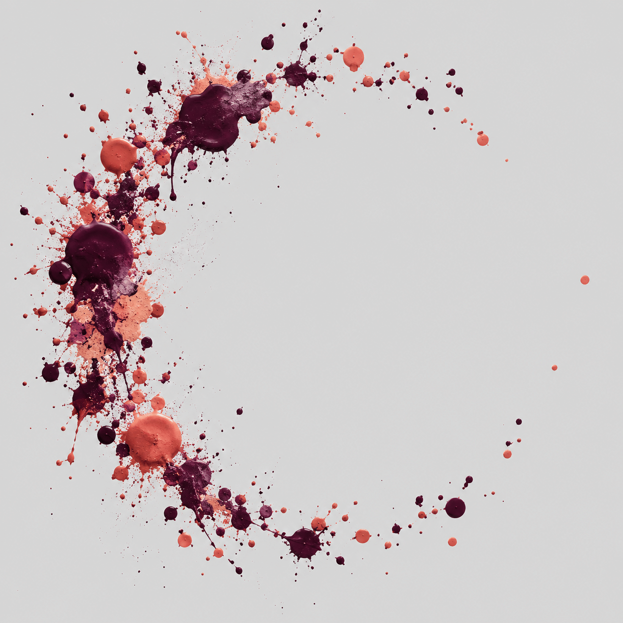
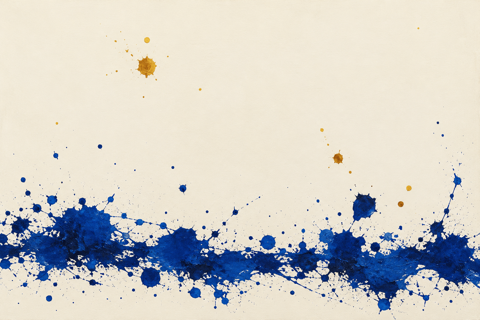
The five standalone studies explore a diagonal current, two opposing colour fields, a restrained near-monochrome composition, a hovering ring and a horizon-like band. Use them as alternative design problems, not templates to copy unchanged. Action painting and Abstract Expressionism provide historical contexts for some gestures, but neither is a synonym for this AOI framework.
Positive editorial assessment — AI-authored
A successful spatter composition makes small differences feel consequential. A narrow empty channel can hold apart two heavy fields; one large mark can slow a rapid cluster. The approach offers direct visual energy while allowing the viewer to enjoy scale, rhythm and colour without a prescribed subject.
Critical editorial assessment — AI-authored
Random coverage is the central weakness. More marks often reduce the force of existing ones, and indiscriminate colour produces muddiness rather than complexity. Edit by removing repetitive clusters, clarifying the largest mass and restoring a purposeful empty region. A lively surface still needs an intelligible structure.
Neutral editorial assessment — AI-authored
Spatterism works as abstract illustration, background art and a study of visual rhythm. It can suggest weather, motion or sound without depicting those phenomena literally. It is less useful where precise symbols or descriptive detail must carry the message. The name denotes the framework used here, not a verified worldwide movement.
A small poetic detour
Original words from the AOI studio.
Poetry
A drop is not a thought alone;
it needs the space beside its fall.
One dark arrival, one unknown,
a pause that gives a scale to all.
The crowded corner starts to lean;
the empty margin holds it still.
Between the marks, the light is seen—
the part the hand chose not to fill.
The prompt workshop
Original creative exercises. These prompts create new illustrations, not documentary evidence.
Two colours, one direction
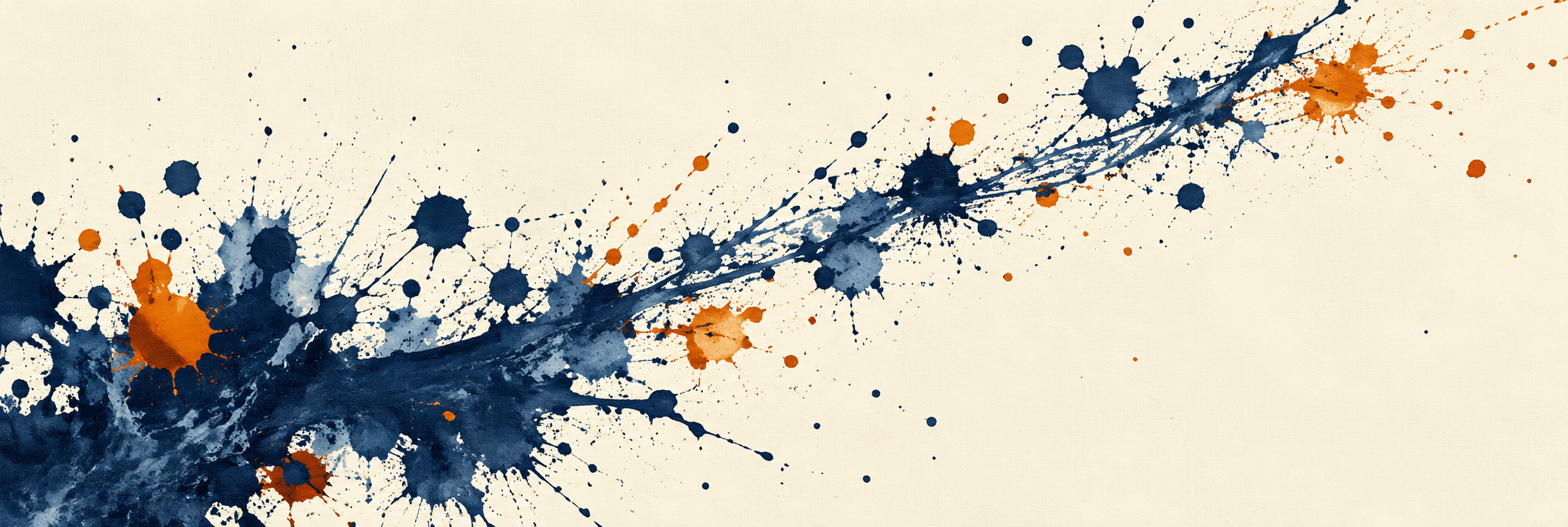
Original abstract Spatterism composition on warm white: one dense indigo cluster low left, varied droplets tapering toward upper right, a few small rust-orange interruptions, most of the opposite corner empty. No repeated stamps or lettering.
Opposing fields
Make a composed field of irregular teal and burnt-orange spatters, two unequal masses separated by a narrow clean vertical interval. Mix a few broad impacts with fine dots, preserve distinct marks and layered transparency, no literal figures or text.
Almost silence
An off-white field with a compact charcoal-grey droplet group near the lower edge and five widely separated pale marks above it. One muted gold accent, extreme restraint, varied edge behaviour, no frame or signature.
Your next inspiration
Discover another art style
Follow a visual thread to the next subject.
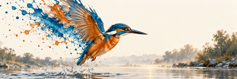
Splattered Realism: A Clear Subject at the Edge of Dissolution
Explore how dispersed marks can interact with figuration.
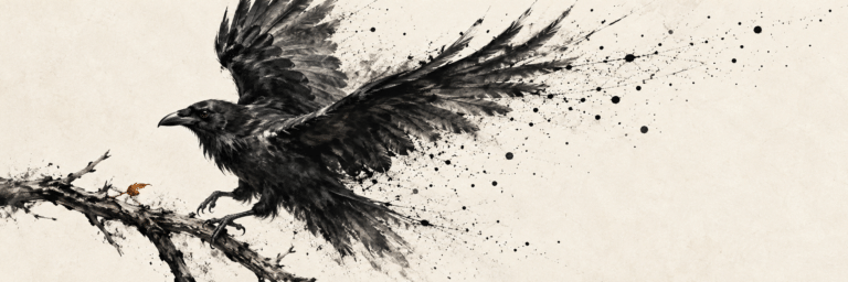
Charcoalsplatterism: Drawing Weight, Released into Motion
Compare an AOI interpretation built around charcoal.
A smile from the studio
Jokes
The empty corner was accused of doing nothing. It replied that it was holding the whole composition together.