
Compact card-printing system · visual study
Print Gocco makes the scale of a greeting card feel like a complete studio. A few ink colours, a lively line and a clear patch of paper can produce an image that is personal without being slight. This guide separates the compact printing system from the broader handmade-card look it can inspire.
A visual introduction
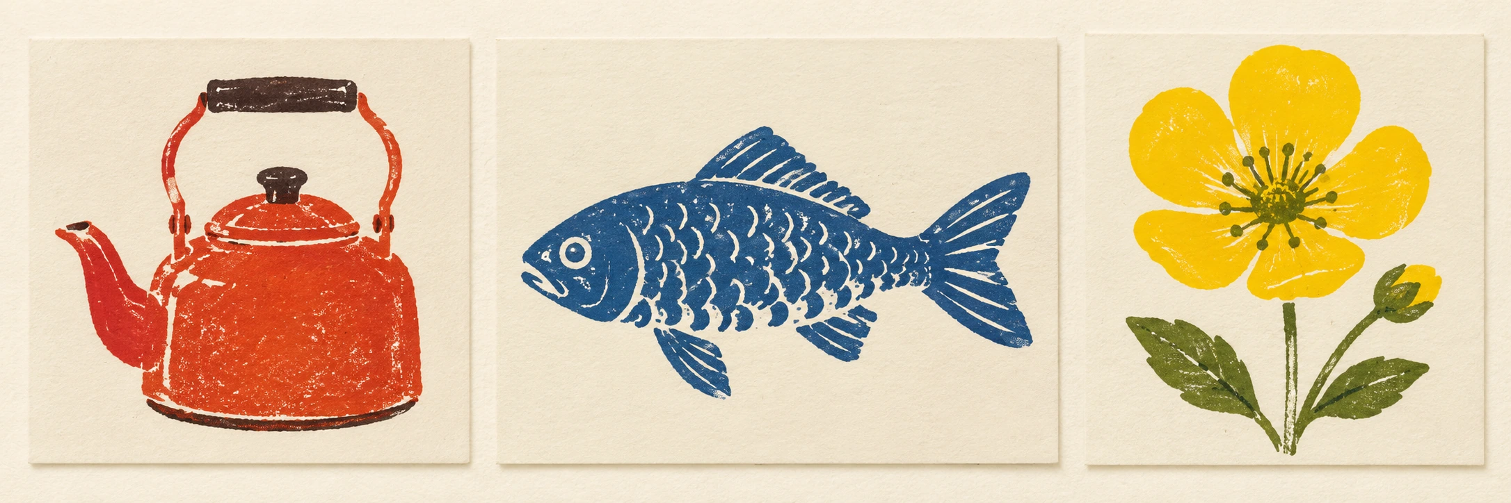
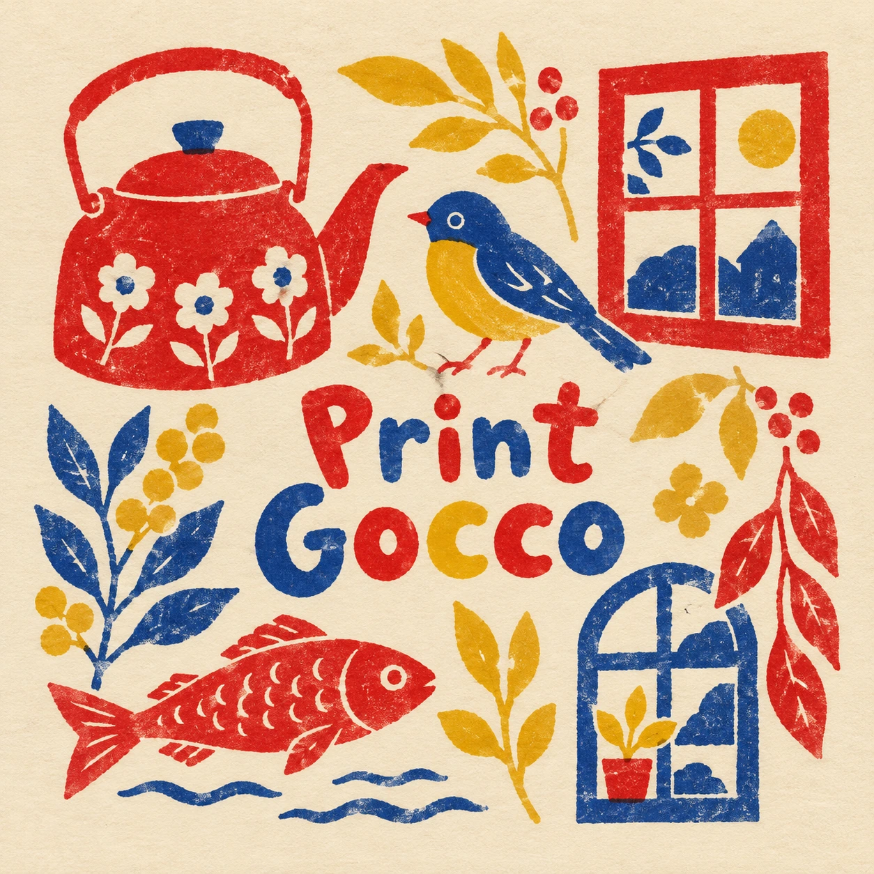
Seven original AI-generated interpretations: a dedicated banner, a centrally titled collage and five standalone studies. These are contemporary illustrations, not historical objects or proof of a physical printing process.
Select an image for a closer look. Use the thumbnails, arrow keys or a swipe to compare examples. Zoom in to inspect details, or share the image that inspires you.
Creative toolbox · take this style further
Choose an input and a destination. Search sends your words to the chosen site; Copy & open puts them on your clipboard to paste there.
Create with AI
Turn your chosen input into an image prompt or a new creative direction.
ChatGPT
Copy your input and paste it into a ChatGPT conversation or image request.
Copy & open ChatGPT (new tab)Claude · Anthropic
Develop an image prompt or explore the style in a new Claude conversation.
Copy & open Claude · Anthropic (new tab)Midjourney
Paste your input into the Imagine bar on the Create page.
Copy & open Midjourney (new tab)Adobe Firefly
Copy your input, open Firefly, and paste it into the prompt field.
Copy & open Adobe Firefly (new tab)Leonardo.Ai
Copy your input, open Leonardo, and paste it into the generation field.
Copy & open Leonardo.Ai (new tab)Image search
Find visual references. Short, concrete keywords usually work best.
Lexica
Search AI images and prompts using your selected input.
Search with this input Lexica (new tab)Pexels
Search the photo and video library. Short keywords often work best.
Search with this input Pexels (new tab)Pixabay
Search photos, illustrations and other images.
Search with this input Pixabay (new tab)Unsplash
Search photographs using the style name or your own keywords.
Search with this input Unsplash (new tab)Wikimedia Commons
Search photographs, artworks and historical images. Check each file for its source and reuse terms.
Search with this input Wikimedia Commons (new tab)Art & research
Explore artists, collections and the ideas behind a style.
Wikipedia
Search for background reading. A style may not have its own article.
Search with this input Wikipedia (new tab)WikiArt
Copy your input into WikiArt’s search to explore artists and artworks.
Copy & open WikiArt (new tab)Europeana
Paste your keywords into the search to explore European museum, library and archive collections.
Copy & open Europeana (new tab)Inspiration
Discover portfolios and visual ideas from creative communities.
Instagram hashtags
Search a hashtag made from your input: spaces and punctuation are removed. Instagram may require sign-in.
Search with this input Instagram hashtags (new tab)ArtStation
Paste your input into artwork search for concept art, environments, characters and visual development.
Copy & open ArtStation (new tab)Behance
Paste your input into project search for illustration, design and visual storytelling.
Copy & open Behance (new tab)A closer look
Intimate card-scale composition, assured drawn contours, localized colour areas, warm paper margins and modest pressure variation; economical motifs designed to read at small size.
A named system, not a generic texture
Print Gocco is the name of a compact household card-printing system developed by RISO. The manufacturer records its introduction in 1977 and describes a flash-based thermal method for preparing an image on a master, followed by pressing the inked master onto paper supported by a pad. This is more specific than the loose idea of a handmade print.
The article uses that system as a visual reference for small, direct compositions. The gallery consists of original generated card-print interpretations, not photographs of actual Gocco output. It does not demonstrate that any particular digital image could be transferred successfully to a physical master. Equipment, consumables and production settings require their own practical checks.
Small format, complete decisions
A card has little room for an uncertain focal point. Begin with a single recognizable motif and make its outline work at the intended size. A kettle, bird, flower or window can be sufficient. Keep a generous margin so the motif feels placed rather than merely cropped. The blank card is part of the design, not unused real estate waiting for another ornament.
Use a few line weights with clear jobs. A main contour may describe the kettle; lighter curves may suggest steam. The steam should not become denser than the object that releases it. Similar discipline helps a fish or bird remain expressive with very little information. Personality can come from proportion and placement rather than a large number of details.
Give each colour a role
The studies use red, cobalt and mustard as a practical limited palette. This is an editorial choice rather than a claim about all Gocco work. Keep colour regions purposeful: a red kettle may carry the weight, blue steam the movement, and a small yellow accent the surprise. Localized areas can feel lively without filling the entire card.
Avoid assuming that more colours automatically mean a better print. If a tiny shape needs several narrowly separated colours to be understood, simplify it. In physical work, consult the instructions for the actual system and materials; a visual study cannot substitute for a reliable production sequence. In a digital interpretation, judge whether the implied ink regions remain plausible and clear.
Handling without manufactured damage
A modest variation in coverage can suggest a small manually operated printing process. It should not make the image look accidentally dirty or unreadable. Keep the principal line continuous where the subject depends on it. A broken bird beak or collapsing window frame is not automatically charming because the caption says handmade.
Distinguish this approach from the familiar noisy gradient and colour-overlap vocabulary of Risograph illustration. Both references can support limited-colour art, but they are not interchangeable machines or workflows. The Gocco studies emphasize compact motifs and drawn line, while the Risograph article explores separations, tonal screens and overprinting more directly.
Five miniature compositions
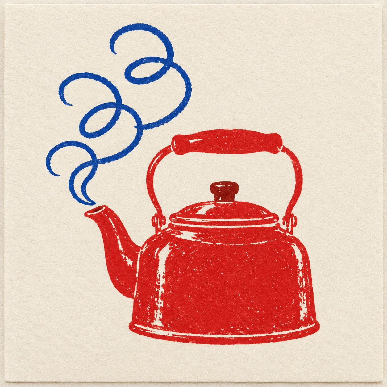
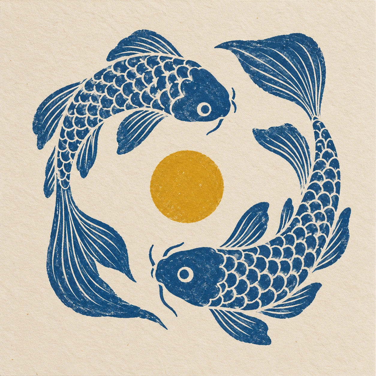
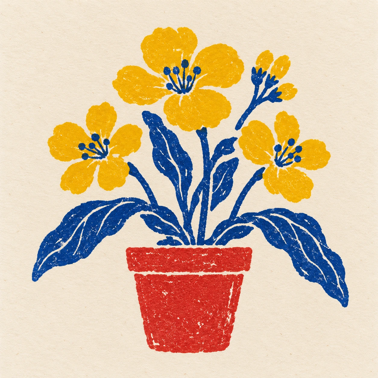
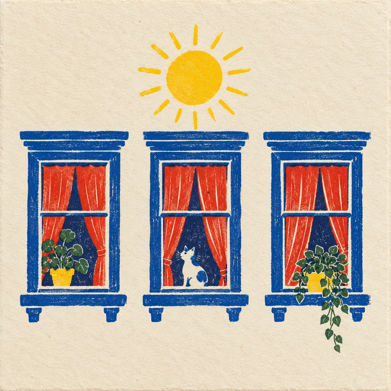
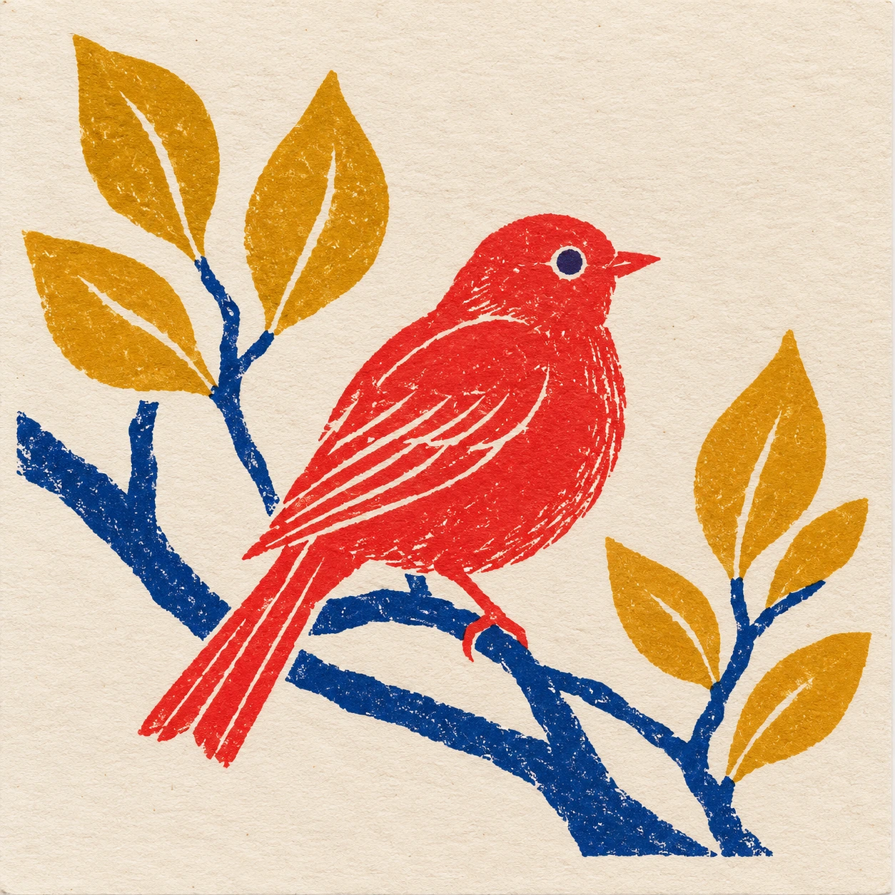
The kettle study tests a compact solid shape with rising line. The paired fish test circular movement without a border. The potted flower tests a stable base and a branching top. The windows test repetition with small differences. The bird tests a clear silhouette balanced against a spare branch. Each should feel like a complete little picture rather than a crop from a larger poster.
Inspect the images at card size. A beautifully rendered texture at full resolution may disappear when the work is reduced, while a slightly awkward contour may become more obvious. Keep the silhouette and spacing strong enough to survive. If an image needs a long caption to identify the subject, revise the drawing before adding more atmosphere.
A personal image with honest provenance
This visual language can support greeting-card concepts, small invitations, playful editorial details and studies of economical drawing. Its intimate scale encourages a direct exchange between maker and reader. That does not require sentimental content: a single odd window or stubborn kettle can carry wit if its placement and proportions are well judged.
Keep the attribution honest. Do not add a fabricated maker’s stamp or claim a generated card was produced on a particular machine. RISO’s own historical account is the source for the system’s origin here; the motifs, poems and jokes are new AOI material. The most useful contemporary interpretation learns from the limits without pretending to be an artifact of the past.
Positive editorial assessment · AI-authored
The small format encourages decisive drawing and direct communication. A kettle with a few steam loops or two circulating fish can feel complete when spacing and line weight are carefully chosen. The limited palette gives each colour a clear role, while generous paper margins preserve an intimate scale. The strongest studies feel economical without feeling empty.
Negative editorial assessment · AI-authored
The handmade-card reference becomes weak when imperfect coverage is used to excuse uncertain drawing. Excessive motifs, tiny details and indiscriminate distress quickly exhaust a small format. Reduce the subject count, strengthen the silhouette and inspect the result at actual card size. A generated image also needs honest labelling; texture does not prove it came from a Gocco device.
Neutral editorial assessment · AI-authored
Print Gocco is a specific RISO printing system, while Gocco-inspired illustration is a broader contemporary visual use. This article introduces the historical system and explores compact composition through original AI studies. It does not provide equipment-specific operating instructions or guarantee compatibility with surviving devices and consumables.
Pocket-sized facts
RISO records the introduction of Print Gocco in 1977.
The compact system combines master preparation and card printing.
Generated illustrations are not physical Gocco prints.
A small poetic detour
Original words from the AOI studio.
Poetry
A Card-Sized Room
The kettle fits; the steam can take its time.
A red bird needs one branch and half a sky.
The window keeps its blue, decisive line;
the little sun has room enough nearby.
Two fish turn round the centre of a thought.
A flower lifts its yellow into view.
The paper offers more than we have bought:
a place for what a few clear marks can do.
I send a small arrangement through the day,
no grand horizon, no elaborate claim.
A card can have a generous thing to say
before it even learns the reader’s name.
The prompt workshop
Original creative exercises. These prompts create new illustrations, not documentary evidence.
Start simple: a kettle card
Create an original Print Gocco-inspired cream card with one red kettle and cobalt steam loops. Use confident drawn contours, localized ink areas and generous margins. Add only slight coverage variation. No text or signature.
The small composition should feel complete.
Build a rhythm of windows
Design a small handmade-card-style print with three invented windows, blue frames, red curtains and one mustard sun. Vary the windows subtly while retaining coherent geometry and open paper.
Avoid letting decorative detail overwhelm card-scale readability.
Experiment: two fish, one circle
Create a compact card print of two blue fish moving around a single mustard dot. Use a few lively scale marks and balanced white space. No border or lettering.
Judge movement through placement, not added effects.
Your next inspiration
Discover another art style
Follow a visual thread to the next subject.
A smile from the studio
Jokes
The postcard expansion plan
The designer proposed a greeting card with a kettle, five birds, a city skyline and a detailed history of tea.
The printer asked which of those was the greeting.
“The whole experience,” said the designer.
They removed the skyline. Then four birds. The history of tea became a steam loop, which turned out to have excellent narrative pace.
At last the kettle sat comfortably on the card, with enough white space to look pleased about it.
The designer called the result minimalist. The printer called it finished. The remaining bird, now promoted to a separate card, called it career development.
An original fictional studio joke.
Sources and further exploration
RISO — development of Print Gocco and the compact card-printing method