
Philosophical reference and creative exercise
Positivism is a philosophical tradition, not a painting style with a fixed palette. This page distinguishes Auguste Comte’s historical ideas about knowledge and art from an original AOI workshop in careful looking. The workshop uses comparison and explicit choices without claiming that an image can eliminate interpretation.
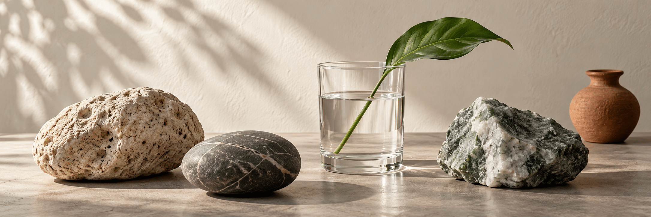
A visual introduction
Select an image for a closer look. Use the thumbnails, arrow keys or a swipe to compare examples. Zoom in to inspect details, or share the image that inspires you.



Creative toolbox · take this style further
Choose an input and a destination. Search sends your words to the chosen site; Copy & open puts them on your clipboard to paste there.
Create with AI
Turn your chosen input into an image prompt or a new creative direction.
ChatGPT
Copy your input and paste it into a ChatGPT conversation or image request.
Copy & open ChatGPT (new tab)Claude · Anthropic
Develop an image prompt or explore the style in a new Claude conversation.
Copy & open Claude · Anthropic (new tab)Midjourney
Paste your input into the Imagine bar on the Create page.
Copy & open Midjourney (new tab)Adobe Firefly
Copy your input, open Firefly, and paste it into the prompt field.
Copy & open Adobe Firefly (new tab)Leonardo.Ai
Copy your input, open Leonardo, and paste it into the generation field.
Copy & open Leonardo.Ai (new tab)Image search
Find visual references. Short, concrete keywords usually work best.
Lexica
Search AI images and prompts using your selected input.
Search with this input Lexica (new tab)Pexels
Search the photo and video library. Short keywords often work best.
Search with this input Pexels (new tab)Pixabay
Search photos, illustrations and other images.
Search with this input Pixabay (new tab)Unsplash
Search photographs using the style name or your own keywords.
Search with this input Unsplash (new tab)Wikimedia Commons
Search photographs, artworks and historical images. Check each file for its source and reuse terms.
Search with this input Wikimedia Commons (new tab)Art & research
Explore artists, collections and the ideas behind a style.
Wikipedia
Search for background reading. A style may not have its own article.
Search with this input Wikipedia (new tab)WikiArt
Copy your input into WikiArt’s search to explore artists and artworks.
Copy & open WikiArt (new tab)Europeana
Paste your keywords into the search to explore European museum, library and archive collections.
Copy & open Europeana (new tab)Inspiration
Discover portfolios and visual ideas from creative communities.
Instagram hashtags
Search a hashtag made from your input: spaces and punctuation are removed. Instagram may require sign-in.
Search with this input Instagram hashtags (new tab)ArtStation
Paste your input into artwork search for concept art, environments, characters and visual development.
Copy & open ArtStation (new tab)Behance
Paste your input into project search for illustration, design and visual storytelling.
Copy & open Behance (new tab)A closer look
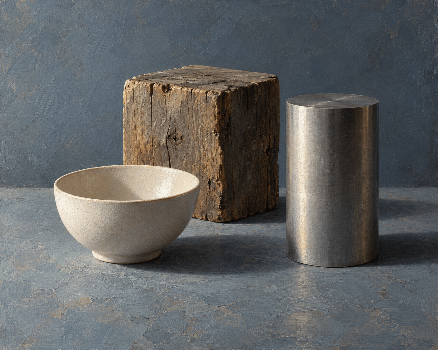
The teaching images use clear viewpoints, deliberate spacing, material differences and readable light. These choices help a viewer compare forms; they are not identifying features of a historical Positivist school. A visibly orderly image can still be imagined, selective or misleading.
A philosophy, not a visual recipe
Positivism is associated with philosophical accounts of knowledge, especially the work of Auguste Comte, rather than with a standard visual-art school. It cannot be identified by one palette, brushstroke or favored subject. Any artistic exercise based on measurement or observation is an interpretation of a broad idea, not proof of membership in a “Positivist art movement.” Philosophical history and a creative image brief should therefore remain separate.
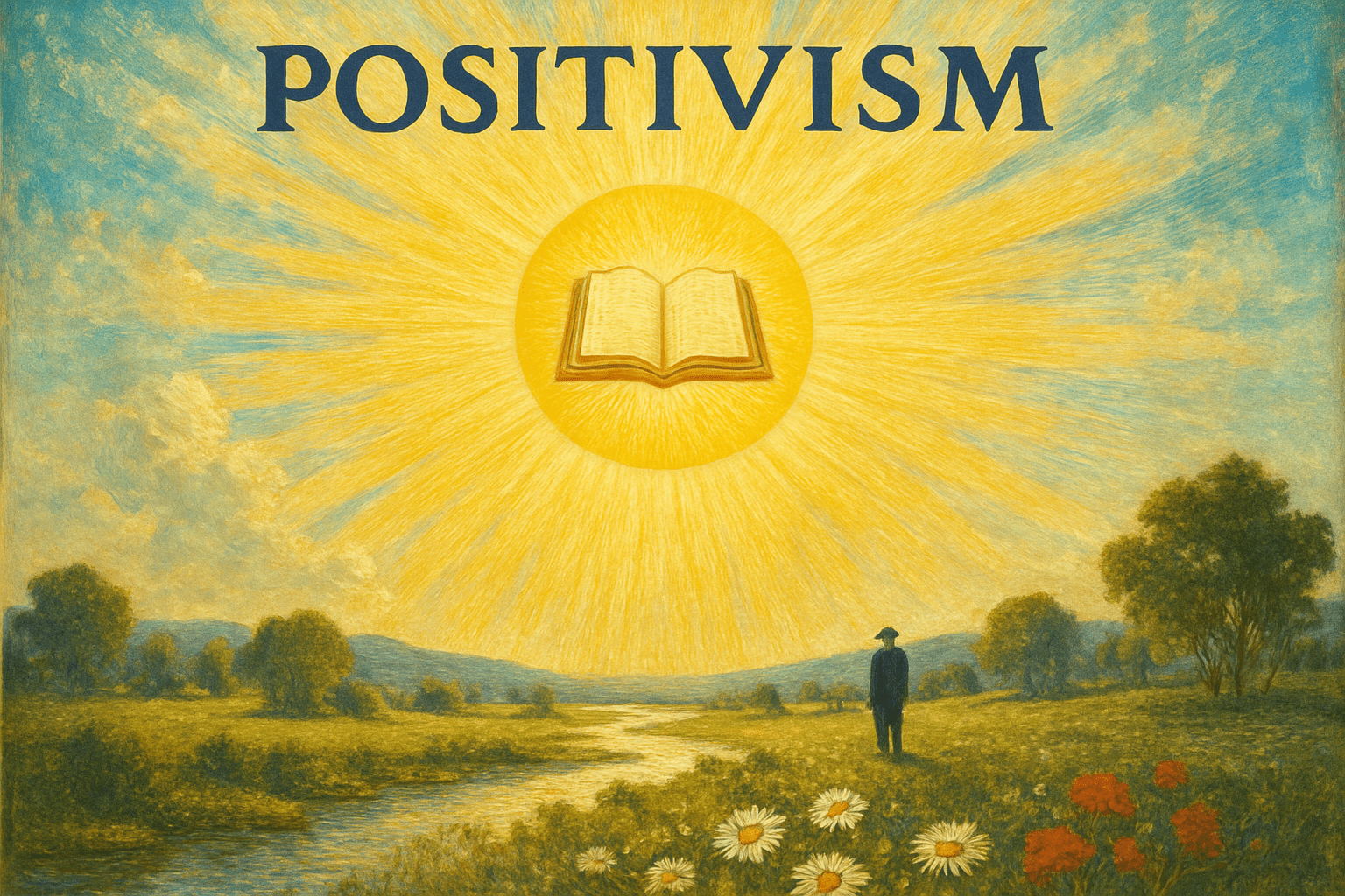
The word does not mean optimism, cheerful subject matter or a bright palette. Nor should an image become “positivist” simply because it looks precise. Separate three questions: what a philosopher argued, what a particular artist made, and what a present-day exercise asks you to do. Confusing those levels produces a tidy label at the cost of a useful explanation.
Comte in context
Auguste Comte (1798–1857) developed positivism as a philosophical and political project. The Stanford Encyclopedia of Philosophy identifies his Course on Positive Philosophy, published in 1830–1842, and his later System of Positive Polity as major works. His concerns extended beyond laboratory procedure to the organization of knowledge and social life.
The same account emphasizes the importance of feeling, ethics and religion in his later thought. This matters for art: a summary that makes Comte an advocate of nothing but detached measurement leaves out much of his project. His historical model of intellectual development is a theory to examine critically, not a neutral scale for ranking people or cultures.
What Comte actually says about art
Chapter V of A General View of Positivism addresses the relationship directly. Comte disputes the assumption that positivism must be hostile to imagination. He argues for connections among feeling, reason and artistic activity, and assigns art an idealizing and socially formative role. The primary text is more complicated than the slogan that only observable facts matter.
It also contains prescriptive hierarchies: Comte limits the governing role he would give artists and assigns women particular domestic and moral functions. These are historical positions, not principles this workshop endorses. Read the chapter as an argument situated in its period. Its interest lies partly in the tension between the importance it gives art and the restrictions it places around artistic and social roles.
AOI looking and making workshop
AOI’s exercise is to make the basis of an image inspectable. Choose a simple object, a consistent light and a limited viewpoint, then record visible relationships before inventing a story. A series of the same plant at different stages can reveal more than a dramatic isolated picture. Distinguish observed features from imaginative additions in the caption. This is a practical discipline for looking, not a claim that art can or should eliminate interpretation. The prompts explore ordered comparison while leaving room for composition and personal choice.
The practical question is simple: which part of the picture comes from what you saw, and which part comes from a decision you made? A chosen frame, a simplified contour or a changed colour may be entirely justified. Make the distinction available to the viewer instead of treating an orderly finish as a guarantee of truth.
Start with a question you can see
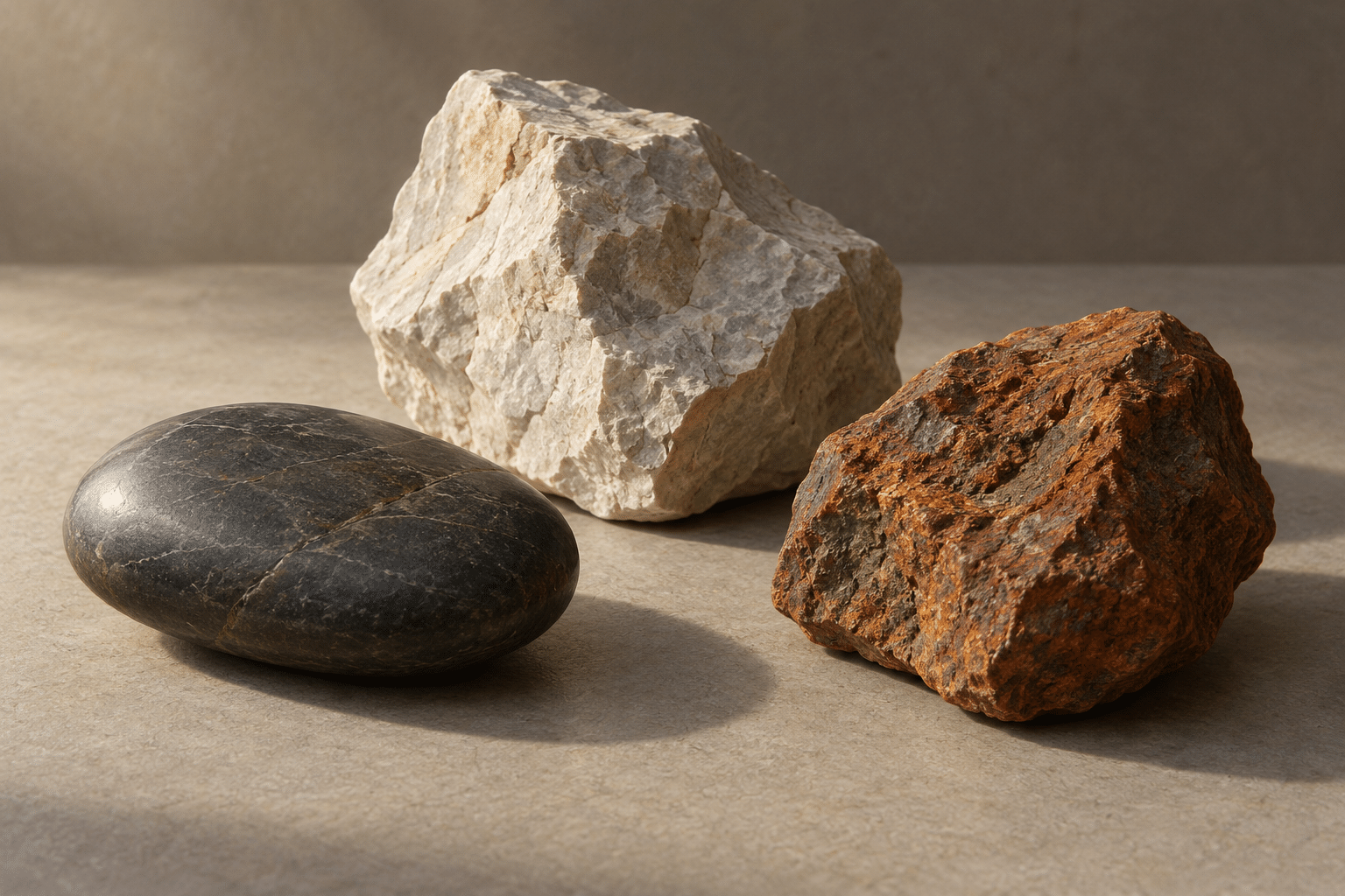
Place three objects under one light and choose a question: how does roughness change a highlight, how does a curved surface turn into shadow, or how does spacing affect apparent balance? Keep the question narrow enough that the picture can answer it. An elaborate arrangement may be attractive while making the comparison harder to follow.
Describe visible relationships before assigning meanings. One stone may be darker, flatter or more porous-looking than another. Those observations do not establish its geological identity, age or history. If identification matters, consult appropriate evidence. In an invented image, even apparently convincing surface details are part of the illustration rather than measurements of an actual object.
Control the comparison, acknowledge the choices
Use a consistent viewpoint and similar lighting when differences between objects are the subject. Keep enough space around each form to see its boundary and cast shadow. If scale changes for clarity, say so. If a detail is enlarged or simplified, explain that choice. A comparative arrangement works best when its conditions can be understood.
A sequence can reveal change, but it can also suggest a story that never happened. A generated plant shown at three stages is an imagined sequence, not evidence of growth over time. For observational work, record the actual dates and conditions separately. For an illustration, label the sequence as hypothetical and avoid invented data, measurements or scientific-looking annotations.
Material, light and composition
A matte ceramic object, a piece of wood and a metal surface respond differently to light. Compare broad value transitions, sharp reflections and the behaviour of edges. Use a simple background to keep these differences readable. The purpose of restraint is to support attention, not to imply that muted colours are intellectually superior.
Composition still matters. Empty space can isolate a specimen, a diagonal can lead the eye through a comparison and repeated intervals can make small differences easier to notice. These are artistic devices. A beautiful arrangement does not invalidate careful looking, but it should not hide which relationships have been selected or staged.
Let interpretation remain visible
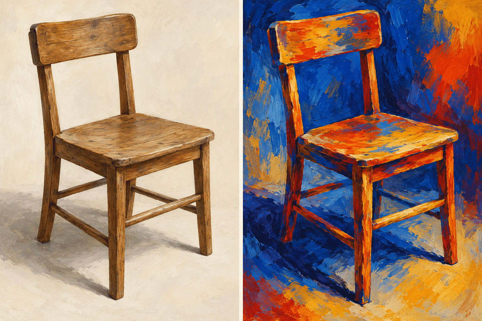
Make two images of one chair. In the first, emphasize proportion, contact with the floor and the direction of light. In the second, change the colour relationships to express unease, warmth or memory. Keep enough of the object recognizable for comparison. The exercise makes different purposes visible without declaring one picture true and the other worthless.
Interpretation is already present in the first image: you chose the chair, the viewpoint, the light and the level of detail. The second simply makes some choices more conspicuous. Discuss what each version helps a viewer notice and what each leaves out. Observation and imagination can inform one another without being treated as interchangeable forms of evidence.
What these images can and cannot demonstrate
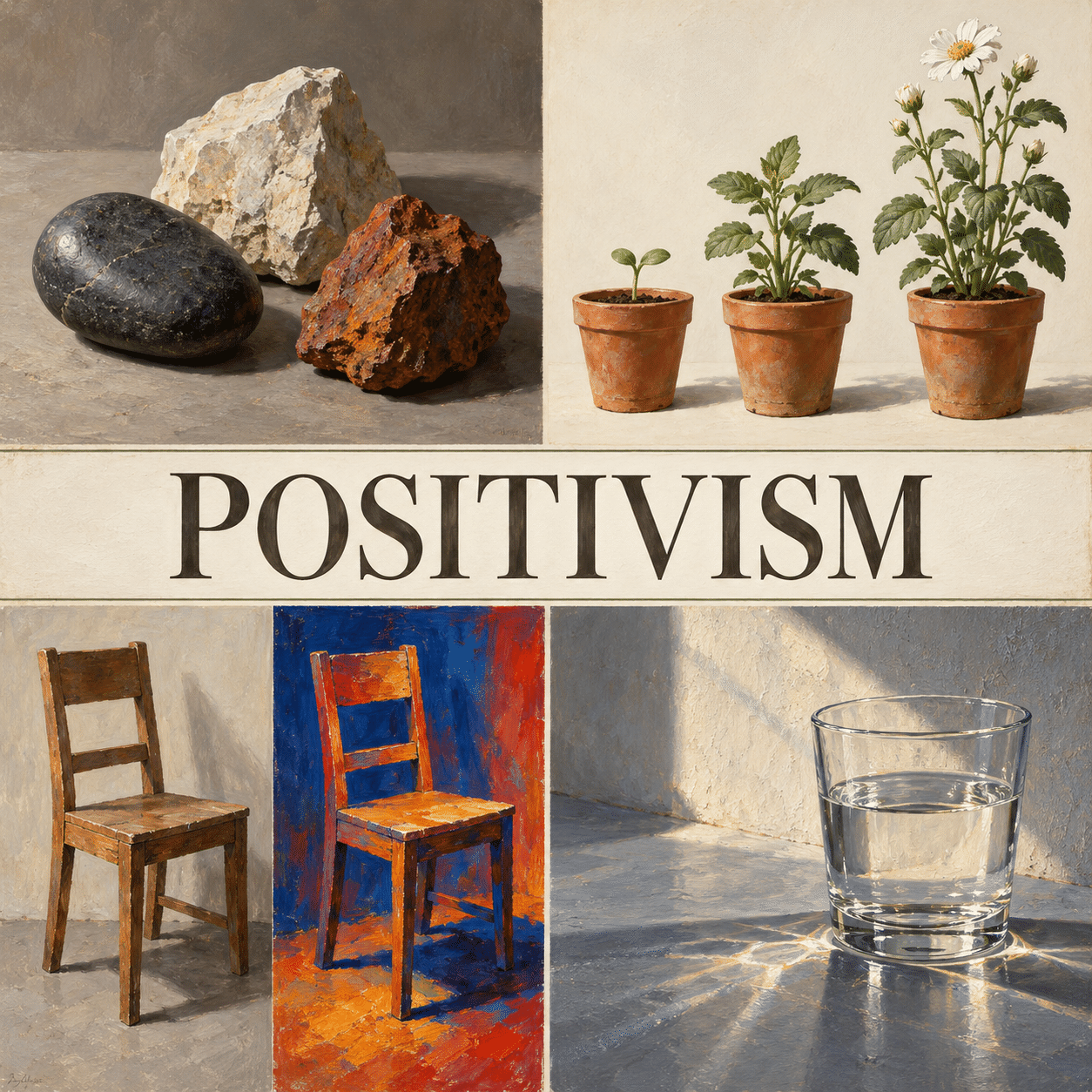
The new gallery contains AI-generated studies of stones, an imagined plant sequence, a chair diptych, glass and light, and contrasting materials. They illustrate possible exercises. They are not historical Positivist artworks, scientific records or demonstrations that a generator has measured the world correctly.
For your own project, pair the image with a short account of its purpose, source and alterations. Avoid labels that promise certainty the process cannot support. The most useful outcome may be a better question: what would need to be observed, checked or changed before this image could support the claim you want to make?
Positive editorial assessment — AI-authored
The observation workshop can sharpen attention by giving a picture a clear question and a comparison that viewers can follow. Explicit choices and modest claims make room for both visual pleasure and thoughtful scrutiny. The philosophical context also challenges the easy assumption that reason and imagination must be enemies.
Critical editorial assessment — AI-authored
Orderly composition can create an undeserved appearance of authority. Measured-looking diagrams, invented sequences and confident captions may persuade without supplying evidence. Improve the exercise by stating what was observed, what was constructed and what remains uncertain; do not turn the philosophical label into a certificate of accuracy.
Neutral editorial assessment — AI-authored
This page combines a brief historical introduction with an explicitly contemporary AOI exercise. It does not establish a historical painting movement or prescribe a universal way to make art. Its methods are useful for studies and comparisons when the relationship between illustration, observation and interpretation stays clear.
Pocket-sized facts
Positivism is not a synonym for optimism or a fixed painting style.
Comte discussed art and imagination directly in A General View of Positivism.
AI-generated study images are illustrations, not observational measurements.
A small poetic detour
Original words from the AOI studio.
Poetry
Three stones receive the morning light;
the paper keeps their shadows near.
I draw the edge that meets my sight,
then mark the choices gathered here.
The measured-looking line can stray,
the brightest surface still conceal;
leave room for questions in the grey,
and say what makes the picture real.
The prompt workshop
Original creative exercises. These prompts create new illustrations, not documentary evidence.
An observation table
Create an original illustration of three stones on a plain table under consistent side light, emphasizing observable differences in shape, surface and shadow. Use no invented measurements or scientific labels.
A comparative study
Create a carefully arranged visual study of the same fictional plant at three growth stages, consistent viewpoint and scale cues, restrained color and clear spacing. Present it as an illustration, not recorded experimental data.
Observation meets interpretation
Create a diptych of a simple chair: one panel a measured-looking observational study, the other a color-based emotional interpretation. Keep the object recognizable and make the different visual purposes clear.
Your next inspiration
Discover another art style
Follow a visual thread to the next subject.
Classical Realism: Observation, Craft and the Contemporary Atelier
Compare a painting tradition concerned with observation and representation, without treating it as a synonym for positivism.

Algorithmic Art: Rules, Variation and the Art of Choosing
Compare explicit rules for making images with claims about what images can demonstrate.
A smile from the studio
Jokes
The still life looked perfectly objective until the pear asked who had chosen its better side.