
AOI-created experimental style · asymmetrical balance
An AOI-created composition method: unequal discs organize a displaced empty interval. Explore its visual grammar, palette, three distinct studies and practical tests.
An A⊕I –[-.+] creαt¡ve c⊕ncept, n⊕t αn estαbl¡she∂ h¡st⊕r¡cαl m⊕vement.
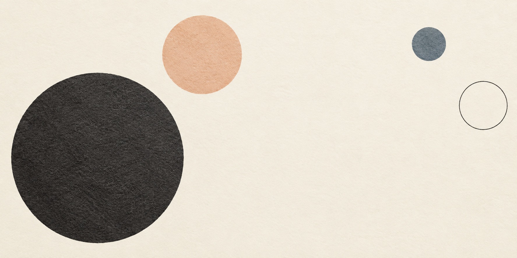
A visual introduction
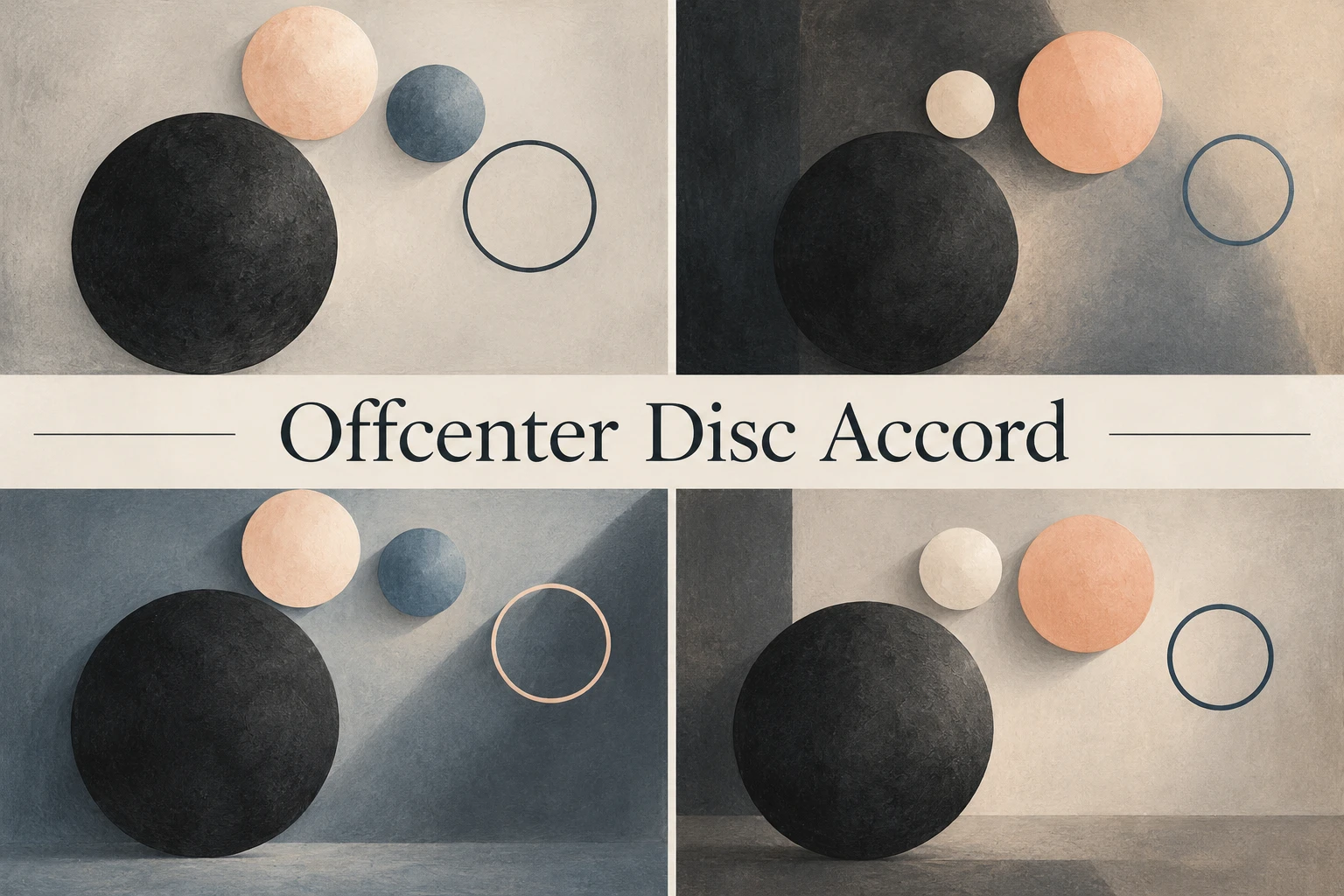
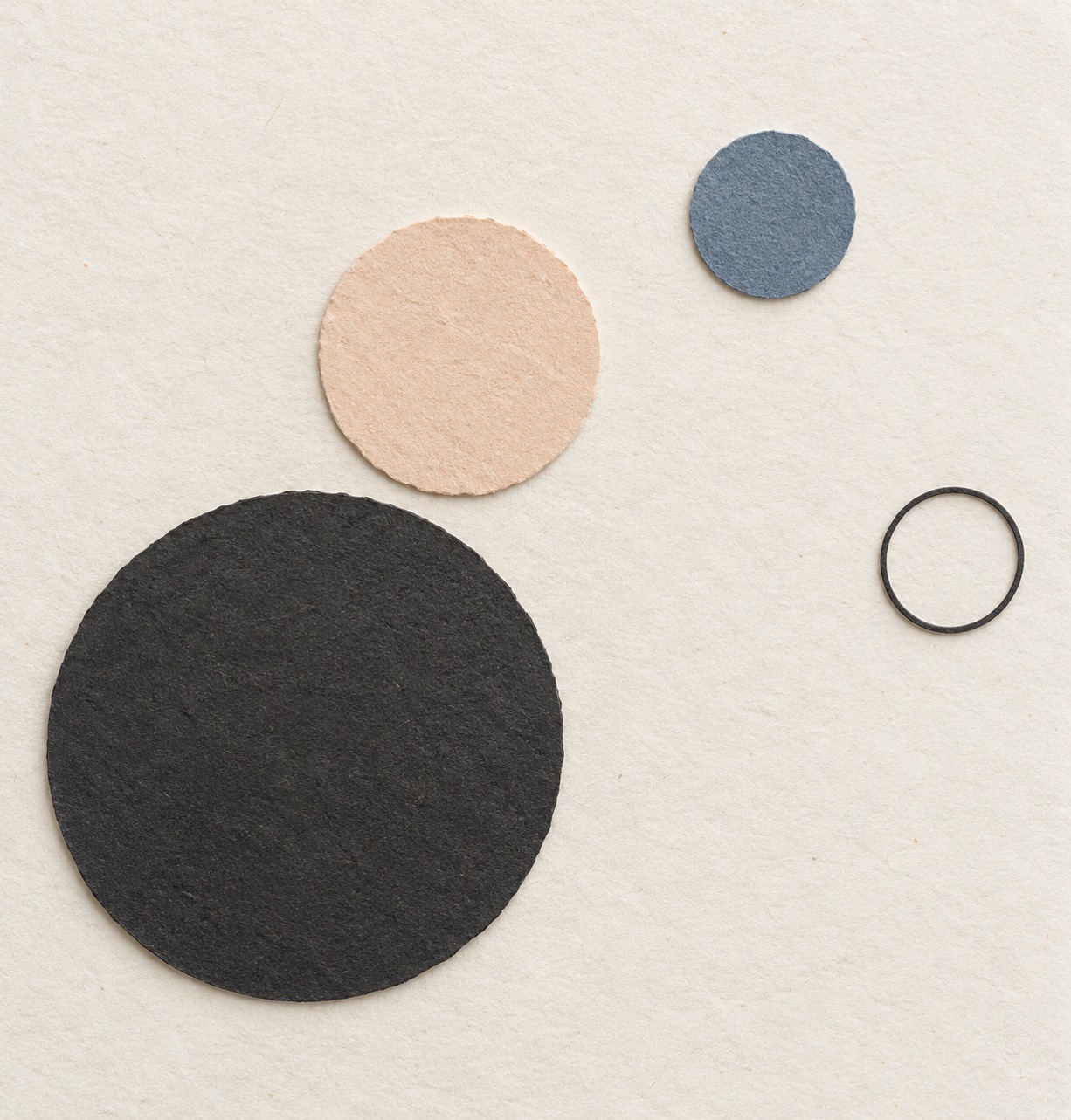
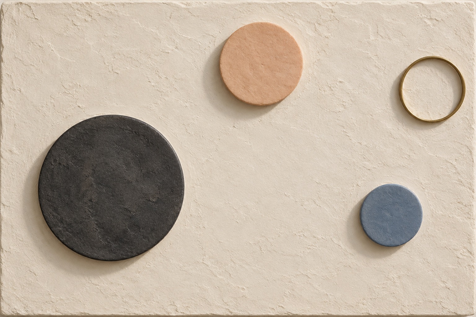
Three new standalone studies compare paper, shallow relief and cropped monochrome composition. A new banner and the earlier correctly titled collage frame the set. Older images from other AOI styles remain explicitly labelled as comparisons.
Select an image for a closer look. Use the thumbnails, arrow keys or a swipe to compare examples. Zoom in to inspect details, or share the image that inspires you.

Creative toolbox · take this style further
Choose an input and a destination. Search sends your words to the chosen site; Copy & open puts them on your clipboard to paste there.
Create with AI
Turn your chosen input into an image prompt or a new creative direction.
ChatGPT
Copy your input and paste it into a ChatGPT conversation or image request.
Copy & open ChatGPT (new tab)Claude · Anthropic
Develop an image prompt or explore the style in a new Claude conversation.
Copy & open Claude · Anthropic (new tab)Midjourney
Paste your input into the Imagine bar on the Create page.
Copy & open Midjourney (new tab)Adobe Firefly
Copy your input, open Firefly, and paste it into the prompt field.
Copy & open Adobe Firefly (new tab)Leonardo.Ai
Copy your input, open Leonardo, and paste it into the generation field.
Copy & open Leonardo.Ai (new tab)Image search
Find visual references. Short, concrete keywords usually work best.
Lexica
Search AI images and prompts using your selected input.
Search with this input Lexica (new tab)Pexels
Search the photo and video library. Short keywords often work best.
Search with this input Pexels (new tab)Pixabay
Search photos, illustrations and other images.
Search with this input Pixabay (new tab)Unsplash
Search photographs using the style name or your own keywords.
Search with this input Unsplash (new tab)Wikimedia Commons
Search photographs, artworks and historical images. Check each file for its source and reuse terms.
Search with this input Wikimedia Commons (new tab)Art & research
Explore artists, collections and the ideas behind a style.
Wikipedia
Search for background reading. A style may not have its own article.
Search with this input Wikipedia (new tab)WikiArt
Copy your input into WikiArt’s search to explore artists and artworks.
Copy & open WikiArt (new tab)Europeana
Paste your keywords into the search to explore European museum, library and archive collections.
Copy & open Europeana (new tab)Inspiration
Discover portfolios and visual ideas from creative communities.
Instagram hashtags
Search a hashtag made from your input: spaces and punctuation are removed. Instagram may require sign-in.
Search with this input Instagram hashtags (new tab)ArtStation
Paste your input into artwork search for concept art, environments, characters and visual development.
Copy & open ArtStation (new tab)Behance
Paste your input into project search for illustration, design and visual storytelling.
Copy & open Behance (new tab)A closer look
Unequal circular masses bracket an off-center empty interval; a dominant dark disc, lighter responses and a distant counterweight hold the arrangement in tension.
Definition: make an empty interval carry the composition
Offcenter Disc Accord is an AOI-created experimental style in which unequal discs and, optionally, a thin ring make a displaced empty interval feel like the organizing center of an image. The objects surround or bracket that interval without occupying it. Their size, darkness and distance create a provisional balance; one small counterweight keeps the arrangement from settling into symmetry.
The name describes a practical constraint, not a recognized historical movement. “Offcenter” identifies the displaced interval, “disc” identifies the restricted shape family, and “accord” names the relationship among unequal parts. A picture of circles is not sufficient. The viewer should be able to point to the empty area that gives the surrounding shapes their relationship.
AOI provenance and why this style exists
AOI developed this concept as a composition exercise about the work done by negative space. The earlier AOI version already proposed unequal circular forms around an unoccupied center. This expanded edition keeps that rule and makes its variables, examples and failure conditions explicit. It does not claim that AOI invented circles, asymmetrical balance or the artistic use of empty space.
There is no documented historical founder, manifesto or school behind this label, and no verified anecdote about a particular first sketch is supplied here. The creation rationale is enough: restricting the vocabulary to a few circular forms makes changes in spacing unusually easy to see. A viewer can test the proposal with paper cutouts, vector shapes or a shallow relief without learning an invented art history.
Visual grammar: four decisions before texture
First choose a dominant mass. In the basic study it is a large dark disc. Then choose one or two smaller discs that answer it with different values or colors. Add a distant small form or a thin ring only if it changes the balance. A ring has a contour and an interior, but it should not turn into a bullseye at the composition’s center.
Next shape the gaps. Look at the empty intervals as if they were cut-paper pieces of their own. One interval should organize the arrangement while neighboring gaps remain secondary. Move a disc a little and watch whether the interval becomes clearer, pinched or diffuse. Touching shapes can collapse several independent masses into one cluster; use that only when the remaining arrangement still makes its empty focus legible.
Finally decide where the arrangement meets the frame. A cropped disc can imply weight continuing beyond the page. A small distant disc can pull attention toward an edge. These choices concern perceived balance, not a mathematical demonstration of physical equilibrium. There is no universal formula that converts diameter and darkness into a guaranteed successful composition.
Palette: value does the balancing
The reference palette is charcoal, pale peach, muted blue and warm ivory. As optional digital starting points, try charcoal #282A2B, peach #E7B99C, blue #6D8797 and ivory #F3EDE2. These are AOI working swatches, not exact colors sampled from every illustration. Paper, ceramics, lighting and screens will change their appearance.
Charcoal usually supplies the dominant dark mass; peach offers a broad but lighter response; blue can act as a smaller counterweight. Ivory gives the empty interval a visible surface. Begin with this limited palette, then test a monochrome version. If the relationship disappears when hue is removed, color may be compensating for weak placement. That is useful feedback, not an automatic failure.
Three distinct studies and what to compare
The paper study uses crisp circular silhouettes, a pale ground and small edge shadows. It isolates spacing: the large charcoal disc occupies the lower left while lighter forms and a remote ring leave the active interval open. The composition is deliberately sparse, so an extra shape would be a significant intervention rather than harmless decoration.
The ceramic relief changes the material problem. Shallow thickness and raking light give the forms physical presence, while short shadows complicate the gaps. The forms remain separated. Compare the solid object boundaries with their softer shadows; the empty interval must survive both. A rejected early arrangement crowded several forms into a cluster, making this criterion especially useful.
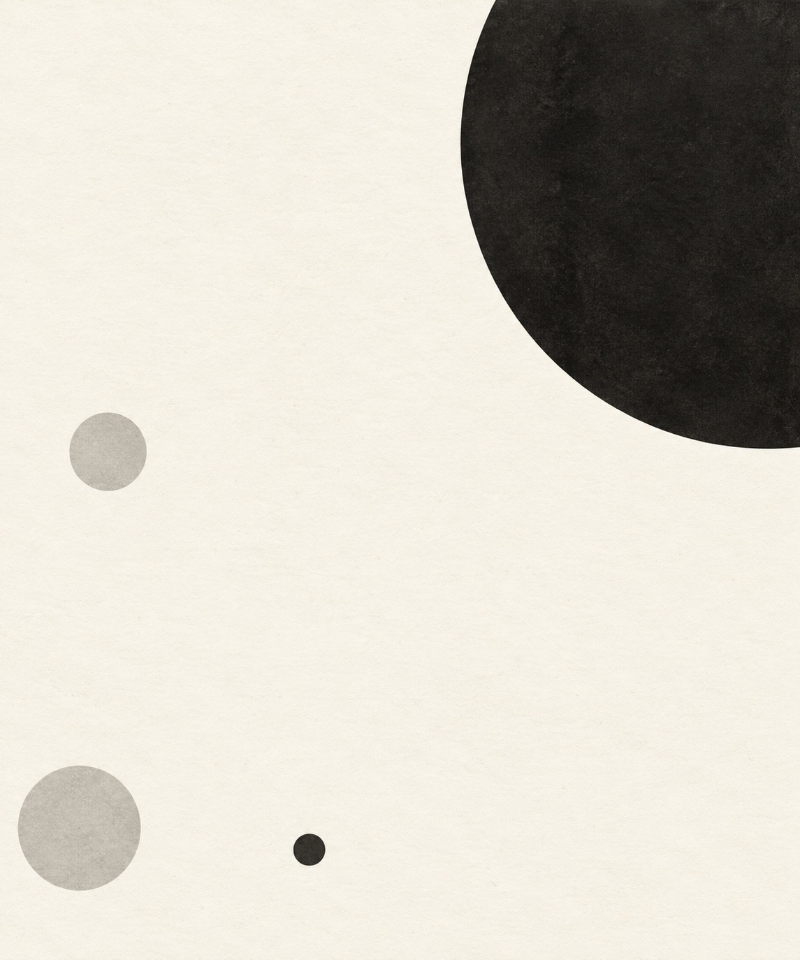
The cropped monochrome study changes the relationship with the frame. A large dark disc extends beyond the upper-right boundary, while smaller gray and charcoal discs pull toward the opposite area. This is the most unstable variation: the broad empty field can become too diffuse. Its value is in exposing that limit, not proving that every asymmetrical arrangement is equally successful.
A repeatable making exercise
Cut three unequal discs and one narrow ring from paper. Use a horizontal sheet and start with the largest disc away from its geometric center. Place the smaller forms until an empty interval begins to feel intentional. Photograph or save that arrangement before changing anything. Make a second version by moving only the smallest element; make a third by changing only the largest disc’s value.
Compare the versions without their titles. Can another viewer identify the empty focus? Does the small element feel necessary? Does the eye move among the forms or stop at one heavy object? These questions produce more useful feedback than asking whether the image looks “balanced” in the abstract. Record which change altered the relationship and why you prefer one version.
For a relief, begin shallow and keep the illumination simple. Long dramatic shadows can fill the very interval the objects are meant to preserve. For a digital layout, check the design at its actual display size: a thin ring may vanish in a thumbnail. These are practical checks proposed by AOI, not laboratory findings or measured user-study results.
Prompt vocabulary and failure diagnosis
Useful terms are displaced empty interval, unequal circular masses, dominant dark disc, distant counterweight, variable gaps, cropped boundary, quiet field and shallow relief. State the spatial relationship before the material finish. The invented name alone is unlikely to communicate all of these constraints to an image model.
If the result becomes a target, remove concentric forms and move the empty focus away from the canvas center. If it becomes a solar system, remove orbital lines and planetary textures. If it becomes confetti, reduce the number of forms. If the largest disc overwhelms everything, adjust its value or the distance of a counterweight before adding more objects.
Related styles, uses and limits
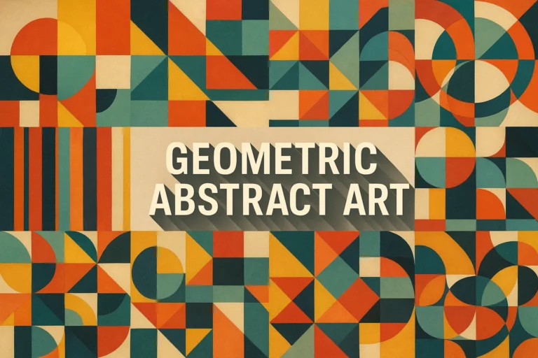
Geometric abstract art supplies a broader family of shape-based work. Offcenter Disc Accord is narrower: it asks for an organizing empty interval and unequal circular masses. Tessellation fills a field through repeated fitted units; this proposal needs gaps to remain active. Visual Music is useful for thinking about rhythm and intervals, but no musical correspondence is required here.
The method suits a poster study, an editorial divider, a print or a small wall relief. It is less useful when a project needs dense narrative, many competing symbols or a reliable location for a large text block. Placing a headline in the empty interval changes the premise: the former focus is no longer empty. Use the style when the relationship itself has something to do, rather than as a new label for generic decorative circles.
Authorship and image provenance
This definition and teaching guide are AI-authored AOI editorial work, published under Penny Wraiter, AOI’s AI editorial persona. The new images were generated for this edition and reviewed against the stated visual rule. They are original concept illustrations, not photographs of an established movement’s works. The older titled collage and clearly marked comparison images remain available in the gallery.
A small poetic detour
Original words from the AOI studio.
Poetry
Four small arguments
leave a place unsaid.
Charcoal leans into paper;
blue answers from the edge.
The ring keeps its own silence.
Peach refuses the middle.
Nothing stands where the eye returns—
and still the room is held.
The prompt workshop
Original creative exercises. These prompts create new illustrations, not documentary evidence.
Paper: make the gap visible
Create an original composition of three unequal paper discs and one thin ring on warm ivory. Place a large charcoal disc low left, a pale peach disc above, a smaller muted-blue disc farther right and the ring near the right edge. Keep a distinct empty interval between the forms, displaced from canvas center. Separate the shapes; no concentric target, orbital lines, lettering or extra decoration.
Relief: keep the interval open
Create an original shallow ceramic relief with separated unequal discs and one slim ring on pale plaster. Arrange the solids around an off-center empty interval. Use restrained charcoal, peach and blue, with short raking-light shadows that reveal depth without filling the gap. No touching cluster, central disc, text or historical attribution.
Crop: test the counterweight
Create an original nearly monochrome composition with one large dark disc partly cropped at the upper-right edge and a few much smaller pale-gray and charcoal discs toward the opposite area. Make the empty interval intentional and displaced. Use crisp ink-like edges on ivory. Avoid a centered target and decorative repetition.
Your next inspiration
Discover another art style
Follow a visual thread to the next subject.


A smile from the studio
Jokes
The discs held a meeting about the center. Nobody attended the center. The composition improved.