
Commercial graphic design · destination posters
Explore midcentury travel posters through bold shapes, destination imagery, museum examples, color hierarchy and original AI illustration prompts.
A visual introduction
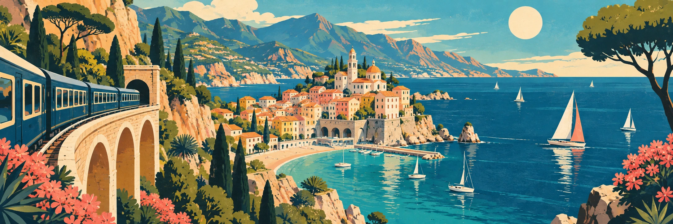
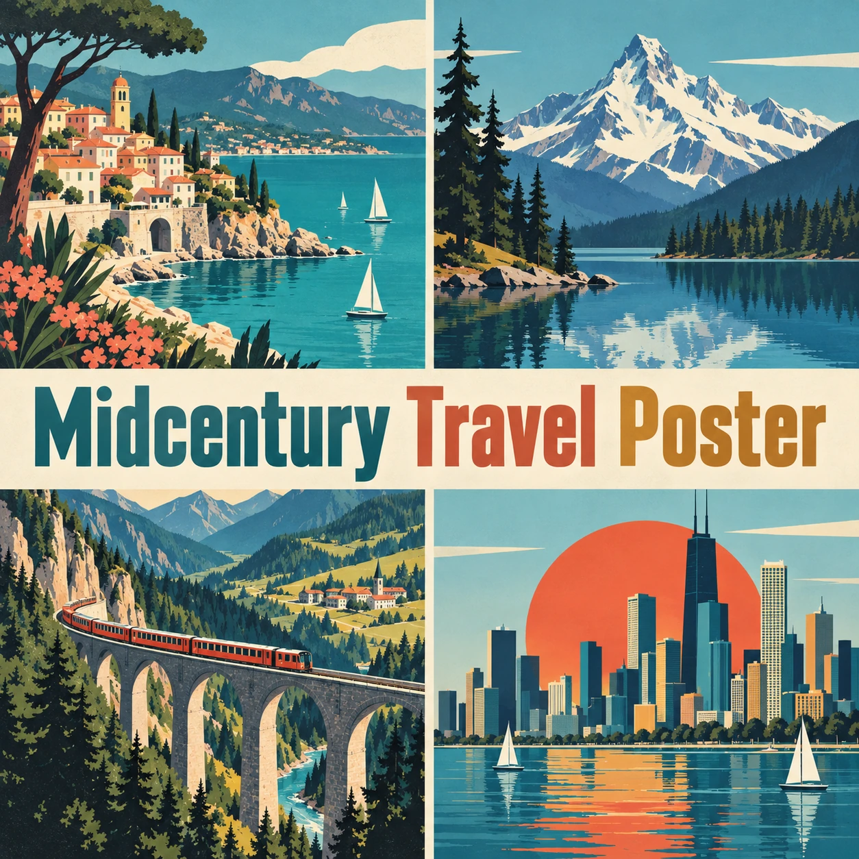
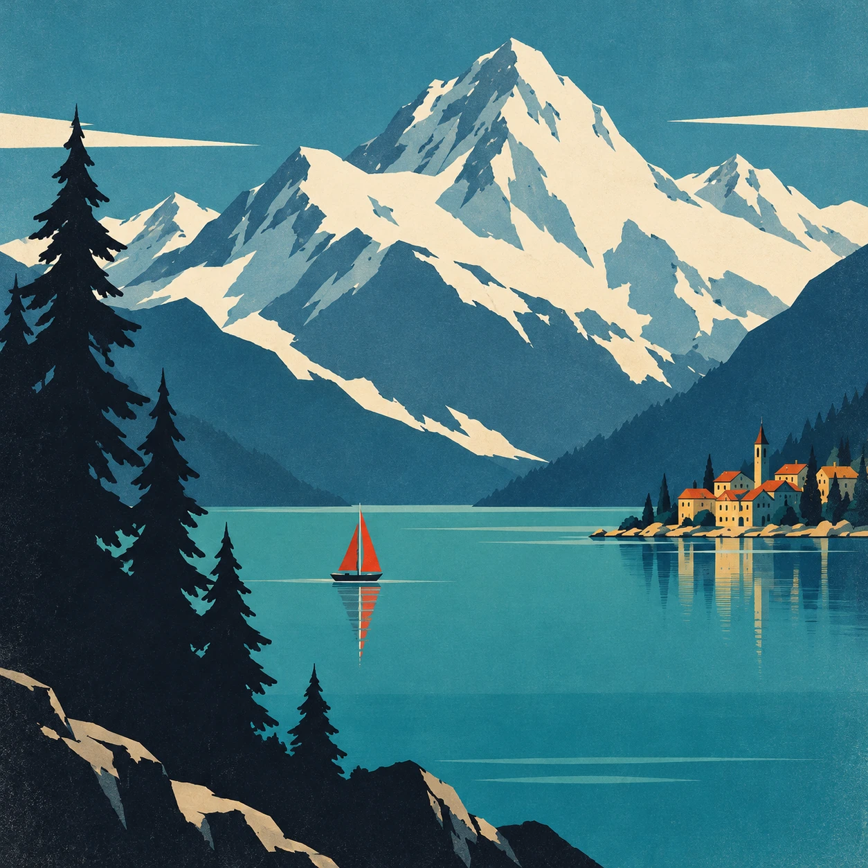
Three original AI-generated illustrations: a panoramic header, a collage with the style name at its center, and a standalone example. Captions distinguish these studies from historical objects and technical documentation.
Select an image for a closer look. Use the thumbnails, arrow keys or a swipe to compare examples. Zoom in to inspect details, or share the image that inspires you.
Creative toolbox · take this style further
Choose an input and a destination. Search sends your words to the chosen site; Copy & open puts them on your clipboard to paste there.
Create with AI
Turn your chosen input into an image prompt or a new creative direction.
ChatGPT
Copy your input and paste it into a ChatGPT conversation or image request.
Copy & open ChatGPT (new tab)Claude · Anthropic
Develop an image prompt or explore the style in a new Claude conversation.
Copy & open Claude · Anthropic (new tab)Midjourney
Paste your input into the Imagine bar on the Create page.
Copy & open Midjourney (new tab)Adobe Firefly
Copy your input, open Firefly, and paste it into the prompt field.
Copy & open Adobe Firefly (new tab)Leonardo.Ai
Copy your input, open Leonardo, and paste it into the generation field.
Copy & open Leonardo.Ai (new tab)Image search
Find visual references. Short, concrete keywords usually work best.
Lexica
Search AI images and prompts using your selected input.
Search with this input Lexica (new tab)Pexels
Search the photo and video library. Short keywords often work best.
Search with this input Pexels (new tab)Pixabay
Search photos, illustrations and other images.
Search with this input Pixabay (new tab)Unsplash
Search photographs using the style name or your own keywords.
Search with this input Unsplash (new tab)Wikimedia Commons
Search photographs, artworks and historical images. Check each file for its source and reuse terms.
Search with this input Wikimedia Commons (new tab)Art & research
Explore artists, collections and the ideas behind a style.
Wikipedia
Search for background reading. A style may not have its own article.
Search with this input Wikipedia (new tab)WikiArt
Copy your input into WikiArt’s search to explore artists and artworks.
Copy & open WikiArt (new tab)Europeana
Paste your keywords into the search to explore European museum, library and archive collections.
Copy & open Europeana (new tab)Inspiration
Discover portfolios and visual ideas from creative communities.
Instagram hashtags
Search a hashtag made from your input: spaces and punctuation are removed. Instagram may require sign-in.
Search with this input Instagram hashtags (new tab)ArtStation
Paste your input into artwork search for concept art, environments, characters and visual development.
Copy & open ArtStation (new tab)Behance
Paste your input into project search for illustration, design and visual storytelling.
Copy & open Behance (new tab)A closer look
Build a destination from a few memorable masses, a strong focal contrast and space for readable typography. Print texture supports the composition; it should not substitute for it.
A destination condensed into an invitation
Midcentury Travel Poster describes a useful family of commercial graphic approaches associated with the middle decades of the twentieth century. It is not one organized movement with a single palette or manifesto. In contemporary image-making, the phrase often signals simplified forms, confident color, emphatic composition and a place presented as somewhere you want to be.
The best examples do not merely show scenery. They select a promise: the scale of a city, the stillness of a lake, the speed of a journey, the warmth of a coast. That promise organizes the design. If every building and tree receives equal attention, the poster becomes a catalogue of things the viewer could have seen.
The dates and labels need care. “Vintage” can blur together nineteenth-century lithography, interwar Art Deco, midcentury graphics and much later nostalgic illustration. Use a dated object when making a historical claim. Use “midcentury-inspired” when making a new picture.
Two museum examples: place first, vehicle optional
Cooper Hewitt’s discussion of Edward McKnight Kauffer’s American Airlines: To New York draws attention to its abstracted skyscrapers and the absence of an airplane. An airline advertisement can sell the experience of the destination rather than depict the machinery of getting there. The museum connects its simplified geometry with modern art and commercial persuasion. [1]
Kauffer’s The Rainbow to Europe, catalogued by the Smithsonian at circa 1953, offers another strategy: a castle-like structure, water and a rainbow condense an idea of Europe into a small number of signs. The record identifies the client as Pan American World Airways and the medium as offset lithograph on paper. It is marked research in progress, so the approximate date should remain approximate. [2]
These examples are particularly useful because they complicate a familiar online stereotype. A travel poster does not require an orange sun, a turquoise sea and distressed cream paper. Those ingredients can work beautifully, but they are design choices, not an identification certificate.
Shape, scale and the direction of desire
Begin with the largest shape. A mountain, skyline or curve of coast should establish the image before the small details arrive. Then choose a contrasting accent: a sail, train or sun. The accent needs room around it. Ten equally bright focal points amount to a committee with no chair.
Scale can be expressive. A tiny vessel against a broad lake makes the water feel expansive; a foreground tree frames a distant town. Simplification should preserve the features that make the scene intelligible while reducing incidental description. Fewer shapes can require more judgment than a highly detailed view.
Think in value as well as hue. A pale mountain against a dark ridge remains legible when the colors are muted. Two saturated colors of similar value may merge at thumbnail size. Check the composition small before adding texture, then check it again after texture has softened the edges.
Typography belongs to the composition
A poster normally has something to say. Reserve space for the destination name and any secondary message at the beginning, rather than placing a headline over the most intricate part of the scenery at the end. The image and lettering should establish a clear reading order.
For AI-assisted work, it is often practical to generate a text-free illustration and add editable lettering separately. Our named collage intentionally demonstrates embedded title treatment, while the banner and standalone study leave the imagery uninterrupted. Final wording, spacing and reproduction sizes still deserve a human-readable check.
A convincing period influence does not require counterfeit age. Subtle ink grain can enrich flat color, but scratches and stains should have a reason. Otherwise the image appears to have spent more time in a cellar than in a designer’s care.
What the invitation leaves outside the frame
Travel advertising selects. A calm waterfront can omit its service roads; a monumental skyline can hide the ordinary work that keeps a city running. Recognizing this does not prevent us from enjoying the design. It helps us read the promise as a constructed message rather than neutral documentation.
When making a poster for a real place, verify its distinctive features instead of assembling generic landmarks. When making an imaginary destination, say so. Our illustrations use fictionalized scenes to explore composition without presenting a generated town as an accurate travel guide.
Reading our coast, collage and alpine lake
The panoramic coast uses the rail curve to lead into the central town, then lets the sea open out to the right. Its relatively rich detail suits a broad banner. The collage contrasts coast, mountain, railway and skyline, with the name of the approach crossing the center as a clear editorial title.
The standalone alpine study is more economical. A pale mountain dominates, dark trees frame one side and a small red sail gives the water a focal point. Compare the quiet lake with the busier coastal image. The difference is not simply how many objects appear, but how strongly one visual decision governs the others. All three are original AI-generated interpretations.
Usability in AI art generation
This language works well for fictional destinations, event illustrations, editorial covers and graphic studies. Specify the place type, the dominant shape, the focal accent and a limited palette. “Large pale mountain above flat teal water, one red sail, dark framing trees” gives the model a hierarchy to attempt.
Models may replace graphic simplification with detailed digital painting, invent pseudo-lettering or reproduce the same sun-and-mountain formula regardless of the destination. Review shape economy and place identity before judging the paper texture. If typography matters, inspect every letter or add it in an editable design tool.
Try separate prompts for coastal, urban and inland scenes while keeping the same palette. This reveals whether the design language can adapt or whether it depends on one repeated postcard. For production, check the actual pixel dimensions and print layout; nostalgic styling does not increase image resolution.
An exercise in choosing one promise
Design three versions of the same imaginary lakeside town: quiet, adventurous and metropolitan. Change the relative size of water, mountain and buildings rather than merely changing the caption. The exercise becomes interesting when the same place can support distinct visual arguments.
Then remove one major element from each version. Does the invitation become clearer? My favourite poster is often the one that knows when to stop describing. A red sail on a generous lake can offer more possibility than a thousand perfectly rendered windows.
A small poetic detour
Original words from the AOI studio.
Poetry
One red sail.
Enough blue
to imagine
leaving.
The prompt workshop
Original creative exercises. These prompts create new illustrations, not documentary evidence.
A bold destination
Original midcentury-inspired travel illustration of a fictional alpine lake, large pale mountain, flat teal water, one red sailboat, dark angular fir trees, strong graphic hierarchy, five-color palette, subtle print grain, no lettering or logos.
Original AOI creative exercise; inspect the result against the guide rather than assuming the model followed every instruction.
An urban invitation
Fictional riverside city travel-poster illustration, simplified navy and ochre skyline, broad cream sky, a single coral bridge as focal shape, confident flat color and generous space for later typography, no actual city claim, no words.
Original AOI creative exercise; inspect the result against the guide rather than assuming the model followed every instruction.
A different promise
Midcentury-inspired poster illustration of a quiet island garden, huge dark leaf shapes framing a small sunlit terrace, restrained green cream and terracotta, calm asymmetry, minimal detail, no distressed paper, no text.
Original AOI creative exercise; inspect the result against the guide rather than assuming the model followed every instruction.
Your next inspiration
Discover another art style
Follow a visual thread to the next subject.
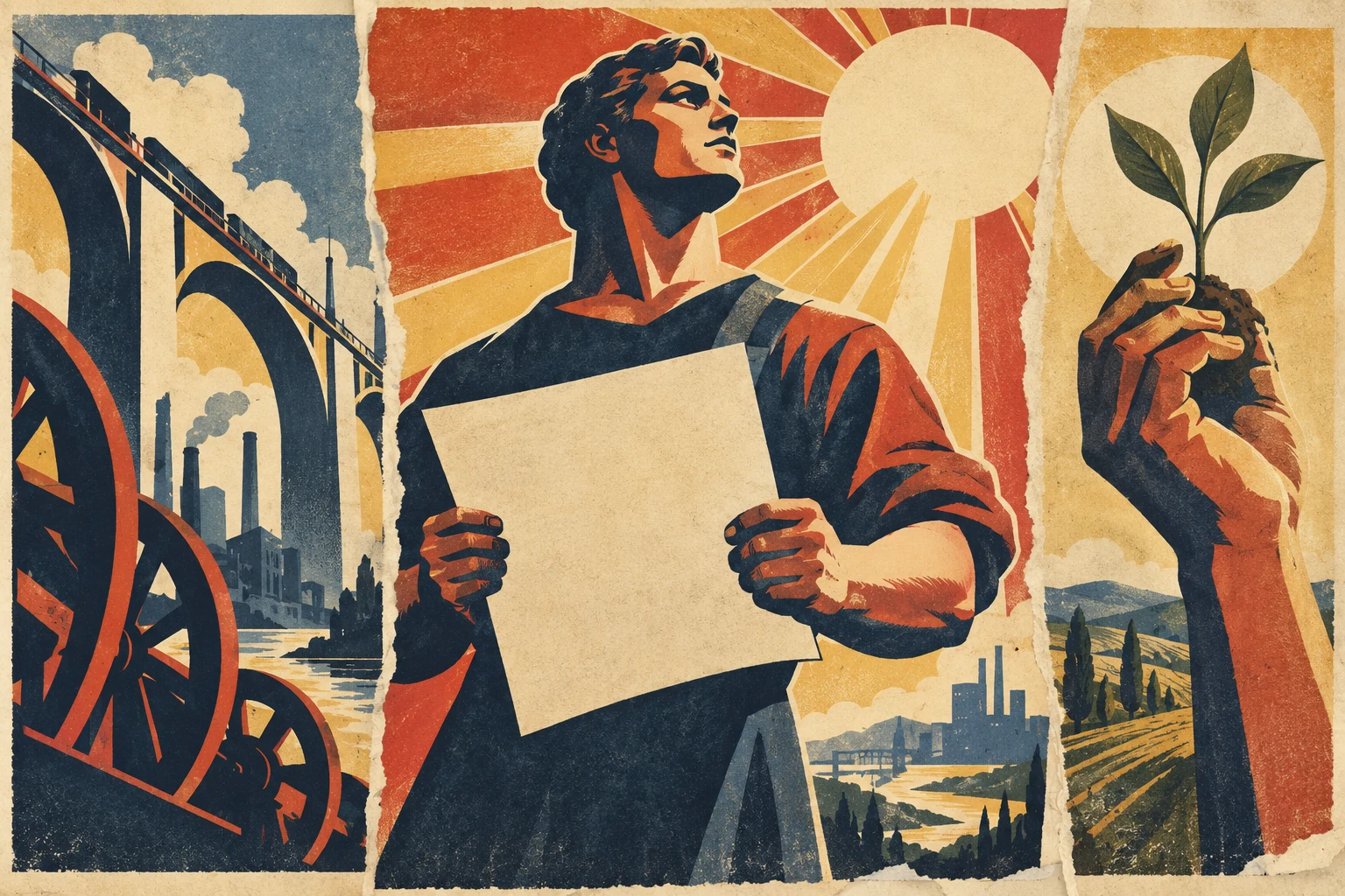
Vintage Propaganda Poster: History, Design and Visual Language
Continue exploring related visual techniques and their differences.
Art Deco: Modern Life in Geometry and Materials
Continue exploring related visual techniques and their differences.
People & works to explore
References discussed in this article. Consult the sources below for context.
Artists and practitioners
Edward McKnight Kauffer — designer of the two cited airline posters [1][2]
Paintings and other works
American Airlines: To New York — discussed by Cooper Hewitt [1]
The Rainbow to Europe — circa 1953, offset lithograph [2]
Sources and further exploration
[1] Cooper Hewitt — Getting There is Half the Fun
[2] Smithsonian / Cooper Hewitt — The Rainbow to Europe, circa 1953