
Graphic design tradition · historical persuasion and contemporary interpretation
Vintage propaganda poster design uses forceful composition, clear visual hierarchy and an economical relationship between image and words. Here, the term describes a broad design category rather than a single art movement. Learn to recognise its devices, read its historical purpose critically and create an original interpretation without presenting fiction as an archival object.
A visual introduction
Open any image to look closer, then browse the examples.
Creative toolbox · take this style further
Choose an input, adjust it, then open a tool. Search links pass your text to the destination. Copy & open copies it for you to paste into the generator; you start generation there.
ChatGPT
Copy your input and paste it into a ChatGPT conversation or image request.
Copy & open ChatGPT (new tab)Claude · Anthropic
Develop an image prompt or explore the style in a new Claude conversation.
Copy & open Claude · Anthropic (new tab)Midjourney
Paste your input into the Imagine bar on the Create page.
Copy & open Midjourney (new tab)Adobe Firefly
Copy your input, open Firefly, and paste it into the prompt field.
Copy & open Adobe Firefly (new tab)Leonardo.Ai
Copy your input, open Leonardo, and paste it into the generation field.
Copy & open Leonardo.Ai (new tab)Lexica
Search AI images and prompts using your selected input.
Search with this input Lexica (new tab)Pexels
Search the photo and video library. Short keywords often work best.
Search with this input Pexels (new tab)Pixabay
Search photos, illustrations and other images.
Search with this input Pixabay (new tab)Unsplash
Search photographs using the style name or your own keywords.
Search with this input Unsplash (new tab)Wikipedia
Search for background reading. A style may not have its own article.
Search with this input Wikipedia (new tab)WikiArt
Copy your input into WikiArt’s search to explore artists and artworks.
Copy & open WikiArt (new tab)Instagram hashtags
Search a hashtag made from your input: spaces and punctuation are removed. Instagram may require sign-in.
Search with this input Instagram hashtags (new tab)A closer look
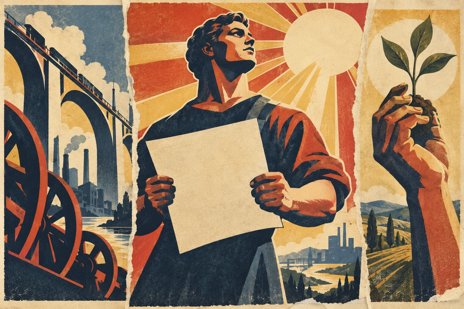
An original three-part collage joins a monumental figure with a blank sheet, a bridge and industrial wheels, and a hand lifting a seedling. Rising diagonals, radiating light, flat areas of navy and red, and warm paper grain create a shared visual rhythm. These are choices in this modern study, not universal rules for historical propaganda.
A family of designs, not a single movement
Vintage propaganda poster is a useful contemporary label for a broad family of persuasive graphics. It is not the name of one school with a founder, manifesto or fixed palette. Historical propaganda posters served particular institutions and causes; a modern image may borrow their appearance for fiction, criticism or an entirely different message. The relationship needs explaining rather than assuming.
The V&A traces the growth of colourful pictorial posters through nineteenth-century advances in printing and discusses the geometric forms and photomontage of Russian Constructivist posters in the 1920s. Its survey also includes later Chinese and Cuban examples. Those different settings should prevent us from compressing a century of graphic work into “red background, heroic person, old paper.” [1]
MoMA places Constructivism within a post-Revolutionary project to develop a new artistic language. That is a specific artistic and social context, not a synonym for every persuasive poster. A diagonal can belong to many compositions. It does not, by itself, establish an ideology, a country or a date. [2]
Read the purpose before you admire the surface
The US National Archives’ Powers of Persuasion exhibition examines Second World War posters through recruitment, production, conservation, pride and fear. Its examples include J. Howard Miller’s We Can Do It!, produced by Westinghouse, and Alexander Liberman’s photographic United We Win (1943). The coexistence of illustration and photography is a useful correction to the idea that propaganda always meant flat, hand-painted figures. [3]
Begin with four questions: who commissioned this image, whom did they want to reach, what action did they want, and what information did they leave outside the frame? A poster can make a real request while presenting a selective account of the world. Admiring its economy does not oblige us to accept its argument.
Distinguish an image’s intended effect from its demonstrated reception. A commanding design proves that someone attempted to persuade an audience; it does not prove that the audience complied. Avoid inventing claims about how many people enlisted, donated or changed their minds because a poster survives in a museum.
The visual grammar: hierarchy, scale and direction
For this entry’s practical exercises, begin with one dominant silhouette. A figure, tool, building or hand should be readable before its smaller details. Use a large light-dark separation to establish the first point of attention, then a secondary shape to move the eye. A restricted palette can help those relationships remain clear, but no particular colour combination defines the whole historical field.
A low viewpoint can enlarge a figure’s apparent authority. A rising diagonal can imply advance, while repeated forms can turn individuals into a collective. Rays can make one area feel like the source of illumination. These are possibilities to test in a particular image, not automatic meanings that operate identically for every viewer.
Typography participates in that hierarchy. A short headline can behave like a solid shape; a smaller line can supply a practical instruction. Decide where those elements belong before drawing elaborate background scenery. Decorative urgency becomes noise when every part shouts at the same volume.
Printing texture is not a certificate of age
Lithography and later printing processes belong to the history of poster production, but simulated paper wear is a modern design choice when you are making a new image. The V&A explains how a lithographic design transfers ink from a prepared surface and how separate colour impressions can build a picture. Follow a documented object’s medium when describing that object; do not infer the actual process from a digital filter. [1]
For an original study, try flat colour areas with small changes in ink density. A restrained registration offset can suggest separate impressions. Keep edge wear subordinate to the design: a strong composition should still work on clean paper. Ageing a weak layout merely gives a weak layout a difficult childhood.
When preparing a print, inspect the final size, margins, colour handling and effective image resolution. Save an editable version with separate type. A convincing preview on a phone does not tell you whether small lettering will survive a large physical print.
Look closely at our original collage
The central figure carries a blank cream sheet against a dark torso. That sheet becomes the largest quiet area, counterbalancing the face and the rays above it. At the left, the bridge supplies a long diagonal while wheels compress mechanical shapes into the foreground. At the right, a raised hand and seedling replace industrial scale with a smaller, legible action.
Ochre, red, navy and warm paper link the three studies. Torn joins make the collage structure visible, and the grain carries across otherwise flat areas. The illustration deliberately leaves out slogans: it lets us examine how authority, optimism and direction can be suggested before a sentence is added.
This is a contemporary AI-generated illustration made for AOI in 2026. It is not a recovered historical poster, a reconstruction of a particular campaign or evidence of how any society pictured itself. Its blank sheet should remain blank in the source asset; readers making their own compositions can add carefully typeset wording in a separate design file.
Make a new poster with a clear, honest brief
Choose a small fictional brief you can describe openly, such as a repair workshop in an imaginary town. Define one visible action: two hands joining a broken chair leg, for example. Sketch three arrangements using only black and white. Keep the version that communicates the action at thumbnail size before introducing colour or texture.
Use an image model for the illustration and reserve a clear area for lettering. Add the final headline yourself in a layout editor when exact spelling, spacing or print consistency matters. Check hands, tools, geometry and overlaps. Keep the generated-image disclosure in the publication caption and retain the prompt with the project files.
Historical imagery deserves the same editorial attention as words. A symbol can carry an association you did not intend, and a copied layout can imply an institutional connection you do not have. If studying an actual poster, keep its maker, date, commissioner and collection record attached. If inventing one, say so. The useful inheritance is the discipline of visual clarity; the message remains your responsibility.
A small poetic detour
Original words from the AOI studio.
Poetry
A paper sun commands the wall.
Below it, one small crease
refuses to stand straight.
The prompt workshop
Original creative exercises. These prompts create new illustrations, not documentary evidence.
Starting point: one readable action
Create an original vintage-inspired illustrated poster study of two adult hands repairing a wooden chair, one strong silhouette, warm cream paper, navy and rust-red flat ink areas, clear empty headline space, restrained print grain. No words, logos, flags or real campaign references. Contemporary invented illustration.
Add exact text separately in a layout editor. Label the image as AI-generated.
Richer composition: movement and scale
Design an original editorial collage of three vintage-inspired poster studies for an imaginary workshop: repaired chair at centre, large simplified tools at left, hands carrying wood at right. Strong diagonals, deliberate scale changes, limited navy, ochre and cream palette, visible paper joins and subtle ink variation. Keep the main action legible. No text, party symbols, real leaders or copied poster layouts.
Describe the visual construction, then inspect whether the intended hierarchy survived.
Experiment: remove the nostalgia
Make two composition studies of the same invented repair-workshop scene. Keep the arrangement and limited palette constant. In version A use clean paper and crisp shapes; in version B add restrained ink grain and edge wear. Leave room for the same headline. Compare readability at thumbnail size. No historical attribution or existing campaign imagery.
Judge composition before surface texture; retain both versions and your notes.
People & works to explore
References discussed in this article. Consult the sources below for context.
Artists and practitioners
J. Howard Miller — designer of We Can Do It!; see National Archives record
Alexander Liberman — photograph used in United We Win (1943); see National Archives
Aleksandr Rodchenko — Constructivist artist discussed by MoMA; context rather than a universal style founder
Paintings and other works
We Can Do It! — J. Howard Miller, produced by Westinghouse; National Archives exhibition
United We Win (1943) — photograph by Alexander Liberman, printed for the War Manpower Commission; National Archives