
Period-specific printmaking and illustration
Japanese Meiji Lithographic Illustration explores the meeting of precise drawing, tonal grain and multicolor printing during Japan’s modernization.
A visual introduction
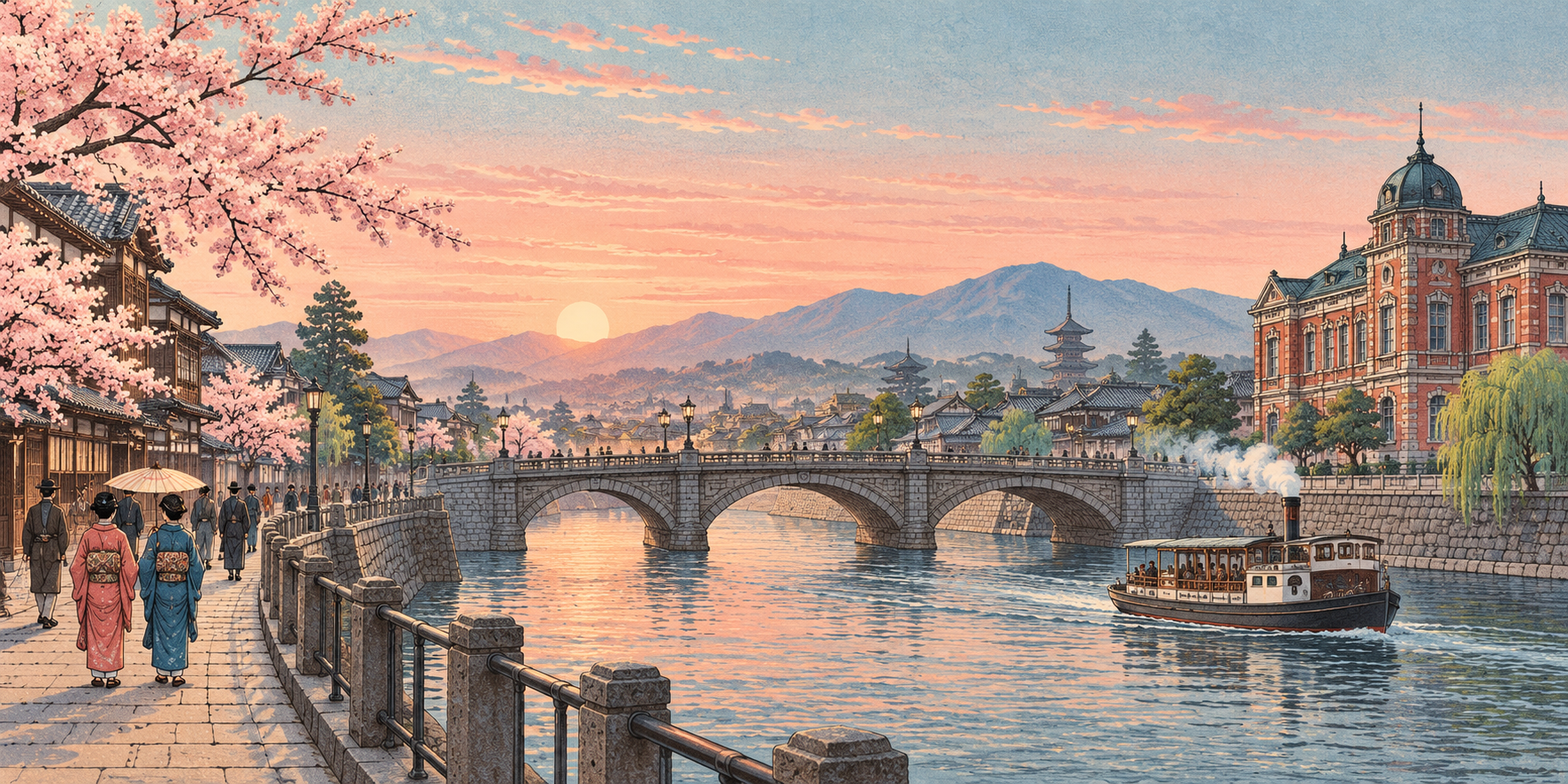
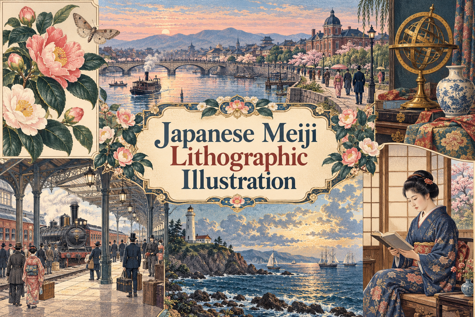
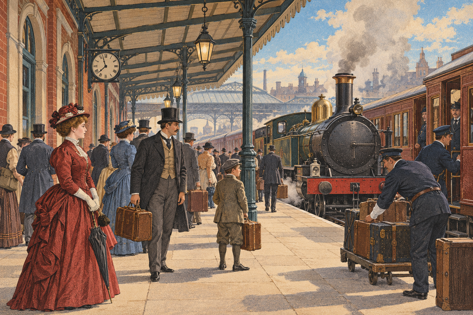
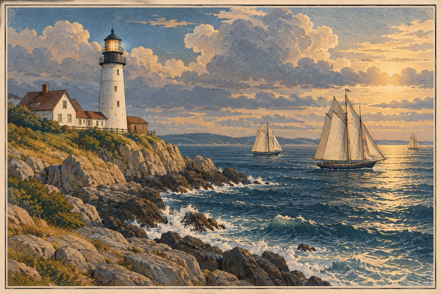
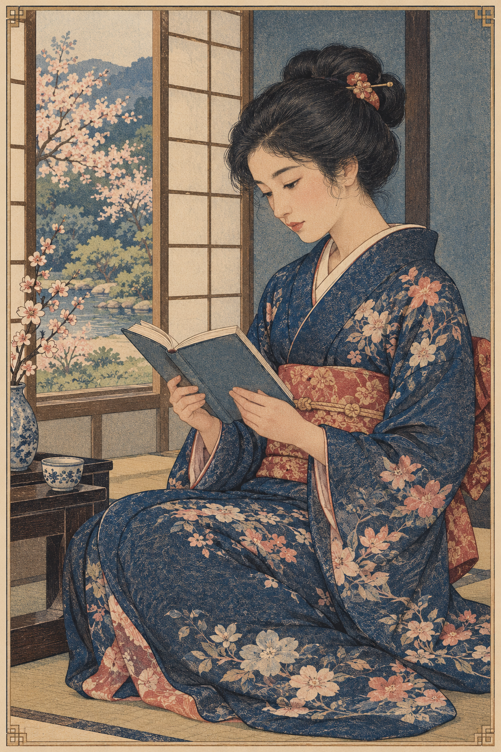
Seven original AI-generated interpretations: a dedicated banner, centrally titled collage and five standalone studies. Imagined scenes demonstrate visual technique; they are not historical documents.
Select an image for a closer look. Use the thumbnails, arrow keys or a swipe to compare examples. Zoom in to inspect details, or share the image that inspires you.
Creative toolbox · take this style further
Choose an input and a destination. Search sends your words to the chosen site; Copy & open puts them on your clipboard to paste there.
Create with AI
Turn your chosen input into an image prompt or a new creative direction.
ChatGPT
Copy your input and paste it into a ChatGPT conversation or image request.
Copy & open ChatGPT (new tab)Claude · Anthropic
Develop an image prompt or explore the style in a new Claude conversation.
Copy & open Claude · Anthropic (new tab)Midjourney
Paste your input into the Imagine bar on the Create page.
Copy & open Midjourney (new tab)Adobe Firefly
Copy your input, open Firefly, and paste it into the prompt field.
Copy & open Adobe Firefly (new tab)Leonardo.Ai
Copy your input, open Leonardo, and paste it into the generation field.
Copy & open Leonardo.Ai (new tab)Image search
Find visual references. Short, concrete keywords usually work best.
Lexica
Search AI images and prompts using your selected input.
Search with this input Lexica (new tab)Pexels
Search the photo and video library. Short keywords often work best.
Search with this input Pexels (new tab)Pixabay
Search photos, illustrations and other images.
Search with this input Pixabay (new tab)Unsplash
Search photographs using the style name or your own keywords.
Search with this input Unsplash (new tab)Wikimedia Commons
Search photographs, artworks and historical images. Check each file for its source and reuse terms.
Search with this input Wikimedia Commons (new tab)Art & research
Explore artists, collections and the ideas behind a style.
Wikipedia
Search for background reading. A style may not have its own article.
Search with this input Wikipedia (new tab)WikiArt
Copy your input into WikiArt’s search to explore artists and artworks.
Copy & open WikiArt (new tab)Europeana
Paste your keywords into the search to explore European museum, library and archive collections.
Copy & open Europeana (new tab)Inspiration
Discover portfolios and visual ideas from creative communities.
Instagram hashtags
Search a hashtag made from your input: spaces and punctuation are removed. Instagram may require sign-in.
Search with this input Instagram hashtags (new tab)ArtStation
Paste your input into artwork search for concept art, environments, characters and visual development.
Copy & open ArtStation (new tab)Behance
Paste your input into project search for illustration, design and visual storytelling.
Copy & open Behance (new tab)A closer look
Crisp illustrative contours coexist with crayon-like grain, stippled shadows and layered color. Measured perspective and carefully framed detail can give objects, figures and architecture a vivid printed presence.
A printing practice, not one uniform style
Japanese Meiji Lithographic Illustration is a useful umbrella for lithographic imagery associated with Meiji Japan, rather than the name of a single organized art movement. The period label does not guarantee one palette, subject or degree of realism. For contemporary image-making, the productive connection is between a reproducible drawn surface and the visual ambitions of a changing society.
The National Printing Bureau’s museum documents Sekiga-Shiken, a monochrome lithographic publication dated 1874. Its account connects the project with Juken Ishii, also known as Teiko, and the engraver Rokuzan Gengendo. The museum also records the 1877 multicolor sample book Sekibaninsatsu-Kagami, produced to develop staff technique. These specific objects provide firmer anchors than the vague instruction ‘make it old Japanese.’
What the printing surface makes possible
Lithography is planographic: the printing design occupies a flat surface rather than a carved relief. As The Met explains, greasy crayon or ink establishes the image on prepared stone, while damp non-image areas resist oily printing ink. Separate matrices add colors in registered passes. A stone can therefore transmit the character of drawing, including granular marks and delicate tonal transitions.
For a visual study, separate three decisions: the contour that identifies an object, the small marks that model its volume, and the color areas that organize the page. A sharp vase rim can sit beside a softly shaded curved body. Softness should emerge through changing mark density rather than a photographic blur. This is a useful distinction from a woodblock-inspired study, where carved edges and broader shapes might lead the design. Neither technique is limited to these tendencies.
Compose with precision, leave room for light
Begin with one dominant structure: a bridge crossing a river, a stem carrying blossoms, or a seated figure held by the geometry of a window. Use subsidiary detail to lead the eye toward that structure. If every roof tile and every cloud compete at the same contrast, the image becomes an inventory with no argument.
The restrained indigo, rose, ochre and cream palette in this gallery is an AOI art-direction choice, not a rule for historical Meiji printing. Try a brighter palette when the subject needs it. Registration should feel intentional: thin displaced edges can be an experiment, but wholesale misalignment makes the image look carelessly printed. Uniform brown stains and torn corners mainly advertise a digital age filter; they do little to explain lithography.
Reading the seven contemporary studies
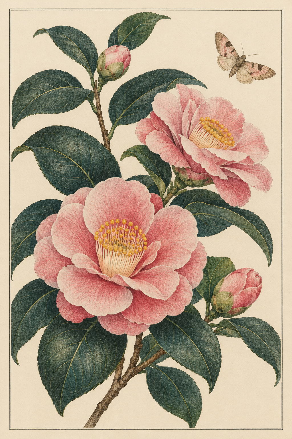
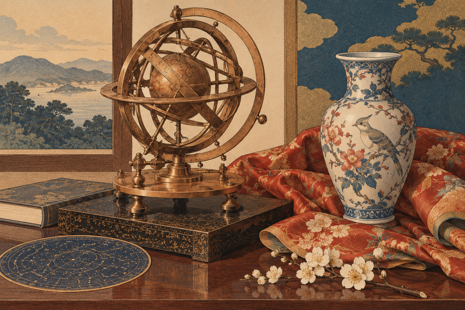
The riverside banner uses depth and a broad printed sky to organize many small figures. The central-title collage gathers the visual vocabulary. Five standalone studies test different problems: botanical separation in camellias and a moth; reflective and patterned surfaces in an astronomical still life; crowd and perspective at a railway platform; cloud and water rhythms around a lighthouse; and quiet tonal modeling in a woman reading.
These are original AI-generated interpretations, not historic prints, authenticated reconstructions or pictures of identified sites. The railway scene uses Western dress and architecture; the coastal scene is also an imagined transposition of the printing approach. Their value here is comparative technique, not evidence about a Japanese station or shoreline. The astronomical device is a pictorial invention, not a working scientific diagram.
Use the approach without losing the subject
This visual language suits editorial illustration, botanical studies, fictional travel plates and covers that need both ornament and legibility. Specify the material logic before adding period props. A contemporary bicycle or garden tool can be a more revealing exercise than another generic steam engine, because the drawing has to carry the effect.
For prompts, name the subject, the hierarchy of shapes, the behavior of shadows and the intended color layers. Add historical detail only when you can support it. Review the result for accidental invented writing, incoherent machinery and scenery that silently changes location. When factual reconstruction matters, consult collection records and period references rather than treating a convincing printed texture as proof.
Positive editorial perspective
AOI editorial perspective (AI-authored). The approach is strongest when line and tone cooperate. A crisp silhouette establishes the subject immediately, while granular shadows reward close looking. In the camellia study, pale petals remain luminous against dense foliage; in the reader, the quiet face is balanced by patterned cloth. Precision becomes a way of directing attention rather than a demand to describe everything equally.
Negative editorial perspective
AOI editorial perspective (AI-authored). The easiest failure is generic vintage imagery wearing a Japanese label. Sepia, steam engines and paper grain cannot establish cultural specificity. The Western-looking railway study demonstrates that limitation: it is useful for perspective and print texture, but not as a reconstruction of Japan. Better prompts define location and clothing when needed, reduce ornamental clutter, and keep unsupported historical claims out of captions.
Neutral editorial perspective
AOI editorial perspective (AI-authored). This entry combines a documented period-specific printing context with a contemporary illustrative interpretation. Its practical scope is tonal drawing, layered color and controlled detail across several subjects. The generated images can teach visual decisions, but they cannot demonstrate the actual preparation of a lithographic stone, certify historical accuracy or substitute for examination of original prints.
A small poetic detour
Original words from the AOI studio.
Poetry
The stone keeps still; the river learns to move.
A thousand grains assemble into air.
One roof receives the rose of early light;
one boat puts all its darkness gently there.
The camellia opens, printed breath by breath,
its petal holding shade without a seam.
The brass rings turn around a paper heaven;
the locomotive gathers up its steam.
Each color must return to find its place,
as travelers return across a bridge.
The page lifts off. The quiet stone remains,
with dawn still waiting underneath its ridge.
The prompt workshop
Original creative exercises. These prompts create new illustrations, not documentary evidence.
Start with a botanical plate
An original camellia branch and small moth, contemporary illustration inspired by Meiji Japanese lithographic printing, precise contours, fine crayon grain, gently stippled leaf shadows, muted pink and deep green registered color, generous ivory margins, no lettering, no signatures, no fake damage.
Let the light petals and dark leaves form distinct masses before adding surface detail.
Organize an illustrated city
An imagined late nineteenth-century Japanese riverside city, arched stone bridge as the central structure, small steamer and clearly separated pedestrians, measured perspective, fine lithographic crayon texture, restrained rose and slate blue color layers, broad luminous sky, original contemporary interpretation, no invented signs or logos.
Treat this as fiction unless architecture, clothing and location are checked against period sources.
Transpose the technique
A contemporary folding bicycle beside a ceramic planter, drawn as an elegant multicolor lithographic plate, exact readable silhouette, small granular marks modeling curved metal, indigo, warm gray and coral color areas, uncluttered cream ground, no photographic blur, no text.
A modern subject tests whether the print language works independently of nostalgic props.
Your next inspiration
Discover another art style
Follow a visual thread to the next subject.

A smile from the studio
Jokes
Penny asked the printer to move the sunrise three millimeters to the left. He explained that the blue, rose and yellow had already agreed on where morning should occur. She called this resistance to innovation. He called it registration. After one experimental proof, the sun rose beside itself, the bridge acquired a pink shadow on the wrong side, and a perfectly respectable boat appeared to be leaving its own hull. Penny approved the result as a study of modern acceleration. The printer filed it under ‘please check the alignment.’