
Contemporary design aesthetic · Japanese and Scandinavian influences
Japandi combines restrained forms, tactile materials and comfortable everyday use. Its strongest images make room for quiet contrasts: pale and dark timber, woven and smooth surfaces, useful objects and open space.
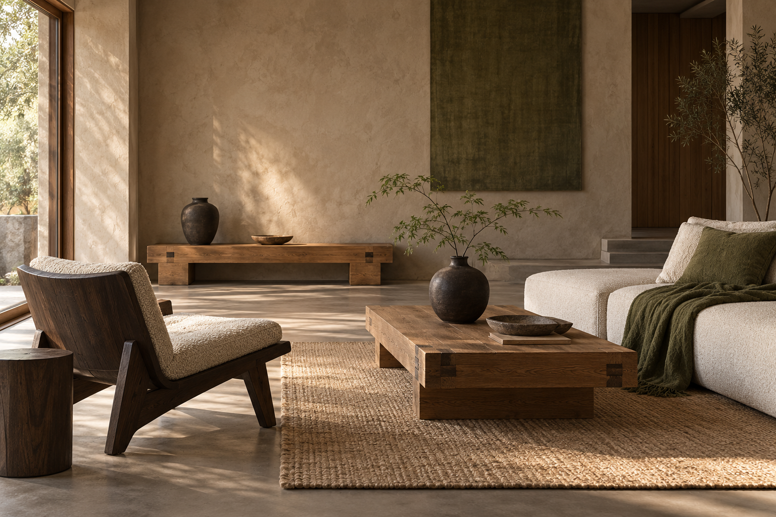
A visual introduction
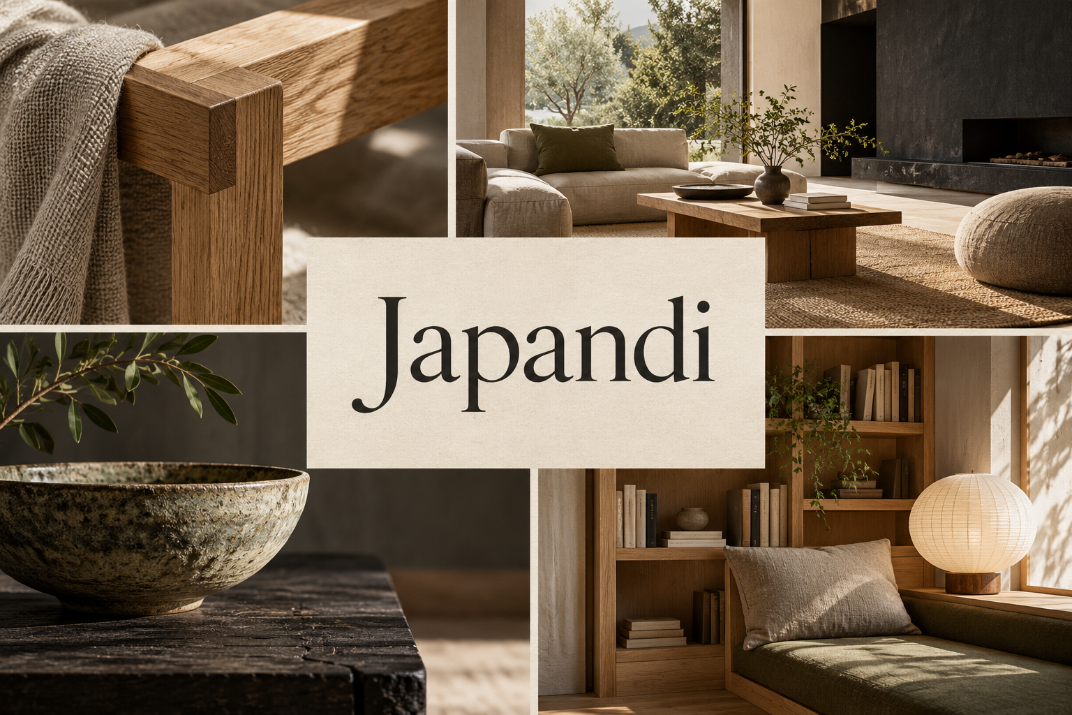
Five original AI-generated AOI interpretations: a dedicated banner, a centrally titled collage and three standalone studies. These illustrations demonstrate the principles discussed; they are not historical artworks.
Select an image for a closer look. Use the thumbnails, arrow keys or a swipe to compare examples. Zoom in to inspect details, or share the image that inspires you.
Creative toolbox · take this style further
Choose an input and a destination. Search sends your words to the chosen site; Copy & open puts them on your clipboard to paste there.
Create with AI
Turn your chosen input into an image prompt or a new creative direction.
ChatGPT
Copy your input and paste it into a ChatGPT conversation or image request.
Copy & open ChatGPT (new tab)Claude · Anthropic
Develop an image prompt or explore the style in a new Claude conversation.
Copy & open Claude · Anthropic (new tab)Midjourney
Paste your input into the Imagine bar on the Create page.
Copy & open Midjourney (new tab)Adobe Firefly
Copy your input, open Firefly, and paste it into the prompt field.
Copy & open Adobe Firefly (new tab)Leonardo.Ai
Copy your input, open Leonardo, and paste it into the generation field.
Copy & open Leonardo.Ai (new tab)Image search
Find visual references. Short, concrete keywords usually work best.
Lexica
Search AI images and prompts using your selected input.
Search with this input Lexica (new tab)Pexels
Search the photo and video library. Short keywords often work best.
Search with this input Pexels (new tab)Pixabay
Search photos, illustrations and other images.
Search with this input Pixabay (new tab)Unsplash
Search photographs using the style name or your own keywords.
Search with this input Unsplash (new tab)Wikimedia Commons
Search photographs, artworks and historical images. Check each file for its source and reuse terms.
Search with this input Wikimedia Commons (new tab)Art & research
Explore artists, collections and the ideas behind a style.
Wikipedia
Search for background reading. A style may not have its own article.
Search with this input Wikipedia (new tab)WikiArt
Copy your input into WikiArt’s search to explore artists and artworks.
Copy & open WikiArt (new tab)Europeana
Paste your keywords into the search to explore European museum, library and archive collections.
Copy & open Europeana (new tab)Inspiration
Discover portfolios and visual ideas from creative communities.
Instagram hashtags
Search a hashtag made from your input: spaces and punctuation are removed. Instagram may require sign-in.
Search with this input Instagram hashtags (new tab)ArtStation
Paste your input into artwork search for concept art, environments, characters and visual development.
Copy & open ArtStation (new tab)Behance
Paste your input into project search for illustration, design and visual storytelling.
Copy & open Behance (new tab)A closer look
Low visual mass, clear circulation, softly filtered light and a few well-proportioned objects create calm. Wood grain, ceramic glaze, linen and paper-like translucency supply variation without requiring much ornament.
A contemporary label with deeper connections
Japandi is a contemporary umbrella label for design that brings Japanese and Scandinavian influences into conversation. It is most useful for interiors, furniture, objects and material-based visual compositions. It is not the name of a single historical school, and it does not summarize the full design cultures of Japan or the Nordic countries.
The relationship predates the current label. Designmuseum Danmark's Learning from Japan exhibition described Japanese influences on Danish crafts, graphics, architecture and furnishings from the late nineteenth century onward. That documented exchange is richer than a formula in which a room becomes Japandi by adding a paper lamp to pale furniture.
Look at craft as closely as color
The Crafts Council's listing for Japandi: shared aesthetics and influences includes fiber and ceramic artists from Japan and several Nordic countries. It emphasizes natural materials and the pace of hand craftsmanship. This is a useful reminder that the aesthetic can be studied at the scale of a woven thread or a vessel, not only through a large interior photograph.
For a new composition, ask how an object is made and used. A chair's frame should plausibly support its seat. A vase needs a coherent opening and wall thickness. A wood joint should meet the surfaces it joins. Generated texture can suggest craft, but it is not evidence that a real object was made by a particular tradition or maker.
Build calm with contrast
Begin with a few large masses and their intervening spaces. Low furniture often creates a long horizontal rhythm; a taller lamp or vessel can provide a measured counterpoint. Leave enough separation to read each silhouette. An arrangement can be asymmetrical while still feeling settled.
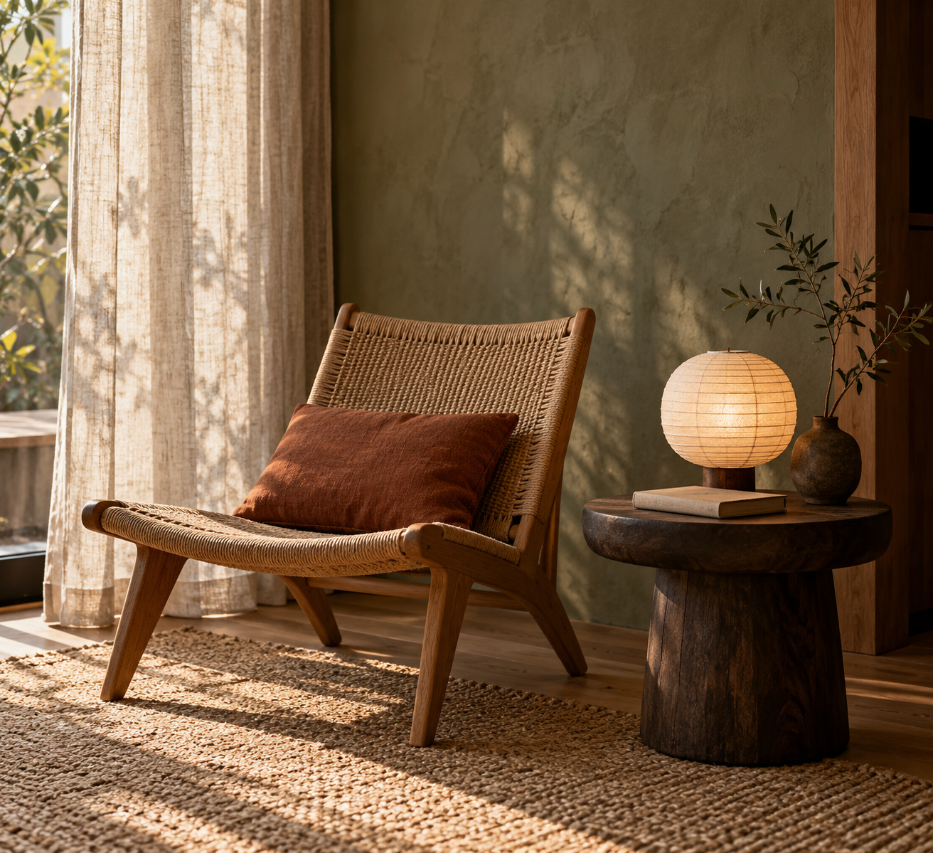
Warm neutrals are convenient, not compulsory. In these AOI studies, charcoal ceramics, moss tones, a rust cushion and an indigo runner prevent the palette from becoming a single beige blur. Test the composition in grayscale: the large value relationships should remain legible.
Contrast texture as deliberately as color. Coarse linen beside smooth clay has a different effect from rough timber beside polished metal. Limit the number of competing surface stories so that viewers can notice the particularities of each.
Light reveals the material
Broad side light makes wood grain, a woven seat and a matte ceramic surface readable without turning every texture into a dramatic special effect. A translucent shade can become a small luminous volume. A dark object against a softly lit wall offers another kind of clarity.
Avoid making every surface equally rough, equally glossy or equally bright. Those shortcuts flatten the material relationships. Examine shadow direction and contact points: a bowl should sit on its table, and a chair should meet the floor. Quiet compositions leave these errors unusually exposed.
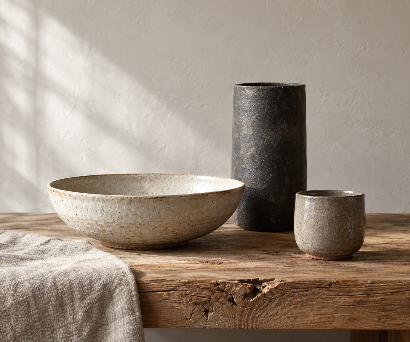
The ceramic still life uses unequal heights and a broad shallow bowl to create rhythm. The reading alcove relies on a curved woven seat, a darker side table and filtered light. Each offers a different way to make a small number of objects feel sufficient.
Restraint should accommodate life
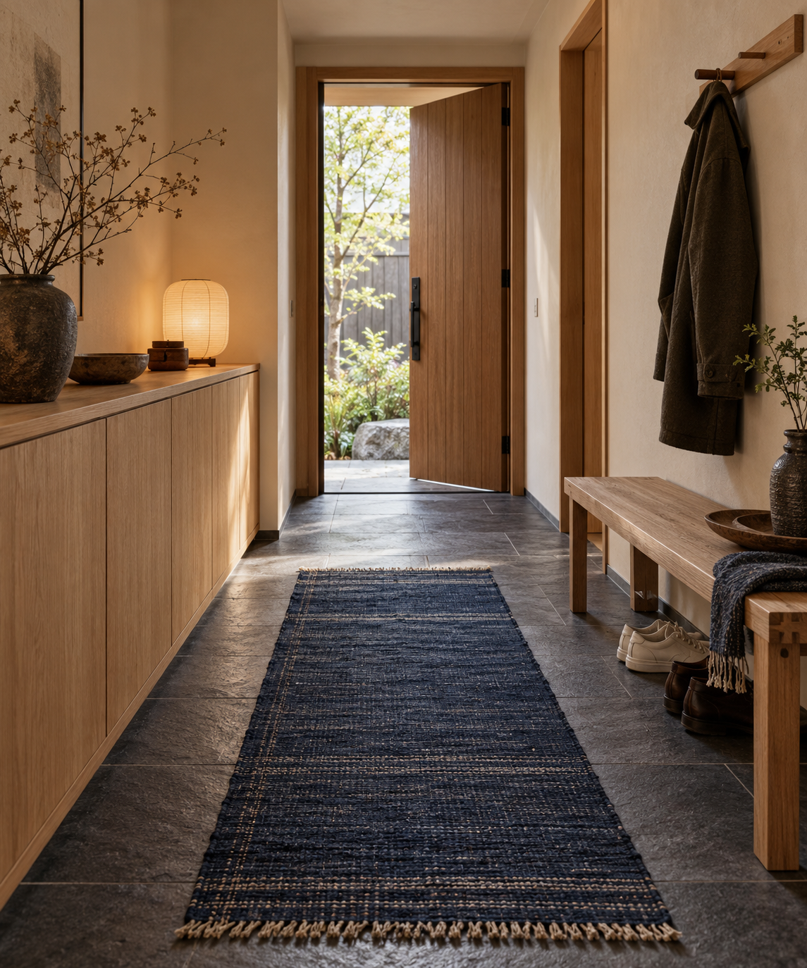
A room remains a place to use. The entryway study includes shoes, a coat and closed storage because practical needs can belong to the composition. Clear circulation and reachable surfaces matter more than an empty photograph. Consider maintenance, comfort and the way objects accumulate over time.
Wabi-sabi and hygge are often attached to Japandi descriptions, but they are not interchangeable decorating instructions. Avoid reducing complex cultural ideas to deliberate damage, a beige palette or an obligatory cozy accessory. Describe the observable choice: an uneven glaze, a comfortable seat, a repaired surface or a generous interval.
Try the approach without buying a new room
Create a small still life using three objects already available. Compare their profiles, heights, tones and textures. Remove distracting extras, change the light direction and test one dark anchor against a lighter ground. This makes the design decisions visible before they become a shopping list.
For image prompts, specify spatial relationships and material behavior rather than stacking mood words. A compact reading corner with a plausible seat and an accessible table is more informative than simply requesting serene luxury. The common failure is superficial uniformity; the remedy is a few carefully observed differences.
A small poetic detour
Original words from the AOI studio.
Poetry
Enough room
The bowl receives the afternoon;
the linen keeps a softer light.
A timber joint, a paper moon,
a chair that waits beyond the bright.
The dark cup gives the pale one weight.
The doorway leaves a space to pass.
A coat comes home. The hour grows late.
One branch makes shadows on the glass.
No object needs to fill the air.
The room has room because we care.
The prompt workshop
Original creative exercises. These prompts create new illustrations, not documentary evidence.
Compose a useful reading corner
Create a Japandi reading corner with one low timber chair, a comfortable woven seat, a reachable dark side table and softly filtered daylight. Use warm plaster, linen and a single muted rust accent. Show plausible joinery and enough room to move.
Give each object a purpose and a distinct surface.
Study three ceramic forms
Photograph an original arrangement of three unequal ceramic vessels on oak: a pale shallow bowl, a tall charcoal cylinder and a small grey cup. Use broad side light, subtle glaze variation and generous empty space.
Height, value and texture do most of the compositional work.
Introduce a stronger accent
Design a compact Japandi entryway with closed ash storage, a bench, charcoal stone and an indigo woven runner. Include a coat and shoes without overcrowding the passage. Keep proportions realistic and lighting calm.
Explore color and everyday use within a restrained structure.
Your next inspiration
Discover another art style
Follow a visual thread to the next subject.
A smile from the studio
Jokes
After three hours of arranging the room, I removed the fourth vase. Then the third. Then the decorative ladder nobody had ever climbed. At last the space felt calm, balanced and useful. My partner walked in, put a cup on the table and sat down. I nearly objected—then remembered that this was the entire point.