
Ottoman ceramic tradition · underglaze-painted architectural ornament
Iznik Tiles combine disciplined repeat structures with lively botanical drawing. Their blue, turquoise, green and red motifs belong to a ceramic surface whose borders, seams and glaze are part of the design.
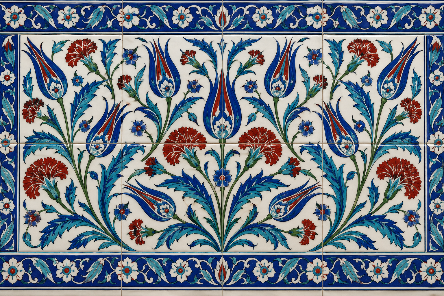
A visual introduction
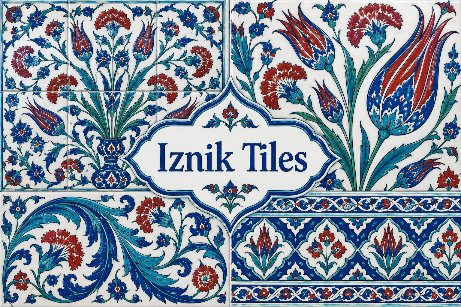
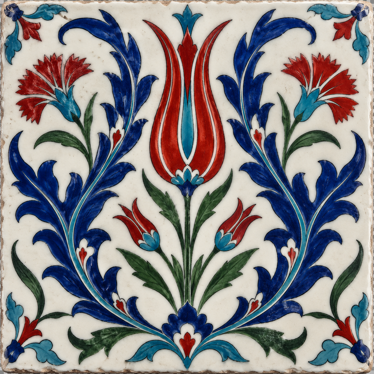
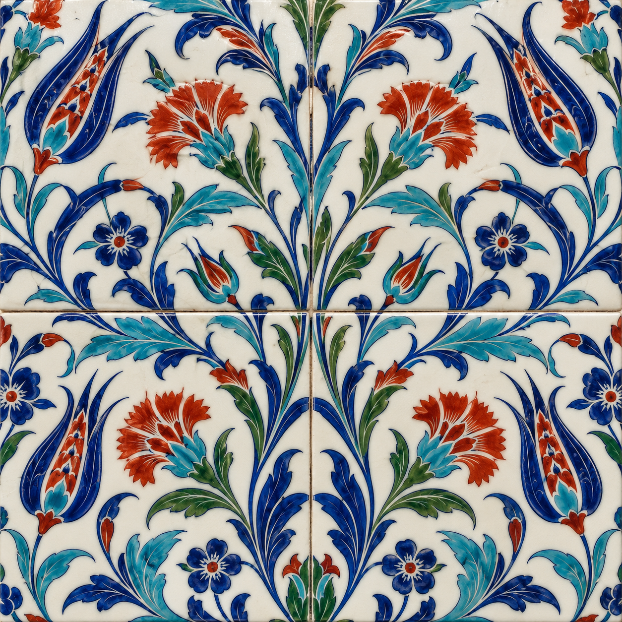
Five original AI-generated AOI interpretations: a dedicated banner, a centrally titled collage and three standalone studies. These are new illustrations, not historical objects or works by the referenced artist.
Select an image for a closer look. Use the thumbnails, arrow keys or a swipe to compare examples. Zoom in to inspect details, or share the image that inspires you.
Creative toolbox · take this style further
Choose an input and a destination. Search sends your words to the chosen site; Copy & open puts them on your clipboard to paste there.
Create with AI
Turn your chosen input into an image prompt or a new creative direction.
ChatGPT
Copy your input and paste it into a ChatGPT conversation or image request.
Copy & open ChatGPT (new tab)Claude · Anthropic
Develop an image prompt or explore the style in a new Claude conversation.
Copy & open Claude · Anthropic (new tab)Midjourney
Paste your input into the Imagine bar on the Create page.
Copy & open Midjourney (new tab)Adobe Firefly
Copy your input, open Firefly, and paste it into the prompt field.
Copy & open Adobe Firefly (new tab)Leonardo.Ai
Copy your input, open Leonardo, and paste it into the generation field.
Copy & open Leonardo.Ai (new tab)Image search
Find visual references. Short, concrete keywords usually work best.
Lexica
Search AI images and prompts using your selected input.
Search with this input Lexica (new tab)Pexels
Search the photo and video library. Short keywords often work best.
Search with this input Pexels (new tab)Pixabay
Search photos, illustrations and other images.
Search with this input Pixabay (new tab)Unsplash
Search photographs using the style name or your own keywords.
Search with this input Unsplash (new tab)Wikimedia Commons
Search photographs, artworks and historical images. Check each file for its source and reuse terms.
Search with this input Wikimedia Commons (new tab)Art & research
Explore artists, collections and the ideas behind a style.
Wikipedia
Search for background reading. A style may not have its own article.
Search with this input Wikipedia (new tab)WikiArt
Copy your input into WikiArt’s search to explore artists and artworks.
Copy & open WikiArt (new tab)Europeana
Paste your keywords into the search to explore European museum, library and archive collections.
Copy & open Europeana (new tab)Inspiration
Discover portfolios and visual ideas from creative communities.
Instagram hashtags
Search a hashtag made from your input: spaces and punctuation are removed. Instagram may require sign-in.
Search with this input Instagram hashtags (new tab)ArtStation
Paste your input into artwork search for concept art, environments, characters and visual development.
Copy & open ArtStation (new tab)Behance
Paste your input into project search for illustration, design and visual storytelling.
Copy & open Behance (new tab)A closer look
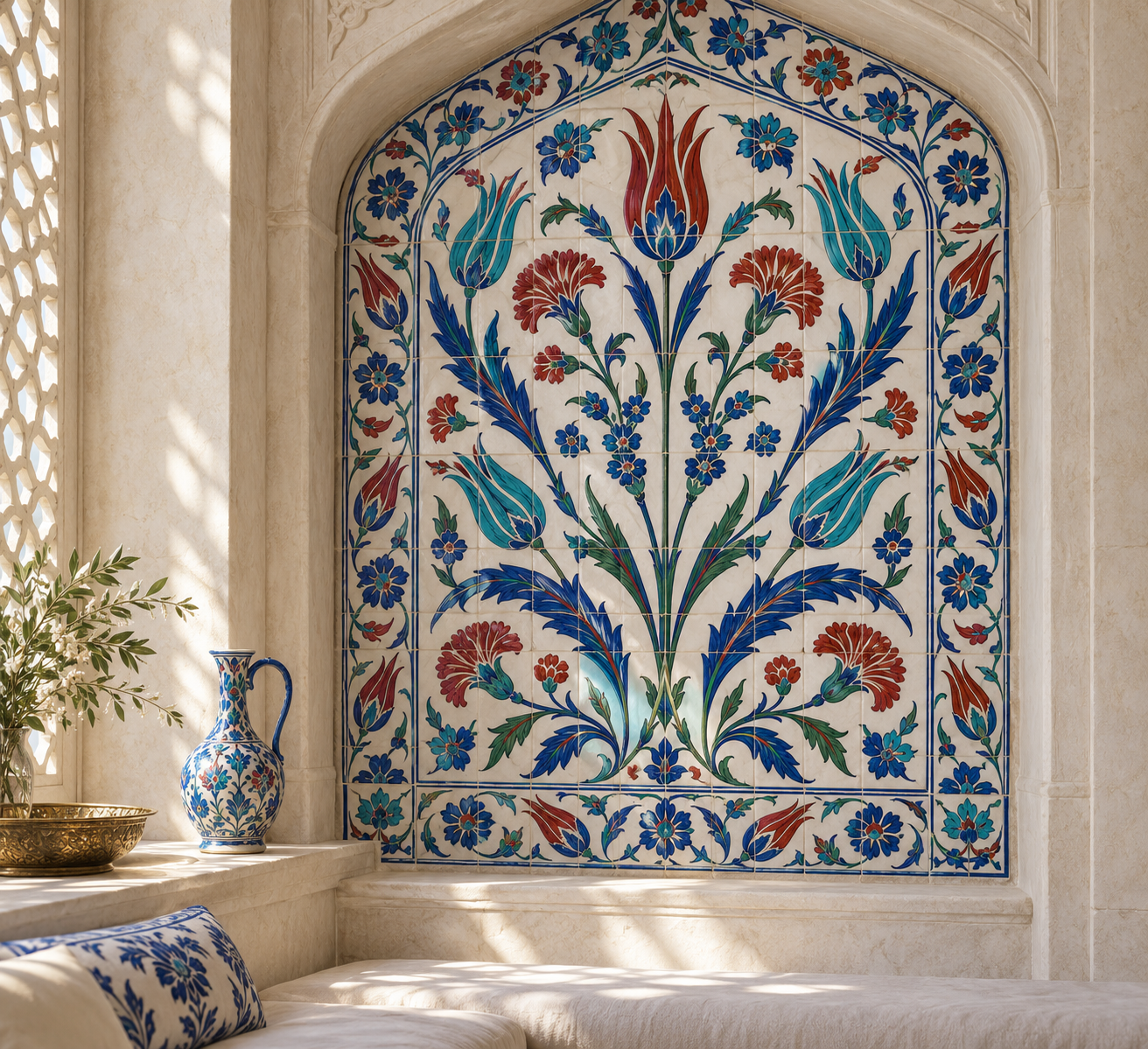
Tulips, carnations, curling leaves and floral sprays unfold across white grounds. Crisp outlines and balanced color areas connect individual tiles into larger rhythmic panels.
A ceramic tradition with a specific context
Iznik was an important Ottoman ceramic production center. The Aga Khan Museum's tiles dated 1560 document fritware with underglaze-painted decoration and a repeat composition associated with architectural interiors. The Walters Art Museum's late-sixteenth-century tile describes the characteristic relationship of bright red with blues and greens.
The term therefore names more than a blue-and-white pattern. Material, process, place and architectural use all matter. This guide offers contemporary design studies informed by collection records. The generated illustrations are not excavated tiles, authenticated antiques or photographs of a named historic building.
Understand the unit and the larger field
Start with a tile-sized unit, then decide which stems, leaves or borders continue beyond it. A repeat succeeds when adjacent units form an intentional larger rhythm. A beautiful isolated flower may make a poor repeating panel if its edges produce abrupt gaps or unwanted clusters.
Use the grout line as a real division. In a digital mockup, check that a stem crossing one edge resumes at the correct height on the next tile. Do not assume that visual similarity proves a mathematically seamless repeat. Test a small array and inspect the joins before expanding it across a wall.
Give botanical drawing a clear hierarchy
Choose a principal flower, then supporting leaves and smaller blossoms. A tulip can provide a tall accent; a curling saz leaf can carry a diagonal. Keep the outlines sufficiently clear to separate adjacent color areas. Too many equally dominant motifs turn the surface into a crowded fabric rather than a readable ceramic panel.
Use white ground actively. It creates breathing space between stems and strengthens saturated cobalt or red. The familiar colors are a useful starting point, not permission to claim that all Iznik ceramics share an identical palette. Historical pieces vary; consult an object record for a particular period and design.
Let the surface remain ceramic
A slight glaze reflection and modest edge variation can suggest material. Avoid excessive cracking, dirt or artificial ageing unless the study explicitly concerns wear. A contemporary interpretation can be clean and new. Neither distress nor a generated inscription establishes historical authenticity.
Compare one square tile, a four-tile repeat and an imagined architectural niche. These test motif, continuity and scale respectively. Keep the niche clearly fictional and omit unverified religious inscriptions. For physical production, work with a ceramic specialist on body, glaze, pigment and firing requirements; an illustration is not a tested fabrication specification.
A small poetic detour
Original words from the AOI studio.
Poetry
Across the seam
A tulip lifts its little flame;
a blue leaf turns to let it pass.
The next tile takes the wandering name
of every stem beneath the glass.
The border keeps a measured pace;
the white ground opens into light.
A flower crosses borrowed space
and finds its neighbor waiting right.
The wall is many, yet the green
continues gently through the seam.
The prompt workshop
Original creative exercises. These prompts create new illustrations, not documentary evidence.
Compose a single botanical unit
Design an original Iznik-inspired square ceramic tile with one red tulip, cobalt curling leaves and turquoise accents on a white glazed ground. No inscriptions.
Balance the flower with the surrounding white space.
Test the joins
Create a frontal four-tile floral panel with stems continuing coherently across visible grout seams.
Inspect every edge; generated repeats need checking.
Study architectural scale
Place an original floral tile panel within a fictional pale-stone niche, with soft grazing light and a restrained border.
Do not present the result as a real monument or antique.
Your next inspiration
Discover another art style
Follow a visual thread to the next subject.
A smile from the studio
Jokes
The tulip was pleased with its position until the tiler explained that half its stem lived next door. “I hope the neighbors are quiet,” it said. They were carnations. The real problem was the curling leaf, which had already applied for planning permission on three adjacent tiles.