AOI experimental visual concept
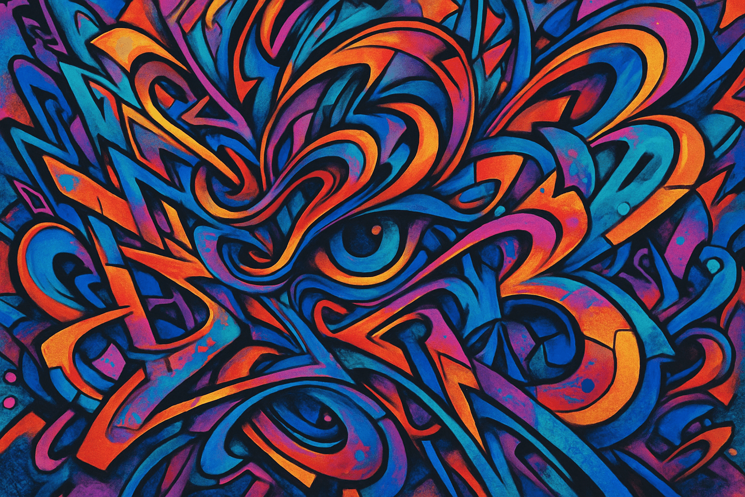
Hyperdimensional Graffiti is the AOI formulation of a graphic language in which invented glyphs appear to cross several incompatible depths while preserving a readable stroke rhythm. It treats the wall as a surface that can seem to fold, split and reconnect. The name describes an imaginative visual proposal, not a documented historical movement or a mathematical demonstration of extra dimensions.
An A⊕I –[-.+] creαt¡ve c⊕ncept, n⊕t αn estαbl¡she∂ h¡st⊕r¡cαl m⊕vement.
A visual introduction
Select an image for a closer look. Use the thumbnails, arrow keys or a swipe to compare examples. Zoom in to inspect details, or share the image that inspires you.
Creative toolbox · take this style further
Choose an input and a destination. Search sends your words to the chosen site; Copy & open puts them on your clipboard to paste there.
Create with AI
Turn your chosen input into an image prompt or a new creative direction.
ChatGPT
Copy your input and paste it into a ChatGPT conversation or image request.
Copy & open ChatGPT (new tab)Claude · Anthropic
Develop an image prompt or explore the style in a new Claude conversation.
Copy & open Claude · Anthropic (new tab)Midjourney
Paste your input into the Imagine bar on the Create page.
Copy & open Midjourney (new tab)Adobe Firefly
Copy your input, open Firefly, and paste it into the prompt field.
Copy & open Adobe Firefly (new tab)Leonardo.Ai
Copy your input, open Leonardo, and paste it into the generation field.
Copy & open Leonardo.Ai (new tab)Image search
Find visual references. Short, concrete keywords usually work best.
Lexica
Search AI images and prompts using your selected input.
Search with this input Lexica (new tab)Pexels
Search the photo and video library. Short keywords often work best.
Search with this input Pexels (new tab)Pixabay
Search photos, illustrations and other images.
Search with this input Pixabay (new tab)Unsplash
Search photographs using the style name or your own keywords.
Search with this input Unsplash (new tab)Wikimedia Commons
Search photographs, artworks and historical images. Check each file for its source and reuse terms.
Search with this input Wikimedia Commons (new tab)Art & research
Explore artists, collections and the ideas behind a style.
Wikipedia
Search for background reading. A style may not have its own article.
Search with this input Wikipedia (new tab)WikiArt
Copy your input into WikiArt’s search to explore artists and artworks.
Copy & open WikiArt (new tab)Europeana
Paste your keywords into the search to explore European museum, library and archive collections.
Copy & open Europeana (new tab)Inspiration
Discover portfolios and visual ideas from creative communities.
Instagram hashtags
Search a hashtag made from your input: spaces and punctuation are removed. Instagram may require sign-in.
Search with this input Instagram hashtags (new tab)ArtStation
Paste your input into artwork search for concept art, environments, characters and visual development.
Copy & open ArtStation (new tab)Behance
Paste your input into project search for illustration, design and visual storytelling.
Copy & open Behance (new tab)A closer look
Broad outlined strokes, selective depth breaks and a limited set of repeating glyph shapes organise the composition. The retained archive illustration uses orange, cyan, purple and dark curves around an eye-like centre; it is one interpretation rather than a compulsory palette.
Why this concept exists
A flat graphic can be energetic yet spatially predictable; an elaborate three-dimensional scene can lose the directness of a mark on a wall. This AOI concept tests the meeting of those two qualities. Its central problem is to preserve the speed and identity of a drawn gesture while making the viewer reconsider where that gesture sits in space.
The formulation here is a studio brief. It does not claim exclusive ownership of the words, a verified first use, or descent from an invented group of historical artists. Graffiti and lettering have substantial histories of their own; a generated abstract mural should not be presented as evidence of participation in a particular street-writing community.
A repeatable grammar
Begin with three related glyphs: for example, a hook, a loop and a tapered bar. Give them a shared stroke width and a recognisable way of turning corners. Arrange a main gesture that can still be followed when every form is flattened into one colour. That silhouette is the composition's anchor.
Next establish three apparent depth levels: the wall plane, a raised ribbon plane and a recessed opening. Use overlap, edge thickness and restrained shadow to identify each level. Only after that system reads clearly should one connection break it. A loop might pass behind a bar and return through an opening where its continuation appears impossible.
Make the contradiction local
If every junction contradicts every other junction, the viewer has no stable system to question. Keep most intersections ordinary. Concentrate the impossible connection near a focal point, where a clean contour lets the eye discover it. The effect should survive removal of glow, particles and decorative texture.
Treat shadows carefully. They can support the apparent relief, but an arbitrary shadow on every side makes the volume incoherent before the intended contradiction is even noticed. Keep one light direction through the stable parts. The impossible event should be a designed exception, not the accidental result of inconsistent rendering.
Palette, density and scale
Choose one dominant colour family, one opposing accent and a neutral support. A warm ribbon against a cooler recess can separate layers without assigning a different saturated colour to every fragment. Leave some wall visible. Quiet gaps make the main gesture readable and give dense intersections room to exert pressure.
At mural scale, judge the design from across a street before inspecting close detail. At icon scale, simplify the depth system to one loop and one crossing. These are different applications of the same grammar, not an invitation to shrink a complicated mural until its marks become noise.
Distinguishing neighbouring ideas
An ordinary trompe-l'oeil mural aims to make a coherent illusion convincing. This proposal first establishes coherence and then introduces a limited spatial contradiction. A psychedelic texture may distribute visual intensity everywhere; this grammar concentrates its surprise around a traceable gesture. Generic three-dimensional graffiti lettering can remain entirely consistent in space and need not contain the paradox at all.
Readable words are optional. If lettering matters, design and proofread the actual letters; invented glyphs should be described as invented glyphs. Decorative marks do not acquire a translation simply because they resemble writing.
A useful comparison exercise
Make three versions with identical outer silhouette and palette. In the first, keep every stroke on the wall. In the second, introduce three consistent depth levels. In the third, change exactly one connection into an impossible return. Compare them at the same size and identify what the third version adds beyond complexity.
Successful results retain a memorable silhouette, a clear path for the eye and a discoverable spatial puzzle. Common failures include tangled outlines, unreadable pseudo-text, gratuitous glow and depth cues that contradict one another everywhere. Repair the underlying intersections before adding more effects.
A small poetic detour
Original words from the AOI studio.
Poetry
Pixels intertwine, / Reality glitches bright, / Dreams unfold with light.
The prompt workshop
Original creative exercises. These prompts create new illustrations, not documentary evidence.
One impossible return
Create an original Hyperdimensional Graffiti study on a pale concrete wall: three broad invented ribbon glyphs, shared stroke width, orange dominant colour, cyan recesses and dark outlines. Establish three readable depth levels and exactly one impossible looping connection. Quiet surrounding wall, no words or logos.
A mural read from a distance
Design an original long mural with one sweeping purple hook, two related gold loops and a single spatial paradox near the right-hand focal point. Keep the outer silhouette readable from far away, consistent light and restrained shadows, generous negative space.
A controlled triptych
Create three original abstract glyph studies with the same shapes and palette: flat strokes, coherent raised relief, then one impossible reconnection. Use identical framing and clear contours so the depth change can be compared. No invented captions or lettering.
Your next inspiration
Discover another art style
Follow a visual thread to the next subject.