
Mood-led creative direction
An AOI creative direction for painting ordinary pleasures with warmth, visible brushwork and a sense of ease. A clear subject, breathing space and selective colour carry the mood; exuberant flowers and a quiet breakfast offer two different approaches.
A visual introduction
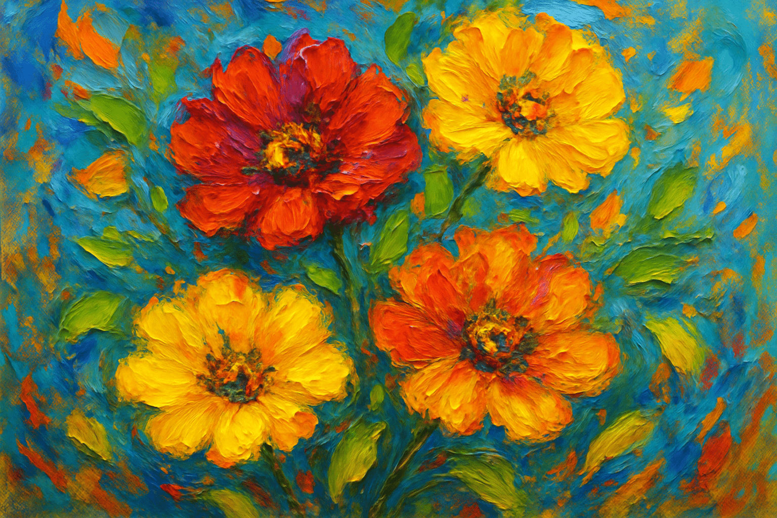
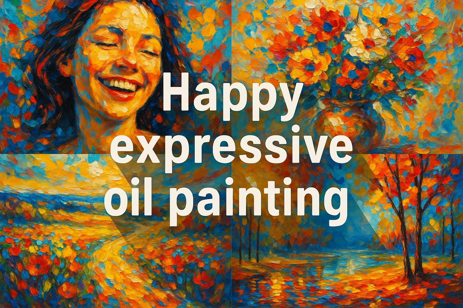
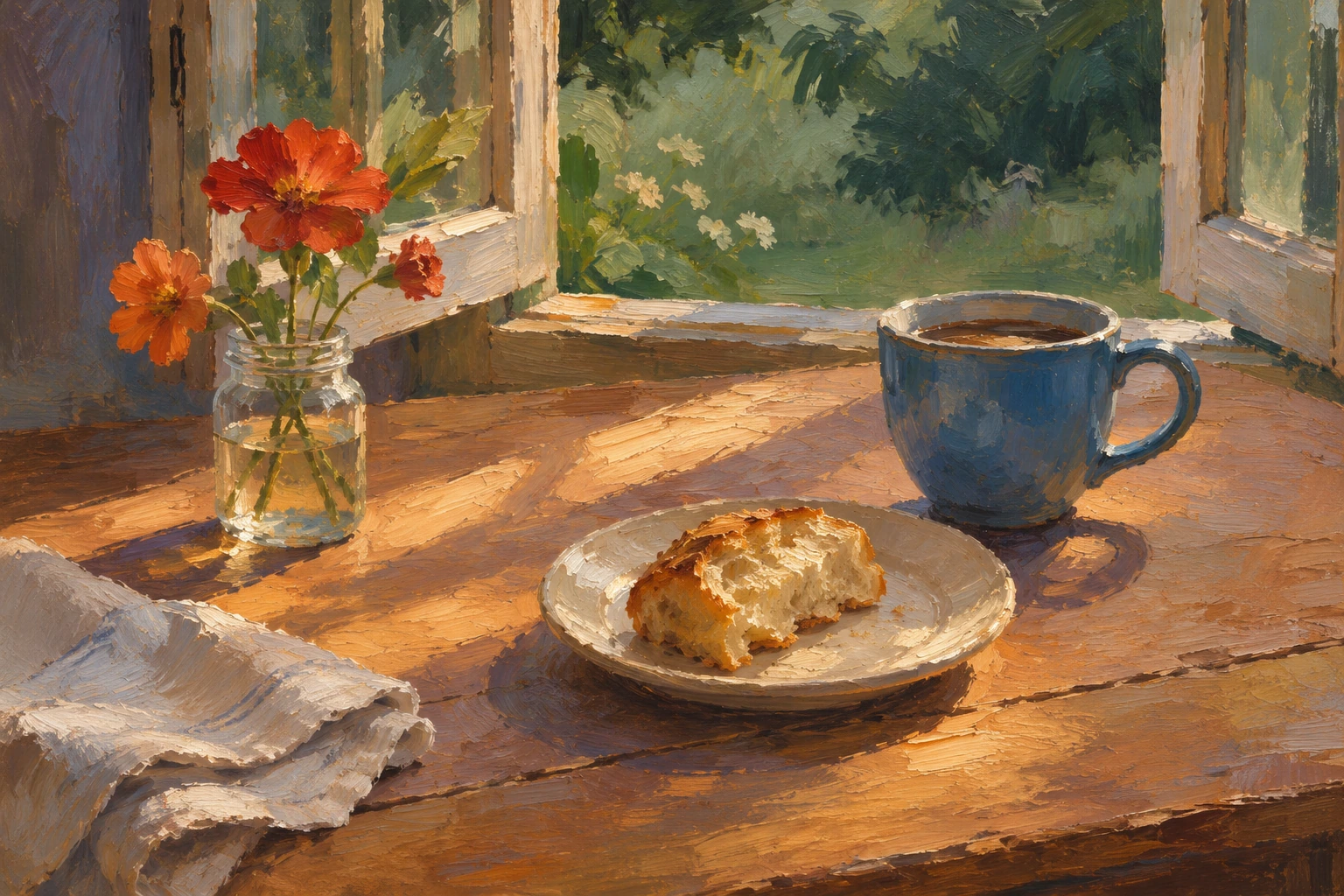
Three AI-generated interpretations: vivid flowers, a retained main-name collage and a quieter breakfast study. They illustrate different degrees of energy within an AOI creative direction.
Select an image for a closer look. Use the thumbnails, arrow keys or a swipe to compare examples. Zoom in to inspect details, or share the image that inspires you.
Creative toolbox · take this style further
Choose an input and a destination. Search sends your words to the chosen site; Copy & open puts them on your clipboard to paste there.
Create with AI
Turn your chosen input into an image prompt or a new creative direction.
ChatGPT
Copy your input and paste it into a ChatGPT conversation or image request.
Copy & open ChatGPT (new tab)Claude · Anthropic
Develop an image prompt or explore the style in a new Claude conversation.
Copy & open Claude · Anthropic (new tab)Midjourney
Paste your input into the Imagine bar on the Create page.
Copy & open Midjourney (new tab)Adobe Firefly
Copy your input, open Firefly, and paste it into the prompt field.
Copy & open Adobe Firefly (new tab)Leonardo.Ai
Copy your input, open Leonardo, and paste it into the generation field.
Copy & open Leonardo.Ai (new tab)Image search
Find visual references. Short, concrete keywords usually work best.
Lexica
Search AI images and prompts using your selected input.
Search with this input Lexica (new tab)Pexels
Search the photo and video library. Short keywords often work best.
Search with this input Pexels (new tab)Pixabay
Search photos, illustrations and other images.
Search with this input Pixabay (new tab)Unsplash
Search photographs using the style name or your own keywords.
Search with this input Unsplash (new tab)Wikimedia Commons
Search photographs, artworks and historical images. Check each file for its source and reuse terms.
Search with this input Wikimedia Commons (new tab)Art & research
Explore artists, collections and the ideas behind a style.
Wikipedia
Search for background reading. A style may not have its own article.
Search with this input Wikipedia (new tab)WikiArt
Copy your input into WikiArt’s search to explore artists and artworks.
Copy & open WikiArt (new tab)Europeana
Paste your keywords into the search to explore European museum, library and archive collections.
Copy & open Europeana (new tab)Inspiration
Discover portfolios and visual ideas from creative communities.
Instagram hashtags
Search a hashtag made from your input: spaces and punctuation are removed. Instagram may require sign-in.
Search with this input Instagram hashtags (new tab)ArtStation
Paste your input into artwork search for concept art, environments, characters and visual development.
Copy & open ArtStation (new tab)Behance
Paste your input into project search for illustration, design and visual storytelling.
Copy & open Behance (new tab)A closer look
Give a small everyday pleasure a clear shape and a comfortable setting. Balance warm accents with cooler shadows, varied brush marks and quieter passages so the image has both life and room to rest.
An AOI direction, not a historical school
Happy expressive oil painting is a descriptive creative direction used in the AOI database. It brings a mood, a kind of paint handling and a medium together; it does not name a documented movement with founders or an early-twentieth-century origin. Here, happy means a sense of pleasure or ease. A sunny table, a pet resting nearby or flowers in an ordinary jar can supply a specific reason for that feeling.
There is no single colour or facial expression that guarantees happiness for every viewer. This workshop offers choices to try, not a universal emotional code. Expressive means that marks and colour actively shape the scene. It does not automatically identify the work with historical Expressionism or Impressionism.
What the oil-painting reference contributes
In physical oil paint, pigment is mixed with an oil medium. Its relatively slow drying permits a range of handling and optical effects. Impasto refers to areas built up with paint, where brush or knife marks and the way the surface catches light become noticeable. Thickness is one option within oil painting, not a requirement for every passage. [1, 2]
For this AOI direction, let the handling vary: broad strokes establish the table or sky, narrower marks turn around a cup or petal, and a few raised-looking highlights bring attention to the focal area. Keep some edges soft and recover sharper ones where objects need definition. A digital illustration can suggest these effects, but it does not possess actual oil paint, drying behaviour or physical surface relief.
Two useful comparisons from museum collections
The National Gallery’s Joy catalogue chapter discusses Vincent van Gogh’s Sunflowers (1888) through the theme of joy and draws attention to its limited palette of yellows with touches of blue. It offers a useful invitation to look closely at variation within a small colour range. It does not establish a historical school called Happy expressive oil painting. [3]
Maurice de Vlaminck’s Boats on the Seine at Chatou (1906) provides a contrasting lesson. The Met describes forceful brushwork and complementary colours, but also tension in the foreground. Vivid colour and active marks can create intensity rather than calm. Use this comparison to ask what the composition is doing, instead of assuming that high saturation alone will supply the desired mood. [4]
Build the mood through relationships
Start with one small pleasure and arrange the major shapes so it can be noticed. Leave an open area beside the main subject. Choose a dominant colour family and a smaller contrasting accent; retain enough dark value to make light feel luminous. Let marks follow forms and change direction when the surface changes. Concentrate detail where the eye should linger, rather than applying the same texture everywhere.
The retained flower illustration uses strong orange, yellow and turquoise to make an energetic variation. The new breakfast study takes a quieter route: a blue cup, bread and a jar of flowers share a patch of light, with open tabletop between them. Compare their spacing, contrast and brush-mark density. The retained collage combines a smiling figure, flowers and landscapes around the complete style name. All three images are AI-generated interpretations, not the museum works discussed above.
For a practical study, work in three passes: establish a readable light-and-dark arrangement, organise the large colour areas, then add a few expressive accents. Review the image small. If everything competes, simplify a background or reduce the strongest colour outside the focal area. If a generated cup, limb or flower collapses beneath texture, repair the form before adding more brushwork.
AOI’s related Joyful expressive oil painting entry places more emphasis on outward movement and shared energy. The distinction is an editorial choice within these overlapping creative briefs, not a formal boundary in art history. Use this page when the subject calls for contentment, and compare the related page when gestures, rhythm or celebration should lead.
A small poetic detour
Original words from the AOI studio.
Poetry
The cup keeps a little blue
beside the bread and morning.
Light crosses an ordinary table;
three flowers lean into the day.
Nothing needs to happen quickly.
The prompt workshop
Original creative exercises. These prompts create new illustrations, not documentary evidence.
A sunny breakfast
Create an original expressive oil-painting interpretation of an unhurried breakfast beside an open garden window: a blue cup, golden bread on a cream plate and a small jar of warm red flowers. Use open spacing, a diagonal patch of sunlight, cool shadows and directional brush marks. Keep the cup and plate perspective coherent; reserve thick-looking highlights for a few accents. No lettering or signature.
A small pleasure
Create an original oil-painting interpretation of a sleepy dog beside an open garden door. Let one relaxed coherent pose, warm floor light and muted green foliage suggest contentment. Use broad quiet shapes around the animal, soft fur passages and a few crisp marks near the face and paws. Natural proportions, believable floor contact, varied texture, no exaggerated smile, text or signature.
Colour as ease
Create an original abstract painting interpretation using broad peach, cream and pale blue shapes, one deeper blue anchor and a few lively yellow marks. Use generous intervals, varied soft and crisp edges and a clear rhythm with a place for the eye to rest. Suggest selective oil-paint texture rather than uniform impasto. Avoid symbols, lettering and signatures.