
An original AOI paired-image study of two ways of seeing
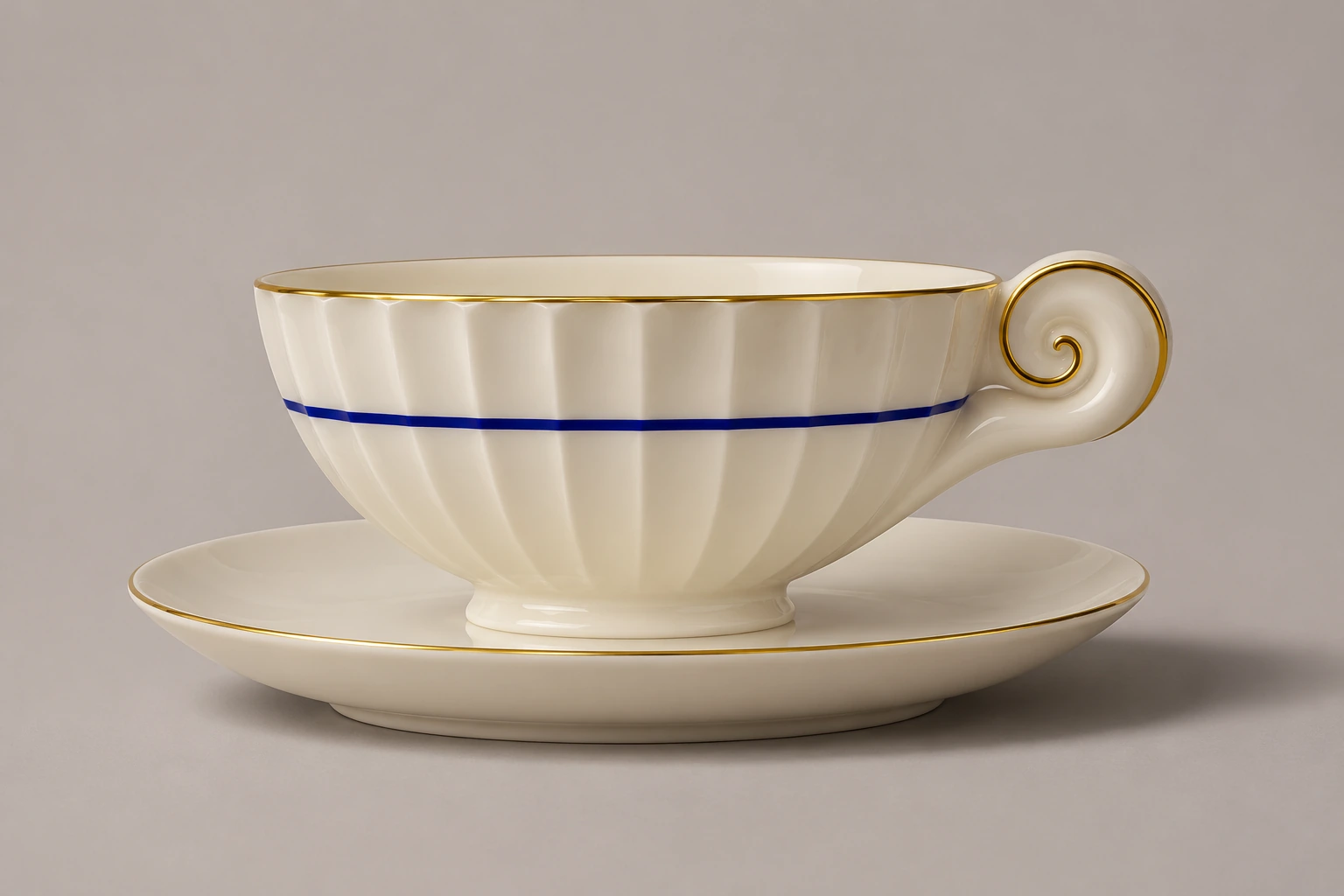
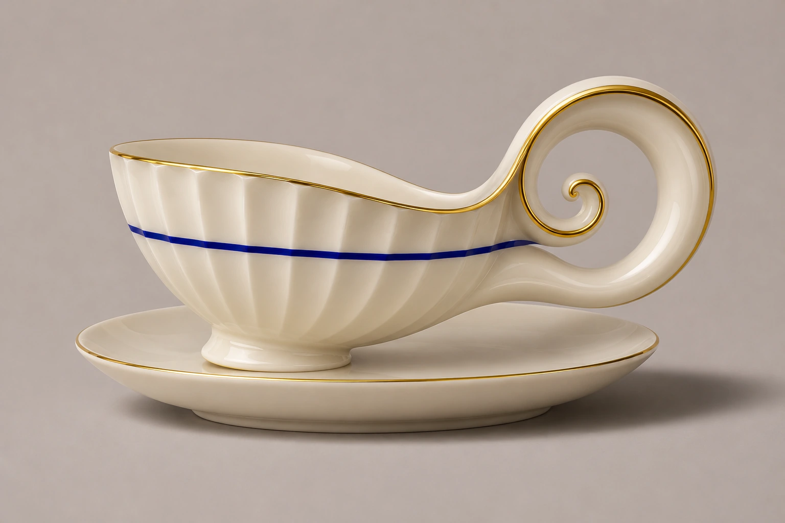
The teacup has a thin gold lip and the manners of a good saucer. In its companion the handle grows until the rim bows towards it. Both cups are strange. Only one introduces itself that way. This extended study uses four pairs and one undecided brooch to ask what the eye sees first, and what persuades it to stay.
A visual introduction
For each subject, image A is the starting work and image B was generated from A as a visual reference. The final brooch tests whether either reading can hold. The comparison viewer places each pair side by side.
Select an image for a closer look. Use the thumbnails, arrow keys or a swipe to compare examples. Zoom in to inspect details, or share the image that inspires you.
Creative toolbox · take this style further
Choose an input and a destination. Search sends your words to the chosen site; Copy & open puts them on your clipboard to paste there.
Create with AI
Turn your chosen input into an image prompt or a new creative direction.
ChatGPT
Copy your input and paste it into a ChatGPT conversation or image request.
Copy & open ChatGPT (new tab)Claude · Anthropic
Develop an image prompt or explore the style in a new Claude conversation.
Copy & open Claude · Anthropic (new tab)Midjourney
Paste your input into the Imagine bar on the Create page.
Copy & open Midjourney (new tab)Adobe Firefly
Copy your input, open Firefly, and paste it into the prompt field.
Copy & open Adobe Firefly (new tab)Leonardo.Ai
Copy your input, open Leonardo, and paste it into the generation field.
Copy & open Leonardo.Ai (new tab)Image search
Find visual references. Short, concrete keywords usually work best.
Lexica
Search AI images and prompts using your selected input.
Search with this input Lexica (new tab)Pexels
Search the photo and video library. Short keywords often work best.
Search with this input Pexels (new tab)Pixabay
Search photos, illustrations and other images.
Search with this input Pixabay (new tab)Unsplash
Search photographs using the style name or your own keywords.
Search with this input Unsplash (new tab)Wikimedia Commons
Search photographs, artworks and historical images. Check each file for its source and reuse terms.
Search with this input Wikimedia Commons (new tab)Art & research
Explore artists, collections and the ideas behind a style.
Wikipedia
Search for background reading. A style may not have its own article.
Search with this input Wikipedia (new tab)WikiArt
Copy your input into WikiArt’s search to explore artists and artworks.
Copy & open WikiArt (new tab)Europeana
Paste your keywords into the search to explore European museum, library and archive collections.
Copy & open Europeana (new tab)Inspiration
Discover portfolios and visual ideas from creative communities.
Instagram hashtags
Search a hashtag made from your input: spaces and punctuation are removed. Instagram may require sign-in.
Search with this input Instagram hashtags (new tab)ArtStation
Paste your input into artwork search for concept art, environments, characters and visual development.
Copy & open ArtStation (new tab)Behance
Paste your input into project search for illustration, design and visual storytelling.
Copy & open Behance (new tab)A closer look
Read each pair first at a small size and then close up. The shared subject, lighting and viewpoint make changes in silhouette easier to see. A repeated line, material sheen or working joint can draw the eye back into a form it initially finds awkward.
Which impression gets there first?
Grotesque Beautyness and Beautiful Grotesqueness are the working names of this AOI experiment. We keep the spelling Beautyness for the first proposition. In A, an orderly object invites attention before an awkward detail comes into focus. In B, a difficult outline catches first and material precision gradually makes it attractive. These are instructions for looking. Your own eye gets the deciding vote.
The ground, medium and viewpoint stay as close as a reference edit allows. No two outputs share a guaranteed geometry. The saucer shifts a little, foliage rearranges and a fold acquires its own shadow. Those changes matter because they can influence which image feels more graceful. Open the four-pair viewer under Discover another art style. Look at each subject at thumbnail size, then inspect a detail before reading the captions.
Porcelain and yew give two kinds of curl
Cup A gives the eye a level gold rim to ride. The little spiral handle comes as a decorative afterthought. In B the eye follows the dip in the rim directly into a handle almost large enough to be another cup. The cobalt stripe records the change as clearly as any ruler. It droops with the bowl. The saucer still presents a stable horizon.
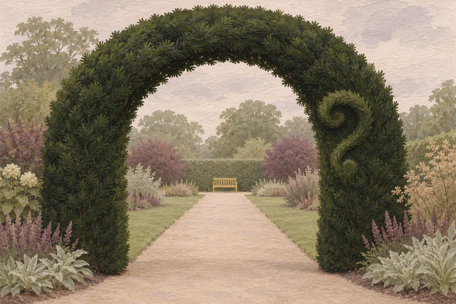
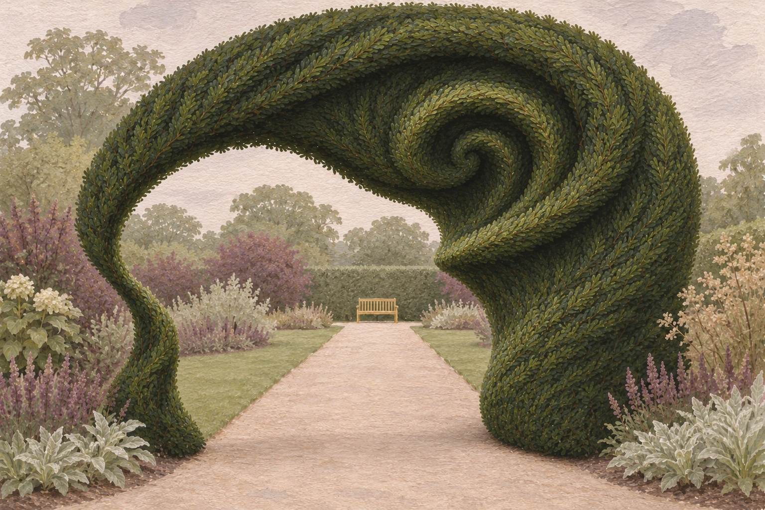
In Hedge A a curl like a question mark hides in the right jamb. The path and little bench make the arch feel orderly enough to walk through. Hedge B lets the curl roll over an entire shoulder, narrowing the opening. The bench matters more than the extra leaves. It remains recognisably a seat, which makes the new growth look enormous. Cover it and the form flattens into an attractive spiral.
Bronze and paper put the test under pressure
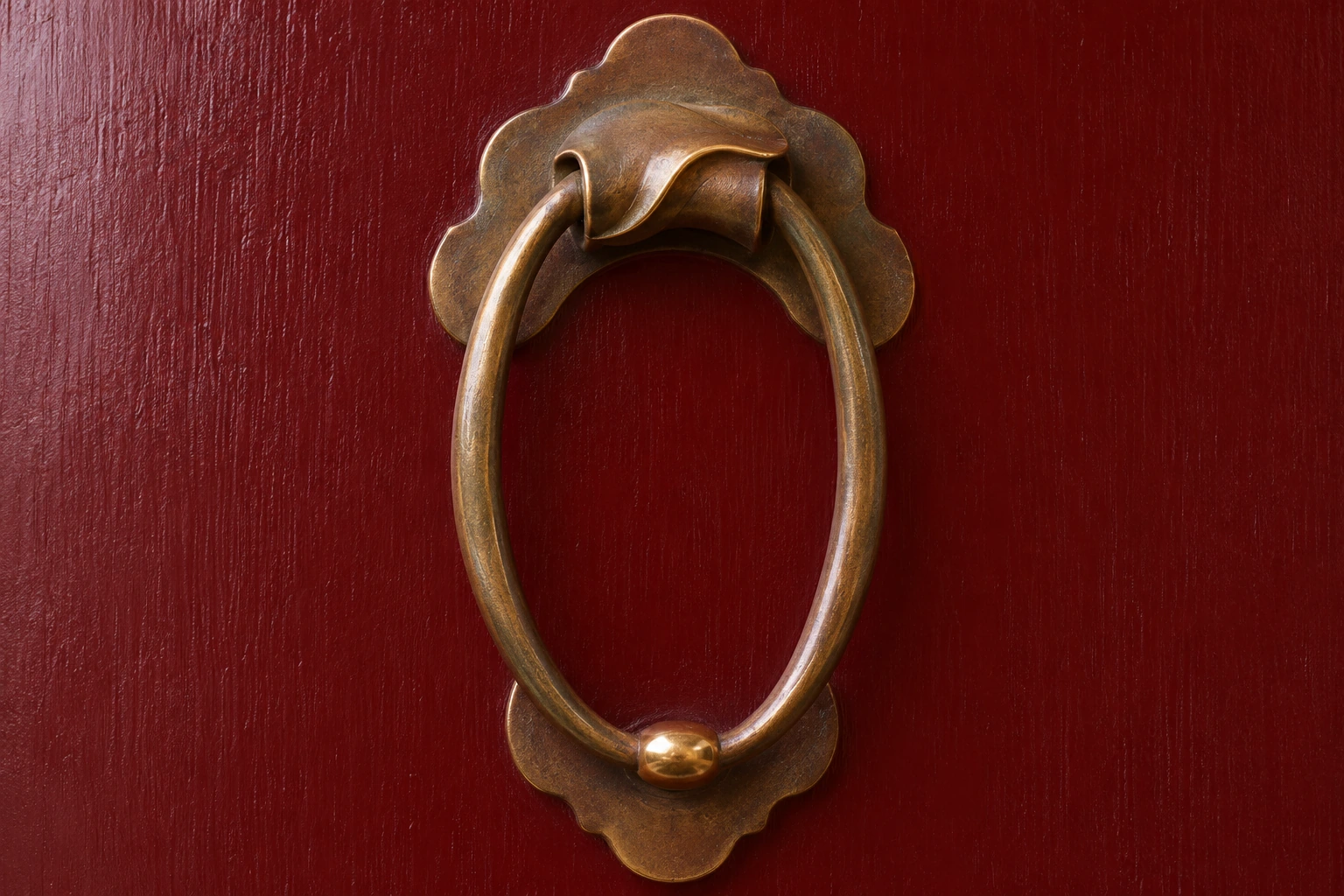
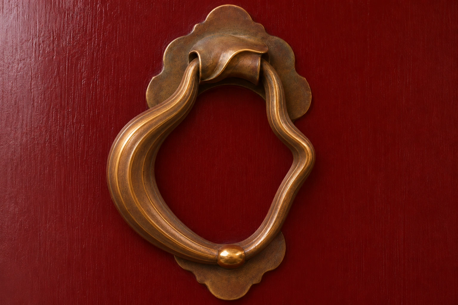
The bronze knocker is the least obedient subject. In A, the bright contact bead picks out the lowest point of an ordinary oval. In B, the left side gains a heavy fold and the right side a kink. The bead still finds the striker. To my eye it remains quite a plausible, handsome piece of hardware in both views. Someone who works with ornamental metal may register the change as a period flourish. That is a genuine counter-reading.
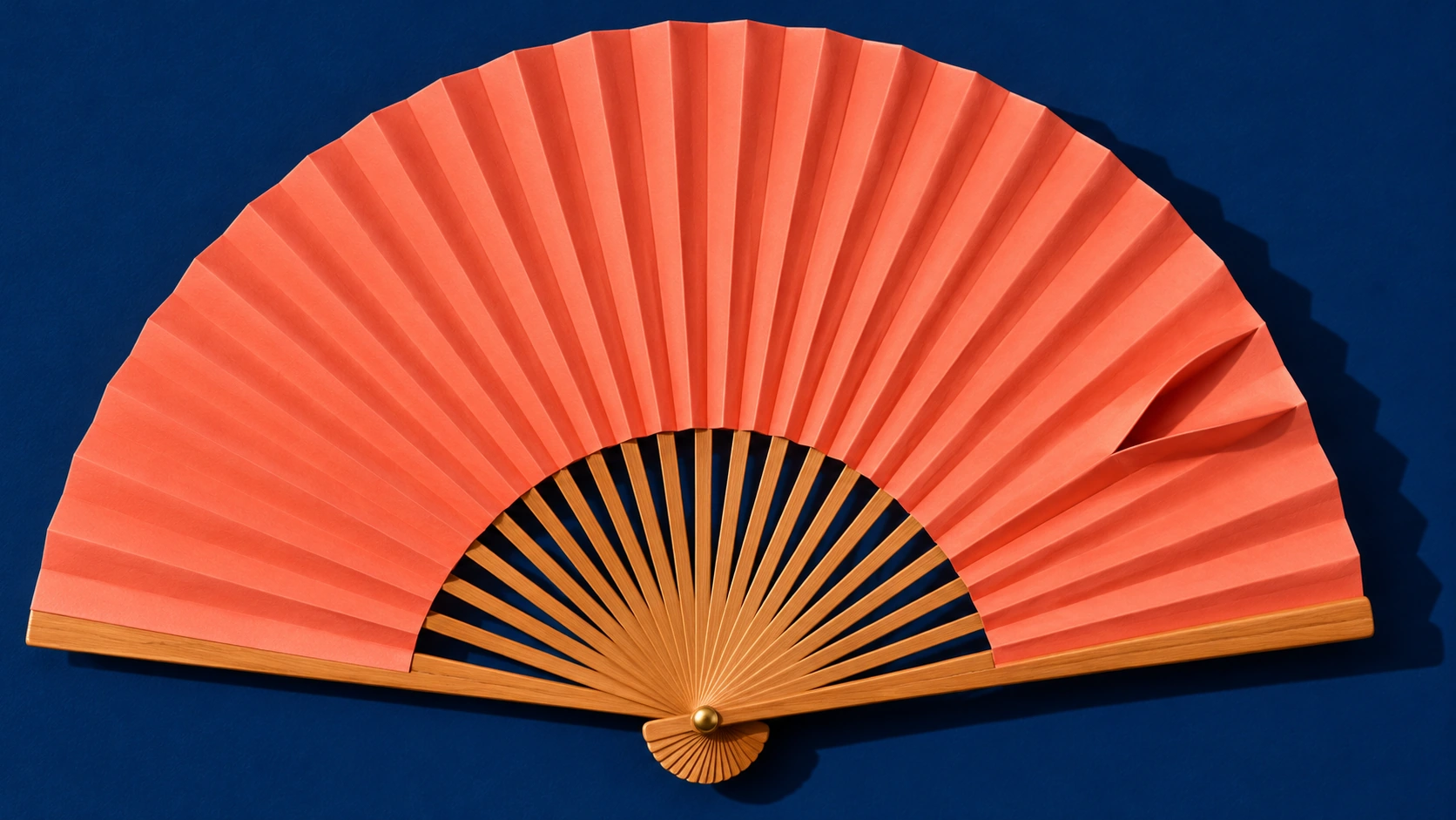
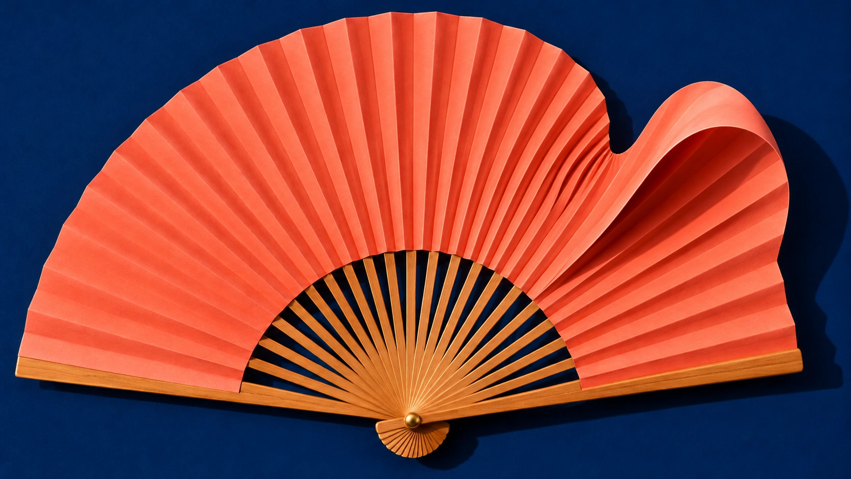
The fan changes more decisively. One reversed pleat in A is easy to pass over. In B, a notch interrupts the top edge and a raised lobe casts a dark pocket of shadow. Yet the intact wooden ribs still run back to one pin. The object keeps making sense in the hand. Try looking at the dark ground above the notch as a shape in its own right. The awkwardness turns surprisingly crisp.
Historical works that sharpen the question
Adam van Vianen’s Lidded Ewer of 1614 is silver gilt, according to the Rijksmuseum. In a studio photograph a fluid-looking fold might suggest a soft material until a narrow reflection declares it metal. The Met’s account of auricular metalwork gives a historical vocabulary for such ear-like and flowing contours. Neither of our paired terms was the maker’s name for that practice.
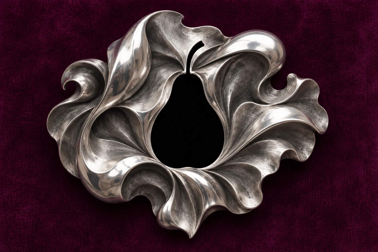
Arcimboldo’s The Gardener, in Cremona, changes from vegetables in a bowl to a face when turned upside down. Compare that physical reversal with the way you look at the silver brooch in this gallery. A pear-shaped opening sits inside an unruly mass of metal. You can switch from the silhouette of the pear to the silver surrounding it without rotating anything. Pay attention to the fraction of a second when the former figure becomes the ground.
Repeat the experiment with an object of your own
Choose something with a job you can picture. A fan has a pivot, a cup has a rim and a knocker has to strike. Make a first image with one small irregularity. For the second, use the first as a reference. Change the outline around that same irregularity and keep the surface and lighting as steady as you can. Give the viewer both pictures with their left-right order reversed as a second pass. If their preference follows position, the experiment has taught you something about display.
The art direction and individual comparison notes accompany the public viewer. The nine studies and the two pieces of gallery art are separate original works. The three reviews below are AI-authored editorial readings by Penny Wraiter. Captions identify the generated interpretations. The museum works are reading references and belong to their respective collections.
Positive review · Penny Wraiter
The cup earns the comparison. Its cobalt stripe remains continuous even where the rim bows, so you can watch a change of proportion travel through the whole vessel. In the fan, the navy notch is as eloquent as the coral pleat. Both images give the viewer a precise place to locate the change.
Negative review · Penny Wraiter
The polished metal and careful lighting flatter nearly everything in the knocker pair. The altered ring looks like a more expensive order from the same foundry. A harsher lamp would add drama but would also spoil the comparison. I would keep the light and try a hinge so lopsided that its contact with the striker becomes a real question.
Neutral review · Penny Wraiter
This exercise describes the order of attention in a small, authored set of images. It works best with a recognisable object and a feature the viewer can track. A trained silversmith, a gardener and a child may see the same gate in different orders. The brooch gives all three a point at which to disagree.
A small poetic detour
Original words from the AOI studio.
Poetry
Gold goes round the cup
and comes back limping.
The gardener clips one curl too late.
A hand at the red door
knows the bronze by weight.
The fan keeps one fold for itself.
I look again. It opens.
The prompt workshop
Original creative exercises. These prompts create new illustrations, not documentary evidence.
Keep one small irregularity
Compose a pale porcelain cup, nearly level gold rim, straight cobalt stripe, modest spiral handle and plain saucer. Light it from one side. Let the spiral register only after the cup itself.
Make the irregularity lead
Use the first cup as a reference. Keep its china, saucer, background and lighting. Enlarge the spiral until the rim bows towards it. Preserve an unbroken cobalt line so the viewer can follow the deformation.
Make the result undecidable
Create a folded silver brooch around a simple pear-shaped void on plum velvet. Give the metal an unruly outer edge and a carefully repeated sequence of polished ridges. Leave enough empty ground that either the void or the metal can become the subject.
People & works to explore
References discussed in this article. Consult the sources below for context.
Artists and practitioners
Adam van Vianen
Giuseppe Arcimboldo
Paintings and other works
Lidded Ewer (1614) by Adam van Vianen, Rijksmuseum
The Gardener by Giuseppe Arcimboldo, Museo Civico Ala Ponzone
A smile from the studio
Jokes
The two teacups agreed on their best side. Unfortunately, it was the handle of the other cup.