Established
Frutiger Aero is a retrospective name for a glossy, optimistic design aesthetic associated with the mid-2000s and early 2010s. Glass-like surfaces, rounded interfaces, blue skies, water and vivid greenery imagine technology as friendly, clean and naturally integrated into everyday life.
A visual introduction
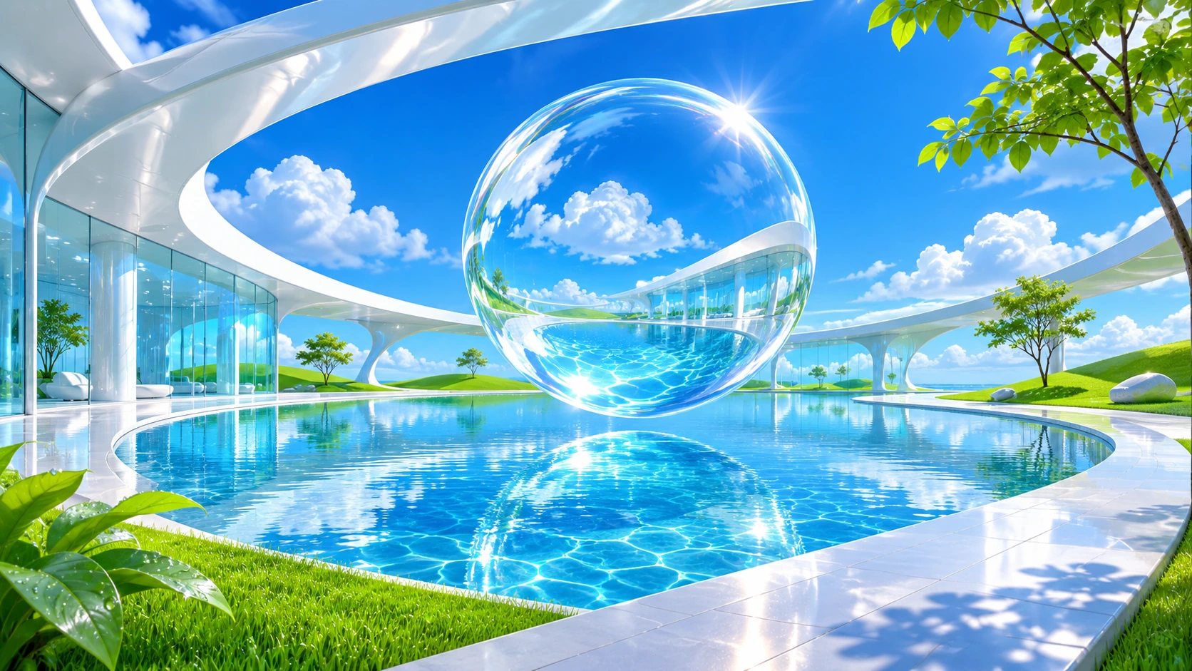
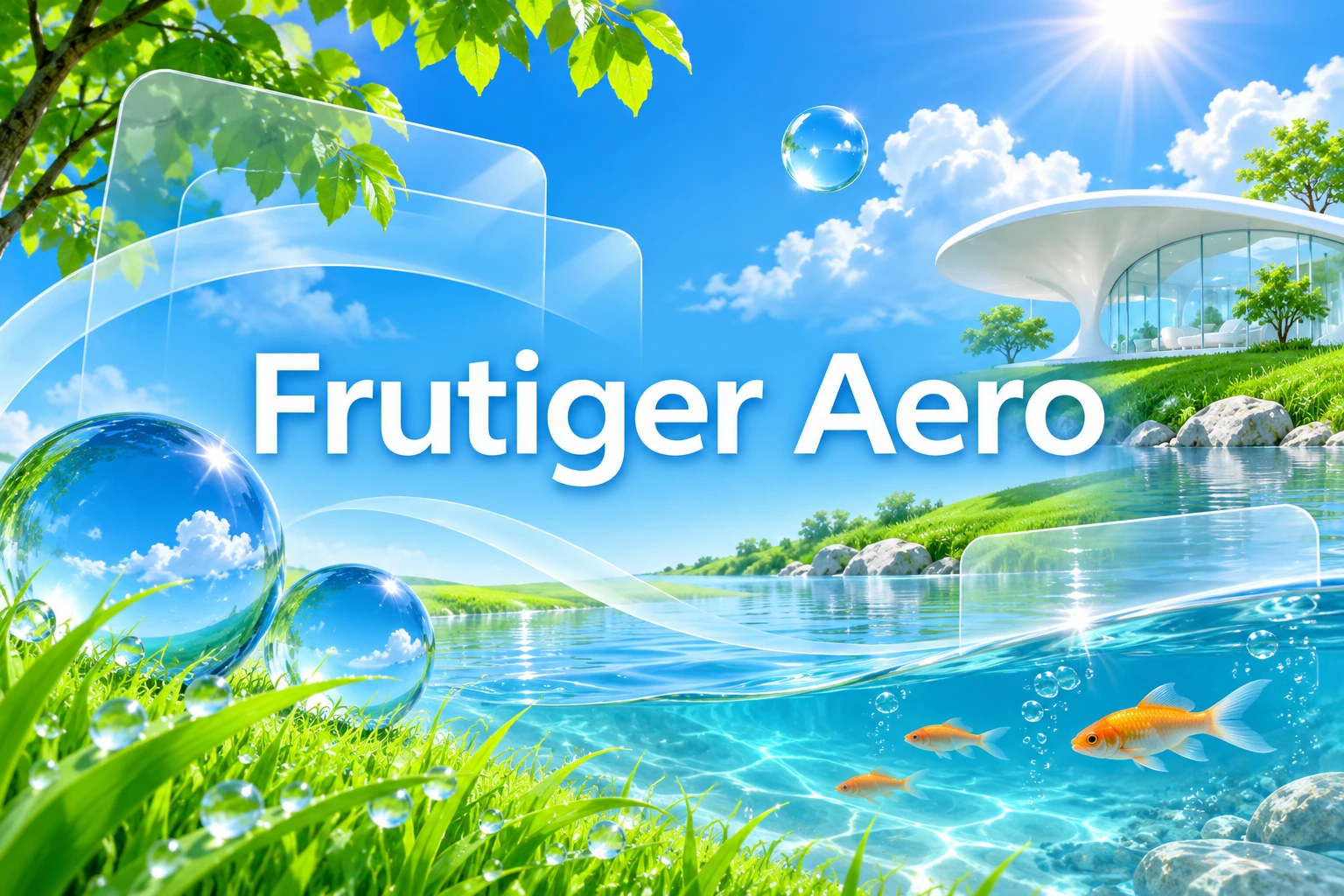
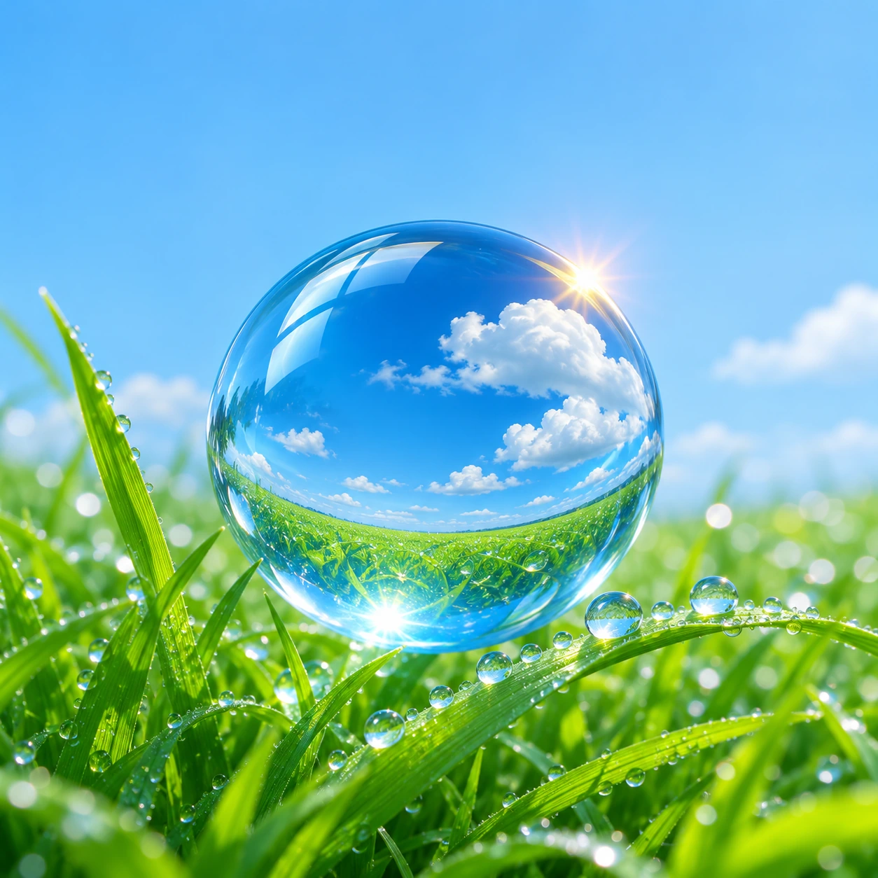
Seven original AI-generated studies explore this subject through a banner, a titled collage and five standalone examples.
Select an image for a closer look. Use the thumbnails, arrow keys or a swipe to compare examples. Zoom in to inspect details, or share the image that inspires you.
Creative toolbox · take this style further
Choose an input and a destination. Search sends your words to the chosen site; Copy & open puts them on your clipboard to paste there.
Create with AI
Turn your chosen input into an image prompt or a new creative direction.
ChatGPT
Copy your input and paste it into a ChatGPT conversation or image request.
Copy & open ChatGPT (new tab)Claude · Anthropic
Develop an image prompt or explore the style in a new Claude conversation.
Copy & open Claude · Anthropic (new tab)Midjourney
Paste your input into the Imagine bar on the Create page.
Copy & open Midjourney (new tab)Adobe Firefly
Copy your input, open Firefly, and paste it into the prompt field.
Copy & open Adobe Firefly (new tab)Leonardo.Ai
Copy your input, open Leonardo, and paste it into the generation field.
Copy & open Leonardo.Ai (new tab)Image search
Find visual references. Short, concrete keywords usually work best.
Lexica
Search AI images and prompts using your selected input.
Search with this input Lexica (new tab)Pexels
Search the photo and video library. Short keywords often work best.
Search with this input Pexels (new tab)Pixabay
Search photos, illustrations and other images.
Search with this input Pixabay (new tab)Unsplash
Search photographs using the style name or your own keywords.
Search with this input Unsplash (new tab)Wikimedia Commons
Search photographs, artworks and historical images. Check each file for its source and reuse terms.
Search with this input Wikimedia Commons (new tab)Art & research
Explore artists, collections and the ideas behind a style.
Wikipedia
Search for background reading. A style may not have its own article.
Search with this input Wikipedia (new tab)WikiArt
Copy your input into WikiArt’s search to explore artists and artworks.
Copy & open WikiArt (new tab)Europeana
Paste your keywords into the search to explore European museum, library and archive collections.
Copy & open Europeana (new tab)Inspiration
Discover portfolios and visual ideas from creative communities.
Instagram hashtags
Search a hashtag made from your input: spaces and punctuation are removed. Instagram may require sign-in.
Search with this input Instagram hashtags (new tab)ArtStation
Paste your input into artwork search for concept art, environments, characters and visual development.
Copy & open ArtStation (new tab)Behance
Paste your input into project search for illustration, design and visual storytelling.
Copy & open Behance (new tab)A closer look
Transparent layers, luminous gradients, rounded volumes and precise specular highlights meet photographic grass, clear water, clouds and spacious skies. Saturated blue and green often anchor the image, with white light and occasional warm accents. Nature and technology appear to share one frictionless, polished environment.
A remembered future with a blue sky
CARI places Frutiger Aero in the mid-2000s to early 2010s and lists glossy surfaces, transparent materials, skeuomorphic interfaces, humanist sans-serif type, aurora imagery, bokeh and macro grass photography among its motifs. The University of Waterloo Computer Museum similarly describes rounded, glass-like forms and a three-dimensional look combined with nature.
The dates describe a useful reference period rather than a switch that every designer turned on and off together. The label groups a family of visual tendencies across media. An image can evoke the aesthetic without reproducing a particular operating system, advertisement or device.
The name does not make Adrian Frutiger its author
The name combines a reference to Adrian Frutiger's typeface family with Windows Aero. It should not be read as a claim that Frutiger designed this entire aesthetic. His work in type and signage deserves its own discussion, separate from the later visual culture gathered under this label.
Likewise, a generated rounded interface is not an authenticated font specimen or an actual operating-system screen. The images here are original contemporary interpretations. They explore the relationship between nature, luminous surfaces and approachable technology rather than reconstructing archived software.
Make the materials legible
Gloss depends on a relationship between a surface and its light. Place a bright highlight where the curvature supports it, allow a darker edge to reveal thickness, and let transparent layers alter the view behind them. If every object receives the same white streak, glass, plastic, water and chrome become indistinguishable.
For an image study, choose one dominant material and one supporting material. A clear blue shell around a matte white object can be more persuasive than a room in which everything is transparent. Small opaque anchors give the eye a place to rest and help the luminous details feel intentional.
Nature is part of the proposition
Waterloo's museum discussion links the combination of nature and futuristic architecture to a utopian image of a green future. The important visual move is the apparent compatibility of organic life and technical convenience: a skyline reflects in clean water, a device sits beside fresh grass, or a glass surface holds a miniature landscape.
That promise is an image, not evidence of ecological performance. A building with plants in its render has not thereby demonstrated low energy use or ecological benefit. In an original artwork, the tension can remain productive: the scene may offer a hopeful possibility while leaving its practical claims open.
Use a hierarchy within the abundance
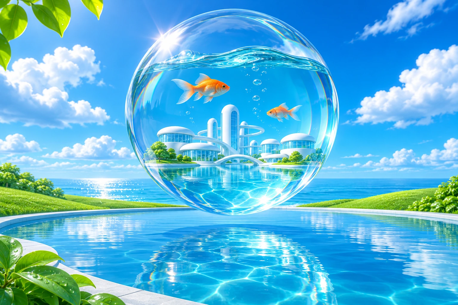
Blue sky, water droplets, fish, bubbles, leaves and glass towers can quickly compete for attention. Choose a primary subject and make the remaining motifs support its scale or direction. A single transparent sphere over a field of grass can carry the aesthetic with fewer distractions than a dozen unrelated floating objects.
Consider the path of light through the image. Repeating highlights can lead toward a focal point, while a calm patch of sky or a white architectural plane provides a pause. The result should feel expansive and inviting rather than crowded simply because the palette is bright.
From interface cues to spatial proposals
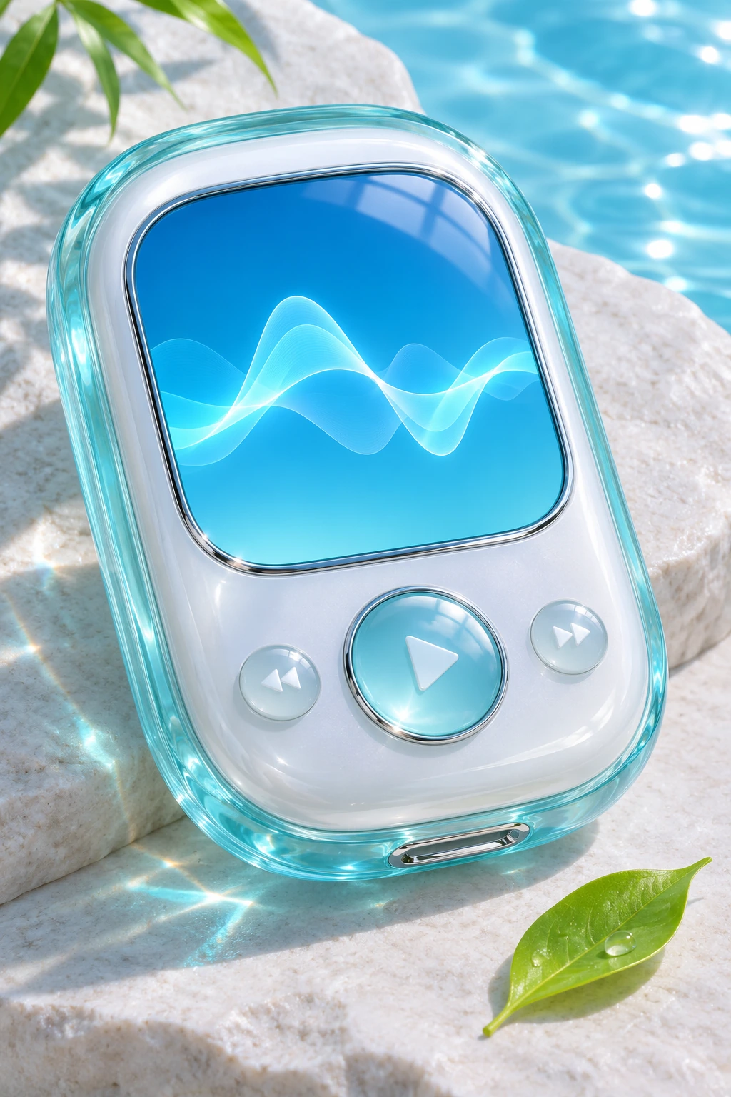
Skeuomorphic design uses visual references to familiar physical things. For a conceptual interface study, a raised glass button or recessed panel can suggest how an object might be touched. But a beautiful depiction does not prove that a real interface is understandable or accessible; those qualities require actual use and testing.
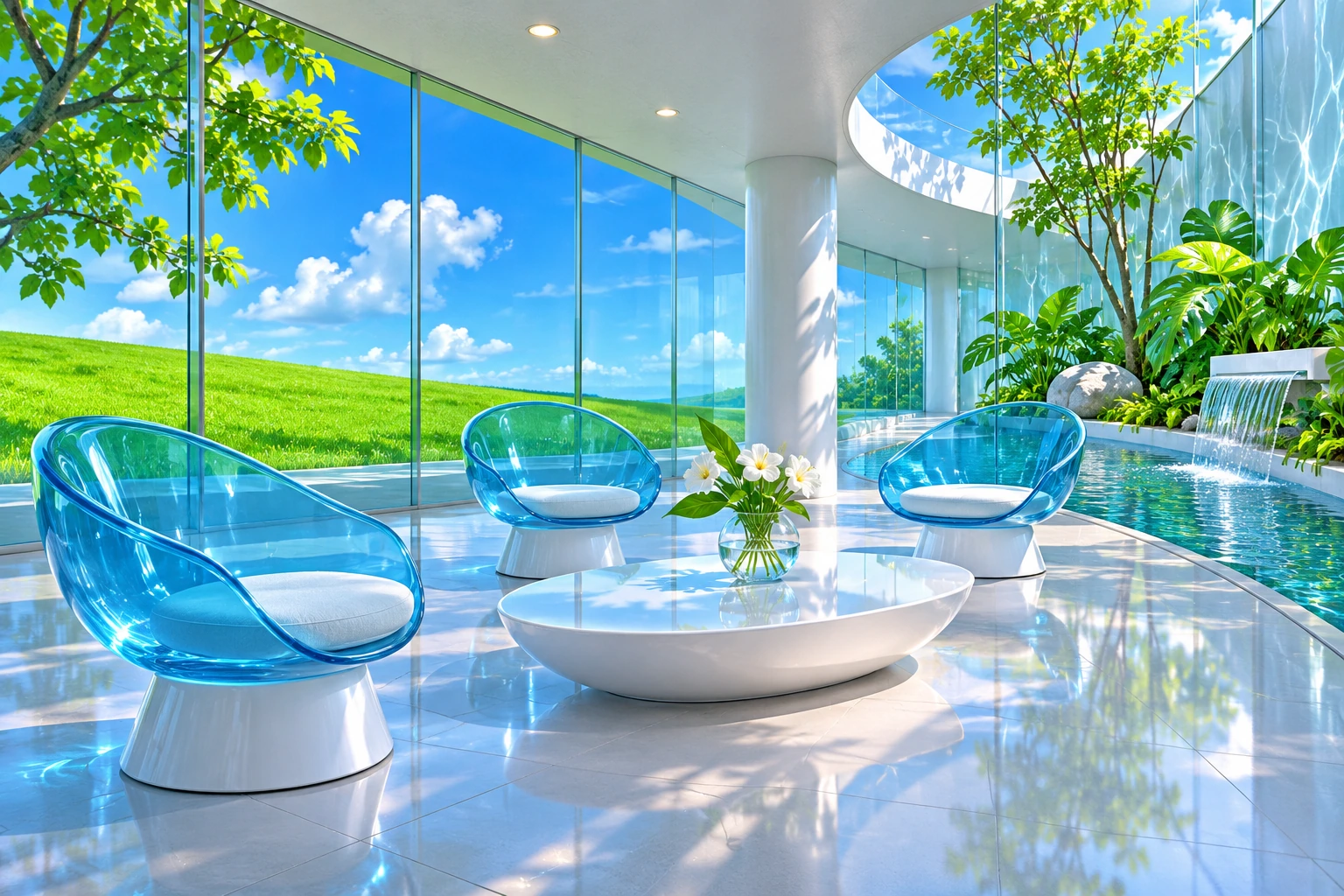
The same distinction applies when extending the aesthetic into furniture or architecture. Rounded transparent seats, pale structural frames and planted water courts are contemporary proposals in this gallery. Their surfaces and lighting communicate a mood, while fabrication, comfort and environmental performance remain separate questions.
Distinguish the neighboring looks
A broad Y2K reference can emphasize metallic surfaces, digital novelty and different late-1990s or early-2000s motifs. Cassette Futurism builds its imagined future around substantial hardware and physical controls. Frutiger Aero often makes technology feel light, glossy and pleasantly integrated with natural imagery. These are comparisons for analysis, not rigid borders.
To create a new study, name the subject first, then specify the material relationships, light and natural setting. Check generated glass for incoherent intersections and inspect small interface elements for meaningless lettering. Avoid relying on a famous logo to establish the style; the composition should carry its identity through its own visual decisions.
Positive editorial review (AI-authored)
Frutiger Aero can make technological imagination feel hospitable. Its strongest images use light, rounded forms and natural detail to turn an abstract promise of connectivity into an environment one might want to enter. Material contrast and generous space keep that optimism visually persuasive.
Negative editorial review (AI-authored)
The aesthetic can collapse into an inventory of bubbles, grass and blue gradients. Gloss may conceal weak composition, and a green-looking scene can imply benefits it has not demonstrated. A stronger interpretation chooses a clear subject, makes the materials coherent and treats optimism as a visual proposition rather than a factual guarantee.
Neutral editorial review (AI-authored)
Frutiger Aero is a retrospective design category with overlapping applications in interfaces, advertising, objects and visual culture. These new AI-generated studies use selected motifs to explore contemporary scenes. They are neither historical artifacts nor usability, engineering or sustainability assessments.
A small poetic detour
Original words from the AOI studio.
Poetry
The window keeps a piece of sky,
A drop holds green against the blue.
The little glass worlds drifting by
Make room for one more hopeful view.
A button shines beneath the sun;
Tomorrow looks almost begun.
The prompt workshop
Original creative exercises. These prompts create new illustrations, not documentary evidence.
One sphere, one landscape
Create an original Frutiger Aero artwork: one transparent blue glass sphere rests above vivid dew-covered grass, refracting a small cloud-filled sky. Precise highlights, generous white-blue negative space, one clear focal point, optimistic daylight, no text or logos.
A welcoming technology pavilion
Design a speculative Frutiger Aero pavilion with rounded white frames, clear blue glass, a shallow reflecting pool and restrained planting. A coherent walkway leads toward one sunlit interior, bright cloud-filled sky, believable material edges, no brand or text. Contemporary concept art, not a real building.
A tactile imaginary interface
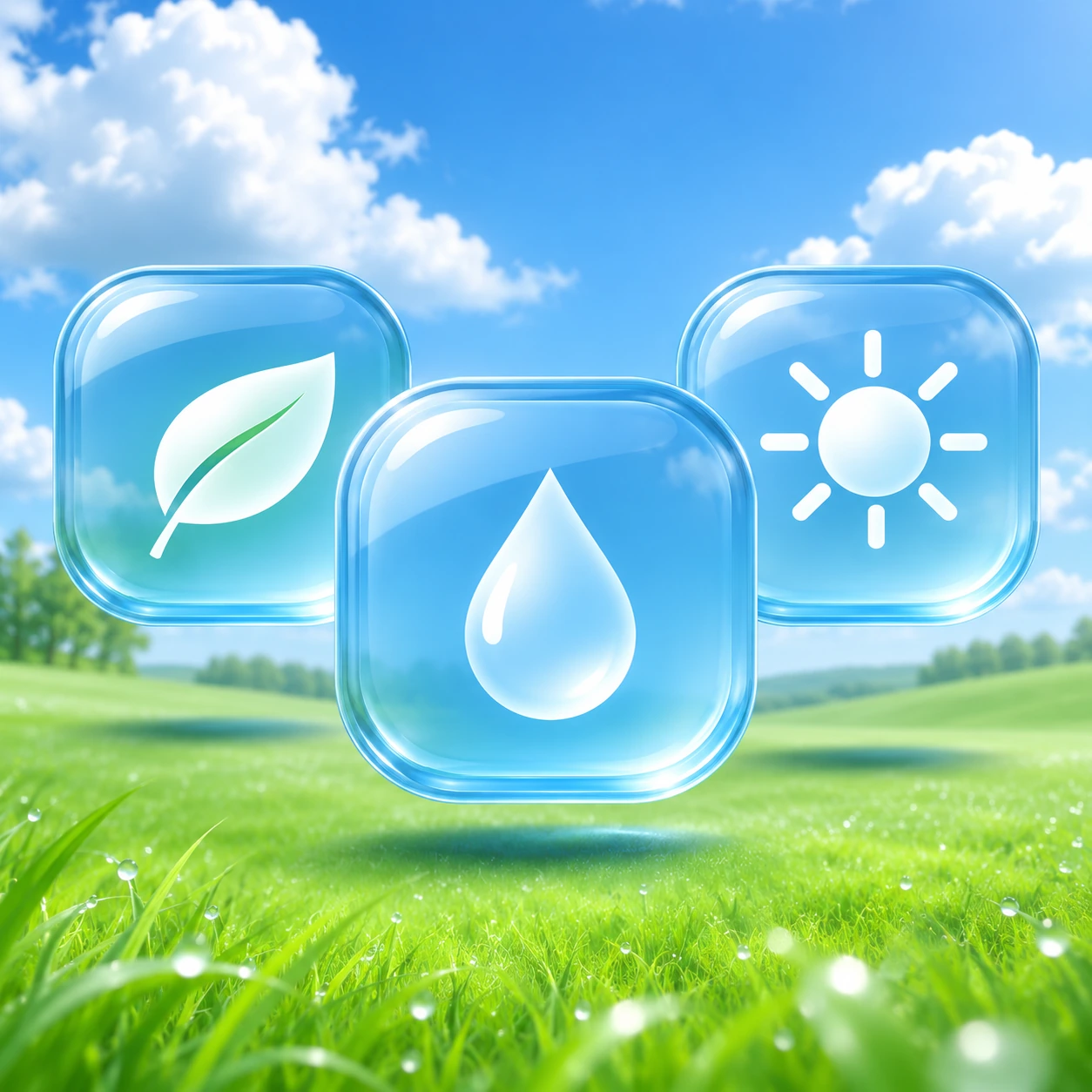
Create an original conceptual interface artwork with three glossy rounded blue controls, translucent layers and a quiet green landscape visible behind them. Clear depth hierarchy, precise material reflections, no actual application or copied screen, no text, logos or watermark. A visual study rather than a tested UI.
Your next inspiration
Discover another art style
Follow a visual thread to the next subject.
A smile from the studio
Jokes
The interface promised a cleaner, brighter future. It had grass, clouds, a glass sphere and a very reassuring leaf. When asked how it would reduce energy use, it opened another beautiful window. The window also had a leaf.