
Illustration for journalism, essays and editorial publishing
A book becomes a roof. A broken bridge is held together by stitches. Editorial illustration gives an article an image with a point of view, choosing a relationship that helps a reader think about the subject.
A visual introduction
Eight original AI-generated illustrations respond to invented editorial briefs. The historical references are documented in the sources. Each gallery caption identifies the premise of its new interpretation.
Select an image for a closer look. Use the thumbnails, arrow keys or a swipe to compare examples. Zoom in to inspect details, or share the image that inspires you.
Creative toolbox · take this style further
Choose an input and a destination. Search sends your words to the chosen site; Copy & open puts them on your clipboard to paste there.
Create with AI
Turn your chosen input into an image prompt or a new creative direction.
ChatGPT
Copy your input and paste it into a ChatGPT conversation or image request.
Copy & open ChatGPT (new tab)Claude · Anthropic
Develop an image prompt or explore the style in a new Claude conversation.
Copy & open Claude · Anthropic (new tab)Midjourney
Paste your input into the Imagine bar on the Create page.
Copy & open Midjourney (new tab)Adobe Firefly
Copy your input, open Firefly, and paste it into the prompt field.
Copy & open Adobe Firefly (new tab)Leonardo.Ai
Copy your input, open Leonardo, and paste it into the generation field.
Copy & open Leonardo.Ai (new tab)Image search
Find visual references. Short, concrete keywords usually work best.
Lexica
Search AI images and prompts using your selected input.
Search with this input Lexica (new tab)Pexels
Search the photo and video library. Short keywords often work best.
Search with this input Pexels (new tab)Pixabay
Search photos, illustrations and other images.
Search with this input Pixabay (new tab)Unsplash
Search photographs using the style name or your own keywords.
Search with this input Unsplash (new tab)Wikimedia Commons
Search photographs, artworks and historical images. Check each file for its source and reuse terms.
Search with this input Wikimedia Commons (new tab)Art & research
Explore artists, collections and the ideas behind a style.
Wikipedia
Search for background reading. A style may not have its own article.
Search with this input Wikipedia (new tab)WikiArt
Copy your input into WikiArt’s search to explore artists and artworks.
Copy & open WikiArt (new tab)Europeana
Paste your keywords into the search to explore European museum, library and archive collections.
Copy & open Europeana (new tab)Inspiration
Discover portfolios and visual ideas from creative communities.
Instagram hashtags
Search a hashtag made from your input: spaces and punctuation are removed. Instagram may require sign-in.
Search with this input Instagram hashtags (new tab)ArtStation
Paste your input into artwork search for concept art, environments, characters and visual development.
Copy & open ArtStation (new tab)Behance
Paste your input into project search for illustration, design and visual storytelling.
Copy & open Behance (new tab)A closer look
Ask what the picture is saying before counting its colours. A clear visual premise, controlled emphasis and a useful relationship with the accompanying text can work through many different materials.
A purpose that can take many forms
Editorial illustration accompanies the ideas, reporting or cultural concerns of a publication. A small spot drawing can punctuate a column. A full-page image can give an essay a visual premise. A cover may address a magazine’s wider editorial world. CUNY City Tech’s illustration teaching material places purpose and context at the centre of the discipline and treats the brief as a problem to understand.
A polished portrait, a rough charcoal drawing, a paper construction and a spare digital shape can all serve that purpose. The useful question is what each contributes to this particular piece of writing. The examples here explore conceptual illustration, where familiar things combine to suggest an argument or tension.
A history carried by publications
The Library of Congress describes the flourishing of illustrated periodicals from the mid-nineteenth century, when black-and-white wood engravings and later colour lithographs brought pictures to newspapers and magazines. Its guide preserves examples and routes into the original collections. Those materials show how much image-making was involved in presenting public events before efficient photographic reproduction.
Olivia Ahmad’s account for the Quentin Blake Centre connects that illustrated press with contemporary digital work, including animation and transitions. Publication formats keep changing the relationship between image, text and reader. An image seen while turning a page has a different rhythm from one encountered in a moving feed.
Artists’ own archives offer specific contemporary references. Christoph Niemann documents his New Yorker subway cover and links to the magazine’s account. Malika Favre’s cover archive includes Operating Theatre, dated 2017. These are named commissioned works with identifiable publishing contexts. Our gallery uses newly invented briefs and original generated compositions.
Write a brief that can be answered
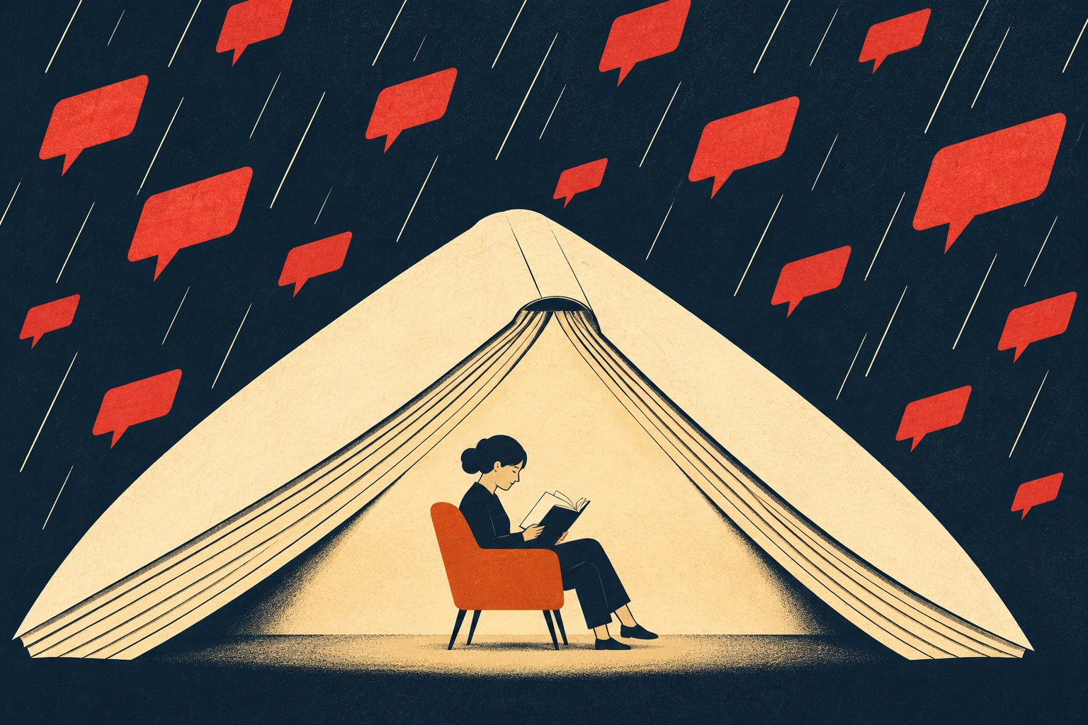
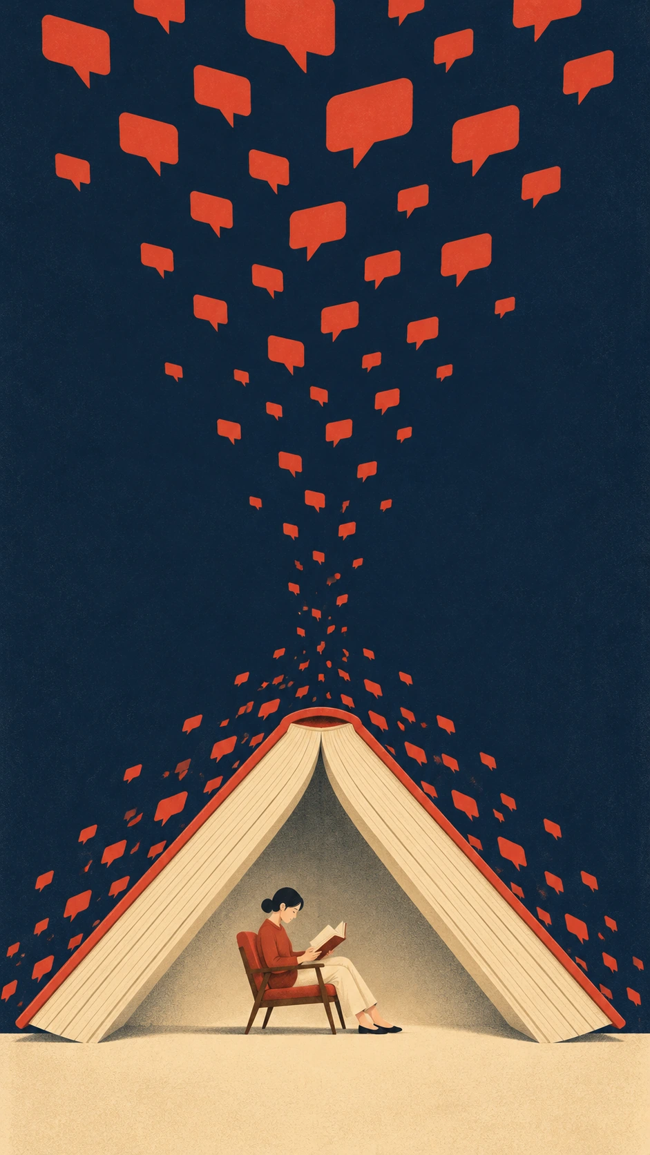
Reduce the intended article to a sentence that contains a relationship. For the attention study, concentrated reading creates a small refuge inside a stream of messages. That sentence gives the image two opposing pressures and a place for the reader to stand. A topic such as technology would leave almost everything undecided.
Add the audience, tone, placement and space the publication actually has. An intimate personal essay may need a quiet image. An analytical feature may benefit from a diagram-like relation. Describe what a reader should notice first and what should reward a second look. The CUNY process material moves from the art director’s brief through research and sketch development. AOI’s exercises below adapt that sequence to generated concepts.
Before rendering, sketch several different answers in simple silhouettes. Change the underlying idea between sketches. A new palette on the same visual pun gives little information about the range of possible arguments. Keep the candidate that adds a useful observation to the writing.
Build one visual proposition
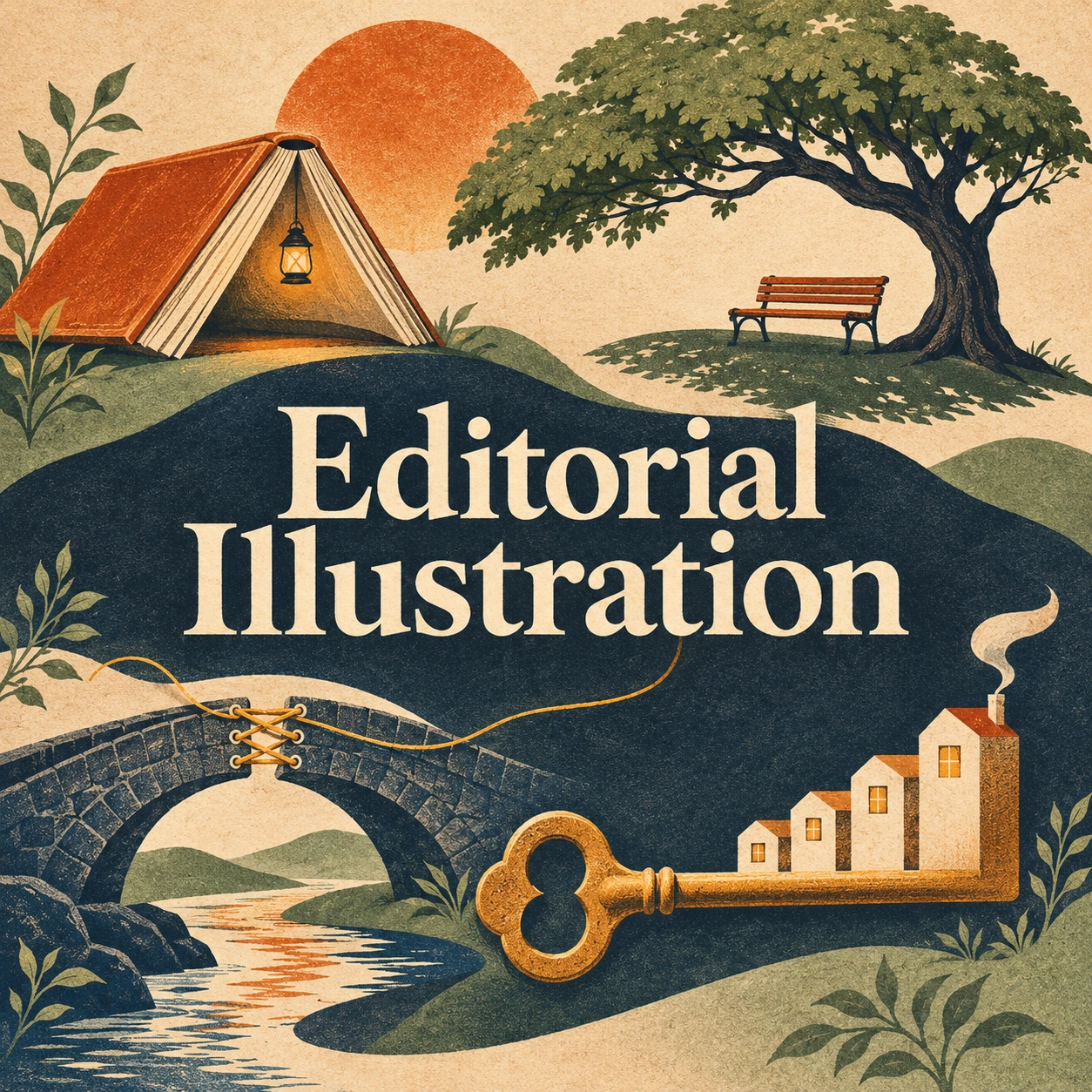
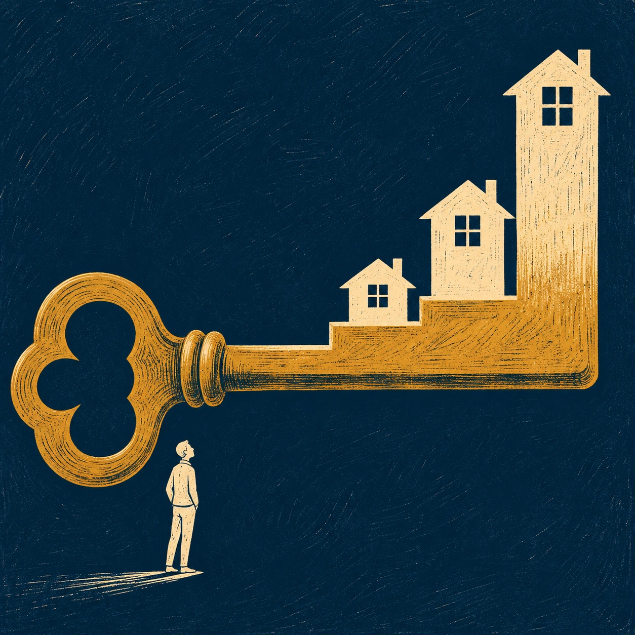
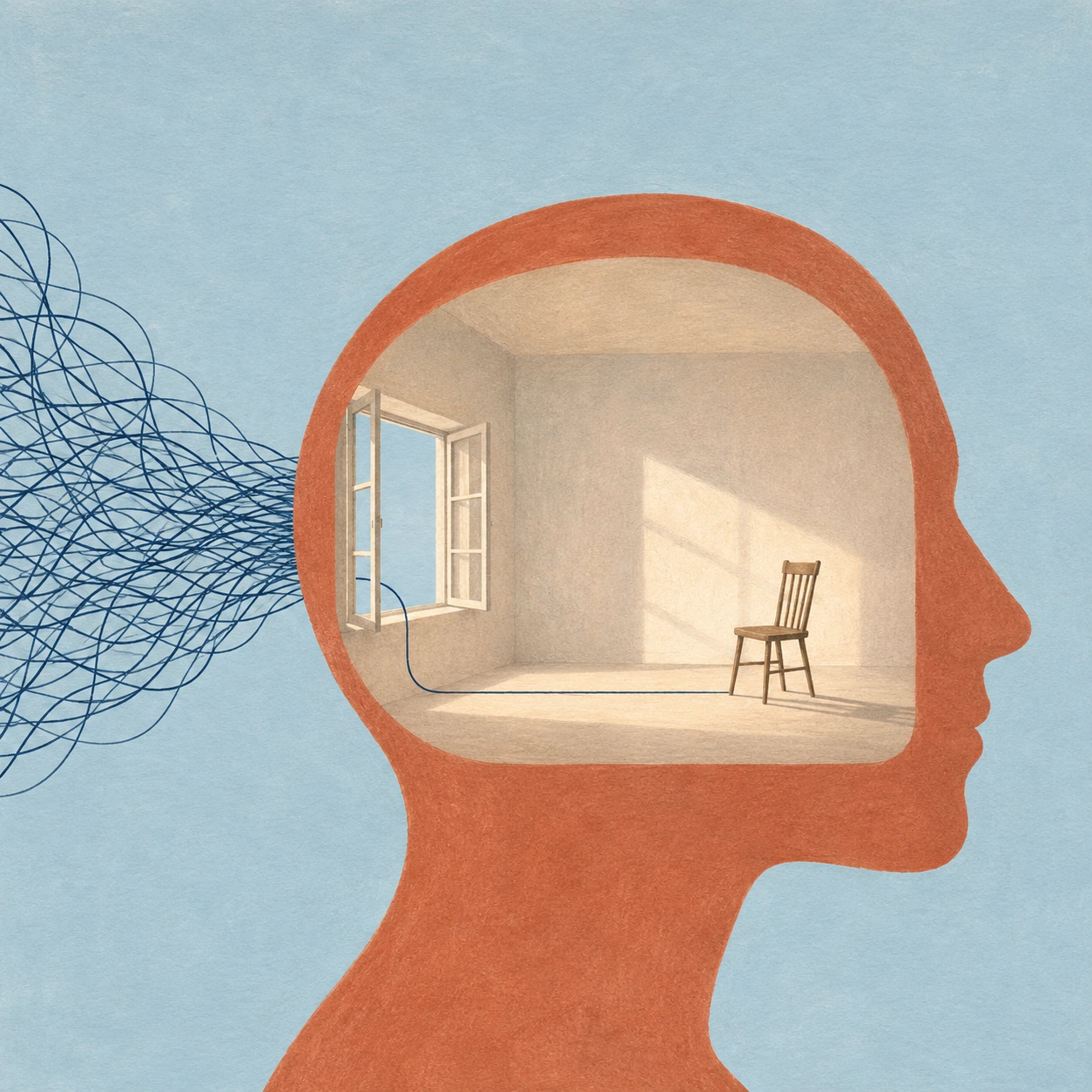
Metaphor transfers a property between things. The book shelter gives reading a protective shape. Substitution lets a familiar object acquire a new function, as the teeth of a key become increasingly tall houses. A deliberate scale shift places the small observer beneath that rising barrier. Negative space can make room for a second reading, as the head silhouette becomes an interior.
Each device needs a clear visual hinge. If the book’s roof stops resembling a book, the attention image becomes an ordinary shelter scene. If the house-shaped teeth disconnect from the key, the housing image becomes a small skyline. Check the junction where the two ideas meet.
Restraint helps. A colour accent can identify the action. A large quiet field can make a small person feel exposed. Texture can suggest urgency, tenderness or physical work, but it also competes for attention. Choose its strength after the premise survives in a plain thumbnail.
Five briefs, five different decisions
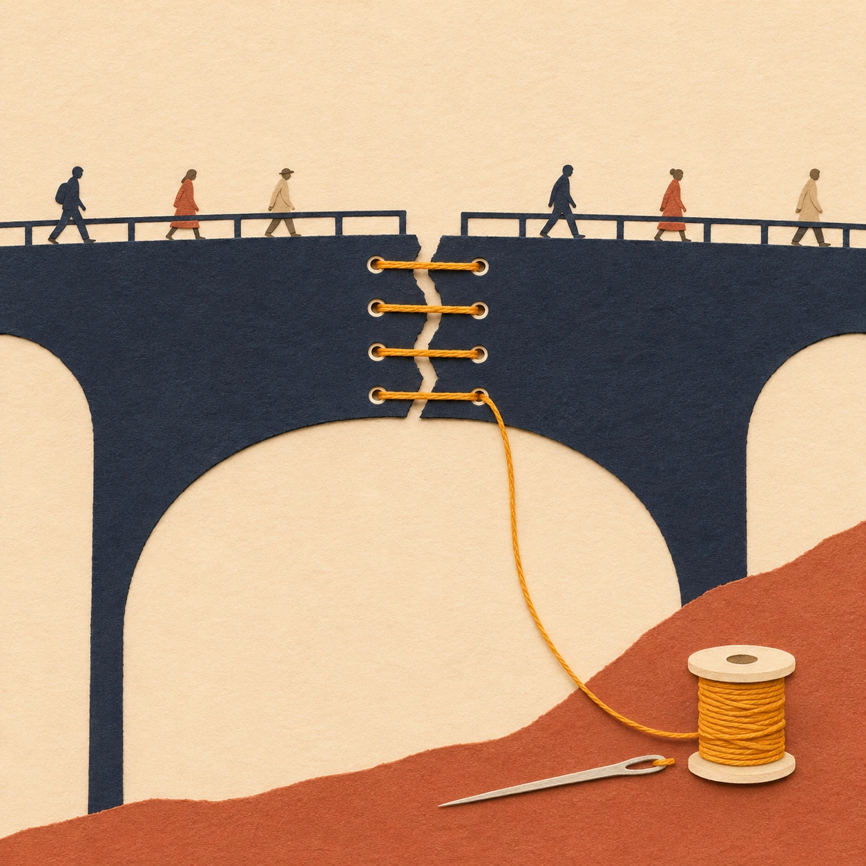
The stitched bridge gives maintenance a visible place in everyday movement. Small figures continue crossing while the golden repair occupies the centre. Its paper-like edges make mending a plausible visual action within the invented world.
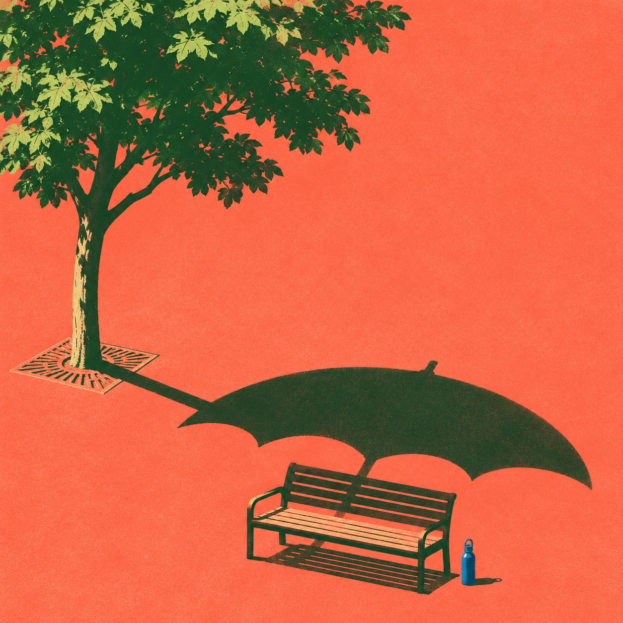
The shade image puts an umbrella-shaped tree shadow beside a bench. The seat sits near its edge, which complicates the apparent promise of comfort. The illustration can open an essay about access to shade. The actual distribution of urban heat would need evidence supplied by the reporting.
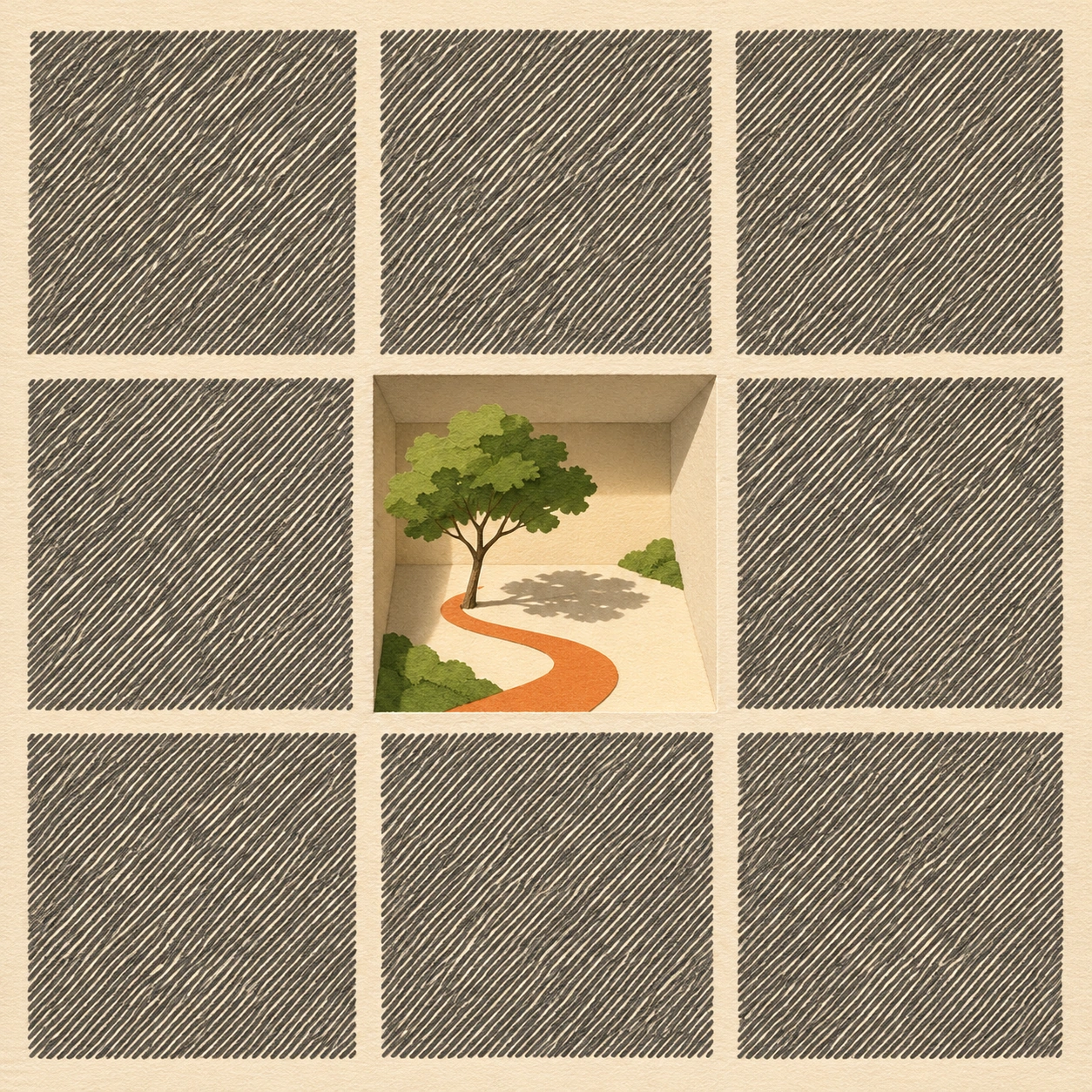
The key and houses use height to make access feel difficult. The room inside a head exchanges visual noise for a single incoming line. The garden in the central calendar-like square gives unallocated time volume and a path. Their subjects differ, but each study is organized around one interpretable change to an ordinary thing.
From a page to a phone screen
The banner places a reader beneath a broad book roof with messages arriving diagonally. The tall variant stretches the navy sky, funnels the message shapes downward and divides their flow around a smaller refuge. The same brief gains a different pacing through the new composition.
For a narrow screen, retain the objects that make the metaphor understandable and leave a clear route between them. Keep the smallest meaningful details large enough to see. If the image must coexist with a headline, plan that space in the brief. The tall study here is presented as a complete text-free artwork.
Check what the metaphor implies
A graceful image can make a blunt argument. A key with rising houses might suggest that ownership is the only meaningful form of housing. A lone reader under cover can suggest that concentration is entirely an individual responsibility. These are interpretive consequences worth discussing with the editor before attaching the image to a real article.
Caption generated interpretations clearly and keep documentary photographs, measured diagrams and eyewitness drawings identifiable through their actual provenance. A convincing invented scene can carry an essay’s metaphor. Evidence about events and people comes from the reporting and its sources.
Evaluate a proposal beside its intended headline and opening paragraph. Check whether it changes the claim, repeats it without adding anything, or leads a reader to a more precise question. A beautiful picture earns the commission when that relationship works.
Positive editorial review
AI-authored editorial assessment. Editorial illustration can make an abstract relationship memorable. The stitched bridge gives maintenance physical presence, while the book roof makes attention spatial. Their familiar objects let a reader enter quickly and then reconsider what those objects are doing. A strong commission can hold that second thought open long enough for the article to deepen it.
Negative editorial review
AI-authored editorial assessment. Visual metaphors can become agreeable shorthand. Keys, ladders, light bulbs and mazes sometimes arrive before the illustrator has read the argument carefully. An attractive simplification can also conceal whose experience the article describes. The housing study needs contextual scrutiny because its stair-like progression might imply a single route to security. Better work begins with the specific brief and challenges the first easy symbol.
Neutral editorial review
AI-authored editorial assessment. Editorial illustration is a publishing practice that accommodates numerous media and levels of realism. Its evaluation depends on the relationship between image, text, audience and placement. The conceptual exercises here demonstrate several compositional devices and formats. A real commission adds an editor’s brief, reporting context and publication requirements to that process.
A small poetic detour
Original words from the AOI studio.
Poetry
A needle waits below the bridge.
Above it, six small coats go by.
The thread has learned to carry weight
without a name against the sky.
Somewhere a page is turning over.
Someone has left a square of time.
The prompt workshop
Original creative exercises. These prompts create new illustrations, not documentary evidence.
Give an essay a visual premise
Illustrate an invented essay about protecting concentrated reading. Make an open book into a simple shelter over one reader while abstract message shapes fall outside. Use navy, cream and vermilion, one clear silhouette and restrained paper texture. Leave all pages and messages blank.
Make supporting work visible
Develop a conceptual illustration for an essay on overlooked maintenance. Show a paper bridge repaired with ochre stitches while small figures continue crossing above. Make the repair the focal point and keep the construction readable. Include a spool and needle only if they clarify the idea.
Test one brief in a tall format
Recompose the reading-shelter idea as a tall phone-oriented artwork. Let a long column of red message shapes descend through navy space and divide around a book roof near the bottom. Keep the reader, chair and full book inside the frame. Change the pacing through scale and empty space.
Your next inspiration
Discover another art style
Follow a visual thread to the next subject.
Vexel Art
Explore how hard-edged tonal shapes can carry an editorial idea.
People & works to explore
References discussed in this article. Consult the sources below for context.
Artists and practitioners
Christoph Niemann
Malika Favre
Paintings and other works
Christoph Niemann’s New Yorker subway cover, documented on his own site
Malika Favre’s Operating Theatre, listed in her New Yorker cover archive
A smile from the studio
Jokes
The calendar requested a day off. The art director approved the square and asked whether the deadline could move into it.