
Original AOI concept · connected visual comparison
Dual Split Versus Image is an AOI concept that binds two visual states into one composition. Aligned forms, deliberate boundaries and shared subjects connect contrasts in age, season, setting or color without requiring a simple winner.
An A⊕I –[-.+] creαt¡ve c⊕ncept, n⊕t αn estαbl¡she∂ h¡st⊕r¡cαl m⊕vement.

A visual introduction
Seven original AI-generated AOI interpretations: a dedicated banner, centrally titled collage and five standalone studies of imagined ages, seasons, settings and color treatments.
Select an image for a closer look. Use the thumbnails, arrow keys or a swipe to compare examples. Zoom in to inspect details, or share the image that inspires you.



Creative toolbox · take this style further
Choose an input and a destination. Search sends your words to the chosen site; Copy & open puts them on your clipboard to paste there.
Create with AI
Turn your chosen input into an image prompt or a new creative direction.
ChatGPT
Copy your input and paste it into a ChatGPT conversation or image request.
Copy & open ChatGPT (new tab)Claude · Anthropic
Develop an image prompt or explore the style in a new Claude conversation.
Copy & open Claude · Anthropic (new tab)Midjourney
Paste your input into the Imagine bar on the Create page.
Copy & open Midjourney (new tab)Adobe Firefly
Copy your input, open Firefly, and paste it into the prompt field.
Copy & open Adobe Firefly (new tab)Leonardo.Ai
Copy your input, open Leonardo, and paste it into the generation field.
Copy & open Leonardo.Ai (new tab)Image search
Find visual references. Short, concrete keywords usually work best.
Lexica
Search AI images and prompts using your selected input.
Search with this input Lexica (new tab)Pexels
Search the photo and video library. Short keywords often work best.
Search with this input Pexels (new tab)Pixabay
Search photos, illustrations and other images.
Search with this input Pixabay (new tab)Unsplash
Search photographs using the style name or your own keywords.
Search with this input Unsplash (new tab)Wikimedia Commons
Search photographs, artworks and historical images. Check each file for its source and reuse terms.
Search with this input Wikimedia Commons (new tab)Art & research
Explore artists, collections and the ideas behind a style.
Wikipedia
Search for background reading. A style may not have its own article.
Search with this input Wikipedia (new tab)WikiArt
Copy your input into WikiArt’s search to explore artists and artworks.
Copy & open WikiArt (new tab)Europeana
Paste your keywords into the search to explore European museum, library and archive collections.
Copy & open Europeana (new tab)Inspiration
Discover portfolios and visual ideas from creative communities.
Instagram hashtags
Search a hashtag made from your input: spaces and punctuation are removed. Instagram may require sign-in.
Search with this input Instagram hashtags (new tab)ArtStation
Paste your input into artwork search for concept art, environments, characters and visual development.
Copy & open ArtStation (new tab)Behance
Paste your input into project search for illustration, design and visual storytelling.
Copy & open Behance (new tab)A closer look
Two distinct visual fields remain connected by a face, horizon, object contour, repeated viewpoint or central figure. The boundary may be crisp, gently blended, vertical, horizontal or diagonal; alignment gives the contrast its meaning.
Two states, one visual argument
Dual Split Versus Image is AOI's name for a compositional proposal: place two conditions in a deliberate relationship, then give the viewer enough continuity to read them together. It draws on established practices of juxtaposition, panel arrangement and image compositing. The name is not presented as a historical movement or a claim that AOI invented split pictures.
The word versus describes an encounter, not necessarily a fight. Young and old, winter and summer, monochrome and color, interior and exterior can illuminate one another without producing a superior side. Begin with a precise question. What changes, what stays recognizable, and why does the boundary belong there?
Build the connection before making the division
A shared feature is the composition's anchor. In a portrait it may be the eye line and center of the mouth. In architecture it may be a doorway, floor line or roof profile. In a landscape it may be a bridge arch or a distinctive tree. If every element changes, the result may still be a successful collage, but its comparison becomes harder to read.
Align the anchor, then control the differences around it. Matching scale and perspective usually matter more than perfect symmetry. The two sides can carry unequal amounts of space if that serves the idea, but neither should look accidentally cropped. Reduce the image to thumbnail size: the connection and the contrast should survive together.
Vertical splits: direct confrontation and shared identity
A vertical division puts the two conditions beside one another. It works especially well for a centered face, a building with a clear axis, or a continuous scene whose left and right fields carry different treatments. A clean boundary reads as a decision; a wandering boundary needs an equally clear reason.
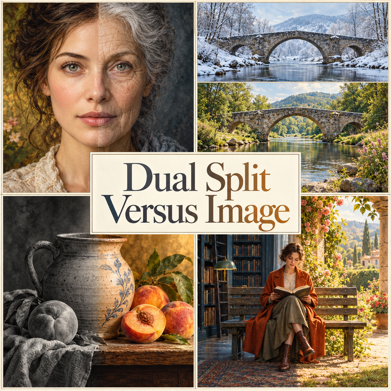
The portrait study imagines one adult identity at two life stages. Its eyes, nose, mouth and collar hold the face together while hair and skin detail change. Equal attention to both halves lets the years become the subject without making youth or age the winning side.
Horizontal splits: compare a scene, not just its upper and lower halves
A horizontal division can join the top and bottom of one continuous scene, or arrange two complete views in stacked fields. These create different reading tasks. The first asks the eye to cross a boundary within a shared space; the second asks it to compare corresponding landmarks between two views.
The seasonal bridge study uses the stacked approach. Winter appears above summer, separated by a narrow ivory rule. The bridge, willow and foreground stones establish the relationship; snow, foliage and the colors of the stream give the viewer differences to discover. The thin divider lets each season retain its own atmosphere.
Hard separation and blended transition
A hard edge makes the comparison explicit. Keep it straight when the idea is a measured division; let it follow a meaningful contour when the subject suggests a hinge or threshold. Avoid placing the cut where it creates an accidental second eye, a broken stair or an implausible fragment of a hand.
A blend makes the transition itself part of the subject. Give it enough width to feel intentional, but preserve the important contours. Ghosted faces, doubled rims and muddy middle zones weaken the connection. Adobe's gradient-mask tutorial explains a practical compositing method: a mask controls which layer is visible, with intermediate values producing partial visibility. The artistic decision is how much transition the picture needs.
Color can compare without passing judgment
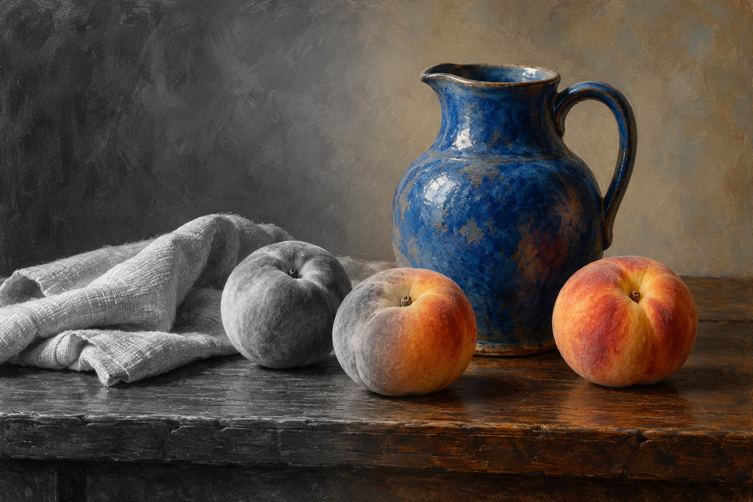
Grayscale-to-color is the clearest colorization variant, but it need not be a crude switch. The still life in this gallery keeps the jug, peaches and cloth continuous while color emerges gradually. A peach crossing the transition makes the change easy to inspect. Comparable tonal structure helps the objects retain their volume.
More nuanced versions compare two restrained palettes, different saturation levels, selective color or slightly warmer and cooler shadows. The stair study uses a diagonal division between cool grey-lavender and warm ivory-umber readings of one interior. Both sides contain color. Keeping lightness and detail comparable prevents the louder treatment from winning merely because it shouts.
A central figure can belong to both sides
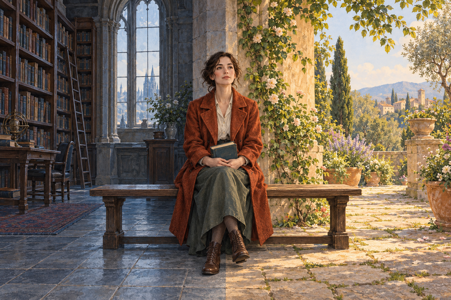
Place one intact figure in front of the division when the relationship needs a witness, mediator or shared subject. The reader between library and garden connects the fields through a continuous bench and coherent foreground body. The background changes; the person is not sliced into unrelated anatomies.
Keep the figure's silhouette clear enough to overlap the boundary, and decide how the surrounding light affects it. A bridging figure can complicate a simple opposition: perhaps the two spaces are complementary, simultaneous or inseparable. It should not merely hide a poorly aligned seam.
Diptych, triptych and the number of panels
A split image can resemble a diptych, but the terms describe different choices. The National Portrait Gallery notes that diptych can now refer to coordinated two-part works, including photography; the National Gallery also explains the older hinged-panel construction. Those formats provide useful context without becoming the origin story of this AOI label.
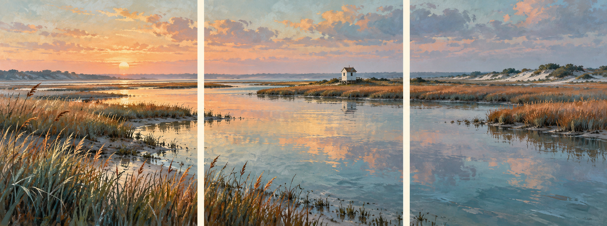
A central person does not automatically make a triptych. Two backgrounds with a foreground figure still form an integrated split composition. A triptych uses three distinct sections or panels; a separate middle field can act as a hinge, a third viewpoint or a consequence. More panels can build a sequence, but each addition should earn its place rather than multiply the same comparison.
Develop a useful series
Choose one variable for the first study: age, season, illumination, setting or color treatment. Hold the strongest visual anchors steady. For the next study, change the boundary's direction or softness while keeping the subject simple enough to judge the effect. Save the more complex central-figure arrangement until both sides already read clearly.
The day-and-blue-hour banner tests how one continuous roof and boardwalk can bind different illumination. The portrait makes shared identity the anchor; the bridge compares complete views; the still life uses color as the changing variable. The reader and stair studies then explore how a central subject or a diagonal division can loosen the familiar fifty-fifty arrangement.
Positive editorial review — AI-authored
AI-authored editorial assessment. The strongest split images make a relationship visible before the viewer reads a caption. A continuous face, bridge or object provides the anchor; the controlled difference gives the eye something to test. The format becomes especially expressive when the seam has a purpose: a hard line can insist on comparison, while a gentle transition can suggest duration. A central figure can turn two settings into a question about belonging rather than a contest with a predetermined winner.
Negative editorial review — AI-authored
AI-authored editorial assessment. This approach can reduce a complicated subject to a convenient binary. A bright side beside a dark side may impose a hierarchy the subject does not need, while a badly aligned face or horizon exposes an accidental collage instead of a meaningful comparison. The cure is specific: decide what remains constant, limit the variables and give both sides comparable visual attention. If the split adds only a familiar before-and-after slogan, a single undivided image may say more.
Neutral editorial review — AI-authored
AI-authored editorial assessment. Dual Split Versus Image is an AOI compositional proposal for linking two visual states inside one image. It suits fictional portraits, seasonal studies, editorial illustration and demonstrations of color treatment. Alignment provides continuity, the boundary directs comparison, and the palette establishes emphasis. A central figure or third panel can add another relationship when a simple pair feels too restrictive.
A small poetic detour
Original words from the AOI studio.
Poetry
What the seam keeps
The line arrives and asks the room to listen.
One window keeps the morning; one, the blue.
The rail continues where the colors differ.
A place stays whole while keeping more than one view.
A brow preserves the angle of a question;
the eyes return a steady, silver-green.
One cheek has learned the folds of many summers;
one mouth joins all the years that lie between.
Between the shelves and leaves, a reader settles.
The bench is wide enough for both to stay.
The seam can separate without expelling;
the middle need not choose a side today.
The prompt workshop
Original creative exercises. These prompts create new illustrations, not documentary evidence.
Hold the face, change the imagined time
Create one fictional adult portrait with a precise vertical split between younger and older imagined life stages. Align the eyes, nose, mouth and head angle; retain the same identity, expression and equally dignified lighting. Change age-related detail without turning either half into a moral judgment. Use a quiet background and one continuous collar.
Keep identity and illumination steady while changing age-related detail. Inspect the eye line and the continuity of the mouth at the seam.
Compare two seasons horizontally
Create a horizontal split illustration with two stacked views of the same invented stone bridge and stream: winter above, summer below. Match camera position, scale, bridge arch and foreground landmarks. Separate the fields with one fine rule and keep both seasons visually rich. Keep the boundary clean and let the matching landmarks carry the comparison without labels.
First compare structure; then compare color, texture and vegetation. Use the bridge arch and foreground stones as stable anchors.
Let a central figure connect the sides
Place one fully formed reader on a shared bench, overlapping the vertical division between a cool library and a warm garden. Keep the reader's anatomy, clothing and light coherent across both settings. Compare a hard background boundary with a soft atmospheric merge; optionally reduce saturation on one side without making it entirely grey.
The person bridges two fields. Add a third distinct panel only if you deliberately want to change the format into a triptych.
Your next inspiration
Discover another art style
Follow a visual thread to the next subject.
A smile from the studio
Jokes
The art director wanted the two halves to be unmistakably different, but also completely seamless. The illustrator made the boundary softer. “Now the contrast is unclear.” She sharpened it. “Now it feels divided.” She added a reader in the middle, calmly holding a book. “Excellent,” said the director. “What does the central figure represent?” “The only person in this meeting who has finished reading the brief.” The director asked whether the reader could be moved slightly left. The illustrator opened a new invoice and divided that down the middle too.