AI platform reference · AOI geometric interpretation
Claude Anthropic (AI) Art is treated here as an AOI interpretation of rule-based visual construction: repeated shapes, articulate contours and deliberate exceptions. It is a creative direction, not an official Anthropic aesthetic or a historical movement.
A visual introduction
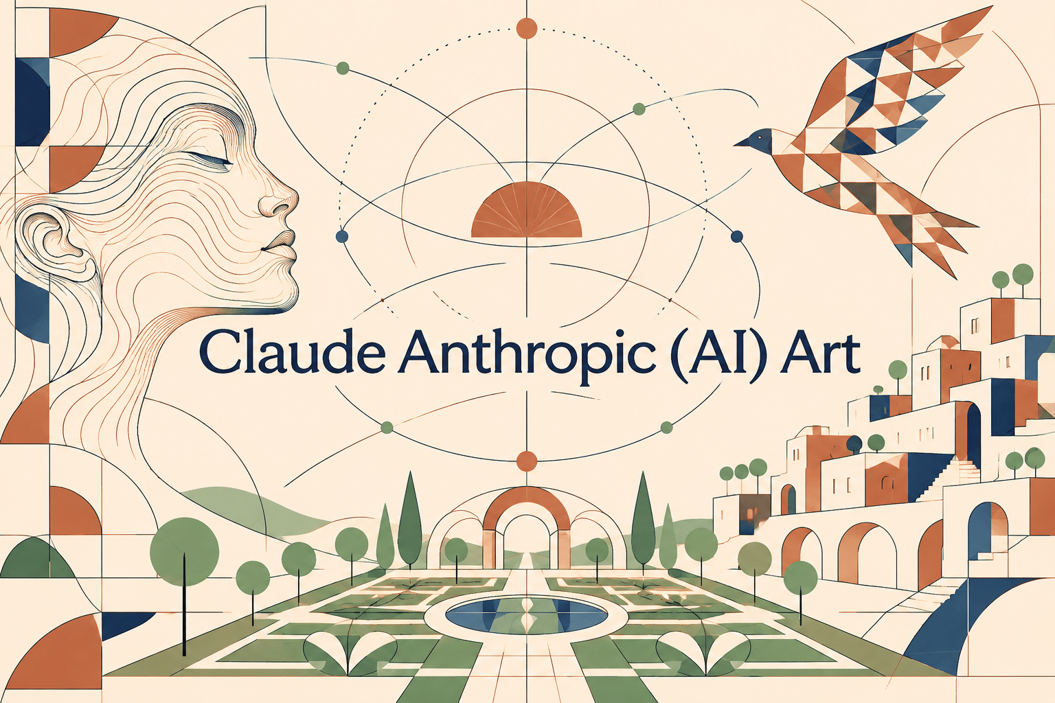
Seven original AI-generated interpretations: a dedicated banner, a centrally titled artistic collage and five standalone studies.
Select an image for a closer look. Use the thumbnails, arrow keys or a swipe to compare examples. Zoom in to inspect details, or share the image that inspires you.

Creative toolbox · take this style further
Choose an input and a destination. Search sends your words to the chosen site; Copy & open puts them on your clipboard to paste there.
Create with AI
Turn your chosen input into an image prompt or a new creative direction.
ChatGPT
Copy your input and paste it into a ChatGPT conversation or image request.
Copy & open ChatGPT (new tab)Claude · Anthropic
Develop an image prompt or explore the style in a new Claude conversation.
Copy & open Claude · Anthropic (new tab)Midjourney
Paste your input into the Imagine bar on the Create page.
Copy & open Midjourney (new tab)Adobe Firefly
Copy your input, open Firefly, and paste it into the prompt field.
Copy & open Adobe Firefly (new tab)Leonardo.Ai
Copy your input, open Leonardo, and paste it into the generation field.
Copy & open Leonardo.Ai (new tab)Image search
Find visual references. Short, concrete keywords usually work best.
Lexica
Search AI images and prompts using your selected input.
Search with this input Lexica (new tab)Pexels
Search the photo and video library. Short keywords often work best.
Search with this input Pexels (new tab)Pixabay
Search photos, illustrations and other images.
Search with this input Pixabay (new tab)Unsplash
Search photographs using the style name or your own keywords.
Search with this input Unsplash (new tab)Wikimedia Commons
Search photographs, artworks and historical images. Check each file for its source and reuse terms.
Search with this input Wikimedia Commons (new tab)Art & research
Explore artists, collections and the ideas behind a style.
Wikipedia
Search for background reading. A style may not have its own article.
Search with this input Wikipedia (new tab)WikiArt
Copy your input into WikiArt’s search to explore artists and artworks.
Copy & open WikiArt (new tab)Europeana
Paste your keywords into the search to explore European museum, library and archive collections.
Copy & open Europeana (new tab)Inspiration
Discover portfolios and visual ideas from creative communities.
Instagram hashtags
Search a hashtag made from your input: spaces and punctuation are removed. Instagram may require sign-in.
Search with this input Instagram hashtags (new tab)ArtStation
Paste your input into artwork search for concept art, environments, characters and visual development.
Copy & open ArtStation (new tab)Behance
Paste your input into project search for illustration, design and visual storytelling.
Copy & open Behance (new tab)A closer look
Build an image from a small vocabulary of curves, modules and flat planes. Repeat a visible rule, then introduce one meaningful deviation. Keep negative space active and let line weight distinguish structure from detail.
A platform name is not a single style
Anthropic’s help documentation distinguishes Claude’s HTML/SVG diagrams and interactive visuals from the photographic and illustrative output of dedicated image generators. [1] That distinction matters: a code-generated drawing, a raster illustration about code and an image analyzed by an assistant are different things.
This gallery contains seven original raster artworks generated with OpenAI image_gen. They explore an AOI-selected visual direction inspired by explicit construction rules. They are not Claude outputs, Anthropic promotional assets or a comparison of model capabilities. The warm ivory, terracotta, navy and sage palette belongs to this particular brief.
Make the construction rule visible
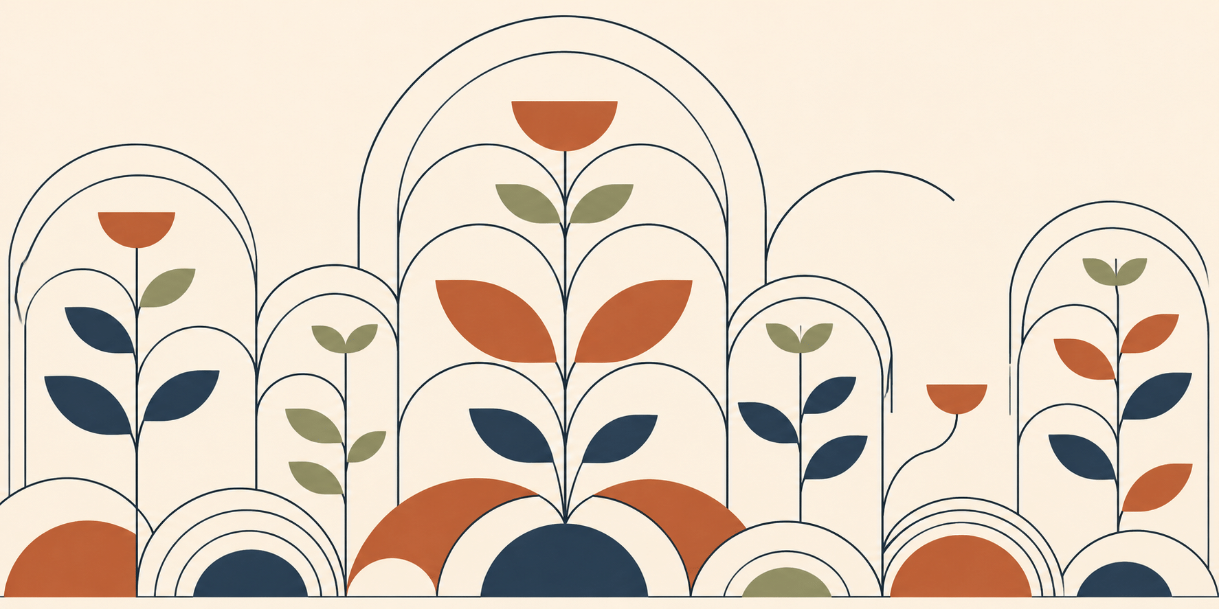
In the garden banner, nested arcs repeat around stems and leaves. The repetition makes the image legible before any individual plant becomes important. A broken arc gives the eye a small interruption to discover. The rule produces coherence; the exception gives that coherence a reason to be noticed.
Start by selecting one family of shapes and deciding what can change. Arches may change size while preserving their proportions; leaves may rotate while retaining their contour. Too many simultaneous exceptions erase the underlying order. Too few can leave the image looking like a sample sheet rather than an artwork.
Use negative space as a material
The profile portrait gives most of the face to the ivory ground. Navy hair and a terracotta cheek describe volume without trying to model every surface. The unfilled area is an active shape, bounded by the forehead, nose, lips and neck. Simplification works because those relationships remain recognizable.
A useful exercise is to remove one filled shape and ask whether the subject becomes clearer. If the result collapses, the missing plane carried structural information. If the picture breathes more easily, that plane may have been decoration. This makes reduction an observable decision rather than a vague preference for minimalism.
Let modules carry motion and scale
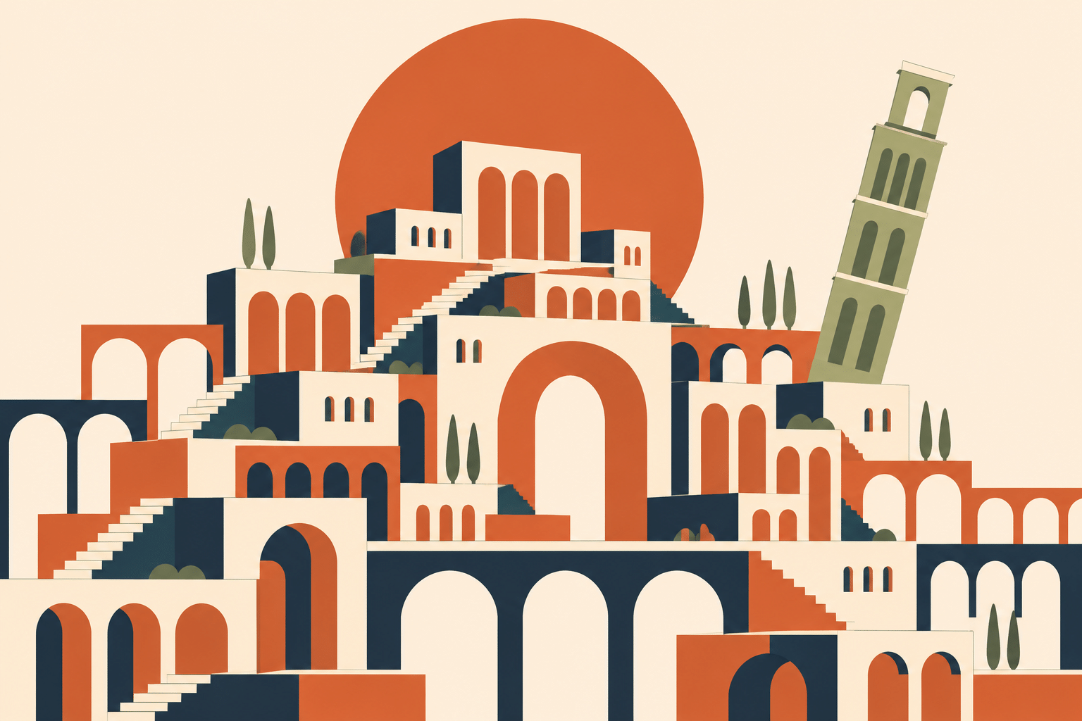
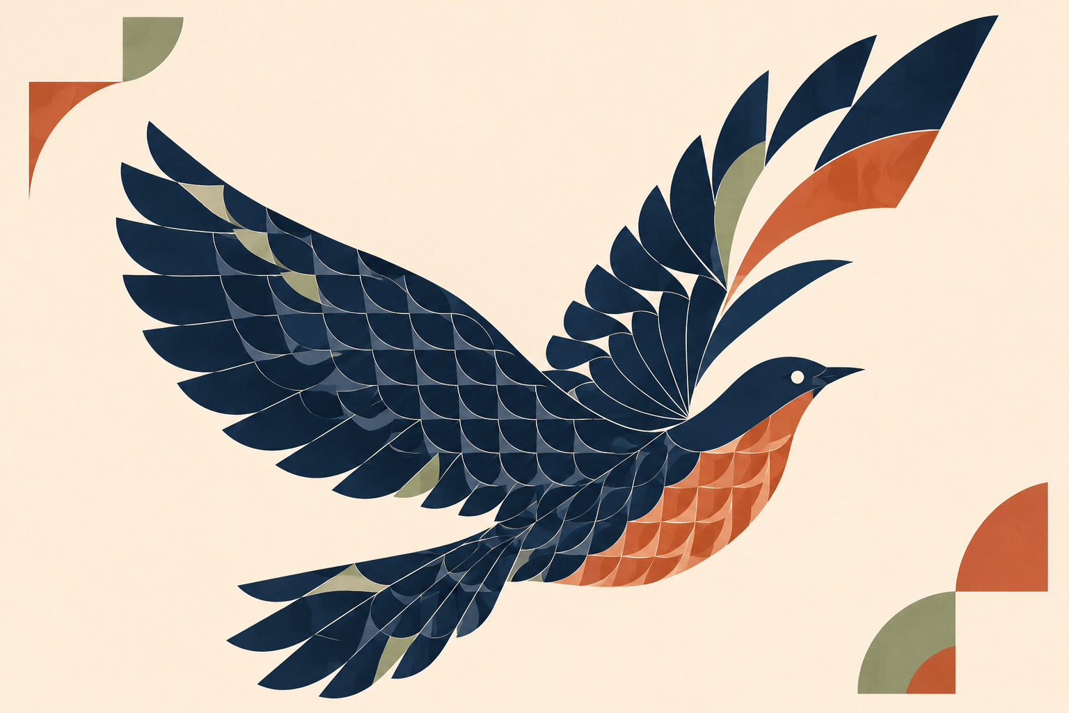
The bird transforms repeated curved feather units into a rising wing. Variation in size and angle creates motion while the navy body holds the silhouette together. In the imaginary city, repeated arches establish a different rhythm; a leaning sage tower interrupts the otherwise upright blocks.
These two examples show why a reusable rule should not become a compulsory motif. A feather module responds to a wing, while an arch responds to a building. The vocabulary can remain related without forcing every subject into identical tiles. A code-based implementation would need explicit geometry and constraints; these raster studies suggest that logic without supplying executable construction data.
Give line weight and color separate jobs
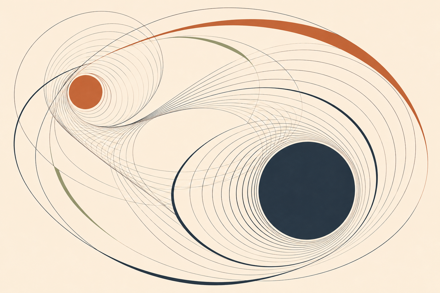
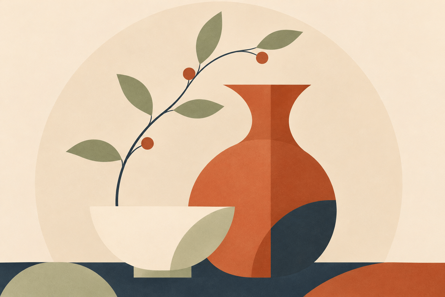
The orbital abstraction uses fine repeated curves for motion and larger filled circles for visual weight. Broad colored arcs connect the two focal regions. The still life instead relies on the shared curvature of a vessel, a bowl and leaves. Both use limited means, but the compositional problem is different.
Choose color by role: navy can anchor the image, terracotta draw attention, sage connect secondary elements, and ivory provide rest. This is a practical palette for the showcase, not a requirement of the platform name. An achromatic version can retain the same hierarchy through light, dark and line weight.
Where the approach helps—and where it fails
This direction suits editorial illustration, wall prints, explanatory covers and visual systems that need a consistent family resemblance. Its strongest quality is inspectability: viewers can see the decisions that hold the image together. Its weakness is interchangeable elegance, especially when every subject receives the same tasteful palette and curved border.
Develop a brief around one relation: a wing unfolding, a tower leaning, a branch answering a vessel. Then inspect the result for that relation, not simply for polish. If a project needs editable SVG, accessible labels or interactive behavior, build and test those deliverables explicitly. A raster image with a vector-like appearance does not provide them.
Positive editorial perspective
AOI editorial perspective (AI-authored). The gallery gives repeated geometry an expressive purpose. The open arc, leaning tower and unfolding wing each make a controlled exception readable, while the restrained palette connects otherwise different subjects.
Negative editorial perspective
AOI editorial perspective (AI-authored). Geometric restraint can become a template that makes every subject equally polite. Preserve a specific gesture or structural tension, and avoid treating a platform name as an explanation for arbitrary beige-and-terracotta styling.
Neutral editorial perspective
AOI editorial perspective (AI-authored). This is a platform-related AOI interpretation, using raster illustrations to explore rule-based composition. It can guide an art brief but does not demonstrate Claude-generated imagery, editable vectors or working interactive code.
Pocket-sized facts
The name denotes a platform-related reference rather than a historical art movement.
Anthropic documents HTML/SVG visual creation separately from dedicated image-generation tools. [1]
The showcase images were generated with OpenAI image_gen and are AOI interpretations.
A small poetic detour
Original words from the AOI studio.
Poetry
An arch repeats, then leaves a door.
A line remembers where it bent.
The garden offers little more
than room for every interval spent.
A bird unfolds a measured wing;
a tower leans beyond the rule.
The smallest change becomes the thing
that keeps the geometry from cool.
A bowl replies to leaves in air.
Two circles turn without a sky.
The empty page is working there,
with room enough to let them fly.
The prompt workshop
Original creative exercises. These prompts create new illustrations, not documentary evidence.
A rule and an exception
Create a geometric garden from repeated navy arches and sage leaf modules on warm ivory. Place one open arch beside a terracotta flower. Quiet editorial composition, generous negative space, no lettering.
Begin with one repeated shape and one intentional deviation.
Motion through modules
Create a flying bird from curved feather modules that expand toward the wing tips. Deep navy silhouette, terracotta breast, restrained sage details, ivory ground. Preserve a clear bird silhouette and use repetition to express motion. No text.
Vary module scale and angle in response to anatomy.
Achromatic experiment
Create an abstract two-center composition using black and gray nested curves on white. One large solid disc and one small open disc, varied line weights, asymmetrical spacing, quiet gaps between dense regions. No astronomical labels or text.
Test whether value and spacing retain the hierarchy without color.
A smile from the studio
Jokes
The geometric city hired a consultant to standardize every arch. All went well until one sage-green tower leaned out of the grid. The consultant called it a compliance problem. The illustrator called it the focal point. The tower requested that both of them stop using a ruler as a personality test.