AI image-model reference · AOI visual interpretation
Nano Banana 2 Google (AI) Art is a platform-related reference, not one fixed aesthetic. This AOI interpretation emphasizes clear object relationships, purposeful color, material separation and playful transformations that remain easy to read.
A visual introduction
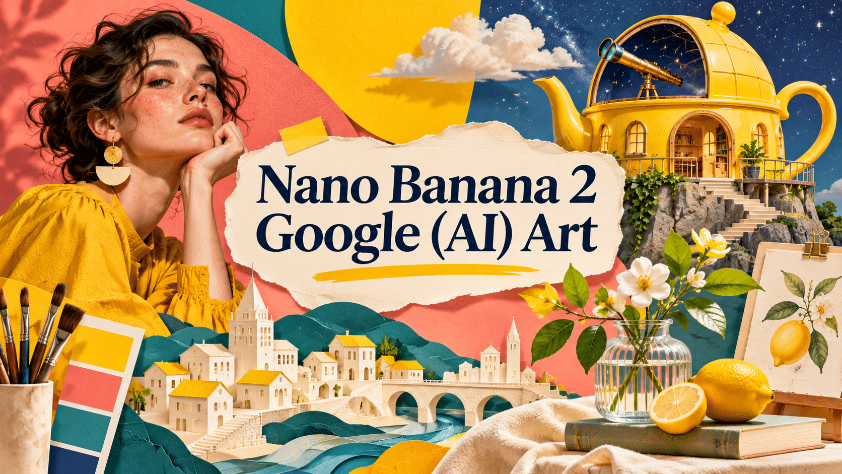
Seven original AI-generated interpretations: a dedicated banner, a centrally titled artistic collage and five standalone studies.
Select an image for a closer look. Use the thumbnails, arrow keys or a swipe to compare examples. Zoom in to inspect details, or share the image that inspires you.
Creative toolbox · take this style further
Choose an input and a destination. Search sends your words to the chosen site; Copy & open puts them on your clipboard to paste there.
Create with AI
Turn your chosen input into an image prompt or a new creative direction.
ChatGPT
Copy your input and paste it into a ChatGPT conversation or image request.
Copy & open ChatGPT (new tab)Claude · Anthropic
Develop an image prompt or explore the style in a new Claude conversation.
Copy & open Claude · Anthropic (new tab)Midjourney
Paste your input into the Imagine bar on the Create page.
Copy & open Midjourney (new tab)Adobe Firefly
Copy your input, open Firefly, and paste it into the prompt field.
Copy & open Adobe Firefly (new tab)Leonardo.Ai
Copy your input, open Leonardo, and paste it into the generation field.
Copy & open Leonardo.Ai (new tab)Image search
Find visual references. Short, concrete keywords usually work best.
Lexica
Search AI images and prompts using your selected input.
Search with this input Lexica (new tab)Pexels
Search the photo and video library. Short keywords often work best.
Search with this input Pexels (new tab)Pixabay
Search photos, illustrations and other images.
Search with this input Pixabay (new tab)Unsplash
Search photographs using the style name or your own keywords.
Search with this input Unsplash (new tab)Wikimedia Commons
Search photographs, artworks and historical images. Check each file for its source and reuse terms.
Search with this input Wikimedia Commons (new tab)Art & research
Explore artists, collections and the ideas behind a style.
Wikipedia
Search for background reading. A style may not have its own article.
Search with this input Wikipedia (new tab)WikiArt
Copy your input into WikiArt’s search to explore artists and artworks.
Copy & open WikiArt (new tab)Europeana
Paste your keywords into the search to explore European museum, library and archive collections.
Copy & open Europeana (new tab)Inspiration
Discover portfolios and visual ideas from creative communities.
Instagram hashtags
Search a hashtag made from your input: spaces and punctuation are removed. Instagram may require sign-in.
Search with this input Instagram hashtags (new tab)ArtStation
Paste your input into artwork search for concept art, environments, characters and visual development.
Copy & open ArtStation (new tab)Behance
Paste your input into project search for illustration, design and visual storytelling.
Copy & open Behance (new tab)A closer look
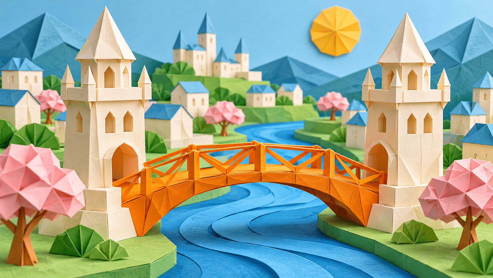
Choose a specific relationship to preserve: a bridge joining two towers, a coat separated from its wall, or one object becoming another while keeping its silhouette. Use color and light to clarify that relationship before adding detail.
Name the model, then define the brief
Google’s February 2026 announcement identifies Nano Banana 2 as Gemini 3.1 Flash Image and discusses image generation, editing, text rendering and subject consistency. Those are vendor-described capabilities, not a single house style. A model capable of handling varied briefs cannot be reduced to a permanent palette or one category of imagery. [1]
The showcase on this page is an AOI interpretation of the requested platform-related phrase. All seven images were generated here with OpenAI image_gen. They are not Google model outputs, comparative tests or proof of the capabilities described in Google’s announcement. Product facts and our artistic exercises serve different purposes.
A visual direction built around clarity
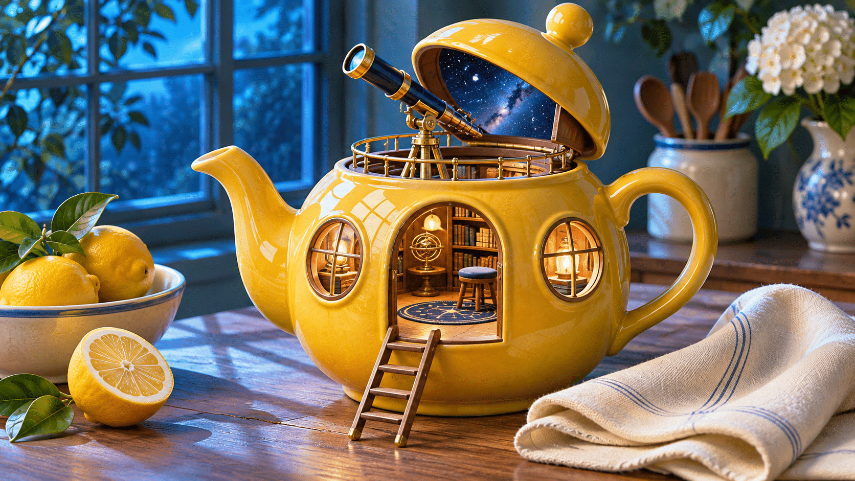
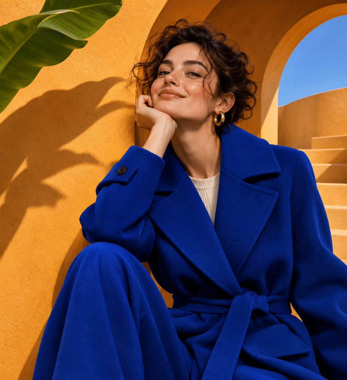
The chosen direction makes relationships explicit. Yellow ceramic against cool window light keeps the teapot observatory immediately recognizable. Cobalt fabric against ochre architecture separates a portrait from its setting. An orange bridge across a blue paper river gives a miniature city a clear center.
This is an editorial choice for the entry, not a claim that Nano Banana 2 always produces clean commercial imagery. A useful brief says which object matters, what it is doing and what must remain unchanged. The same discipline applies when the requested medium is painterly, graphic or deliberately rough.
Transform one thing at a time
A playful transformation is stronger when the original object survives. The teapot keeps its spout, handle and ceramic body while acquiring an observatory. The viewer can understand the premise before noticing the tiny interior. If every feature changed at once, it would become a generic miniature building.
For an actual editing workflow, state both the change and the elements to preserve. A coat might change color while its seams, folds and pose remain important. Review the result against those constraints rather than accepting a broadly similar image. The standalone generated examples here illustrate such briefs; they do not demonstrate a completed edit sequence in Google’s product.
Materials need different visual evidence
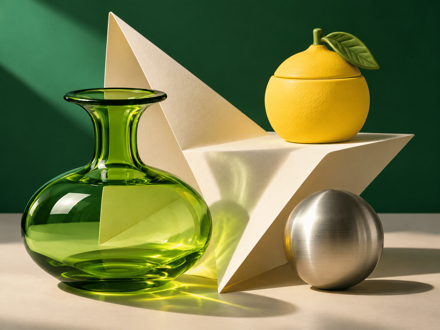
Transparent glass, matte ceramic, brushed metal and folded paper cannot all be described by one glossy highlight. In the still life, each object has a different surface response. The paper’s angular fold organizes the composition while the glass, ceramic and metal provide contrasting rounded forms.
When evaluating a result, look at contact shadows, edge thickness, reflections and the places where objects overlap. A pleasing palette can hide inconsistent geometry. Start with a small number of materials and a simple light arrangement so that the image’s internal logic remains inspectable.
Typography and color are design decisions
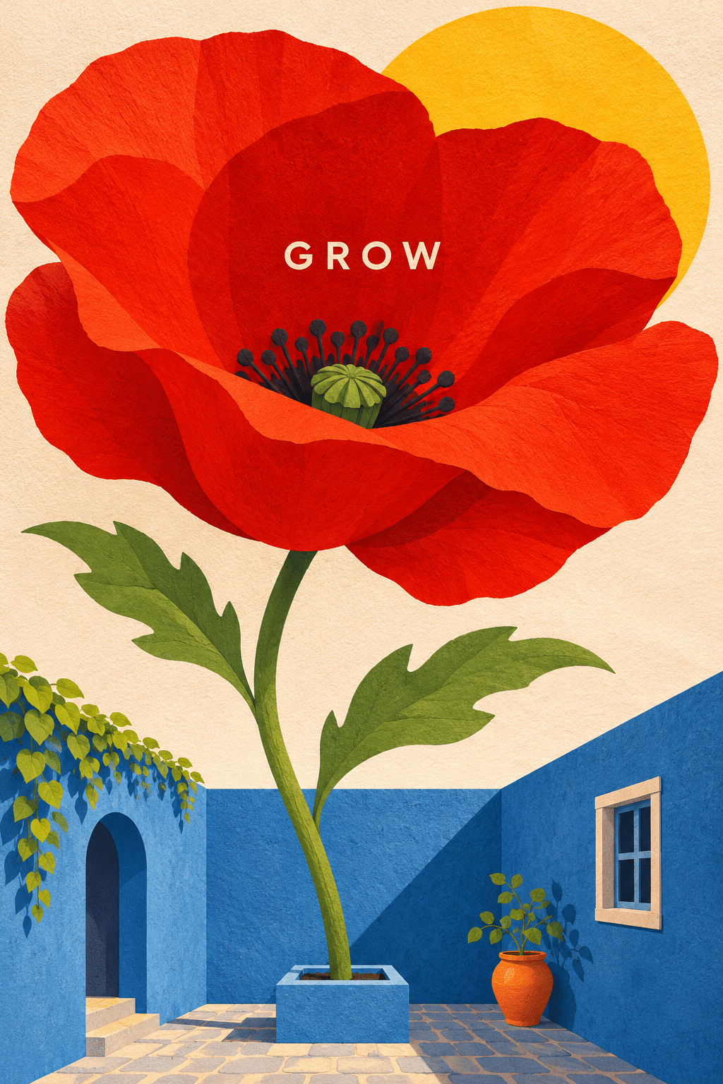
Google’s announcement presents text rendering as a feature. [1] That does not remove the need to proofread every generated word. Our GROW poster contains one short word placed within a large red flower; its purpose is to demonstrate a clear design relationship, not to benchmark another model’s typography.
Treat color as a system of roles. One hue can identify the focal object, another separate its setting, and a quiet neutral provide rest. Repeat a color when it connects useful parts of the image. Avoid adding every bright hue simply because a model can render them.
A practical evaluation loop
Write a brief with one main subject, one relation, a medium and a light or color strategy. Generate or edit, then compare the result with those decisions. Check the subject first, geometry second and small decorative details last. When changing the brief, change one important variable so the effect is understandable.
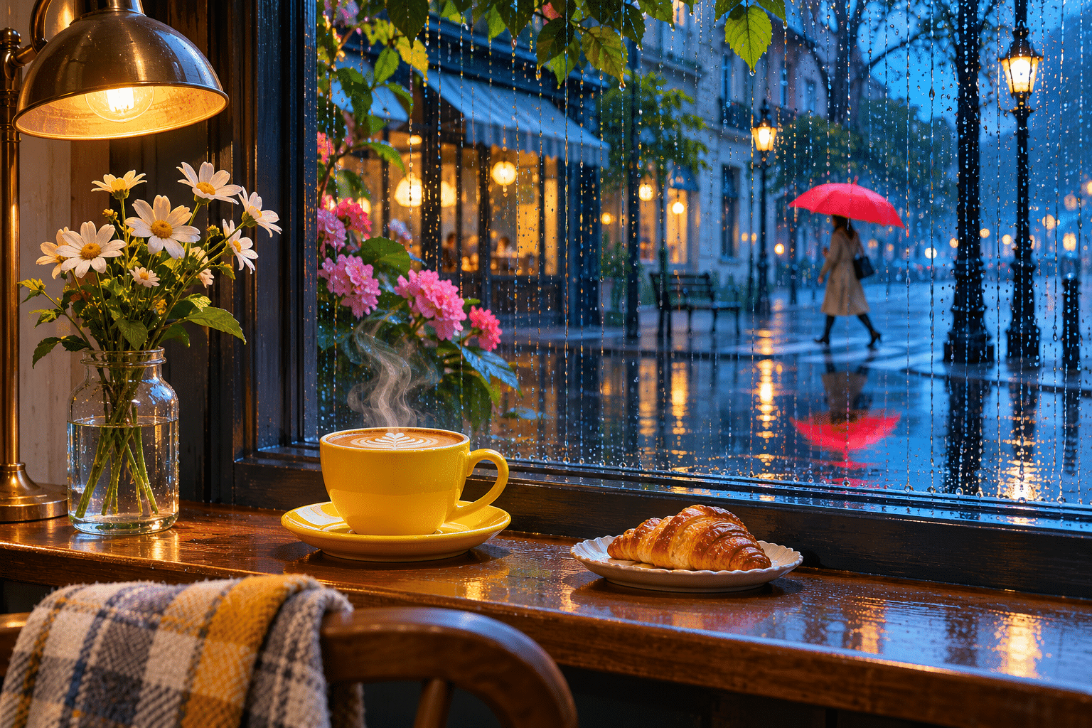
This approach suits editorial illustrations, concept mockups and visual communication studies. Its risk is bland perfection: clean objects and cheerful colors can be polished but interchangeable. Introduce a specific narrative or a deliberate formal tension. The rainy café scene uses an ordinary cup, a reflected umbrella and the separation between indoor warmth and outdoor blue to create that specificity.
Positive editorial perspective
AOI editorial perspective (AI-authored). A clear relational brief makes varied subjects easy to read. The teapot transformation, material still life and paper bridge each give color and detail a concrete compositional purpose.
Negative editorial perspective
AOI editorial perspective (AI-authored). Clean surfaces and cheerful palettes can become generic stock imagery. Add a meaningful constraint or a specific moment, and inspect geometry rather than letting polish stand in for accuracy.
Neutral editorial perspective
AOI editorial perspective (AI-authored). Nano Banana 2 is a Google image-model name, not an art movement. This AOI showcase uses another generation tool to explore a chosen visual direction and does not measure or reproduce the named model’s behavior.
Pocket-sized facts
Google identifies Nano Banana 2 as Gemini 3.1 Flash Image in its launch announcement. [1]
The platform name does not specify one fixed artistic style.
The gallery contains AOI interpretations generated with OpenAI image_gen, not Google outputs.
A small poetic detour
Original words from the AOI studio.
Poetry
A teapot keeps a patch of sky.
A paper bridge completes a town.
The coat holds blue against the wall;
the rain turns every window down.
Three surfaces receive one light
and answer it in different ways.
A single word grows with a flower;
a yellow cup collects the day.
Keep one intention in the frame.
Keep one clear reason for the hue.
The picture finds its little world
when every part has work to do.
The prompt workshop
Original creative exercises. These prompts create new illustrations, not documentary evidence.
One playful transformation
Create an exceptional standalone original artwork. Wide editorial banner: a beautiful lemon-yellow ceramic teapot becomes a small observatory on a kitchen table, blue window light, tiny telescope through its lid and a folded ivory cloth, one coherent playful transformation, exquisite material clarity. AOI visual interpretation of a clear, edit-friendly contemporary AI image brief, not output from Google or a benchmark. Precise object relationships, purposeful color separation, believable materials and clean focal hierarchy. A playful but carefully art-directed image, no vendor logo or endorsement. No text, letters, numbers, signature or watermark.
Keep the original object's silhouette recognizable.
Separate the materials
Create an exceptional standalone original artwork. A museum-quality still life of transparent green glass, matte lemon ceramic and brushed steel, three objects arranged around a sharply folded ivory sheet, studio light defines material differences. AOI visual interpretation of a clear, edit-friendly contemporary AI image brief, not output from Google or a benchmark. Precise object relationships, purposeful color separation, believable materials and clean focal hierarchy. A playful but carefully art-directed image, no vendor logo or endorsement. No text, letters, numbers, signature or watermark.
Give each surface its own response to light.
A word with a purpose
Create an exceptional standalone original artwork. A clean expressive poster-art image of a giant red poppy rising from a tiny blue courtyard, bold flattened forms and delicate paper texture, exact small central text 'GROW' only, no other text. AOI visual interpretation of a clear, edit-friendly contemporary AI image brief, not output from Google or a benchmark. Precise object relationships, purposeful color separation, believable materials and clean focal hierarchy. A playful but carefully art-directed image, no vendor logo or endorsement. Only the word GROW is permitted.
Proofread the word and assess its relationship to the composition.
A smile from the studio
Jokes
The designer asked for one small change: turn the teapot into an observatory while keeping it recognizably a teapot. The result was excellent, but the astronomer complained that every observation ended at four o’clock. Apparently the universe had agreed to tea time.
Sources and further exploration
[1] Google — Nano Banana 2 announcement, model identity and vendor-described capabilities