
Chinese painting traditions: brush, ink and composition
Brush pressure, ink tone and the spacing of marks can give a small branch or a long landscape its rhythm. Two museum works offer specific starting points for looking and making.
A visual introduction
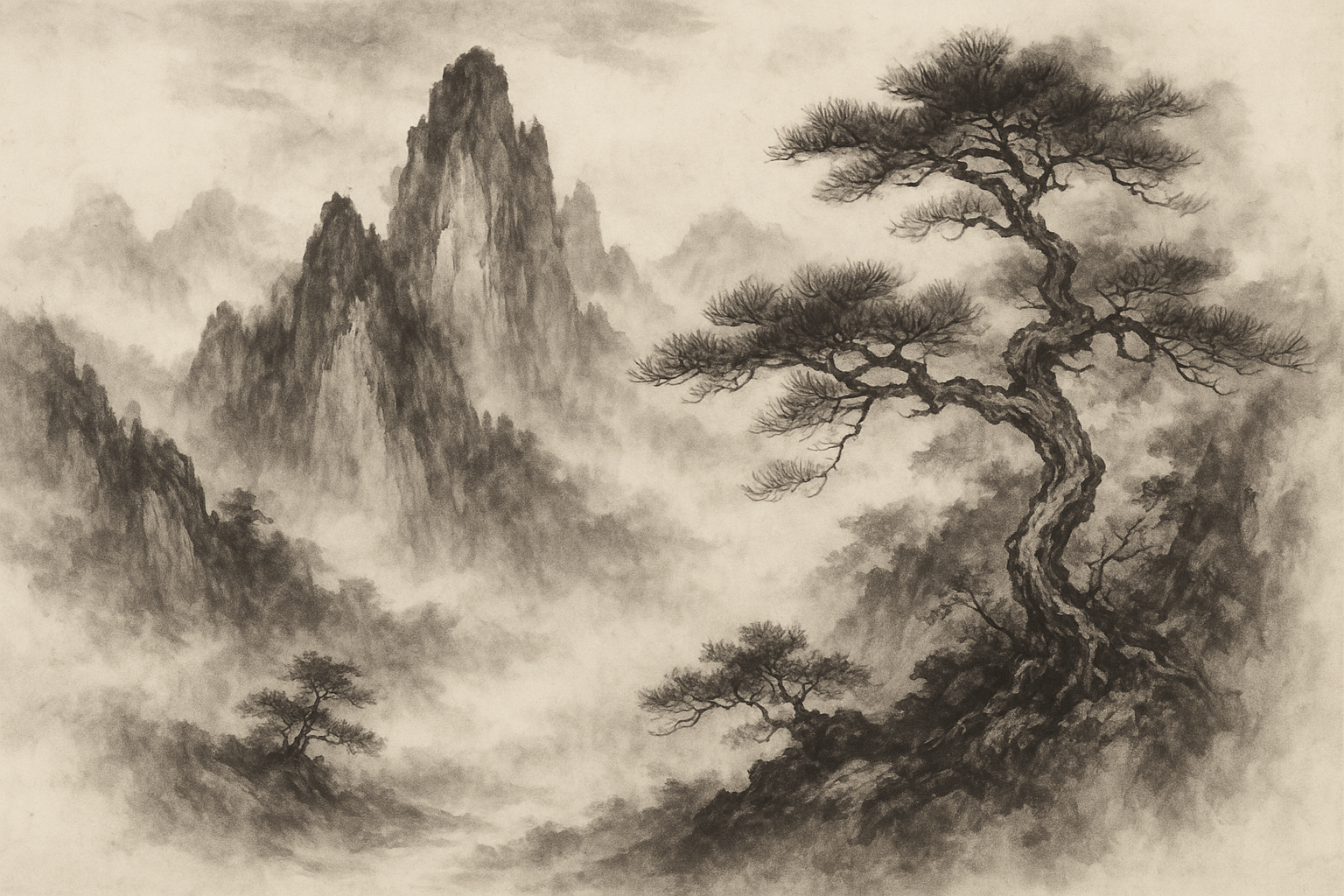
The archive collage offers several motifs for comparison. Its English title and panel arrangement are modern editorial design.
Select an image for a closer look. Use the thumbnails, arrow keys or a swipe to compare examples. Zoom in to inspect details, or share the image that inspires you.

Creative toolbox · take this style further
Choose an input and a destination. Search sends your words to the chosen site; Copy & open puts them on your clipboard to paste there.
Create with AI
Turn your chosen input into an image prompt or a new creative direction.
ChatGPT
Copy your input and paste it into a ChatGPT conversation or image request.
Copy & open ChatGPT (new tab)Claude · Anthropic
Develop an image prompt or explore the style in a new Claude conversation.
Copy & open Claude · Anthropic (new tab)Midjourney
Paste your input into the Imagine bar on the Create page.
Copy & open Midjourney (new tab)Adobe Firefly
Copy your input, open Firefly, and paste it into the prompt field.
Copy & open Adobe Firefly (new tab)Leonardo.Ai
Copy your input, open Leonardo, and paste it into the generation field.
Copy & open Leonardo.Ai (new tab)Image search
Find visual references. Short, concrete keywords usually work best.
Lexica
Search AI images and prompts using your selected input.
Search with this input Lexica (new tab)Pexels
Search the photo and video library. Short keywords often work best.
Search with this input Pexels (new tab)Pixabay
Search photos, illustrations and other images.
Search with this input Pixabay (new tab)Unsplash
Search photographs using the style name or your own keywords.
Search with this input Unsplash (new tab)Wikimedia Commons
Search photographs, artworks and historical images. Check each file for its source and reuse terms.
Search with this input Wikimedia Commons (new tab)Art & research
Explore artists, collections and the ideas behind a style.
Wikipedia
Search for background reading. A style may not have its own article.
Search with this input Wikipedia (new tab)WikiArt
Copy your input into WikiArt’s search to explore artists and artworks.
Copy & open WikiArt (new tab)Europeana
Paste your keywords into the search to explore European museum, library and archive collections.
Copy & open Europeana (new tab)Inspiration
Discover portfolios and visual ideas from creative communities.
Instagram hashtags
Search a hashtag made from your input: spaces and punctuation are removed. Instagram may require sign-in.
Search with this input Instagram hashtags (new tab)ArtStation
Paste your input into artwork search for concept art, environments, characters and visual development.
Copy & open ArtStation (new tab)Behance
Paste your input into project search for illustration, design and visual storytelling.
Copy & open Behance (new tab)A closer look
Look for varied line width, dry and wet marks, contrasting ink tones and intervals of unpainted paper. Different artists use these resources differently.
A varied tradition, seen through two works
Chinese ink painting includes different subjects, formats and approaches to the brush. This guide focuses on two works on paper rather than proposing one origin story for the whole tradition. Neither a misty mountain nor a monochrome palette, by itself, tells us what a painting means. Begin with the artist, the object and its context.
In Zhao Mengfu’s Twin Pines, Level Distance, dated about 1310 by the Metropolitan Museum of Art, landscape becomes a vehicle for expressive brush lines. The museum connects the treatment of rocks and pines to calligraphic conventions. The inscription also matters: the work is not simply scenery. This is a specific example of painting and writing working together, not evidence that all Chinese painting rejects observation.
Look at the character of each mark
Xu Wei’s sixteenth-century Twelve Flowers and Poems offers another approach. The Smithsonian identifies it as ink on paper; conservator Grace Jan draws attention to changes in line thickness and pools of different ink tones across the handscroll. These are useful things to look for before reaching for general adjectives such as peaceful or spiritual.
For a contemporary exercise, give each kind of mark a job. A dark, tapering stroke can establish a stem; a broken, drier edge can describe a rough surface; a pale wash can separate one plane from another. Compare a controlled line with a spreading patch. The useful question is what the change contributes to the subject, rather than whether every edge looks soft.
Compose the spaces as carefully as the ink
Try a simple arrangement of a branch and three leaf clusters. Set the main diagonal first, then vary the gaps between clusters. Leave one broad interval and one tighter grouping. Unpainted paper becomes effective through its relationship to the marks around it; leaving half a sheet blank does not automatically produce a convincing composition.
A long horizontal composition can unfold as a sequence of encounters, while a compact study needs a more immediate balance. Use changes in density, tone and scale to guide attention. Avoid repeating identical leaf stamps or filling every gap with decorative mist. A useful revision exercise is to remove a weak cluster and see whether the remaining marks become more decisive.
Using this reference in contemporary work
These exercises suit brush studies, botanical illustration and experiments in visual rhythm. They are contemporary learning prompts, not instructions for claiming the identity or authority of a historical painter. A generated image may suggest watery ink or dry-brush texture without reproducing the physical process that made an actual painting.
Keep interpretation separate from documentation. Do not add invented Chinese characters, signatures or collector seals as decoration. If text is essential, use verified wording and identify its modern author. Consult the museum records below for named works, dates and media; treat the practical suggestions here as AOI exercises rather than a complete account of Chinese art.
Read a brush passage as a sequence
Choose a small passage from a documented work and describe how the marks differ: broad or narrow, wet-looking or dry-looking, continuous or interrupted. Distinguish what is visible from assumptions about the exact order of execution. An image can suggest a working sequence without proving it.
For a practical study, use a few marks to establish a branch or rock and leave a substantial area untouched. Ask whether the unpainted interval has a clear role in the composition. Blank paper is not automatically meaningful; its size and placement should help the marks relate to one another.
Let the format change the composition
Compare a compact vertical arrangement with a longer horizontal sequence. Decide how the viewer’s attention enters, pauses and continues in each. Do not stretch the same composition to fit both formats. The relationship between mark, interval and viewing sequence offers a more useful starting point than applying a generic ink texture to an unrelated scene.
A small poetic detour
Original words from the AOI studio.
Poetry
Ink flows like rivers,
Mountains whisper ancient tales;
Silence speaks in strokes.
The prompt workshop
Original creative exercises. These prompts create new illustrations, not documentary evidence.
One branch, three clusters
Create an original contemporary ink-on-paper study of one branching stem and three unequal leaf clusters. Use tapered dark strokes, a few paler washes and deliberately varied gaps. Keep the largest area of paper quiet. No calligraphy, signatures or seals. Present it as a modern exercise, not a historical Chinese artwork.
A landscape unfolds
Create an original contemporary horizontal ink study with three distinct passages: dry rocky marks, a sparse stand of pines and a pale distant slope. Change the density and scale as the eye moves across the image. Let unpainted intervals connect the passages. Avoid identical trees, decorative mist everywhere, lettering and imitation seals.
Wet against dry
Create an original experimental botanical ink illustration. Contrast one broad wet leaf wash with fine tapering stems and a small cluster of dry, broken marks. Keep the subject recognizable while varying edge sharpness. Use paper texture sparingly; no text or fake historical provenance.
People & works to explore
References discussed in this article. Consult the sources below for context.
Artists and practitioners
Zhao Mengfu
Xu Wei
Paintings and other works
Zhao Mengfu, Twin Pines, Level Distance, ca. 1310; handscroll, ink on paper; Metropolitan Museum of Art.
Xu Wei, Twelve Flowers and Poems, sixteenth century; ink on paper; National Museum of Asian Art, Smithsonian Institution.