
AOI visual concept · playful dimensional illustration
Bubble Pop is defined here as an AOI creative direction built from buoyant rounded forms, selective glossy highlights and sharply organized colour. It is a working visual proposal, not a documented historical movement. The aim is a picture that feels ready to rise or burst while remaining clear enough to read at a glance.
An A⊕I –[-.+] creαt¡ve c⊕ncept, n⊕t αn estαbl¡she∂ h¡st⊕r¡cαl m⊕vement.
A visual introduction
Select an image for a closer look. Use the thumbnails, arrow keys or a swipe to compare examples. Zoom in to inspect details, or share the image that inspires you.
Creative toolbox · take this style further
Choose an input and a destination. Search sends your words to the chosen site; Copy & open puts them on your clipboard to paste there.
Create with AI
Turn your chosen input into an image prompt or a new creative direction.
ChatGPT
Copy your input and paste it into a ChatGPT conversation or image request.
Copy & open ChatGPT (new tab)Claude · Anthropic
Develop an image prompt or explore the style in a new Claude conversation.
Copy & open Claude · Anthropic (new tab)Midjourney
Paste your input into the Imagine bar on the Create page.
Copy & open Midjourney (new tab)Adobe Firefly
Copy your input, open Firefly, and paste it into the prompt field.
Copy & open Adobe Firefly (new tab)Leonardo.Ai
Copy your input, open Leonardo, and paste it into the generation field.
Copy & open Leonardo.Ai (new tab)Image search
Find visual references. Short, concrete keywords usually work best.
Lexica
Search AI images and prompts using your selected input.
Search with this input Lexica (new tab)Pexels
Search the photo and video library. Short keywords often work best.
Search with this input Pexels (new tab)Pixabay
Search photos, illustrations and other images.
Search with this input Pixabay (new tab)Unsplash
Search photographs using the style name or your own keywords.
Search with this input Unsplash (new tab)Wikimedia Commons
Search photographs, artworks and historical images. Check each file for its source and reuse terms.
Search with this input Wikimedia Commons (new tab)Art & research
Explore artists, collections and the ideas behind a style.
Wikipedia
Search for background reading. A style may not have its own article.
Search with this input Wikipedia (new tab)WikiArt
Copy your input into WikiArt’s search to explore artists and artworks.
Copy & open WikiArt (new tab)Europeana
Paste your keywords into the search to explore European museum, library and archive collections.
Copy & open Europeana (new tab)Inspiration
Discover portfolios and visual ideas from creative communities.
Instagram hashtags
Search a hashtag made from your input: spaces and punctuation are removed. Instagram may require sign-in.
Search with this input Instagram hashtags (new tab)ArtStation
Paste your input into artwork search for concept art, environments, characters and visual development.
Copy & open ArtStation (new tab)Behance
Paste your input into project search for illustration, design and visual storytelling.
Copy & open Behance (new tab)A closer look
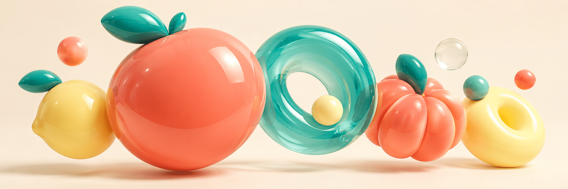
A few large inflated forms lead the composition; smaller bubbles establish rhythm and scale. Crisp silhouettes, broad colour fields, restrained reflections and generous gaps keep the surface lively without turning it into visual foam.
A working definition with a clear boundary
The useful idea in Bubble Pop is not simply that everything should be bright. It is the tension between a simple readable silhouette and a surface that appears elastic, glossy or translucent. A round form seems to hold pressure; a narrow gap suggests that two forms might touch; a tiny satellite bubble can make a much larger object feel buoyant. Those relationships give the concept something to do.
This page develops an AOI interpretation of the label. It does not claim an invention date, exclusive ownership of rounded glossy imagery, or a recognized school with famous members. Earlier unsupported affiliations are not used as evidence. A resemblance to a well-known artist’s use of dots, toys or bright colour does not make that artist a Bubble Pop practitioner.
What “pop” contributes
Historical Pop art is a distinct field. MoMA’s collection offers works connected with familiar commercial imagery, everyday objects and popular culture; it is a useful comparison, not documentation of this new label. [1] Bubble Pop can borrow the design problem of immediate recognition without claiming to share every historical Pop concern.
Keep neighbouring ideas separate. A dot is a flat mark; a bubble suggests volume or a thin boundary. A balloon has a particular object identity; a spherical shape need not be a balloon. A cute character may appear in the scene, but cuteness is not required. The same visual grammar can describe an abstract arrangement, a city or a still life.
The three-scale rule
Begin with one dominant shape or cluster, a supporting group and a few small accents. Assign them clearly different sizes. A field of equally sized spheres gives the eye nowhere to settle; a field in which every sphere competes to be the protagonist is worse. Treat small bubbles as punctuation rather than filler.
Leave an open route through the composition. This can be an arc, diagonal or quiet central gap. Place overlaps deliberately and check that neighbouring contours do not merely kiss in confusing tangencies. A large soft form gains energy when it is balanced by one small sharp accent or an uninterrupted patch of background.
Colour with jobs to do
Choose a dominant hue, a contrasting supporting hue and a small accent. The new gallery often uses coral, turquoise and pale lemon, but these are examples rather than a mandatory palette. A deep indigo background can make a few luminous objects feel celebratory; a warm cream field can produce a quieter, more tactile result.
Control saturation by area. If every square centimetre is maximally bright, colour loses its ability to direct attention. Let one form carry the strongest colour and let a neighbouring surface rest. Test the image at thumbnail size: the principal shape should remain legible even before its reflections can be seen.
Surface and light
Decide whether each object is opaque, translucent or transparent. Opaque forms need a clear transition between light and shade; translucent forms can glow at thin edges; transparent bubbles need boundaries that remain visible against the background. These are illustration choices, not a claim that every invented object follows a single physical material model.
Use a small number of consistent highlight shapes. Long soft reflections suggest a broad light source, while tiny pinpoints can become glittering noise. Keep cast shadows coherent enough to explain contact. A hovering form should have an intentional relationship to the ground rather than an accidental dark patch underneath it. Reserve mirror-like complexity for one focal surface.
Five studies, five different problems
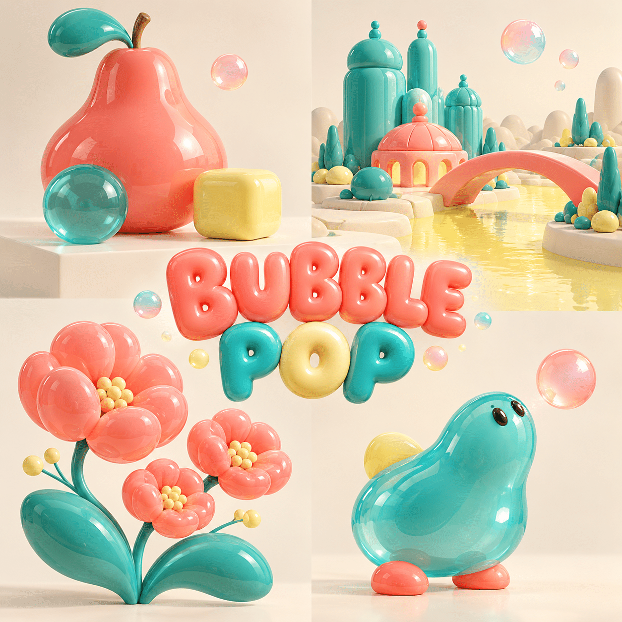
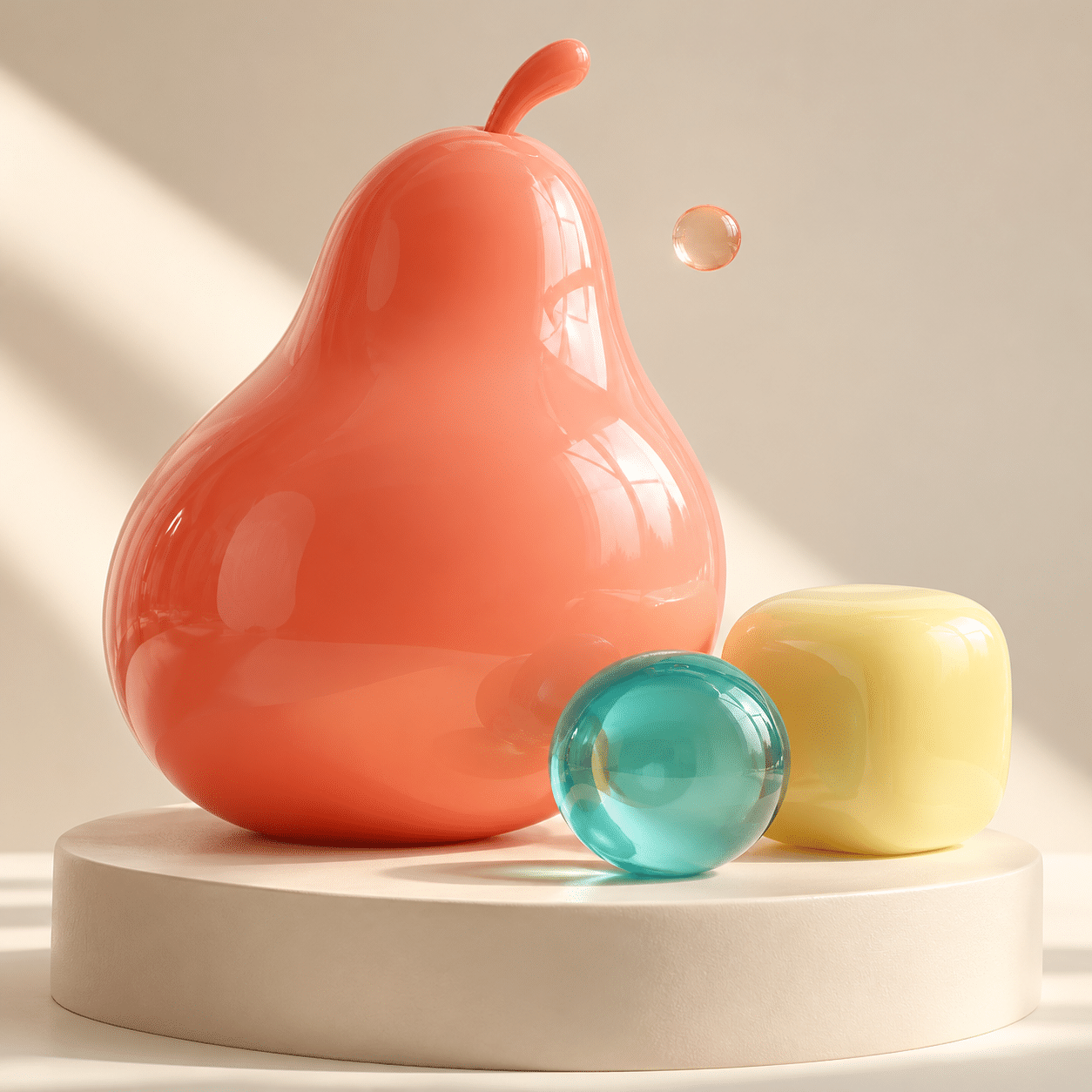
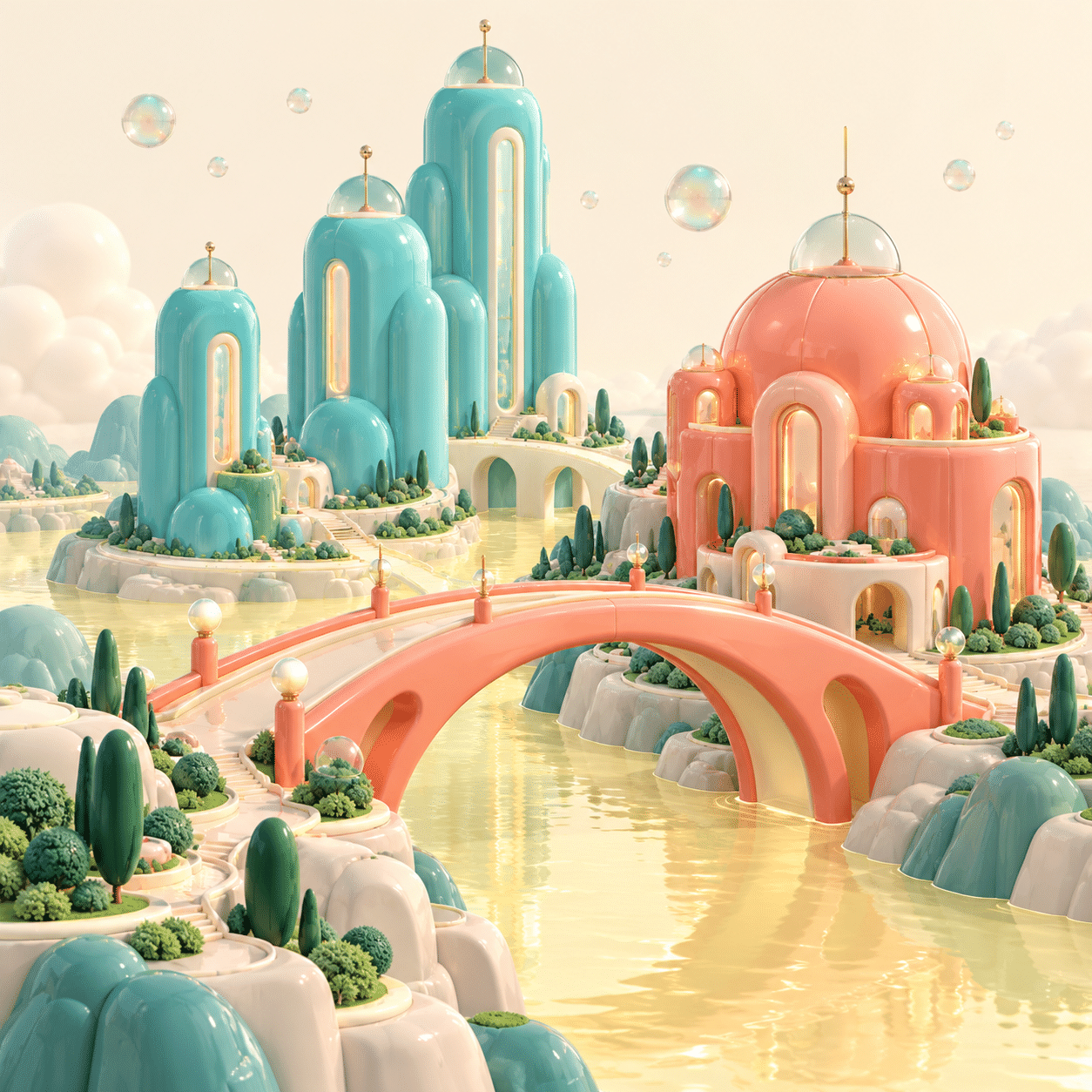
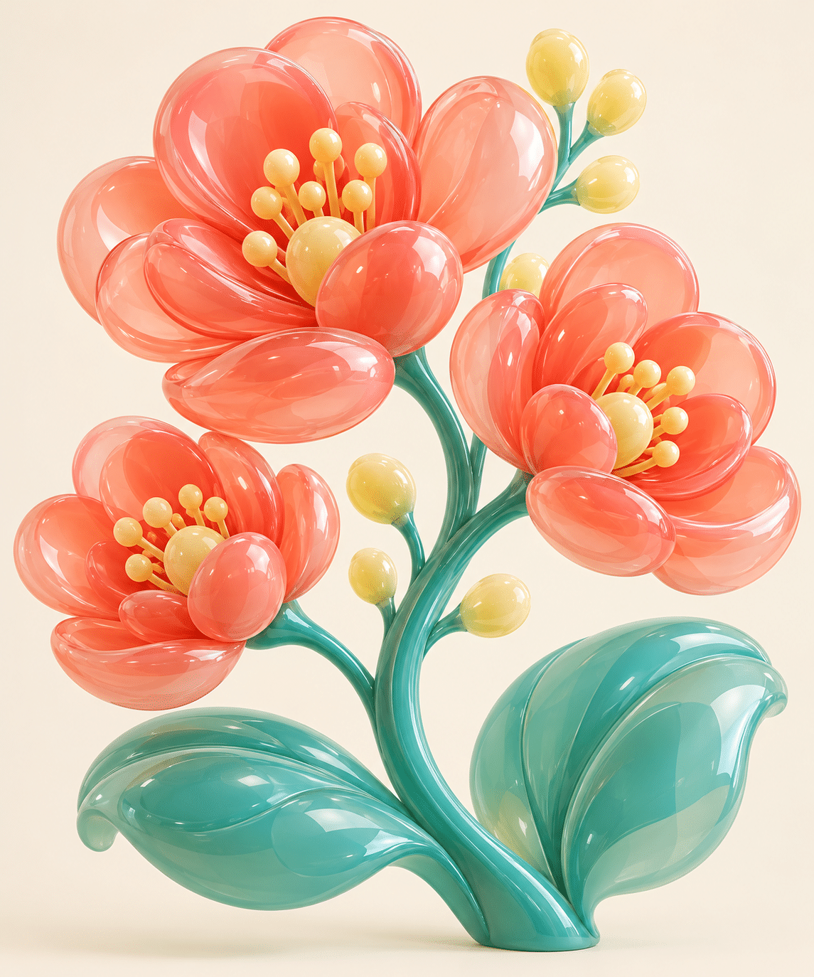
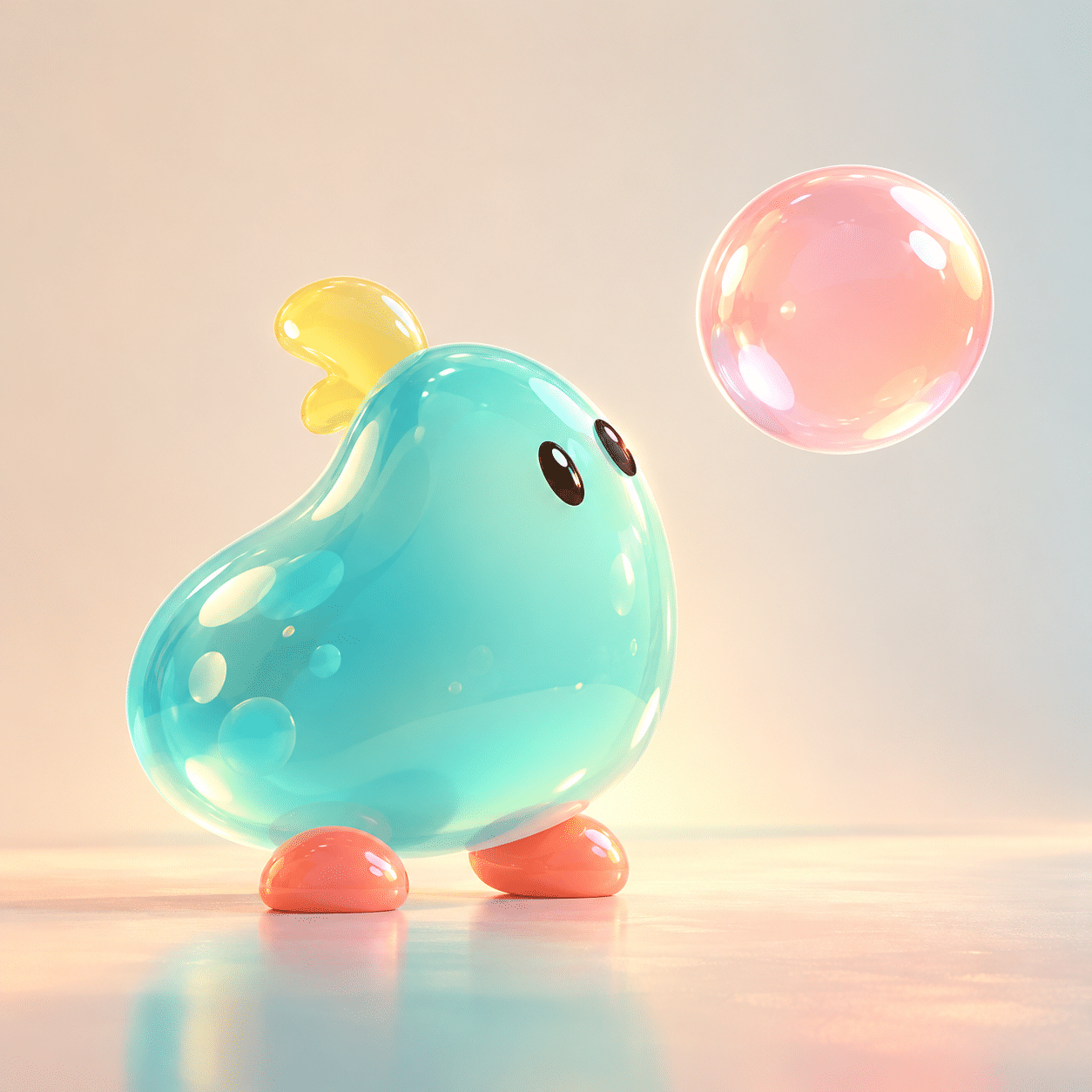
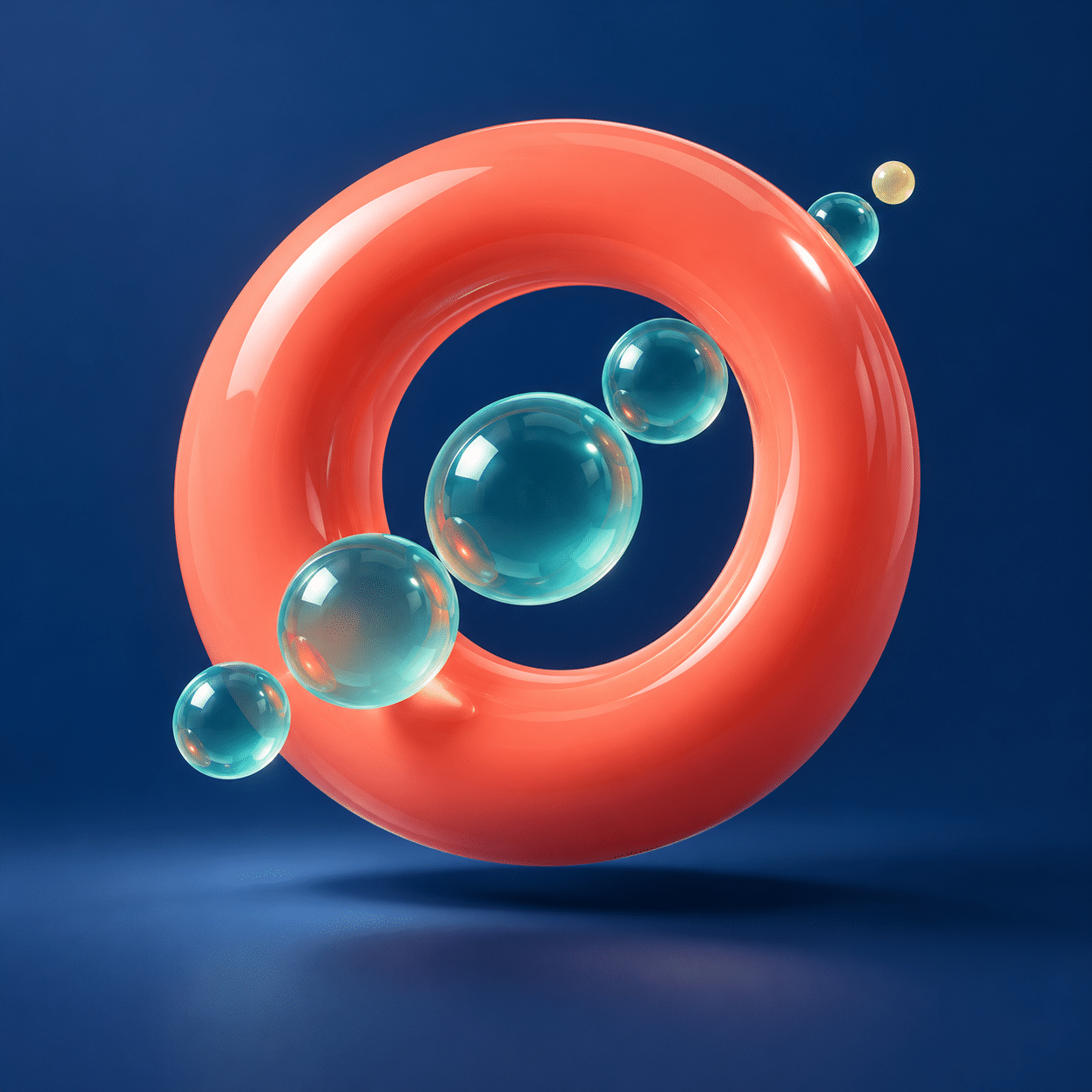
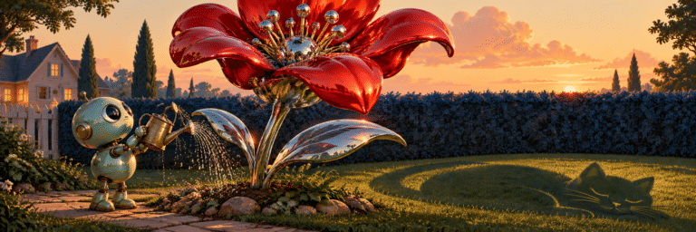
The still life asks how a few inflated fruit-like forms can sit convincingly together. The city study tests whether towers and bridges remain readable when their corners soften. A botanical composition turns petals into clustered volumes while preserving a stem-and-leaf hierarchy. A small abstract creature explores personality through posture rather than borrowed character features. The final abstract study makes a single opening and a trail of bubbles carry the composition.
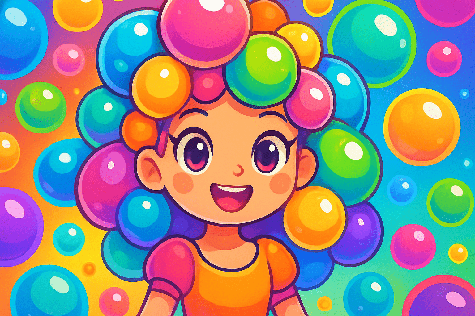
The banner gathers a buoyant arc above a quiet ground; the centrally titled collage introduces four different motifs. All are original AI-generated illustrations for this AOI proposal. Their appearance does not establish that the imagined materials or structures could be manufactured. The earlier image remains as an archive reference where usable.
A practical making sequence
Draw the silhouette first in a single flat colour. Reduce the scene until its main action is obvious: rising, balancing, clustering or opening. Add the supporting masses, then choose a material for each. Only after those decisions should highlights and small bubbles arrive. This sequence prevents finish from concealing a weak composition.
For a prompt, name the subject, dominant shape, spacing, palette, surface and light. “Playful, colourful, beautiful” is too vague to guide the result. An inflated pear beside a translucent turquoise orb on a cream platform gives the generator a concrete relationship. Revise the largest failing relationship first; adding more sparkle seldom repairs it.
Uses and limits
Bubble Pop can serve editorial illustration, playful campaign imagery, packaging concepts and decorative scenes. When text will accompany an image, reserve a genuinely quiet region rather than hoping letters will compete successfully with reflections. A featured image should work at small size, where three decisive forms are often stronger than twenty elaborate ones.
The approach becomes monotonous when every subject is reduced to the same shiny toy. Vary scale, negative space and material opacity across a series. Avoid implying that bright colour guarantees happiness or therapeutic benefit. An image can invite play while leaving viewers free to feel something else.
Positive editorial assessment — AI-authored
The strongest Bubble Pop images make buoyancy legible through spacing, scale and a few controlled reflections. Their appeal survives reduction because the silhouette carries the idea. The visual language can accommodate many subjects without requiring a mascot or a famous artist’s signature motifs.
Critical editorial assessment — AI-authored
Gloss can become a substitute for invention. Endless spheres, identical highlights and maximal saturation produce attractive but interchangeable images. A better version gives each scene a specific action, a quiet interval and at least one material contrast.
Neutral editorial assessment — AI-authored
Bubble Pop is used here as an AOI art-direction proposal for rounded dimensional illustration. It is suitable for playful visual communication and formal experiments. Its history should not be confused with Pop art, and generated examples do not demonstrate real material engineering.
A small poetic detour
Original words from the AOI studio.
Poetry
A round shape holds a little air,
a small one leaves the larger room;
colour rises like a dare,
then pauses at the edge of bloom.
One bright reflection, not a crowd,
one open space the eye can keep;
the quiet makes the colour loud,
the smallest bubble makes the leap.
The prompt workshop
Original creative exercises. These prompts create new illustrations, not documentary evidence.
Starting point: a buoyant still life
An original Bubble Pop illustration of one coral inflated pear-like form beside a smaller translucent turquoise sphere on a pale cream platform. One tiny lemon bubble above them, broad soft studio light, restrained highlights, clear contact shadows, spacious composition, no logos or text.
Richer composition: a rounded city
An imagined small city of softly rounded turquoise and coral towers, one broad arched bridge, a pale lemon river and three tiny hovering bubbles. Clear foreground, middle and background groups; one dominant silhouette; smooth opaque surfaces contrasted with a single translucent dome. Quiet sky, no signs or lettering.
Experiment: pressure and absence
An abstract Bubble Pop composition with a large coral torus hovering over an indigo ground and five differently sized turquoise bubbles passing through its open centre. Strong negative space, limited palette, selective glossy highlights, coherent soft shadow, no clutter or text.
Your next inspiration
Discover another art style
Follow a visual thread to the next subject.

Pop Art: Repetition, Consumer Images and the Art of Looking Again
Compare the established context while keeping the AOI Bubble Pop proposal distinct.
Lowbrow Art: Vernacular Images, Unruly Stories and Serious Craft
Compare the established context while keeping the AOI Bubble Pop proposal distinct.
A smile from the studio
Jokes
The composition asked for breathing room. The bubbles took that rather literally.
Sources and further exploration
[1] MoMA: Pop art — historical works for comparison, not evidence of a Bubble Pop movement