Established optical method · AOI artistic interpretation
A clear piece of material can conceal a load in ordinary light and disclose it between polarizers. This art direction takes that change of visibility as its subject: bright fringes gather around a notch or contact while the surrounding field stays quiet.
A visual introduction
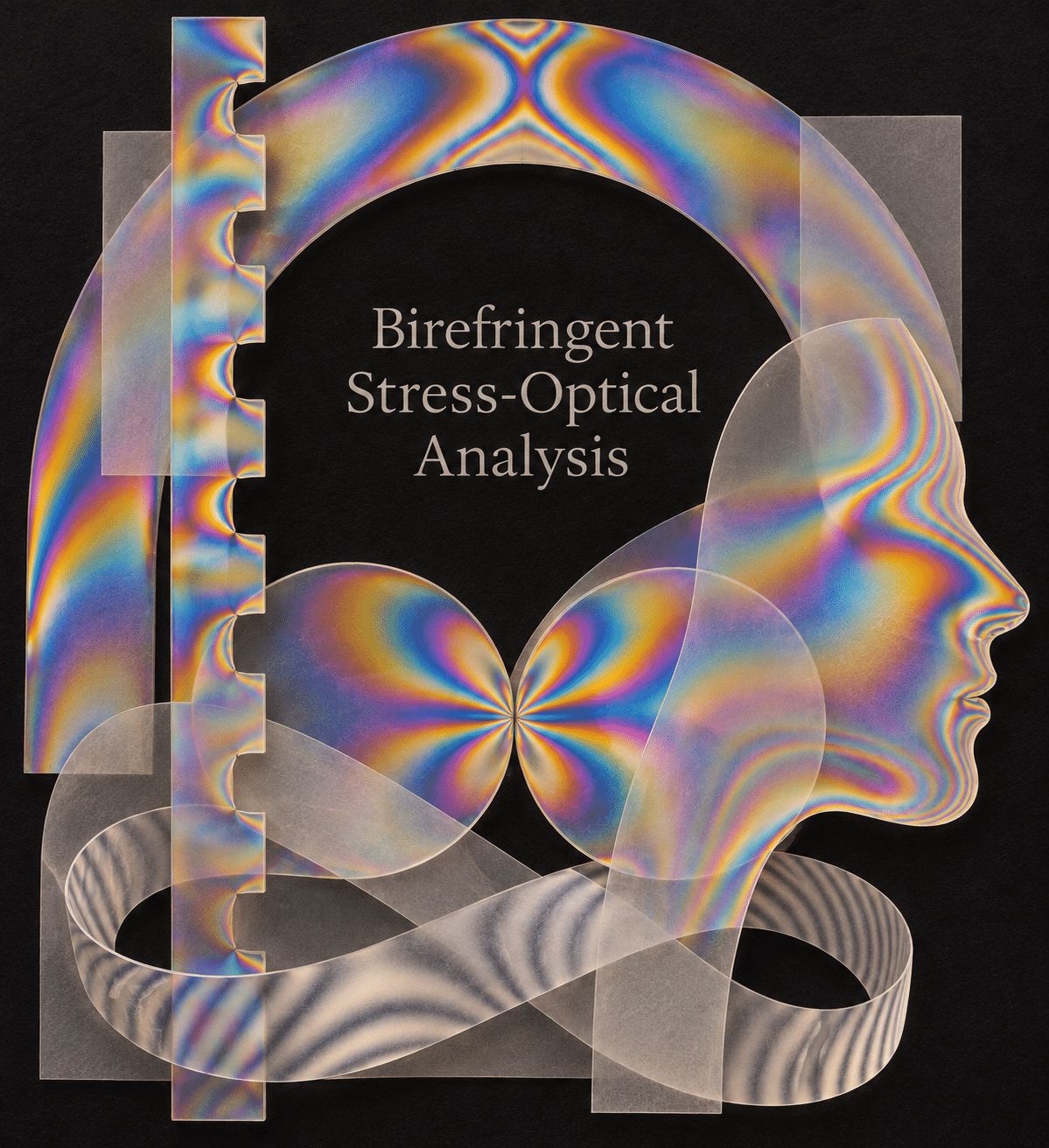
Seven original AI-generated interpretations: a dedicated banner, a centrally titled artistic collage and five standalone studies.
Select an image for a closer look. Use the thumbnails, arrow keys or a swipe to compare examples. Zoom in to inspect details, or share the image that inspires you.
Creative toolbox · take this style further
Choose an input and a destination. Search sends your words to the chosen site; Copy & open puts them on your clipboard to paste there.
Create with AI
Turn your chosen input into an image prompt or a new creative direction.
ChatGPT
Copy your input and paste it into a ChatGPT conversation or image request.
Copy & open ChatGPT (new tab)Claude · Anthropic
Develop an image prompt or explore the style in a new Claude conversation.
Copy & open Claude · Anthropic (new tab)Midjourney
Paste your input into the Imagine bar on the Create page.
Copy & open Midjourney (new tab)Adobe Firefly
Copy your input, open Firefly, and paste it into the prompt field.
Copy & open Adobe Firefly (new tab)Leonardo.Ai
Copy your input, open Leonardo, and paste it into the generation field.
Copy & open Leonardo.Ai (new tab)Image search
Find visual references. Short, concrete keywords usually work best.
Lexica
Search AI images and prompts using your selected input.
Search with this input Lexica (new tab)Pexels
Search the photo and video library. Short keywords often work best.
Search with this input Pexels (new tab)Pixabay
Search photos, illustrations and other images.
Search with this input Pixabay (new tab)Unsplash
Search photographs using the style name or your own keywords.
Search with this input Unsplash (new tab)Wikimedia Commons
Search photographs, artworks and historical images. Check each file for its source and reuse terms.
Search with this input Wikimedia Commons (new tab)Art & research
Explore artists, collections and the ideas behind a style.
Wikipedia
Search for background reading. A style may not have its own article.
Search with this input Wikipedia (new tab)WikiArt
Copy your input into WikiArt’s search to explore artists and artworks.
Copy & open WikiArt (new tab)Europeana
Paste your keywords into the search to explore European museum, library and archive collections.
Copy & open Europeana (new tab)Inspiration
Discover portfolios and visual ideas from creative communities.
Instagram hashtags
Search a hashtag made from your input: spaces and punctuation are removed. Instagram may require sign-in.
Search with this input Instagram hashtags (new tab)ArtStation
Paste your input into artwork search for concept art, environments, characters and visual development.
Copy & open ArtStation (new tab)Behance
Paste your input into project search for illustration, design and visual storytelling.
Copy & open Behance (new tab)A closer look
Draw the transparent body, its supports and the point of contact first. Let nested bands turn around a hole or fan away from a bearing. Keep regions of low visual activity, including a strong silhouette against the dark field.
How to see a force without drawing an arrow
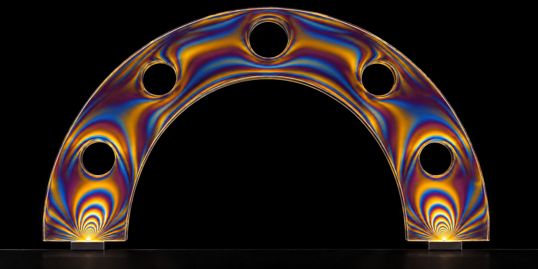
A clear arch presses on two small feet. Under ordinary illumination the viewer might notice its polished edge and little else. In a polariscope a suitably stressed transparent material can show a quite different picture. Regions of interference light appear within the body, drawing attention to relationships that its outer shape alone cannot show.
Harvard’s photoelasticity demonstration explains how stress can induce birefringence in a normally isotropic material. Two polarized light components travel differently through it. Viewed through the appropriate analyzer, their relative delay helps determine the intensity or colors we see. The result depends on the specimen and the optical arrangement. An artist borrowing the appearance need not pretend to have measured the cause.
Read the contact before the color
Look for a hole, a notch, a support or a place where two bodies touch. These give the eye a reason for a pattern to change. In an artwork, setting a tight cluster of bands beside a generous quiet area can suggest that a load has a local consequence. Give every square inch the same rainbow and that contrast vanishes.
Ask someone to point to where the push enters the object. If the answer could be anywhere, strengthen the shape of the contact before you brighten the fringes. A nearly invisible loading pin can carry more compositional weight than the largest patch of red.
Why blue is not a number
The Illinois Materials Testing and Instructional Laboratory describes isochromatic fringes as contours of constant principal stress difference under the conditions of its technique. Interpreting real measurements involves the material, thickness, illumination and fringe order. A single hue in a generated picture supplies none of that calibration.
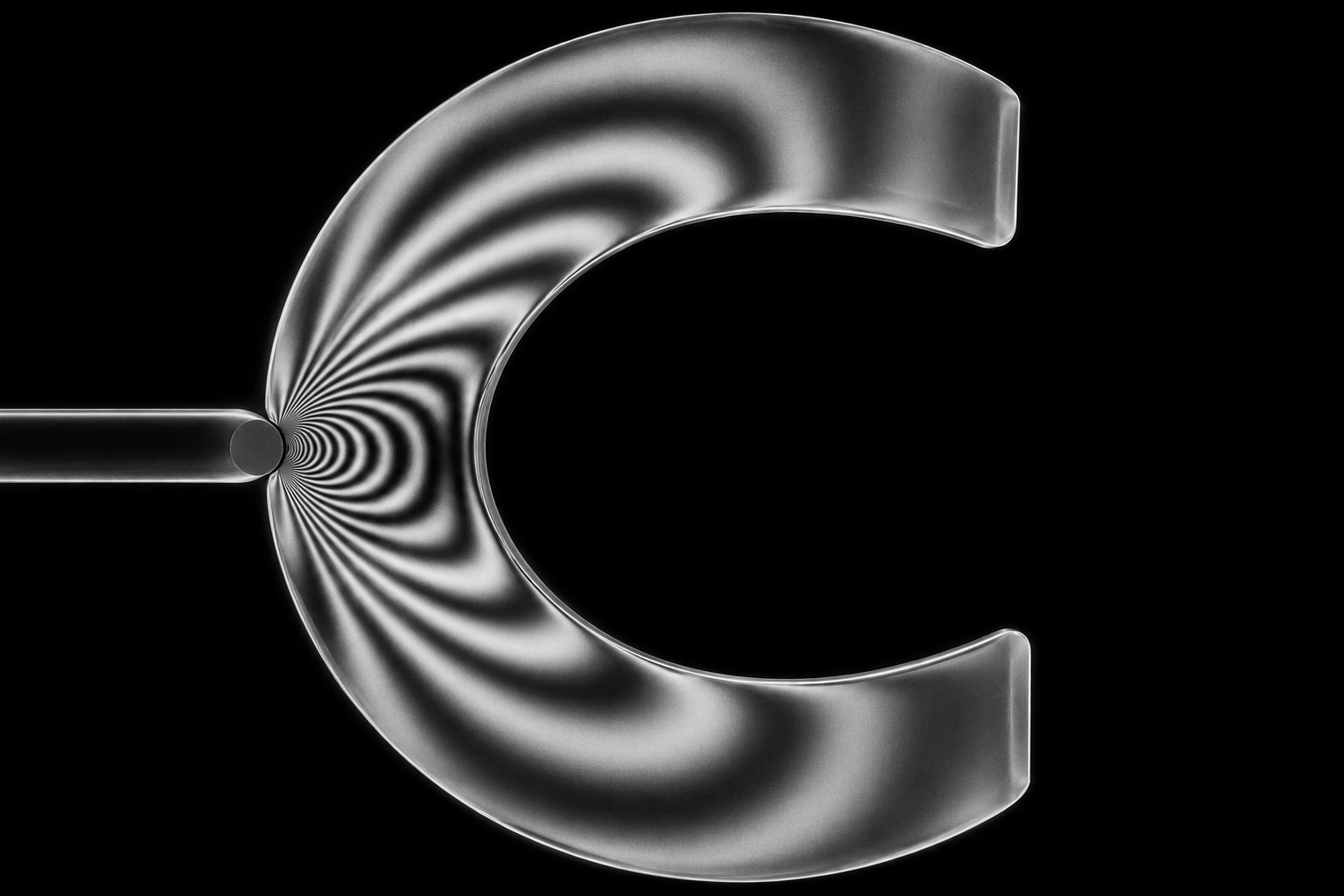
A monochromatic study is a useful visual test. Without the fascination of rainbow color, the spacing and direction of alternating dark and bright bands have to carry the form. Let an inner bend gather several bands while a broad outer curve gives them room to part. These generated specimens carry no engineering loads or safety ratings.
Scale it up, but say what changes
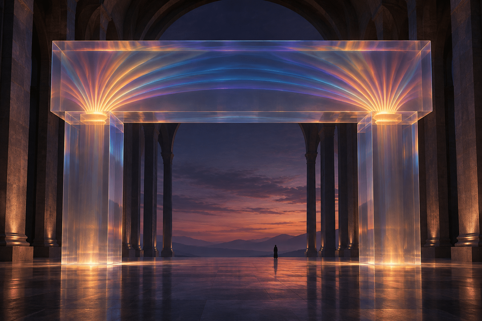
Slide from the bench to an imagined building. A large transparent gate can gather color above its bearings while paving and sky remain dark. A person beside it supplies the sense of scale. The image proposes what a load might feel like at the scale of architecture; it does not document a feasible structure.
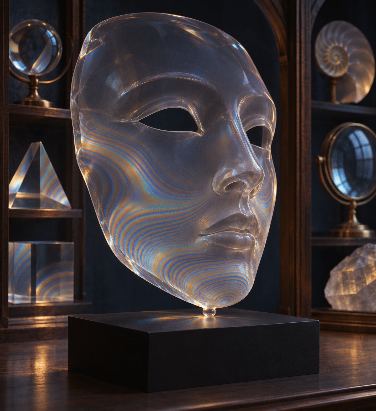
For a portrait variation, sculpt a mask with a clear jaw resting on a stand. The band pattern belongs to the contact between sculpture and stand. It need not imply anything about a person’s health or emotions. That restraint makes the object more intriguing: the expression is fixed, but the material seems to be answering the plinth.
Three kinds of color worth keeping apart
Thermal images map a detected or imagined temperature field to a palette. Surface iridescence can shift with viewing angle. In a photoelastic study the light travels through the specimen and the optical system determines what reaches the observer. All three can be vivid; they tell different stories about where the color comes from.
For an art print, begin with black paper, a thin outline and three fringe values before attempting a full spectrum. For a sequence, hold the camera still and change just the apparent contact or the shape of the notch. The worthwhile comparison is where the bands move, not how many bright colors you manage to fit in the frame.
Positive editorial perspective
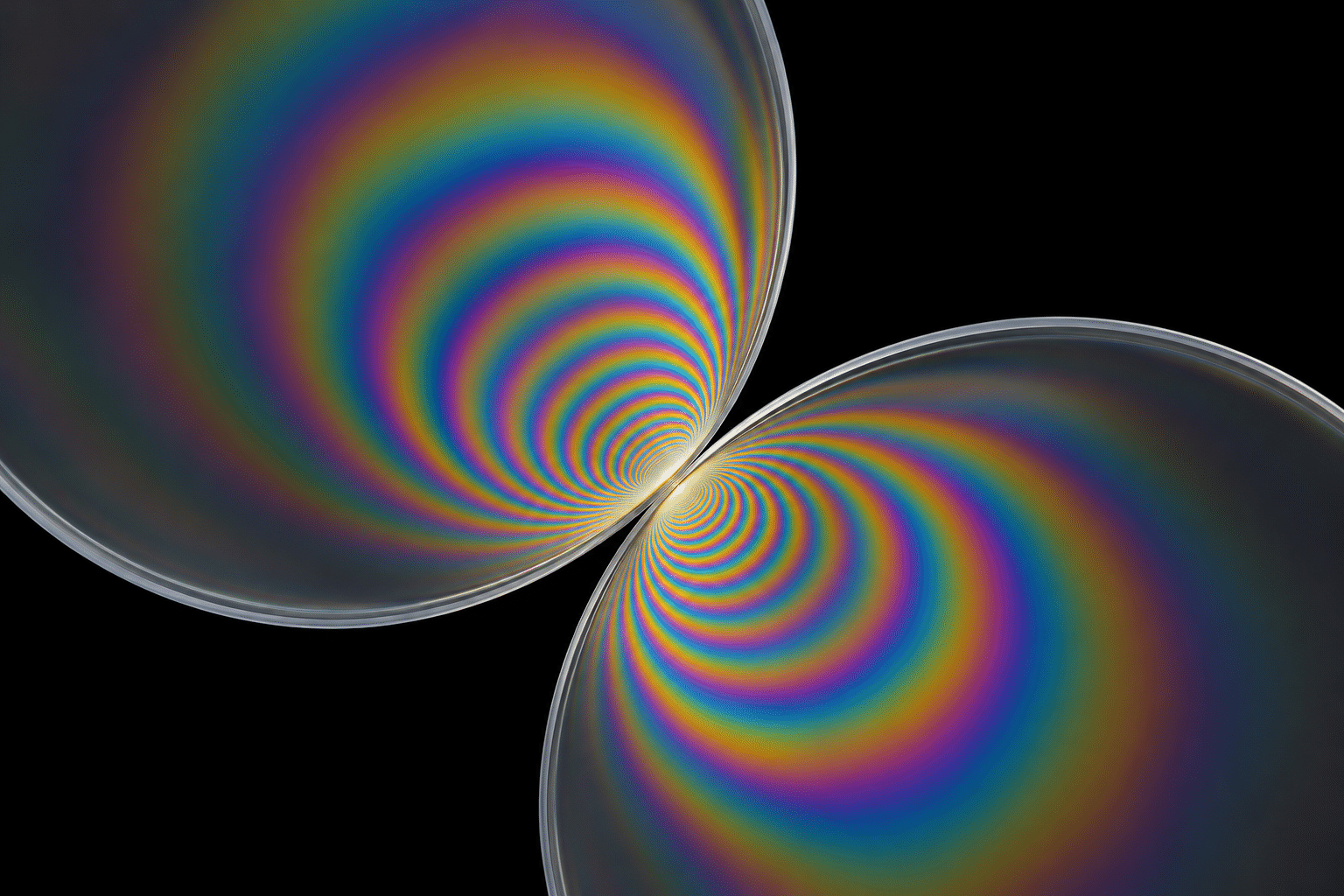
AOI editorial perspective (AI-authored). The contact between two discs gives the eye a precise point from which to explore the growing fans. That physical cue makes an abstract image surprisingly intimate.
Negative editorial perspective
AOI editorial perspective (AI-authored). A rainbow pasted onto a silhouette tells us little about the silhouette. Quiet the center or move a band until we can identify the specific edge or contact it answers.
Neutral editorial perspective
AOI editorial perspective (AI-authored). The entry distinguishes an established optical method from a set of artistic studies. No fringe here is a measured result.
Pocket-sized facts
Photoelasticity can reveal stress-induced birefringence in suitable transparent materials.
Fringe appearance depends on the optical setup and specimen; hue alone is not a universal stress scale.
The seven images are artistic interpretations, not measurements.
A small poetic detour
Original words from the AOI studio.
Poetry
A pin leans in. The ribbon keeps
its shape to any passing eye.
Between two sheets of dark it sleeps
in bands of brass and lapis dye.
Two circles meet. Their narrow kiss
unfolds a fan on either side.
No hand could draw a map of this
by tracing just the rim outside.
Take all the color from the bend:
the silver lines still crowd and part.
Where does the weight begin or end?
The black field gives the question heart.
The prompt workshop
Original creative exercises. These prompts create new illustrations, not documentary evidence.
A notch under pressure
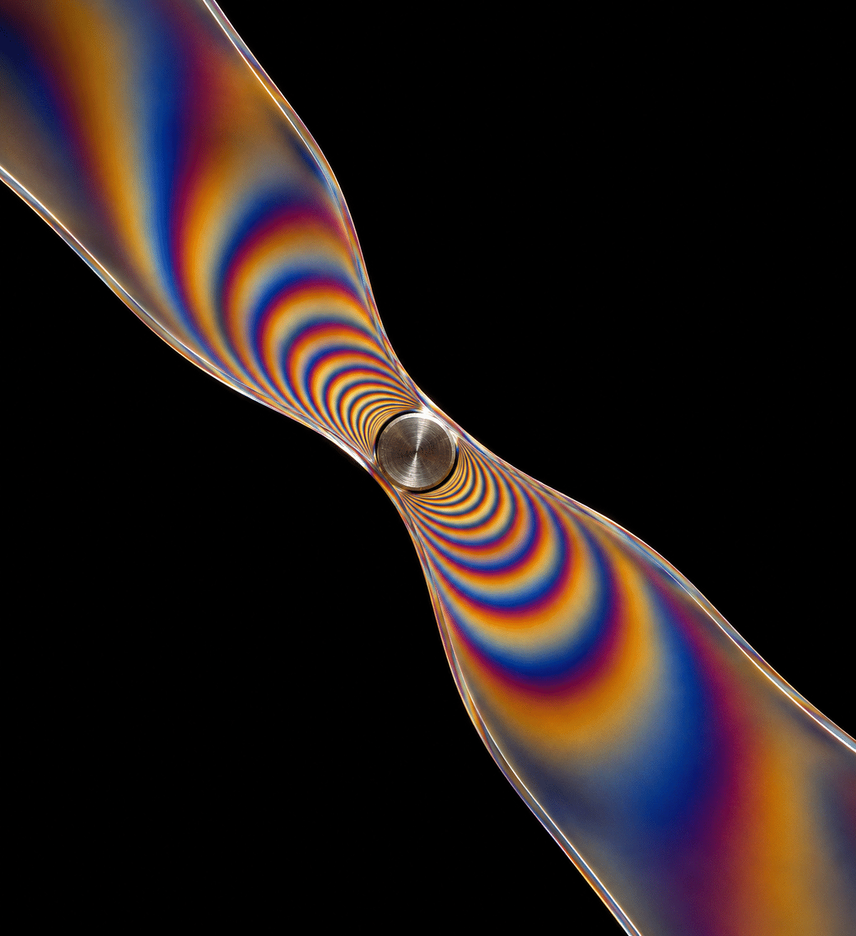
Dark-field artistic interpretation of a transparent strip with a small notch pressed against one pin; nested amber and blue bands gather at the neck, quiet clear ends.
Design one contact with a visible consequence.
A black-and-white bend
A clear open loop against black, bright and dark interference contours following its inner bend, monochromatic light and spare silver-gray edges.
Spacing must explain what color otherwise disguises.
Two discs meet
Two transparent discs in contact, localized paired fringe fans opening away from the tangent, plain dark field, no labels or scales.
The image is a study of contact, not a measurement.
A smile from the studio
Jokes
The gallery label said, “This arch is under considerable stress.” A visitor suggested a holiday. The technician slipped out one polarizer and the colors disappeared. “There,” said the visitor, “it looks much calmer.” The arch requested a second opinion from someone willing to move the weight.