
Architectural illustration · parallel projection and selective removal
Understand axonometric cutaways: parallel projection, visible interiors, drawing hierarchy, architectural references and AI illustration prompts.
A visual introduction
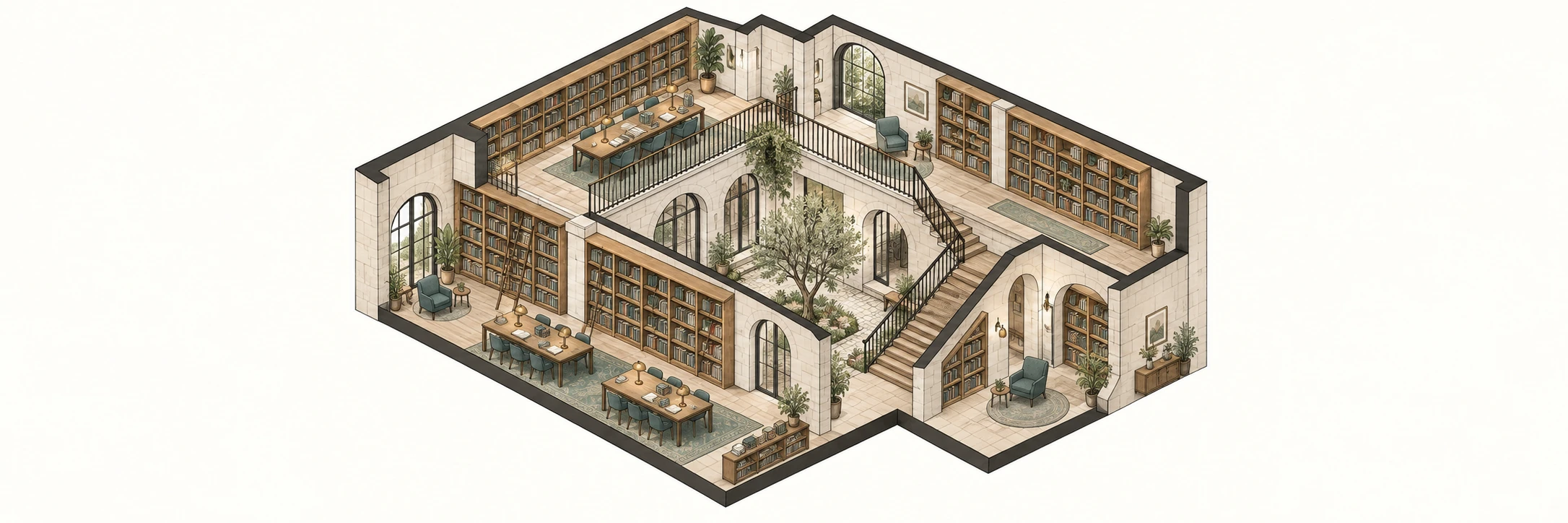
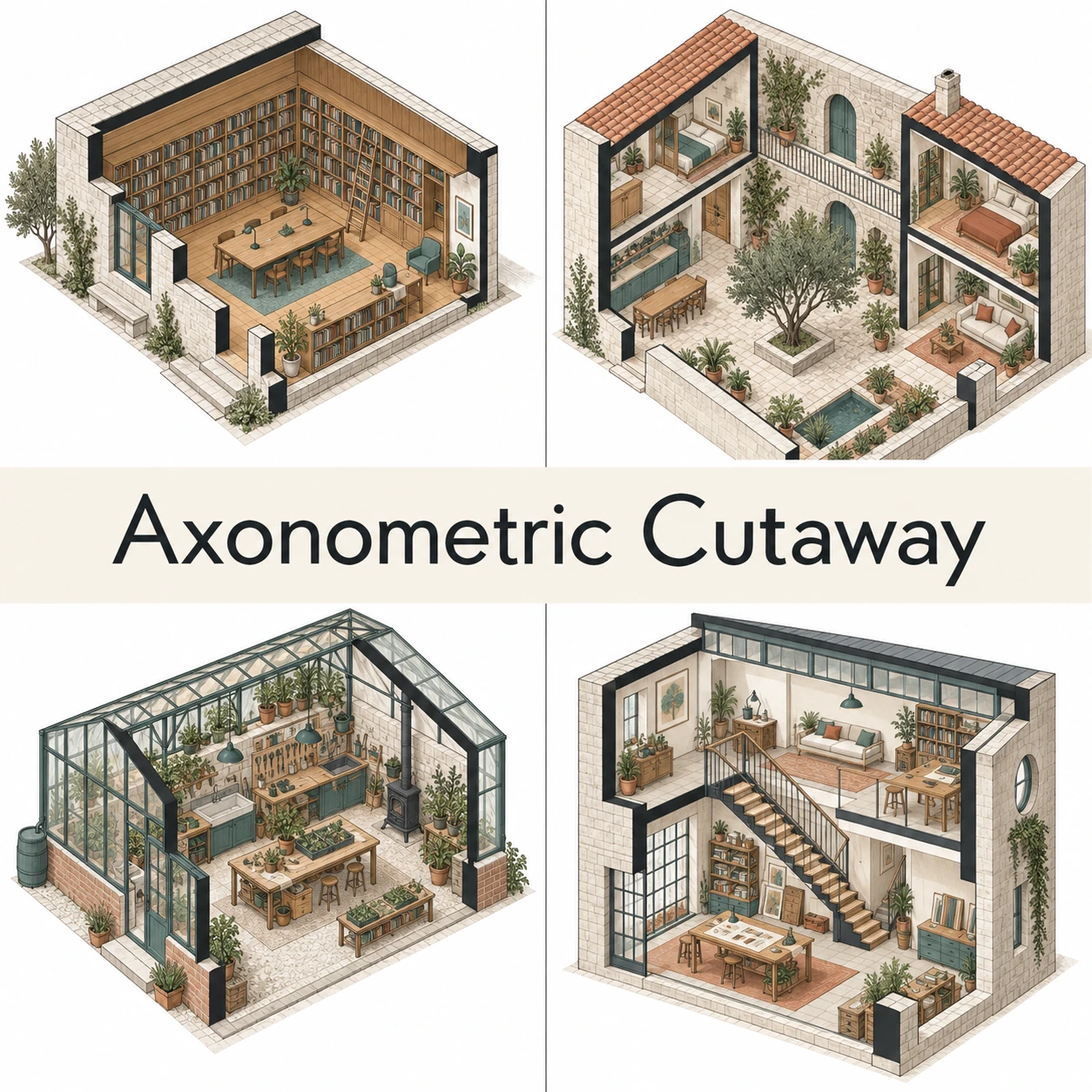
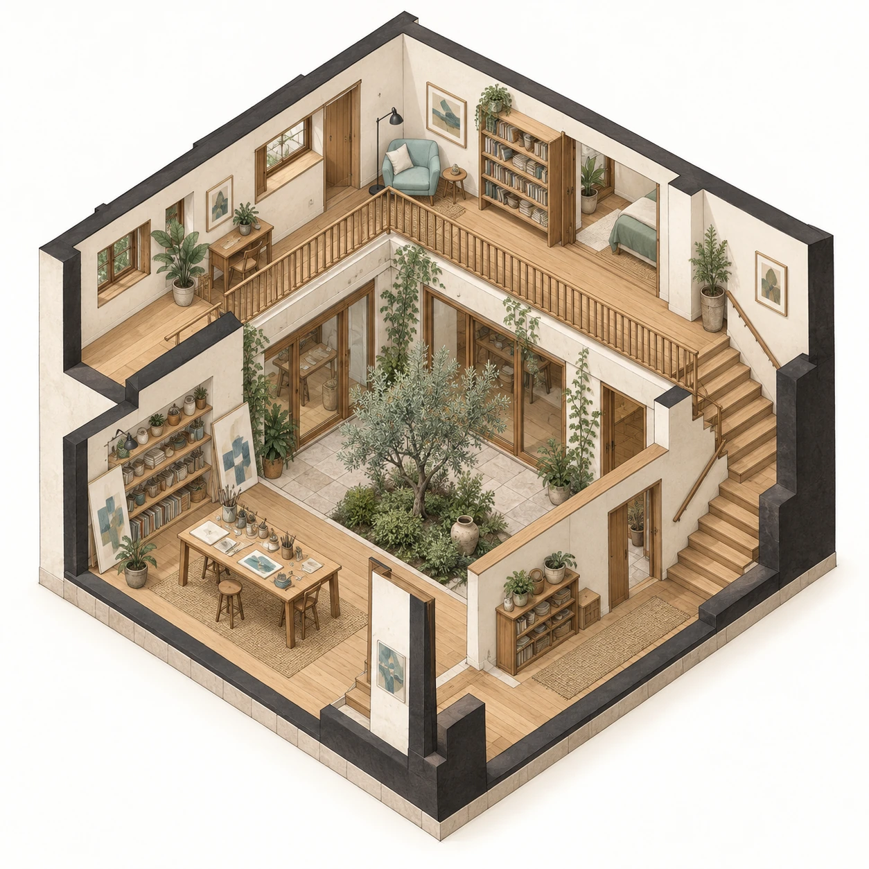
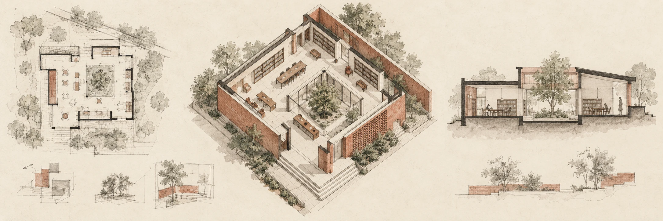
Three original AI-generated illustrations: a panoramic header, a collage with the style name at its center, and a standalone example. Captions distinguish these studies from historical objects and technical documentation.
Select an image for a closer look. Use the thumbnails, arrow keys or a swipe to compare examples. Zoom in to inspect details, or share the image that inspires you.
Creative toolbox · take this style further
Choose an input and a destination. Search sends your words to the chosen site; Copy & open puts them on your clipboard to paste there.
Create with AI
Turn your chosen input into an image prompt or a new creative direction.
ChatGPT
Copy your input and paste it into a ChatGPT conversation or image request.
Copy & open ChatGPT (new tab)Claude · Anthropic
Develop an image prompt or explore the style in a new Claude conversation.
Copy & open Claude · Anthropic (new tab)Midjourney
Paste your input into the Imagine bar on the Create page.
Copy & open Midjourney (new tab)Adobe Firefly
Copy your input, open Firefly, and paste it into the prompt field.
Copy & open Adobe Firefly (new tab)Leonardo.Ai
Copy your input, open Leonardo, and paste it into the generation field.
Copy & open Leonardo.Ai (new tab)Image search
Find visual references. Short, concrete keywords usually work best.
Lexica
Search AI images and prompts using your selected input.
Search with this input Lexica (new tab)Pexels
Search the photo and video library. Short keywords often work best.
Search with this input Pexels (new tab)Pixabay
Search photos, illustrations and other images.
Search with this input Pixabay (new tab)Unsplash
Search photographs using the style name or your own keywords.
Search with this input Unsplash (new tab)Wikimedia Commons
Search photographs, artworks and historical images. Check each file for its source and reuse terms.
Search with this input Wikimedia Commons (new tab)Art & research
Explore artists, collections and the ideas behind a style.
Wikipedia
Search for background reading. A style may not have its own article.
Search with this input Wikipedia (new tab)WikiArt
Copy your input into WikiArt’s search to explore artists and artworks.
Copy & open WikiArt (new tab)Europeana
Paste your keywords into the search to explore European museum, library and archive collections.
Copy & open Europeana (new tab)Inspiration
Discover portfolios and visual ideas from creative communities.
Instagram hashtags
Search a hashtag made from your input: spaces and punctuation are removed. Instagram may require sign-in.
Search with this input Instagram hashtags (new tab)ArtStation
Paste your input into artwork search for concept art, environments, characters and visual development.
Copy & open ArtStation (new tab)Behance
Paste your input into project search for illustration, design and visual storytelling.
Copy & open Behance (new tab)A closer look
Keep parallel edges consistent, retained floors attached and cut surfaces distinct from surfaces seen beyond. Remove enough enclosure to reveal a spatial argument without turning the building into an exploded assembly.
What is an axonometric cutaway?
An axonometric cutaway combines a projection method with a decision about visibility. The axonometric view presents an object obliquely without ordinary perspective convergence; the cutaway removes part of its enclosure so an interior can be understood. Autodesk’s definition emphasizes that parallel lines in the object remain parallel in the view rather than meeting at vanishing points. [1]
The result can explain a house, machine, stage set or imagined spacecraft at a glance. Exterior and interior occupy the same picture. It is a drawing technique, not a single historical art movement, and it can serve either technical explanation or expressive illustration.
Its particular pleasure is the feeling of access. We see rooms usually hidden behind a facade while retaining a sense of the whole. The drawing seems generous. But generosity needs editing: remove everything and there is no building left to understand.
Cutaway, section, exploded view and isometric
A cutaway removes selected material. An exploded view separates components to expose their assembly. In a cutaway, the floors and walls that remain should ordinarily stay in their spatial positions. Floating every level above the next may make an excellent exploded illustration, but it answers a different question.
A section conventionally describes an imaginary cut through an object, often in a flat projection. A sectional axonometric can combine that cut with a three-dimensional view. The terms overlap in practice, so explain what has been removed rather than trusting a label to do all the work.
Isometric is a specific form of axonometric representation, not a synonym for every angled architectural drawing. For a visual brief, asking for consistent parallel projection is often more useful than piling several projection terms together. “Photorealistic wide-angle perspective, perfectly isometric” gives the model competing instructions, then blames it for choosing one.
Architectural references that reward comparison
MoMA records Richard Meier’s The Atheneum, New Harmony, Indiana, Axonometric, circa 1976, as graphite on tracing paper. The modest medium is a useful reminder that this way of explaining space does not depend on glossy digital rendering. This is a reference for axonometric architectural drawing; the catalogue title alone does not establish that it is a cutaway. [2]
John Hejduk’s Diamond House B, Projection, 1963–1967, offers a more conceptual comparison. SFMOMA explains how the rotated plan and layered projections complicate spatial reading even while quantitative information remains. A projection can be formally consistent and still be difficult to decipher. Legibility is a design achievement, not an automatic consequence of using geometry. [3]
These references are not templates to imitate blindly. Ask what each drawing privileges: organization, overlap, enclosure, circulation or ambiguity. Our illustrations choose a more accessible explanatory role, with visible rooms and a restrained palette. That is an editorial choice, not the only legitimate use of the technique.
Build a hierarchy of edges
Give the cut itself a visual identity. A darker edge or filled cut surface can distinguish severed material from a wall seen farther inside. Then reduce the weight of furniture and small fittings. If a chair leg shouts as loudly as the building’s boundary, the room loses its structure.
Choose the removal strategically. A missing front corner can reveal two adjoining rooms and their connection. Removing the entire roof may explain a courtyard but conceal the experience of enclosure. Decide which relationship is essential before choosing an attractive camera angle.
Stairs deserve unusually suspicious attention. Follow the route from one floor to the next and check the opening above it. A staircase can be beautifully shaded while terminating at a slab. Generators are excellent at making such arrangements look intentional; circulation remains less impressed.
Reading our library and courtyard studies
The panoramic library study balances pale surfaces, timber tones and teal accents around an open central area. Shelves and desks provide scale cues while the retained volumes keep the building readable. The collage compares several small architectural programs without lifting the floors into an exploded stack.
The standalone courtyard-house study concentrates on rooms arranged around planted open space. Darker cut edges help organize the picture; furnishings make the spaces approachable. These are AI-generated architectural illustrations, not measured models or verified designs. Their usefulness is visual: they let us discuss what the cut reveals, what it hides and where the drawing still needs checking.
Usability in AI art generation
Axonometric cutaways work well for editorial explanations, fictional architecture, game environments and concept presentations. Name the object, the removed portion and the interior relationship you want to show. “Two-level library, front corner and part of roof removed, retained floors connected, continuous stair visible” is a more actionable brief than “complex architectural masterpiece.”
Expect perspective drift, incompatible floor heights, walls with changing thickness and rooms whose contents do not fit. Repeated windows or stairs can look plausible locally while contradicting the whole. Inspect the main axes, then the circulation, then the small details. Decorative polish should be the last approval criterion.
When exact spatial consistency is required, construct or verify the geometry in CAD or a 3D tool and use a controlled orthographic view. A generated bitmap alone does not provide a dependable geometric model. You can explore material atmosphere with AI while retaining a separate, authoritative spatial reference.
An exercise in useful subtraction
Imagine a tiny two-room studio. Show it first as a closed volume, then with the near corner removed, then with most of the roof removed. Keep the view and palette as stable as possible. Compare which version explains the entrance, the work area and the connection between rooms.
Now remove the decorative objects from your assessment. Can you still explain the building? If yes, the cut is doing its job. If no, the potted plants have been promoted beyond their qualifications. A good cutaway tells you why the inside belongs to the outside.
A small poetic detour
Original words from the AOI studio.
Poetry
The wall steps aside.
A room explains
what its door
had been keeping.
The prompt workshop
Original creative exercises. These prompts create new illustrations, not documentary evidence.
A readable first cut
Axonometric cutaway illustration of a two-room artist studio, front corner and part of roof removed, retained walls connected, consistent parallel edges, dark cut surfaces, fine interior lines, cream and timber palette, white background, no labels, no exploded parts.
Original AOI creative exercise; inspect the result against the guide rather than assuming the model followed every instruction.
Show a circulation story
Two-level library axonometric cutaway, one continuous visible staircase connecting retained floors around a small courtyard, near enclosure removed, restrained teal accents, clear spatial hierarchy, illustrative concept, no dimensional annotations.
Original AOI creative exercise; inspect the result against the guide rather than assuming the model followed every instruction.
A fictional interior
Axonometric cutaway of a compact lunar greenhouse workshop, selected near wall removed, planted work area connected to entry room, coherent floor plane, parallel projection, pale structural shell and warm equipment accents, no floating levels, no text.
Original AOI creative exercise; inspect the result against the guide rather than assuming the model followed every instruction.
Your next inspiration
Discover another art style
Follow a visual thread to the next subject.
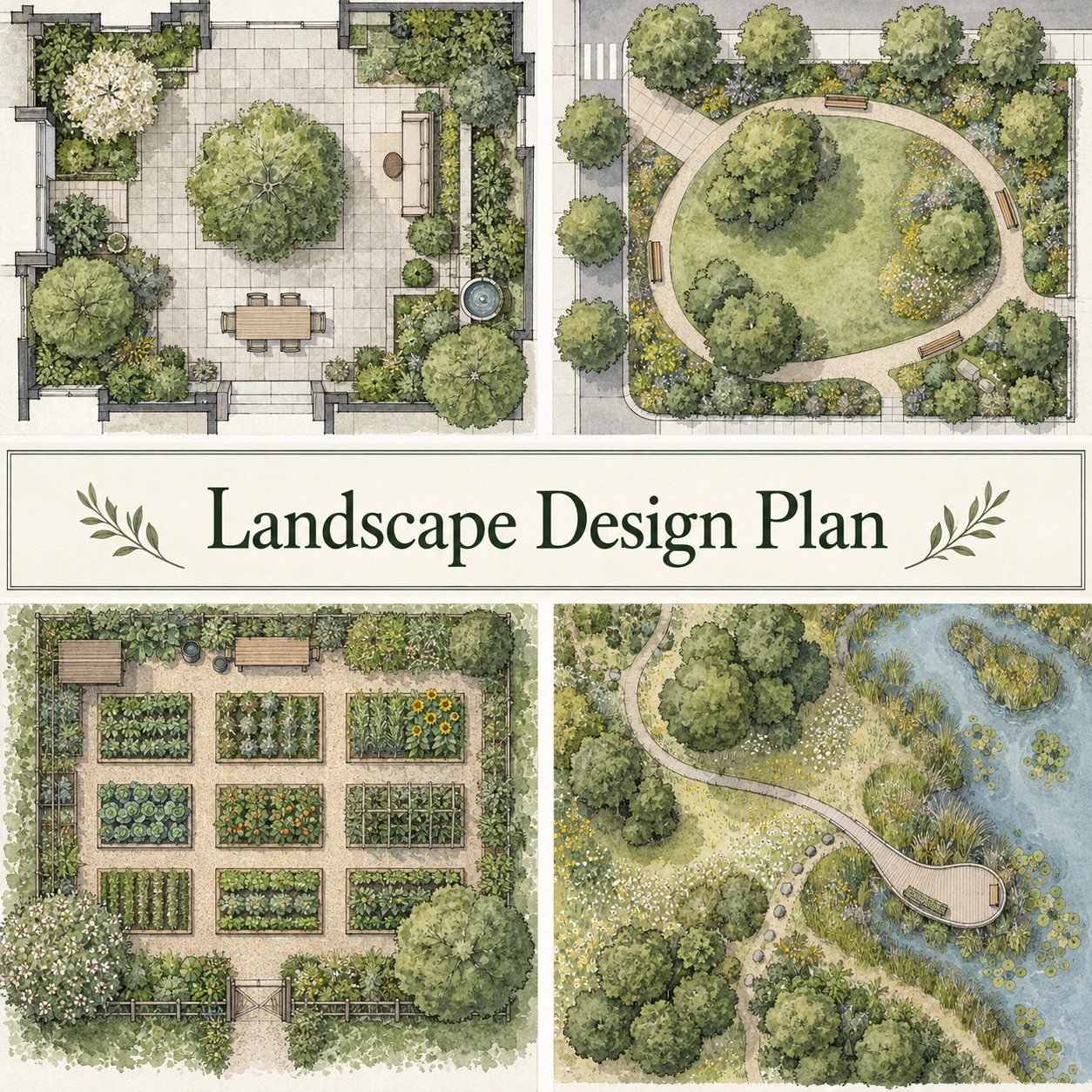
Architectural Drawing: Make Space Understandable
Continue exploring related visual techniques and their differences.
People & works to explore
References discussed in this article. Consult the sources below for context.
Artists and practitioners
Richard Meier — architectural drawing reference [2]
John Hejduk — experimental projection reference [3]
Paintings and other works
The Atheneum, New Harmony, Indiana, Axonometric — circa 1976 [2]
Diamond House B, Projection — 1963–1967 [3]
Sources and further exploration
[1] Autodesk — Axonometric View