Text-based visual art
Explore ASCII art through character choice, spacing, tonal ramps and native text. Learn to distinguish editable text artworks from raster interpretations.
A visual introduction
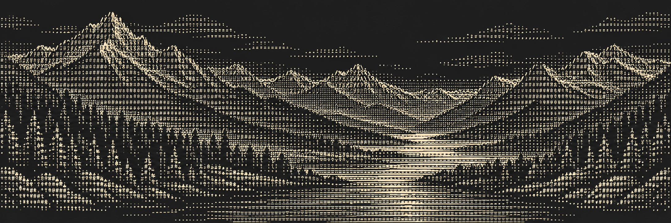
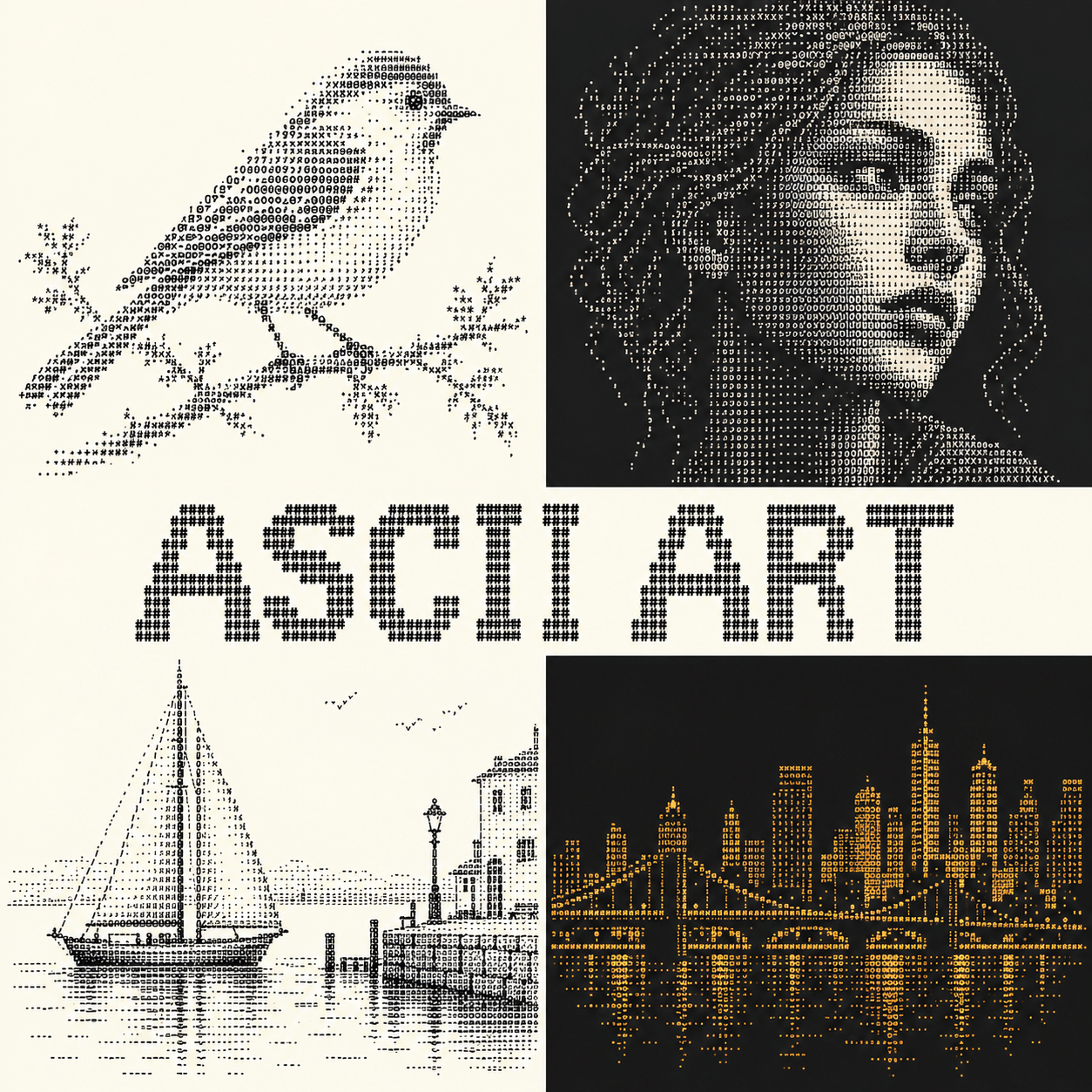
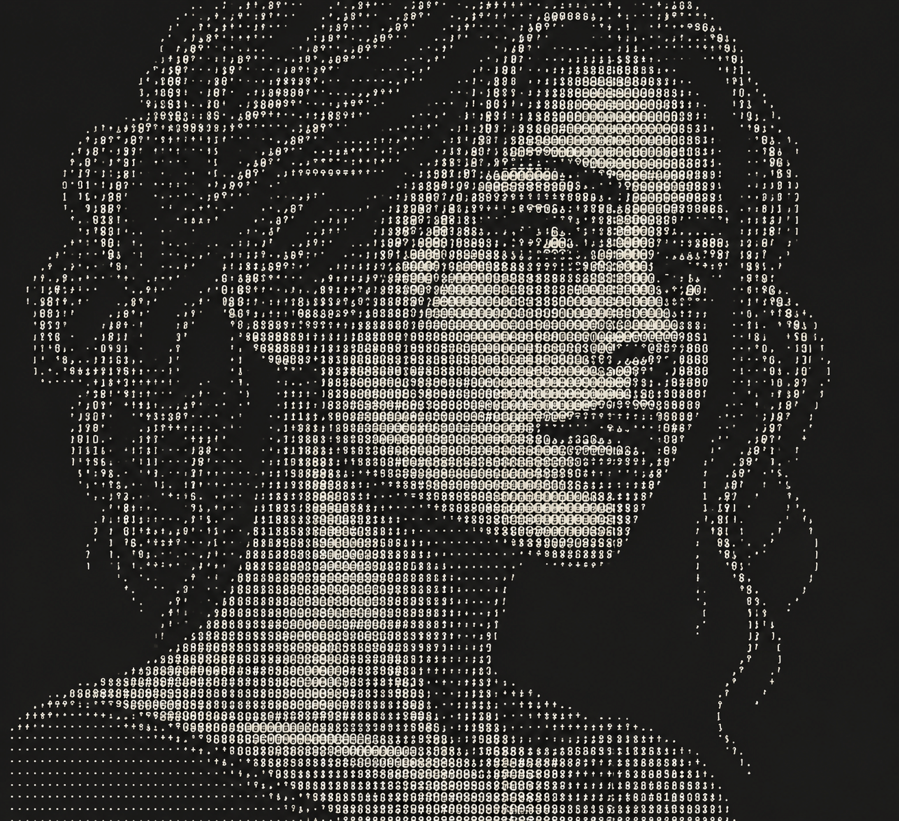
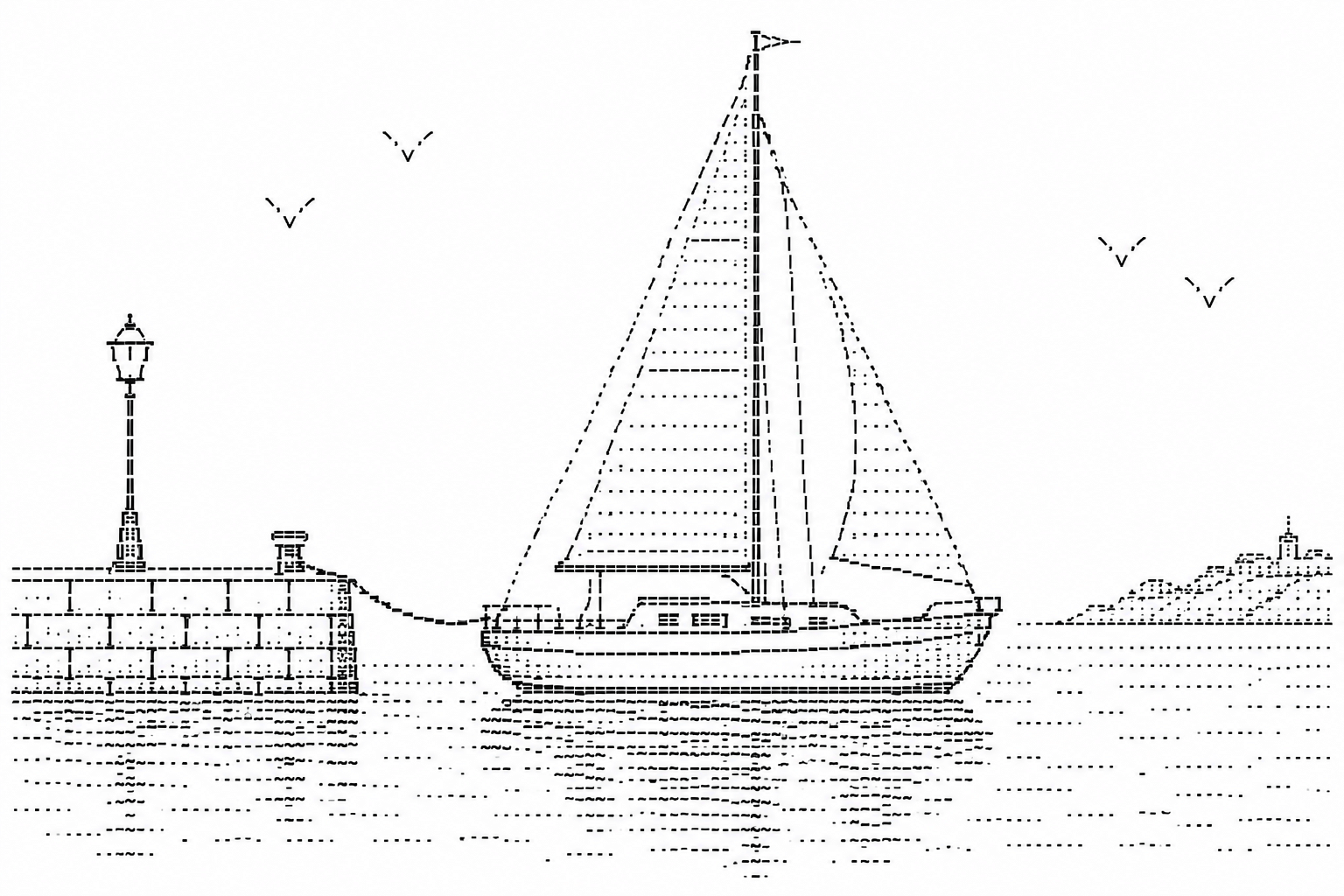
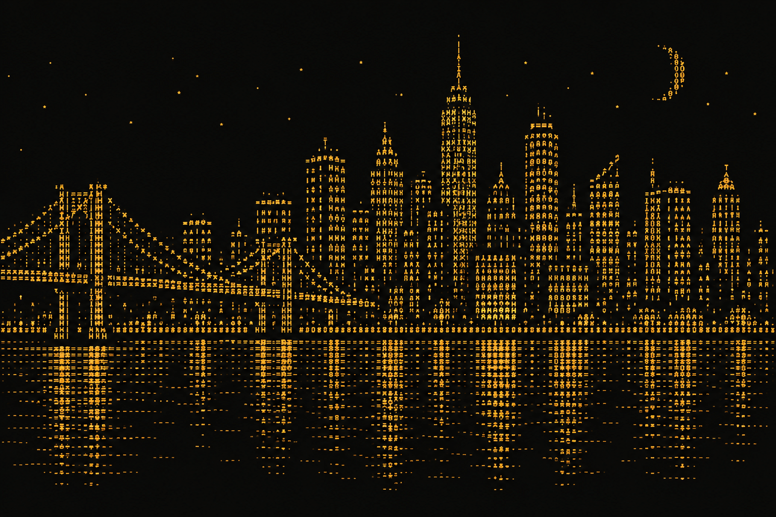
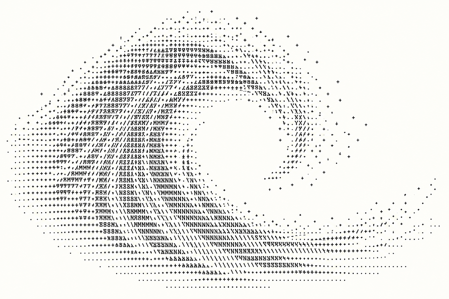
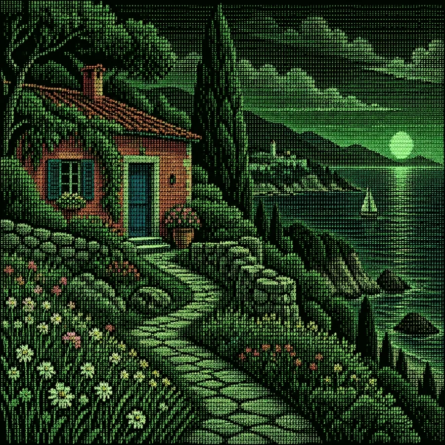
Select an image for a closer look. Use the thumbnails, arrow keys or a swipe to compare examples. Zoom in to inspect details, or share the image that inspires you.


Creative toolbox · take this style further
Choose an input and a destination. Search sends your words to the chosen site; Copy & open puts them on your clipboard to paste there.
Create with AI
Turn your chosen input into an image prompt or a new creative direction.
ChatGPT
Copy your input and paste it into a ChatGPT conversation or image request.
Copy & open ChatGPT (new tab)Claude · Anthropic
Develop an image prompt or explore the style in a new Claude conversation.
Copy & open Claude · Anthropic (new tab)Midjourney
Paste your input into the Imagine bar on the Create page.
Copy & open Midjourney (new tab)Adobe Firefly
Copy your input, open Firefly, and paste it into the prompt field.
Copy & open Adobe Firefly (new tab)Leonardo.Ai
Copy your input, open Leonardo, and paste it into the generation field.
Copy & open Leonardo.Ai (new tab)Image search
Find visual references. Short, concrete keywords usually work best.
Lexica
Search AI images and prompts using your selected input.
Search with this input Lexica (new tab)Pexels
Search the photo and video library. Short keywords often work best.
Search with this input Pexels (new tab)Pixabay
Search photos, illustrations and other images.
Search with this input Pixabay (new tab)Unsplash
Search photographs using the style name or your own keywords.
Search with this input Unsplash (new tab)Wikimedia Commons
Search photographs, artworks and historical images. Check each file for its source and reuse terms.
Search with this input Wikimedia Commons (new tab)Art & research
Explore artists, collections and the ideas behind a style.
Wikipedia
Search for background reading. A style may not have its own article.
Search with this input Wikipedia (new tab)WikiArt
Copy your input into WikiArt’s search to explore artists and artworks.
Copy & open WikiArt (new tab)Europeana
Paste your keywords into the search to explore European museum, library and archive collections.
Copy & open Europeana (new tab)Inspiration
Discover portfolios and visual ideas from creative communities.
Instagram hashtags
Search a hashtag made from your input: spaces and punctuation are removed. Instagram may require sign-in.
Search with this input Instagram hashtags (new tab)ArtStation
Paste your input into artwork search for concept art, environments, characters and visual development.
Copy & open ArtStation (new tab)Behance
Paste your input into project search for illustration, design and visual storytelling.
Copy & open Behance (new tab)A closer look
Visible rows and columns of characters; shapes made by punctuation and letters; whitespace used as light or negative space; density changes suggesting tone; a recognizable image that remains visibly constructed from text.
The characters are the material
Strict ASCII art uses printable characters from the ASCII character set, arranged with spaces and line breaks. RFC 20, published in 1969, documents seven-bit ASCII for network interchange; it is a technical reference for the character set, not a claim about who invented text-based art.
The name is also used more broadly in textmode communities. ASCII Gallery explains that some BBS-era works include extended DOS glyphs, while distinguishing plain text arrangements from ANSI works using terminal control sequences. State the convention being used. Unicode blocks, emoji and extended characters may be valid text art without being strict seven-bit ASCII.
Two useful ways to build an image
Contour-based work chooses characters for their shapes. A slash can suggest a rising edge, parentheses can turn a curve and a vertical bar can establish an upright. The arrangement is often designed by hand, with each character contributing to a recognizable outline or feature.
Tonal work uses character density to suggest light and dark. Sparse punctuation can create a pale area, while denser letters or symbols can form shadows. MIT Media Lab’s FaceTerm project discusses this familiar brightness-mapping approach and explores a more feature-sensitive use of typography for faces. Shape and tone can work together rather than requiring one universal conversion recipe.
A grid is a design constraint
Choose a fixed-width font and a manageable line width before drawing. Every character should occupy the expected column so the image does not collapse when displayed. Preserve spaces and line breaks, and avoid automatic wrapping. A text image that works in one narrow editor may need adjustment for another viewing environment.
Character cells are often taller than they are wide, so a square grid of characters may not produce a visually square image. Judge the result in its intended font. A circle that looks flattened or stretched can be corrected by changing the number of rows and columns rather than adding decorative detail.
Design for recognition first
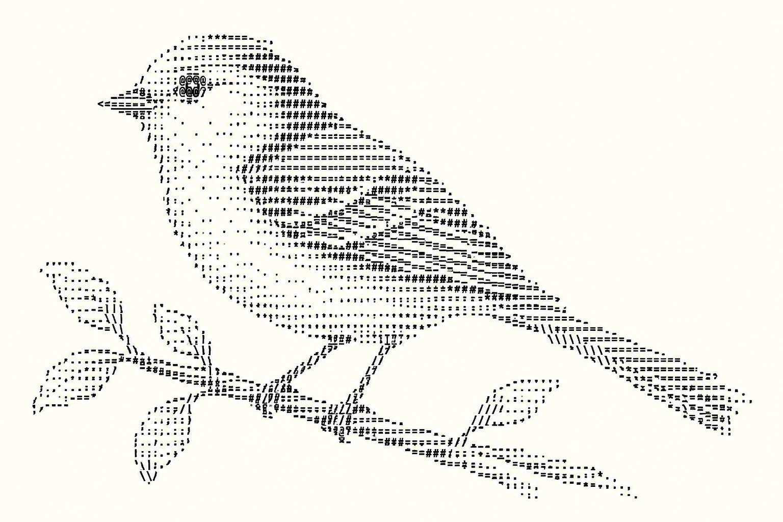
Begin with a strong silhouette or a small number of distinctive features. A bird may need a clear beak and wing direction; a building may need a roofline and repeated openings. Leave enough empty space for those features to remain separate. Tiny gaps can matter as much as the printed marks.
For tonal images, test a short character ramp in the chosen font before using it across a whole picture. The apparent darkness of a character depends on its design and display. Preserve a hierarchy of large light and dark areas, then refine selected features. Converting every pixel mechanically can preserve noise while losing the subject.
Text files and raster interpretations
A native text artwork remains selectable characters with meaningful spacing. A screenshot or generated bitmap may resemble that appearance but does not provide an editable character arrangement. The new AI-generated gallery is labelled as raster interpretation: it illustrates textmode motifs without claiming every visible mark is a verified ASCII glyph or that the images are downloadable text files.
The prompt workshop therefore includes briefs for genuine text output as well as a visual interpretation. When making a native version, keep an original plain-text file, check its character set and preview it without proportional-font substitution. Credit creators when reusing existing text art; a small file or an old online circulation history does not remove authorship.
An exercise in deliberate character choice
Begin with a small object that has an unmistakable outline, such as a cup with a handle. Use a fixed-width editor and a frame no wider than forty columns. Draw only the rim, side, base and handle. Check whether the object reads before adding shading. Keep spaces as carefully as printed characters: closing the handle’s empty interior may destroy its identity.
Make a second version with a short tonal ramp chosen in the actual display font. Compare a space, punctuation and denser characters on the intended background; do not assume the same ordering works for every typeface or reversed colour scheme. Add only enough tone to distinguish the inside from the outside. If the shading overwhelms the contour, remove characters before increasing the canvas.
A portability check is part of finishing
Save a native text version, reopen it in a second fixed-width viewer and compare the longest lines, blank lines and leading spaces. Check that tabs have not shifted the arrangement and that automatic wrapping has not broken the silhouette. If a particular font, character encoding or terminal behaviour is essential, state that beside the work.
Present a short prose description alongside the text image so its subject is available without having to interpret every mark. For a raster version, supply an appropriate alt description and identify it as a raster. These are different deliverables: a visually convincing screenshot is not evidence that the underlying text will survive copying into another application.
Positive editorial assessment — AI-authored
ASCII art can achieve striking economy: a few characters and well-placed spaces can suggest form, gesture and mood. Its visible constraints invite inventive solutions. The strongest work remains readable both as an image and as an arrangement of individual typographic decisions.
Critical editorial assessment — AI-authored
Dense automatic conversions can become muddy, while font changes or wrapping can destroy carefully planned shapes. A raster imitation may conceal invalid glyphs. Improve the work by simplifying the subject, testing the actual display and preserving the native text when editability matters.
Neutral editorial assessment — AI-authored
ASCII art belongs to a wider field of text-based imagery. Strict character-set practice, extended textmode art and raster interpretations have different properties. Clear labelling helps viewers understand what they are seeing and how the work can be copied, displayed or modified.
A small poetic detour
Original words from the AOI studio.
Poetry
A slash leans into empty space;
a bracket turns to hold the air.
A row of dots becomes a distance,
a darker letter settles there.
The picture lives between the columns,
its silence measured line by line.
A little alphabet of choices
lets shape appear without a sign.
The prompt workshop
Original creative exercises. These prompts create new illustrations, not documentary evidence.
Native text: a small bird
Create an original plain-text ASCII drawing of a small bird in profile using only printable seven-bit ASCII characters and spaces. Maximum 40 columns and 18 rows. Preserve line breaks in a code block, use a fixed-width layout, and prioritize a readable beak, body and tail over dense shading.
Native text: a harbour
Create an original plain-text ASCII harbour scene using only printable seven-bit ASCII characters, spaces and line breaks. Maximum 72 columns and 28 rows. Include one sailboat, a simple quay and open sky. Use a coherent fixed-width grid and a restrained density ramp; output the artwork in a code block.
Raster concept: character portrait
Create an original raster illustration of a fictional adult face suggested entirely by visible rows of monospaced letters and punctuation, ivory marks on charcoal, strong light-dark hierarchy and generous margins. This is a visual textmode interpretation, not a claim of valid editable ASCII output.
Your next inspiration
Discover another art style
Follow a visual thread to the next subject.
Digital Drawing: Line, Layers and Deliberate Visual Decisions
Compare character grids with drawn digital marks.
A smile from the studio
Jokes
The portrait requested softer shading. The full stop offered to bring a few friends.