Image-display technique and decorative color-separation effect
Anaglyphs separate two views through color-filtered glasses. Anaglyph-inspired graphics borrow the red/cyan edge effect; learn what distinguishes the appearance from verified stereoscopic depth.
A visual introduction
Two retained AOI archive illustrations show the decorative red/cyan vocabulary. Neither has been validated as a stereoscopic image for viewing with glasses.
Select an image for a closer look. Use the thumbnails, arrow keys or a swipe to compare examples. Zoom in to inspect details, or share the image that inspires you.
Creative toolbox · take this style further
Choose an input and a destination. Search sends your words to the chosen site; Copy & open puts them on your clipboard to paste there.
Create with AI
Turn your chosen input into an image prompt or a new creative direction.
ChatGPT
Copy your input and paste it into a ChatGPT conversation or image request.
Copy & open ChatGPT (new tab)Claude · Anthropic
Develop an image prompt or explore the style in a new Claude conversation.
Copy & open Claude · Anthropic (new tab)Midjourney
Paste your input into the Imagine bar on the Create page.
Copy & open Midjourney (new tab)Adobe Firefly
Copy your input, open Firefly, and paste it into the prompt field.
Copy & open Adobe Firefly (new tab)Leonardo.Ai
Copy your input, open Leonardo, and paste it into the generation field.
Copy & open Leonardo.Ai (new tab)Image search
Find visual references. Short, concrete keywords usually work best.
Lexica
Search AI images and prompts using your selected input.
Search with this input Lexica (new tab)Pexels
Search the photo and video library. Short keywords often work best.
Search with this input Pexels (new tab)Pixabay
Search photos, illustrations and other images.
Search with this input Pixabay (new tab)Unsplash
Search photographs using the style name or your own keywords.
Search with this input Unsplash (new tab)Wikimedia Commons
Search photographs, artworks and historical images. Check each file for its source and reuse terms.
Search with this input Wikimedia Commons (new tab)Art & research
Explore artists, collections and the ideas behind a style.
Wikipedia
Search for background reading. A style may not have its own article.
Search with this input Wikipedia (new tab)WikiArt
Copy your input into WikiArt’s search to explore artists and artworks.
Copy & open WikiArt (new tab)Europeana
Paste your keywords into the search to explore European museum, library and archive collections.
Copy & open Europeana (new tab)Inspiration
Discover portfolios and visual ideas from creative communities.
Instagram hashtags
Search a hashtag made from your input: spaces and punctuation are removed. Instagram may require sign-in.
Search with this input Instagram hashtags (new tab)ArtStation
Paste your input into artwork search for concept art, environments, characters and visual development.
Copy & open ArtStation (new tab)Behance
Paste your input into project search for illustration, design and visual storytelling.
Copy & open Behance (new tab)A closer look
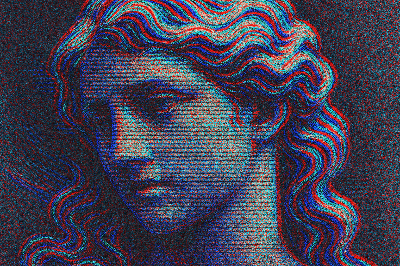
A readable subject with red/cyan contour separation, controlled displacement and stable light–dark structure. Color fringes alone do not establish stereo depth.
Two views, or just two colors?
An anaglyph is an image that encodes separate views for the two eyes in different color channels. Matching filtered glasses separate those views. Red/cyan is a common pairing: NASA’s Pathfinder example assigns the left view to red and the right view to green and blue, which together make cyan. That is an image-display technique, not a historical painting movement. [1]
The phrase “anaglyph filter” also describes a decorative effect: colored versions of an image are shifted against each other. It can suggest vibration, misregistration or a retro screen, but a displaced copy of one flat picture does not recover the different surfaces visible from two camera positions. A convincing red/cyan appearance therefore does not prove stereoscopic depth. The illustrations here demonstrate the appearance; they have not been validated as stereo pairs.
Visual grammar: a stable image with restless edges
The retained portrait makes the distinction visible. A readable face sits beneath red, cyan and blue edge echoes, dense grain and horizontal scan-like lines. Its large eyes and wave-shaped hair remain the focal structure. The effect becomes expressive because the subject is still legible through the disturbance. If every contour breaks apart equally, the filter can bury the image it was meant to enliven.
For a decorative study, begin with a clear silhouette and broad light–dark groups. Confine the strongest color separation to a few boundaries, such as a cheek, shoulder or architectural edge. Keep some areas quiet so that the displaced contours have something stable to push against. A restrained gray base can make red and cyan accents easier to judge. This is AOI compositional advice, not a calibrated stereo recipe.
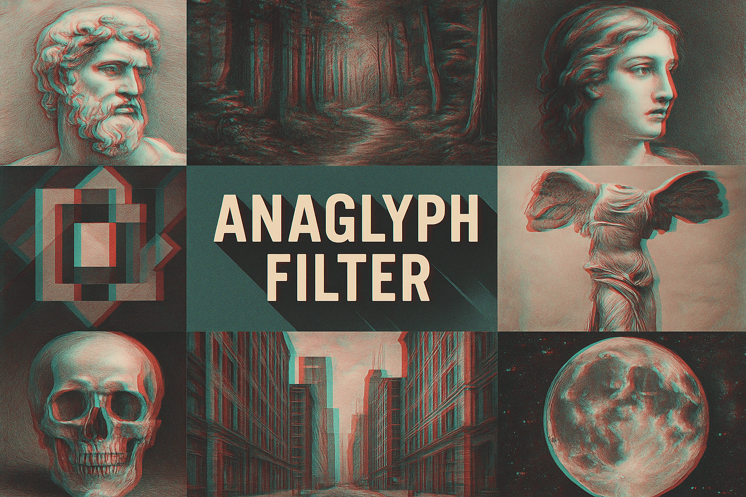
The collage compares faces, sculpture-like forms, a forest corridor, buildings, a skull and a moon. These motifs offer different contour densities and suggestions of recession. Its centered title stays readable. The image is an archive illustration rather than evidence that the depicted sculptures or portraits were historically made with anaglyph techniques.
What a genuine stereo workflow needs
A stereo workflow starts with two appropriate viewpoints, then prepares them for a chosen display. Blender’s manual describes a camera pair, its separation and convergence controls, and several anaglyph color pairings. It also warns that anaglyph output discards color-channel information. Keep the original left and right images when exporting a combined version. [2]
For a first exercise, use a simple scene with an object in front of a plain background. Inspect each eye’s view separately, check the combined result through the intended glasses, and compare it at the intended display size. A color-fringe preview alone is not a successful stereo test. If the purpose is only a graphic poster, make that choice explicit and judge the composition without claiming that it provides binocular depth.
A documented use beyond the retro look
NASA’s MISR national-parks anaglyphs provide a concrete comparison. The instrument observes Earth from multiple angles; the cited 2016 release combines its vertical and forward-looking camera data. The page gives a viewing instruction with the red lens over the left eye. Here the different viewpoints represent landscape structure, rather than decorative echoes added to a single photograph. Follow each source image’s own viewing instructions. [3]
Prompt vocabulary and useful limits
For decorative image generation, specify red/cyan edge separation, a stable grayscale subject, controlled horizontal displacement, selective grain and a quiet background. Name where the effect should be strongest. “Make it 3D” is too vague: it may produce shaded lettering, a sculpted object or unrelated glitch artifacts instead of the intended contour relationship.
The three prompts below are original exercises in the visual appearance. They do not promise matched left/right images, a measurable depth map or compatibility with glasses. For an actual stereoscopic deliverable, create and inspect the views in a stereo-capable workflow. Keep an ordinary image available when the audience cannot use the required display or glasses.
This article was prepared with AI assistance in AOI’s Penny Wraiter editorial persona. Existing archive images are retained; their original prompts, model and stereo construction are unknown. Source-based technical explanation is separated from the editorial exercises.
A small poetic detour
Original words from the AOI studio.
Poetry
One face stays still.
Its red edge takes a step,
its cyan edge replies.
Between the echoes,
a contour holds its place.
The prompt workshop
Original creative exercises. These prompts create new illustrations, not documentary evidence.
A portrait with controlled separation
Create an original graphic portrait of a fictional adult against charcoal gray. Keep the eyes, nose and mouth readable in a stable grayscale image. Add restrained red and cyan horizontal edge echoes around the hair and shoulders, with selective fine grain and a calm background. No lettering, signature or watermark. Decorative anaglyph-inspired illustration, not a validated stereoscopic image.
Architecture with a quiet anchor
Create an original poster-like view along a simple street with three clearly separated building masses. Use a grayscale base and red/cyan contour separation strongest at the nearest architectural edges. Leave the central doorway crisp as a focal anchor; preserve vertical structure and open sky. No text. A graphic color-split study, not a guaranteed glasses-viewable stereo pair.
Compare the strength of the effect
Create an original three-panel design study of the same ceramic vessel silhouette on a neutral ground. Show restrained, moderate and exaggerated red/cyan edge echoes while keeping vessel scale, lighting and framing consistent. Let the comparison show when separation starts to obscure the object. No labels or invented measurement claims; decorative interpretations only.
A smile from the studio
Jokes
The red channel asked the cyan channel for some space. The designer moved it three pixels and called it a relationship study.
Sources and further exploration
NASA/JPL: Stimpy in Super Resolution — a documented left/red, right/cyan channel example
Blender Manual: Stereoscopy usage — camera pairs, display modes and export limitations
NASA/JPL: National Parks viewed by MISR — a real multi-angle application and viewing instructions