Historical art movement
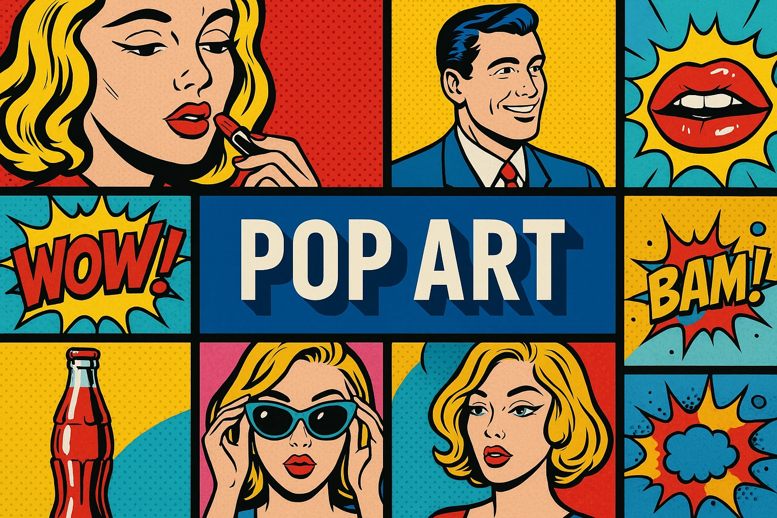
Pop Art brings images of everyday consumption and mass communication into art, often making repetition and recognition part of the subject.
A closer look
For an original exercise, choose an ordinary object whose shape is quickly recognized, then change how it is presented.
Understanding the subject
Pop Art developed through distinct practices rather than one universal technique. Advertising, packaging, comics and other widely circulated images became material for artists to examine and transform. Bright color is common in familiar examples, but it is not enough to identify a work as Pop Art. The relationship to commerce, reproduction and cultural familiarity matters, and individual works can be admiring, critical, ambiguous or several of these at once.
AOI looking and making workshop
For an original exercise, choose an ordinary object whose shape is quickly recognized, then change how it is presented. Repeat it, enlarge it or isolate one detail to make the familiar less automatic. Use a controlled palette and crisp value boundaries so repetition remains legible. Avoid copying a commercial logo when a fictional package will serve the idea. Compare versions that feel celebratory and uneasy. The point is to examine how presentation changes meaning, not simply to add dots and saturated color to a picture.
The prompt workshop
Original creative exercises. These prompts create new illustrations, not documentary evidence.
An ordinary object enlarged
Create an original graphic image of a plain tin opener enlarged against a vivid yellow field, crisp blue shadows and simple contour lines. Make everyday form visually surprising without logos or copied packaging.
A fictional product grid
Create a Pop-inspired grid of nine invented cereal boxes with blank labels, repeated structure and varied bold color pairs. Use repetition to emphasize small changes in appearance.
Too much of a good thing
Create an original graphic composition of identical disposable cups multiplying until they crowd the frame, cheerful colors becoming visually overwhelming. Keep the shapes simple and omit commercial branding.
Your next inspiration
Discover another art style
Follow a visual thread to the next subject.