
An adult-made visual interpretation of early exploratory mark-making
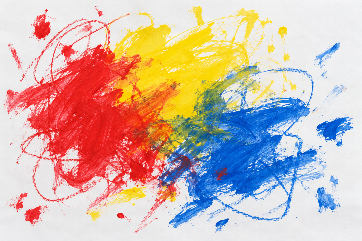
Toddler Drawing, as an illustration approach, uses exploratory loops, uneven pressure, simple invented figures and generous paper space. The aim is expressive mark-making rather than polished drawing disguised with wobbly outlines.
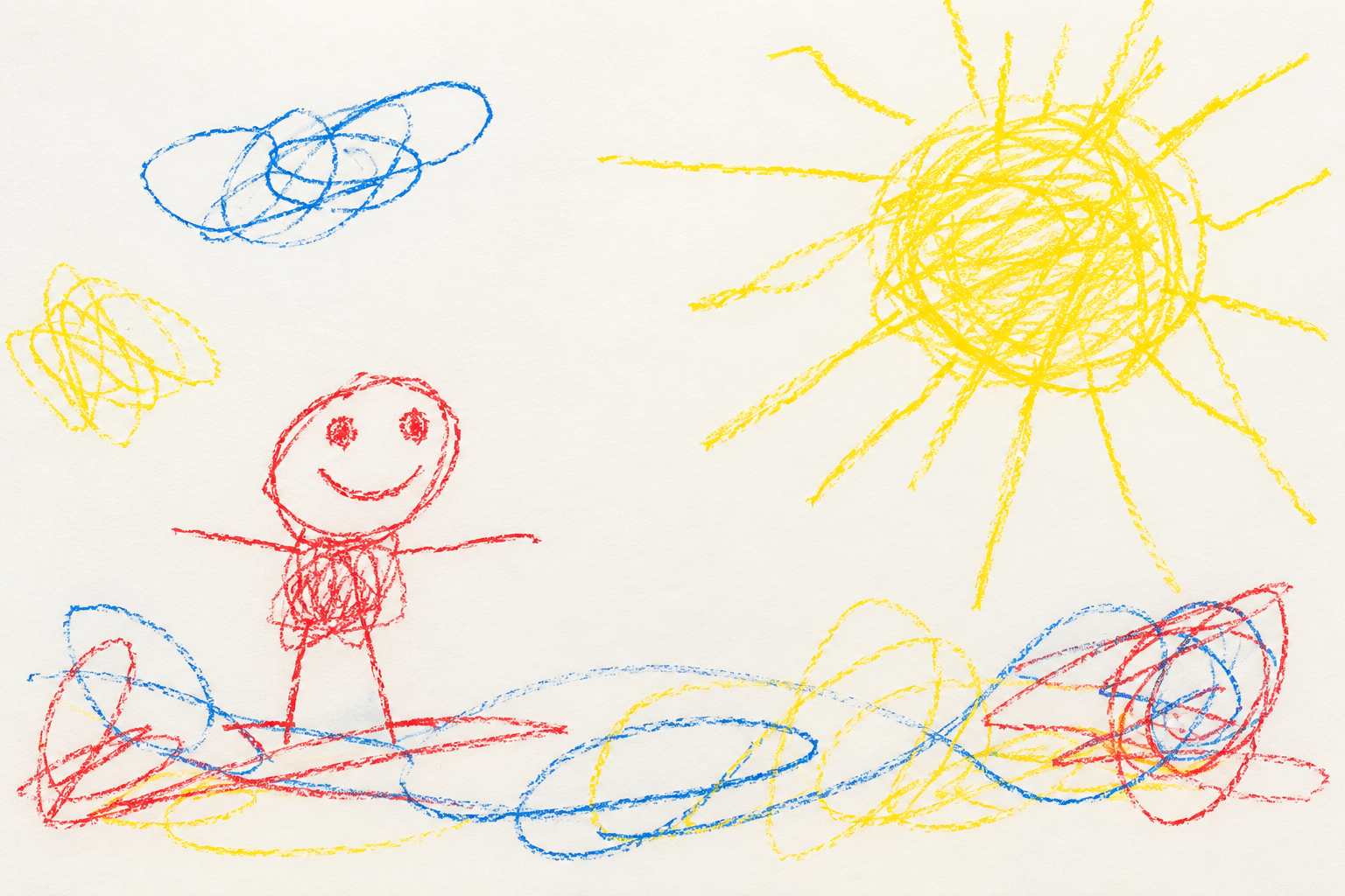
A visual introduction
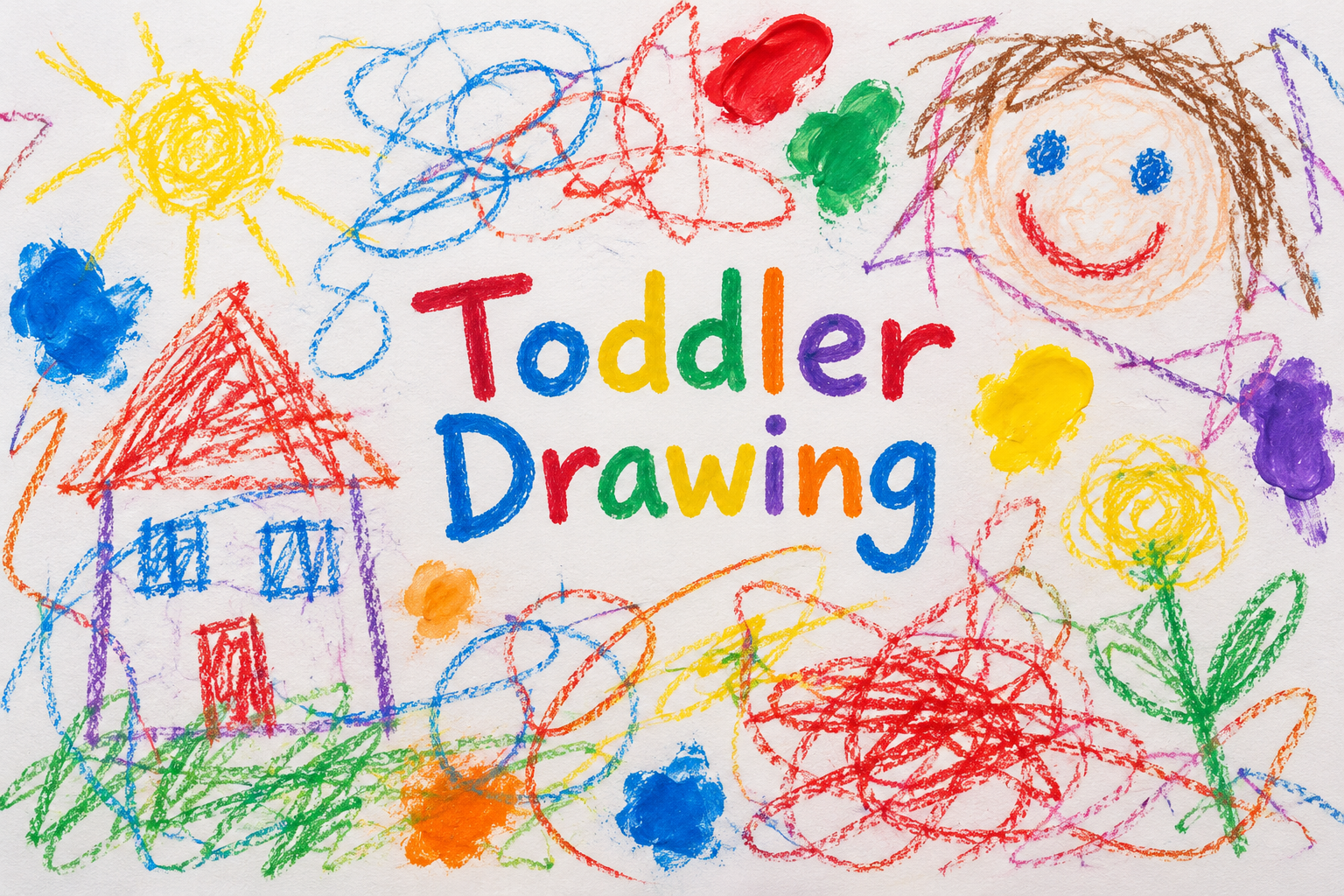
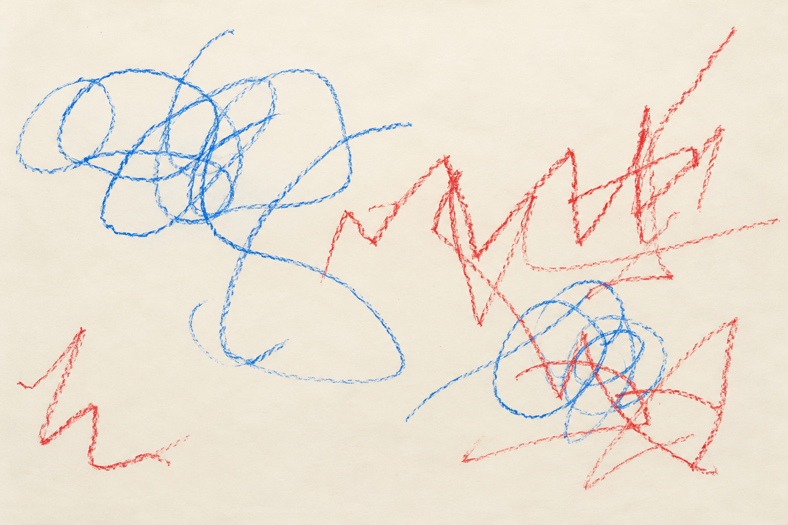
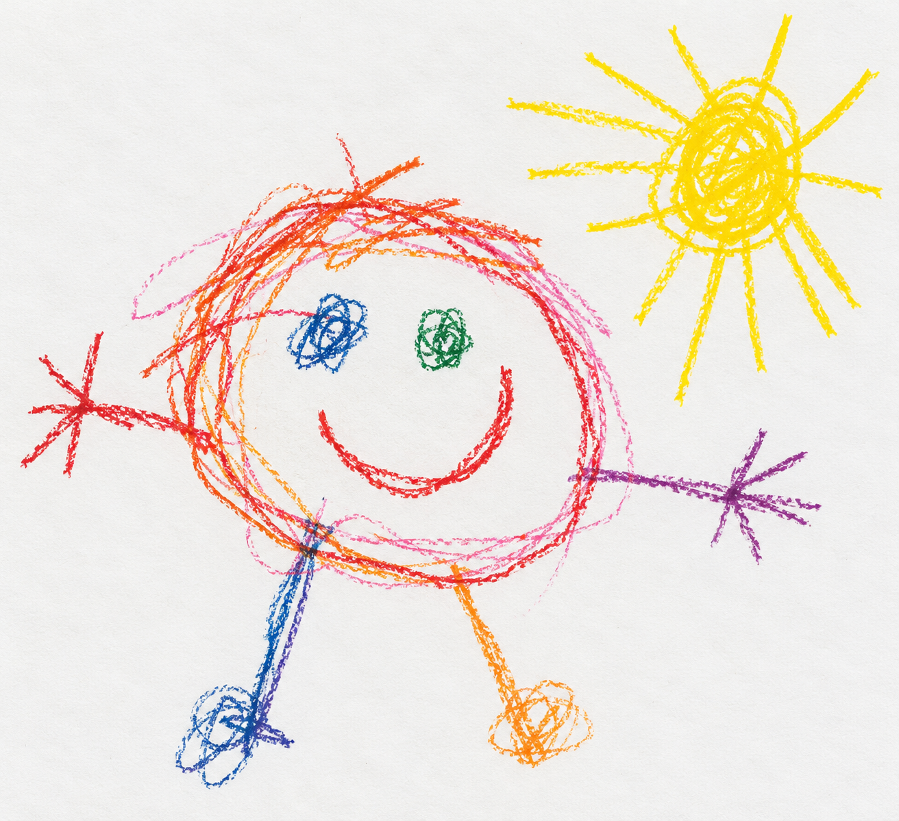
Five original AI-generated AOI interpretations: a dedicated banner, a centrally titled collage and three standalone studies. These are new illustrations, not historical objects or works by the referenced artist.
Select an image for a closer look. Use the thumbnails, arrow keys or a swipe to compare examples. Zoom in to inspect details, or share the image that inspires you.
Creative toolbox · take this style further
Choose an input and a destination. Search sends your words to the chosen site; Copy & open puts them on your clipboard to paste there.
Create with AI
Turn your chosen input into an image prompt or a new creative direction.
ChatGPT
Copy your input and paste it into a ChatGPT conversation or image request.
Copy & open ChatGPT (new tab)Claude · Anthropic
Develop an image prompt or explore the style in a new Claude conversation.
Copy & open Claude · Anthropic (new tab)Midjourney
Paste your input into the Imagine bar on the Create page.
Copy & open Midjourney (new tab)Adobe Firefly
Copy your input, open Firefly, and paste it into the prompt field.
Copy & open Adobe Firefly (new tab)Leonardo.Ai
Copy your input, open Leonardo, and paste it into the generation field.
Copy & open Leonardo.Ai (new tab)Image search
Find visual references. Short, concrete keywords usually work best.
Lexica
Search AI images and prompts using your selected input.
Search with this input Lexica (new tab)Pexels
Search the photo and video library. Short keywords often work best.
Search with this input Pexels (new tab)Pixabay
Search photos, illustrations and other images.
Search with this input Pixabay (new tab)Unsplash
Search photographs using the style name or your own keywords.
Search with this input Unsplash (new tab)Wikimedia Commons
Search photographs, artworks and historical images. Check each file for its source and reuse terms.
Search with this input Wikimedia Commons (new tab)Art & research
Explore artists, collections and the ideas behind a style.
Wikipedia
Search for background reading. A style may not have its own article.
Search with this input Wikipedia (new tab)WikiArt
Copy your input into WikiArt’s search to explore artists and artworks.
Copy & open WikiArt (new tab)Europeana
Paste your keywords into the search to explore European museum, library and archive collections.
Copy & open Europeana (new tab)Inspiration
Discover portfolios and visual ideas from creative communities.
Instagram hashtags
Search a hashtag made from your input: spaces and punctuation are removed. Instagram may require sign-in.
Search with this input Instagram hashtags (new tab)ArtStation
Paste your input into artwork search for concept art, environments, characters and visual development.
Copy & open ArtStation (new tab)Behance
Paste your input into project search for illustration, design and visual storytelling.
Copy & open Behance (new tab)A closer look
Wax-crayon loops, broad paint patches, repeated strokes and tentative circular forms sit unevenly on pale paper. Colors overlap without precise registration, and marks vary in weight, direction and completeness.
Respect the activity behind the appearance
Young children's drawing is an activity of exploration, movement and emerging meaning. ZERO TO THREE describes how scribbles and marks can develop toward more controlled drawing and representation. There is substantial variation between children; an illustration style cannot diagnose ability or establish a developmental timetable. The examples here are generated adult-made interpretations, not artworks made by a child.
As an art-style entry, Toddler Drawing therefore names a set of visible choices rather than a claim about authorship. Loose loops, repeated motions and provisional shapes can communicate discovery. Calling any unfinished or awkward picture 'toddler art' misses the point: the interesting quality is the relationship between a gesture, a material and the pleasure of seeing a mark appear.
Begin with movement, not calculated imperfection
Choose a small number of actions: circling, tapping, dragging, crossing or filling a patch with repeated strokes. Let each action leave a different trace. A crayon dragged lightly should show more paper grain than a heavily pressed line. A broad paint patch should not have the same dry texture as wax. These differences make the image feel materially understandable.
Avoid placing an identical wobble on every contour. Real exploratory marks can run off course, overlap a previous loop or stop unexpectedly. A few confident strokes may coexist with tentative ones. Leave empty areas, incomplete forms and uneven spacing. A composition that has been perfectly balanced and then distressed often feels more like a polished commercial graphic.
Simple figures carry flexible meanings
A circle with a few lines may suggest a person without describing anatomy conventionally. The figure does not need adult proportions, perspective or a complete set of features. In these illustrations, simplicity is an intentional visual convention. It should remain distinct from an accidental distortion in a realistic image.
For a friendly scene, use one or two figures and a limited group of objects. Let size express interest rather than physical scale: a flower may be larger than a house. Keep the resulting story easy to read without correcting every inconsistency. Color can follow attraction and repetition instead of local realism, so long as the picture does not become a uniform field of unrelated marks.
Use the approach honestly
This visual language can support playful editorial illustrations, family-themed designs and experiments with expressive reduction. Label generated or adult-made examples clearly. Do not invent a child's name, age, story or authorship to make the result seem more moving. If an actual child's work is being shared, its context is a separate consideration from this generated style study.
Common failures include overdesigned cute characters, simulated handwriting that accidentally forms unwanted words, and a full rainbow repeated mechanically in every corner. Try fewer colors, larger paper margins and one repeated gesture. The useful lesson is permission to discover an image through making marks, not a performance of incompetence or a joke at a child's expense.
A small poetic detour
Original words from the AOI studio.
Poetry
The red line went out for a walk
and came back wearing several loops.
A yellow patch became the sun,
then something only yellow knew.
The paper left a field of white
for all the marks still on their way.
A face appeared beside a circle;
a house grew legs and wandered off.
No horizon asked to be straight.
No flower checked its proper size.
The crayon stopped, the room grew quiet,
and there was more upon the page.
The prompt workshop
Original creative exercises. These prompts create new illustrations, not documentary evidence.
A few exploratory marks
Adult-made illustrative interpretation of early exploratory crayon drawing, a few uneven red and blue loops, varied wax pressure, broad yellow patch, generous off-white paper, no words or signature.
Keep the marks sparse and materially varied; do not claim child authorship.
A simple invented family scene
A deliberately simple adult-made crayon illustration of two friendly circular figures beside an oversized flower, irregular line lengths, uneven spacing, three colors, visible paper grain, no lettering.
Use symbolic simplicity without adding polished cartoon anatomy.
Paint and crayon meet
An adult-made playful mark-making study with broad finger-paint-like color patches crossed by dry wax-crayon loops, obvious differences between paint and wax, large quiet margins, no text.
Let two materials interact without filling the entire paper.
Your next inspiration
Discover another art style
Follow a visual thread to the next subject.
A smile from the studio
Jokes
The drawing brief requested one small house. The picture delivered a house, a very large sun, two people and something green whose role remained confidential. Asked about the extra material, the imaginary art director explained that the sun had negotiated more space and the green thing was essential to the story. The brief was amended accordingly.
Sources and further exploration
ZERO TO THREE — how early mark-making and drawing can develop