
Photographic and digital technique
Selective colouring retains color in chosen parts of an image while rendering the rest monochrome. Its strength is directed attention: the surviving color should contribute to the subject, story or visual structure.
A visual introduction
Select an image for a closer look. Use the thumbnails, arrow keys or a swipe to compare examples. Zoom in to inspect details, or share the image that inspires you.
Creative toolbox · take this style further
Choose an input and a destination. Search sends your words to the chosen site; Copy & open puts them on your clipboard to paste there.
Create with AI
Turn your chosen input into an image prompt or a new creative direction.
ChatGPT
Copy your input and paste it into a ChatGPT conversation or image request.
Copy & open ChatGPT (new tab)Claude · Anthropic
Develop an image prompt or explore the style in a new Claude conversation.
Copy & open Claude · Anthropic (new tab)Midjourney
Paste your input into the Imagine bar on the Create page.
Copy & open Midjourney (new tab)Adobe Firefly
Copy your input, open Firefly, and paste it into the prompt field.
Copy & open Adobe Firefly (new tab)Leonardo.Ai
Copy your input, open Leonardo, and paste it into the generation field.
Copy & open Leonardo.Ai (new tab)Image search
Find visual references. Short, concrete keywords usually work best.
Lexica
Search AI images and prompts using your selected input.
Search with this input Lexica (new tab)Pexels
Search the photo and video library. Short keywords often work best.
Search with this input Pexels (new tab)Pixabay
Search photos, illustrations and other images.
Search with this input Pixabay (new tab)Unsplash
Search photographs using the style name or your own keywords.
Search with this input Unsplash (new tab)Wikimedia Commons
Search photographs, artworks and historical images. Check each file for its source and reuse terms.
Search with this input Wikimedia Commons (new tab)Art & research
Explore artists, collections and the ideas behind a style.
Wikipedia
Search for background reading. A style may not have its own article.
Search with this input Wikipedia (new tab)WikiArt
Copy your input into WikiArt’s search to explore artists and artworks.
Copy & open WikiArt (new tab)Europeana
Paste your keywords into the search to explore European museum, library and archive collections.
Copy & open Europeana (new tab)Inspiration
Discover portfolios and visual ideas from creative communities.
Instagram hashtags
Search a hashtag made from your input: spaces and punctuation are removed. Instagram may require sign-in.
Search with this input Instagram hashtags (new tab)ArtStation
Paste your input into artwork search for concept art, environments, characters and visual development.
Copy & open ArtStation (new tab)Behance
Paste your input into project search for illustration, design and visual storytelling.
Copy & open Behance (new tab)A closer look
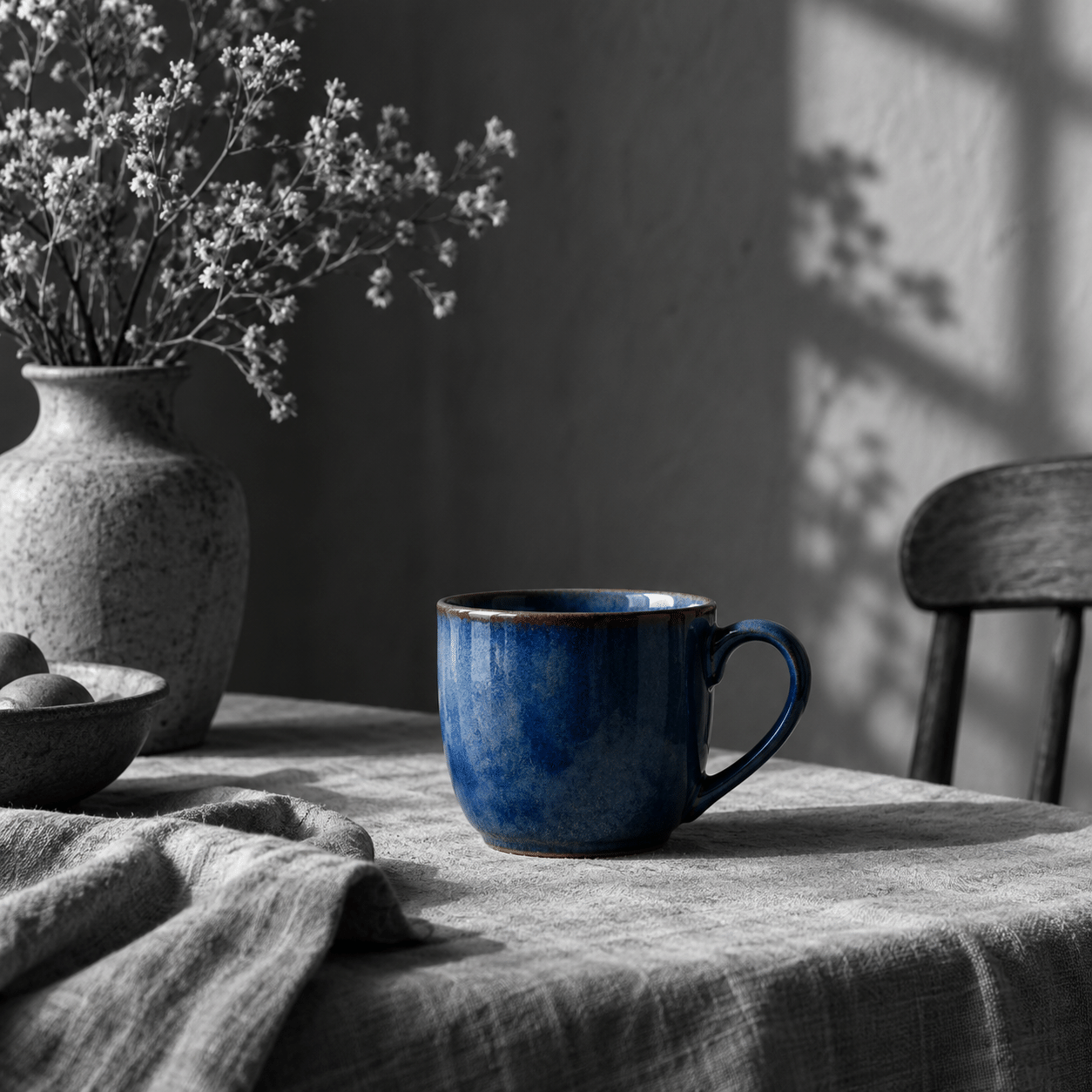
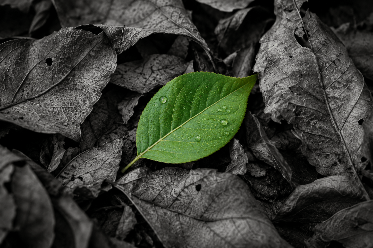
A restrained colored subject sits within a grayscale field, with carefully resolved boundaries and a coherent tonal composition.
What the technique changes
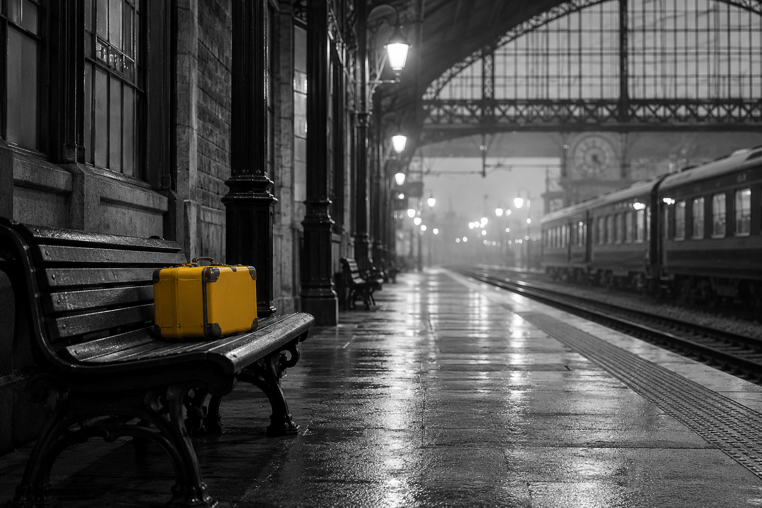
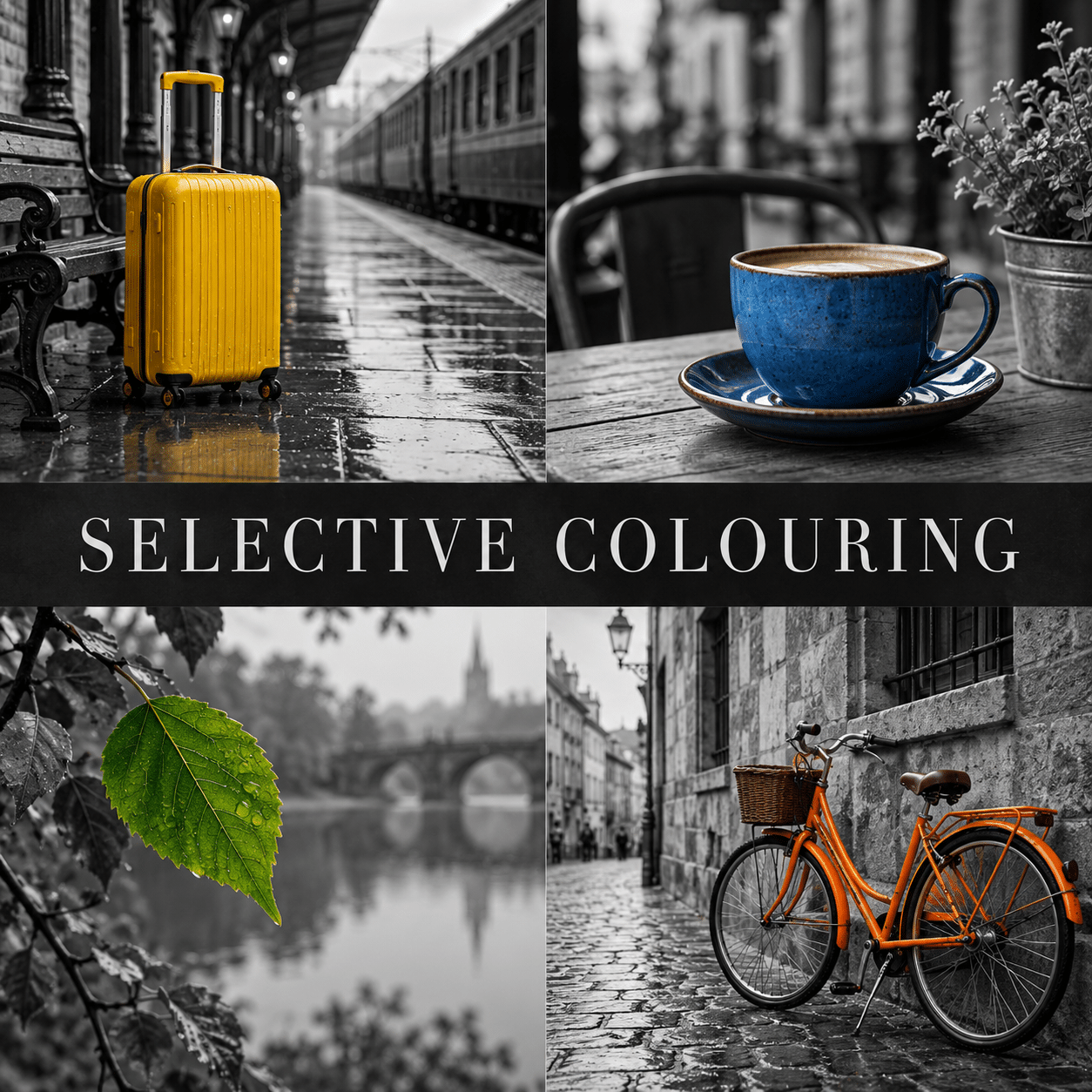
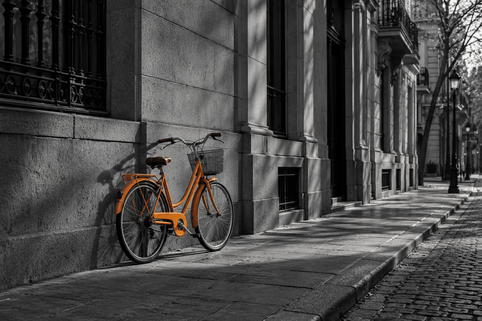
Selective colouring separates chromatic emphasis from the underlying photograph. A blue cup, green leaf or yellow suitcase may retain color while its surroundings become grayscale. The effect can isolate an object, connect distant details or make a small element unexpectedly important. It is a technique rather than a single historical movement, and no exclusive origin is asserted here.
The image must still work in values. A brightly colored subject with the same lightness as its background may look conspicuous without becoming clearly shaped. Examine the monochrome version first: silhouettes, light direction and the distribution of dark and light areas provide the structure on which the color decision depends.
A mask is a compositional decision
Corel’s tutorial demonstrates a practical layer-and-mask approach: keep access to the color original, create a monochrome treatment and control where each version appears. The useful principle is reversibility. A mask lets you refine boundaries without repeatedly damaging the source image or rebuilding the effect.
Work beyond the obvious outline. Hair, transparent glass, reflections, motion blur and fine foliage require different transitions. A hard edge appropriate to a painted metal object may look pasted on around fabric. Check whether reflected color belongs to the intended treatment, and make that choice consistently rather than leaving accidental colored halos.
Choose the color for a reason
One retained hue can identify the object that carries a narrative: a suitcase in an empty station suggests a departure, while a leaf among dried foliage suggests a difference in condition. These are possible readings, not universal meanings attached to yellow or green. Context, scale and placement establish the relationship.
Several colored details can also work when they form a deliberate rhythm. Limit the selection by a clear rule: every ceramic object, one repeated fabric or a linked sequence of signs. Selecting unrelated bright areas weakens the hierarchy because the viewer has to guess why each exception exists.
Related terms that mean different things
Adobe Photoshop’s Selective Color adjustment changes color components within selected color ranges. Despite the similar name, it is not synonymous with the grayscale-and-retained-color effect discussed here. Likewise, a limited-palette photograph may contain subtle color throughout, while this technique deliberately separates colored and monochrome regions.
Knolling concerns arrangement; selective colouring concerns color treatment. A flat lay can use both, but a strong arrangement does not require monochrome surroundings. Duotone applies a tonal color scheme across an image and creates another kind of unity. These distinctions help turn a vague prompt into an actual design decision.
Avoid the automatic spotlight
The effect can become predictable when every image relies on a red object in an otherwise gray scene. That familiar formula is not inherently wrong, but repetition cannot replace a meaningful subject. Try a quieter blue, a small green patch or a warm object against a carefully articulated grayscale background.
Keep saturation proportionate to the scene. An electric color that ignores subdued illumination may feel more like an advertising cutout than an observed object. If that artificial emphasis is intended, make it part of the image’s visual logic. Otherwise, use texture, shadow and moderate saturation to keep the colored region integrated.
A useful working exercise
Create three versions of one photograph: fully colored, fully monochrome and selectively colored. Compare what each version makes you notice first and what information disappears. Keep the selective version only if its change in attention improves the image’s purpose. The technique is particularly useful for controlled illustration, editorial emphasis and visual experiments.
The gallery contains AI-generated demonstrations, not documentary photographs or proof of manual masking. It varies the subject from a cup to a bicycle and a leaf so that the technique is visible beyond one cliché. For an actual photographic project, retain the original and describe substantial alterations when the context requires a documentary account.
A small poetic detour
Original words from the AOI studio.
Poetry
The Remaining Color
The room gives back its gray and white;
a cup keeps blue beside the chair.
No louder lamp, no stronger light—
just one small reason to look there.
The rest is present, still and clear;
the color asks us to come near.
The prompt workshop
Original creative exercises. These prompts create new illustrations, not documentary evidence.
One clear exception
Create an original photographic interpretation of a blue ceramic cup on a grayscale table, only the cup retains restrained blue color, coherent soft shadows, clean natural edges.
Color and narrative
Create a wide grayscale railway platform with a single yellow suitcase on a bench, deep atmospheric perspective and quiet negative space. Only the suitcase retains color; no text.
A repeated color rule
Create a grayscale greenhouse interior where only three small green leaves retain color, spaced as a visual rhythm at different depths. All other objects monochrome; plausible light and delicate edges.
A smile from the studio
Jokes
The suitcase was asked to blend in. It retained a yellow objection.