
AOI creative concept · Contour waves & expressive rhythm
Psiwave Graphism turns a feeling into a field of lines. Close parallel strokes gather, bend and drift apart until a face, flower or imagined landscape seems to carry its own quiet current. The pleasure is in the tension between a readable subject and a wave rhythm that almost escapes it.
An AOI creative concept, not an established historical movement.
A visual introduction
Open any image to look closer, then browse the examples.
Creative toolbox · take this style further
Choose an input, adjust it, then open a tool. Search links pass your text to the destination. Copy & open copies it for you to paste into the generator; you start generation there.
ChatGPT
Copy your input and paste it into a ChatGPT conversation or image request.
Copy & open ChatGPT (new tab)Claude · Anthropic
Develop an image prompt or explore the style in a new Claude conversation.
Copy & open Claude · Anthropic (new tab)Midjourney
Paste your input into the Imagine bar on the Create page.
Copy & open Midjourney (new tab)Adobe Firefly
Copy your input, open Firefly, and paste it into the prompt field.
Copy & open Adobe Firefly (new tab)Leonardo.Ai
Copy your input, open Leonardo, and paste it into the generation field.
Copy & open Leonardo.Ai (new tab)Lexica
Search AI images and prompts using your selected input.
Search with this input Lexica (new tab)Pexels
Search the photo and video library. Short keywords often work best.
Search with this input Pexels (new tab)Pixabay
Search photos, illustrations and other images.
Search with this input Pixabay (new tab)Unsplash
Search photographs using the style name or your own keywords.
Search with this input Unsplash (new tab)Wikipedia
Search for background reading. A style may not have its own article.
Search with this input Wikipedia (new tab)WikiArt
Copy your input into WikiArt’s search to explore artists and artworks.
Copy & open WikiArt (new tab)Instagram hashtags
Search a hashtag made from your input: spaces and punctuation are removed. Instagram may require sign-in.
Search with this input Instagram hashtags (new tab)A closer look
Fine contour bundles, repeated arcs with small offsets, selective areas of luminous color, and dark or pale intervals where the eye can rest. Line density describes form; a few warm accents guide attention through cooler fields.
A working definition, without an invented history
Here Psiwave Graphism is developed as an AOI creative concept: a way of organizing an image through expressive, wave-like linework. It is not presented as a documented historical movement. The word “psi” gives the name an imaginative psychological flavor; it does not make the picture a brain scan, a record of someone’s thoughts, or evidence of psychic phenomena.
The earlier archive entry paired an attractive abstract image with unsourced artist names and a claimed historical period. Those attributions have been removed. What remains worth developing is the visual idea: lines that seem to carry a changing state of attention. Calm can be expressed through wide, even intervals; urgency through compressed bands; uncertainty through a gentle misalignment between neighboring rhythms. These are artistic choices, not universal codes for emotion.
The visual grammar: flow, offset, pause
Start with one dominant flow. Draw it as a simple curve before adding detail: perhaps a slow S through a landscape, an arc around a cheek, or a fan opening along a petal. The image should still read when reduced to a small thumbnail. If it requires hundreds of glowing marks to make sense, its underlying composition probably needs more work.
Build a family of lines around that curve. Let spacing change gradually, so dense areas appear to tighten and open areas release. Introduce a second family with a small offset rather than making every stroke follow exactly the same route. Their relationship creates the visual pulse. In this studio vocabulary, “phase” is a useful compositional metaphor for that offset; an AI illustration need not represent a mathematically exact wave.
Reserve a pause. An unmarked patch of background, an intact facial contour or a broad stretch of water gives the intricate areas something to work against. Keep the strongest contrast near one chosen focal point. A successful image offers both a sweeping gesture at a distance and delicate discoveries up close.
Color that has a job
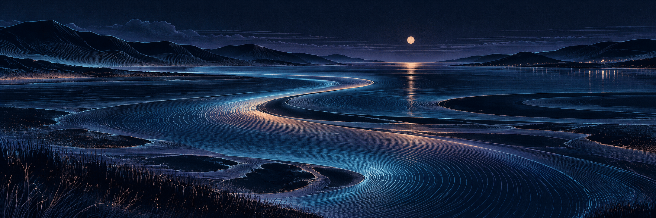
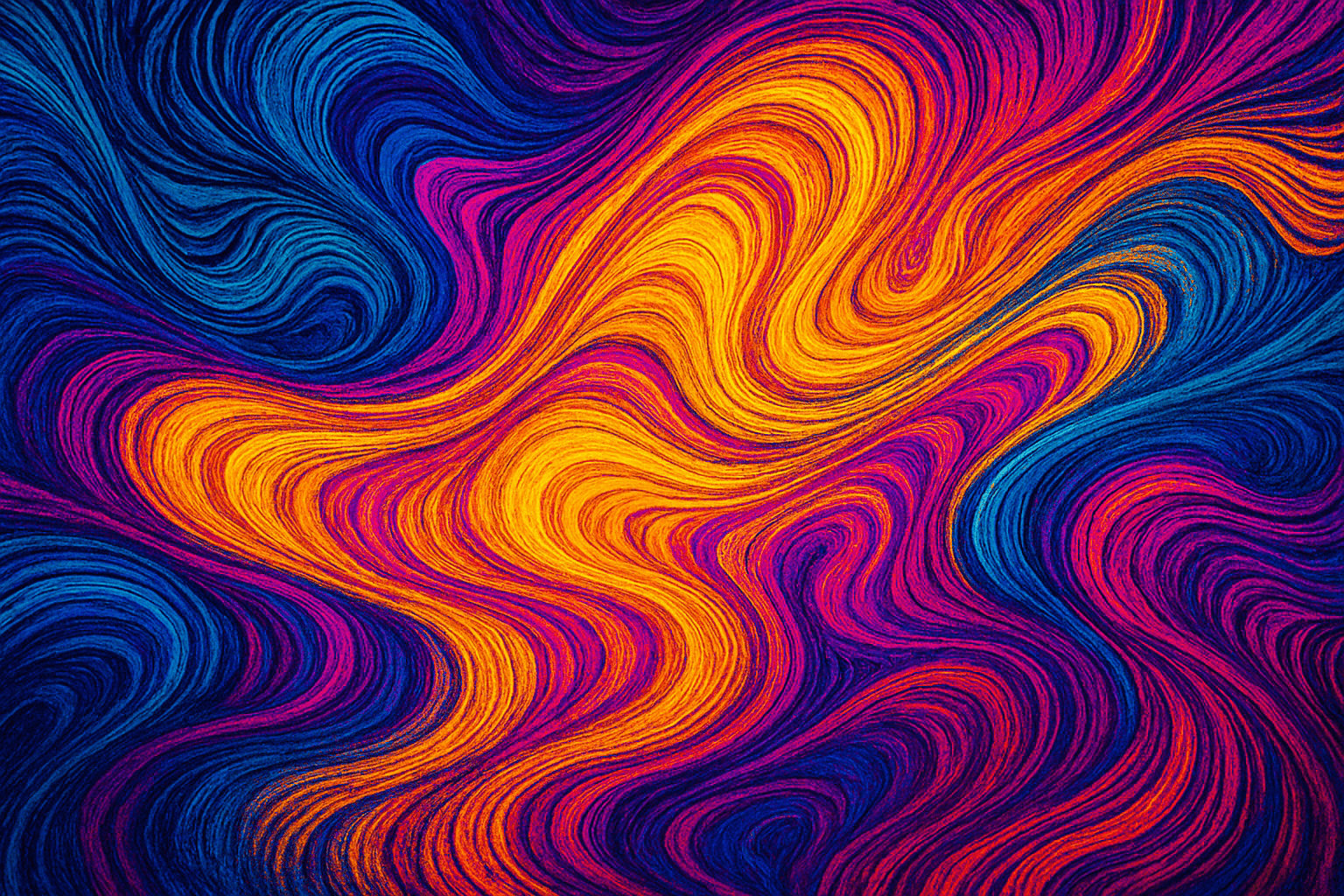
The retained archive example uses a hot gold current against blue and magenta. Its dense, grainy swirls make a useful energetic starting point. The new banner explores a quieter variation: an ink-blue estuary, fine cyan contours and a narrow apricot current. The two belong to the same concept while occupying different emotional registers.
Choose a small palette before adding glow. One dark foundation, two related cool colors and one selective warm accent are enough for a first study. Let a warm passage indicate a bend, meeting point or change in rhythm. Avoid making every line equally bright. A restrained monochrome drawing can express Psiwave Graphism as clearly as a neon image; rhythm and spacing matter more than saturation.
Four subjects, one adaptable method
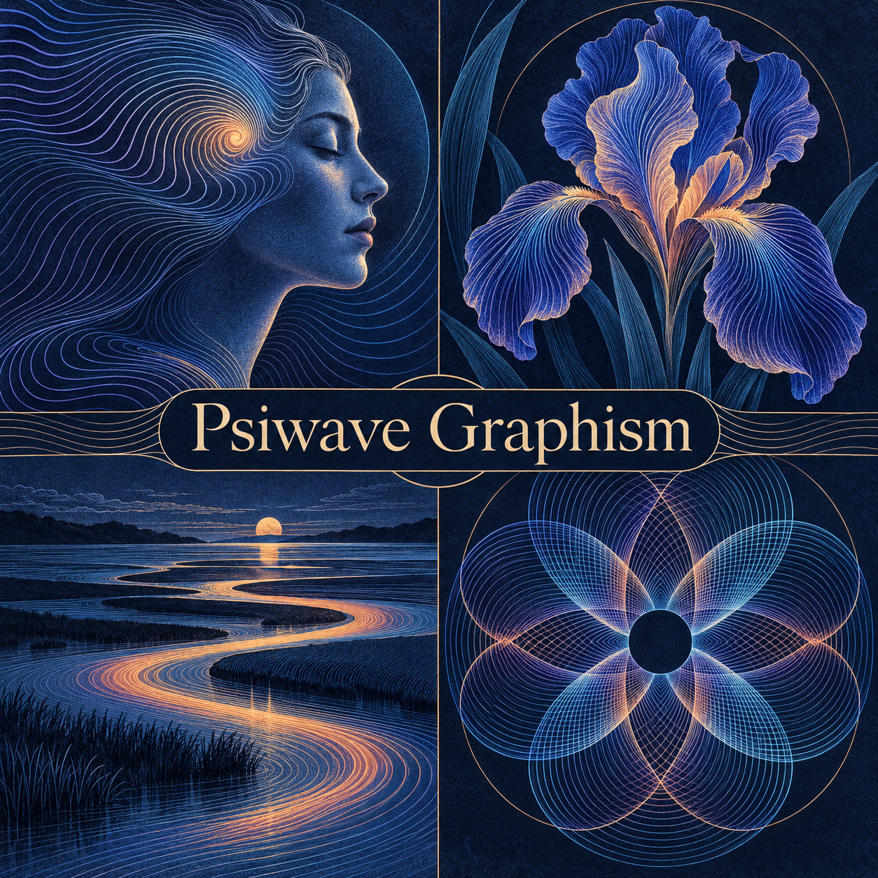
Portrait: preserve a legible profile, eye line or cheek plane. Let the surrounding contour bundles suggest inward movement without filling the face with arbitrary symbols. A fictional sitter avoids implying that the drawing reveals a real person’s mental state.
Botanical study: use a petal’s turn as the direction for the line family. Allow neighboring petals to carry slightly different rhythms while retaining the flower’s overall silhouette. An iris works well in the new collage because its broad folded petals give the lines room to open and tighten.
Landscape: establish the horizon and a single route through the scene. The banner’s tidal channel leads the eye from the foreground toward the distance. Contours can describe water, banks and hills, but different spacing in each area helps them remain distinct.
Abstract study: overlap two or three line fans around a quiet center. Change one variable at a time—spacing, rotation, stroke weight or color—so the effect of each decision stays visible. The collage’s rosette is a visual interpretation, not a technical interference diagram.
A repeatable studio exercise
Make three versions of one motif. In the first, keep the lines nearly parallel and the intervals generous. In the second, compress them near a focal point. In the third, offset a secondary bundle across the first. Preserve the subject, viewpoint and palette between versions. Comparing these studies teaches more than changing the subject and every setting at once.
For a drawn or vector workflow, begin with a handful of guiding paths, duplicate or interpolate them, then edit the spacing deliberately. For image generation, describe the subject, the dominant flow, the quiet area and the accent color in that order. Save the prompt with the result. If the image becomes a nest of luminous tubes, ask for fine flat strokes and print-like texture; if it becomes cluttered, reduce the number of line families.
How to judge the result
Ask three questions: can I identify the main form at a glance; do the lines direct my attention somewhere specific; and is there a place for my eye to rest? If all three answers are yes, detail can enrich the picture instead of rescuing it. Check the image at both full size and thumbnail size before choosing a featured crop.
The name should not become a shortcut for any glowing abstract artwork. Psiwave Graphism is strongest when the contours actively construct the subject and when changes in rhythm feel intentional. Keep useful irregularities and tactile grain, but remove accidental tangles, broken anatomy and meaningless decorative marks. The aim is a composed visual current, with enough surprise to invite a second look.
Pocket-sized facts
AOI uses Psiwave Graphism here as a creative concept, without claiming a historical founder or movement.
The original archive image is retained alongside two new AI-generated interpretations.
Contours, spacing and controlled overlap define the approach; neon color is optional.
Technique notes
Keep the subject and palette fixed while changing line spacing; compare the images side by side.
Use one dominant line family and a quieter secondary family before introducing a third.
Review fine-line images at their intended display size: dense marks can merge and lose clarity when reduced.
A small poetic detour
Original words from the AOI studio.
Poetry
A line leans close to hear the tide,
A second keeps a breath aside.
Between their paths, the dark stays wide;
A little moon has room to hide.
No thought is caught, no secret known—
Just color finding currents of its own.
The prompt workshop
Original creative exercises. These prompts create new illustrations, not documentary evidence.
Start here · One current
An original Psiwave Graphism abstract study: one slow S-shaped current drawn with fine parallel contour lines, ink-blue ground, cyan linework and a narrow warm-gold focal passage. Gradually vary the line spacing, preserve generous quiet dark areas, crisp flat strokes with delicate paper grain. Strong thumbnail composition, no text, no circuitry, no glossy tubes.
Richer composition · The listening iris
A single imagined iris flower in Psiwave Graphism, broad folded petals constructed from closely spaced violet and pale-cyan contour lines, a small coral-gold accent where the petals converge. Each petal has its own controlled wave rhythm; keep the overall silhouette clear and the background deep ink blue. Exquisite etched texture, calm negative space, no lettering, no indiscriminate neon glow.
Experimental variation · A thought in profile
A fictional adult portrait in calm profile, developed as Psiwave Graphism: preserve the nose, lips and eye line as a simple readable contour, then let two gently offset families of fine wave lines unfold around the temple and shoulder. Warm ivory marks on deep blue with one muted coral interval. Expressive artistic metaphor, not a medical scan or psychic diagram. Restrained flat graphic drawing, no symbols or text.
Landscape study · The quiet estuary
An imagined moonlit estuary in Psiwave Graphism, a long S-shaped tidal channel leading toward low distant hills, fine cyan and violet contour bundles describing the water, one selective apricot current and a small moon. Broad dark intervals balance intricate etched linework. Wide panoramic composition, tactile print grain, no signs, no text, no glowing plastic tubes.
Your next inspiration
Discover another art style
Follow a visual thread to the next subject.
A smile from the studio
Jokes
The contour lines formed a band. They agreed on the rhythm, but everyone wanted a longer pause.
My Psiwave portrait looks thoughtful. Mostly it is wondering where I put the eraser.
I asked the image for a little more space. It deleted the meeting from its calendar.