
Magazine art direction and commercial visual culture
Playboy is a publication and brand, not a unified art movement. Its visual history offers a way to study the relationship between illustration, photography, typography and an editorial identity.
A visual introduction
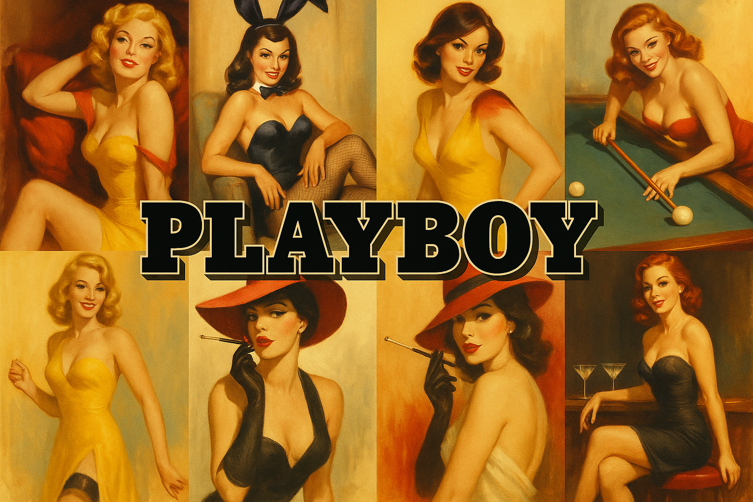
Compare the retained archive studies. The titled collage is modern editorial illustration; its panels are not reproductions of documented works.
Select an image for a closer look. Use the thumbnails, arrow keys or a swipe to compare examples. Zoom in to inspect details, or share the image that inspires you.

Creative toolbox · take this style further
Choose an input and a destination. Search sends your words to the chosen site; Copy & open puts them on your clipboard to paste there.
Create with AI
Turn your chosen input into an image prompt or a new creative direction.
ChatGPT
Copy your input and paste it into a ChatGPT conversation or image request.
Copy & open ChatGPT (new tab)Claude · Anthropic
Develop an image prompt or explore the style in a new Claude conversation.
Copy & open Claude · Anthropic (new tab)Midjourney
Paste your input into the Imagine bar on the Create page.
Copy & open Midjourney (new tab)Adobe Firefly
Copy your input, open Firefly, and paste it into the prompt field.
Copy & open Adobe Firefly (new tab)Leonardo.Ai
Copy your input, open Leonardo, and paste it into the generation field.
Copy & open Leonardo.Ai (new tab)Image search
Find visual references. Short, concrete keywords usually work best.
Lexica
Search AI images and prompts using your selected input.
Search with this input Lexica (new tab)Pexels
Search the photo and video library. Short keywords often work best.
Search with this input Pexels (new tab)Pixabay
Search photos, illustrations and other images.
Search with this input Pixabay (new tab)Unsplash
Search photographs using the style name or your own keywords.
Search with this input Unsplash (new tab)Wikimedia Commons
Search photographs, artworks and historical images. Check each file for its source and reuse terms.
Search with this input Wikimedia Commons (new tab)Art & research
Explore artists, collections and the ideas behind a style.
Wikipedia
Search for background reading. A style may not have its own article.
Search with this input Wikipedia (new tab)WikiArt
Copy your input into WikiArt’s search to explore artists and artworks.
Copy & open WikiArt (new tab)Europeana
Paste your keywords into the search to explore European museum, library and archive collections.
Copy & open Europeana (new tab)Inspiration
Discover portfolios and visual ideas from creative communities.
Instagram hashtags
Search a hashtag made from your input: spaces and punctuation are removed. Instagram may require sign-in.
Search with this input Instagram hashtags (new tab)ArtStation
Paste your input into artwork search for concept art, environments, characters and visual development.
Copy & open ArtStation (new tab)Behance
Paste your input into project search for illustration, design and visual storytelling.
Copy & open Behance (new tab)A closer look
A controlled hierarchy, a strong focal image and deliberate contrast between image and lettering; no single palette defines the whole publication.
Look beyond the brand shorthand
The rabbit emblem and glamour photograph are familiar shorthand, but neither describes every kind of art commissioned for Playboy. Art Paul’s own site identifies him as the magazine’s founding art director and documents a practice spanning illustration, publication design and fine art. This is a more useful starting point than assigning every Pop artist to an invented Playboy movement.
An art director brings different visual voices into a publication. A photographic cover, a satirical drawing and an illustration for fiction may have different marks, colors and moods while sharing an editorial setting. Study a particular issue or credited image when making a historical claim; do not turn an archive-inspired portrait into evidence about the whole magazine.
Make hierarchy do the work
For a contemporary editorial exercise, decide what a viewer should notice first. Give one subject the strongest contrast, place secondary shapes where they lead toward it, and leave space for readable type. Test the composition at thumbnail size. If the decorative border is louder than the subject, reduce its contrast rather than adding more decoration.
The retained images here concentrate on a retro glamour motif. Their warm ground, dark clothing and carefully posed figures are one modern interpretation, not a survey of the publication’s contributors. A broader design study can use an object, a humorous situation or an abstract illustration instead. Treat the subject as a person or a visual idea with agency, rather than relying on a pose alone to carry the composition.
Study a spread as a sequence of attention
Look at where an editorial layout asks the reader to enter: a photograph, a headline, an illustration or an unusually large area of blank paper. Follow the sequence to the smaller text. The relationship between these elements is a more useful subject for analysis than treating a recognizable logo as the entire visual identity.
Design a fictional culture-magazine spread with an illustration on one page and a clear reading column on the other. Make a second version in which the image crosses the fold. Compare whether the changed arrangement strengthens the article’s premise or simply makes the spread more conspicuous.
Separate illustration, photography and typography
These are different editorial voices. An illustration can condense a metaphor; a photograph can establish a person or setting; type can introduce a pause or a change in tone. Give each a distinct responsibility before choosing decorative treatments. A busy composition often improves when two competing elements stop trying to deliver the same message.
For image-generation work, create the pictorial component separately from final typography. Set names and headings in a layout application, where spelling, spacing and reading order can be checked at publication size.
Read the brand context critically
A magazine’s presentation of aspiration, gender and consumption is part of its meaning. Analyze how an image positions its subject and intended reader, including what it leaves out. Technical polish does not make an editorial viewpoint neutral. New visual studies can investigate the mechanisms of commercial art direction without reproducing a cover or implying a commission, endorsement or official relationship with the publication.
The prompt workshop
Original creative exercises. These prompts create new illustrations, not documentary evidence.
Editorial still life
Create an original midcentury-inspired editorial illustration of a red chair, a folded newspaper and a small lamp. Use one decisive black shape, warm ivory ground and restrained red accents. Leave a quiet area for a headline, but include no lettering or logos.
Portrait and hierarchy
Create an original illustrated portrait of an adult in an elegant evening jacket, looking directly at the viewer. Use warm ochre, black and cream, a simple background and one strong diagonal. Contemporary magazine illustration, no masthead, no logo, no imitation cover.
Visual wit
Design an original editorial image in which an oversized bow tie becomes the shadow of an ordinary desk lamp. Keep the visual joke immediately readable, with a limited palette and generous negative space. No text.
Sources and further exploration
Art Paul: art direction, illustration and publication design