
Painting medium
Oil painting binds pigment in a drying oil and offers a wide range of surface effects, from thin transparent passages to opaque, textured marks. It is a medium used by many movements rather than a single style.
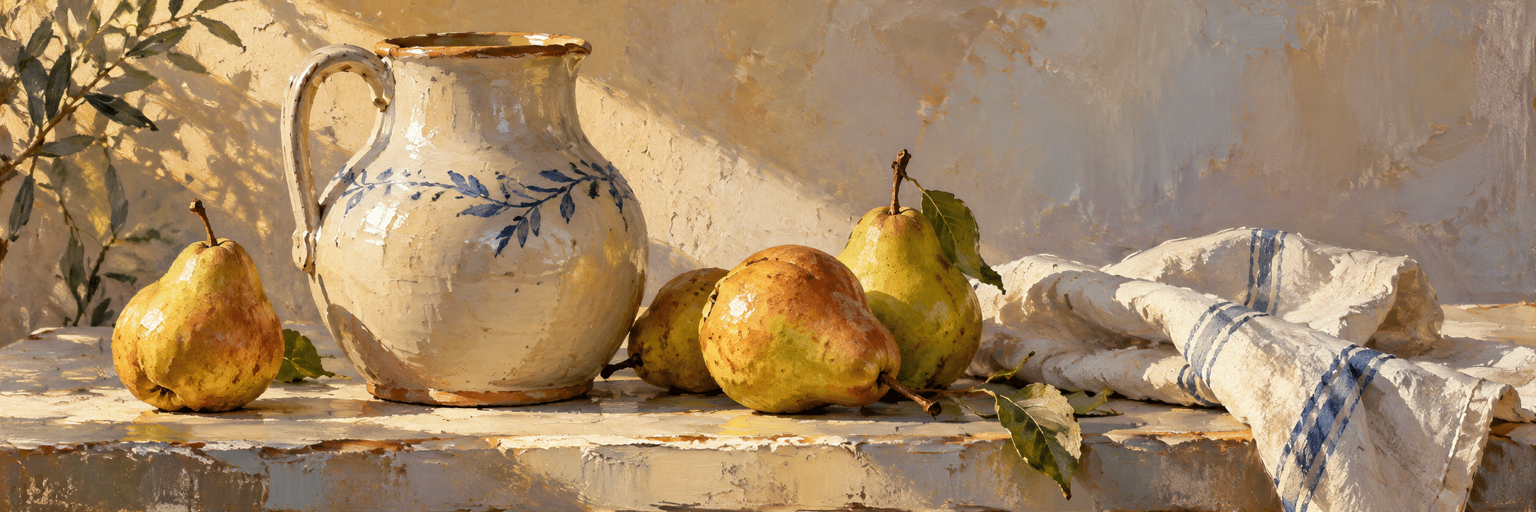
A visual introduction
Select an image for a closer look. Use the thumbnails, arrow keys or a swipe to compare examples. Zoom in to inspect details, or share the image that inspires you.
Creative toolbox · take this style further
Choose an input and a destination. Search sends your words to the chosen site; Copy & open puts them on your clipboard to paste there.
Create with AI
Turn your chosen input into an image prompt or a new creative direction.
ChatGPT
Copy your input and paste it into a ChatGPT conversation or image request.
Copy & open ChatGPT (new tab)Claude · Anthropic
Develop an image prompt or explore the style in a new Claude conversation.
Copy & open Claude · Anthropic (new tab)Midjourney
Paste your input into the Imagine bar on the Create page.
Copy & open Midjourney (new tab)Adobe Firefly
Copy your input, open Firefly, and paste it into the prompt field.
Copy & open Adobe Firefly (new tab)Leonardo.Ai
Copy your input, open Leonardo, and paste it into the generation field.
Copy & open Leonardo.Ai (new tab)Image search
Find visual references. Short, concrete keywords usually work best.
Lexica
Search AI images and prompts using your selected input.
Search with this input Lexica (new tab)Pexels
Search the photo and video library. Short keywords often work best.
Search with this input Pexels (new tab)Pixabay
Search photos, illustrations and other images.
Search with this input Pixabay (new tab)Unsplash
Search photographs using the style name or your own keywords.
Search with this input Unsplash (new tab)Wikimedia Commons
Search photographs, artworks and historical images. Check each file for its source and reuse terms.
Search with this input Wikimedia Commons (new tab)Art & research
Explore artists, collections and the ideas behind a style.
Wikipedia
Search for background reading. A style may not have its own article.
Search with this input Wikipedia (new tab)WikiArt
Copy your input into WikiArt’s search to explore artists and artworks.
Copy & open WikiArt (new tab)Europeana
Paste your keywords into the search to explore European museum, library and archive collections.
Copy & open Europeana (new tab)Inspiration
Discover portfolios and visual ideas from creative communities.
Instagram hashtags
Search a hashtag made from your input: spaces and punctuation are removed. Instagram may require sign-in.
Search with this input Instagram hashtags (new tab)ArtStation
Paste your input into artwork search for concept art, environments, characters and visual development.
Copy & open ArtStation (new tab)Behance
Paste your input into project search for illustration, design and visual storytelling.
Copy & open Behance (new tab)A closer look
The relationship between paint thickness, opacity, blending, edge and visible stroke determines how an oil painting communicates its subject.
A material with several possibilities
The National Gallery explains that a paint medium binds pigment and that the properties and proportions of both affect the resulting image. The National Portrait Gallery describes oil’s capacity for subtle blending, fine detail and pronounced impasto. These possibilities can coexist, but no painting needs to use all of them.
Begin with the kind of surface the subject calls for. A restrained portrait may depend on small transitions; a landscape may benefit from broken marks; an abstract composition may make paint thickness itself a major event. The medium does not dictate whether the image must be realistic or loose.
Separate colour from value
A convincing colour relationship needs a useful distribution of light and dark. Before refining mixtures, identify the largest value groups. A brilliant orange object can still feel flat if its shadow, highlight and surrounding field do not establish a coherent form. Conversely, a small range of colours can feel rich when their values are carefully organized.
Mix and compare colours in context rather than judging them only on a palette. A grey that seems dull alone may appear luminous beside a darker warm field. Reserve the strongest contrasts for the parts of the painting that need them. Equal intensity everywhere can make the image less articulate.
Edges connect the subject to its surroundings
A sharp edge can establish an overlap, while a soft transition can turn a form or let it merge with the surrounding atmosphere. Lost edges invite the viewer to complete a shape. Treat those differences as compositional decisions rather than finishing every boundary to the same degree.
For a useful exercise, paint a simple object with only a few large strokes, then choose one edge to sharpen and another to soften. Compare the effect before adding detail. The location of a single clear edge may do more for the focal point than a large number of small descriptive marks.
Thickness and transparency should have a purpose
A thin passage can let underlying colour influence the surface, while opaque paint can assert a light or cover a previous decision. Raised marks catch illumination differently from smooth ones. In a physical painting, these effects change with viewing conditions; a digital image can only suggest part of that material experience.
Use appropriate prepared supports and follow the guidance for the actual paints and mediums in use. This article offers visual principles, not a universal layering recipe. Product formulation, surface and working method matter. Test unfamiliar combinations separately rather than assuming that every attractive effect will form a durable paint film.
Read the artwork beyond the texture
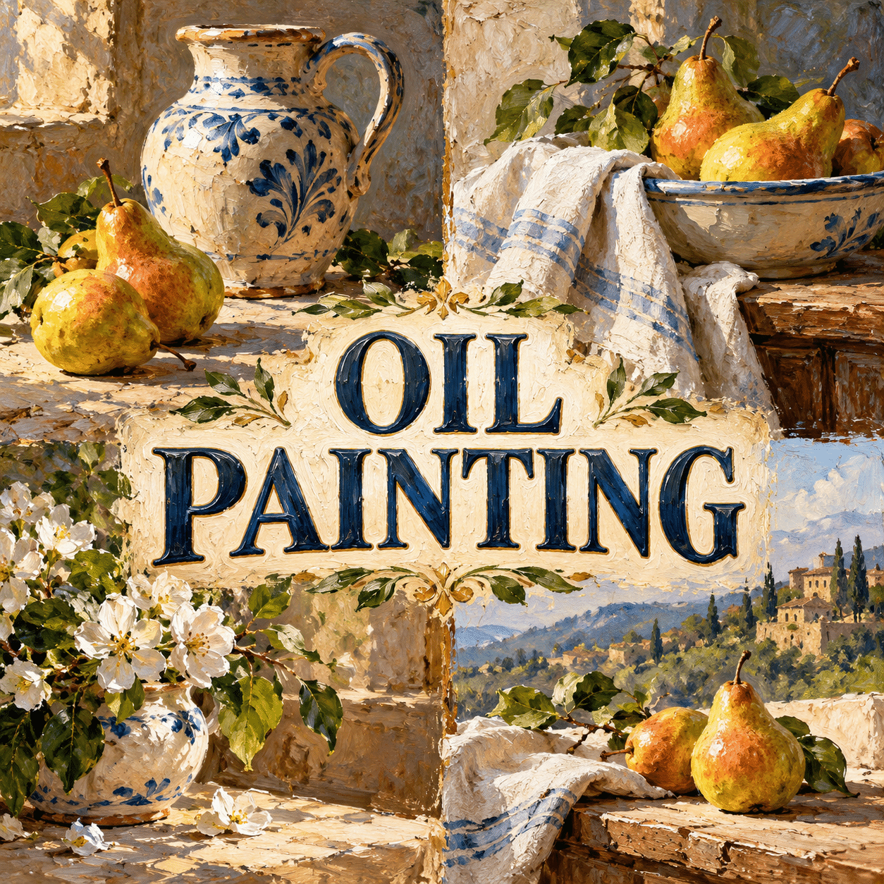
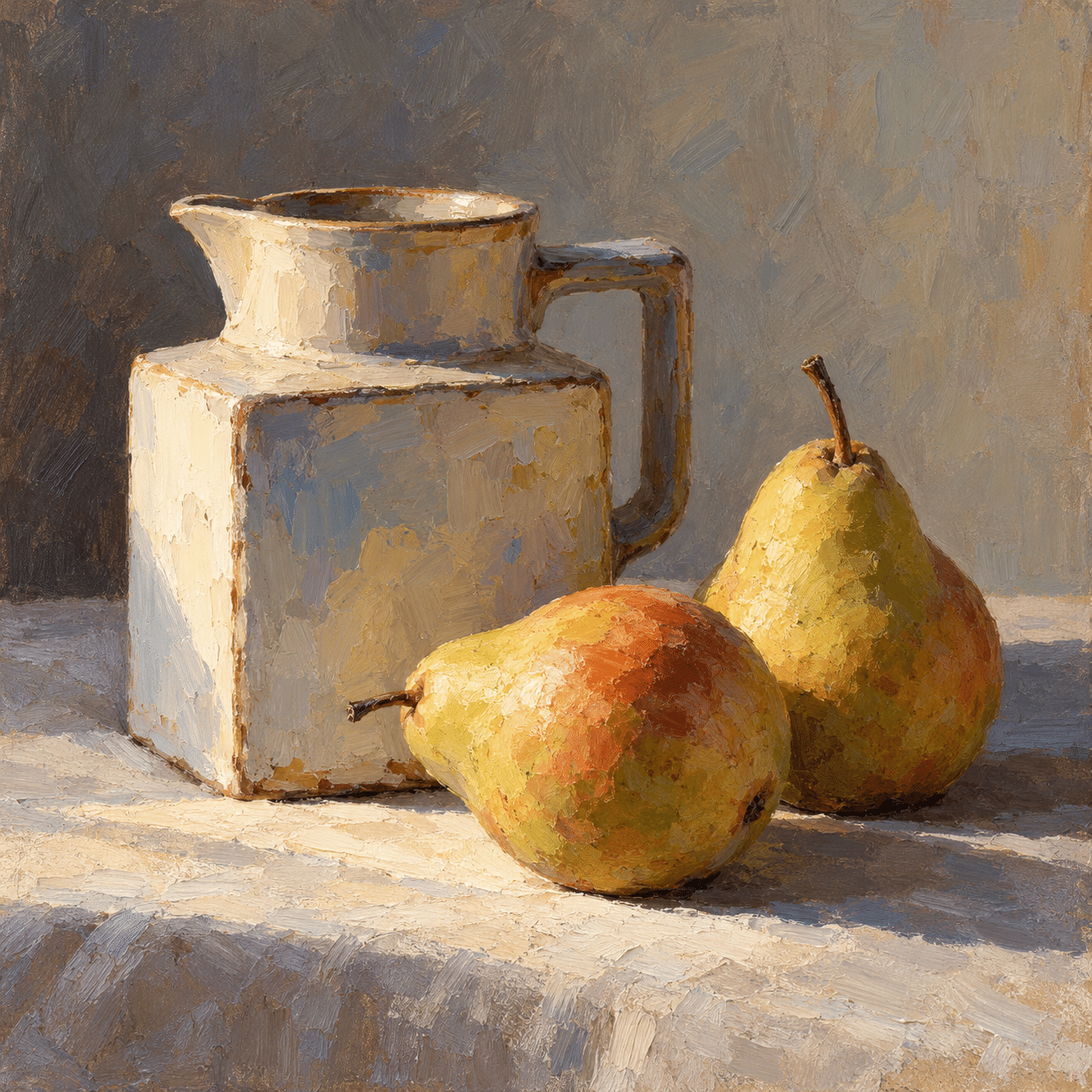
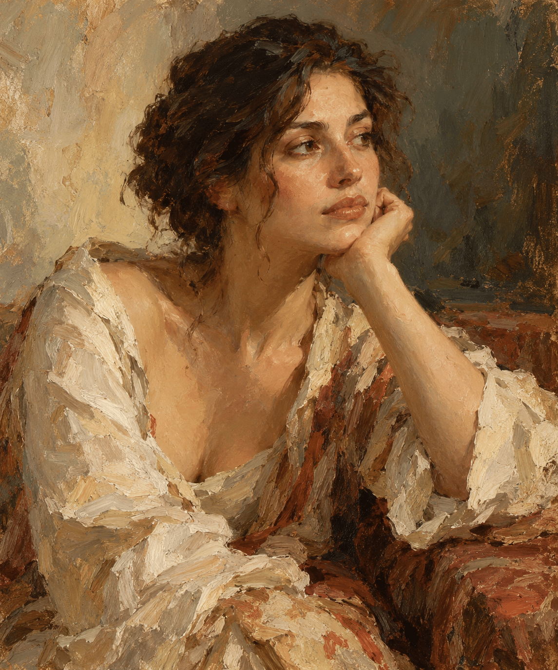
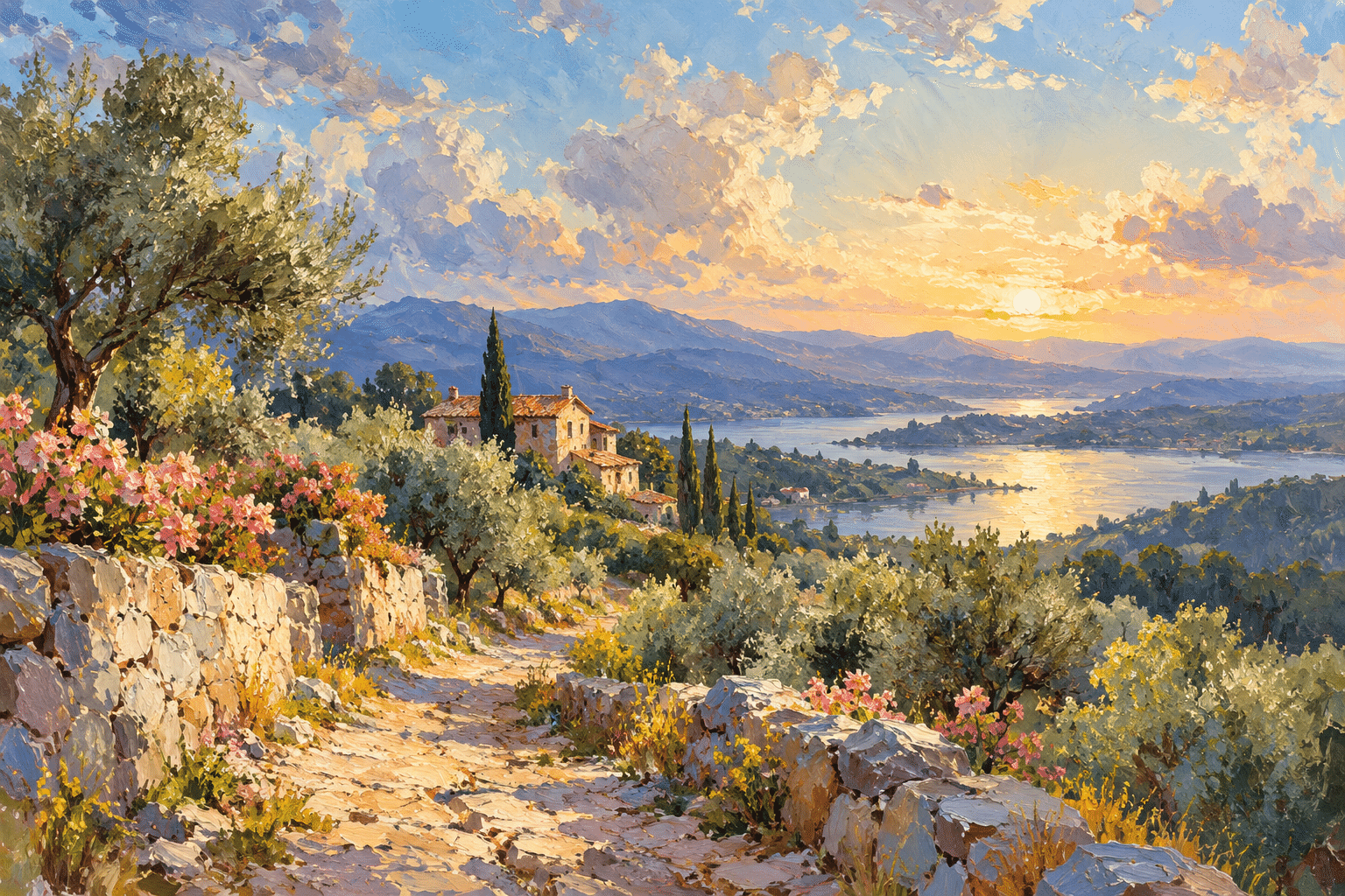
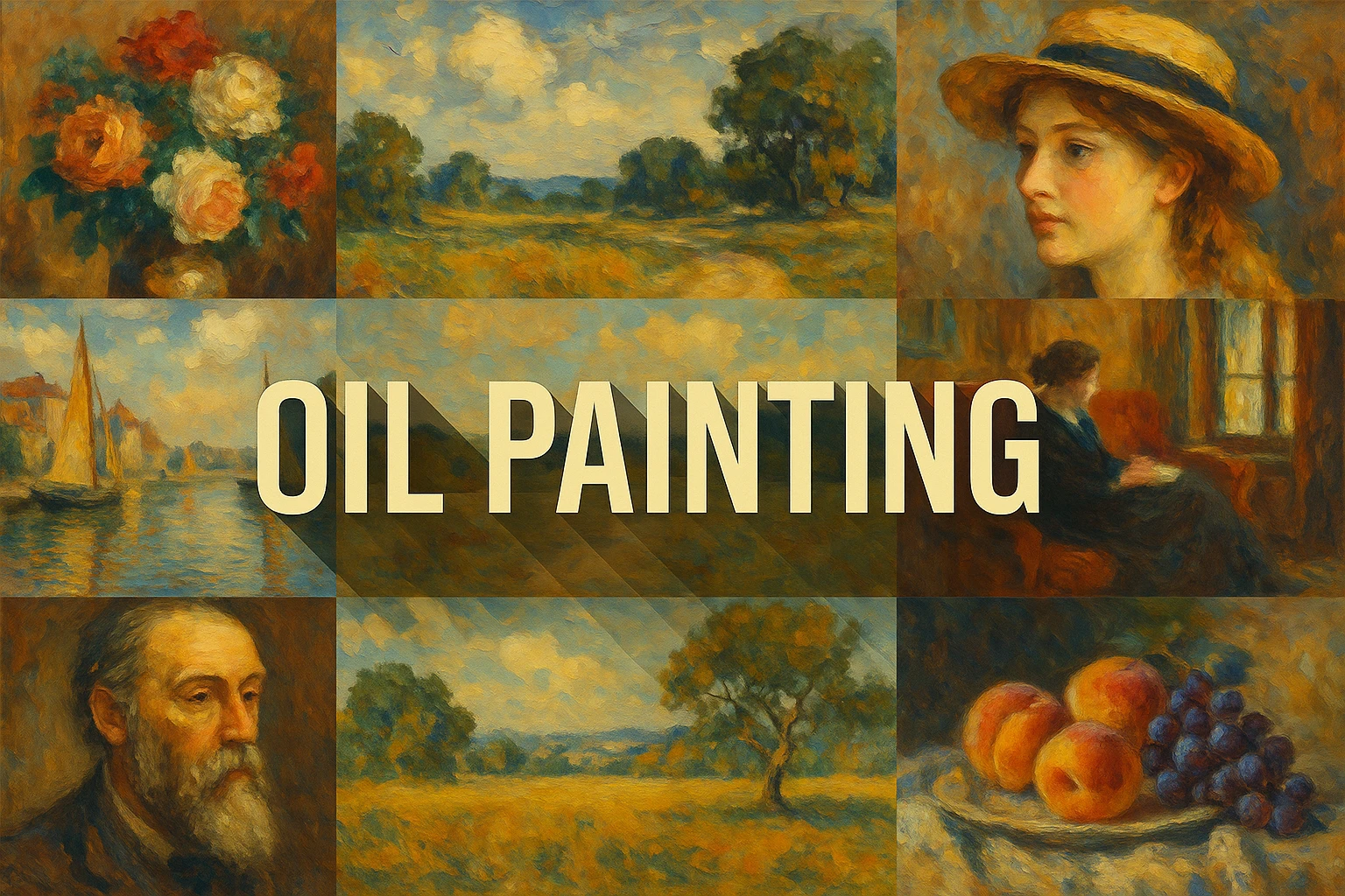
The new still-life, portrait and landscape studies demonstrate different balances of blended form and visible brushwork. They are AI-generated interpretations of oil-paint appearances, not photographs of physical canvases or evidence of a particular studio process. Their texture should be read as part of the image.
Common weaknesses include adding uniform canvas texture, making every highlight equally thick and polishing away all useful variation. Ask what the marks explain about light, space and material. Oil painting’s breadth becomes useful when its choices are specific: a quiet transition, a firm opaque accent or a broken stroke can each carry a different part of the picture.
A small poetic detour
Original words from the AOI studio.
Poetry
The Weight of Colour
A thin blue waits beneath the grey;
a warmer stroke returns the sun.
The edge grows soft, the jug grows round—
the work is more than colour done.
One lifted ridge can catch the light
that all the painted shadows need.
The prompt workshop
Original creative exercises. These prompts create new illustrations, not documentary evidence.
A quiet still life
Create an original oil-painting interpretation of a ceramic jug and pears in side light. Distinct thin shadows and opaque lights, selective visible brushwork, coherent values and no fake signature.
A living portrait surface
Create an invented adult portrait with subtle blended facial planes and more open brushwork in clothing and background. Keep anatomy coherent and edges varied; no imitation of a known painting.
Broken landscape light
Create an original landscape with broad sky, distant hills and a sunlit foreground path. Use broken colour and selective impasto-like accents rather than uniform texture.
A smile from the studio
Jokes
The palette said it was nearly finished. The painting requested one more carefully mixed grey.