
Korean gold-foil bonding technique
Keum-Boo bonds thin gold foil to a prepared metal surface, often silver, creating a luminous relationship between gold accents and the underlying form.

A visual introduction
Select an image for a closer look. Use the thumbnails, arrow keys or a swipe to compare examples. Zoom in to inspect details, or share the image that inspires you.
Creative toolbox · take this style further
Choose an input and a destination. Search sends your words to the chosen site; Copy & open puts them on your clipboard to paste there.
Create with AI
Turn your chosen input into an image prompt or a new creative direction.
ChatGPT
Copy your input and paste it into a ChatGPT conversation or image request.
Copy & open ChatGPT (new tab)Claude · Anthropic
Develop an image prompt or explore the style in a new Claude conversation.
Copy & open Claude · Anthropic (new tab)Midjourney
Paste your input into the Imagine bar on the Create page.
Copy & open Midjourney (new tab)Adobe Firefly
Copy your input, open Firefly, and paste it into the prompt field.
Copy & open Adobe Firefly (new tab)Leonardo.Ai
Copy your input, open Leonardo, and paste it into the generation field.
Copy & open Leonardo.Ai (new tab)Image search
Find visual references. Short, concrete keywords usually work best.
Lexica
Search AI images and prompts using your selected input.
Search with this input Lexica (new tab)Pexels
Search the photo and video library. Short keywords often work best.
Search with this input Pexels (new tab)Pixabay
Search photos, illustrations and other images.
Search with this input Pixabay (new tab)Unsplash
Search photographs using the style name or your own keywords.
Search with this input Unsplash (new tab)Wikimedia Commons
Search photographs, artworks and historical images. Check each file for its source and reuse terms.
Search with this input Wikimedia Commons (new tab)Art & research
Explore artists, collections and the ideas behind a style.
Wikipedia
Search for background reading. A style may not have its own article.
Search with this input Wikipedia (new tab)WikiArt
Copy your input into WikiArt’s search to explore artists and artworks.
Copy & open WikiArt (new tab)Europeana
Paste your keywords into the search to explore European museum, library and archive collections.
Copy & open Europeana (new tab)Inspiration
Discover portfolios and visual ideas from creative communities.
Instagram hashtags
Search a hashtag made from your input: spaces and punctuation are removed. Instagram may require sign-in.
Search with this input Instagram hashtags (new tab)ArtStation
Paste your input into artwork search for concept art, environments, characters and visual development.
Copy & open ArtStation (new tab)Behance
Paste your input into project search for illustration, design and visual storytelling.
Copy & open Behance (new tab)A closer look
Thin gold shapes integrated with silver surfaces, warm-cool metal contrast, restrained patches or strips, visible underlying texture, reflective accents that follow the object's curvature.
Gold attached to a surface
Keum-Boo is a Korean metalworking technique; the V&A translates the name as attached gold. Its guide describes joining thin gold sheets or strips to another metal, such as silver, through heat. Jeweller Charles Lewton-Brain's process account explains the use of pressure from burnishing on a suitably prepared surface.
This is a technique, not a single ornament vocabulary. It should not be confused with painting a surface gold, adhesive leaf decoration or electroplating. The V&A illustrates the technique with Jessica Jue's Ever Flowing Sculpture (2022), a silver work with 24-carat gold foil, showing that the subject extends beyond small jewelry.
Let the gold belong to the form
Design the underlying object first. A gold strip can follow the curve of a vessel, a small patch can emphasize a fold, or a cluster of fragments can shift the balance of a brooch. The placement should respond to the object rather than float over it as a generic luxury pattern.
Think about the proportion of gold to exposed silver. A small luminous accent may have more force than an evenly covered surface. Gold can also cross a change of curvature, making the viewer notice where the form turns. Repeating small shapes works best when their spacing has a deliberate rhythm.
Metal contrast without a compulsory black ground
Warm gold against cool silver is the fundamental visual relationship explored here. A darkened silver appearance is one possible design choice, not the definition of Keum-Boo. A pale satin surface can make the gold read gently, while a darker field produces stronger contrast.
Lighting must describe the material and the object together. Gold is reflective, not a yellow light source. Use controlled highlights that follow the curvature, and preserve enough underlying texture to show the relationship between foil and surface. Avoid thick-looking appliqué edges when the intention is thin bonded foil.
Digital studies and practical boundaries
The visual language can inform original pendant concepts, small vessels, sculptural folds and abstract metal panels. A digital rendering should be described as a design interpretation; it cannot verify metal purity, bond strength or whether a proposed object is manufacturable.
For prompting, specify a plausible silver form, thin gold areas, coherent reflection and intentional placement. Leave hallmark text and maker's signatures out unless they belong to a real, verified object. Exact workshop preparation and heating conditions depend on materials and process; the sources provide further technical context, while this entry concentrates on recognition and design.
Positive editorial perspective
AOI editorial perspective (AI-authored). Keum-Boo can give a small gold accent considerable compositional power. The strongest designs use the relationship between foil, texture and curvature so that decoration reveals the object rather than concealing it.
Negative editorial perspective
AOI editorial perspective (AI-authored). Generic gold flecks can become a luxury shorthand detached from form. Reduce the coverage, clarify the metal reflections and make each accent respond to a fold, edge or meaningful interval.
Neutral editorial perspective
AOI editorial perspective (AI-authored). Keum-Boo is a bonding and surface-decoration technique with many possible designs. Digital studies can explore its appearance, but physical execution and material claims require evidence from the actual object.
A small poetic detour
Original words from the AOI studio.
Poetry
A silver curve receives the gold,
A little warmth the metal holds.
No yellow sun is burning there;
The light arrives from ordinary air.
A narrow leaf, a broken band,
A bright decision of the hand.
The quiet ground remains in view;
The smallest patch can change its hue.
Around the fold the glimmer goes,
Then rests where cooler silver shows.
Two metals share one measured grace:
The gold has found a place, not all the space.
The prompt workshop
Original creative exercises. These prompts create new illustrations, not documentary evidence.
Place one luminous accent
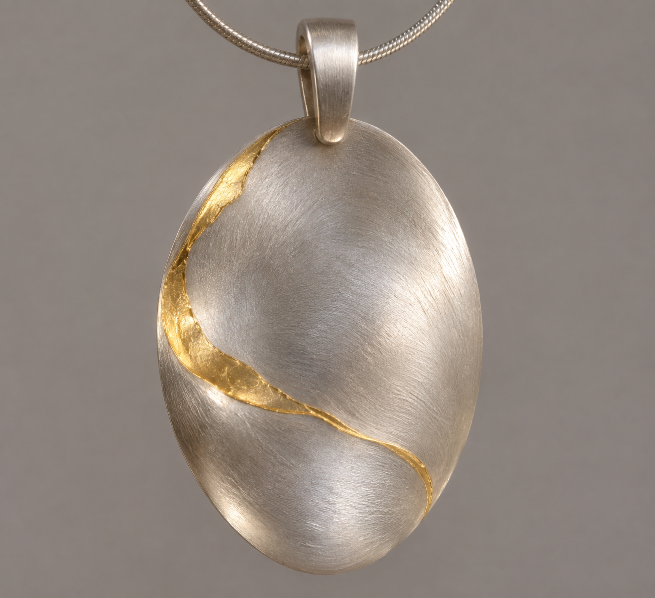
Original Keum-Boo-inspired pendant design study, gently curved satin silver oval with one thin irregular gold-foil accent following its contour, realistic metal reflection, subtle surface texture, plain neutral background, no hallmark or text.
A digital concept illustration does not certify a physical bond or material purity.
Follow a sculptural fold
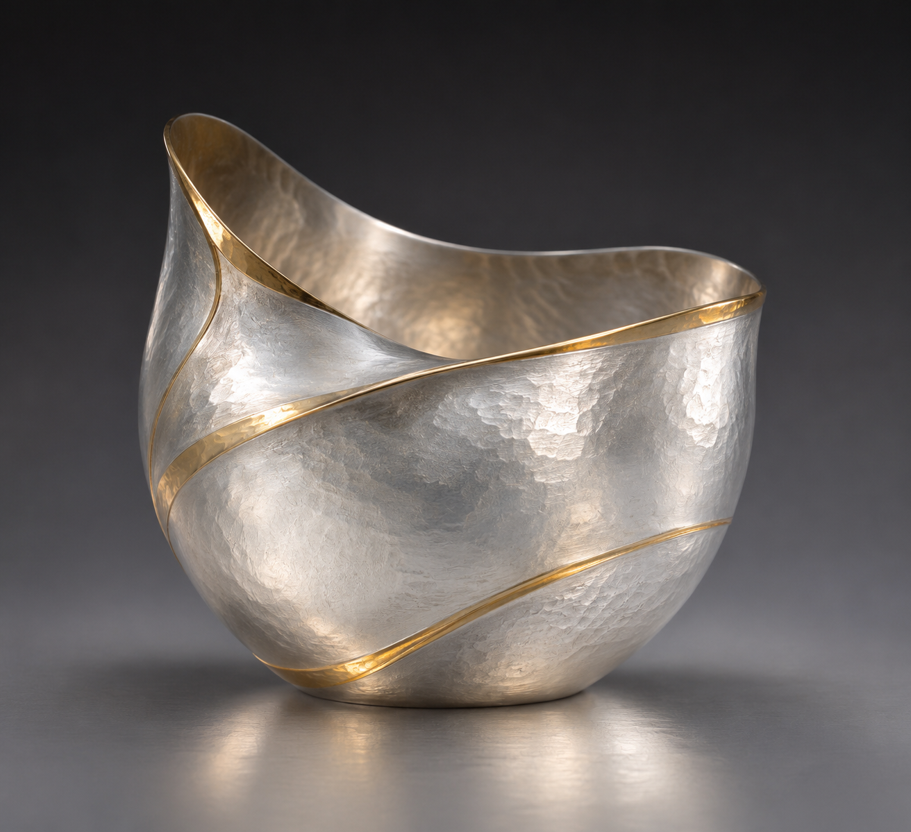
An original small silver vessel with an asymmetrical folded rim, thin warm gold strips following selected changes of curvature, ample exposed pale silver, controlled studio highlights, no copied object or signature.
Let placement reveal the form instead of covering it with a pattern.
Compare surface contrast
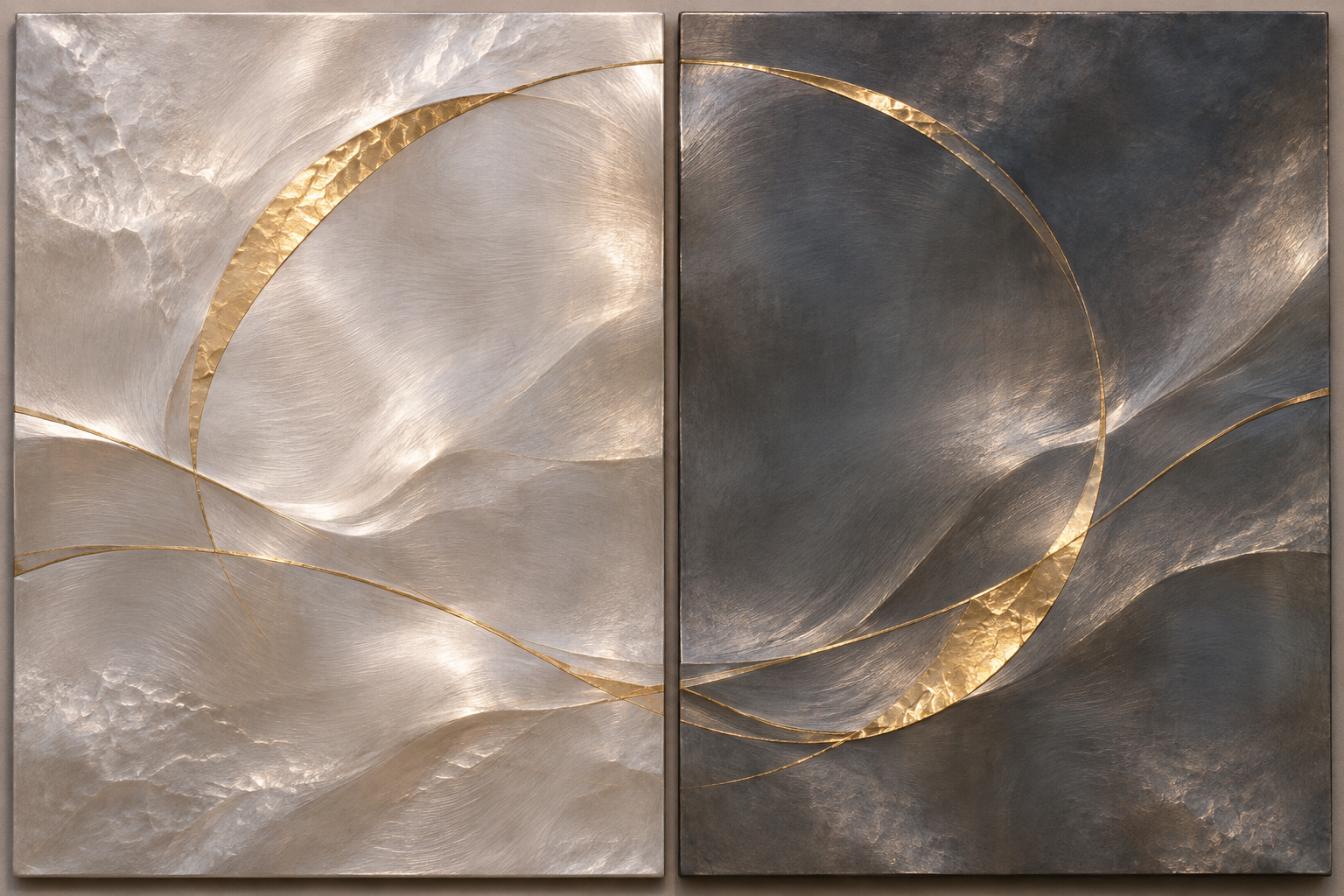
Original pair of related metal-panel studies with the same restrained gold-foil shapes, one on pale satin silver and one on darkened silver, believable thin foil and consistent light, no labels.
Dark silver is a visual option, not a requirement of the technique.
A smile from the studio
Jokes
The silver bowl asked why the gold had brought so little luggage. 'I'm foil,' said the gold. 'I travel light.' The bowl agreed to host it, provided it followed the curves, respected the negative space and stopped calling every reflection a personal spotlight.