
Art Nouveau in German-speaking contexts
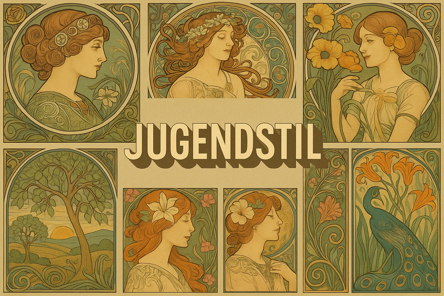
Jugendstil is the German name associated with Art Nouveau around the turn of the twentieth century. Its identity includes graphic design, architecture and applied arts, with both flowing natural forms and more geometric approaches. The key idea is not simply to add flowers, but to make line, structure and ornament participate in a coherent design.
A visual introduction
Select an image for a closer look. Use the thumbnails, arrow keys or a swipe to compare examples. Zoom in to inspect details, or share the image that inspires you.
Creative toolbox · take this style further
Choose an input and a destination. Search sends your words to the chosen site; Copy & open puts them on your clipboard to paste there.
Create with AI
Turn your chosen input into an image prompt or a new creative direction.
ChatGPT
Copy your input and paste it into a ChatGPT conversation or image request.
Copy & open ChatGPT (new tab)Claude · Anthropic
Develop an image prompt or explore the style in a new Claude conversation.
Copy & open Claude · Anthropic (new tab)Midjourney
Paste your input into the Imagine bar on the Create page.
Copy & open Midjourney (new tab)Adobe Firefly
Copy your input, open Firefly, and paste it into the prompt field.
Copy & open Adobe Firefly (new tab)Leonardo.Ai
Copy your input, open Leonardo, and paste it into the generation field.
Copy & open Leonardo.Ai (new tab)Image search
Find visual references. Short, concrete keywords usually work best.
Lexica
Search AI images and prompts using your selected input.
Search with this input Lexica (new tab)Pexels
Search the photo and video library. Short keywords often work best.
Search with this input Pexels (new tab)Pixabay
Search photos, illustrations and other images.
Search with this input Pixabay (new tab)Unsplash
Search photographs using the style name or your own keywords.
Search with this input Unsplash (new tab)Wikimedia Commons
Search photographs, artworks and historical images. Check each file for its source and reuse terms.
Search with this input Wikimedia Commons (new tab)Art & research
Explore artists, collections and the ideas behind a style.
Wikipedia
Search for background reading. A style may not have its own article.
Search with this input Wikipedia (new tab)WikiArt
Copy your input into WikiArt’s search to explore artists and artworks.
Copy & open WikiArt (new tab)Europeana
Paste your keywords into the search to explore European museum, library and archive collections.
Copy & open Europeana (new tab)Inspiration
Discover portfolios and visual ideas from creative communities.
Instagram hashtags
Search a hashtag made from your input: spaces and punctuation are removed. Instagram may require sign-in.
Search with this input Instagram hashtags (new tab)ArtStation
Paste your input into artwork search for concept art, environments, characters and visual development.
Copy & open ArtStation (new tab)Behance
Paste your input into project search for illustration, design and visual storytelling.
Copy & open Behance (new tab)A closer look
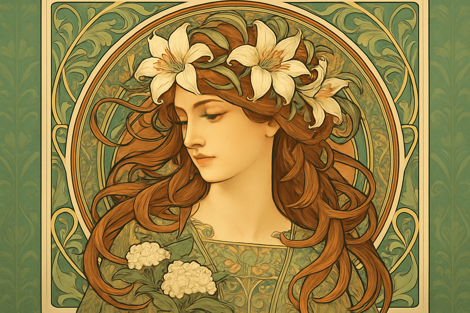
Look for stylised natural forms, strong graphic contours, asymmetrical rhythms and relationships between decoration and the object it inhabits. Flat pattern and geometric organisation can be as important as a sweeping curve.
A name with a publishing history
The V&A connects the name Jugendstil with the Munich magazine Jugend, founded in 1896. Its account places German developments within an international Art Nouveau network and distinguishes them from the related Vienna Secession. Shared concerns do not erase differences between artists, cities and institutions. [1]
This context helps avoid a common shortcut: treating every ornate poster as the same style. Identify the object, its maker, date and place before using the label. A contemporary image can explore Jugendstil principles without claiming to be a historical design.
Make the line organise the whole
A stem-like curve can connect a border to a central form, while repeated angular units can establish a different rhythm. In either case, line should do structural work. Ask where it leads the eye, where it slows and how it changes direction around the main subject.
Trace the dominant lines without copying the decorative details. If the underlying arrangement remains coherent, the ornament has a framework. If removing the flowers leaves only unrelated curls, the design may be relying on motifs rather than relationships.
Nature transformed into pattern
Stylisation selects and alters a natural form. A leaf might become a repeated tapered shape; a wing might supply a pattern of branching divisions. The result need not resemble a botanical illustration. Its value lies in how the transformation suits the page, object or architectural surface.
Choose a limited vocabulary and repeat it with variation. A border can echo the central shape without enclosing it mechanically. Leave intervals where the ground remains visible so the patterned passages have different levels of emphasis.
Graphics and objects pose different problems
A printed design must organise text, image and the edges of the page. A handle, lamp or piece of furniture also has to account for use, material and construction. The V&A's collection survey shows how widely Art Nouveau extended across media. A convincing study should therefore specify its medium instead of treating every application as a flat poster. [2]
When typography is important, set and proofread the final text separately. Generated decorative lettering can look plausible while failing to communicate the actual words. Legibility is part of the design, not a technical detail to postpone indefinitely.
An exercise in integration
Develop an original book-cover study around one plant-derived motif and one geometric rhythm. First lay out the title area, central image and margins in plain shapes. Then let the motif connect those parts. Compare a sparse version with a denser one at the final viewing size.
Judge whether the added ornament strengthens the hierarchy. Historical reference becomes useful when it changes how the whole is organised, rather than merely supplying a familiar border. Keep the result credited as a contemporary interpretation and use museum objects for claims about period practice.
A small poetic detour
Original words from the AOI studio.
Poetry
Curves of nature’s spell,
Jugendstil whispers softly,
Beauty in each line.
The prompt workshop
Original creative exercises. These prompts create new illustrations, not documentary evidence.
A cover organised by line
Design an original Jugendstil-informed book-cover composition using one stylised iris motif, a clear central title space and a controlled geometric border. Integrate ornament with the layout; leave text areas blank for accurate later typesetting.
An object with structural ornament
Create an original lamp concept whose stem-derived curves connect base, support and shade coherently. Show plausible construction, restrained material contrast and ornament that follows the structure of the object.
Sparse and dense
Create two original graphic panels using the same leaf-derived motif and page proportions: one sparse, one richly patterned. Preserve a clear hierarchy and compare how negative space changes the rhythm. No copied historical poster.