
Japanese woodblock-print genre
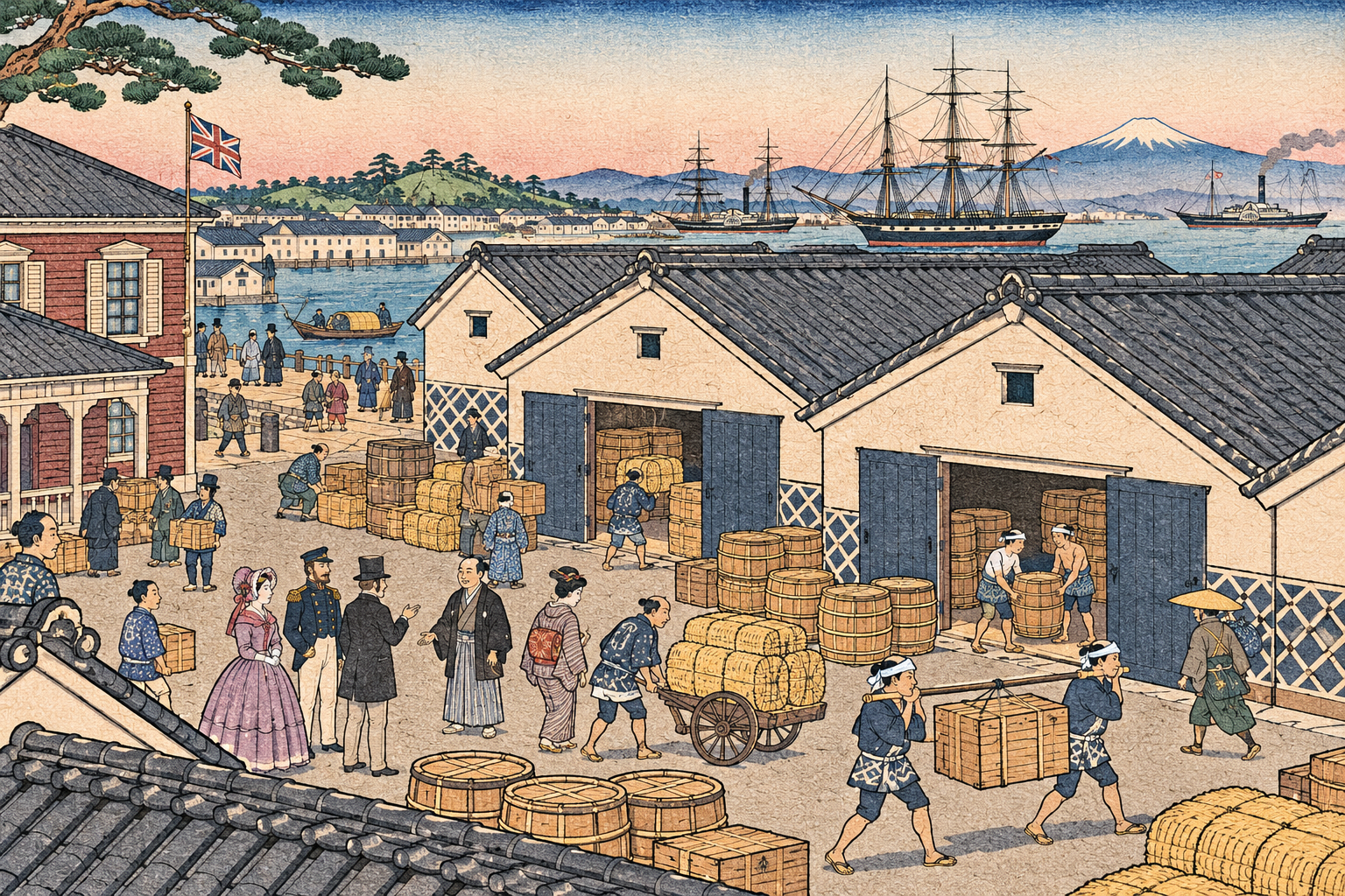
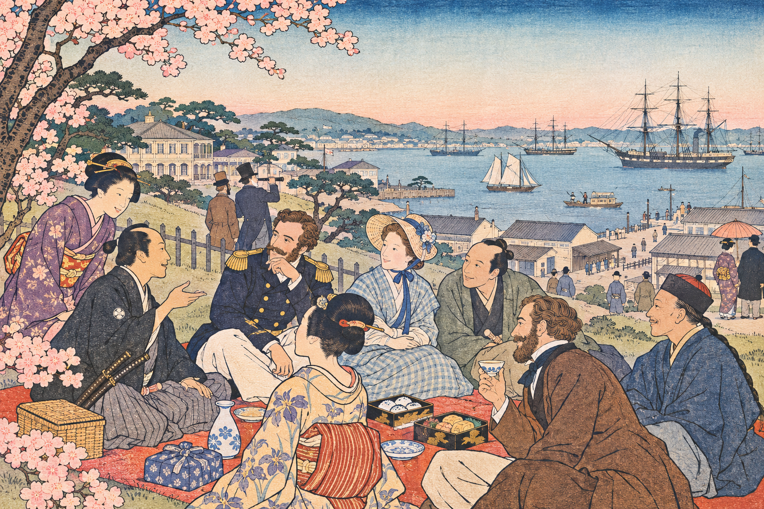
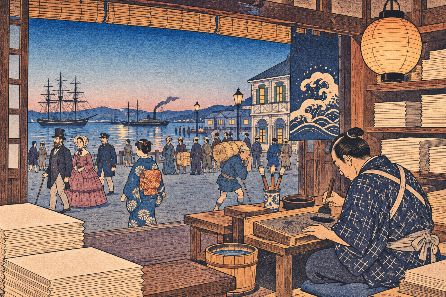
Yokohama-e are Japanese prints associated with the treaty-port encounter, depicting foreign people, commerce and unfamiliar sights through selective pictorial conventions.
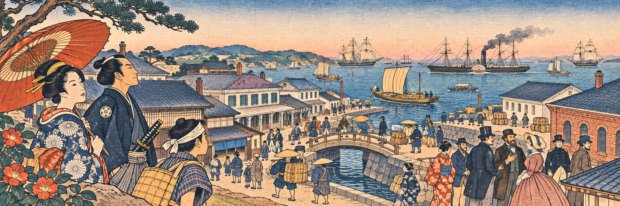
A visual introduction
Select an image for a closer look. Use the thumbnails, arrow keys or a swipe to compare examples. Zoom in to inspect details, or share the image that inspires you.
Creative toolbox · take this style further
Choose an input and a destination. Search sends your words to the chosen site; Copy & open puts them on your clipboard to paste there.
Create with AI
Turn your chosen input into an image prompt or a new creative direction.
ChatGPT
Copy your input and paste it into a ChatGPT conversation or image request.
Copy & open ChatGPT (new tab)Claude · Anthropic
Develop an image prompt or explore the style in a new Claude conversation.
Copy & open Claude · Anthropic (new tab)Midjourney
Paste your input into the Imagine bar on the Create page.
Copy & open Midjourney (new tab)Adobe Firefly
Copy your input, open Firefly, and paste it into the prompt field.
Copy & open Adobe Firefly (new tab)Leonardo.Ai
Copy your input, open Leonardo, and paste it into the generation field.
Copy & open Leonardo.Ai (new tab)Image search
Find visual references. Short, concrete keywords usually work best.
Lexica
Search AI images and prompts using your selected input.
Search with this input Lexica (new tab)Pexels
Search the photo and video library. Short keywords often work best.
Search with this input Pexels (new tab)Pixabay
Search photos, illustrations and other images.
Search with this input Pixabay (new tab)Unsplash
Search photographs using the style name or your own keywords.
Search with this input Unsplash (new tab)Wikimedia Commons
Search photographs, artworks and historical images. Check each file for its source and reuse terms.
Search with this input Wikimedia Commons (new tab)Art & research
Explore artists, collections and the ideas behind a style.
Wikipedia
Search for background reading. A style may not have its own article.
Search with this input Wikipedia (new tab)WikiArt
Copy your input into WikiArt’s search to explore artists and artworks.
Copy & open WikiArt (new tab)Europeana
Paste your keywords into the search to explore European museum, library and archive collections.
Copy & open Europeana (new tab)Inspiration
Discover portfolios and visual ideas from creative communities.
Instagram hashtags
Search a hashtag made from your input: spaces and punctuation are removed. Instagram may require sign-in.
Search with this input Instagram hashtags (new tab)ArtStation
Paste your input into artwork search for concept art, environments, characters and visual development.
Copy & open ArtStation (new tab)Behance
Paste your input into project search for illustration, design and visual storytelling.
Copy & open Behance (new tab)A closer look
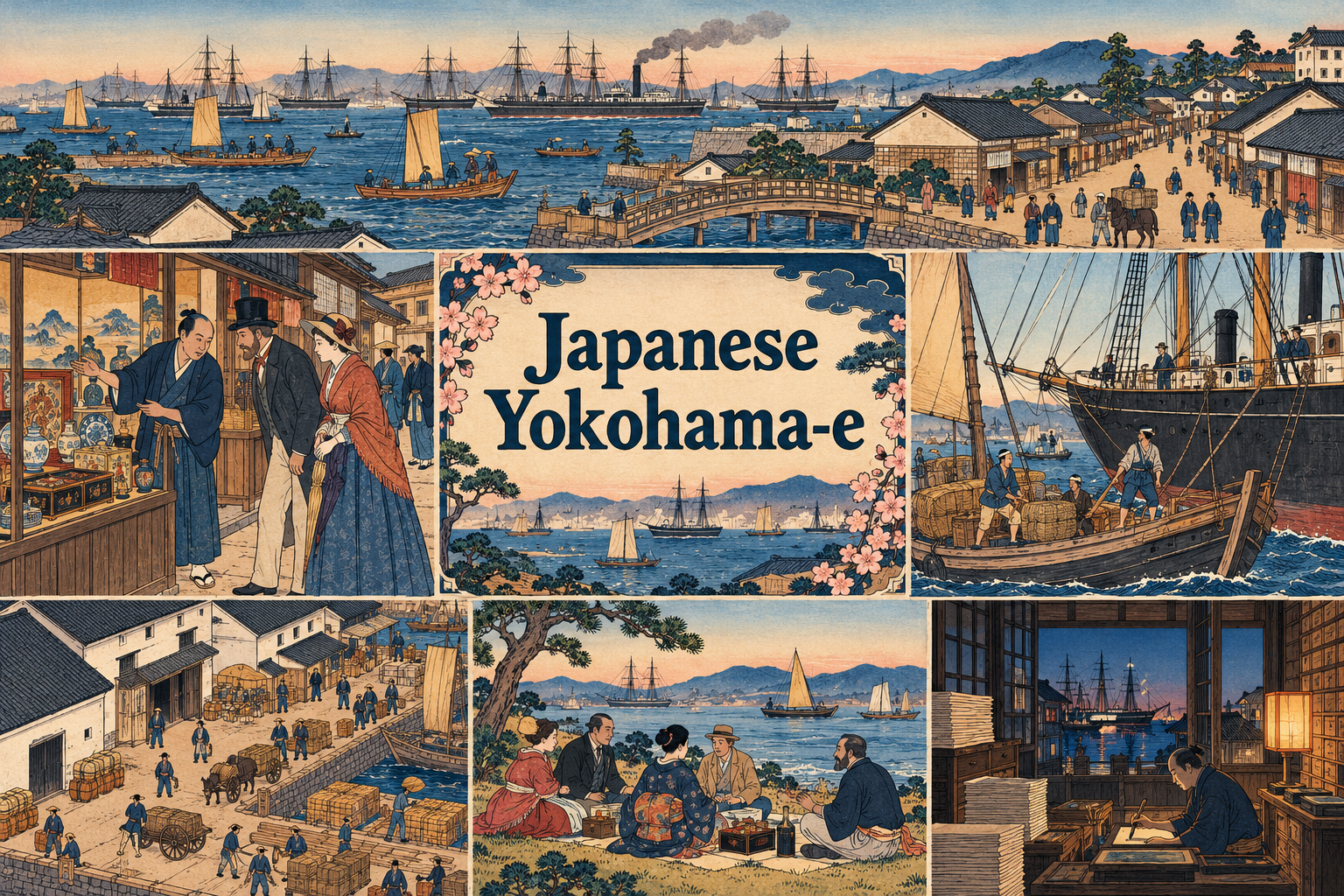
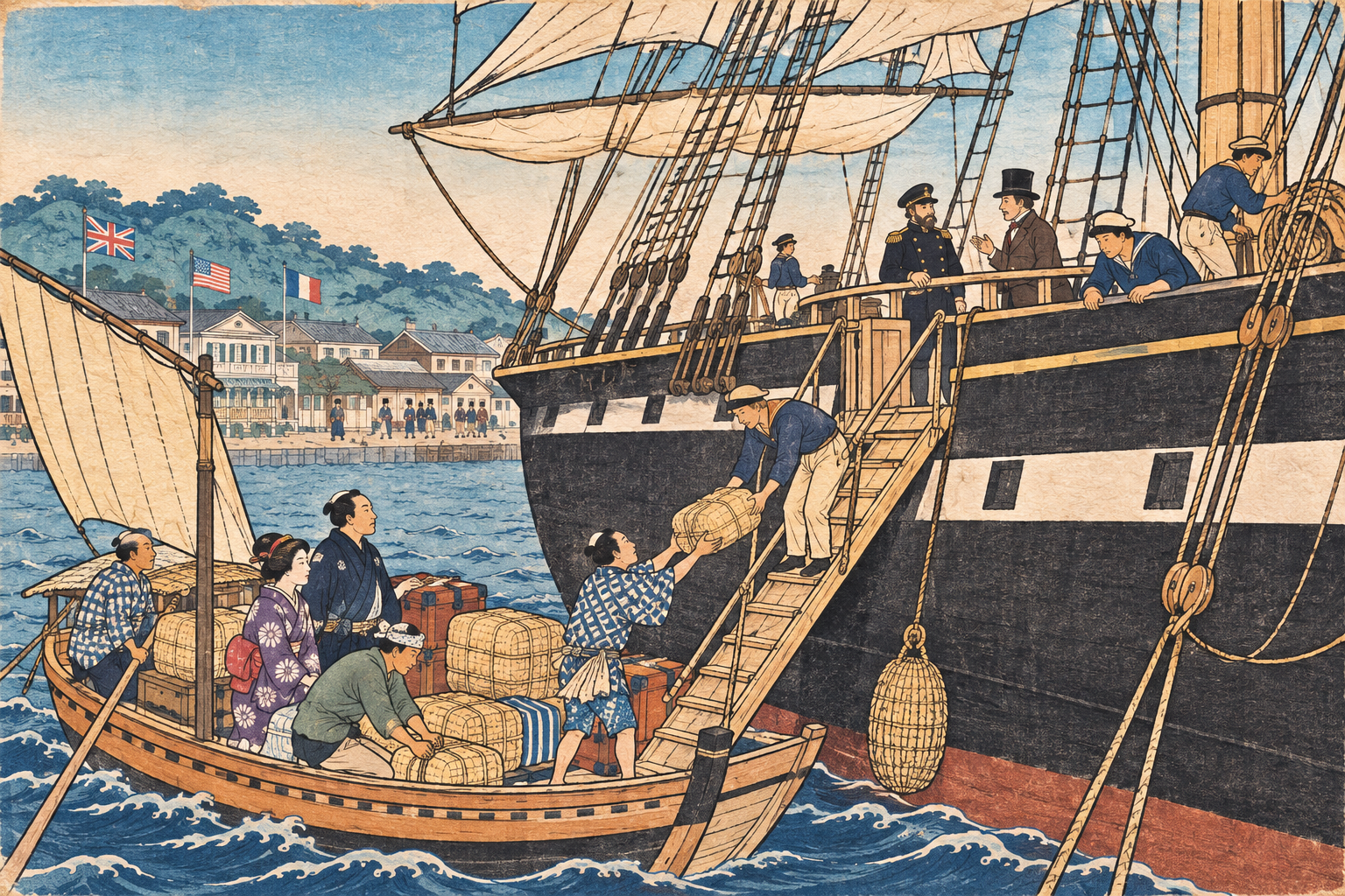
Keyblock-like outlines, flat printed color, busy port scenes, carefully arranged groups, clothing and transport details, panel-spanning compositions with a readable architectural framework.
A port seen through print
Yokohama-e are associated with the encounter surrounding Yokohama's opening to foreign trade. The Metropolitan Museum of Art dates Utagawa Sadahide's triptych The Newly Opened Port of Yokohama in Kanagawa Prefecture to the second month of 1860, following the port's opening in July 1859. Its medium is woodblock printing with ink and color on paper.
These images are valuable historical evidence, but they are selective representations. MIT's Visualizing Cultures project explains how artists combined local observation with imagery from foreign illustrated publications. A costume, pose or event in a print therefore needs interpretation; it should not automatically be treated as an eyewitness record.
The port as a composition
A harbor scene can become unreadable when every ship, building and person demands equal attention. Organize the activity into clear bands: foreground figures, a route through the middle ground and distant masts or architecture. Give the main action a recognizable silhouette and let secondary incidents remain smaller.
Crisp outlines and flat color create continuity across a crowded picture. Perspective can be legible without becoming photographic. In a multi-panel composition, plan how roads, rooflines or waterfront edges carry the eye across joins. Each sheet should contribute to the whole rather than functioning as an unrelated miniature poster.
Woodblock logic and neighboring subjects
Treat Yokohama-e as a subject genre within Japanese print culture, not as a synonym for all nineteenth-century Japanese illustration. The woodblock medium distinguishes the specific Met example from lithographic illustration. Meiji-era subject matter alone does not tell you how an image was printed.
For an original digital interpretation, request a coherent line network, separate color areas and paper character. Minor variation can suggest printing, but large random registration errors merely blur the drawing. Lettered cartouches require deliberate language and layout; leave them out of an image-only study rather than inventing pseudo-Japanese marks.
A contemporary study with historical care
Useful experiments include a waterfront panorama, a merchant interior or an imagined street scene whose architecture and clothing have been researched for a stated period. Identify invented scenes as interpretations. Avoid turning unfamiliar people into caricatures or presenting modern stereotypes as historical observation.
The most rewarding comparison asks how the picture organizes novelty: what becomes central, which objects are explained through detail, and what remains a distant sign. A contemporary illustration can explore those compositional questions without claiming to reproduce a lost historical print or to document an event that never happened.
Positive editorial perspective
AOI editorial perspective (AI-authored). The genre offers a lively way to study how images organize commerce and cultural encounter. Strong outlines, grouped figures and connected panels make complex urban activity readable without reducing it to a single emblem.
Negative editorial perspective
AOI editorial perspective (AI-authored). An uncritical imitation can repeat stereotypes or mistake borrowed source imagery for direct observation. Research specific details, avoid caricature and distinguish an invented illustration from a historical document.
Neutral editorial perspective
AOI editorial perspective (AI-authored). Yokohama-e provides a historically situated subject and compositional reference. Its prints vary by artist and purpose; the label does not prescribe one palette or encompass every Japanese print depicting foreigners.
A small poetic detour
Original words from the AOI studio.
Poetry
The harbor fits upon a sheet;
Small printed strangers cross a street.
A mast divides the pale sea air;
A window holds a watching stare.
Three panels open like a gate,
And distant ships appear to wait.
The black line gathers roof and sleeve;
The colors choose what we believe.
I follow roads the blocks have made,
Past cargo, curiosity and trade.
The page records a meeting place,
Yet leaves its questions in the space.
The prompt workshop
Original creative exercises. These prompts create new illustrations, not documentary evidence.
Compose a harbor street
Original digital interpretation informed by Yokohama-e woodblock composition, a researched nineteenth-century Japanese port street, crisp dark contours, flat indigo and warm ochre color, small coherent figures, shipping visible beyond rooftops, no text, seals or signature.
Choose a stated period and verify costume details before treating the image as educational.
Connect a wide panorama
An original wide port panorama inspired by Japanese woodblock spatial organization, waterfront path connecting foreground figures, warehouses and distant masts, restrained printed colors, clear group silhouettes and continuous architecture, no imitation of an existing print.
Build one readable route through the bustle; make the panel-spanning rhythm intentional.
Study the merchant interior
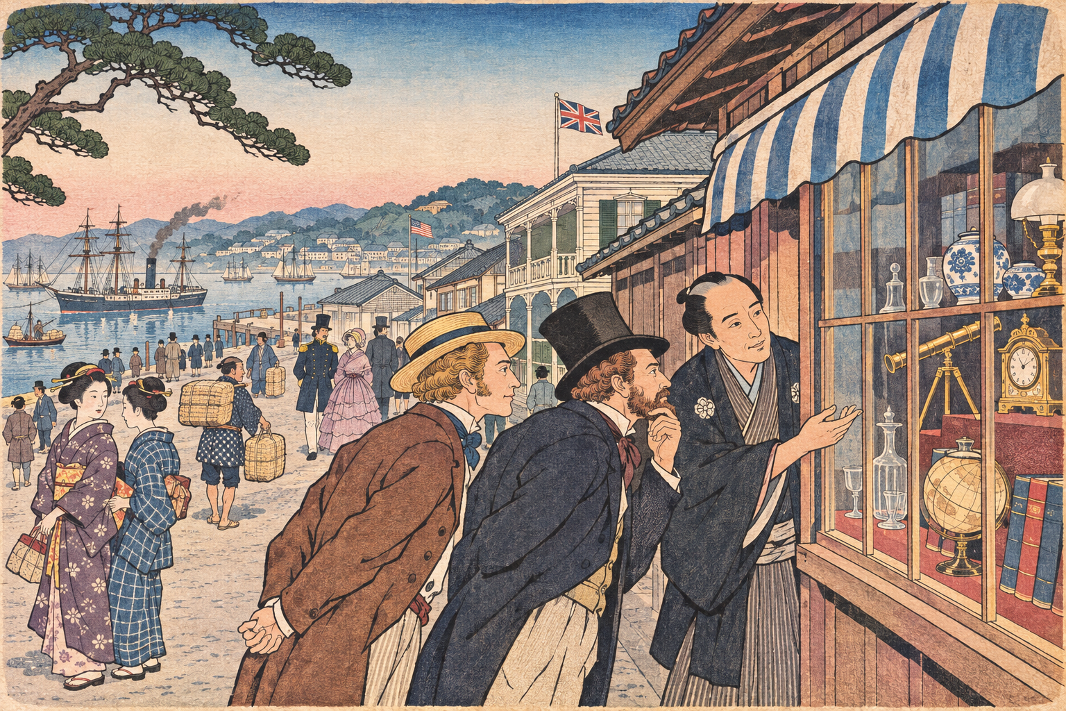
Original invented merchant interior in a historical Japanese treaty-port context, shelves of goods, a doorway framing distant activity, concise keyblock-like outlines and flat color planes, quiet paper texture, respectful figure characterization, no lettering.
Label the scene as invented; do not imply documentary authenticity.
A smile from the studio
Jokes
The ship asked the printmaker for a little more room. 'You already have three panels,' said the printmaker. 'Yes,' said the ship, 'but the merchant brought his entire inventory, and the foreground gentlemen are still deciding which hat best represents international commerce.'