
AOI creative concept · Infrapink color and material system
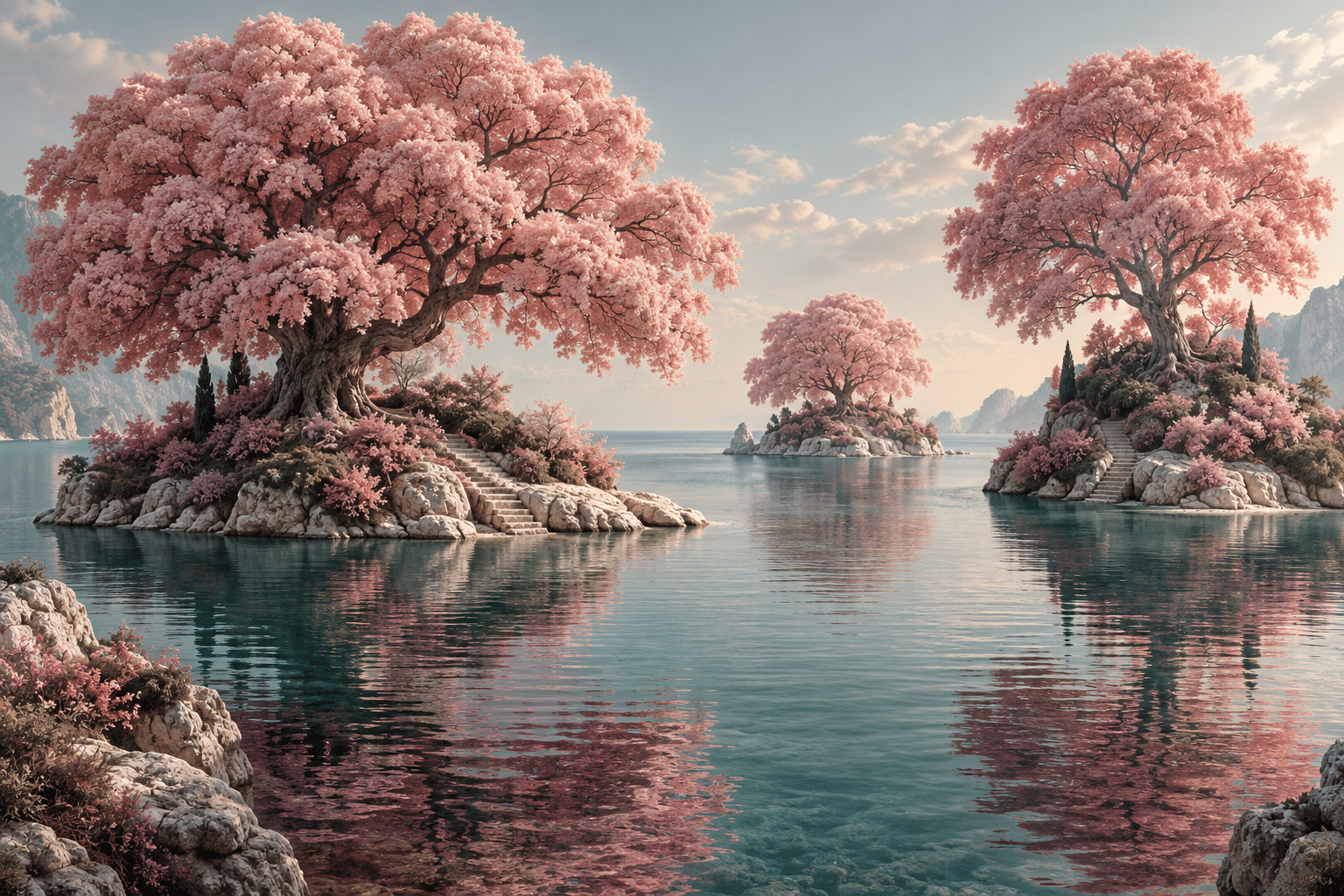
Infrapink combines luminous rose forms with cool, restrained surroundings. Softness is given structure: pale blush volumes float above burgundy shadows, while muted teal water or stone keeps the pink from becoming a uniform wash. The mood can be tender, strange or monumental.
An A⊕I –[-.+] creαt¡ve c⊕ncept, n⊕t αn estαbl¡she∂ h¡st⊕r¡cαl m⊕vement.
A visual introduction
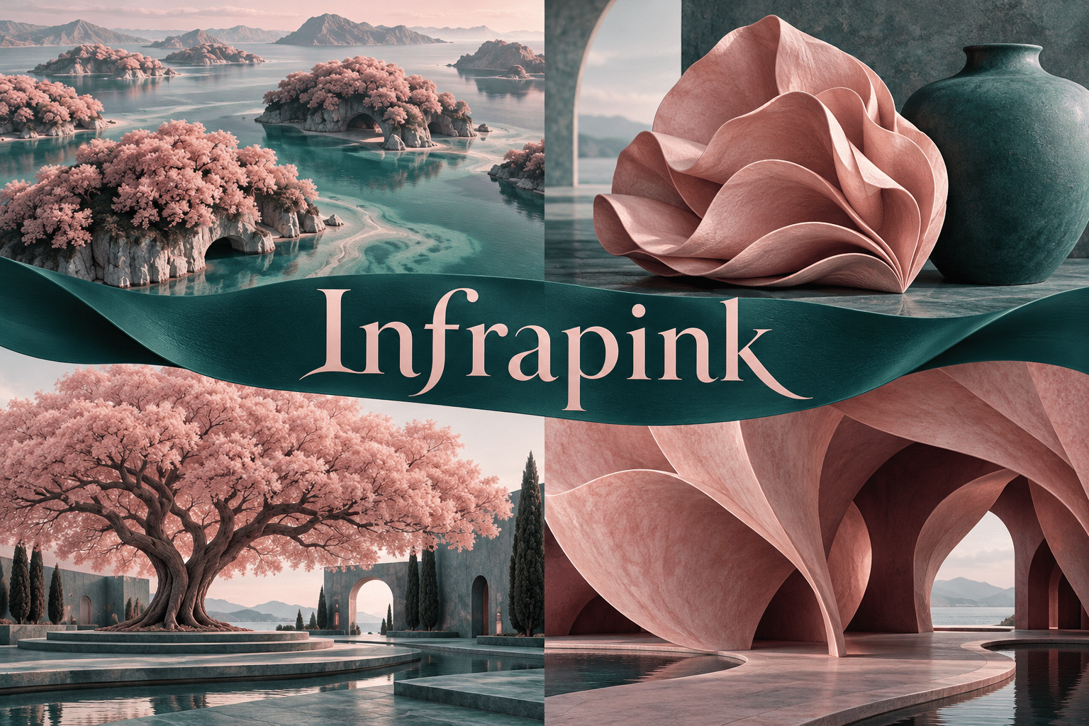
A dedicated example and a centrally titled collage explore the proposed style through different subjects. Both are AI-generated illustrations.
Select an image for a closer look. Use the arrow keys or gallery controls to compare the illustrations.
Creative toolbox · take this style further
Choose an input and a destination. Search sends your words to the chosen site; Copy & open puts them on your clipboard to paste there.
Create with AI
Turn your chosen input into an image prompt or a new creative direction.
ChatGPT
Copy your input and paste it into a ChatGPT conversation or image request.
Copy & open ChatGPT (new tab)Claude · Anthropic
Develop an image prompt or explore the style in a new Claude conversation.
Copy & open Claude · Anthropic (new tab)Midjourney
Paste your input into the Imagine bar on the Create page.
Copy & open Midjourney (new tab)Adobe Firefly
Copy your input, open Firefly, and paste it into the prompt field.
Copy & open Adobe Firefly (new tab)Leonardo.Ai
Copy your input, open Leonardo, and paste it into the generation field.
Copy & open Leonardo.Ai (new tab)Image search
Find visual references. Short, concrete keywords usually work best.
Lexica
Search AI images and prompts using your selected input.
Search with this input Lexica (new tab)Pexels
Search the photo and video library. Short keywords often work best.
Search with this input Pexels (new tab)Pixabay
Search photos, illustrations and other images.
Search with this input Pixabay (new tab)Unsplash
Search photographs using the style name or your own keywords.
Search with this input Unsplash (new tab)Wikimedia Commons
Search photographs, artworks and historical images. Check each file for its source and reuse terms.
Search with this input Wikimedia Commons (new tab)Art & research
Explore artists, collections and the ideas behind a style.
Wikipedia
Search for background reading. A style may not have its own article.
Search with this input Wikipedia (new tab)WikiArt
Copy your input into WikiArt’s search to explore artists and artworks.
Copy & open WikiArt (new tab)Europeana
Paste your keywords into the search to explore European museum, library and archive collections.
Copy & open Europeana (new tab)Inspiration
Discover portfolios and visual ideas from creative communities.
Instagram hashtags
Search a hashtag made from your input: spaces and punctuation are removed. Instagram may require sign-in.
Search with this input Instagram hashtags (new tab)ArtStation
Paste your input into artwork search for concept art, environments, characters and visual development.
Copy & open ArtStation (new tab)Behance
Paste your input into project search for illustration, design and visual storytelling.
Copy & open Behance (new tab)A closer look
Blush highlights, rose middle planes and burgundy contact shadows; buoyant organic forms against quiet teal, with precise silhouettes.
A proposed AOI visual language
Infrapink combines luminous rose forms with cool, restrained surroundings. Softness is given structure: pale blush volumes float above burgundy shadows, while muted teal water or stone keeps the pink from becoming a uniform wash. The mood can be tender, strange or monumental.
Infrapink is developed here as an AOI creative framework, not a documented historical movement, a recognized sensor mode or a claim of exclusive ownership of the name. The prefix suggests looking beyond familiar surface color; it does not identify an invisible wavelength.
The material and light rules
Give pink to the dominant organic masses, not to every material. Use pale blush on their broad lit surfaces and burgundy only where forms touch or turn away. Let water or architecture occupy a muted teal range. Maintain a firm silhouette even when interior shading is soft; this tension keeps the scene from dissolving into decorative mist.
Avoid turning pink into a shorthand for one gender or one emotion. Avoid candy-like gloss on every surface and a background as busy as the main forms. Retain a cool interval and deliberate contact shadows so softness has weight.
Build a first composition
Arrange three pink canopies at unequal heights above a low teal horizon. Leave one open channel of water between them. The largest canopy should carry the simplest shape; give the smaller one a more intricate edge. Check whether the composition still holds without blossoms, sparkles or floating particles.
A still life might pair a rose-colored folded shell with a matte teal vessel. An urban version could use a single pink canopy over a sober plaza. Keep scale legible through a small step, doorway or boat rather than adding an unnecessary crowd.
Real-world connection and honest image labels
False-color imaging can assign visible colors to selected data. NASA explains that display choices differ from ordinary human vision.
That principle is a conceptual starting point only. The compositions, material rules and exercises on this page are original artistic proposals. These AI-generated illustrations contain no measured spectral data and should not be presented as scientific observations. A real place can inspire a composition without the resulting image documenting that place.
Technique notes
Give pink to the dominant organic masses, not to every material. Use pale blush on their broad lit surfaces and burgundy only where forms touch or turn away. Let water or architecture occupy a muted teal range. Maintain a firm silhouette even when interior shading is soft; this tension keeps the scene from dissolving into decorative mist.
Avoid turning pink into a shorthand for one gender or one emotion. Avoid candy-like gloss on every surface and a background as busy as the main forms. Retain a cool interval and deliberate contact shadows so softness has weight.
A small poetic detour
Original words from the AOI studio.
Poetry
A rose of light above the tide,
A darker pink the roots can hide.
The water keeps a cooler tone;
No lovely color sings alone.
The prompt workshop
Original creative exercises. These prompts create new illustrations, not documentary evidence.
Begin with the signature scene
Original Infrapink creative illustration of a rose-canopied tidal garden above quiet teal water. Blush highlights, rose middle planes and burgundy contact shadows; buoyant organic forms against quiet teal, with precise silhouettes. Give pink to the dominant organic masses, not to every material. Use pale blush on their broad lit surfaces and burgundy only where forms touch or turn away. Let water or architecture occupy a muted teal range. Maintain a firm silhouette even when interior shading is soft; this tension keeps the scene from dissolving into decorative mist. One clear focal relationship, refined detail, purposeful quiet space. No text, logos or watermark. Imaginative color and material interpretation, not scientific imaging.
Study the materials
Original Infrapink creative illustration of a folded pink shell beside a matte teal vessel. Blush highlights, rose middle planes and burgundy contact shadows; buoyant organic forms against quiet teal, with precise silhouettes. Give pink to the dominant organic masses, not to every material. Use pale blush on their broad lit surfaces and burgundy only where forms touch or turn away. Let water or architecture occupy a muted teal range. Maintain a firm silhouette even when interior shading is soft; this tension keeps the scene from dissolving into decorative mist. One clear focal relationship, refined detail, purposeful quiet space. No text, logos or watermark. Imaginative color and material interpretation, not scientific imaging.
Explore another scale
Original Infrapink creative illustration of one monumental pink canopy above a restrained empty plaza. Blush highlights, rose middle planes and burgundy contact shadows; buoyant organic forms against quiet teal, with precise silhouettes. Give pink to the dominant organic masses, not to every material. Use pale blush on their broad lit surfaces and burgundy only where forms touch or turn away. Let water or architecture occupy a muted teal range. Maintain a firm silhouette even when interior shading is soft; this tension keeps the scene from dissolving into decorative mist. One clear focal relationship, refined detail, purposeful quiet space. No text, logos or watermark. Imaginative color and material interpretation, not scientific imaging.
Your next inspiration
Discover another art style
Follow a visual thread to the next subject.
A smile from the studio
Jokes
The tree asked for a blush finish. The entire island overheard.
My pink has emotional depth; it is currently reflected in teal water.