
AOI creative concept · Infrablack color and material system
Infrablack builds a world from differences inside darkness. Velvet, graphite, polished basalt and smoked glass remain separate even when they share a near-black palette. Narrow reflections reveal structure, while large unlit areas give the composition its scale and restraint.
An A⊕I –[-.+] creαt¡ve c⊕ncept, n⊕t αn estαbl¡she∂ h¡st⊕r¡cαl m⊕vement.
A visual introduction
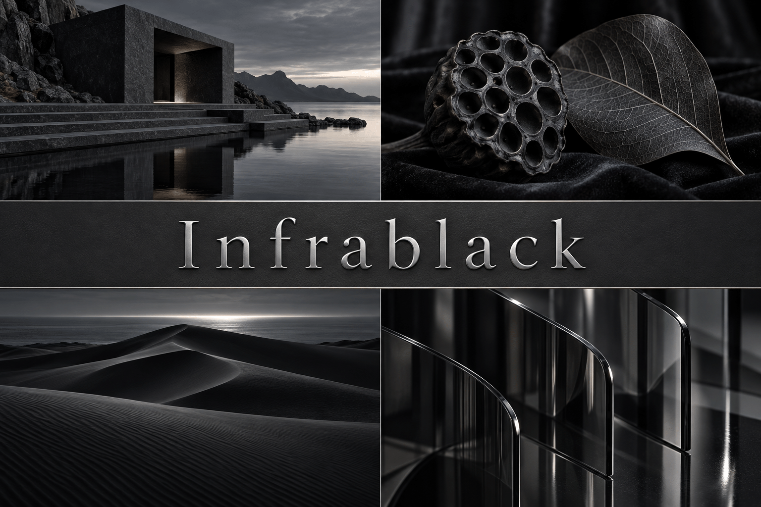
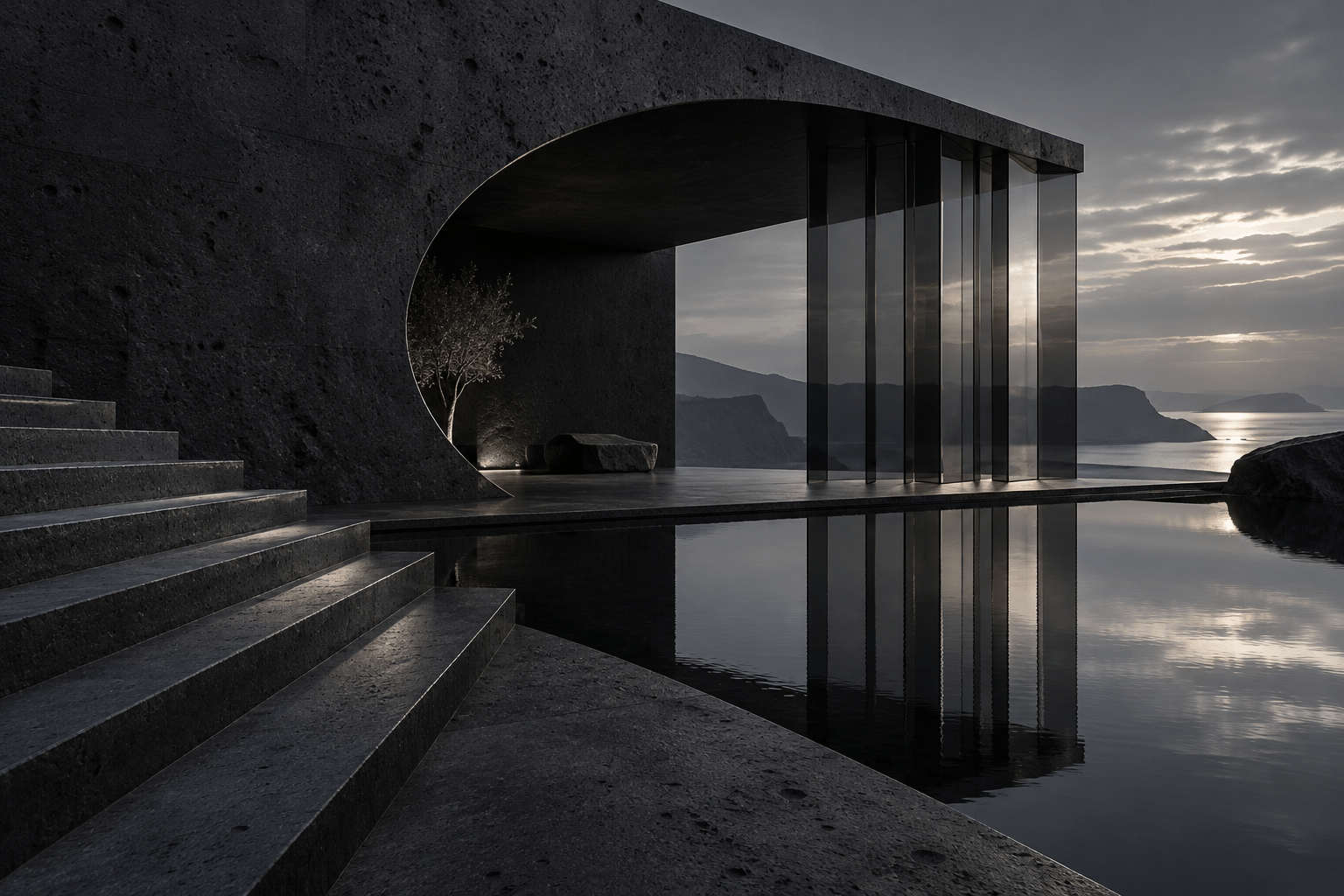
A dedicated example and a centrally titled collage explore the proposed style through different subjects. Both are AI-generated illustrations.
Select an image for a closer look. Use the arrow keys or gallery controls to compare the illustrations.
Creative toolbox · take this style further
Choose an input and a destination. Search sends your words to the chosen site; Copy & open puts them on your clipboard to paste there.
Create with AI
Turn your chosen input into an image prompt or a new creative direction.
ChatGPT
Copy your input and paste it into a ChatGPT conversation or image request.
Copy & open ChatGPT (new tab)Claude · Anthropic
Develop an image prompt or explore the style in a new Claude conversation.
Copy & open Claude · Anthropic (new tab)Midjourney
Paste your input into the Imagine bar on the Create page.
Copy & open Midjourney (new tab)Adobe Firefly
Copy your input, open Firefly, and paste it into the prompt field.
Copy & open Adobe Firefly (new tab)Leonardo.Ai
Copy your input, open Leonardo, and paste it into the generation field.
Copy & open Leonardo.Ai (new tab)Image search
Find visual references. Short, concrete keywords usually work best.
Lexica
Search AI images and prompts using your selected input.
Search with this input Lexica (new tab)Pexels
Search the photo and video library. Short keywords often work best.
Search with this input Pexels (new tab)Pixabay
Search photos, illustrations and other images.
Search with this input Pixabay (new tab)Unsplash
Search photographs using the style name or your own keywords.
Search with this input Unsplash (new tab)Wikimedia Commons
Search photographs, artworks and historical images. Check each file for its source and reuse terms.
Search with this input Wikimedia Commons (new tab)Art & research
Explore artists, collections and the ideas behind a style.
Wikipedia
Search for background reading. A style may not have its own article.
Search with this input Wikipedia (new tab)WikiArt
Copy your input into WikiArt’s search to explore artists and artworks.
Copy & open WikiArt (new tab)Europeana
Paste your keywords into the search to explore European museum, library and archive collections.
Copy & open Europeana (new tab)Inspiration
Discover portfolios and visual ideas from creative communities.
Instagram hashtags
Search a hashtag made from your input: spaces and punctuation are removed. Instagram may require sign-in.
Search with this input Instagram hashtags (new tab)ArtStation
Paste your input into artwork search for concept art, environments, characters and visual development.
Copy & open ArtStation (new tab)Behance
Paste your input into project search for illustration, design and visual storytelling.
Copy & open Behance (new tab)A closer look
Near-black material contrasts, graphite planes, narrow silver reflections and carefully placed negative space; darkness retains readable structure.
A proposed AOI visual language
Infrablack builds a world from differences inside darkness. Velvet, graphite, polished basalt and smoked glass remain separate even when they share a near-black palette. Narrow reflections reveal structure, while large unlit areas give the composition its scale and restraint.
Infrablack is developed here as an AOI creative framework, not a documented historical movement, a recognized sensor mode or a claim of exclusive ownership of the name. The prefix suggests looking beyond familiar surface color; it does not identify an invisible wavelength.
The material and light rules
Assign each material a different reflection behavior. Velvet absorbs, graphite carries a broad soft sheen, basalt carries a sharper edge and glass reveals a thin transmitted highlight. Keep the light source coherent. Near-black does not mean empty black: enough mid-dark information must remain for the eye to understand the main forms.
Avoid crushing all shadows, outlining every object or treating black as an absence of design. A spectacular highlight cannot rescue an unreadable arrangement. Keep invented materials and light effects labelled as artistic choices, not measurements of absorption.
Build a first composition
Construct a simple stair, wall and pool. Let the stair emerge through alternating matte and softly reflective planes, then use one thin reflection to describe the waterline. View the result on a modestly bright display: the structure should remain understandable without pushing every shadow toward pure black.
For a small study, place a black ceramic seedpod on velvet beside a graphite leaf. For a landscape, use dark dunes and a restrained pale horizon. Keep the number of high-contrast edges low; a long quiet interval makes a small glint feel significant.
Real-world connection and honest image labels
False-color imaging can assign visible colors to selected data. NASA explains that display choices differ from ordinary human vision.
That principle is a conceptual starting point only. The compositions, material rules and exercises on this page are original artistic proposals. These AI-generated illustrations contain no measured spectral data and should not be presented as scientific observations. A real place can inspire a composition without the resulting image documenting that place.
Technique notes
Assign each material a different reflection behavior. Velvet absorbs, graphite carries a broad soft sheen, basalt carries a sharper edge and glass reveals a thin transmitted highlight. Keep the light source coherent. Near-black does not mean empty black: enough mid-dark information must remain for the eye to understand the main forms.
Avoid crushing all shadows, outlining every object or treating black as an absence of design. A spectacular highlight cannot rescue an unreadable arrangement. Keep invented materials and light effects labelled as artistic choices, not measurements of absorption.
A small poetic detour
Original words from the AOI studio.
Poetry
The stair arrives a shade at a time,
A silver edge, a silent climb.
The pool withholds its borrowed sky;
The dark has room to let it lie.
The prompt workshop
Original creative exercises. These prompts create new illustrations, not documentary evidence.
Begin with the signature scene
Original Infrablack creative illustration of a basalt pavilion above a dark pool with graphite stairs. Near-black material contrasts, graphite planes, narrow silver reflections and carefully placed negative space; darkness retains readable structure. Assign each material a different reflection behavior. Velvet absorbs, graphite carries a broad soft sheen, basalt carries a sharper edge and glass reveals a thin transmitted highlight. Keep the light source coherent. Near-black does not mean empty black: enough mid-dark information must remain for the eye to understand the main forms. One clear focal relationship, refined detail, purposeful quiet space. No text, logos or watermark. Imaginative color and material interpretation, not scientific imaging.
Study the materials
Original Infrablack creative illustration of a black ceramic seedpod and graphite leaf on velvet. Near-black material contrasts, graphite planes, narrow silver reflections and carefully placed negative space; darkness retains readable structure. Assign each material a different reflection behavior. Velvet absorbs, graphite carries a broad soft sheen, basalt carries a sharper edge and glass reveals a thin transmitted highlight. Keep the light source coherent. Near-black does not mean empty black: enough mid-dark information must remain for the eye to understand the main forms. One clear focal relationship, refined detail, purposeful quiet space. No text, logos or watermark. Imaginative color and material interpretation, not scientific imaging.
Explore another scale
Original Infrablack creative illustration of sculptural dark dunes beneath a narrow silver horizon. Near-black material contrasts, graphite planes, narrow silver reflections and carefully placed negative space; darkness retains readable structure. Assign each material a different reflection behavior. Velvet absorbs, graphite carries a broad soft sheen, basalt carries a sharper edge and glass reveals a thin transmitted highlight. Keep the light source coherent. Near-black does not mean empty black: enough mid-dark information must remain for the eye to understand the main forms. One clear focal relationship, refined detail, purposeful quiet space. No text, logos or watermark. Imaginative color and material interpretation, not scientific imaging.
Your next inspiration
Discover another art style
Follow a visual thread to the next subject.
A smile from the studio
Jokes
The black vase requested a spotlight. We negotiated one tasteful pixel of enthusiasm.
The shadows formed a committee. Their minutes remain confidential.