
Video-game visual reference
DOOM is a game-series reference, not a historical art movement. Its visual vocabulary is best studied by separating the graphic economy of the 1993 game from later interpretations of industrial science fiction and infernal horror.
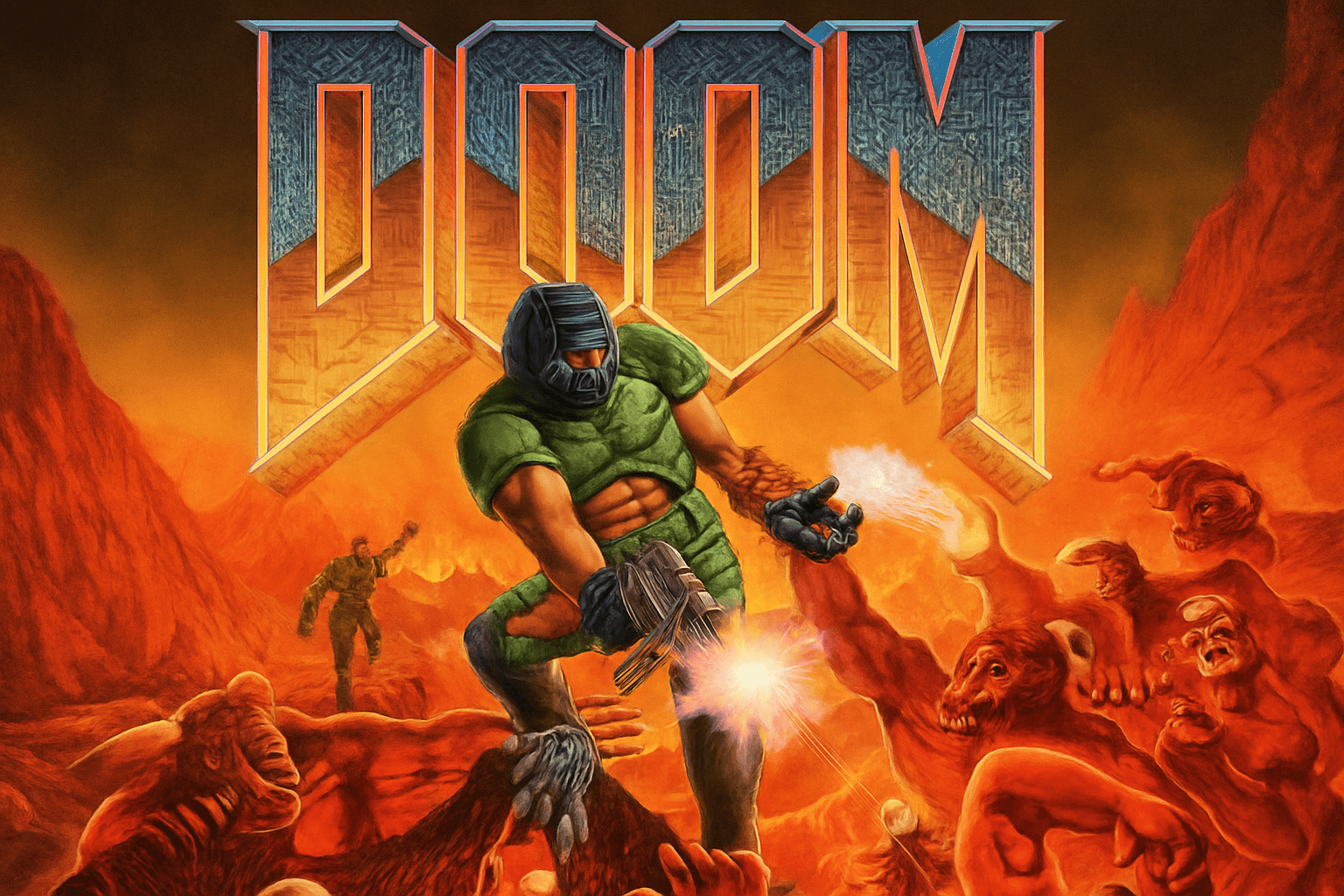
A visual introduction
Select an image for a closer look. Use the thumbnails, arrow keys or a swipe to compare examples. Zoom in to inspect details, or share the image that inspires you.
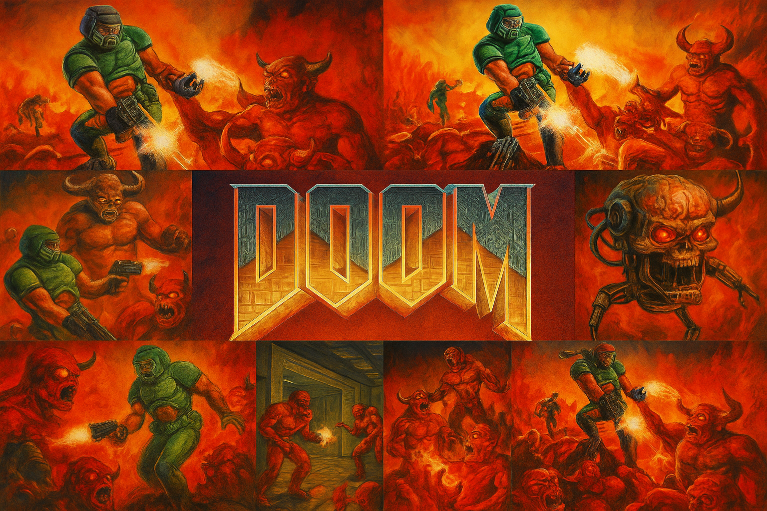
Creative toolbox · take this style further
Choose an input and a destination. Search sends your words to the chosen site; Copy & open puts them on your clipboard to paste there.
Create with AI
Turn your chosen input into an image prompt or a new creative direction.
ChatGPT
Copy your input and paste it into a ChatGPT conversation or image request.
Copy & open ChatGPT (new tab)Claude · Anthropic
Develop an image prompt or explore the style in a new Claude conversation.
Copy & open Claude · Anthropic (new tab)Midjourney
Paste your input into the Imagine bar on the Create page.
Copy & open Midjourney (new tab)Adobe Firefly
Copy your input, open Firefly, and paste it into the prompt field.
Copy & open Adobe Firefly (new tab)Leonardo.Ai
Copy your input, open Leonardo, and paste it into the generation field.
Copy & open Leonardo.Ai (new tab)Image search
Find visual references. Short, concrete keywords usually work best.
Lexica
Search AI images and prompts using your selected input.
Search with this input Lexica (new tab)Pexels
Search the photo and video library. Short keywords often work best.
Search with this input Pexels (new tab)Pixabay
Search photos, illustrations and other images.
Search with this input Pixabay (new tab)Unsplash
Search photographs using the style name or your own keywords.
Search with this input Unsplash (new tab)Wikimedia Commons
Search photographs, artworks and historical images. Check each file for its source and reuse terms.
Search with this input Wikimedia Commons (new tab)Art & research
Explore artists, collections and the ideas behind a style.
Wikipedia
Search for background reading. A style may not have its own article.
Search with this input Wikipedia (new tab)WikiArt
Copy your input into WikiArt’s search to explore artists and artworks.
Copy & open WikiArt (new tab)Europeana
Paste your keywords into the search to explore European museum, library and archive collections.
Copy & open Europeana (new tab)Inspiration
Discover portfolios and visual ideas from creative communities.
Instagram hashtags
Search a hashtag made from your input: spaces and punctuation are removed. Instagram may require sign-in.
Search with this input Instagram hashtags (new tab)ArtStation
Paste your input into artwork search for concept art, environments, characters and visual development.
Copy & open ArtStation (new tab)Behance
Paste your input into project search for illustration, design and visual storytelling.
Copy & open Behance (new tab)A closer look
Strong silhouettes, severe architectural routes and contrasts between machinery and hostile organic forms can communicate danger before small details are visible.
Specify which DOOM you mean
The label covers a series with changing technology and art direction. A reference to DOOM (1993) is not a request for the same finish as a later high-detail game. Before using the name in a brief, decide whether the target is early-game graphic economy, painted promotional art or a contemporary imagined environment. Mixing these without explanation produces an ambiguous specification.
Bethesda’s account of the classic games’ widescreen artwork distinguishes the original 4:3 assets from expanded versions by Stephen Browning. Some versions retain the original pixels and extend the sides; others adjust transitions. This is a useful concrete lesson: even an apparently familiar image has a version, format and production context. [1]
Read the space before the spectacle
For an original industrial-horror scene, make the route through the space readable. Use a dominant doorway, a clear ledge or a strong line of machinery to direct attention. Contrast hard manufactured surfaces with an intrusion that follows a different logic—stone, smoke or organic growth. The contrast can carry tension without filling every corner with monsters.
A limited palette helps establish hierarchy. Reserve the strongest warm light or saturated accent for the main destination. Separate foreground obstruction, navigable middle ground and distant threat. A busy wall texture should not compete with the silhouette that the viewer needs to recognize first.
Keep medium and credit clear
The archived AOI images are synthetic interpretations of game-associated motifs, not official screenshots, production assets or newly discovered promotional paintings. Their painted finish should not be offered as proof of what the 1993 game looked like in play. Consult the publisher’s linked material for documented art and its stated use conditions.
For a new image, describe the desired architecture, lighting and surface language. Avoid copied interface elements, fabricated developer credits and claims that a generated scene appears in the game. This workshop studies a visual reference; it does not imply endorsement by the rights holders.
A useful variation
Build the same corridor with three lighting schemes: cold work lights, one red emergency source, and distant warm illumination beyond a blocked opening. Keep the camera and geometry fixed. Compare how light changes the implied route and threat. That controlled variation teaches more than adding more weapons or effects to every version.
A small poetic detour
Original words from the AOI studio.
Poetry
The corridor keeps its angles.
Beyond the door, another law.
One light reaches the grating;
the rest is space we have not crossed.
The prompt workshop
Original creative exercises. These prompts create new illustrations, not documentary evidence.
Industrial threshold
Original industrial-horror environment: a low steel corridor opens onto a vast dark stone chamber, one red warning light near the threshold, strong readable geometry, worn metal and restrained smoke. No characters, logos, interface or copied game level.
Graphic economy
An original early-game-inspired environment study with chunky shapes, limited grey-green and ember palette, clear doorway silhouette and sparse texture. Treat low detail as deliberate design, not a low-resolution photograph.
One light changes the route
A coherent sci-fi maintenance room with pipes, grating and a sealed door, one warm light beyond a narrow opening, cool quiet foreground. Emphasize spatial tension and a readable route; no gore, lettering or franchise logos.
Sources and further exploration
[1] Bethesda / Slayers Club — expanded widescreen art for DOOM (1993) and DOOM II