
Historical painting approach
Divisionism separates colors into distinct marks so that their relationships can contribute to the perceived image. It is closely connected with Neo-Impressionism and has a significant Italian history; it is broader than painting only with uniform dots.
A visual introduction
Seven new AI-generated studies use separated color marks across landscape, work, still life, water and portraiture. They simulate visual principles rather than physical pigment behavior. The earlier illustration is retained.
Select an image for a closer look. Use the thumbnails, arrow keys or a swipe to compare examples. Zoom in to inspect details, or share the image that inspires you.

Creative toolbox · take this style further
Choose an input and a destination. Search sends your words to the chosen site; Copy & open puts them on your clipboard to paste there.
Create with AI
Turn your chosen input into an image prompt or a new creative direction.
ChatGPT
Copy your input and paste it into a ChatGPT conversation or image request.
Copy & open ChatGPT (new tab)Claude · Anthropic
Develop an image prompt or explore the style in a new Claude conversation.
Copy & open Claude · Anthropic (new tab)Midjourney
Paste your input into the Imagine bar on the Create page.
Copy & open Midjourney (new tab)Adobe Firefly
Copy your input, open Firefly, and paste it into the prompt field.
Copy & open Adobe Firefly (new tab)Leonardo.Ai
Copy your input, open Leonardo, and paste it into the generation field.
Copy & open Leonardo.Ai (new tab)Image search
Find visual references. Short, concrete keywords usually work best.
Lexica
Search AI images and prompts using your selected input.
Search with this input Lexica (new tab)Pexels
Search the photo and video library. Short keywords often work best.
Search with this input Pexels (new tab)Pixabay
Search photos, illustrations and other images.
Search with this input Pixabay (new tab)Unsplash
Search photographs using the style name or your own keywords.
Search with this input Unsplash (new tab)Wikimedia Commons
Search photographs, artworks and historical images. Check each file for its source and reuse terms.
Search with this input Wikimedia Commons (new tab)Art & research
Explore artists, collections and the ideas behind a style.
Wikipedia
Search for background reading. A style may not have its own article.
Search with this input Wikipedia (new tab)WikiArt
Copy your input into WikiArt’s search to explore artists and artworks.
Copy & open WikiArt (new tab)Europeana
Paste your keywords into the search to explore European museum, library and archive collections.
Copy & open Europeana (new tab)Inspiration
Discover portfolios and visual ideas from creative communities.
Instagram hashtags
Search a hashtag made from your input: spaces and punctuation are removed. Instagram may require sign-in.
Search with this input Instagram hashtags (new tab)ArtStation
Paste your input into artwork search for concept art, environments, characters and visual development.
Copy & open ArtStation (new tab)Behance
Paste your input into project search for illustration, design and visual storytelling.
Copy & open Behance (new tab)A closer look
Threads, strokes or small patches retain their identity at close range while forming larger light, color and shape relationships from farther away.
Separation is the central decision
The Getty vocabulary distinguishes Divisionism's separated color from the narrower association of Pointillism with dots and short marks. The National Gallery's account of Italian Divisionism describes painters using threads of unmixed color and investigating the appearance of light.
These historical ambitions should not be turned into a promise that any two painted colors will mix optically into a predictable third. Pigments, spacing, contrast, lighting and viewing distance all affect what a viewer sees.
Establish the image before dividing the marks
Begin with a readable arrangement of light and dark masses. Then decide how separate colors will contribute within each area. A well-placed group of marks can describe a plane; a uniform scatter across the entire surface may weaken the underlying forms.
Try a small study with only a few color families. Keep their value roles distinct enough to preserve the subject at a distance. The aim is an active relationship among marks, not merely a textured overlay on a finished image.
Mark direction can carry structure
Short vertical strokes, longer curved threads and compact patches create different rhythms. Let them respond to the subject: a broad sky, a turning body and a reflective surface need not share the same mark pattern.
Check the work both close up and from the intended viewing distance. If the composition becomes unreadable, adjust the larger relationships rather than automatically adding more marks. If all colors merge into a dull area, reconsider spacing and the balance of neighboring values.
Technique can serve more than light effects
The National Gallery's Italian exhibition connects Divisionist practice with social and political concerns as well as visual experimentation. The technique is not restricted to sunny leisure scenes or decorative sparkle.
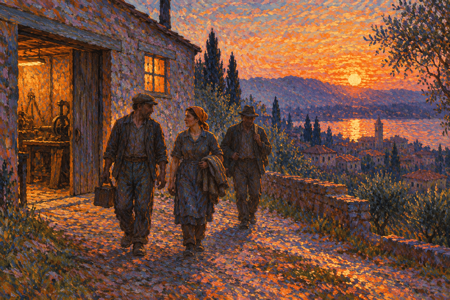
Choose an original subject whose structure benefits from divided color: workers moving through evening light, a garden in broken shade or a crowded interior. Explain how the marks support that particular scene. A digital interpretation can explore the principle while remaining clearly distinct from a physical painting and its pigments.
French and Italian contexts
The Courtauld explains that Seurat preferred terms emphasizing divided color and light over the simple description of dots. His work with Paul Signac belongs to the development of Neo-Impressionism. Pointillism describes a recognizable way of applying marks, while Divisionism directs attention toward the separation and relationship of color. The terms overlap, but they do not answer exactly the same question.
The National Gallery’s Radical Light exhibition emphasized the distinctive development of Italian Divisionism, including Giovanni Segantini, Gaetano Previati and Vittore Grubicy de Dragon. Its account connects varied dots and strokes with optical research, Symbolism and social concerns, and traces relationships with emerging Futurism. This history makes the subject broader than a formula for bright leisure landscapes.
What separated color can do
A shadow does not have to be a single dark mixture. It can be constructed from neighboring blue, violet and green marks whose combined value remains lower than the lit area. A warm surface can include cooler interruptions that keep it active. The key is the relationship among marks, not an assumption that saturation must be high everywhere.
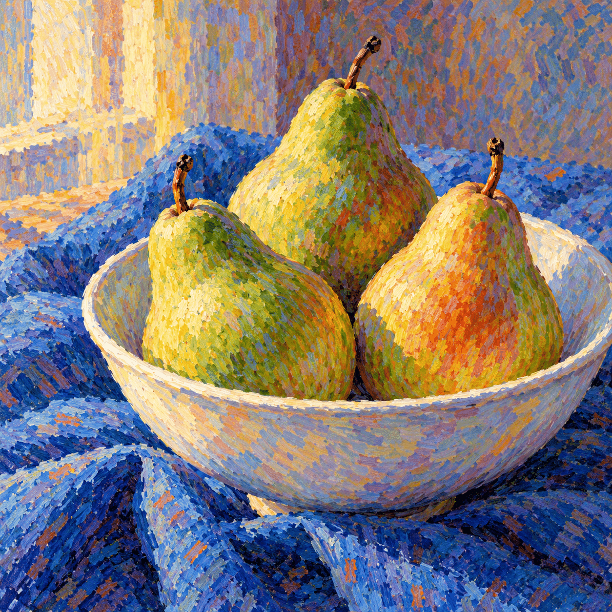
Keep three questions separate: how light or dark the area is, how warm or cool its colors are, and how the marks move across it. If all three change randomly, the surface can become noisy. If they support one another, a rounded pear or a receding path can remain clear while its color stays visibly divided.
Spacing and direction are compositional tools
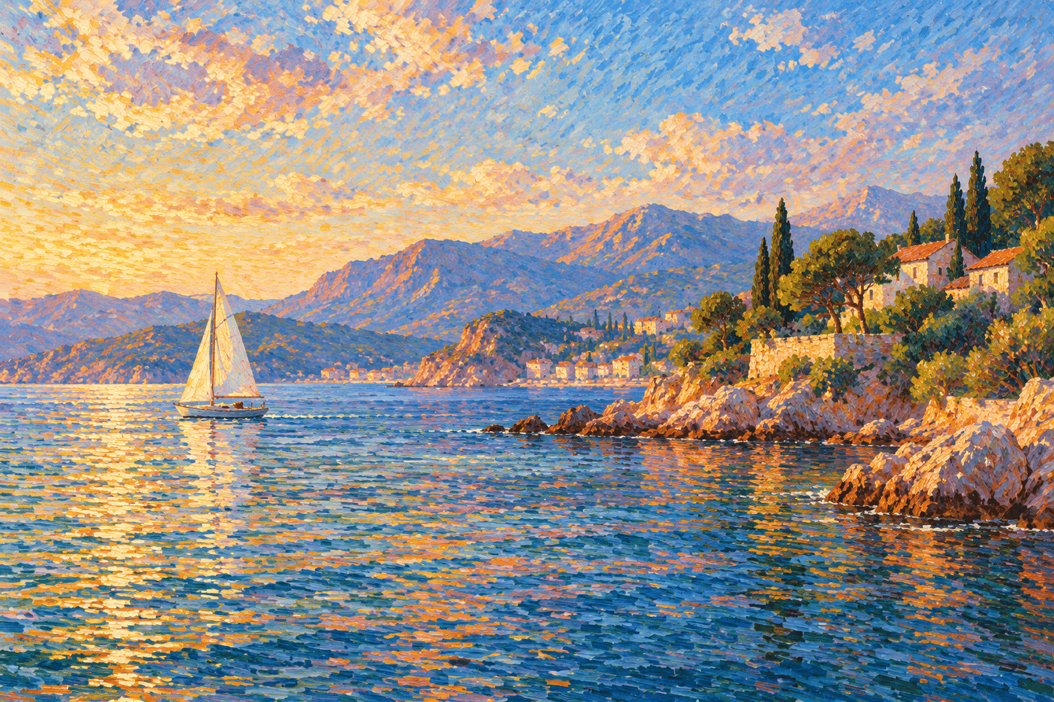
Longer marks can follow the turn of a form; small compact touches can hold a distant mass together. Horizontal strokes can quiet water, while a curved rhythm can carry foliage or fabric. A consistent mark size is one option, not a requirement. Choose the scale in relation to the intended viewing distance and the size of the image.
Leave room for larger areas of relative calm. Even a densely worked surface benefits from differences in contrast and mark density. A pale sky may contain many strokes without competing with the foreground if their values remain close. A small high-contrast group can then establish the focal point. This is a useful way to control attention without abandoning the divided surface.
The new gallery: beyond a dot effect
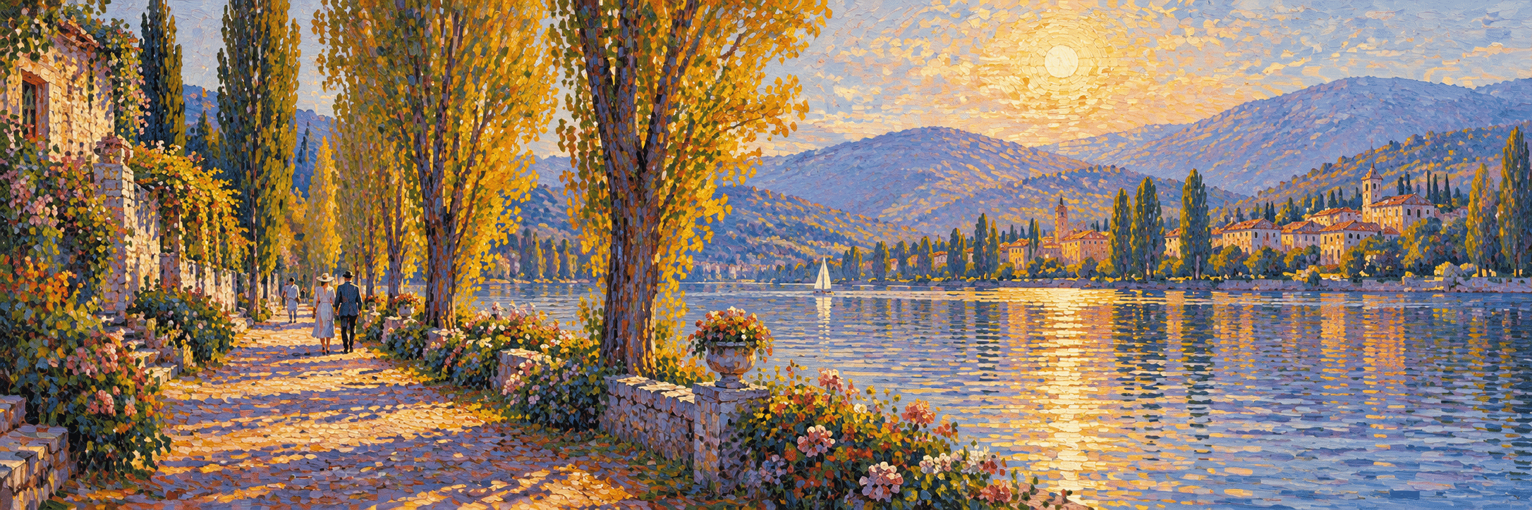
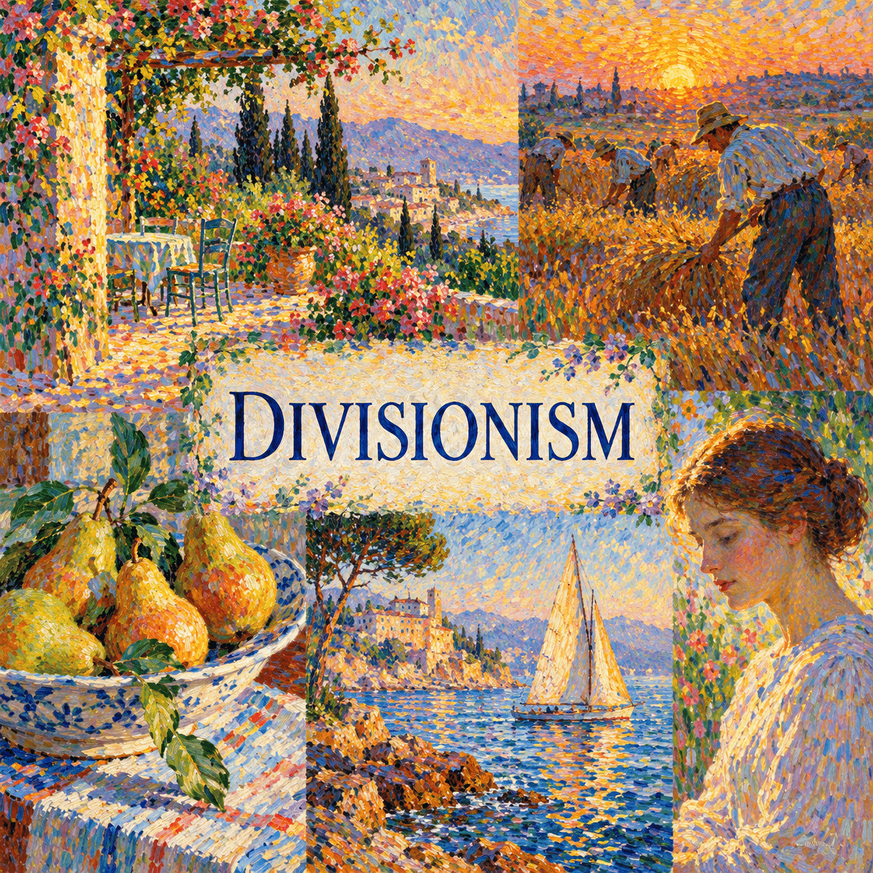
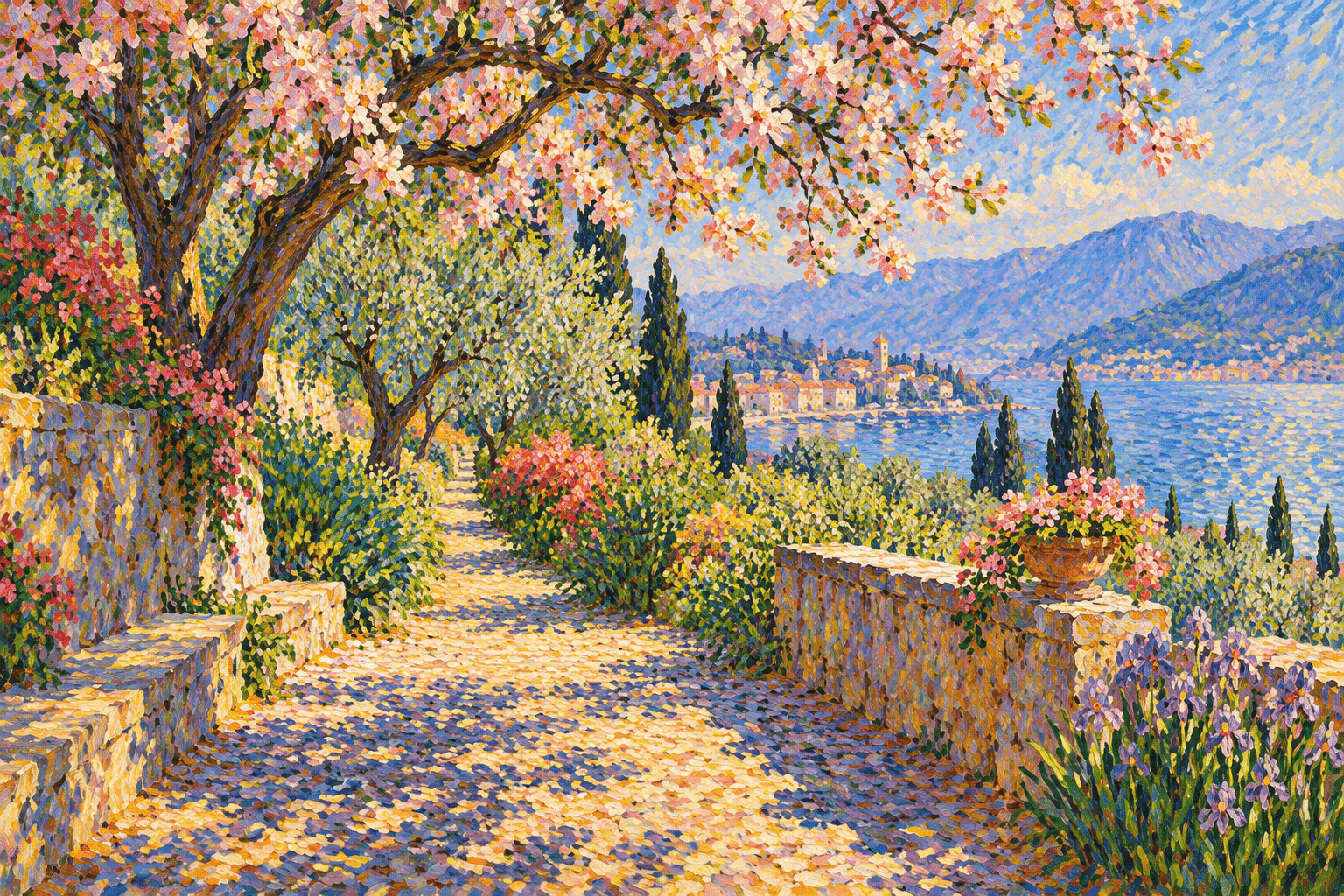
The riverside banner uses warm foliage against cool water, and the titled collage introduces several subject types. The garden example makes broken shade the main event. The worker scene shifts to an everyday social subject at dusk, where silhouettes need to remain readable despite the active surface. The bowl of pears asks the marks to describe volume rather than scenery.
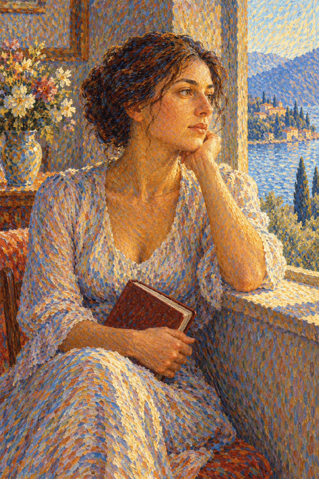
The sailboat study separates the rhythms of water, shore and sail. The portrait brings the same question into skin, clothing and a quieter human presence. All seven new images are AI-generated interpretations; their apparent paint texture is synthetic, and they do not demonstrate physical pigment behavior. The earlier illustration remains available for comparison.
Some of these studies favor compact patches more than fine threads. That variation is useful for discussing the range of divided marks, but the gallery is not a complete survey of the historical movement. Museum works remain the reference for particular artists, materials and working methods.
A practical comparison exercise
Make a small still life with three clear value groups. In one version, blend neighboring colors into continuous surfaces; in another, keep selected warm and cool marks separate. Compare the images from close range and at a smaller display size. Ask where the divided version increases energy and where it weakens the form.
For prompts, describe the subject’s structure first, then the color relationships and mark direction. Separate violet and amber strokes supporting a dusk silhouette is more specific than colorful pointillist masterpiece. Use a limited number of color families at first. Revise a confused area by changing its larger value relationship before adding more detail.
Positive editorial assessment — AI-authored
Divisionism makes color relationships active at the level of the mark while retaining a larger image. The new still life and water studies are useful because they show how directional strokes can support volume and space. Including workers and a portrait also helps resist the assumption that the technique belongs only to decorative landscapes.
Critical editorial assessment — AI-authored
A divided surface can become a uniform texture that overwhelms its subject. The new garden imagery is highly saturated and risks turning light into decorative sparkle. More restrained studies would further clarify the role of value and spacing. Digital simulations also cannot verify historical claims about optical mixing or reproduce the material interaction of actual pigments.
Neutral editorial assessment — AI-authored
Divisionism encompasses related approaches to separated color, with important French and Italian contexts. Dots, threads and patches can all participate. Evaluate a study through its larger forms, neighboring values, mark rhythm and viewing distance rather than through the presence of dots alone. The gallery illustrates those decisions without claiming historical authorship.
A small poetic detour
Original words from the AOI studio.
Poetry
Neighbors in the Light
A thread of blue beside the gold
refuses to become the same;
together they describe the sun
without surrendering a name.
Step close: the river comes apart.
Step back: its waters find their way.
The separate marks keep company
and make a larger kind of day.
The prompt workshop
Original creative exercises. These prompts create new illustrations, not documentary evidence.
Broken shade
Original painted garden study built from separate warm and cool marks, a clear underlying value structure and varied mark direction, no uniform dot filter.
Evening work
Original Divisionism-inspired scene of workers leaving a workshop at dusk, threads of color supporting bodies and light, readable silhouettes from a distance.
Two viewing distances
Original still life designed to show distinct color strokes up close and coherent rounded forms from farther away, controlled spacing and a limited palette.
People & works to explore
Speculative or unverified references from the database. Check the names, dates and associations before treating them as facts.
Artists and practitioners
Georges Seurat
Paul Signac
Giovanni Segantini
Gaetano Previati
Vittore Grubicy de Dragon
A smile from the studio
Jokes
The colors agreed to work together, provided nobody made them share a palette puddle.