
Contemporary digital painting approach
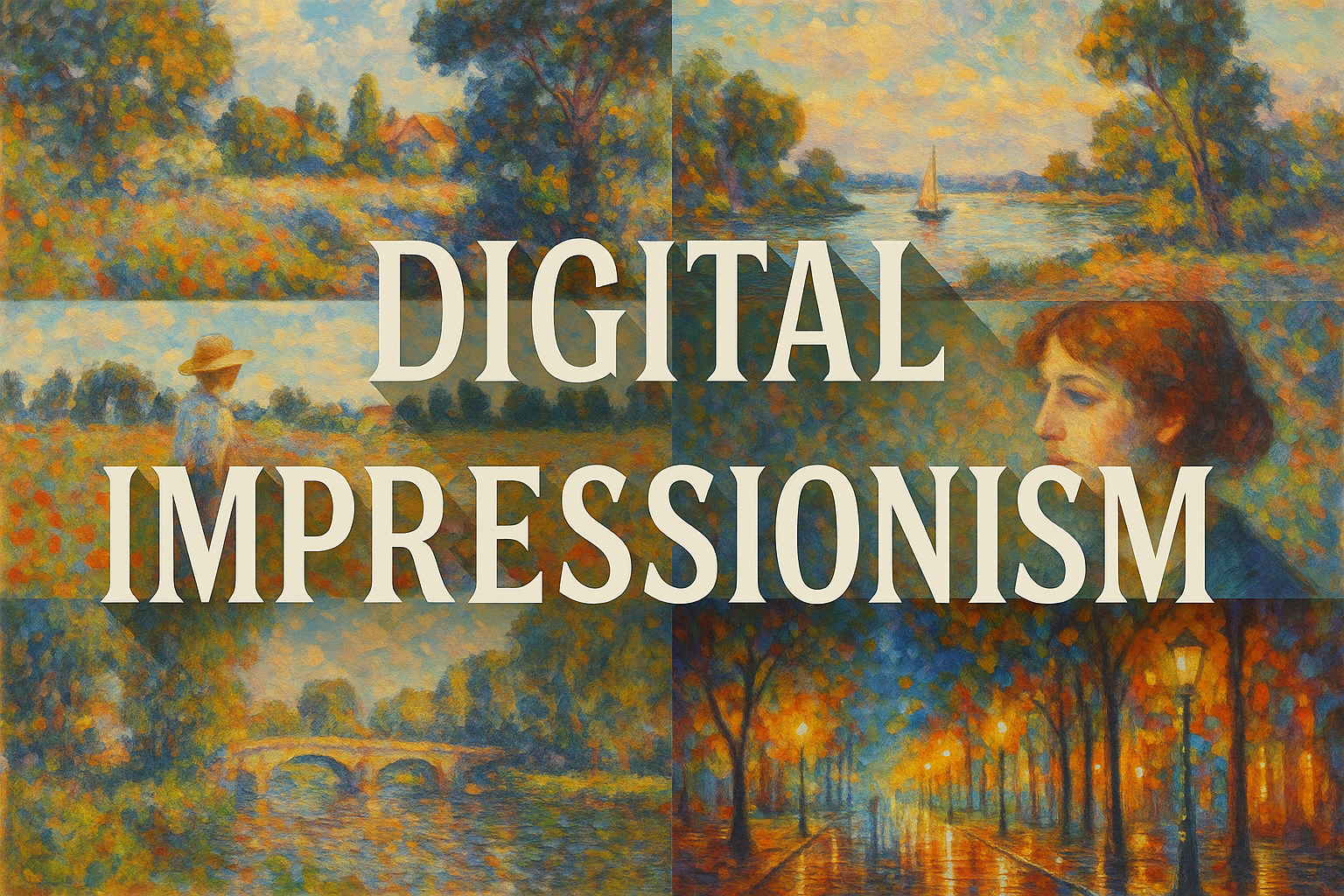
Digital Impressionism is a useful descriptive term for digital images that emphasise changing light, colour relationships and visible marks rather than uniform photographic detail. It is not a single formally bounded movement with one founder or manifesto. The connection to historical Impressionism is an artistic reference; the digital tools and working methods belong to a different material context.
A visual introduction
Select an image for a closer look. Use the thumbnails, arrow keys or a swipe to compare examples. Zoom in to inspect details, or share the image that inspires you.
Creative toolbox · take this style further
Choose an input and a destination. Search sends your words to the chosen site; Copy & open puts them on your clipboard to paste there.
Create with AI
Turn your chosen input into an image prompt or a new creative direction.
ChatGPT
Copy your input and paste it into a ChatGPT conversation or image request.
Copy & open ChatGPT (new tab)Claude · Anthropic
Develop an image prompt or explore the style in a new Claude conversation.
Copy & open Claude · Anthropic (new tab)Midjourney
Paste your input into the Imagine bar on the Create page.
Copy & open Midjourney (new tab)Adobe Firefly
Copy your input, open Firefly, and paste it into the prompt field.
Copy & open Adobe Firefly (new tab)Leonardo.Ai
Copy your input, open Leonardo, and paste it into the generation field.
Copy & open Leonardo.Ai (new tab)Image search
Find visual references. Short, concrete keywords usually work best.
Lexica
Search AI images and prompts using your selected input.
Search with this input Lexica (new tab)Pexels
Search the photo and video library. Short keywords often work best.
Search with this input Pexels (new tab)Pixabay
Search photos, illustrations and other images.
Search with this input Pixabay (new tab)Unsplash
Search photographs using the style name or your own keywords.
Search with this input Unsplash (new tab)Wikimedia Commons
Search photographs, artworks and historical images. Check each file for its source and reuse terms.
Search with this input Wikimedia Commons (new tab)Art & research
Explore artists, collections and the ideas behind a style.
Wikipedia
Search for background reading. A style may not have its own article.
Search with this input Wikipedia (new tab)WikiArt
Copy your input into WikiArt’s search to explore artists and artworks.
Copy & open WikiArt (new tab)Europeana
Paste your keywords into the search to explore European museum, library and archive collections.
Copy & open Europeana (new tab)Inspiration
Discover portfolios and visual ideas from creative communities.
Instagram hashtags
Search a hashtag made from your input: spaces and punctuation are removed. Instagram may require sign-in.
Search with this input Instagram hashtags (new tab)ArtStation
Paste your input into artwork search for concept art, environments, characters and visual development.
Copy & open ArtStation (new tab)Behance
Paste your input into project search for illustration, design and visual storytelling.
Copy & open Behance (new tab)A closer look
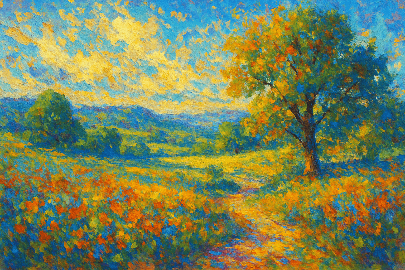
Broken colour, selective edges and grouped marks suggest a scene without describing every object equally. A clear value structure supports the looseness, while brush scale and colour temperature direct attention.
What the historical reference contributes
Historical Impressionism developed in nineteenth-century France through artists with distinct practices and shared exhibition histories. The National Gallery's account connects its broken brushwork with the depiction of fleeting light and modern subjects. That context is a starting point, not evidence that a modern software effect belongs to the historical group. [1]
The transferable question is how much a mark needs to describe. A few separate notes of colour can suggest a reflected window or a sunlit sleeve without outlining every edge. The viewer completes the relationship when the marks are organised convincingly.
Paint the light pattern first
Block the largest light and dark masses before choosing a textured brush. Decide where the scene's strongest contrast belongs. A loose painting still needs an intelligible arrangement; scattering attractive strokes over an unresolved composition does not create spontaneity.
Keep local colour responsive to illumination. A pale wall in cool shade need not use the same mixture as the same wall in warm light. Compare neighbouring areas rather than assigning each object one fixed colour. A small warm accent can appear luminous against a quieter cool field without excessive saturation.
Make the digital brush do a specific job
Vary mark size according to scale and attention. Broad strokes can establish a distant mass, while a few smaller accents define the focal area. Repeating the same brush stamp at the same size across the canvas produces a pattern that may have little relationship to the scene.
Use layers and undo as opportunities to compare decisions, not reasons to polish every passage equally. Save a simplified state before adding detail. If the later version loses the large light pattern, return to that structure and retain only the marks that clarify it.
Edges, texture and restraint
Some boundaries can remain sharp while others dissolve into similar values. Choose edges according to the form, the light and the intended focus. Uniform blur removes information indiscriminately; selective edge control decides where information matters.
Texture should support the marks rather than sit as a blanket over them. Inspect the image at its intended size. A convincing painted effect at high zoom can become noisy when reduced, while subtle colour relationships may disappear on a small display.
Different digital processes need different descriptions
A hand-painted tablet image, a photograph transformed through software and a generative image are different processes. All can explore loose colour relationships, but their provenance should remain clear. Do not describe a generated brush texture as physical paint or imply that a filter performed direct observation.
For a useful exercise, study the same ordinary scene under two lighting conditions. Keep the arrangement stable and change the colour relationships and edge emphasis. The result should explain a change in perception, not merely apply a different preset.
A small poetic detour
Original words from the AOI studio.
Poetry
Pixels bloom and fade,
Canvas of light, breath it takes,
Eternal moments.
The prompt workshop
Original creative exercises. These prompts create new illustrations, not documentary evidence.
Light across a table
Create an original digital painting of a breakfast table beside a window. Broad light and shadow masses, broken warm-cool colour, visible varied brush marks and only a few sharp focal edges. Avoid uniform blur and repeated brush stamps.
Two weather conditions
Create two original digital studies of the same canal-side path under overcast light and late afternoon sun. Identical viewpoint and objects, deliberately different colour relationships and edge emphasis, painterly marks that preserve structure.
Reduce the information
Paint an original urban corner using a limited palette and no more than three broad value groups. Let small colour accents suggest pedestrians and reflections without outlining every detail; keep one clear focal area.