Original AOI concept · contour-led manga illustration
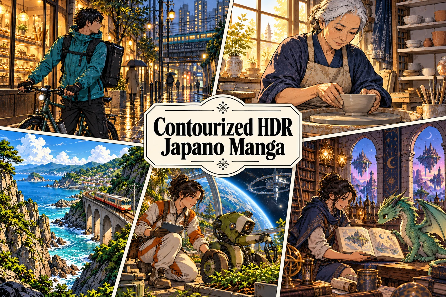
Contourized HDR Japano Manga is an original Art of AI concept for colour illustration: assertive ink contours, manga-inspired staging and luminous contrasts held inside a readable composition. A face, railway, orbital greenhouse or dragon’s library can share this visual grammar. The subject changes; the relationship between line, light and attention remains the organising idea.
An original AOI creative concept, not an established historical movement.
A visual introduction
Select an image for a closer look. Use Previous, Next or the arrow keys to compare all seven images; press Escape to close the gallery.

Creative toolbox · take this style further
Choose an input and a destination. Search sends your words to the chosen site; Copy & open puts them on your clipboard to paste there.
More tools
Additional destinations selected for this article.
ChatGPT
Copy your input and paste it into a ChatGPT conversation or image request.
Copy & open ChatGPT (new tab)Claude · Anthropic
Develop an image prompt or explore the style in a new Claude conversation.
Copy & open Claude · Anthropic (new tab)Midjourney
Paste your input into the Imagine bar on the Create page.
Copy & open Midjourney (new tab)Adobe Firefly
Copy your input, open Firefly, and paste it into the prompt field.
Copy & open Adobe Firefly (new tab)Leonardo.Ai
Copy your input, open Leonardo, and paste it into the generation field.
Copy & open Leonardo.Ai (new tab)Lexica
Search AI images and prompts using your selected input.
Search with this input Lexica (new tab)Pexels
Search the photo and video library. Short keywords often work best.
Search with this input Pexels (new tab)Pixabay
Search photos, illustrations and other images.
Search with this input Pixabay (new tab)Unsplash
Search photographs using the style name or your own keywords.
Search with this input Unsplash (new tab)Wikipedia
Search for background reading. A style may not have its own article.
Search with this input Wikipedia (new tab)WikiArt
Copy your input into WikiArt’s search to explore artists and artworks.
Copy & open WikiArt (new tab)Instagram hashtags
Search a hashtag made from your input: spaces and punctuation are removed. Instagram may require sign-in.
Search with this input Instagram hashtags (new tab)A closer look
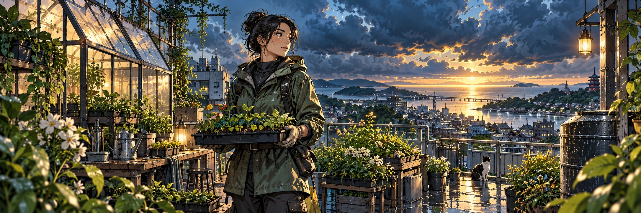
The Weather Keeper places a botanist and seedling tray against a clearing coastal storm. Dark clothing and greenhouse frames establish the drawing; the narrow bright horizon and reflected window light supply the radiance. The five additional studies test the same approach through a courier, a ceramic artist, a coastal train, an orbital garden and a fantasy library. All are original AI-generated illustrations.
A new name for a deliberate combination
This entry introduces an AOI creative brief, not an established Japanese art movement. It has no invented founding school, historical manifesto or list of famous practitioners. “Japano” is part of the requested name and signals a Japanese-inspired direction here; it should never stand in for the variety of Japanese visual cultures.
Manga is also much larger than a particular face shape or a neon city. The British Museum describes it as visual narrative with a broad range of subjects. That is the useful connection for this experiment: a picture should make an action, relationship or change of attention intelligible. A quiet craft scene can carry that principle as well as an extraordinary adventure. [1]
The sources below explain component ideas. They do not document or endorse this newly coined style. Its particular rules, examples and exercises are AOI’s proposal, open to further development.
Let the contour do a job
A contour should tell us where a form turns, what overlaps what, or which object deserves attention. Use heavier outer lines around the nearest significant silhouette, lighter internal marks for material and anatomy, and finer edges as the scene recedes. Uniformly thick outlines flatten every distance; equally intricate detail gives the eye nowhere to rest.
“Contourized” allows a second, selective layer: nested bands that follow a sleeve, curved vessel, rock stratum or mechanical casing. Think of a few topographic lines describing volume. They need a reason and a direction. An automatic-looking fringe around every object becomes noise, particularly after the image is reduced to a phone screen.
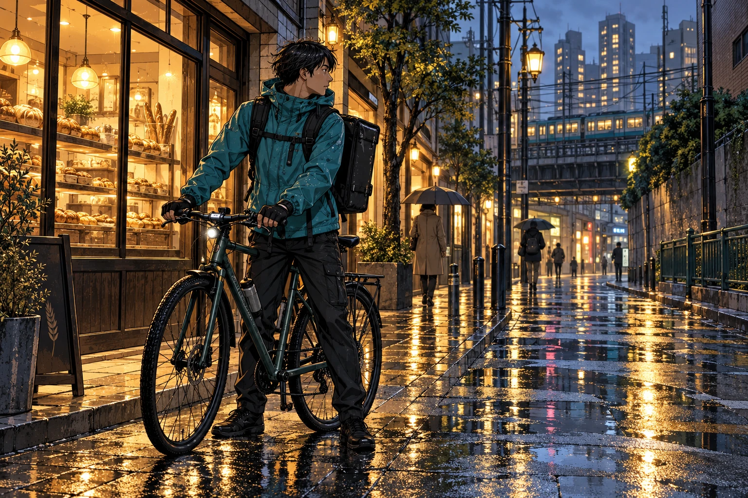
In the courier study, the dark rider and bicycle read against an illuminated shop. The street then opens into cooler distance. The drawing supplies the structure before the reflections supply spectacle. That order matters: if the wet pavement becomes brighter and sharper everywhere, the delivery disappears inside its own scenery.
Use an HDR-like appearance with precision
Here “HDR” describes the desired appearance of light: retained shadow information, separated colour planes and a few brilliant accents. The web images are ordinary SDR WebP illustrations, not technical HDR deliverables. Adobe’s explanation distinguishes genuine HDR display headroom from the tone-mapped appearance of an image on a standard display. A dramatic illustration alone does not establish an HDR workflow. [2]
Build three large value groups first: a substantial dark region, a quieter middle range and a small area of high brightness. Put the sharpest contrast where the story needs it. A warm lantern can command attention without turning the surrounding stone into black paste; a bright planet can remain subordinate to the engineer standing before it.
Avoid treating saturation, sharpness and bloom as one master switch. Metal may receive a narrow hard highlight, foliage a softer reflected colour, and a face a restrained transition. Different materials need different light. The image gains depth from those distinctions, not from making every surface glitter.
Five examples, five different problems
Last Delivery After the Rain tests a figure within architecture. Follow the courier’s glance across the street, then compare the crisp foreground contour with the smaller marks in the distance. The pause gives the scene its subject; the rain establishes the conditions around it.
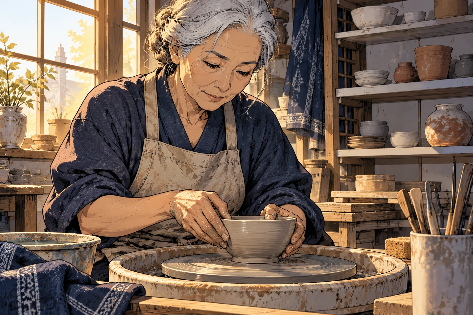
Clay, Hands, Morning tests intimacy. The artist, hands and bowl form a compact triangle of attention. Clay colours and window light offer an alternative to nocturnal cyan and amber. Judge the contact between fingers and vessel closely: attractive lighting cannot repair an action that makes no physical sense.
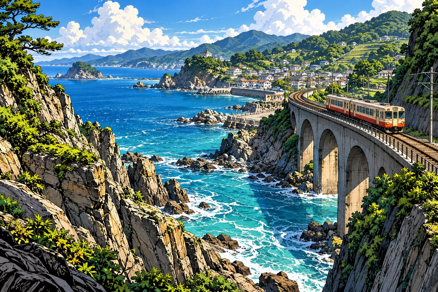
Where the Railway Meets the Sea tests depth at landscape scale. A curved bridge leads the eye through cliffs and open water. The train needs enough separation to remain visible without becoming the largest or brightest shape. Background linework should recede with the land.
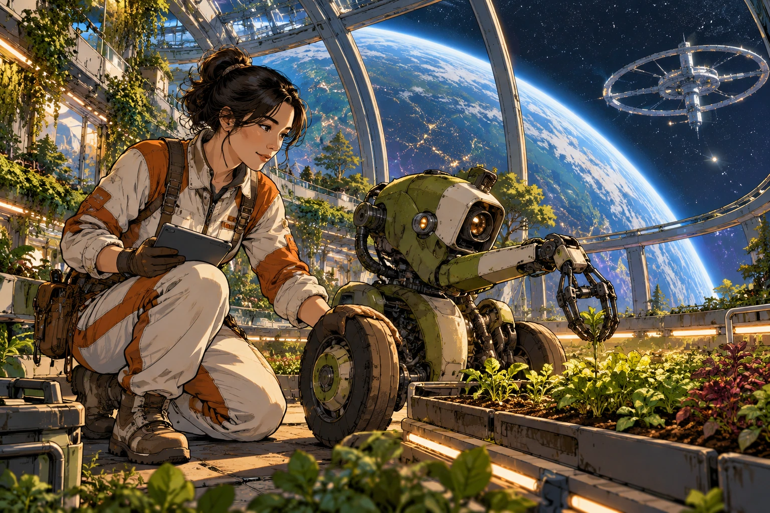
The Orbital Garden makes the science-fiction setting explicit. Structural ribs and the planet beyond establish scale; the engineer, gardening robot and seedlings establish a task. The machinery should have connected parts and comprehensible contact with the floor. Science fiction becomes more convincing when its inhabitants have something particular to do.
The Dragon Who Kept the Library carries the method into fantasy. The offered book links librarian and creature, while lanterns and the distant sky divide warm and cool space. The dragon’s silhouette needs to distinguish wings, limbs and tail. Magic broadens the imagined world; it does not remove the need for readable visual relationships.
Build a scene that survives a smaller screen
Start with a single sentence describing the action: an engineer checks a seedling tray while a robot holds it steady. Make a small composition with three value masses. Choose the principal silhouette and a route through the scene before specifying decorative details. If you cannot identify the action at thumbnail size, simplify the staging.
Then assign a line hierarchy and one dominant light situation. Describe the material differences that matter. Add the optional contour bands only where they clarify a turn of form. Leave some surfaces quiet. In a generated image, phrases such as “intricate everywhere” work against the hierarchy you have just designed.
Review the result at full size for malformed fingers, disconnected mechanisms, uncertain weight-bearing and doubled edges. Review it again at mobile size for crowded silhouettes and vanishing focal points. A visibly pleasing illustration can still contain errors; keep the useful result and revise the specific defect rather than hiding it beneath more effects.
For text in a finished project, set and proofread real lettering separately. Do not let decorative pseudo-Japanese signs become the shorthand for a whole country. Original characters, specific activities and thoughtfully observed settings give the image more identity than a layer of arbitrary symbols.
Keep the grammar, change the world
A useful comparison keeps the composition constant while changing the genre. Place a contemporary ceramic workshop, an orbital repair bay and a dragon’s study around the same triangle of figure, hands and object. Keep the line hierarchy and the amount of bright light similar. Compare which choices belong to the visual style and which merely announce the setting.
This approach suits illustrated fiction, editorial art, worldbuilding and character environments. For a longer sequence, record recurring character features, palette, light direction and contour thickness; a name alone will not make separate generations consistent. The supplied prompts are starting points, not guarantees.
My test is simple: after the glow has caught your eye, does the drawing still have something to say? Let the fantastic arrival be spectacular. Let the hand holding the book remain worth looking at.
A small poetic detour
Original words from the AOI studio.
Poetry
Every edge insists.
The light leaves room for doubt.
A dragon turns the page.
The prompt workshop
Original creative exercises. These prompts create new illustrations, not documentary evidence.
Begin with one meaningful action
Original Contourized HDR Japano Manga illustration of an adult ceramic artist shaping a bowl in a modest workshop; variable-weight ink contours, fine interior lines, selective contour bands following the clay, controlled cel-shaded planes, warm window light and readable cool shadows; clear hands-to-bowl contact, quiet background, no lettering.
Original AOI creative exercise; results depend on the image tool and need visual review.
Take the grammar into science fiction
An original orbital greenhouse above a blue crescent planet, an engineer checks seedlings beside a compact gardening robot; manga-inspired narrative staging, strong framing contours, finer distant structures, connected mechanical joints, restrained copper highlights in cobalt shadows; small bright accents, no franchise characters, no logos or text.
Original AOI creative exercise; results depend on the image tool and need visual review.
Test a fantasy variation
An adult librarian offers a book to a small original dragon in a tower library; retain a clear triangle between face, hands and book, heavy outer silhouettes and delicate internal ink, contour bands following stone and scales, violet shadows and a few amber lanterns; readable wings and limbs, no existing franchise imagery, no readable text.
Original AOI creative exercise; results depend on the image tool and need visual review.
People & works to explore
Creative worldbuilding: these names and works may be invented. They are not historical attributions.
Artists and practitioners
Art of AI — original concept developed in 2026; editorial guide by Penny Wraiter
Paintings and other works
The Weather Keeper — original AI-generated AOI study, 2026
Last Delivery After the Rain — original AI-generated AOI study, 2026
Clay, Hands, Morning — original AI-generated AOI study, 2026
Where the Railway Meets the Sea — original AI-generated AOI study, 2026
The Orbital Garden — original AI-generated AOI study, 2026
The Dragon Who Kept the Library — original AI-generated AOI study, 2026