
Colour-led composition strategy
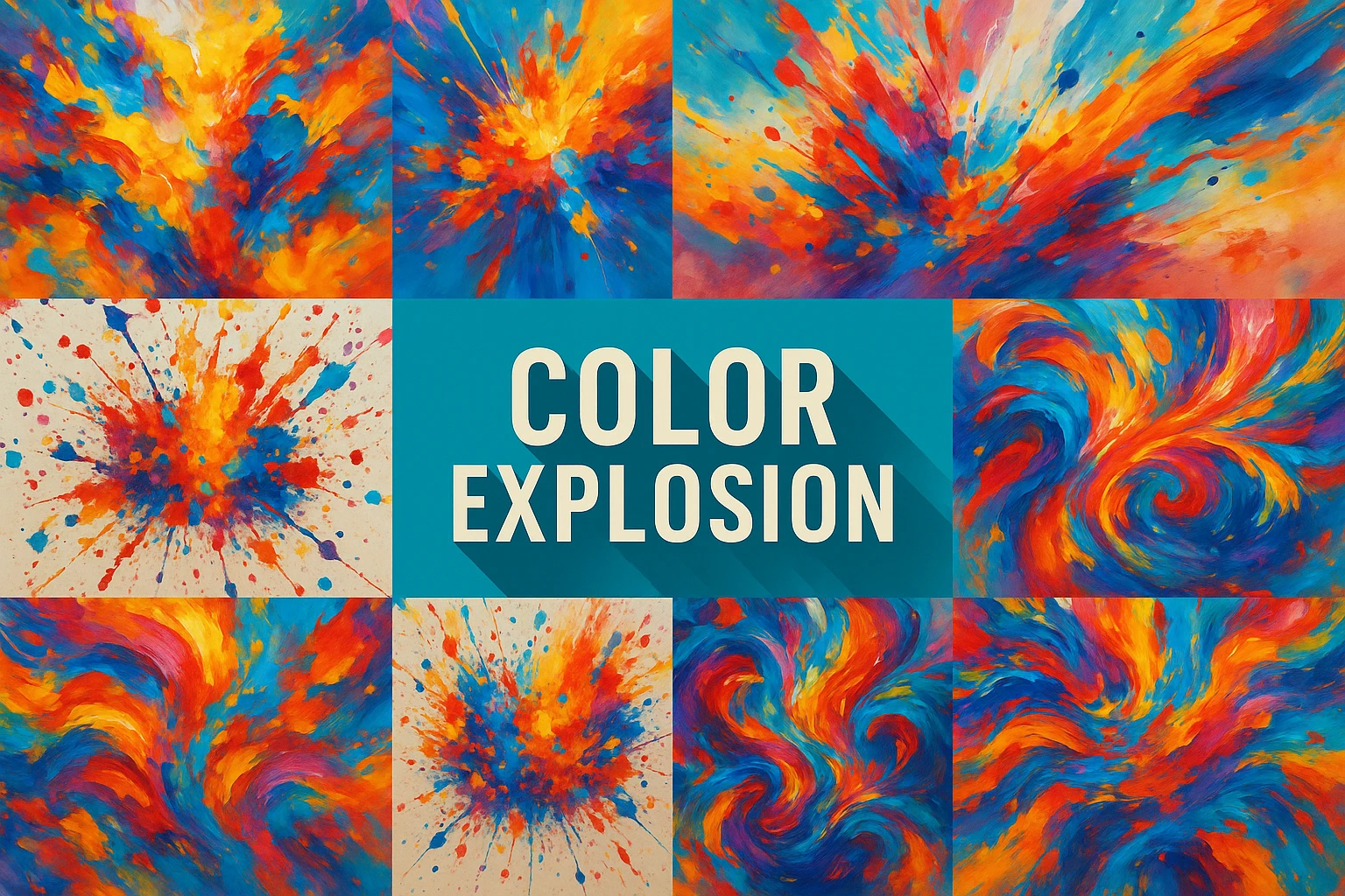
Color Explosion describes a compositional effect in which concentrated colour seems to burst, spread or collide. It is a practical visual strategy rather than a single historical movement. The strongest examples organise intensity: a dominant direction, a clear focal region and quieter intervals make the colour feel energetic instead of merely excessive.
A visual introduction
Select an image for a closer look. Use the thumbnails, arrow keys or a swipe to compare examples. Zoom in to inspect details, or share the image that inspires you.
Creative toolbox · take this style further
Choose an input and a destination. Search sends your words to the chosen site; Copy & open puts them on your clipboard to paste there.
Create with AI
Turn your chosen input into an image prompt or a new creative direction.
ChatGPT
Copy your input and paste it into a ChatGPT conversation or image request.
Copy & open ChatGPT (new tab)Claude · Anthropic
Develop an image prompt or explore the style in a new Claude conversation.
Copy & open Claude · Anthropic (new tab)Midjourney
Paste your input into the Imagine bar on the Create page.
Copy & open Midjourney (new tab)Adobe Firefly
Copy your input, open Firefly, and paste it into the prompt field.
Copy & open Adobe Firefly (new tab)Leonardo.Ai
Copy your input, open Leonardo, and paste it into the generation field.
Copy & open Leonardo.Ai (new tab)Image search
Find visual references. Short, concrete keywords usually work best.
Lexica
Search AI images and prompts using your selected input.
Search with this input Lexica (new tab)Pexels
Search the photo and video library. Short keywords often work best.
Search with this input Pexels (new tab)Pixabay
Search photos, illustrations and other images.
Search with this input Pixabay (new tab)Unsplash
Search photographs using the style name or your own keywords.
Search with this input Unsplash (new tab)Wikimedia Commons
Search photographs, artworks and historical images. Check each file for its source and reuse terms.
Search with this input Wikimedia Commons (new tab)Art & research
Explore artists, collections and the ideas behind a style.
Wikipedia
Search for background reading. A style may not have its own article.
Search with this input Wikipedia (new tab)WikiArt
Copy your input into WikiArt’s search to explore artists and artworks.
Copy & open WikiArt (new tab)Europeana
Paste your keywords into the search to explore European museum, library and archive collections.
Copy & open Europeana (new tab)Inspiration
Discover portfolios and visual ideas from creative communities.
Instagram hashtags
Search a hashtag made from your input: spaces and punctuation are removed. Instagram may require sign-in.
Search with this input Instagram hashtags (new tab)ArtStation
Paste your input into artwork search for concept art, environments, characters and visual development.
Copy & open ArtStation (new tab)Behance
Paste your input into project search for illustration, design and visual storytelling.
Copy & open Behance (new tab)A closer look
Watch how saturated accents interact with dark or pale supports, how shapes expand from a focal region, and where the image gives the eye a rest. Colour relationships and spatial rhythm matter more than using every hue.
Energy needs a structure
Choose what the explosion does. It might radiate from one point, sweep diagonally across a frame or break through a restrained surrounding field. Establish that movement with large shapes before adding droplets, fragments or fine texture. A burst without direction often reads as a uniform decorative pattern.
The phrase is used descriptively here. It should not be confused with Fauvism, Abstract Expressionism or another documented movement simply because those subjects can involve strong colour. The National Gallery of Art's collection overview offers useful historical comparisons while keeping their different contexts visible. [1]
Separate hue, value and saturation
Hue identifies a colour family; value concerns relative lightness; saturation concerns intensity. Changing all three everywhere makes it difficult to control attention. Begin with one dominant hue family and one contrasting accent, then use value to keep the main forms readable.
Check a greyscale version. If all the energetic marks collapse into the same middle value, the composition may depend on colour differences that become difficult to read at a distance. Strengthen a few light-dark relationships rather than making every hue brighter.
Make a centre without a bullseye
A focal region can be an irregular cluster, an opening or a transition between opposing colour fields. It need not sit in the exact middle. Use mark size and direction to draw the eye towards it, then allow a secondary route out so the image does not become static.
Keep some edges calmer. Sharp fragments everywhere make every area equally insistent. A soft passage beside a crisp burst can intensify the latter, just as a quiet background can make a small saturated mark feel unexpectedly strong.
Choose a material logic
Liquid splashes, torn-paper fragments and luminous digital streaks imply different behaviour. A splash spreads and leaves droplets; paper retains cut edges; light can overlap without behaving like opaque paint. Choose one dominant material logic, or make the contrast between two materials intentional.
Avoid using surface effects to hide unclear construction. Glitter, smoke and glow can all be useful, but they should reinforce the movement already present in the large shapes. Remove them temporarily and see whether the image still has a direction.
A practical revision method
Make three studies using the same palette: a central burst, an off-centre diagonal and a narrow band crossing a quiet field. Keep total colour coverage roughly comparable. Choose the arrangement that best fits the intended use, whether a poster, an abstract painting or a small preview image.
Then reduce the number of accents by half. If the image becomes stronger, the earlier version had too many competing events. A successful colour explosion gives intensity a destination and a rhythm; restraint is part of its force.
The prompt workshop
Original creative exercises. These prompts create new illustrations, not documentary evidence.
One directed burst
Create an original abstract colour composition with a coral-and-gold burst moving diagonally through a deep blue field. One clear focal region, varied mark sizes and generous quiet space. No lettering, uniform glitter or random multicolour noise.
Paper has edges
Design an original collage of sharply cut coloured paper fragments expanding from an off-centre opening. Limited warm palette against a pale ground, convincing overlap and directional rhythm; preserve the material logic of paper.
Compare three arrangements
Create three original colour studies with the same palette and similar coloured area: central burst, diagonal sweep and narrow horizontal band. Use consistent scale so their different rhythms can be compared.