
Historical photographic process
The calotype is a nineteenth-century paper-negative process associated with William Henry Fox Talbot. Its reproducible negative and the visual influence of paper distinguish it from the unique metal-plate daguerreotype.
A visual introduction
Select an image for a closer look. Use the thumbnails, arrow keys or a swipe to compare examples. Zoom in to inspect details, or share the image that inspires you.


Creative toolbox · take this style further
Choose an input and a destination. Search sends your words to the chosen site; Copy & open puts them on your clipboard to paste there.
Create with AI
Turn your chosen input into an image prompt or a new creative direction.
ChatGPT
Copy your input and paste it into a ChatGPT conversation or image request.
Copy & open ChatGPT (new tab)Claude · Anthropic
Develop an image prompt or explore the style in a new Claude conversation.
Copy & open Claude · Anthropic (new tab)Midjourney
Paste your input into the Imagine bar on the Create page.
Copy & open Midjourney (new tab)Adobe Firefly
Copy your input, open Firefly, and paste it into the prompt field.
Copy & open Adobe Firefly (new tab)Leonardo.Ai
Copy your input, open Leonardo, and paste it into the generation field.
Copy & open Leonardo.Ai (new tab)Image search
Find visual references. Short, concrete keywords usually work best.
Lexica
Search AI images and prompts using your selected input.
Search with this input Lexica (new tab)Pexels
Search the photo and video library. Short keywords often work best.
Search with this input Pexels (new tab)Pixabay
Search photos, illustrations and other images.
Search with this input Pixabay (new tab)Unsplash
Search photographs using the style name or your own keywords.
Search with this input Unsplash (new tab)Wikimedia Commons
Search photographs, artworks and historical images. Check each file for its source and reuse terms.
Search with this input Wikimedia Commons (new tab)Art & research
Explore artists, collections and the ideas behind a style.
Wikipedia
Search for background reading. A style may not have its own article.
Search with this input Wikipedia (new tab)WikiArt
Copy your input into WikiArt’s search to explore artists and artworks.
Copy & open WikiArt (new tab)Europeana
Paste your keywords into the search to explore European museum, library and archive collections.
Copy & open Europeana (new tab)Inspiration
Discover portfolios and visual ideas from creative communities.
Instagram hashtags
Search a hashtag made from your input: spaces and punctuation are removed. Instagram may require sign-in.
Search with this input Instagram hashtags (new tab)ArtStation
Paste your input into artwork search for concept art, environments, characters and visual development.
Copy & open ArtStation (new tab)Behance
Paste your input into project search for illustration, design and visual storytelling.
Copy & open Behance (new tab)A closer look
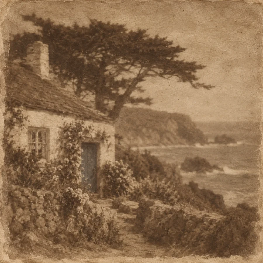
Broad tonal masses, softened fine detail and the visible influence of paper can matter more than a uniformly sharp surface; print color and texture should not be reduced to a generic sepia filter.
Separate the negative from the print
Talbot patented the calotype process in 1841. The Metropolitan Museum describes its importance as a camera negative made on sensitized paper from which multiple positive prints could be produced. The Library of Congress uses “calotype” specifically for the paper negative and distinguishes it from the salted paper print commonly made from that negative.
That distinction helps when reading museum captions. A positive photograph with warm tones is not automatically a calotype, and a modern image with a brown overlay does not reproduce the historical process. Identify the object, support and printing method before making claims about an individual photograph.
Paper participates in the image
The paper negative can soften fine detail and encourage a grouping of light and dark. The Met notes that some photographers continued to favor paper negatives after glass negatives became available, valuing their appearance or practical advantages. The process was not simply an unsuccessful attempt at the sharpness of another medium.
For a visual interpretation, begin with a subject whose large forms remain meaningful when detail is reduced: a courtyard, a quiet portrait or a group of architectural openings. Preserve a few decisive edges and let secondary information recede. Uniform blur usually loses the hierarchy that makes a restrained image compelling.
Compose through masses and intervals
Compare the image at a small size. Does the main light shape lead into the subject, or does an irrelevant bright patch dominate? Look at the spacing between a figure and its background and at the way an opening interrupts a dark wall. These relationships remain readable when minute surface detail becomes less prominent.
Use texture with restraint in a digital study. A repeated grunge pattern placed evenly over everything looks like an applied effect. Consider how the support affects tonal transitions and how the image sits within the paper's margins.
Keep the historical claim honest
An original digitally generated interpretation can explore tonal grouping and paper-like texture without pretending to be an antique photograph. Describe it as a contemporary study. For an actual historical object, consult the collection record rather than guessing its process from color alone.
The useful creative question is what the reduction of detail allows the viewer to notice. Treat the material limitation as a compositional opportunity, not merely a signal that the picture is old.
The prompt workshop
Original creative exercises. These prompts create new illustrations, not documentary evidence.
Courtyard in tonal masses
Contemporary digital interpretation of an early paper-negative photograph: an original quiet courtyard, broad light and shadow masses, restrained fine detail, subtle paper influence, generous margins, no artificial date or archive stamp.
A quiet portrait
Original contemporary portrait study inspired by paper-negative photography, seated adult beside a window, readable silhouette and hands, soft secondary detail, rich but restrained tonal grouping, clearly modern interpretation.
Light through openings
An original cloister-like architectural study with three irregular openings, one dominant light interval, gently softened detail and subtle matte paper texture, monochrome tonal design, no claim of historical provenance.