
AOI experimental visual concept
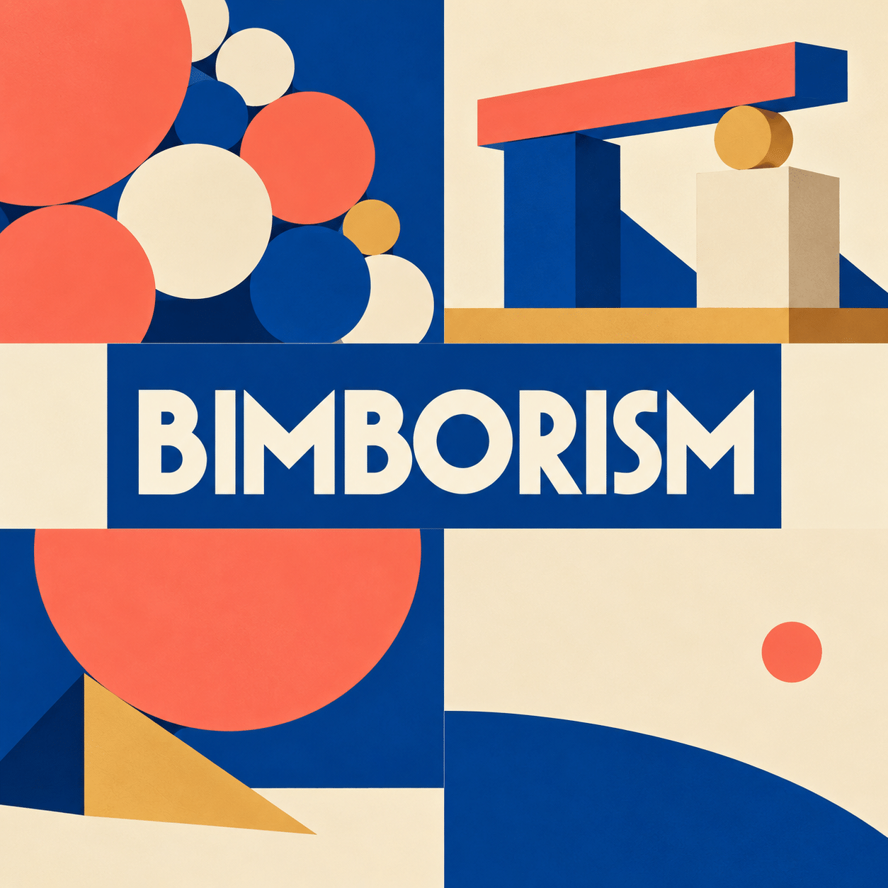
Bimborism is used here for an AOI experimental approach to abstract images built from simple geometric forms that seem to jostle, balance and negotiate space. The proposal gives playful shapes a compositional problem to solve. It is not presented as a documented historical school, and the earlier attribution of the term to eighteenth-century artists is unsupported.
An A⊕I –[-.+] creαt¡ve c⊕ncept, n⊕t αn estαbl¡she∂ h¡st⊕r¡cαl m⊕vement.
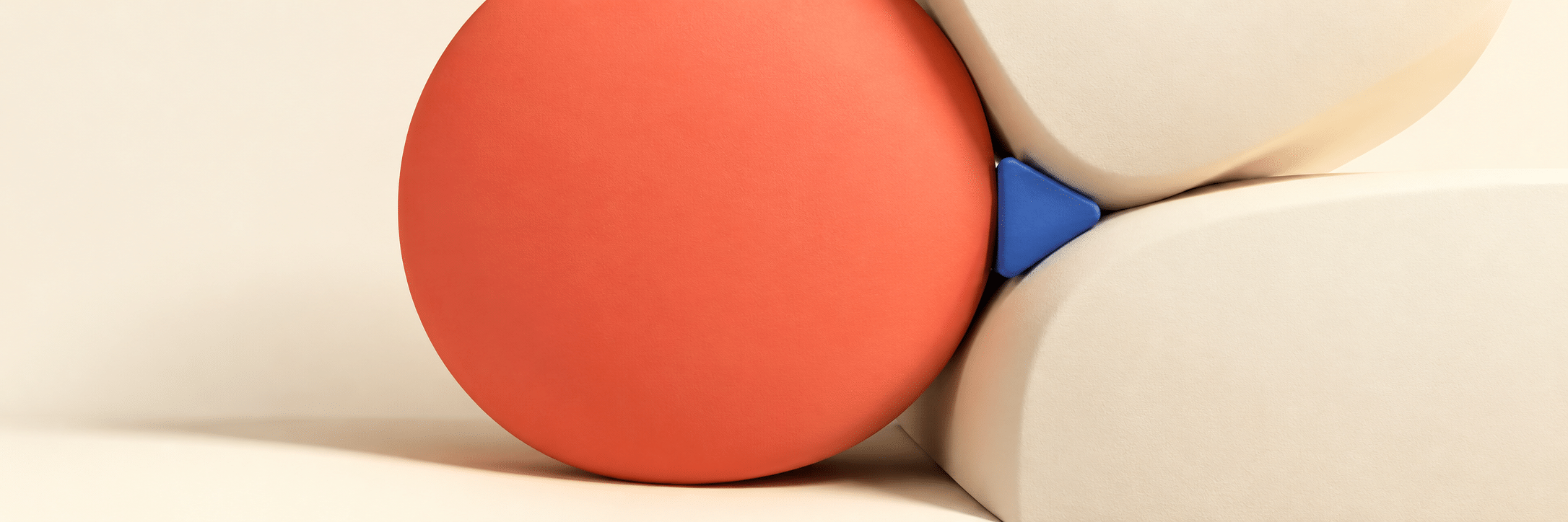
A visual introduction
Select an image for a closer look. Use the thumbnails, arrow keys or a swipe to compare examples. Zoom in to inspect details, or share the image that inspires you.

Creative toolbox · take this style further
Choose an input and a destination. Search sends your words to the chosen site; Copy & open puts them on your clipboard to paste there.
Create with AI
Turn your chosen input into an image prompt or a new creative direction.
ChatGPT
Copy your input and paste it into a ChatGPT conversation or image request.
Copy & open ChatGPT (new tab)Claude · Anthropic
Develop an image prompt or explore the style in a new Claude conversation.
Copy & open Claude · Anthropic (new tab)Midjourney
Paste your input into the Imagine bar on the Create page.
Copy & open Midjourney (new tab)Adobe Firefly
Copy your input, open Firefly, and paste it into the prompt field.
Copy & open Adobe Firefly (new tab)Leonardo.Ai
Copy your input, open Leonardo, and paste it into the generation field.
Copy & open Leonardo.Ai (new tab)Image search
Find visual references. Short, concrete keywords usually work best.
Lexica
Search AI images and prompts using your selected input.
Search with this input Lexica (new tab)Pexels
Search the photo and video library. Short keywords often work best.
Search with this input Pexels (new tab)Pixabay
Search photos, illustrations and other images.
Search with this input Pixabay (new tab)Unsplash
Search photographs using the style name or your own keywords.
Search with this input Unsplash (new tab)Wikimedia Commons
Search photographs, artworks and historical images. Check each file for its source and reuse terms.
Search with this input Wikimedia Commons (new tab)Art & research
Explore artists, collections and the ideas behind a style.
Wikipedia
Search for background reading. A style may not have its own article.
Search with this input Wikipedia (new tab)WikiArt
Copy your input into WikiArt’s search to explore artists and artworks.
Copy & open WikiArt (new tab)Europeana
Paste your keywords into the search to explore European museum, library and archive collections.
Copy & open Europeana (new tab)Inspiration
Discover portfolios and visual ideas from creative communities.
Instagram hashtags
Search a hashtag made from your input: spaces and punctuation are removed. Instagram may require sign-in.
Search with this input Instagram hashtags (new tab)ArtStation
Paste your input into artwork search for concept art, environments, characters and visual development.
Copy & open ArtStation (new tab)Behance
Paste your input into project search for illustration, design and visual storytelling.
Copy & open Behance (new tab)A closer look
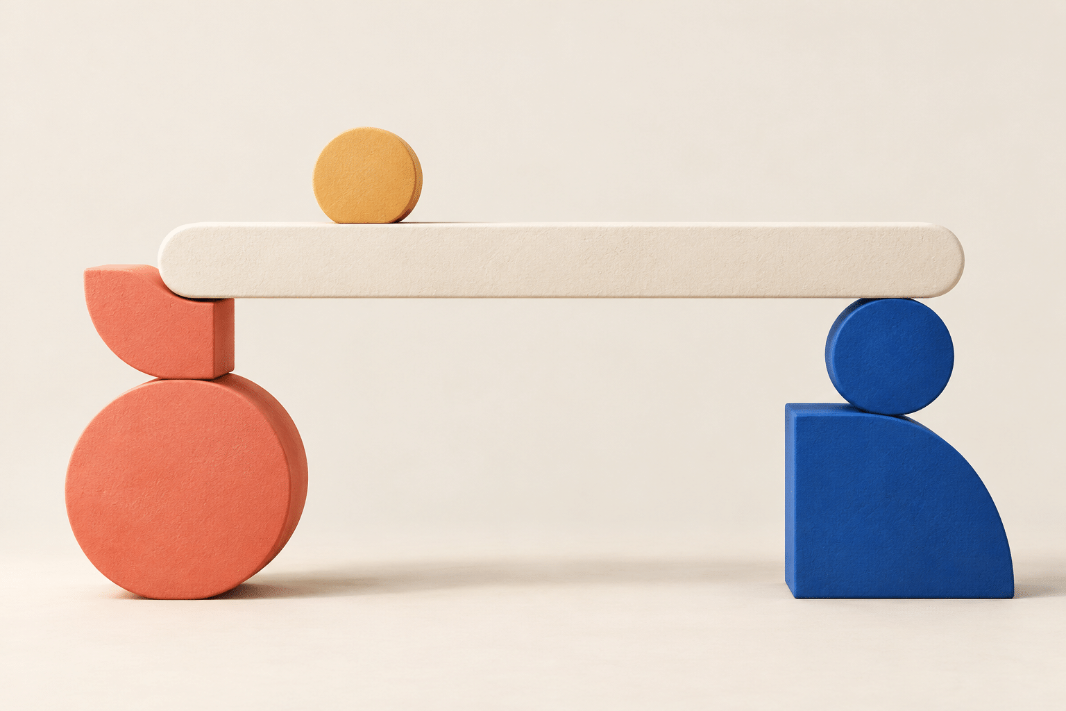
Rounded blocks, discs and wedges establish a small family of forms. Unequal scale, offset alignments and narrow gaps create tension; a restrained palette keeps the relationships readable.
A clear starting point
This formulation begins with the existing idea of geometric abstraction and adds a particular studio constraint: make a composition feel sociable or awkward through relationships between shapes, without turning those shapes into cartoon characters. A large disc can appear to crowd a narrow wedge; three small blocks can counterbalance one heavy form. The effect comes from placement and proportion.
The label is a creative proposal for this guide. No verified founder, historical manifesto or early exhibition is claimed. The name does not describe a group of people or prescribe a stereotype about intelligence, gender or appearance. Its useful content lies in the visual rules that follow.
Build a limited cast of forms
Choose three shape families and repeat them with controlled variation. Keep one property stable, such as edge softness, while changing size or tilt. If every object has a different contour, texture and lighting system, the viewer cannot easily compare their relationships.
Give the composition a dominant form and a supporting rhythm. A large shape near an edge may create pressure that a cluster on the opposite side can answer. Avoid balancing by simply making both sides identical. An asymmetrical arrangement can feel stable when its visual weights are deliberately distributed.
Colour and space carry the argument
Use one dominant colour, a quieter supporting family and a small accent. Place the accent where a relationship needs emphasis: a tiny wedge between two oversized discs, for instance. Saturating everything equally makes colour compete with the geometry instead of explaining it.
Negative space is an active component. A narrow gap can feel compressed, while a broad interval suggests separation. Test the image as black shapes on white. If the intended interaction disappears, refine size and spacing before adding gradients or surface effects.
Flatness or volume: choose the rules
A flat poster can express tension through overlap alone. A sculptural interpretation introduces weight, contact and shadow, so its balancing acts need a different kind of coherence. Keep the light direction consistent and show which objects touch. An intentionally impossible balance should be the focal event rather than one accident among many.
This distinguishes the proposal from generic collections of colourful blobs. The task is not to accumulate attractive shapes; it is to make their arrangement communicate a specific relation such as crowding, cooperation or precarious balance.
A practical comparison
Arrange the same seven forms three times: comfortably spaced, tightly crowded and precariously balanced. Keep palette, frame and shape inventory unchanged. Compare how much emotional character can emerge without adding faces, words or symbols.
Select the version whose relationships remain clear at thumbnail size. If it needs a paragraph to explain where the tension lies, simplify. Record the rules you used so another image can explore the same concept without merely copying the first composition.
Three studies, three kinds of tension
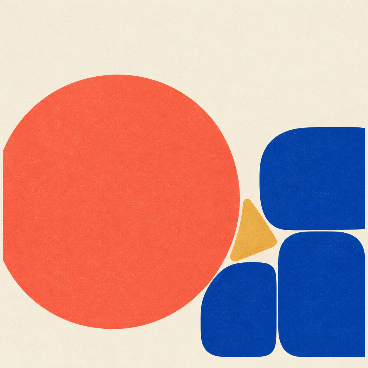
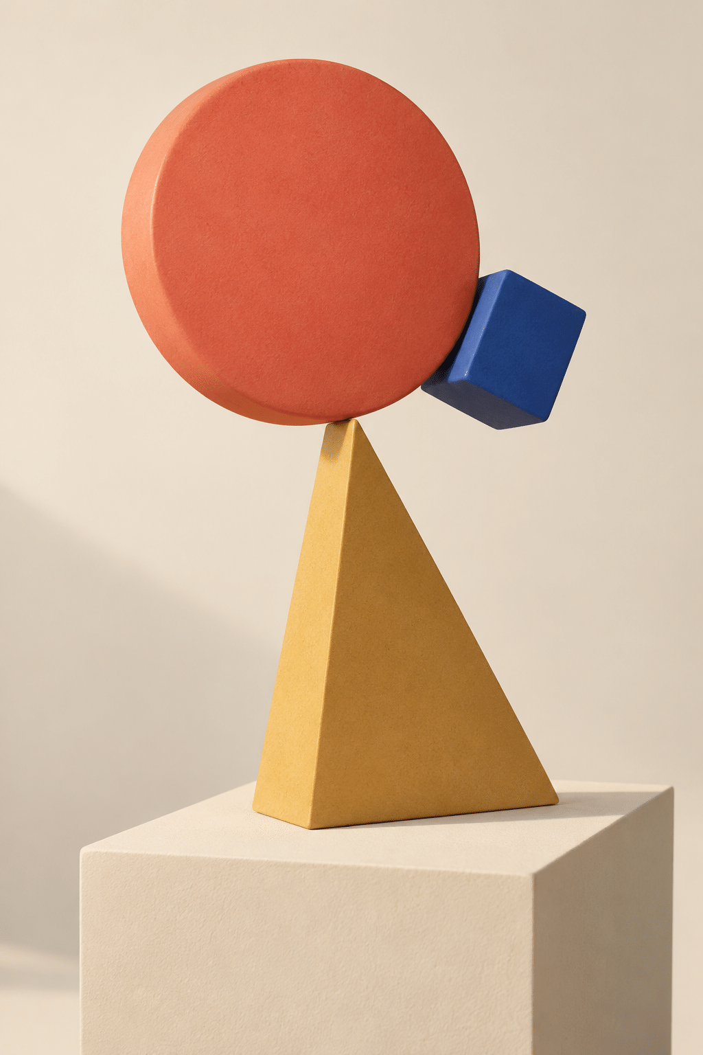
The first new study uses flat silhouettes: a large disc presses toward a small group of blocks, leaving a narrow interval that becomes the real subject. The second turns the proposition into a sculptural balancing act. Its interest lies in the point of contact and the contrast between apparent weight and a small support. The third uses separated groups and a connecting bar to test cooperation rather than collision.
Read these as proposals, not as evidence of engineered structures or actual fabricated objects. A flat composition can ignore gravity; a rendered sculpture must make clear whether it depicts plausible support or an intentional impossibility. Mixing those expectations accidentally makes the image less precise.
A useful palette exercise is to keep the same coral, cream and blue families while changing their proportions. Let coral occupy most of the visual mass in one image and become a tiny accent in another. The emotional effect then comes from hierarchy rather than a new collection of fashionable colours.
Where the proposal is useful—and where it fails
Bimborism can support posters, editorial illustrations, spatial sketches and objects whose visual interest depends on relationships. It is less useful as a catch-all label for any rounded abstract design. The decisive question is what the shapes do to one another: crowd, support, interrupt, lean away or leave room.
The historical context is geometric abstraction, which MoMA describes through geometric and linear forms. This guide adds a particular AOI studio exercise; it does not retroactively recruit established artists into a new movement. Evaluate each result by its readable arrangement, not by the novelty of its name.
A small poetic detour
Original words from the AOI studio.
Poetry
Room at the Edge
The circle took the wider seat,
the wedge stood waiting by the wall.
A little block moved half a step
and made sufficient room for all.
No face was drawn, no sentence said;
the space between them spoke instead.
The prompt workshop
Original creative exercises. These prompts create new illustrations, not documentary evidence.
Seven forms in balance
Create an original abstract Bimborism study with seven rounded geometric forms: three discs, two blocks and two wedges. Unequal scale, deliberate asymmetrical balance, coral dominant colour, cream ground and one blue accent. No faces or lettering.
Crowding and release
Design an original flat geometric poster with a tight cluster of soft-edged blocks on one side and one small isolated disc on the other. Make spacing and visual weight express a playful negotiation; limited palette, crisp silhouettes.
A precarious sculpture
Imagine an original tabletop sculpture of rounded wedges and discs balancing around one narrow contact point. Matte surfaces, consistent side lighting and readable contact shadows. Keep the tension focused on a single balancing event.
A smile from the studio
Jokes
The circle called it a balanced discussion. The small wedge asked to see the seating plan.