
Design practice · music, imagery and typography
An album cover gives sound a visible doorway. A face, a strange object, a field of colour or a few carefully placed letters can invite a listener into a musical world. Album art is a design practice rather than one historical movement: photography, illustration, collage and typography can all take the lead. The challenge is to make a particular recording recognizable without reducing it to a genre cliché.
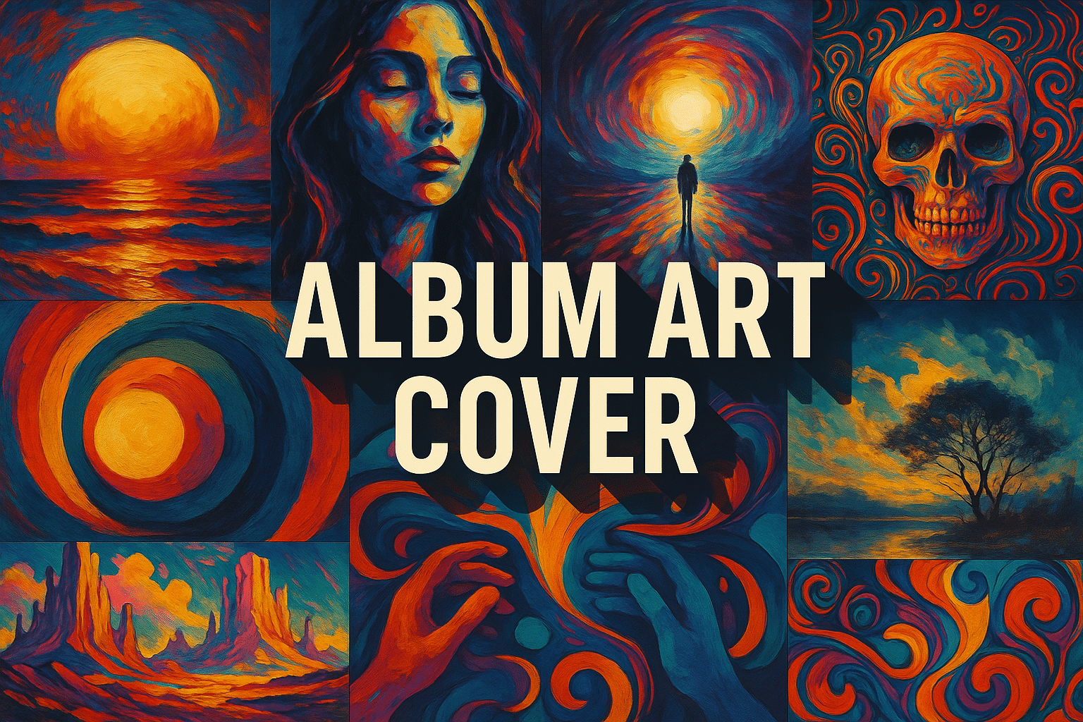
A visual introduction
Select an image for a closer look. Use the thumbnails, arrow keys or a swipe to compare examples. Zoom in to inspect details, or share the image that inspires you.

Creative toolbox · take this style further
Choose an input and a destination. Search sends your words to the chosen site; Copy & open puts them on your clipboard to paste there.
Create with AI
Turn your chosen input into an image prompt or a new creative direction.
ChatGPT
Copy your input and paste it into a ChatGPT conversation or image request.
Copy & open ChatGPT (new tab)Claude · Anthropic
Develop an image prompt or explore the style in a new Claude conversation.
Copy & open Claude · Anthropic (new tab)Midjourney
Paste your input into the Imagine bar on the Create page.
Copy & open Midjourney (new tab)Adobe Firefly
Copy your input, open Firefly, and paste it into the prompt field.
Copy & open Adobe Firefly (new tab)Leonardo.Ai
Copy your input, open Leonardo, and paste it into the generation field.
Copy & open Leonardo.Ai (new tab)Image search
Find visual references. Short, concrete keywords usually work best.
Lexica
Search AI images and prompts using your selected input.
Search with this input Lexica (new tab)Pexels
Search the photo and video library. Short keywords often work best.
Search with this input Pexels (new tab)Pixabay
Search photos, illustrations and other images.
Search with this input Pixabay (new tab)Unsplash
Search photographs using the style name or your own keywords.
Search with this input Unsplash (new tab)Wikimedia Commons
Search photographs, artworks and historical images. Check each file for its source and reuse terms.
Search with this input Wikimedia Commons (new tab)Art & research
Explore artists, collections and the ideas behind a style.
Wikipedia
Search for background reading. A style may not have its own article.
Search with this input Wikipedia (new tab)WikiArt
Copy your input into WikiArt’s search to explore artists and artworks.
Copy & open WikiArt (new tab)Europeana
Paste your keywords into the search to explore European museum, library and archive collections.
Copy & open Europeana (new tab)Inspiration
Discover portfolios and visual ideas from creative communities.
Instagram hashtags
Search a hashtag made from your input: spaces and punctuation are removed. Instagram may require sign-in.
Search with this input Instagram hashtags (new tab)ArtStation
Paste your input into artwork search for concept art, environments, characters and visual development.
Copy & open ArtStation (new tab)Behance
Paste your input into project search for illustration, design and visual storytelling.
Copy & open Behance (new tab)A closer look
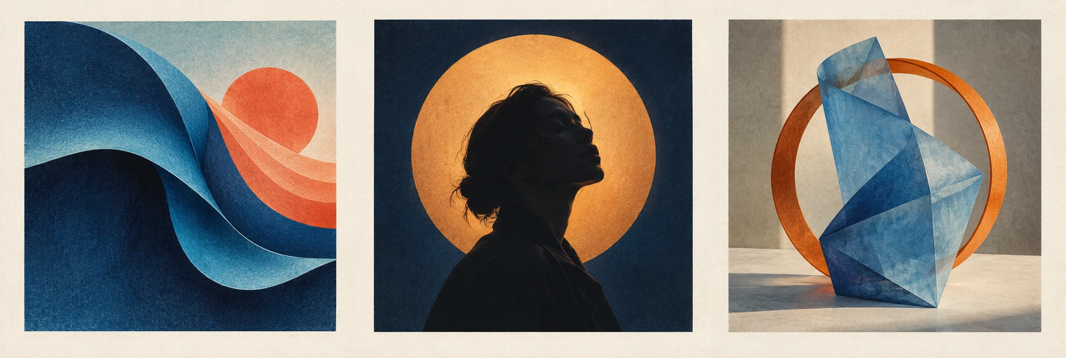
The new panoramic banner places three invented cover studies side by side: an abstract wave, a central silhouetted portrait and an unusual still life. They explore different ways to suggest rhythm and atmosphere without borrowing a commercial sleeve. The retained LIGHT study and blue-orange collage offer further AOI examples; all are AI-generated concepts, not released albums.
Begin with the sound, not the stock image
Listen for relationships you can translate into visual choices. Is the music spacious or crowded, regular or interrupted, intimate or distant? A generous margin, a repeated cut-paper shape or an unusually close crop can answer those questions without illustrating a lyric literally.
Write a compact brief: one sentence about the recording, three visual qualities and one thing to avoid. “Patient, grainy, nocturnal; avoid a generic star field” gives the design a clearer direction than a genre name alone. A quiet record can have a vivid cover if that tension is intentional.
Sketch three alternatives with the same ingredients. Let a portrait dominate one, an object dominate another and empty space dominate the third. Compare the invitation each makes before investing in polish.
Packaging has a design history
UMKC Libraries’ account of Alex Steinweiss describes how his work at Columbia Records challenged utilitarian packaging through expressive imagery, typography and colour. It is a useful starting point for understanding the cover as a designed encounter with music, rather than simply a protective container. [1]
A cover also has specific credits. MoMA’s record for Patti Smith’s Horses (1975) names Robert Mapplethorpe, Bob Heimall and Arista Records. The photograph, its graphic arrangement and the published object belong to a collaborative history; do not automatically assign every visual decision to the performer. [2]
Those examples suggest two different questions for a new project: what can the package contribute to the listening experience, and who is responsible for each part of that contribution? Record the answers alongside the final artwork.
Three routes: portrait, object and imagined world
A portrait establishes a relationship with a performer. Consider posture, distance, gaze and the space around the person. A face need not fill the frame to feel present, and a dramatic effect should not override the identity the musician wants to communicate.
An object can create a visual riddle. MoMA’s discussion of Robert Brownjohn’s Let It Bleed cover (1969) describes a deliberately improbable stacked construction. Borrow the design question—how can ordinary things become surprising together?—rather than recreating that particular arrangement. [3]
An imagined world can connect the sleeve to a wider identity. The V&A’s Pink Floyd exhibition brings graphics, staging and performance into the same account and highlights collaboration with Hipgnosis. A recurring motif may travel across these formats, but each format still needs its own composition. [4]
Make hierarchy survive the change of scale
A sleeve across a room, a cover in the hand and a thumbnail on a phone are different encounters. Test all three. A single strong shape may carry recognition at small size, while texture and secondary details reward close attention.
Treat lettering as designed form. Size, spacing and alignment can support an image or fight it. If an image model supplies the illustration, reserve deliberate space and set the final artist name and title separately. An intentional wordless cover is a clear decision; accidental, misspelled lettering is not.
Do not simply stretch the square into every promotional format. Build a wide banner and a vertical poster from the same visual vocabulary. Move elements when necessary and preserve the intended first point of attention.
Finish the package, not just the front
Check the actual distributor and printer requirements when preparing delivery files; dimensions, margins and acceptable formats belong to that specific job. Keep an editable master so changes do not require rebuilding the design from a flattened preview.
Retain image origins, permissions, contributor credits and the final text in the project record. A generated concept should not be presented as a photograph of a real performer or an existing commercial release. Our page illustrations are explicitly labelled studies.
Finally, look at the cover after listening again. Does it disclose something you heard, or merely resemble other covers in the category? A strong design can surprise the music. It should still have listened to it.
Build a visual identity that can vary
Test the cover alongside a track image, a small announcement and a monochrome thumbnail. Keep one recognisable element across the set: a particular shape, a crop, a colour relationship or a typographic rhythm. Consistency does not require repeating the entire cover unchanged in every format.
Decide which element is essential before adapting the design. A detailed illustration may simplify to a silhouette, while a photographic cover may retain a distinctive crop. The adaptation should preserve identity even when small text is no longer readable.
Separate the image from the final lettering
If an image generator is part of the process, leave deliberate space for the artist name and title, then set the approved wording in a layout tool. Check spelling, hierarchy and contrast at actual size. A cover should remain a useful piece of communication when the listener sees it briefly, not only when the designer explains its concept.
A small poetic detour
Original words from the AOI studio.
Poetry
Before the needle—
a square of colour holds still.
The room learns to hum.
The prompt workshop
Original creative exercises. These prompts create new illustrations, not documentary evidence.
Start with a listening brief
Create an original square cover concept for a fictional patient, grainy, nocturnal recording. One amber light reflected in dark blue water, restrained paper texture, a clear focal point and planned empty space. No lettering or existing album reference.
Original AOI exercise; a generated image is not historical or documentary evidence.
Build a complete direction
Develop three coordinated cover concepts using an abstract wave, a silhouetted fictional adult portrait and an unusual still life. Shared indigo, amber and coral palette; distinct compositions. Set any final typography separately.
Original AOI exercise; a generated image is not historical or documentary evidence.
Test the format
Adapt the chosen square concept into a wide banner and a vertical poster, rearranging elements rather than stretching the image. Keep its focal motif recognizable at thumbnail size. No text or logos.
Original AOI exercise; a generated image is not historical or documentary evidence.
People & works to explore
References discussed in this article. Consult the sources below for context.
Artists and practitioners
Alex Steinweiss — record packaging
Robert Mapplethorpe and Bob Heimall — contributors to Horses
Robert Brownjohn — Let It Bleed cover
Hipgnosis — album imagery and visual identity
Paintings and other works
Patti Smith, Horses (1975), album cover
The Rolling Stones, Let It Bleed (1969), record jacket