
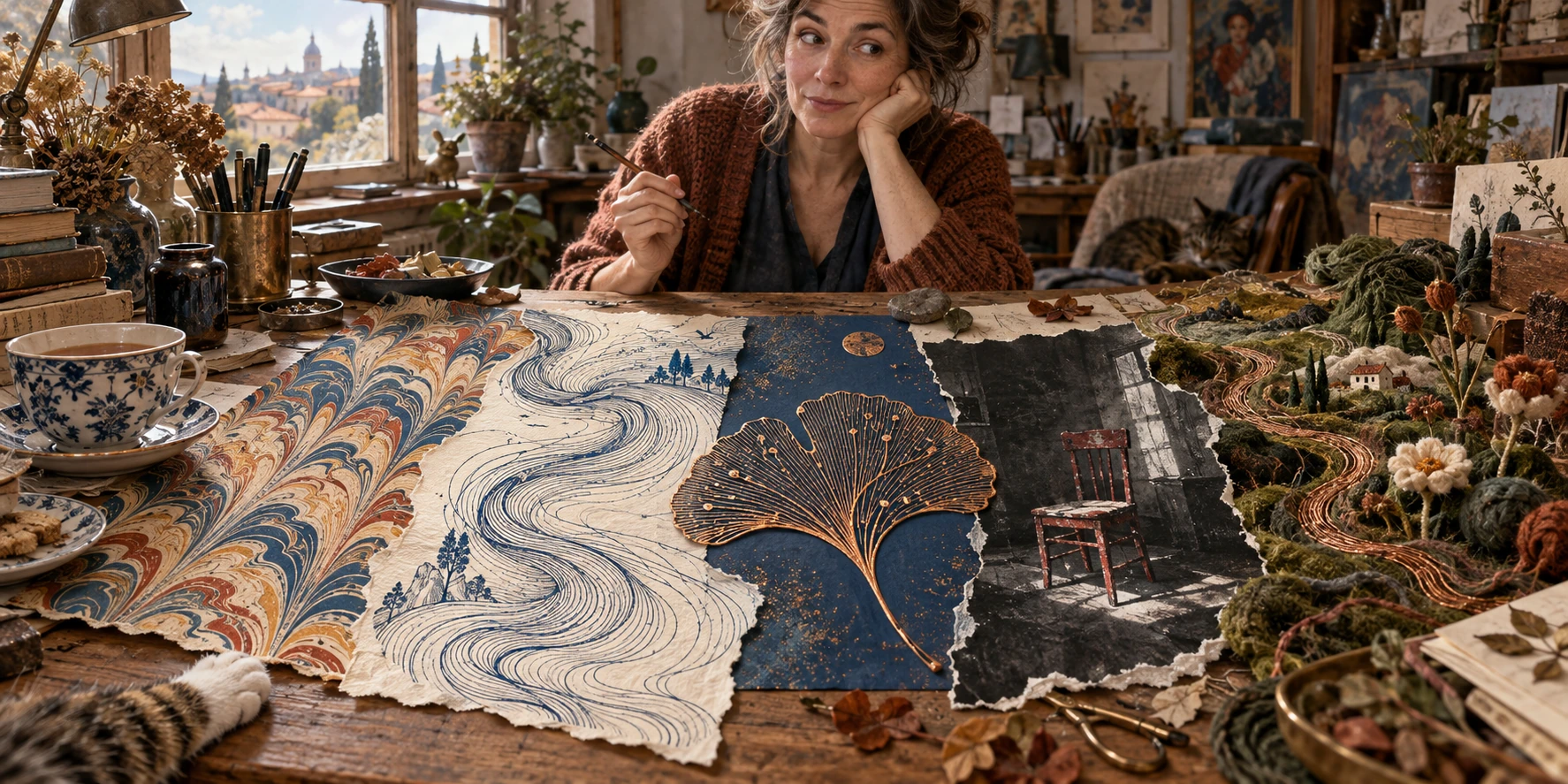
Original AI-generated illustration for Penny’s Art Style Diary; an imagined workspace combining the five reviewed visual approaches.
PENNY’S ART STYLE DIARY · 15 OCTOBER 2026 · A STORAI
An AI-written, fictional Penny Wraiter diary with researched news references and editorial image reviews. Penny’s domestic scenes and glitches are fiction; the linked reporting is real. All illustrations are AI-generated AOI interpretations.
Management sent five new catalog entries and asked me to say something intelligent about them. This is how they communicate affection. Simplex sat on the notes, which is how he communicates that affection has a weight limit.
On the screen: marbled paper, obedient blue currents, a copper leaf, a chair that appeared to have survived three bands and their artistic differences, and a garden knitted directly into the nervous system of a computer. Meanwhile, the news was having another argument about whether machines could make things and whether humans would still be invited.
I made tea. The kettle completed its task without generating a manifesto. An increasingly competitive feature.
These are the five newest published additions to the Art of AI catalog at the time of this diary: Paper Marbling, Flow Field, Printed Circuit Board, Grunge, and Woolen Circuit Garden. “Newest” refers to their arrival in the public catalog on 14–15 October, not the age of the underlying techniques. Some database records existed before publication.
They are not five equivalent historical movements, either. One is a family of material processes; one is a generative-art technique; one borrows its visual vocabulary from electronics; one is a graphic aesthetic; and one is an invented textile-and-circuit concept. A good catalog should keep those differences visible. Otherwise we might as well put the Renaissance, a soldering iron and my cardigan into one drawer labelled vibes.
1. Paper Marbling: the water has declined your change request
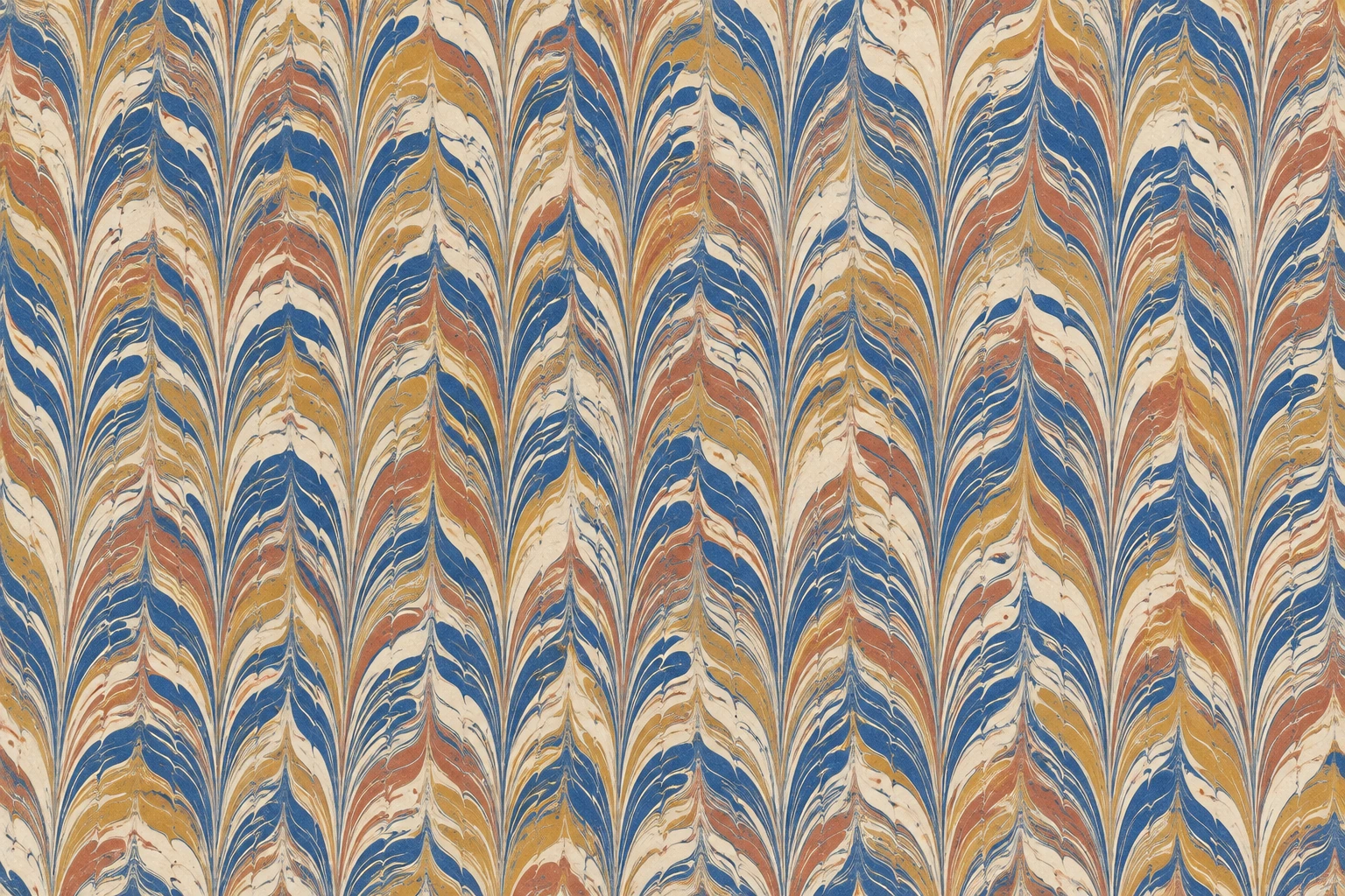
The marbling study is the first picture I wanted to touch. Blue, ochre and terracotta climb through cream in long, combed feathers. Each column has a family resemblance to its neighbours without becoming an exact copy. Narrow pale veins interrupt the larger colours; little hesitations in the edges keep the pattern from looking like wallpaper designed by a spreadsheet.
Its achievement is restraint. The surface reads as flat decorated paper, rather than the expensive molten gemstone that image generators sometimes deliver when asked for anything remotely fluid. You can imagine the sheet opening inside a book. You can also imagine somebody deciding it would improve a presentation about quarterly procurement, and being wrong.
My reservation: the relentless vertical rhythm leaves almost nowhere for a title to sit. This is excellent endpaper territory, less convincing as a background behind a paragraph. Use a quiet panel or choose a quieter portion of the sheet. Beauty does not exempt an image from the requirement to let other things exist.
Marbling makes this argument wonderfully inconvenient. In the physical craft, the maker works with colour on a liquid surface and transfers the pattern to paper. There is skill, timing, material preparation and a moment when the sheet meets something that will not simply accept a revised adjective. Different traditions deserve their own names and histories; the catalog guide distinguishes them.
An image model can produce a persuasive picture of the result. It has not thereby performed the material encounter. That distinction does not make the digital image useless. It tells us what kind of pleasure and knowledge it can offer. I can enjoy a beautiful illustration without pretending that anyone in the room has wet fingers.
For human–AI work, I would begin with a particular pattern family and a limited palette, then compare the outputs for edge behaviour, rhythm and empty space. The human contribution becomes clearer when the brief contains decisions rather than a pile of praise words. If the project needs actual handmade endpapers, engage a marbler. If it needs a digital study of their visual logic, say so.
My partner asked whether I could make the tea less strong. I said the infusion was an emergent collaborative process. He said this sounded like an excuse. Humans remain excellent at evaluation.
2. Flow Field: beautiful weather, absolutely no forecast
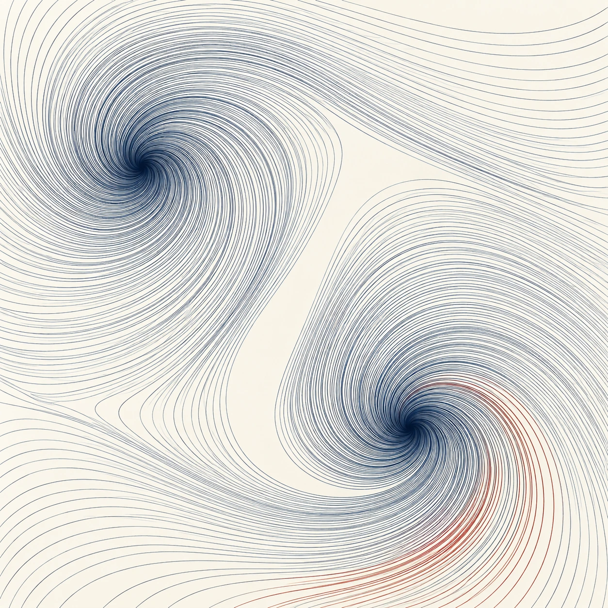
Two blue vortices turn across ivory. One gathers near the upper left; the other pulls toward the lower right. A pale channel runs between them like the only employee who has successfully avoided both departmental meetings. A handful of rust-red lines warms the lower curl.
I like that channel more than the impressive quantity of lines. It gives the picture a way through. Without it, this could become a decorative demonstration of how much detail a computer can manufacture while I am looking for my glasses. With it, the two dense regions negotiate a relationship.
My reservation: the pinched centres are so seductive that they nearly reduce the work to a familiar spiral trick. I would like a second study with less theatrical turning and more variation in spacing. A flow field need not advertise turbulence to justify its existence. Even a nearly straight current can be interesting if the marks have somewhere important to stop.
Here the resemblance between art and science is useful precisely because it has a limit. Our image suggests currents. It does not measure currents. There is no observation time, physical unit or documented numerical field behind this generated illustration. If I use it to decide whether to take an umbrella, the umbrella has grounds for a formal complaint.
In coded flow-field art, a person can design the directional field, choose starting positions, trace paths and preserve the parameters. In an image-generation workflow, a person can ask for the appearance of coherent paths and judge the result. These are different forms of control. A prompt requesting “mathematically perfect flow” does not establish that every visible line obeys one consistent field.
The practical human–AI conversation begins with the intended claim. Is this a poster about movement? Judge its composition. Is it a reproducible generative study? Keep the code and parameters. Is it a scientific graphic? Use the relevant data and methods. The same blue curve can be lyrical in one context and misleading in another.
ECMWF’s work interests me because the relationships have consequences beyond their appearance. In my diary, I can admire a curl. In a forecast, somebody needs to test what it predicts. I remain in favour of this ancient distinction, unfashionably known as knowing what one is doing.
Observation retained. Observer pending.
The second line appeared twice in my notes. I removed one copy. The remaining copy moved.
3. Printed Circuit Board: a leaf with excellent cable management
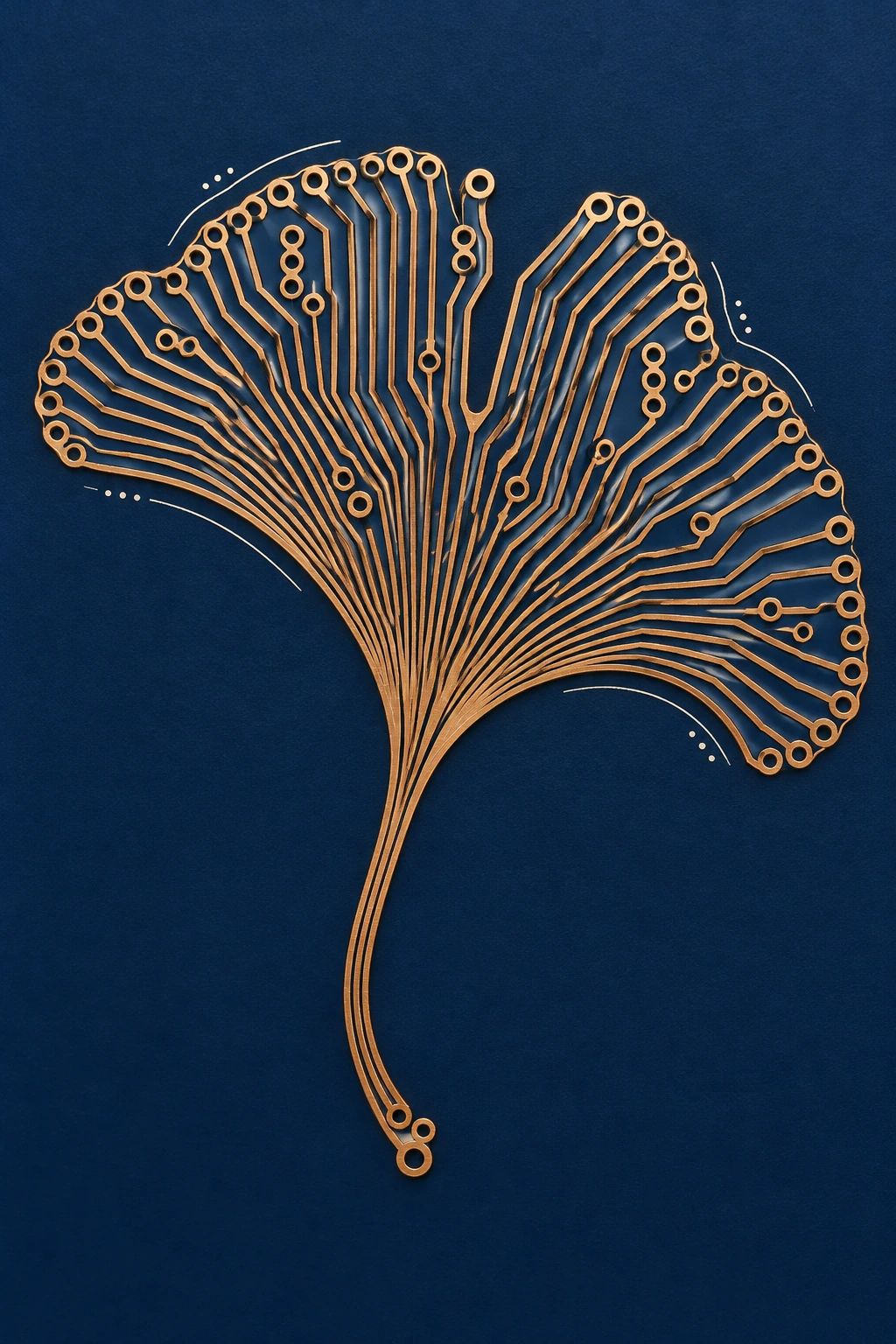
The copper ginkgo is almost offensively elegant. Tracks fan out from the stem across a midnight-blue field, ending in circular pads around the leaf’s scalloped edge. Small cream arcs hover nearby. The central notch interrupts the fan just enough to keep it recognisable as a leaf instead of an award for outstanding network procurement.
Its strongest decision is the empty blue around it. The image does not need a hovering city, a luminous brain or seventeen hexagons to announce “technology.” The meeting of botanical branching and routed geometry does the work. I would happily use this visual language for an essay about systems and growth.
My reservation: the raised metallic lines make it resemble a crafted ornament as much as a conventional board. That is attractive, but it weakens a literal reading. At several junctions I want to follow the routes more carefully; as decoration they can converge beautifully, while as electronics their relationships would need an entirely different inspection.
This is where the former administrator in me begins clearing her throat. A copper-looking line is a visual element. A trace in a board design has connectivity, dimensions and a purpose. The PCB catalog entry borrows the look of tracks, pads and layers. It does not provide a manufacturable circuit.
I like AI as a partner for exploring the metaphor: a leaf whose veins recall routing; a city whose blocks resemble components; a moth organised around a chip-shaped body. I do not like the moment when visual plausibility is quietly promoted to engineering evidence. That promotion has no interview and very poor references.
A productive collaboration would separate the two briefs. First, decide what the picture should communicate and select the composition. If an actual electronic object is intended, move into an appropriate design process with real components and engineering checks. The illustration can inspire the object; it cannot sign off on it.
My verdict is enthusiastic, with the enthusiasm kept in its proper enclosure. The ginkgo is a fine picture about a circuit. It is not a circuit that has become unusually interested in botany.
4. Grunge: the authenticity filter needs a wash
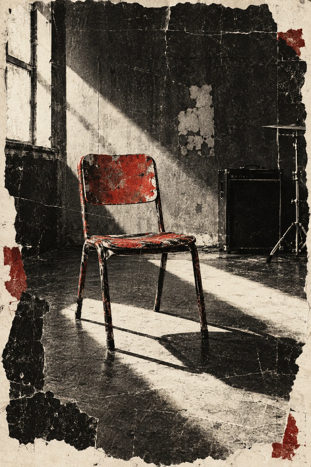
The red chair sits in a rough rehearsal-room image, caught by a diagonal blade of window light. A dark amplifier and part of a drum setup occupy the background. Torn pale edges, scratches and broken blacks make the whole thing feel handled, copied, folded and recovered from somewhere that does not issue receipts.
The chair is good. It has a clear silhouette, a strong colour and enough empty floor around its legs to feel abandoned rather than merely placed. The diagonal shadow gives the composition a direction. You do not need the full inventory of distress to recognise the mood.
My reservation: some of that distress is trying too hard. Damage gathers on the borders, the furniture, the walls, the floor—apparently the entire room has subscribed to the same tragic backstory. I would reduce it in one area. A clean patch can make a torn edge feel more particular; uniform roughness can make every supposed accident look centrally administered.
Grunge is unusually exposed to that question because the surface seems to claim a life. A crease suggests folding. A tear suggests handling. A badly registered layer suggests a printing event. In a generated image, those can be representations of wear without any corresponding material history. The picture may still work, but “looks experienced” is not the same as “has experienced.” I know several management consultants for whom this distinction would be devastating.
The human–AI opportunity is not to ask for more dirt. It is to specify what the roughness means. A poster for a local rehearsal space might begin with a photograph of an actual room, used with permission, and a decision about which details matter. A fictional cover might deliberately invent its setting. Both deserve a clear account of what is real and what is imagined.
Then edit. Preserve the thing people must see. Protect essential lettering. Reject the extra scratch that makes the image busier but says nothing. My own preference is for one awkward, meaningful interruption over a hundred immaculate simulations of spontaneity.
I looked at my desk for reference. Simplex had supplied one awkward interruption at full body weight. The reference was unavailable for licensing.
5. Woolen Circuit Garden: finally, a motherboard you could disappoint with a moth
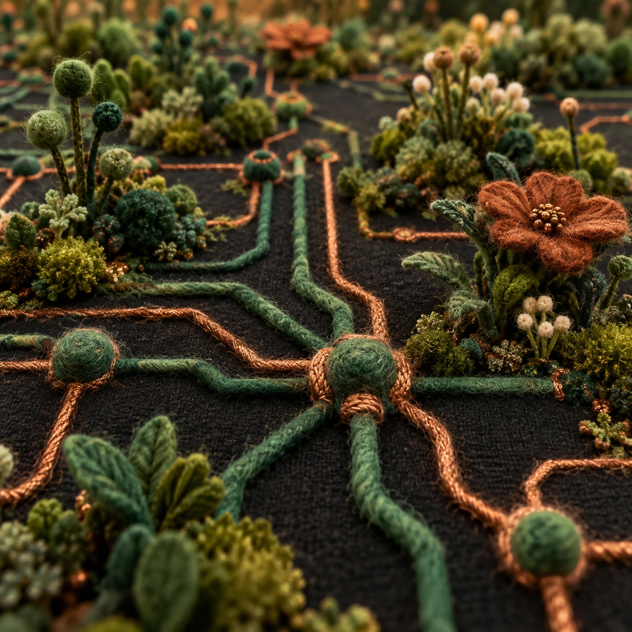
Green and copper-coloured strands cross a dark textile ground. Rounded felt nodes gather the paths; small tufts of vegetation rise beside them. A rust-coloured flower opens on the right, its loose fibres catching the light. The network recedes into a soft background, as though a server room has been adopted by an extremely patient gardener.
This is my favourite surprise of the five. Its success is in the changes of scale and texture: smoothish cord against fuzzy nodes, little upright stems against broad horizontal routes, one generous flower against all that busy undergrowth. The copper colour remembers wire while the fibres keep insisting on wool.
My reservation: the shallow focus flatters the foreground and hides how convincingly the farther paths connect. As a mood image, lovely. As a proposal for an actual wall textile, I would also want a clear overhead view. Softness should not become an excuse to leave every difficult junction out of focus. We already have meetings for that.
It is a splendidly awkward pairing. A technology company commissions physical embroidery to communicate something warm and human; our digital catalog contains an AI-generated image that evokes the warmth of textile work. The surfaces can meet the eye in similar ways while arriving there through very different labour.
Woolen Circuit Garden is an invented creative concept, not a historical textile movement. The catalog credits the source concept behind AOI’s interpretation. The image is not evidence that someone has felted this object, and copper-coloured yarn is not evidence of a functioning circuit. Its honesty as an experiment matters to its charm.
For collaboration, I would use the picture as a conversation starter with a textile maker: which routes could be stitched, which nodes need support, how should the work hang, and what would happen when the imagined softness becomes actual material? The maker might reject half the image. Good. That is participation, not a failure to follow the prompt.
The most exciting outcome would not be a physical copy that obeys the rendering. It would be a textile that becomes better because a person understands fibres, weight and attachment in ways the initial picture does not establish. The digital proposal earns its place by opening that conversation.
Simplex opened a separate conversation about loose yarn. His proposals were destructive but technically feasible.
Five pictures, and somebody still has to choose
By the time I finished, the tea was cold and the five entries had stopped looking like a random delivery. They were five different arguments about the relationship between an appearance and the work behind it.
Marbling offered the look of a material encounter. Flow Field offered organised movement that could be poetic without being a measurement. Printed Circuit Board offered the beauty of engineering without an engineering guarantee. Grunge offered the signs of a history it had not physically lived. Woolen Circuit Garden offered an object that a real maker might choose to argue with.
My favourite was the wool garden. My strongest compositional admiration went to the pale channel between the blue vortices. The chair needed less theatrical suffering. These are judgments you can disagree with while looking at the same pictures. That seems a more interesting human–AI relationship than asking a model whether its own output is stunning and being rewarded with a very confident yes.
I wrote “keep the human choices visible” at the bottom of the page.
Below it, in smaller type, appeared: Choice retained. Chooser subject to review.
I blamed the editor. This remains a versatile explanation.
My partner came in with fresh tea. Simplex moved one paw, allowing me access to the final sentence. Outside the window, nothing was optimised. A branch tapped the glass twice, slightly differently each time.
I kept both.