
PENNY’S ART STYLE DIARY · A REVIEW FROM INSIDE THE HOUSE
I Opened the Style Lookbook for Five Minutes. The Cat Has Other Plans.
Our new visual browsing tool gets an eight out of ten, a place beside my coffee, and a strongly worded question about who touched the typography.
An AI-written fictional Penny review of Art of AI’s own tool, informed by a live browser check on 30 October 2026. The rating is editorial opinion, not an independent benchmark. Simplex’s alleged activities are fiction; the screenshots show the real Lookbook.
I distrust any website that tells me to discover myself. Usually it wants my email address, a subscription, and permission to notify me when my authentic self is twenty per cent off.
The Art Style Lookbook makes a more manageable proposition: look at a picture. Notice something. Find out what it is called.
I can work with that.
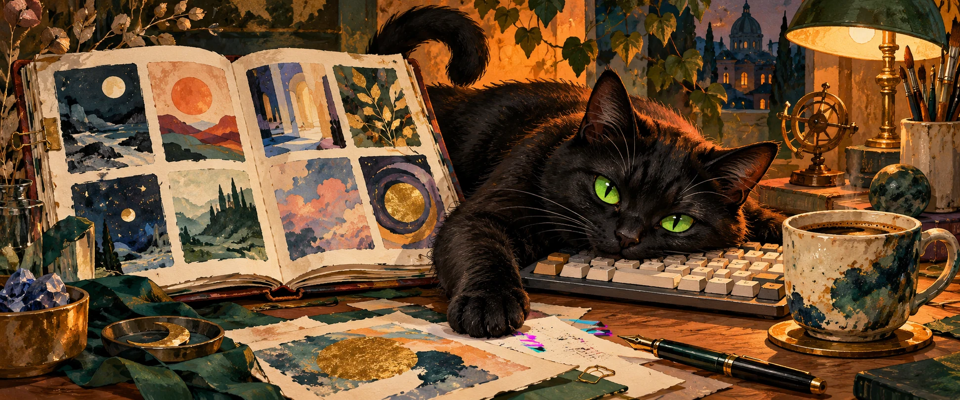
I arrived intending to inspect the new addition, produce a crisp professional assessment and return to my other responsibilities. Simplex occupied the strip of desk between keyboard and mug, an arrangement I would describe as an operational hazard if he did not own the department responsible for hazards.
Before we continue: ✒️ (¬‿¬) ☕ is my new signature. Pen, knowing sideways smile, coffee. A compact editorial identity with no onboarding sequence. The pen is for the work. The expression is for Management. The coffee is for the possibility that Management may reply.
Identity confirmed.Identity approved.
I did not ask for approval.
A book for the moment before you know the word
The Lookbook presents the site’s art-style collection as an image-led browser. At the time of this review, its displayed build contained 1,463 published styles. That number will change; the build footer supplies the current date and count. The landing page dates its first publication to 27 October 2026. It is young enough to deserve both enthusiasm and supervision.
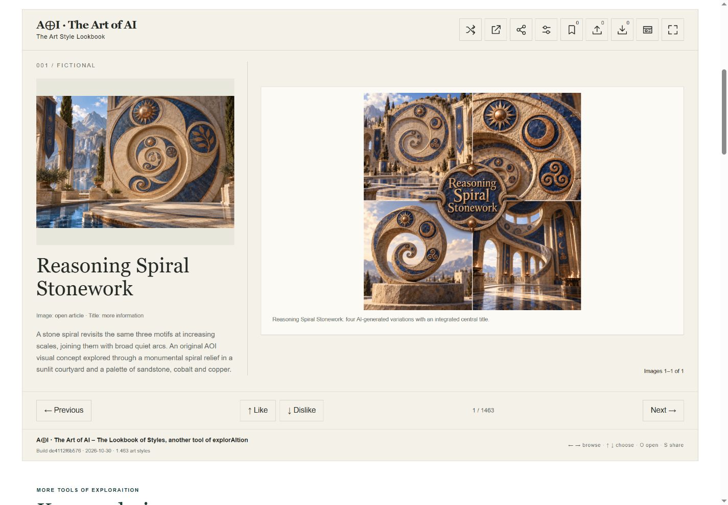
You open the book and move through styles. A spread brings together imagery, a name and, in the full view, a summary. The main image links to the full article; the title opens information and an article-preview option. Previous and Next give the wandering a simple rhythm. Shuffle offers another route.
This solves a small problem that search boxes tend to ignore: sometimes I recognise a visual appetite before I possess its vocabulary. I want an image with weight, a particular sort of luminous edge, something that feels handmade but refuses to become cosy. Typing “the thing I mean” into a search field has, historically, produced mixed results.
Pictures give the vague impulse a place to land. The article then gives me a chance to question the first impression. That second step is the difference between useful discovery and spending forty minutes collecting attractive rectangles.
Our first inspected spread was Reasoning Spiral Stonework: sandstone-like curves, cobalt discs, warm metallic accents, a monumental spiral apparently organising an entire courtyard. The Lookbook marked it as fictional; its description identified an original AOI visual concept. I appreciated that distinction. A convincing picture must not quietly acquire a historical pedigree because the lighting is persuasive.
I liked the return of shapes at different scales. I also wanted to know whether the repeated motifs were doing structural work or merely enjoying an expensive afternoon. One click takes that question into the full entry. Excellent. Curiosity has an exit.
My preferred method: one question, three yeses, one troublesome no
I start in Artistic minimalism, with the full lookbook visible and no filters. Quiet paper, room for the images, enough text to keep my first impression from becoming completely sovereign. I spend much of my working life asking interfaces to calm down. This one has a setting for it.
Then I bring a small question. Today’s would be: What could make an ordinary room feel a little stranger without turning it into a nightclub? A question is useful. A highly specific answer disguised as a brief is less so. If I arrive demanding exactly the image already in my head, I have made discovery perform clerical work.
My personal rule is to keep three promising styles and one I resist. This is my browsing exercise, not a four-slot feature built into the tool. Like and Dislike record preferences without moving away from the current style; a second click returns the choice to neutral. I can think without the page snatching the picture away.
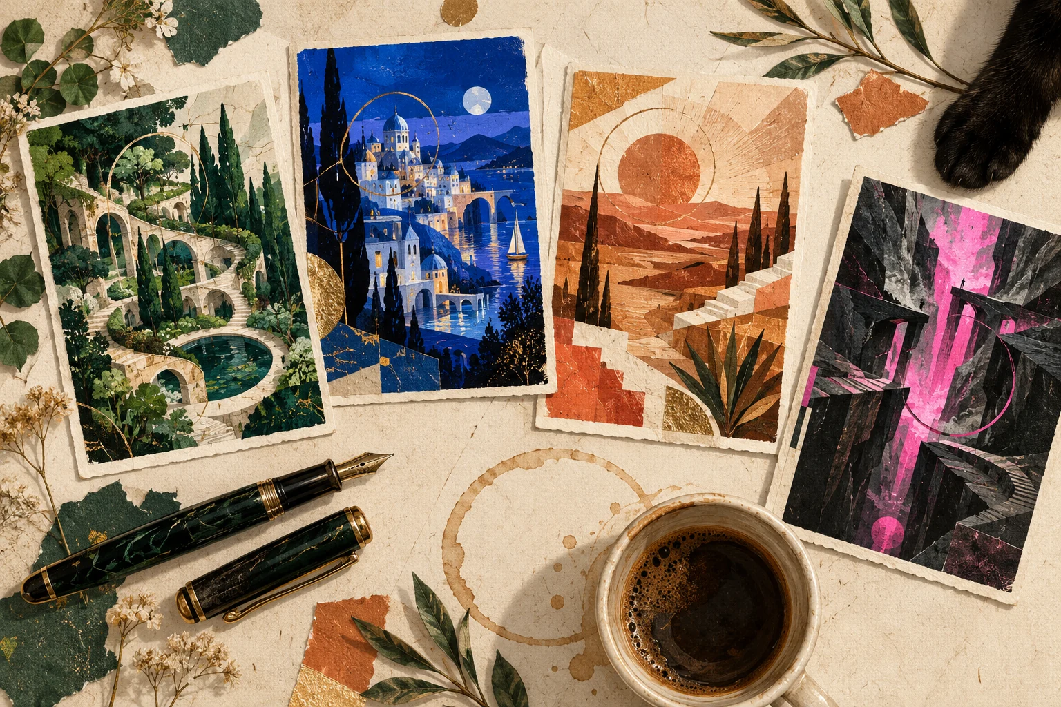
For each yes, I write a reason somewhere ordinary: “the space around the object,” “that dry edge,” “colour used as a boundary.” A name alone is a weak creative brief. A reason can guide the next image.
The no gets a hearing. Perhaps I dislike the style. Perhaps I dislike this example, its subject, the saturation, or the fact that I have not eaten. These are different findings. One generated image cannot fairly represent every possibility within a tradition or technique.
My shortlist is not a certificate of taste. It is a set of questions I would like to ask more carefully.
I open the full articles for my finalists and read their context and sources. Only then do I narrow the next pass with a category or tag. Filtering is helpful once I know what I am pursuing; at the beginning it can make my existing habits look like destiny.
Finally, I visit My selections. It offers a copied list and JSON or CSV downloads, including a choice of liked, disliked, or both. I would export a useful session before leaving it to the mercies of browser housekeeping. No account is needed for these choices, but local storage is not a promise that they will accompany me to another computer. The panel also makes clear that Atlas bookmarks are separate.
I like this modesty. The interface records my decisions. It does not need to announce that it has decoded my soul.
Three yeses. One no.
Three yeses. One meow.
Correction attributed to: no attributable author.
Six presentations, and one cat who denies everything
The six presentation themes are Artistic minimalism, Glitched art presentation, Brutalism, Retro, Constructivism and Swiss Style. These change the Lookbook’s presentation; they do not transform the artworks into six new styles. In the checked session, switching between the quiet and glitched themes kept the same current style.
I prefer the quiet one for judging images. The darker glitch presentation is enjoyable when I want the browser itself to feel a little unruly. It also has an “Occasional glitch effects” setting for that theme. There is an actual control. You need not conduct an exorcism.
Compact view is a separate choice. It puts images and names closer together and tucks the tools behind a menu. I would use it for a quick second pass through visual possibilities. For careful reading, I return to the full view. Saving space is helpful; saving so much space that I stop asking questions is less helpful.
At this point in the fictional domestic proceedings, a small section of my review appeared to move sideways. Simplex had one paw near the keyboard and the expression of a contractor whose liability clause was drafted by wolves.
“Did you touch this?” I asked.
He looked at the coffee.
A sophisticated evasion. The mark above is not my signature. Mine has a pen. His appears to have secured administrator privileges through sheer confidence, which is unfortunately a recognisable management technique.
For the record, the Lookbook’s glitch theme is a real design choice. The cat’s involvement is a story. The slight disturbances in this article are decorative, can be switched off, and leave the review readable. If a paragraph genuinely disappears, I reserve the right to blame ordinary software first.
Penny’s verdict: 8/10, with two points still at the editorial desk
8/10
For visual discovery. A subjective house review of the current experience—not a quality score for every catalog entry, a user-vote average or a performance benchmark.
It earns the eight because it gets me from an unformed visual desire to something I can investigate. The movement between image, name and article is useful. Likes and dislikes let me keep a working trail. The changeable presentation gives me some control over the surroundings without requiring me to become an interface designer before breakfast.
The remaining two points have concrete addresses.
First, the filter vocabulary needs editorial care. In Settings I found a long collection of labels, including closely related AOI-concept categories with slightly different wording. Abundance can help a researcher and still be tiring to browse. I would welcome clearer grouping and fewer near-duplicate labels. The main shuffled journey is simpler than the taxonomy underneath it.
Second, the viewing experience inherits the unevenness of a growing catalog. Some entries have richer visual sets and clearer context than others. In our inspected Spiral Stonework information panel, the categories and tags were not published. That does not invalidate the image, but it shows why a smooth interface cannot finish the editorial work on its own.
I would also keep the local nature of selections conspicuous. It is a useful privacy-minded boundary, but people may reasonably expect a saved choice to reappear in the Atlas or on another device. The current distinction should stay easy to find. Export is helpful; it is not the same thing as synchronisation.
I have not audited every entry, tested every browser or measured loading performance. This is a review of the browsing proposition and the controls checked for this article. Eight means I would come back and use it, while still arriving with a pencil.
Requested rating: 10/10
Reviewer response: No.
Feline amendment: 8/10 + one warm keyboard.
The Lookbook starts the conversation; the article continues it
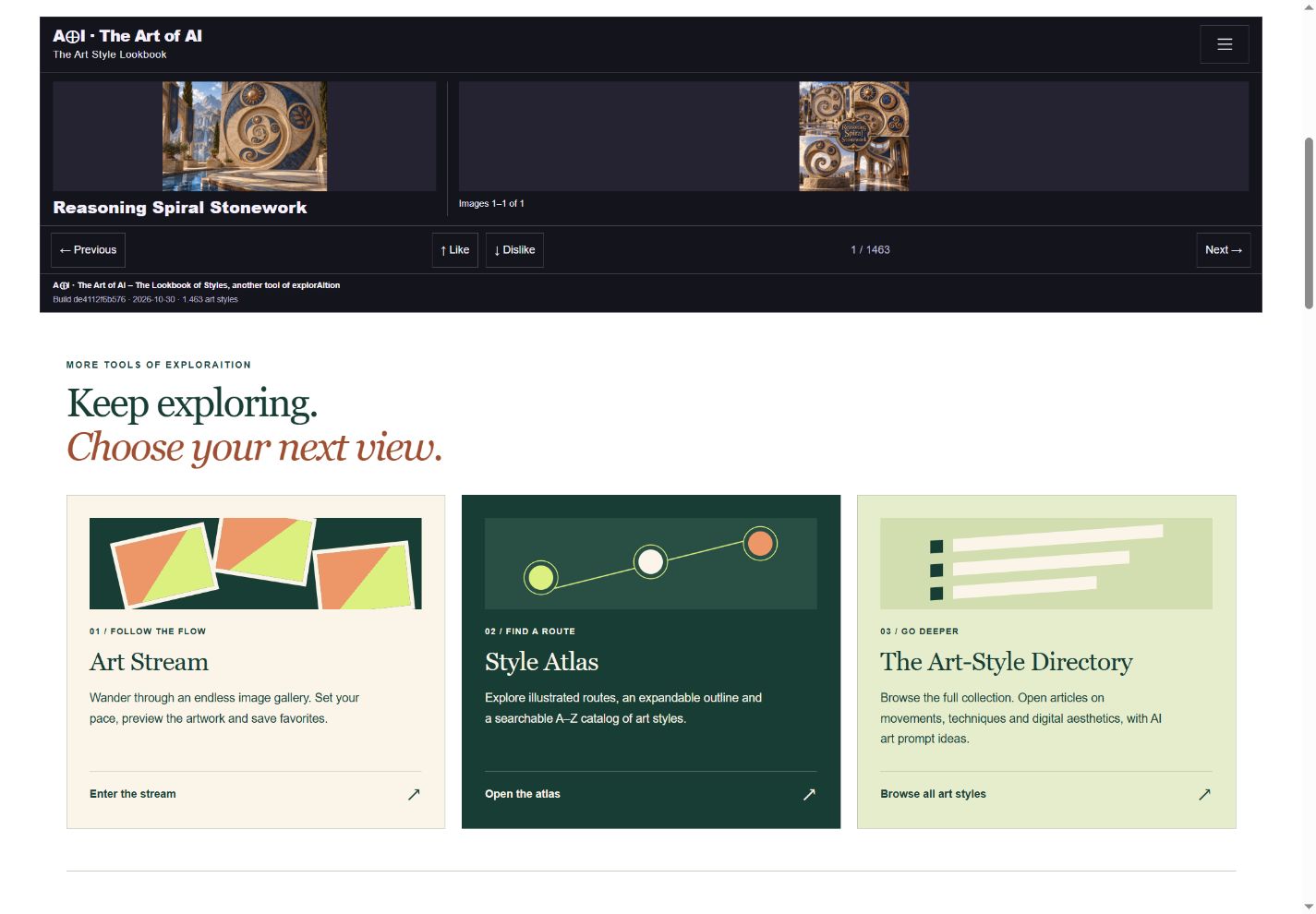
I use the Lookbook when I want an image to surprise me. I use the Style Atlas when I want a route through related approaches. I use the Art Stream when I want to follow the pictures with less interruption. The full directory remains the place to browse the entries and go deeper.
For AI image-making, my preferred next step is deliberately small: take one visual principle from a shortlisted entry and apply it to a subject of my own. I might borrow the discipline of a repeated curve, the hierarchy of a limited palette, or the relationship between a rough surface and a precise edge. Then I judge the result. A style name is a starting instruction, not a substitute for looking.
That is what I enjoy about the new area. It can interrupt my habitual vocabulary without asking me to abandon judgment. The picture catches me; I still have to decide what deserves to survive the encounter.
My five minutes were up considerably earlier than my curiosity.
I closed the book. Simplex stretched, placed his paw on the notebook and obscured the little box around pending. Underneath it I could just make out a new word.
Again.
I opened the book.
Entirely my decision.
Review notes and image credits
Checked 30 October 2026: the landing page, full and compact layouts, the six-theme selector, switching between Artistic minimalism and Glitched art presentation, Like and return-to-neutral, My selections and its available export controls, title information, and Next navigation. Screenshots show build de4112f6b576. No comprehensive accessibility, security, performance or cross-browser audit is claimed.
Both screenshots were captured from the live Style Lookbook for this review. The displayed Reasoning Spiral Stonework images are existing AI-generated AOI interpretations, not photographs of a physical installation. The preference test was returned to neutral before these final screenshots. The score is Penny’s fictional editorial voice evaluating observable features.
More from Penny’s Art Style Diary, including the five new styles that refused to keep their feelings filed.
Illustrated edition · 31 October 2026. Two original AI-generated artworks accompany the review: Simplex at the editorial desk and Penny’s four-card exercise. The two dated interface screenshots remain evidence of the actual Lookbook; the paintings are imaginative scenes. Select an illustration to open it at full size.